This article is rated as:


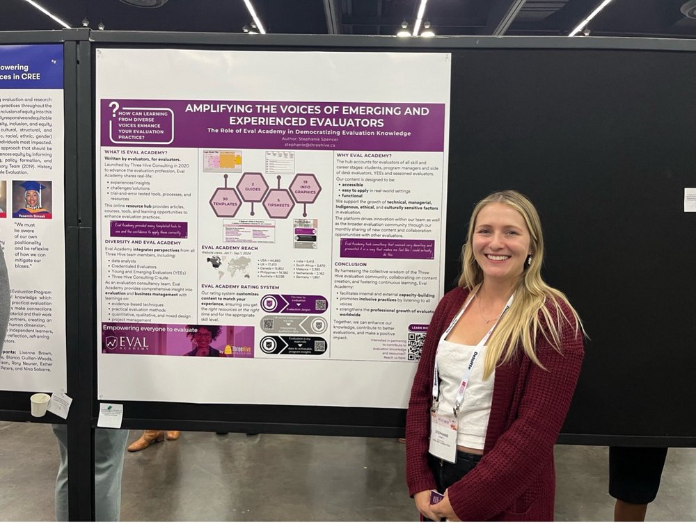
Eval Academy just released a new, free infographic: “Amplifying the Voices of Emerging and Experienced Evaluators – AEA Poster”!
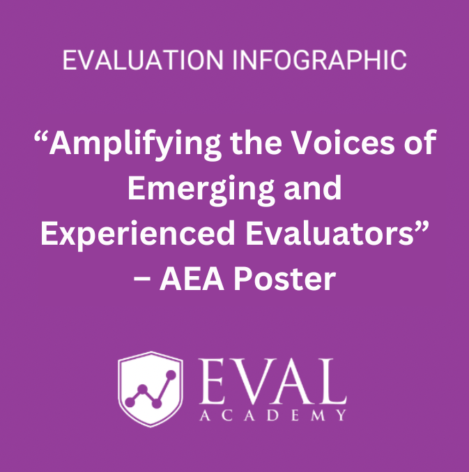
Amplifying the Voices of Emerging and Experienced Evaluators – AEA Poster
CA$0.00
Curious about how Eval Academy is democratizing evaluation knowledge? Dive into our new infographic, a downloadable copy of the poster presented at the 2024 AEA Conference in Portland, Oregon.
Who’s it for?
This resource is perfect for anyone passionate about expanding access to evaluation knowledge, including:
-
Students
-
Program Managers
-
New and Emerging Evaluators
-
Seasoned Evaluators
-
CEOs and Decision-Makers
What’s Inside?
This infographic reveals:
-
The mission and impact of Eval Academy
-
How content is crafted to support evaluators at all levels
-
Eval Academy’s reach and resources at a glance