• Skip to main content
  • Skip to footer
  • Home

The May 13 Group

the next day for evaluation

  • Get Involved
  • Our Work
  • About Us
You are here: Home / Archives for allblogs

allblogs

Oct 23 2024

Attending a conference? Do this.

I’m writing this at the start of the American Evaluation Association’s national conference.

Unfortunately it’s another year that I won’t be attending. But I want to pass some advice to all of you who attend conferences like this one with hopes of building both your skills and your professional reputation.

It’s time to think beyond the physical space, networking opportunities, and personal connections.

First, the secret.

For every conference that draws thousands of people to a physical space somewhere in the world, there are lots of people (in the same network) who won’t be present. That potential audience could be 10 times, or even a hundred times, the number of participants that show up live.

This is an opportunity.

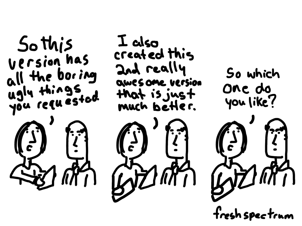
My evaluation comics started drawing an audience because I drew them and shared them during evaluation conferences that I attended. And the comics, along with associated blog posts, carried with them a snapshot of the lessons learned during the live conference.

Because even if it feels like there are lots of people at the conference, there are more people on the outside looking in. And these people are often hoping to learn a little by extension.

This comic comes from a post I wrote about evaluation blogging.

Here are some ways that you can leverage your participation at a conference to help amplify lessons learned, while also boosting your own reputation.

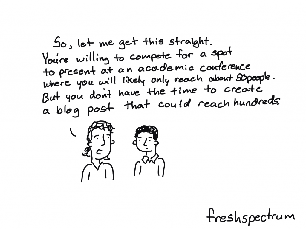
1. Turn your presentations into blog posts.

This can be a really quick win. Chances are, if you are presenting, you spent a lot of time thinking through and planning that presentation. Take the opportunity to turn it into a blog post. And if you don’t have a blog, you can write a LinkedIn article.

I know I’ve done this before, but I couldn’t find an example when writing this. So here is a guest post written by Kylie Hutchinson based on her experiences at the 2011 evaluation conference.

Kylie Hutchinson (@EvaluationMaven) with 23 tips for a better conference presentation #eval11

2. Turn your presentation into a YouTube video.

As you’re practicing your presentation, turn on your mobile phone selfie style, and create a recording. If it’s a long presentation, give a shortened version. Then upload to YouTube to share.

Want to see my first ever AEA presentation? Here it is…

3. Amplify other people’s presentations with social posts.

Attend presentations, and then share your takeaways on social. It doesn’t have to be much, just a simple post on LinkedIn. You can also tag the presenters and hashtag the conference.

Inspired by a Michael Quinn Patton presentation, shared on AEA365.

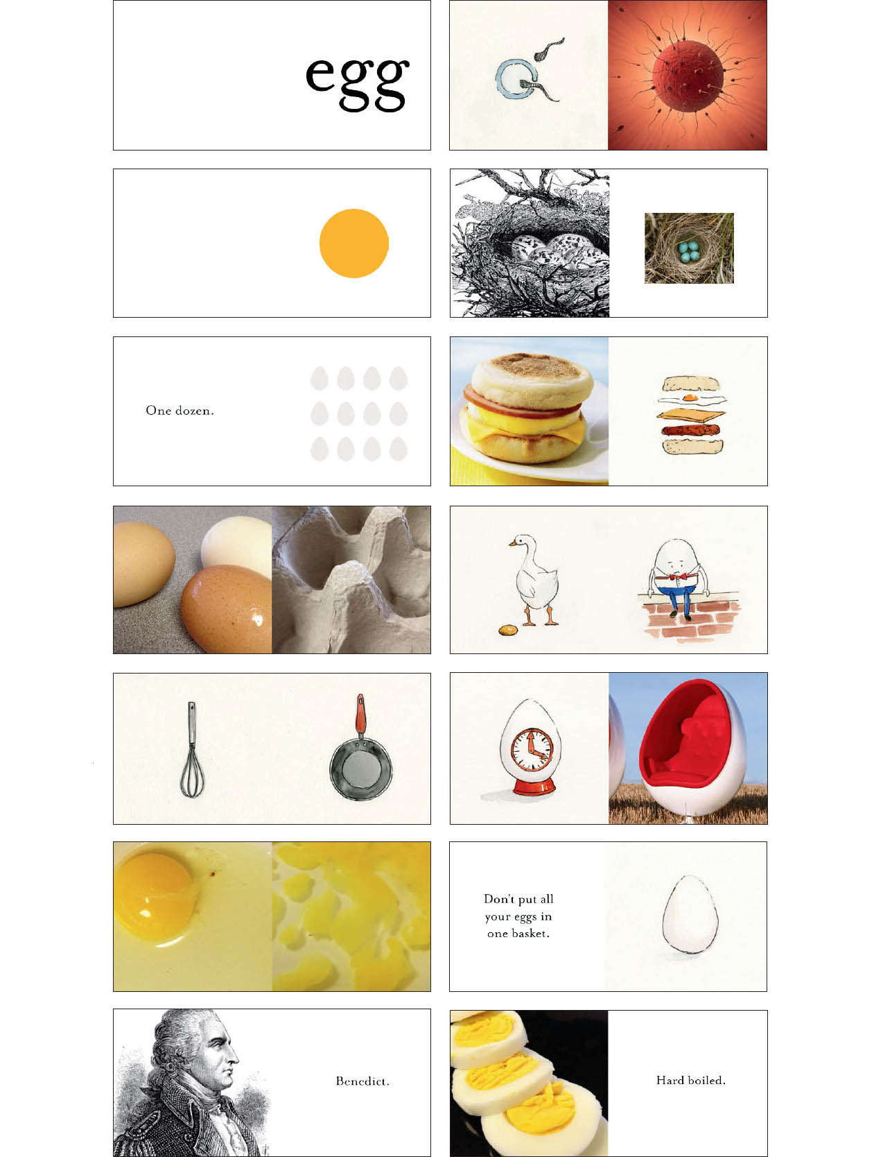
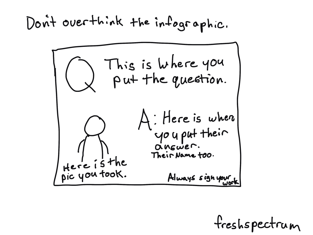
4. Ask your fellow attendees questions, take a picture, then make a small infographic to share.

This is a strategy that can also help you network, even if you’re an introvert like me.

Pick some interesting questions based on your background. Then ask everyone you meet that question and take their picture (if they let you). After that, put each question & answer, with the photo, onto a slide sized image in Canva or PowerPoint. Now you have a bunch of original infographics to share.

5. Simply document your experience for others who can’t make it live.

The most valuable parts of a conference are not always the presentations or workshops. I always got most value from personal conversations and connections with peers. There can be long days, and it can be exhausting, but simply documenting your experience can provide value for all the people who won’t be there live.

Back in 2014, Isaac Castillo lost his voice. He asked if I could turn into a cartoon, this was the result.

What else am I missing?

Do you have any suggestions for turning a personal conference experience into something that can be shared more broadly? Let me know in the comments.

Written by cplysy · Categorized: freshspectrum

Oct 15 2024

Why Isn’t My Map Working?!? 10 Excel Troubleshooting Tips

I have a love-hate relationship with maps in Excel…

Pros of Excel Maps

  • If you’re only making maps once in a while (i.e., you’re not a full-time cartographer), Excel maps are great because you don’t have to purchase/download/install/learn any specialty mapping software.
  • Fast to make. Get started here: https://depictdatastudio.com/how-to-make-maps-in-excel-file-to-download/
  • Works in Excel, PowerPoint, and Word (so it’s easy to copy/paste maps between those Microsoft programs, too).
  • Easy to add your own branding (with Theme Colors and Theme Fonts).

Cons of Excel Maps

  • Excel only makes heat maps by default (a.k.a. filled maps, choropleth maps). With behind-the-scenes tricks, you can also make hex maps, tile grid maps, tile grid trendline maps, and more.
  • Currently only works with Microsoft 365. Time to upgrade, if you haven’t yet.
  • Stickwithitness required. These work best for high-level U.S. maps (e.g., states). The smaller the geography (counties, zip codes), the more troubleshooting required. Making non-U.S. maps? Even more troubleshooting required. You’ve been warned. If you’re not tenacious, turn back now.

Can I Make Excel Maps for Places Outside the U.S.?

Yes!!!

When I was teaching data visualization workshops in South Africa, a woman from Eswatini asked whether she could map her country’s four regions.

After class, I attempted to make a quick YouTube video from my hotel room. I was planning to create a table with some pretend numbers… highlight those values… and insert a map.

And then I ran into all sorts of problems! Boo, Excel. I lost an hour to troubleshooting. I watched other YouTube videos. I read help forums. Here’s what I found.

10 Troubleshooting Tips for Excel Maps

In this video, you’ll learn the top 10 ways that Excel maps can get messed up.

Do you have more tips? Please comment and let us know.

What’s Inside

  • 0:00 Intro
  • 1:10 Dataviz On The Go
  • 2:16 Making a new map – What didn’t work
  • 2:56 (1) Make sure you’re on good internet
  • 3:38 (2) Convert to Geography (or not)
  • 5:20 (3) Make sure your headers are (correctly) labeled
  • 6:02 (4) Convert to an Excel Table
  • 6:45 (5) Spelling
  • 7:13 (6) Leading or trailing spaces
  • 7:54 (7) Special characters
  • 8:19 (8) Add higher-level geographic details in a column(s) to the left
  • 9:35 (9) Check alternative/former names
  • 10:06 (10) Check language translations (e.g., both English and siSwati spellings)
  • 10:30 Repeating the 10 troubleshooting tips
  • 13:46 Your turn
  • 14:13 Personal note from Ann

Download the Excel File

It’s here: https://depictdatastudio.ck.page/troubleshootingmapsinexcel

Read the Transcript

Ann K. Emery: [00:00:00] This video is turning out to be a hot mess. It was supposed to be a video like “Yes, you can make non US maps in Excel.” I made a YouTube video a while back, I’ll link to it right here. And it was about making maps in Excel. If you’re new to maps, you can watch that one first. It’s a great getting started video.

I had a US example. People commented like, “can I make non US maps?” Yes, you can. It was supposed to be that video, but then I ran into all sorts of issues. And this has turned into a, “I lost an hour of my life troubleshooting, so you don’t have to” video. And I’m going to show you 10 different things that I had to try to get this map to work.

And you’re going to just go through each of these items methodically with your map. And then at the end, please comment and tell me what the fix was. And hopefully we’ll all learn from each other.

I have a love hate relationship with Excel maps, as you [00:01:00] might be able to tell from, uh, my tone. I’m a little bit frustrated at the moment with how much troubleshooting we have to do sometimes.

So hopefully this video will just, you know, speed it up for everybody.

And by the way, if you’re new here, I’m Anne Emery. You’re watching Dataviz on the go. And I’m here in Johannesburg. Did I say that? I’m teaching a two day class and one of the women in the class, she was based in Eswatini, which you might know as Swaziland.

We had people from all different African countries in my class and we were making some maps and she raised her hand and she was like, “can I make maps for my country for the four regions of Eswatini in Excel?” and I was like, “yeah, of course.” And that’s the video this was supposed to be, right. Of, uh, making the Eswatini regions.

But I’m going to show you what I tried and what didn’t work. Right here. Okay. And then we’re going to create this “after” table. We’re going to have to reformat the table and I’m going to go [00:02:00] through these 10 troubleshooting tips, in order, of most common through least common. So please go in order as you’re troubleshooting and obviously let me know if there’s a number 11 or number 12 on this list

that you have to try that works for you.

All right. First up, here’s what didn’t work, right? You’re supposed to enter your regions. In this case, enter your values, which can be numbers. It can be, these are just made up percentages. It can be currency. Okay. You’re supposed to. So just highlight your table, go to insert, go to the map section and add a filled map, aka heat map, color coded map, choropleth map.

But of course Excel panics right away and it’s like, “uh, uh, uh, you have to have geographic data.” No big deal. We can do that, among many, many other things.

Oh, and I should mention when I was teaching this class in the [00:03:00] conference room, we did have internet, but it was like, you know, how event internet is. It was awful.

So I actually didn’t even get this far. We got stuck on. Cause I was like, “Hey. Mirela, like, come here. I made the map for you.” I was going to do that during the break in class, but we couldn’t because I wasn’t on good enough internet. And here in the hotel, I’m on like, iffy, iffy. It’s not perfect, right?

You’re not gonna be able to make maps from your airplane Wi Fi. From your public Wi Fi at the coffee shop that comes in and out, you have to have good enough Wi Fi. Okay, so earlier, number one didn’t even work.

We’re on number two now, which I expected to happen. We are going to convert to geography. Or not.

Okay. I’ll show you what both of these mean later. So let’s create the “after” table. I’m going to highlight these regions. I’m going to go actually, let me delete this one, right? Cause I want it to link to this. I want it to link to this revamped table I’m going [00:04:00] to make. This is a little hard to do with my one hand, but I got to hold my mini mic.

So you don’t get all the Background noises from the hotel. All right, where were we? Let’s convert these to geography. I’m going to highlight these regions, go to data, go to the little data types down arrow, say geography, please. It goes and connects to Bing maps and comes back down. So it takes a second to do right.

And now we have a map of the four regions. Except now we also have a new issue. We have this little caution sign, which when we click on, it tells us, sorry, we plotted 75 percent of your locations correctly. And you can see the three out of four, and this one is gray. Gray means like something was wrong with it, right?

There wasn’t any data. It tells us with the hover over, there’s no data. And I was like, but there is data there because even when you hover over the [00:05:00] little card and you can see that’s that region there’s data. So then I spent the rest of my hour, my agonizing hour, figuring out all these other things, watching other YouTube videos, reading blog posts and articles, reading help forums where Microsoft staff had responded.

One of the things that came up in a lot of help forum articles was to make sure your headers are labeled, and correctly labeled. That means if you don’t have the word Region here, you might run into issues. If you don’t have some type of column header here, you might run into issues. These words feed into the legend over here.

So if you don’t have it, you might get a error message, but it also just gives you a really poorly labeled legend. So you need to have some words there and they need to be correctly labeled. Like you can’t say that this is a country, but then it’s regions. It has… Obviously, [00:06:00] right? It’s gotta be correct.

Number four, I tried a good old fashioned Excel trick. I tried converting to an Excel table. This is a regular table, a generic table, a lowercase T table. A lot of times Excel tables can solve issues with pivot tables, pivot charts, slicers, so I thought, let me try. The, the trusty fixes, right? What you would do is you’d highlight your lowercase T table.

You go to insert. Here’s the official table. Yes, it has headers like we just talked about. Click okay. And. That, that doesn’t fix anything, right? Same issue with the map. Let me make sure you can read these.

All right. Number five, let’s try some spelling. I was not familiar with these regions before a few hours ago.

So I checked and double and triple checked all the spellings, against what the participants were saying, told me, and wrote for me, [00:07:00] against Wikipedia. I looked at all the websites to make sure that they were spelled correctly. They were. I copied and pasted them from the internet rather than even typing them in.

That wasn’t the case. I checked number six, because I copied and pasted them. I checked for leading or trailing spaces. I don’t visually see any leading or trailing spaces, but I thought let’s check everything Uncover every stone, right? A trailing space would be if you’re typing in or copying and pasting and you accidentally have a space that can cause a lot of issues in Excel and with formulas.

I’m thinking of lookup formulas that rely on exact matches with spaces. Sometimes if you copy paste, or if you download your data from a database or external source, you might have a leading space. I checked them all, that, that was not the issue. I checked for special characters. I’m thinking of Spanish speaking countries [00:08:00] where the names might have accents or they might have the little squiggle over the N.

A lot of different languages other than English have special characters. So you’re going to try with and without to see which one kind of, uh, jiggles Excel correctly, like shakes it so that it works. Not the case here.

Um, number eight, I saw this one on a lot of official Microsoft forums as well. Staff were saying, try adding higher level geographic details, which would go in a column off to the left.

Higher level geographic details are things like this. We’re going to add country so that just to make sure Excel knows we’re talking about Eswatini. So you’re going to type in your header, obviously, and then you just repeat the country name

all the way down. Not just once, right? So that it, it knows these are regions within East Swatini. This is important because a lot of [00:09:00] names are multiple places in the world. So I live in Windermere, Florida, but there’s Windermere, England. There’s a Windermere in Johannesburg. There’s lots of Windermere’s around the world.

So I can’t just make a map of Windermere. I would need to tell Excel, this is the Florida version, right? So I thought maybe these may, who knows, right? Maybe that’s the case.

I also mixed and matched. All of these troubleshooting tips. I thought, well, maybe this has to be converted to geography. Um, but we’re still, this one’s still gray, right? So I’m trying all the things.

Uh, number nine, check alternative or former names. The participant was like, “try Swaziland.” So I tried that.

When I press enter, watch what Excel does. It thinks for a split second, and then it says, nope. It’s Eswatini now, so you’re going to try things like that. Countries and [00:10:00] regions and districts and provinces, they change names. So give it a try.

And then number 10, you’re going to check for language translations. For example, um, Eswatini has two official languages. So I thought maybe the spelling is different of these regions in the two official languages, but that is the name. That is the one name of the region. There’s not like an English version or something, you know, so you’re trying all the different non US, non English things.

Then I got really frustrated and I thought, “this was supposed to take five minutes to make and record this YouTube video.” And here I am an hour into troubleshooting. I should be at dinner. I should be on the hotel treadmill, getting my 10, 000 steps in. Those are the things that I’m gonna do if everything works, any minute now.

And I said, “okay, come on, Ann, come on, brain, you can do it.”

And I went methodically down the list again, I kid you not.

So I started at the top again. I checked the internet. I [00:11:00] disconnected. I reconnected. Everything was fine. I can see my little wifi symbol at the moment is totally fine.

I tried converting to geography or not. I tried, uh, re, I tried like copying and pasting these in. To unregion it, uh, you can see that that doesn’t work. That makes it worse.

I made sure my headers are correctly labeled. I thought, I thought, and then I saw another help forum with somebody actually making a map of South Africa and they ran into the issue where,

oh, what was it? It was like they were supposed to plot provinces, but they used the word district. Or it was supposed to be district, and they used the word provinces. The naming was wrong, and the person like hadn’t realized. Or the data set they got was wrong, or something. So I thought, well, I think these are supposed to be regions.

The woman from Eswatini said they’re regions. The map [00:12:00] card says region. Online, it says there are four regions. The word region was very clear, but I was like, I don’t know, for kicks, let me try all the names, you know, so

I know they’re not states. These are not U. S. states, but I thought, let me try that.

Let me try province.

Let me try something more generic, like, what… I considered Guatemala has departments. Let me try district, because I was thinking of that South Africa help forum.

And earlier district had worked. And then I was like, I got it to work once with district, what’s going on? So this is where it gets wild.

And I was like, let me just start at the top of the list and I’ll just go back down again.

So I tried unconverting these to geography and finally, finally it worked.

I have no idea why. Okay, so to [00:13:00] recap. These are regions. Everybody says they’re regions. Everybody online says they’re regions. Microsoft on the little cards thought they were regions, but for the map to work, I can’t say region. It has to say district.

Typically maps have to typically have the convert to geography. It has to be like categorized as it’s, this isn’t a percentage. This isn’t a text field. It’s not a date. It’s geography. Not the case here. Now everything is correctly filled in. You hover over it. It knows what that region name is. The moral of this video is keep trying.

Just go from the top and let it back down. Try every little combination you possibly can. And then most importantly, please comment below the video. Let me know if you have troubleshooting tip 10 million that you’ve tried.

Let me know where you get stuck.

Let me know what works for you.

I can’t [00:14:00] wait to read through your comments because I know we’re all going to help each other so that we don’t get so frustrated. We can speed this up a little bit more.

Thank you so much in advance for your help in the comments.

Hey, future Ann here. I got my steps in, I had a steak, and now I’m no longer stressed. Funny how that works. And now I’m going to bed. Good night.

Written by cplysy · Categorized: depictdatastudio

Oct 10 2024

Liderazgo transformacional o jerarquía

Liderazgo necesario para pasar de jerarquía a una organización equilibrada de trabajo en red:

    • Para un trabajo organizacional en red equilibrado, se necesita un liderazgo transformacional que fomente la colaboración, la innovación y la transparencia. Los líderes deben ser facilitadores en lugar de controladores, promoviendo la autonomía y la auto-gestión dentro de los equipos. Es crucial que estos líderes comuniquen una visión compartida y desarrollen nuevos líderes a través de la capacitación y la mentoría.

    Razones por las que las organizaciones de cooperación al desarrollo tienden a la jerarquía:

      • A pesar de sus principios de participación y horizontalidad, estas organizaciones tienden a la jerarquía debido a la necesidad de control y estabilidad. La jerarquía proporciona una estructura clara y definida, lo que facilita la supervisión y la rendición de cuentas. Además, la planificación rigurosa y a largo plazo es más fácil de implementar en una estructura jerárquica.
      • La baja rendición de cuentas interna puede deberse a la falta de transparencia y confianza dentro de la organización. En una estructura jerárquica, la información tiende a ser confidencial y compartida solo con quienes tienen la necesidad de saber, lo que puede limitar la rendición de cuentas inerna. Además, la resistencia al cambio y la desconfianza hacia los líderes pueden contribuir a esta problemática.

      Cómo conseguir más coherencia y aumentar la rendición de cuentas interna de manera constructiva y empática:

        Para lograr más coherencia y mejorar la rendición de cuentas, las organizaciones deben:

        • Fomentar una cultura de transparencia: Compartir información abiertamente y promover la confianza y la colaboración.
        • Implementar programas de cambio organizacional: Incluir capacitación, comunicación clara y participación activa de todos los niveles.
        • Desarrollar mecanismos claros de planificación, coordinación, seguimiento y responsabilidad mutua: Utilizar herramientas de gestión de procesos para mantener la alineación.
        • Establecer procesos de resolución de conflictos: Fomentar una cultura de respeto y colaboración.
        • Capacitar continuamente en el uso de tecnologías: Asegurar que todos los miembros estén familiarizados con las herramientas digitales necesarias para la comunicación y la transparencia.

        Written by cplysy · Categorized: TripleAD

        Oct 08 2024

        Formstorming Charts, Graphs, and Illustrations

        You want to know the secret to improving the quality of your charts, graphs, and illustrations?

        It’s simple. Create more than one chart, graph, or illustration. Then pick the best one.

        Or, in other words, formstorm it.

        Stop taking the easy way out.

        The following comes from a presentation given by John Cleese on Creativity In Management, which you can watch in full on YouTube.

        I was always intrigued that one of my Monty Python colleagues who seem to be to me more talented than I was did never produce scripts as original as mine. And I watched for some time and then I began to see why.

        If he was faced with a problem and fairly soon saw a solution, he was inclined to take it. Even though I think he knew the solution was not very original. Whereas if I was in the same situation, although I was sorely tempted to take the easy way out and finish, I just couldn’t. I’d sit there with the problem for another hour and a quarter and by sticking at it would, in the end, almost always come up with something more original.

        It was that simple. My work was more creative than his simply because I was prepared to stick with the problem longer. So imagine my excitement when I found that this was exactly what MacKinnon found in his research. He discovered that the most creative professionals always played with the problem for much longer before they tried to resolve it. Because they were prepared to tolerate that slight discomfort and an anxiety that we all experience when we haven’t solved a problem.

        Most everyday chart designers move forward too fast on a single chart design or icon choice.

        • “Categorical data, I’ll create a bar chart.“
        • “Time series data, I’ll create a line graph.”

        And most of the time that’s fine. But if the data is important, don’t just stop with the quick default chart choice. Because every chart you create, and variation, can tell a different story.

        And instead of checklists or chart choosers, my suggestion is to create a bunch of possible charts before picking the one you want to use in your report or presentation.

        What is formstorming?

        Formstorming is a process I read about in the second edition of Graphic Design The New Basics by Ellen Lupton and Jennifer Cole Phillips.

        Formstorming is an act of visual thinking — a tool for designers to unlock and deepen solutions to basic design problems.

        Generating multiple iterations of one subject is a means of digging deeper.

        This is my favorite example from the book. How many ways can you illustrate an egg?

        You might be familiar with some of the daily challenges you’ll see ln Social Media. Things like daily drawing challenges or the 30 day chart challenge. These kinds of challenges can be really great for creative practice.

        Prompts from the #30DayChartChallenge – April 2024

        But it can also be really useful to take on that mindset when just doing your regular data visualization work.

        More iterations, more creative solutions.

        So how many chart or illustration iterations should you consider?

        When I get a new potential design client, before we settle on a budget, I always ask how important the project is to that client. Because the process involved in any creative project is not usually dependent on the amount of time it takes to “do the work.” But the importance of that work.

        If you are creating a logo for a side project, you probably won’t sink that much time into it. But if you are creating a logo for a city, one that will be on signs, documents, vehicles, and more, you probably want to spend more time than a lunch break.

        The same thing goes with chart iterations. If sharing the data is important, spend more time creating more iterations. If it’s not that important, just stick with a few. If you currently just create one chart option, try creating 3. If you already create a few, and the project is important or the message is critical, try to create far more (say 15).

        But if you just want to stretch your creative limits, I would suggest approaching the visual with a nice 3 by 3 (9 iterations).

        Keep in mind, you don’t have to go all in on a final design. You could start by just brainstorming options with a marker and sketch pad.

        Want some more tips on practical creativity?

        There is still time to register for my Compelling Qualitative Data Visualization course, which will be held on October 15 & 17.

        I’ve been reading a LOT of qualitative data sections inside of reports, and trust me, there are a lot of people who could use some support. It’s just not something anybody is taught in their social science programs in grad school.

        You can learn more about the course on my workshop page at diydatadesign.com.

        Written by cplysy · Categorized: freshspectrum

        Oct 02 2024

        Is your report too wordy? Don’t do this.

        Have you been told your report is too wordy?

        Or maybe you received input that your report was “too long” or “not reader friendly.”

        And then perhaps you were given the advice, “make it shorter.”

        STOP!

        Don’t follow that advice.

        In this post I’ll tell you why making your report shorter is often bad advice, and what you should do instead.

        Shorter is not the same as easier to read.

        When I was a kid my mom always had a few magazine subscriptions. We were not a Newsweek, Atlantic, or National Geographic family, more of a Southern Living and Better Homes and Gardens. These magazines would then accumulate over time and you would find them all around the house, from end tables to bathrooms.

        Magazines were always the kind of thing that you could just pick up and read an article or two then set down. But even though they were really easy to pick up and read, it’s not like they were necessarily that short.

        Most magazines are around 100 pages, but do you hear people complaining that a People magazine is too long? A lot of reports that people complain about are around the same page length, and sometimes much shorter. You could even get a comment that a 5 page executive summary is too wordy.

        And maybe it is. Because here’s the secret.

        People only complain about length or wordiness, when something is hard to read. But length (and even wordiness) isn’t the thing that makes our work hard to read.

        So if it’s not a length or wordiness issue, what is it?

        In short, poor organization and the wrong format.

        A lot of reports are written like novels. There is an expectation that the reader is going to start from the beginning and work their way to the end.

        Most people don’t read reports from start to finish. They don’t want a novel. They just want to skim. Then when they find something they want to read more about, they read more about it.

        And if your report isn’t designed in a way that could be easily skimmed, people are going to complain that it’s too wordy.

        Here are a few approaches for improving your report design (some are counterintuitive).

        Try these things before you start summarizing your analyses and cutting out chunks of your rich data.

        1. Turn your headings into a story.

        Think about it. If people are just going to flip through your report, they are going to start by reading all of your headings. If your headings just say, Executive Summary, Introduction, Methods, Findings, Recommendations, your reader is not going to get anything out of their skim.

        If you change each heading into a short narrative sentence, and do this systematically throughout the whole report, the headings themselves will tell the reader a story. Even if they only skim.

        2. Add more pages.

        If people are complaining that your 10 page report is too long, try making it 20 pages. Just don’t add any new words. With the added space create blocks of white space and make room for illustration. In our digital world readability is more important than physical space. It’s very possible you can make something easier to read just by giving it more space.

        3. Reduce font size.

        Not everywhere. But if you have long sections, layer your text by staggering font size. Make the first intro paragraph a larger font and the rest of the section smaller. This creates a path for your skim readers to go from header to first paragraph to next header, and on and on.

        4. Spotlight important things.

        If you have important findings, interesting quotes, or just stuff you really want the person reading to know, format the information so it won’t be skipped. This could be as simple as using a colored block and position to highlight a couple sentences or using an icon. The goal is to intentionally break your reader’s skim through the use of formatting.

        5. Systematically illustrate.

        Most evaluators and researchers have this academic bad habit of only using visuals if they can fully justify their existence. But in our visual first digital world, visuals are no longer optional. Images have become visual cues that certain information is important, or that a section has changed.

        If the visuals don’t exist, everything just lumps together into a big block of text.

        Want to learn how to illustrate your report?

        My compelling qualitative data visualization course will be live on October 15 & 17.

        Reports filled with rich qualitative data are much more likely to feel too wordy. But the answer to improving those reports is NOT to just summarize the data. I have an approach to qualitative data visualization that enhances your work and increases readability without destroying the richness that makes qualitative data so valuable.

        You can learn more about the course on my workshop page at diydatadesign.com.

        Written by cplysy · Categorized: freshspectrum

        • « Go to Previous Page
        • Go to page 1
        • Interim pages omitted …
        • Go to page 31
        • Go to page 32
        • Go to page 33
        • Go to page 34
        • Go to page 35
        • Interim pages omitted …
        • Go to page 310
        • Go to Next Page »

        Footer

        Follow our Work

        The easiest way to stay connected to our work is to join our newsletter. You’ll get updates on projects, learn about new events, and hear stories from those evaluators whom the field continues to actively exclude and erase.

        Get Updates

        Want to take further action or join a pod? Click here to learn more.

        Copyright © 2026 · The May 13 Group · Log in

        en English
        af Afrikaanssq Shqipam አማርኛar العربيةhy Հայերենaz Azərbaycan dilieu Euskarabe Беларуская моваbn বাংলাbs Bosanskibg Българскиca Catalàceb Cebuanony Chichewazh-CN 简体中文zh-TW 繁體中文co Corsuhr Hrvatskics Čeština‎da Dansknl Nederlandsen Englisheo Esperantoet Eestitl Filipinofi Suomifr Françaisfy Fryskgl Galegoka ქართულიde Deutschel Ελληνικάgu ગુજરાતીht Kreyol ayisyenha Harshen Hausahaw Ōlelo Hawaiʻiiw עִבְרִיתhi हिन्दीhmn Hmonghu Magyaris Íslenskaig Igboid Bahasa Indonesiaga Gaeilgeit Italianoja 日本語jw Basa Jawakn ಕನ್ನಡkk Қазақ тіліkm ភាសាខ្មែរko 한국어ku كوردی‎ky Кыргызчаlo ພາສາລາວla Latinlv Latviešu valodalt Lietuvių kalbalb Lëtzebuergeschmk Македонски јазикmg Malagasyms Bahasa Melayuml മലയാളംmt Maltesemi Te Reo Māorimr मराठीmn Монголmy ဗမာစာne नेपालीno Norsk bokmålps پښتوfa فارسیpl Polskipt Portuguêspa ਪੰਜਾਬੀro Românăru Русскийsm Samoangd Gàidhligsr Српски језикst Sesothosn Shonasd سنڌيsi සිංහලsk Slovenčinasl Slovenščinaso Afsoomaalies Españolsu Basa Sundasw Kiswahilisv Svenskatg Тоҷикӣta தமிழ்te తెలుగుth ไทยtr Türkçeuk Українськаur اردوuz O‘zbekchavi Tiếng Việtcy Cymraegxh isiXhosayi יידישyo Yorùbázu Zulu