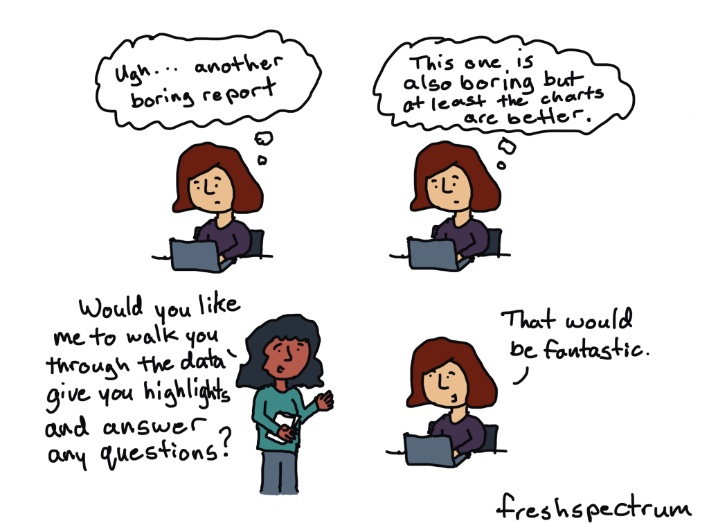
Are you drowning in the deep end of Excel?
First, dip a toe in. And then another.
You’ll be swimming confidently before you know it.
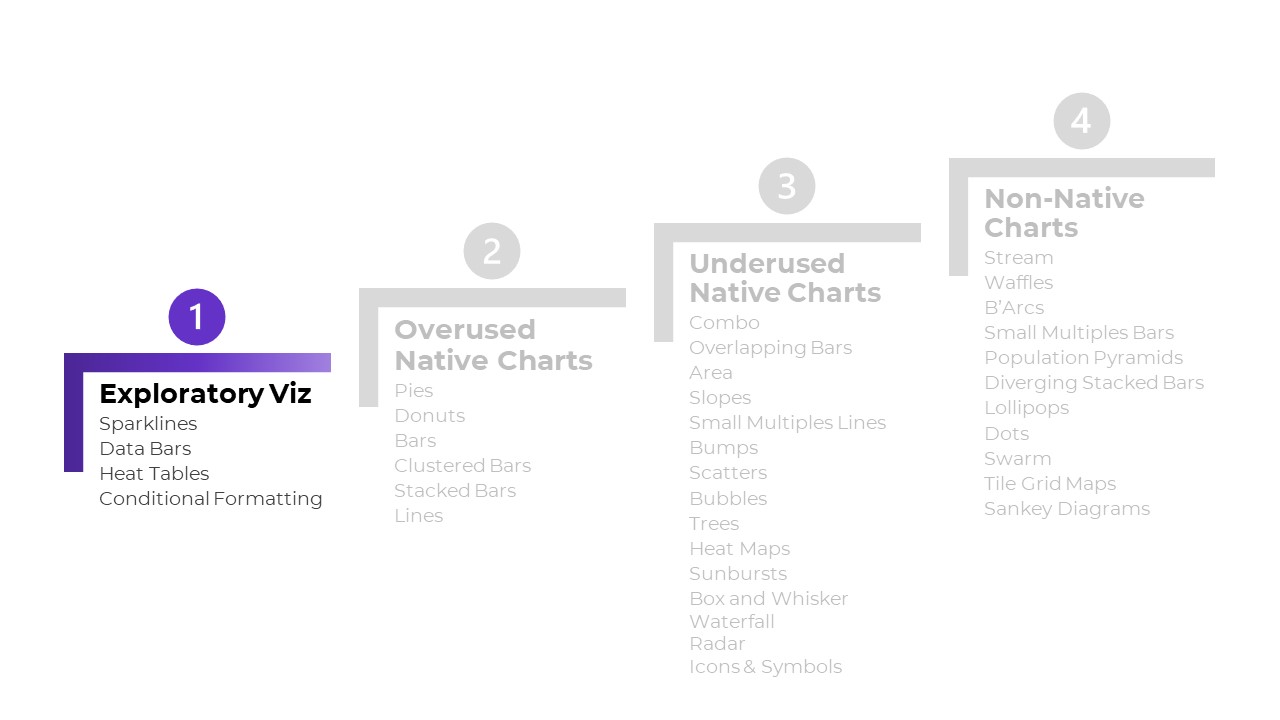
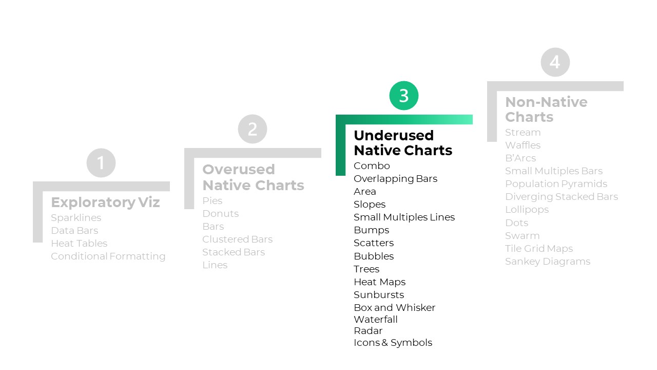
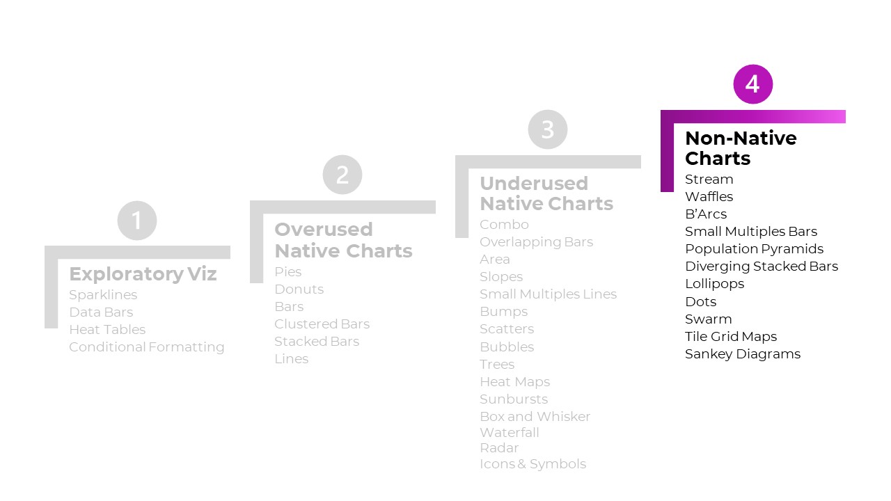
4 Levels of Excel Vizardry
I’ve taught data visualization in Excel a dozen different ways over the years.
Nowadays, I teach Excel dataviz based on the degree of behind-the-scenes hacking needed to produce that chart.
We start easy. Then, we work up to harder battles.
Here are the 4 Levels of Excel Vizardry:
- Level 1: Exploratory Viz
- Level 2: Overused Native Charts
- Level 3: Underused Native Charts
- Level 4: Non-Native Charts
Level 0 would be Data Visualization Best Practices, like articulating which chart to use, when. I can’t get into the nitty-gritty details hacking Excel to make population pyramids… if someone’s never heard of a population pyramid before. That’s a separate course altogether.
Level 5 would be adapting those charts for specific contexts, like for interactive dashboards. That’s a separate course, too.
Let’s go through some of the Excel secrets in more detail.
Level 1: Exploratory Viz
We can make sparklines, data bars, and heat tables within seconds.
These miniature charts help us spot key patterns instantly.
Easy to make! And an instant payoff!
I love starting private workshops and online courses with exploratory viz.
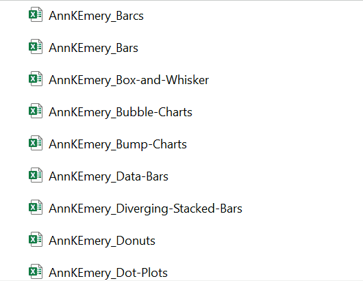
I’ve blogged about these skills over and over and over because they’re the perfect launchpad. Here’s my latest tutorial.

Level 2: Overused Native Charts
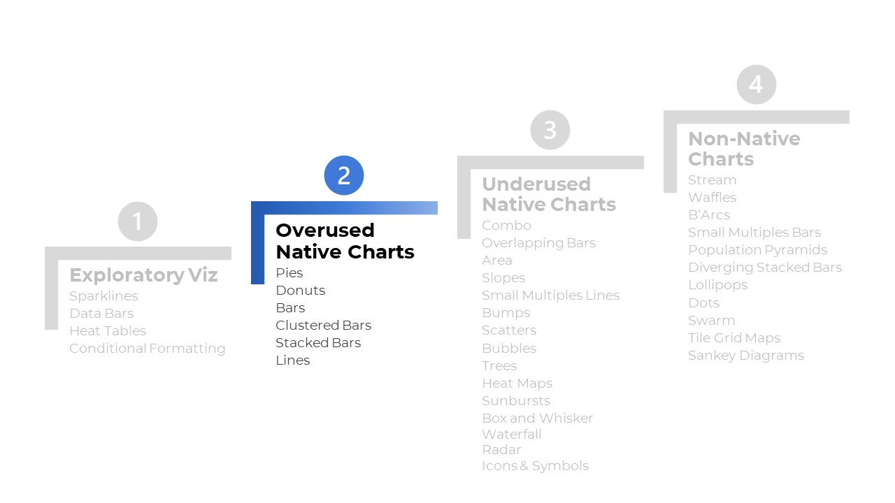
These are the familiar faces:
- Pies
- Donuts
- Bars and columns
- Clustered bars and clustered columns
- Stacked bars and stacked columns
- Line graphs

What are Native Charts?
“Native” charts mean they’re available from our menu with just a few clicks:
What’s Wrong with Overused Charts?
There’s nothing wrong with a bar chart here or there… but any chart gets boring when we show it over and over and over and over and over and over.
There’s also the issue of analytical depth — or lack of depth.. If we’re only using bar charts… then we’re only showing totals and averages. There are dozens more statistical approaches!
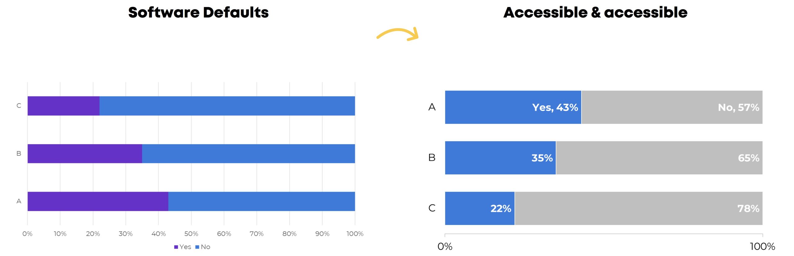
Beware! Formatting Needed
Stacked bar charts, for example.
They’re easy to make.
But we still have to:
- enlarge the font;
- darken the font (to pass official Accessibility rules for color contrast);
- directly label the data (so viewers aren’t relying on the colored legend alone — another Accessibility rule);
- outline the touching shapes in white (which helps with colorblindness and grayscale printing);
- show fewer increments in the scale (so it’s not so busy);
- decide whether to apply a dark-light contrast — or not (learn about data storytelling here); and
- adjust the gap width (if you want) to nudge the bars closer together.
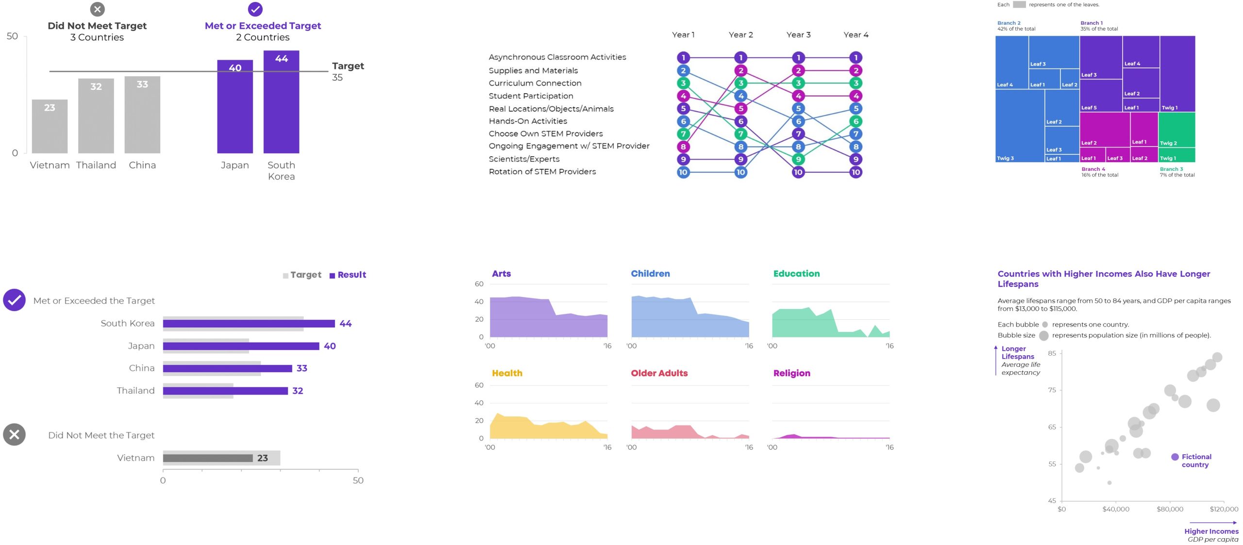
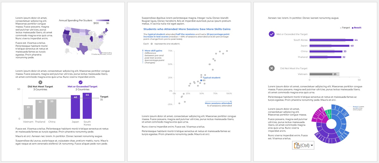
Level 3: Underused Native Charts
This is where it starts getting fun!!
Excel can make:
- Combo charts (e.g., a column chart with a target line, as shown below)
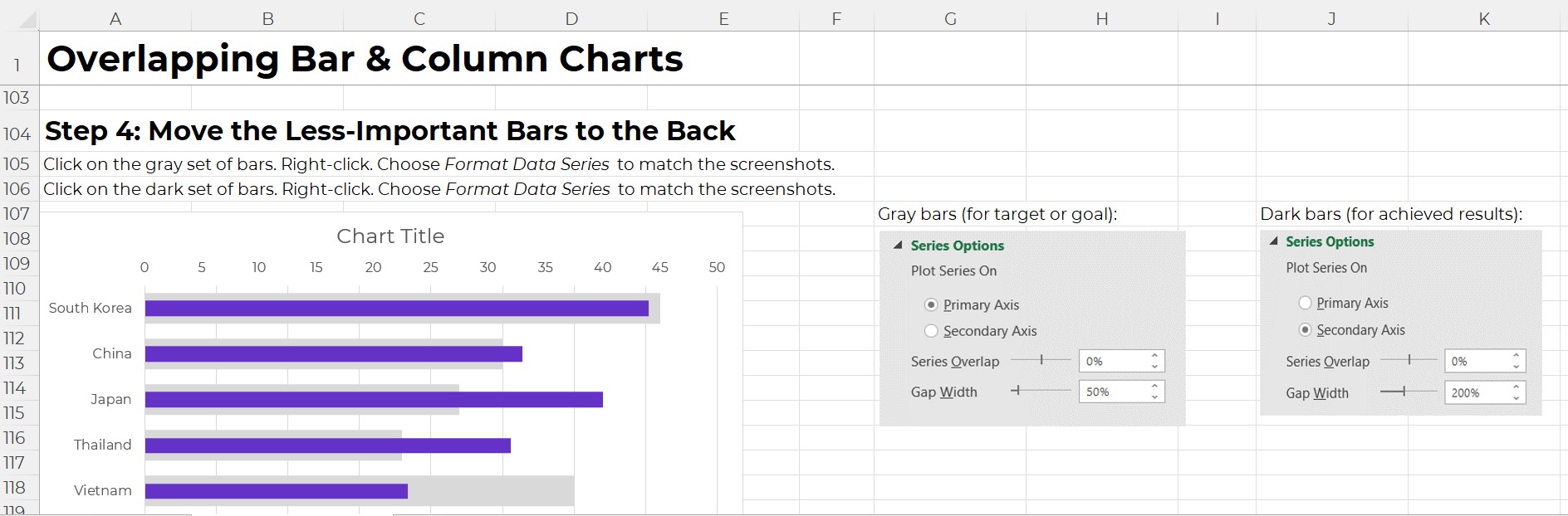
- Overlapping Bars
- Area charts (where you shade the area underneath the line for better oomph and high color contrast)
- Slopes (a line chart with exactly 2 points in time, like pre and post)
- Small Multiples Lines (to combat the spaghetti line graph)
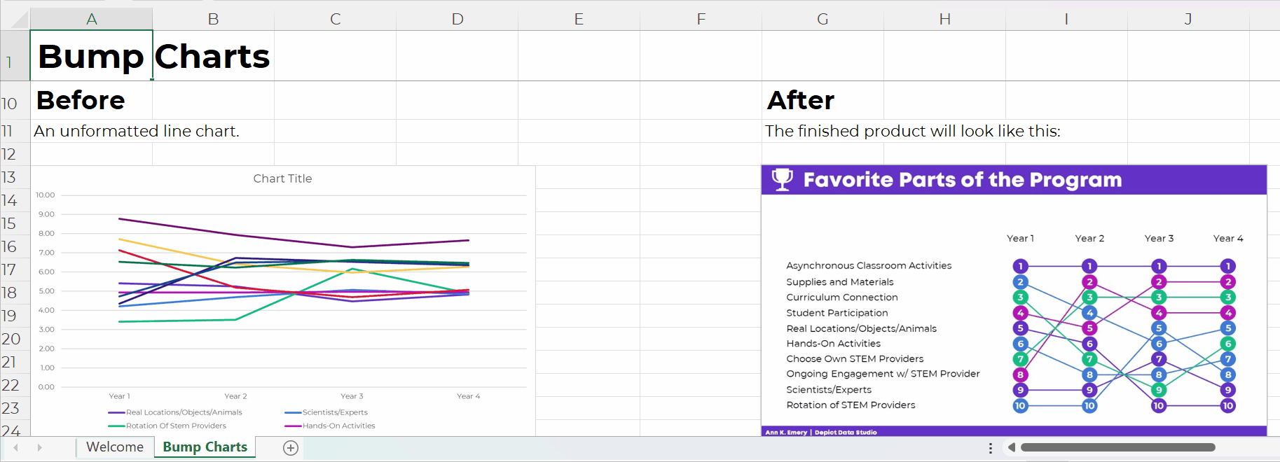
- Bumps (for rankings)
- Scatter plots (x and y)
- Bubble charts (x, y, and z)
- Tree maps (for nested categories)
- Heat Maps
- Sunbursts (nesting)
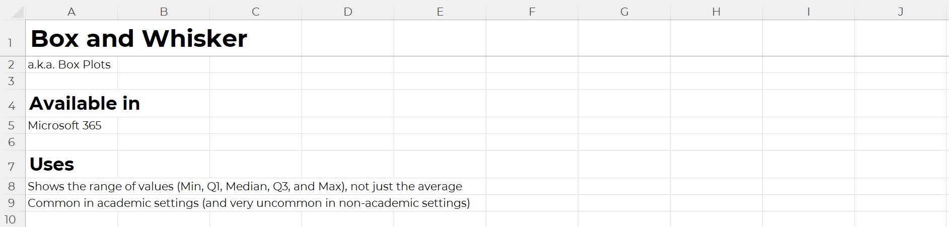
- Box and Whisker (to go beyond averages and show the min, quartile 1, median, quartile 3, and max)
- Waterfall (how pieces add to a net number)
- Radar (to compare several ordinal categories at once)
- Icons & Symbols (to make our graphs easier to navigate — and more memorable!)
Yes, These are Native Charts 
Well… if you’re using the latest version of Excel.
If you’re on outdated software, (most of) these charts are still possible. They just get harder to make, i.e., they’re in Level 4 territory.
Yes, Underused Native Charts Add Variety (and Analytical Depth)
We’re not just adding variety for variety’s sake.
(Although common sense — and hundreds of consulting projects — has shown me that dataviz novelty is one of the best ways to increase engagement.)
Most importantly, we’re adding analytical depth. For example, a regular ol’ bar chart just compares the average or total of several categories. What if we compare them by location, too? Now we’ve got a heat map! We can spot geographical patterns, which would’ve been impossible in a bar chart.
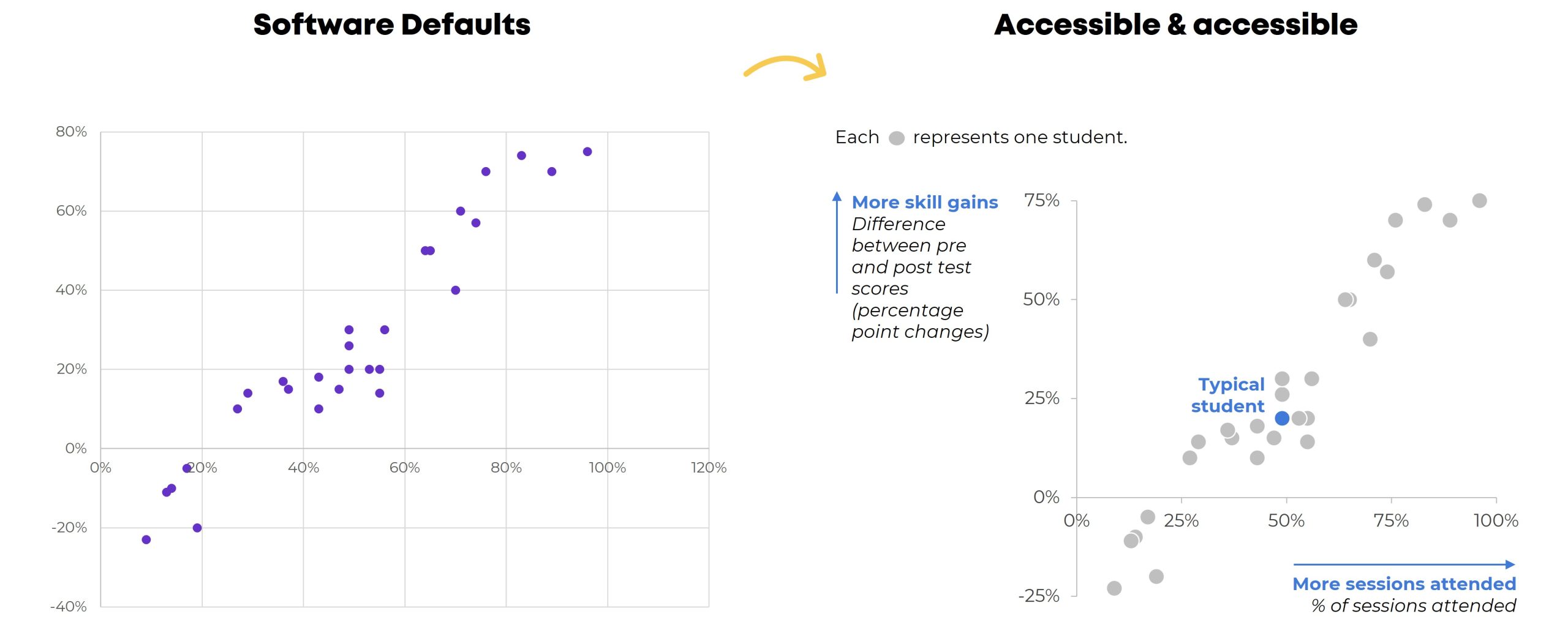
Beware! Formatting Needed
Scatter plots are easy to make.
But we still have to:
- enlarge the font;
- darken the font (to pass official Accessibility rules for color contrast);
- add a key (that each dot represents one student);
- label the scales (with everyday language, like More skills gains, because scatter plots are notoriously difficult to read for people who don’t stare at graphs all the time); and
- decide whether to add a dark-light contrast.
Level 4: Non-Native Charts
Have you mastered Levels 1, 2, and 3? Are you already using a variety of charts? Have you actually analyzed your data (beyond averages, and beyond totals)? Can you adjust the gap width, annotate the data, and apply colors strategically in your sleep?
Then you’re ready for Level 4!
With behind-the-scenes elbow grease, you can make:
- Stream graphs
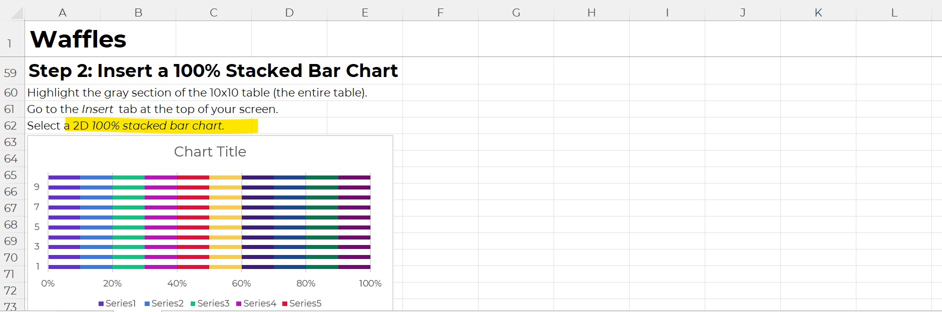
- Waffles
- B’Arcs
- Small Multiples Bars
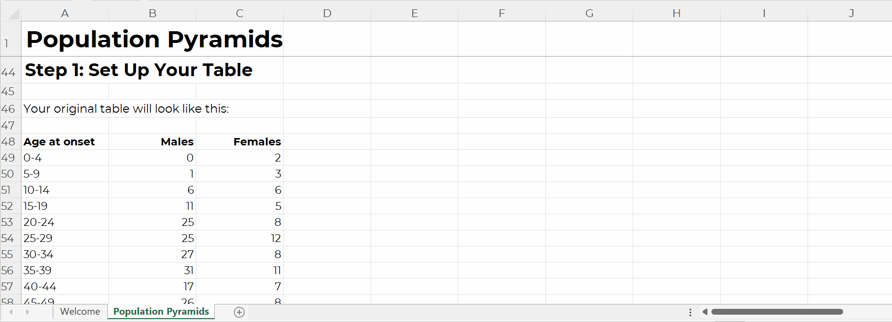
- Population Pyramids
- Diverging Stacked Bars
- Lollipops
- Dots
- Swarm
- Tile Grid Maps
- Sankey Diagrams
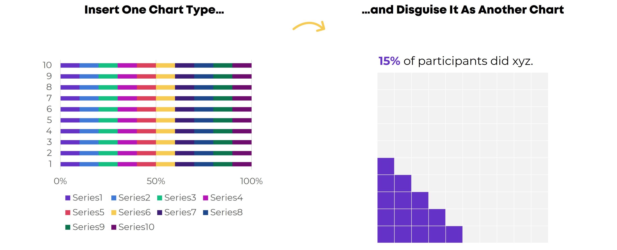
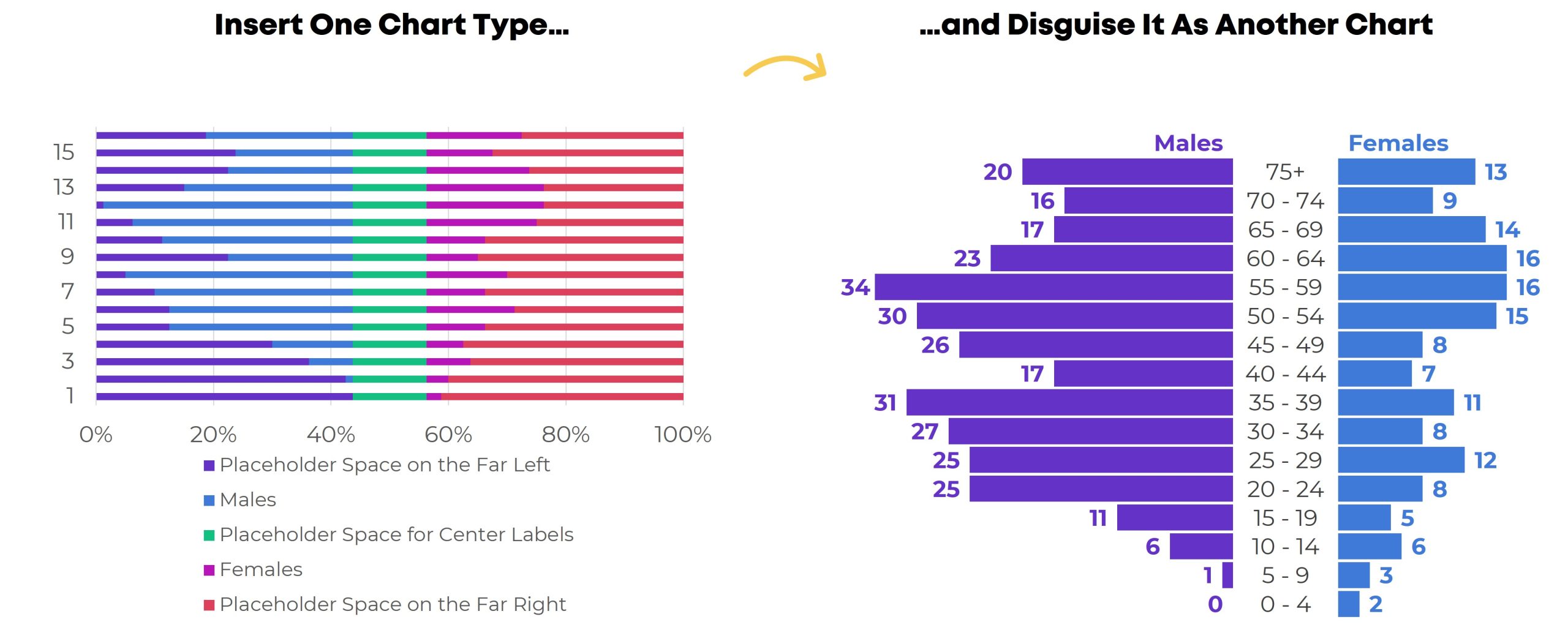
What are Non-Native Charts?
You won’t find any buttons that automatically make these charts.
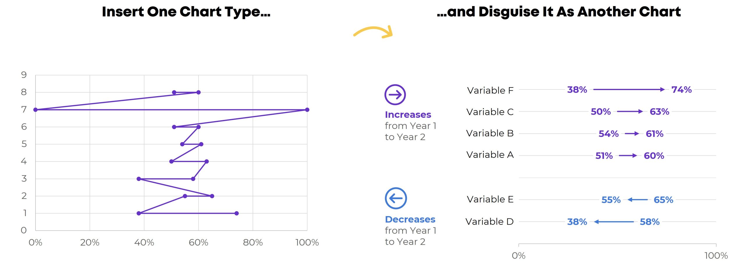
Instead, we have to insert one chart type…
…and disguise it as something else.
For example, we have to insert a stacked bar chart… and disguise it as a waffle chart.
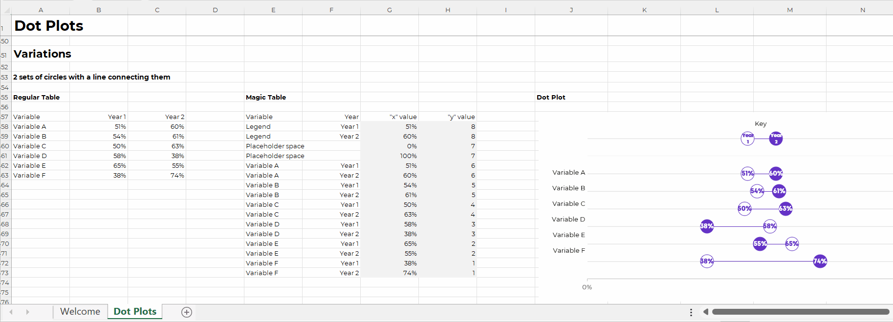
(You’ll need a Magic Table behind the scenes, too.)
A stacked bar chart gets disguised as a population pyramid.
Yes, you’ll need a Magic Table with placeholder values.
A scatter plot gets disguised as a dot plot, and so on.
Each value gets assigned a x-y placeholder location inside the Magic Table.
Do these maneuvers turn your brain inside out and upside down? You’re not alone.
Learn More
If you’re consistently making, editing, and applying graphs from Level 4, you’re already a vizard. Get in touch so I can send work your way!
If you’re in Level 1, 2, or 3, you’ll love Great Graphs in Excel. We’re meeting LIVE for 10 weeks this spring. In our very first class, you’ll make the Exploratory Viz from Level 1. Then, you’ll make graphs from Levels 2, 3, and 4. You’ll go slow and steady so you don’t feel overwhelmed. You’ll dip your toe in… and then you’ll be swimming in the deep end in no time.