Bored of the basics?
Want to take your graphs to the next level?
Wondering what’s possible in Microsoft Excel?
From A to Z, here are some of the amazing data visualizations that you can make inside of good ol’ Excel.
Area
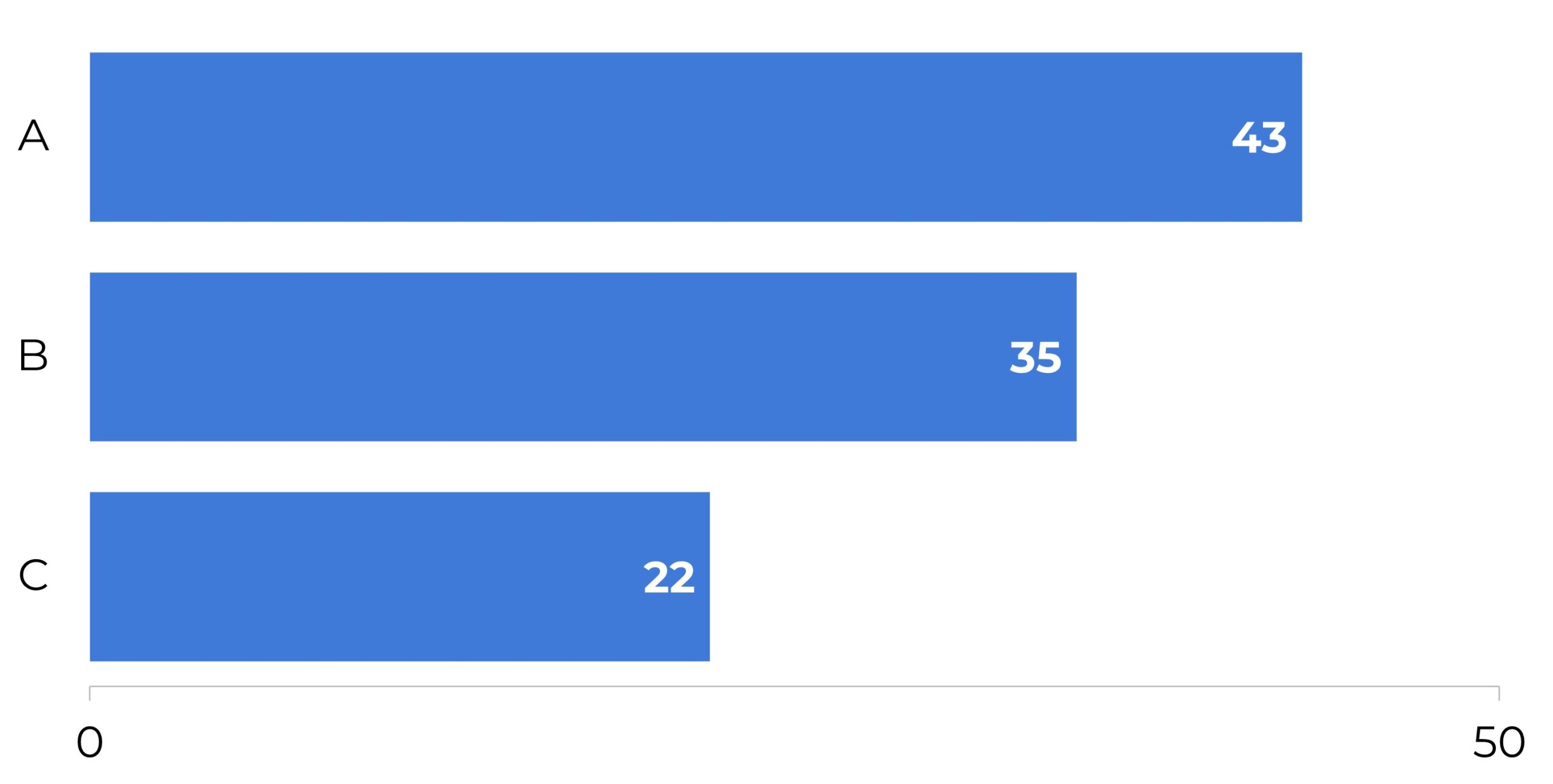
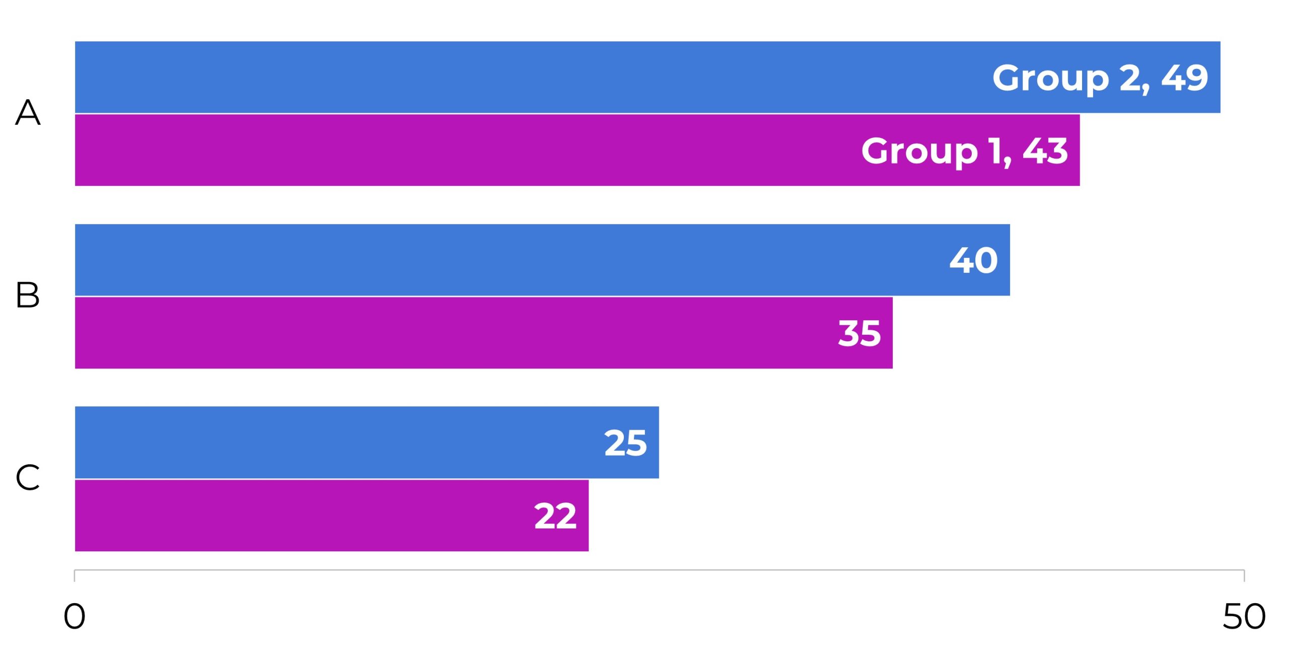
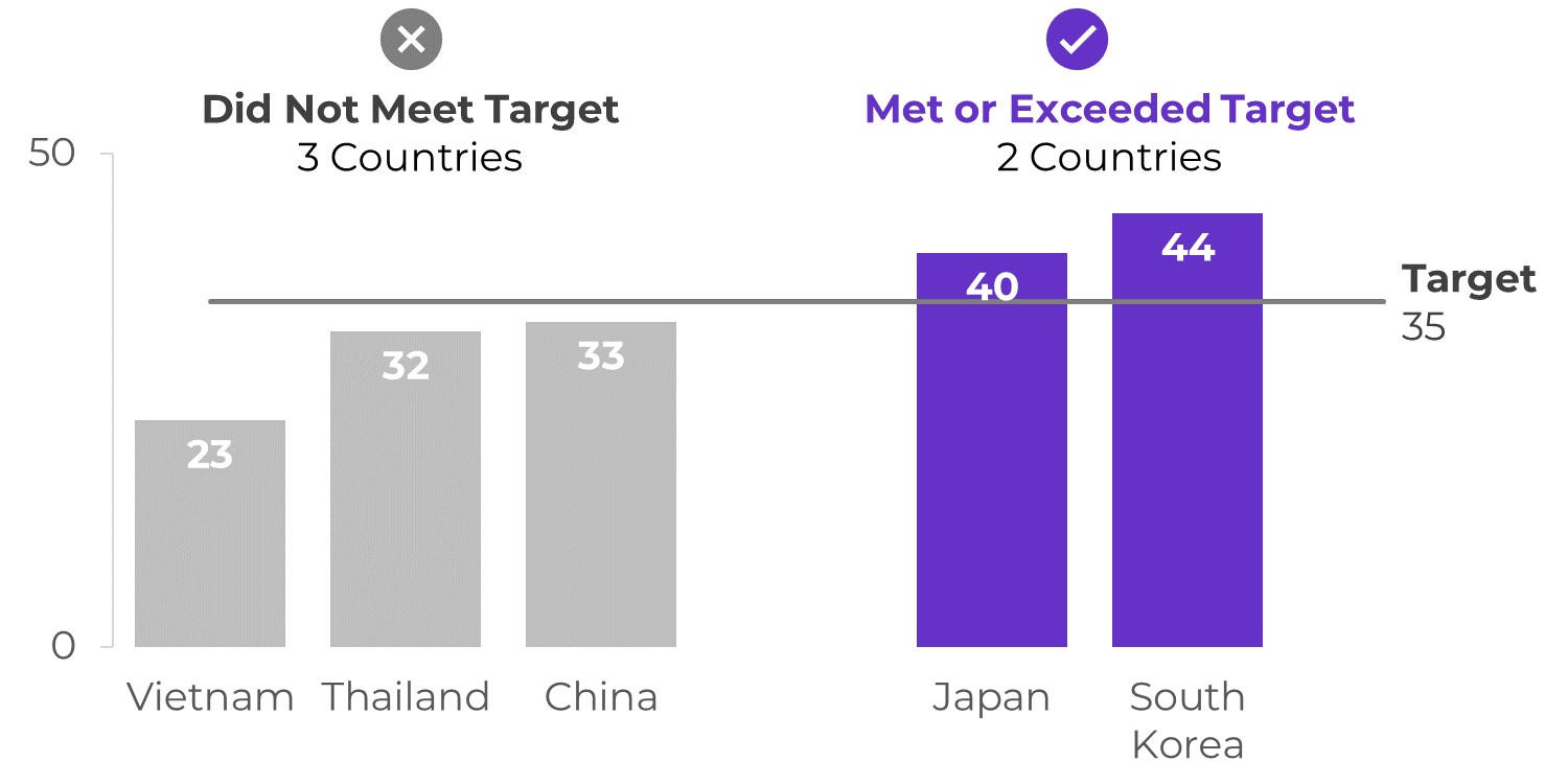
Bars
Bar’c
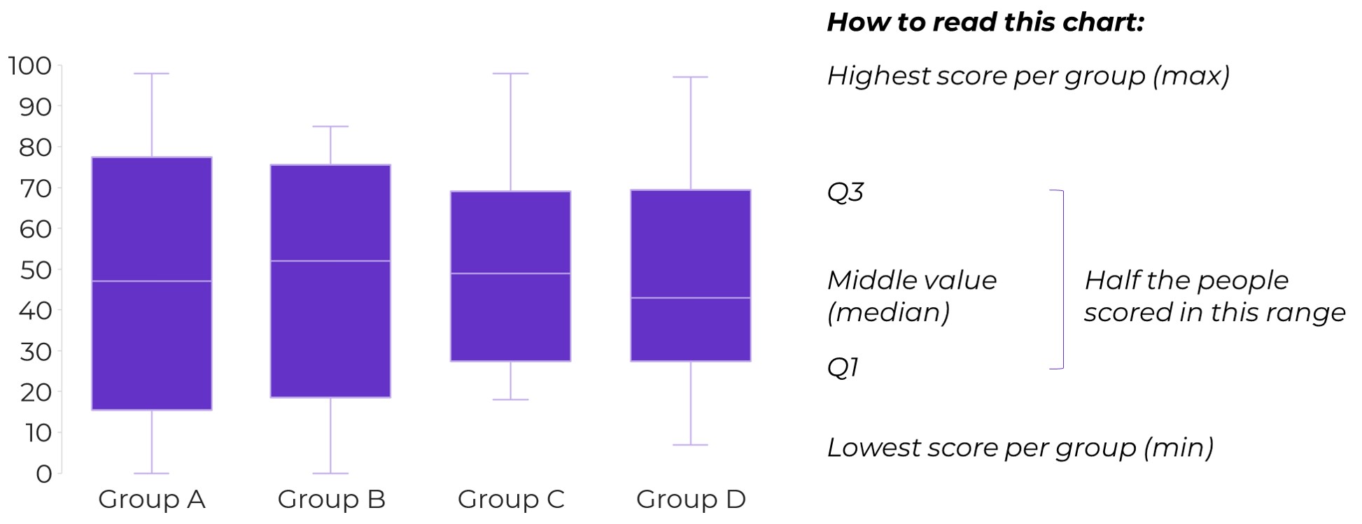
Box and Whisker
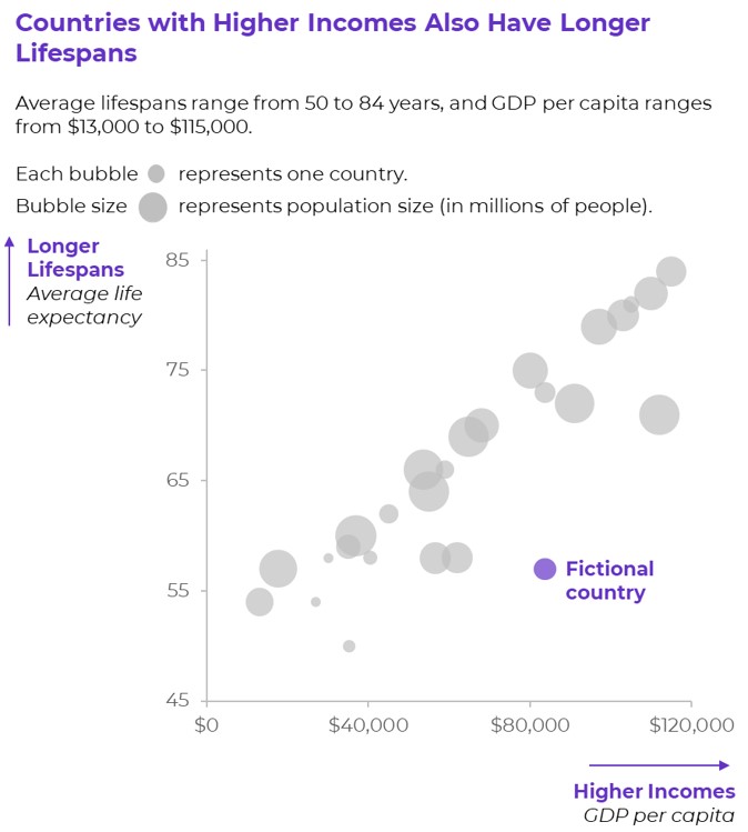
Bubble Charts
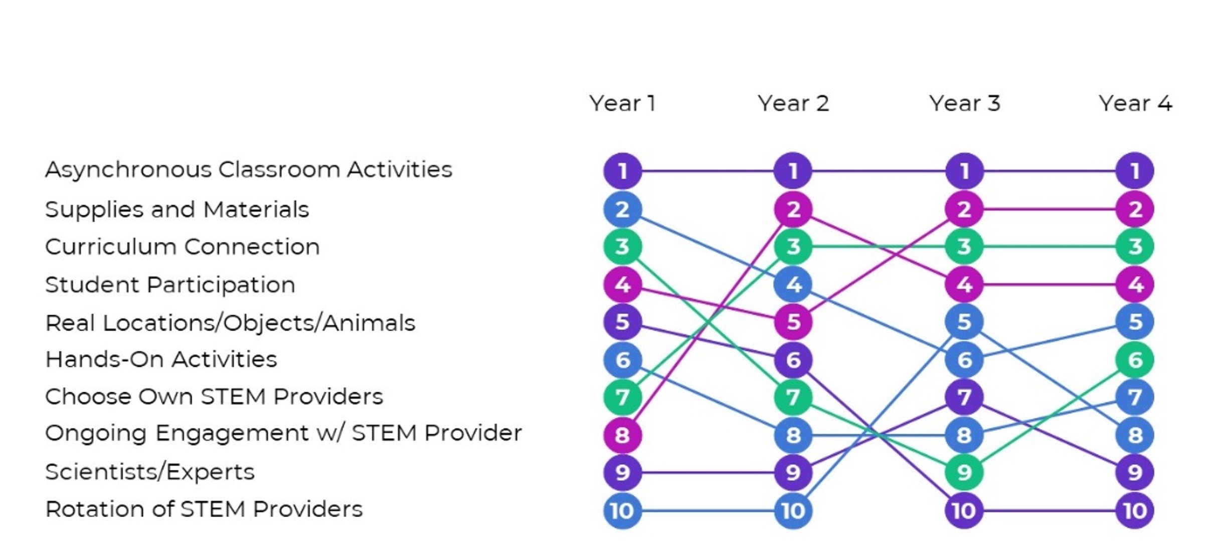
Bump
To visualize rankings over time.
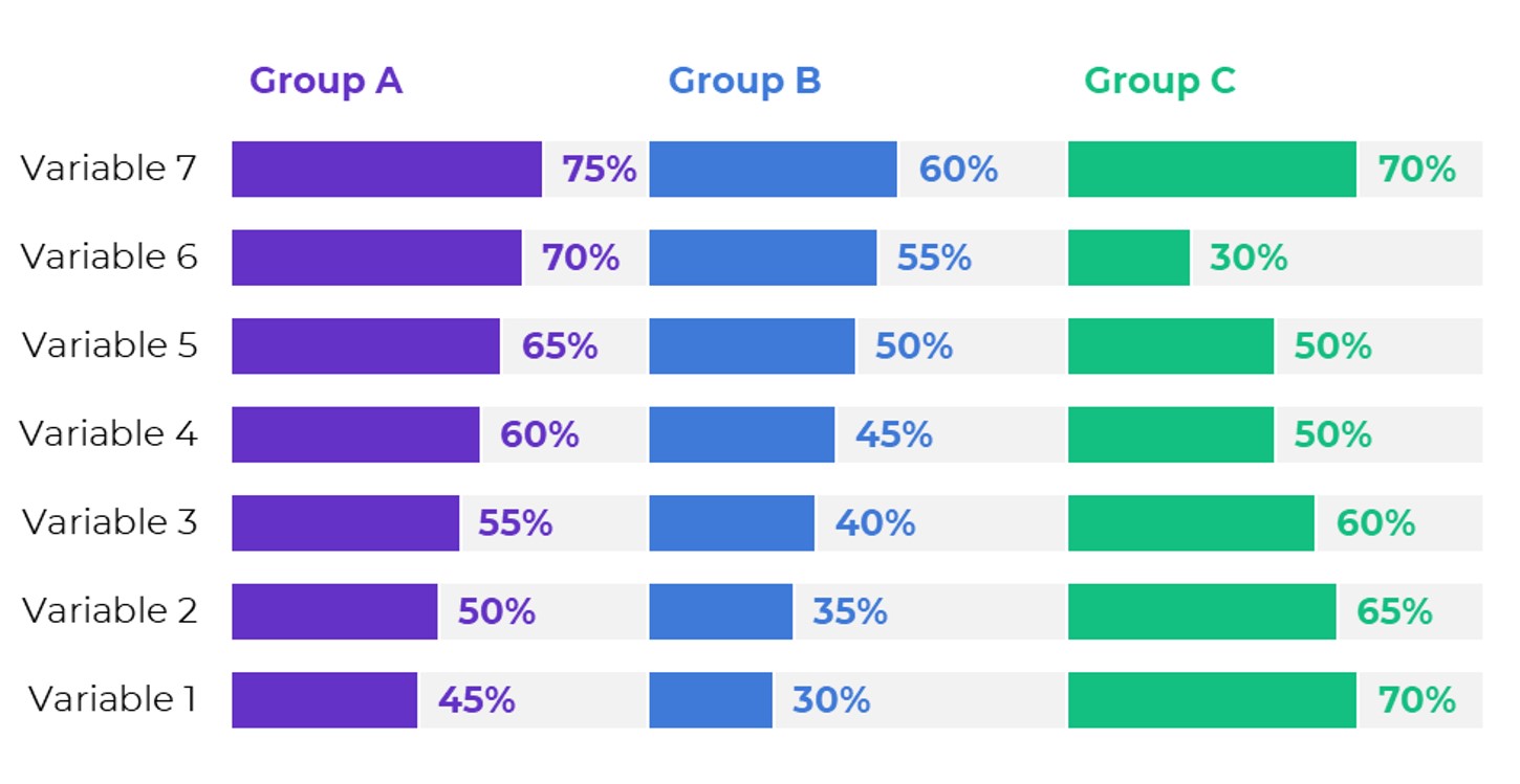
Clustered Bars
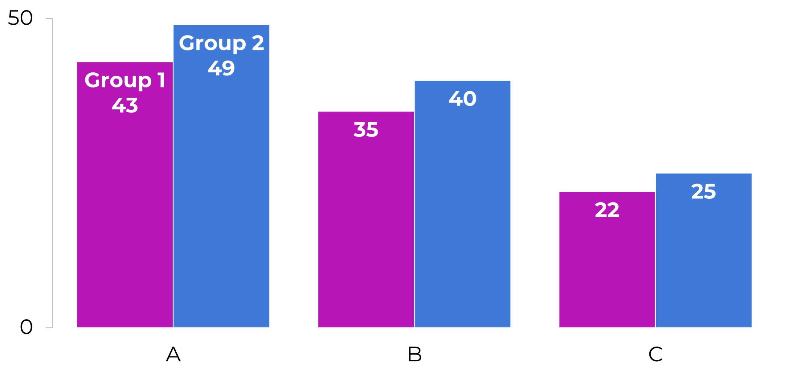
Clustered Columns
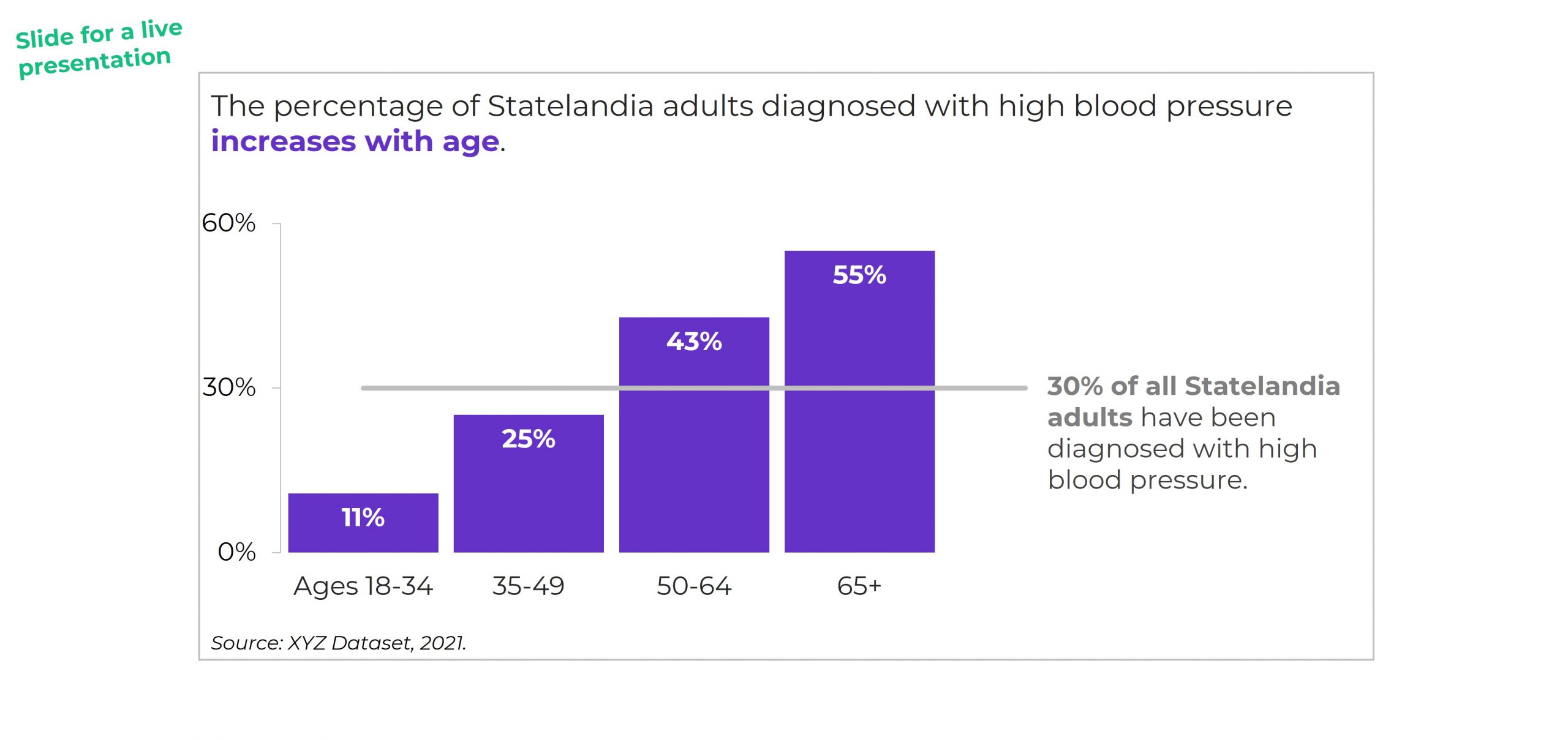
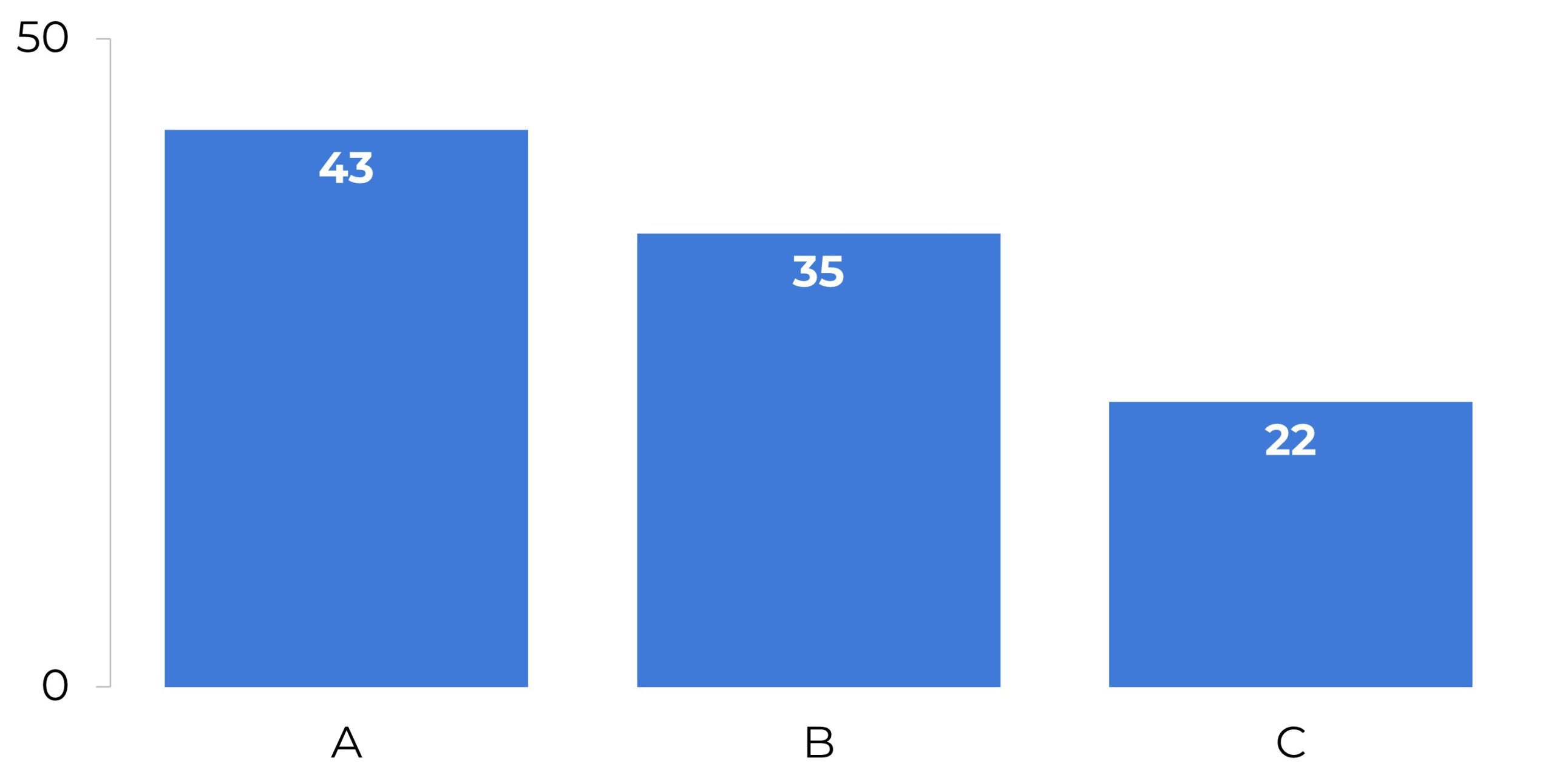
Columns
Combo Charts
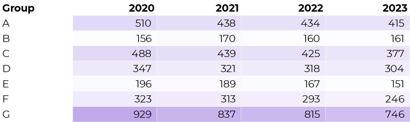
Data Bars
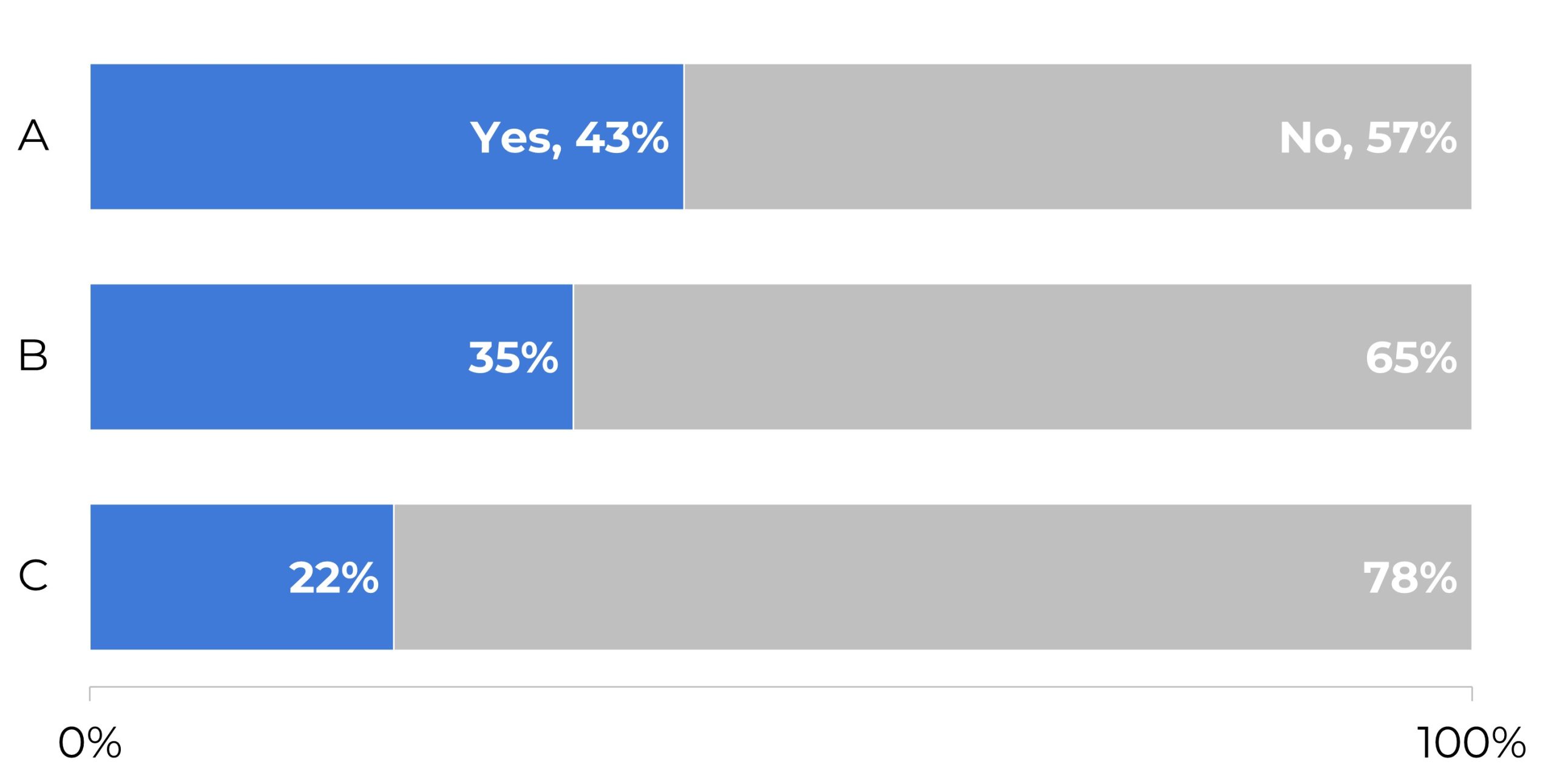
Diverging Stacked Bars

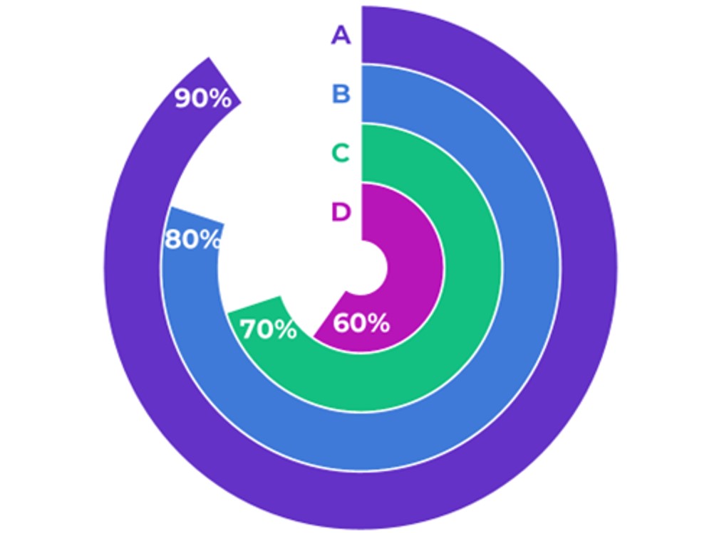
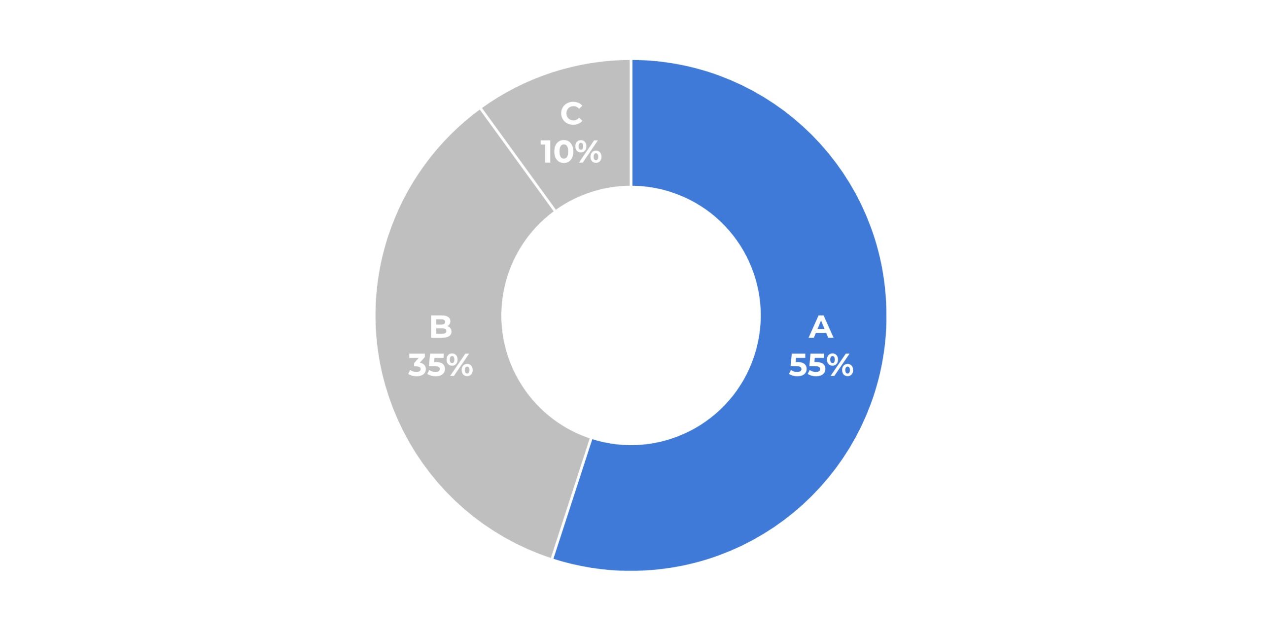
Donuts
Dot Plots
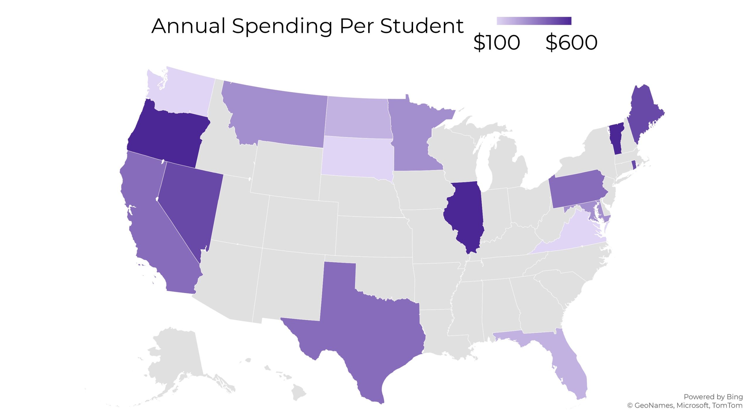
Heat Maps
Heat Tables
Histograms
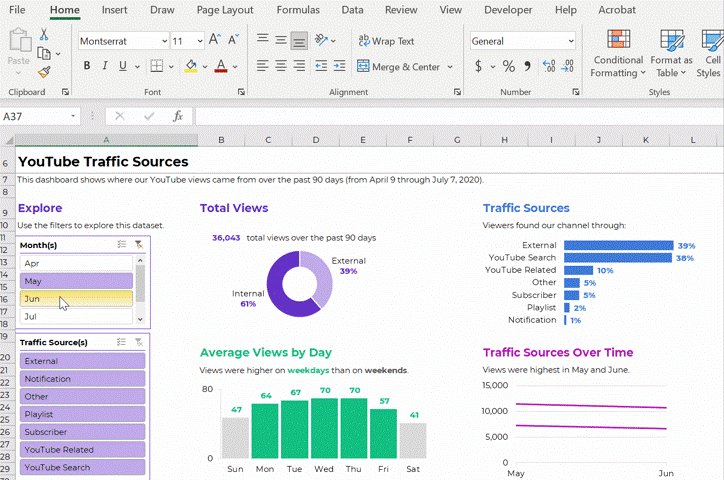
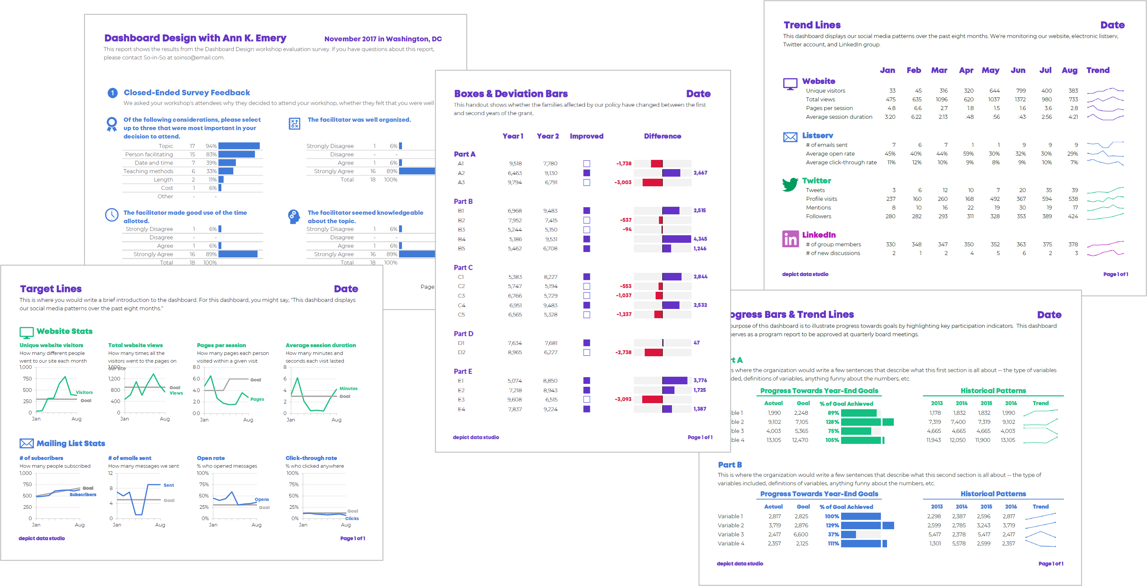
Interactive Dashboards
Lines
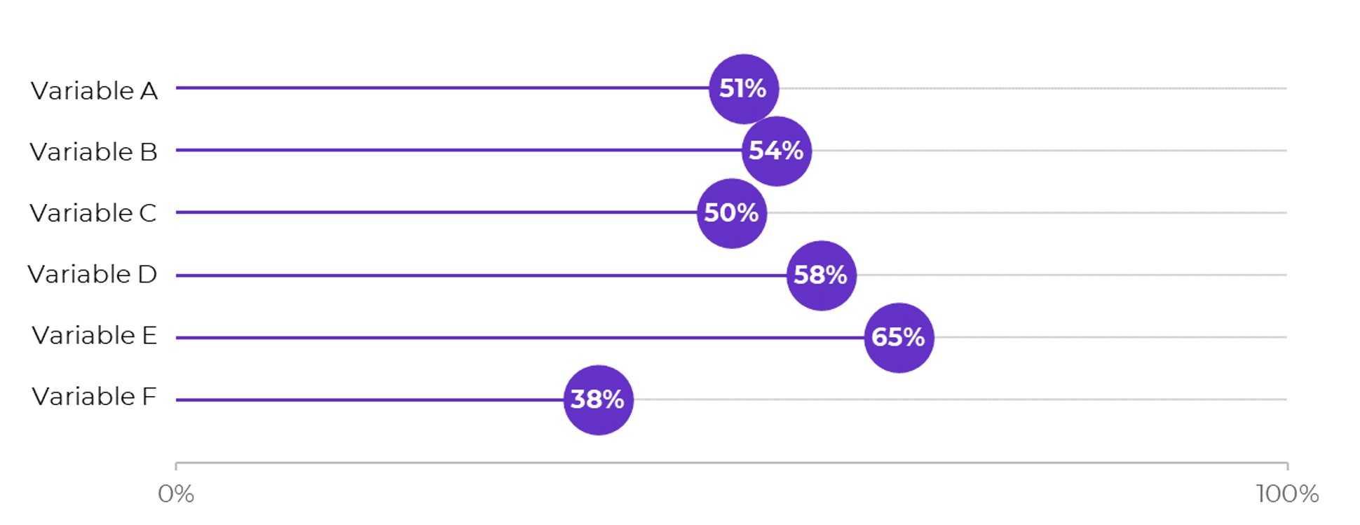
Lollipops
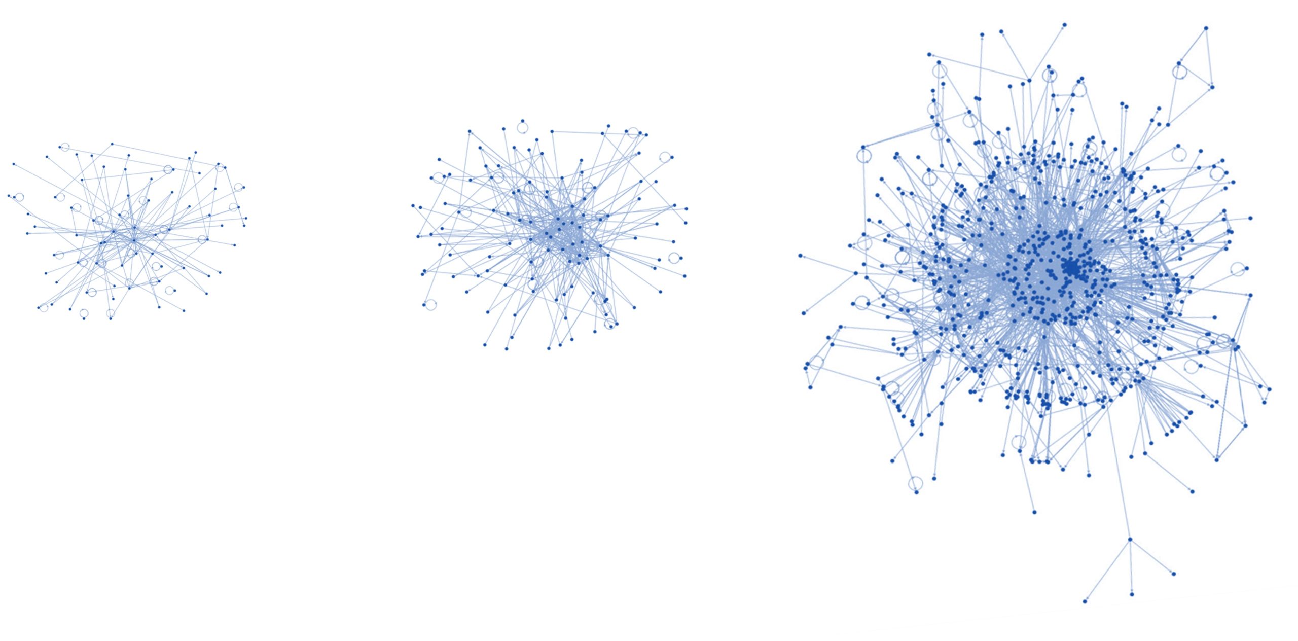
Network Maps
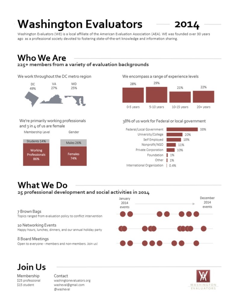
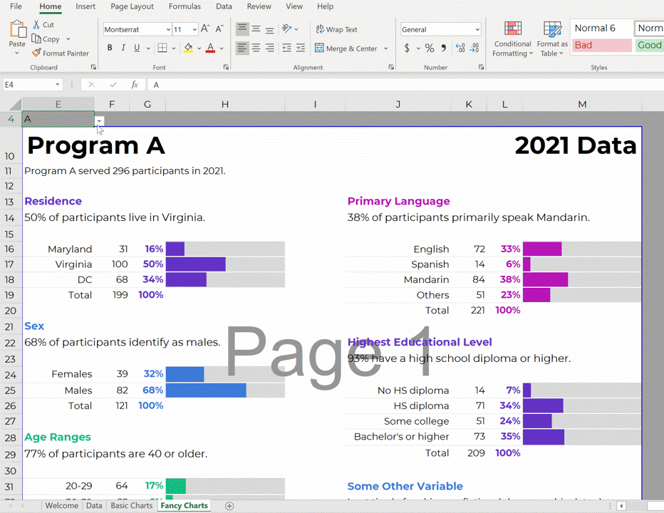
One-Pagers
Made entirely within Excel and saved as a PDF (not pasted into Word).
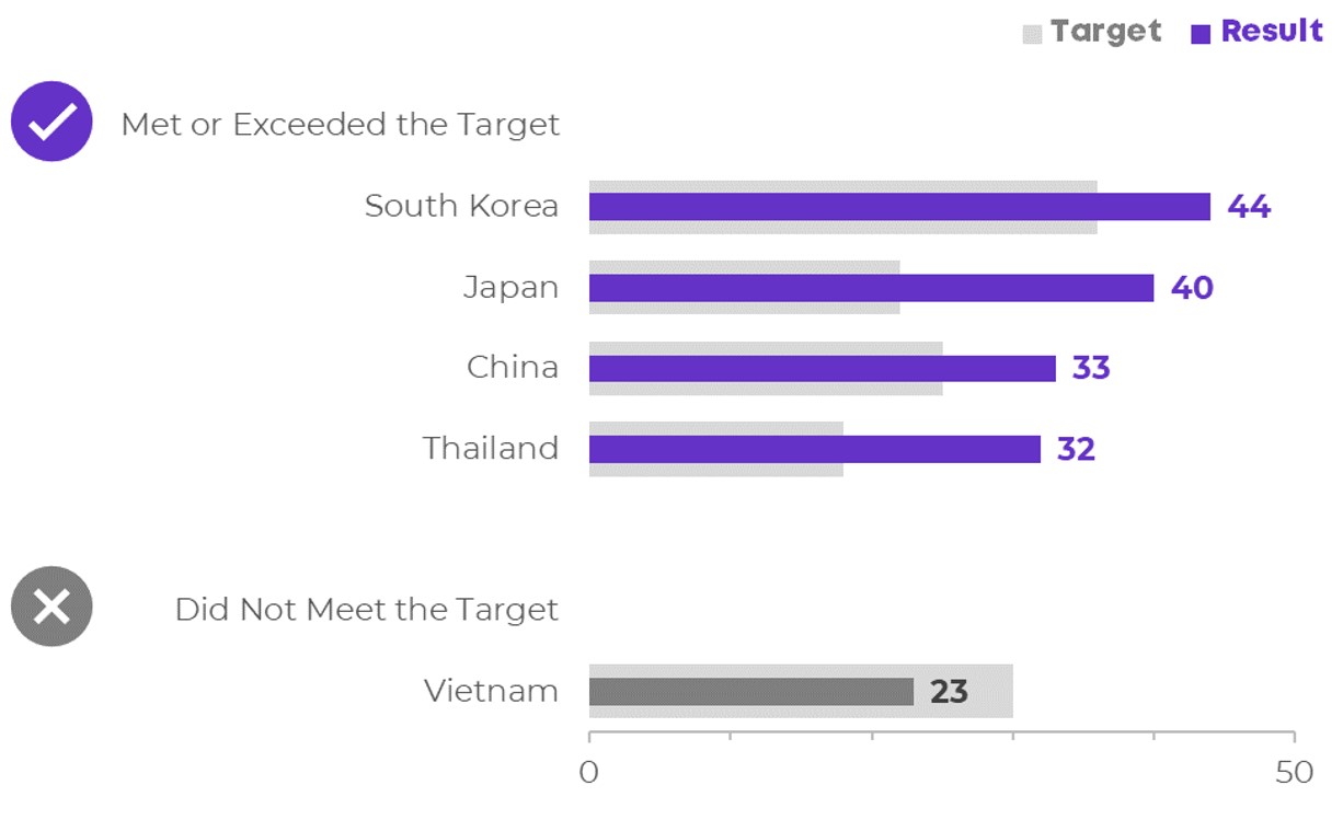
Overlapping Bars & Columns
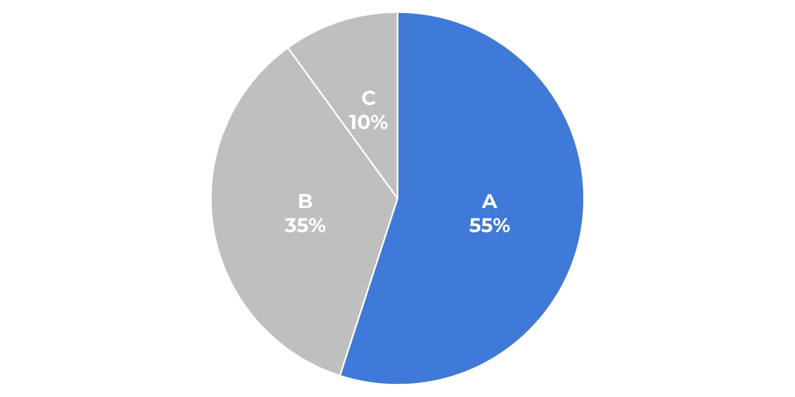
Pie Charts
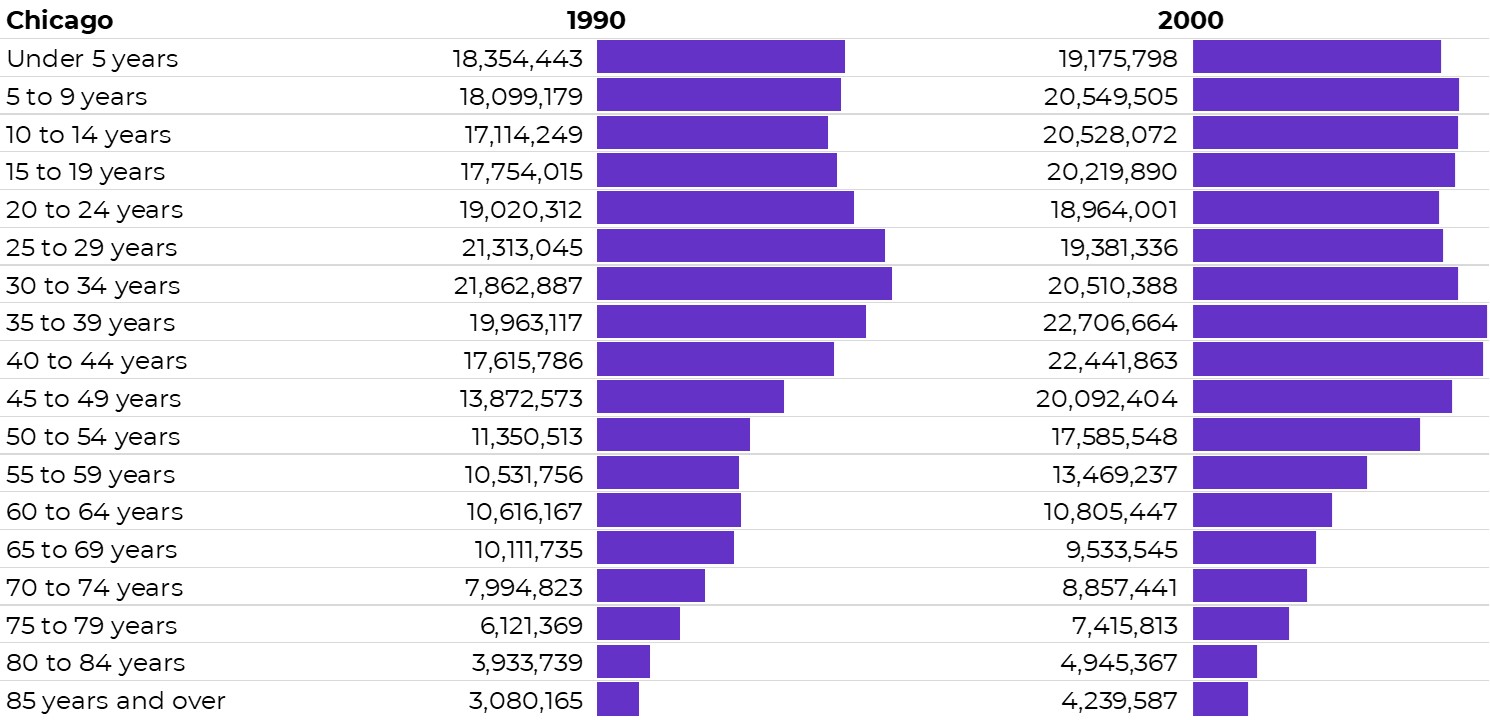
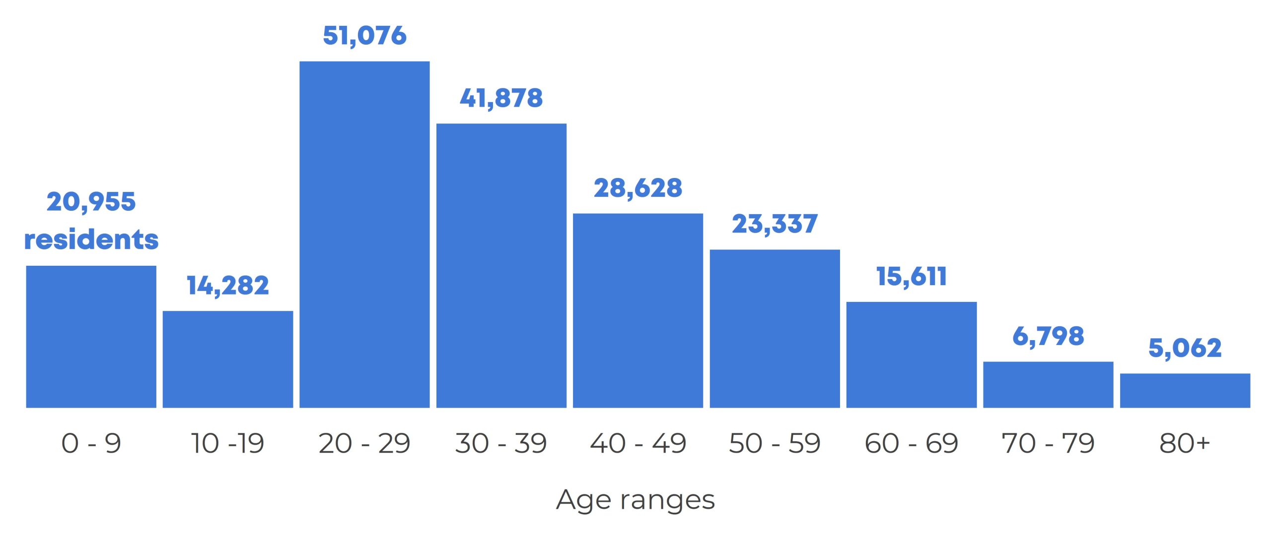
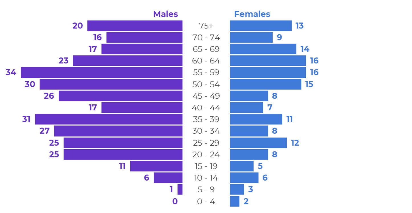
Population Pyramids
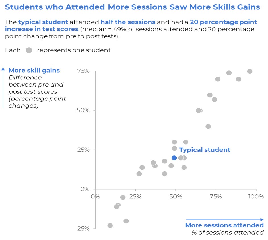
Scatter Plots
Series of Matching Dashboards
One per student, per school, per state, etc. Create one template and let Excel handle the rest.
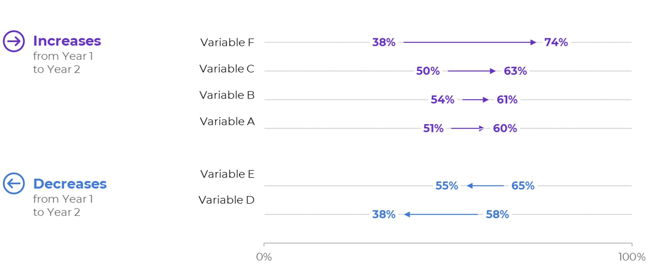
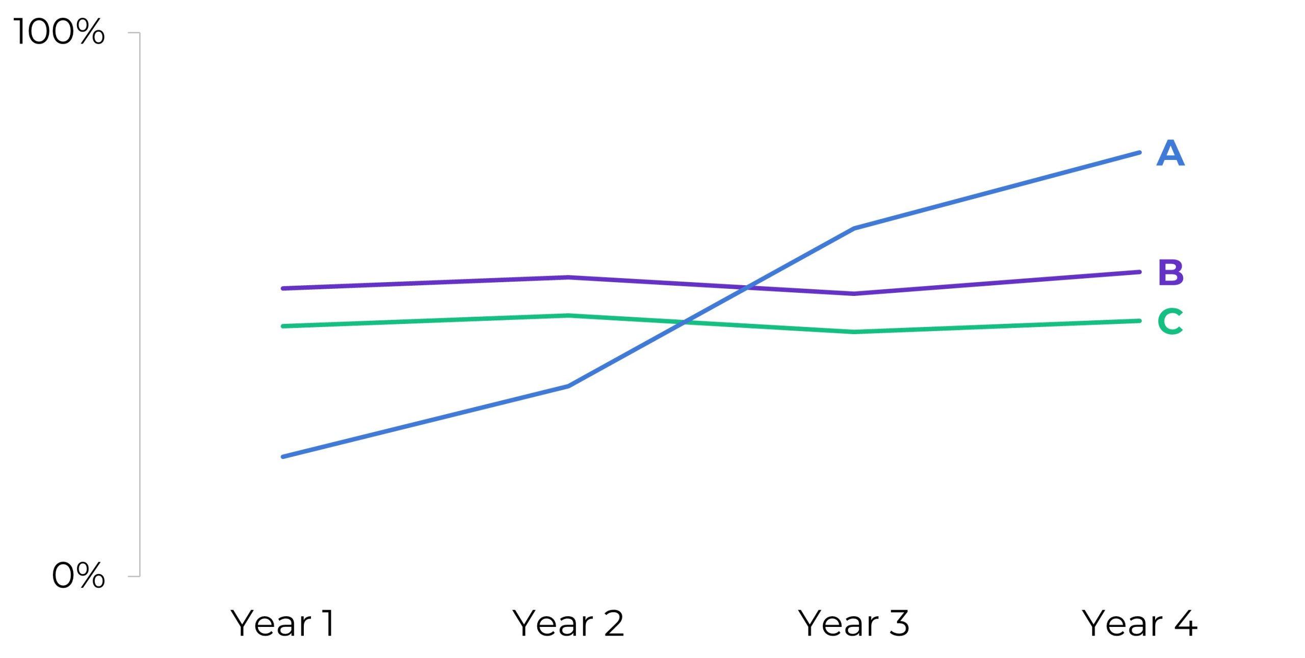
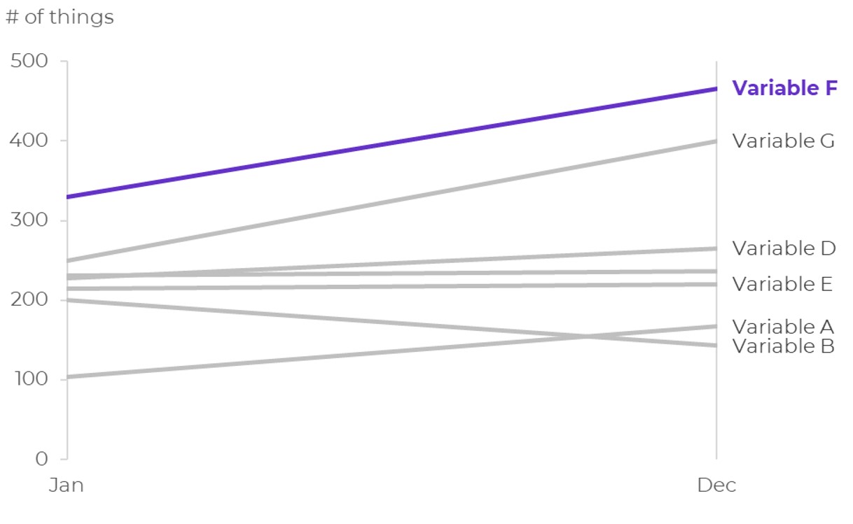
Slopes
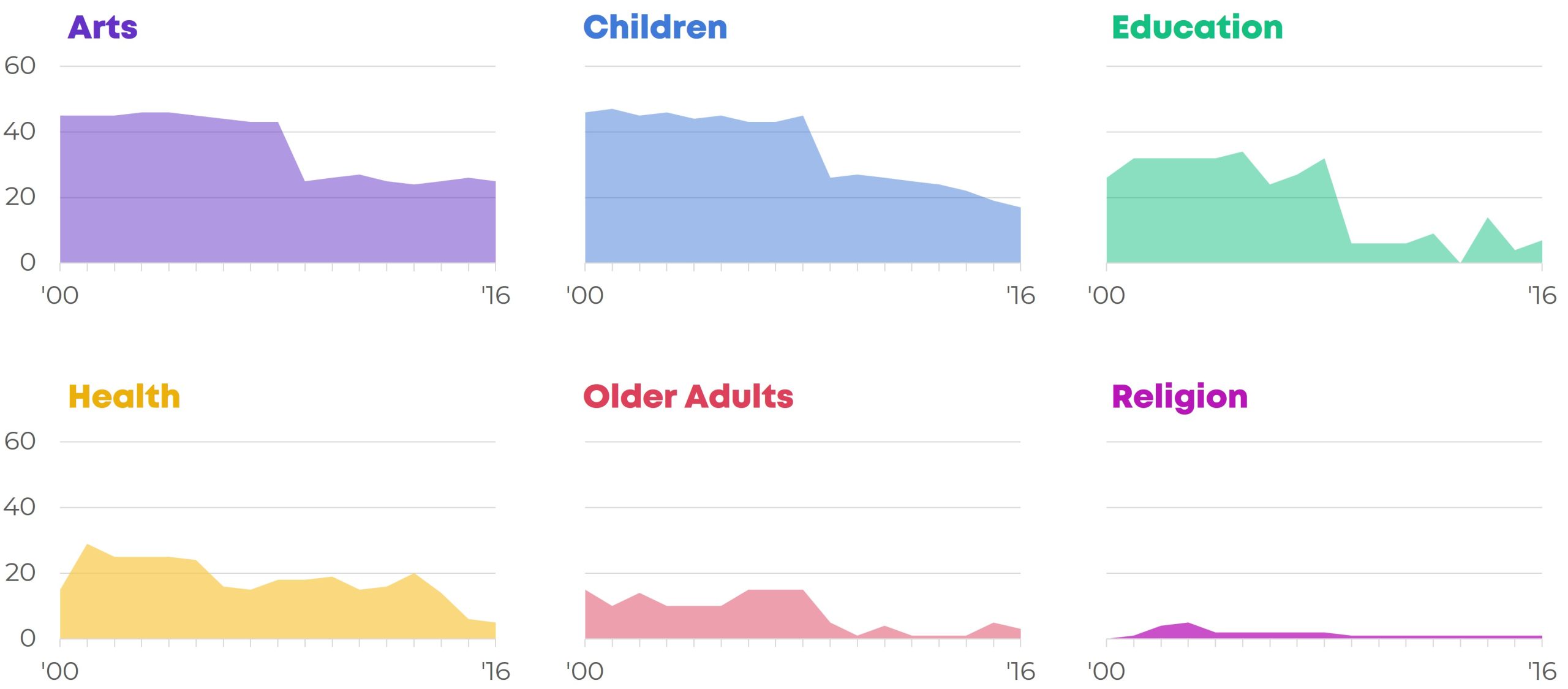
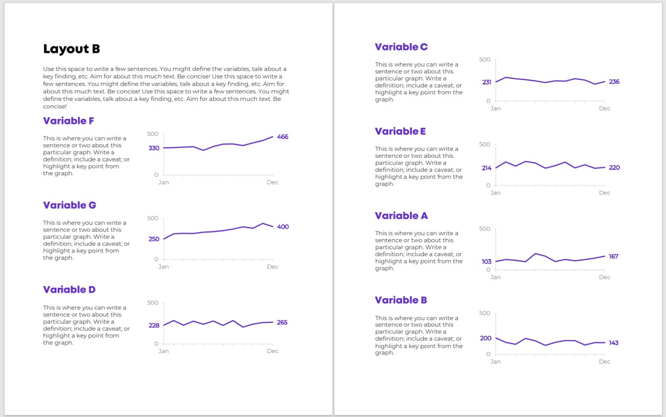
Small Multiples Bars
Small Multiples Lines
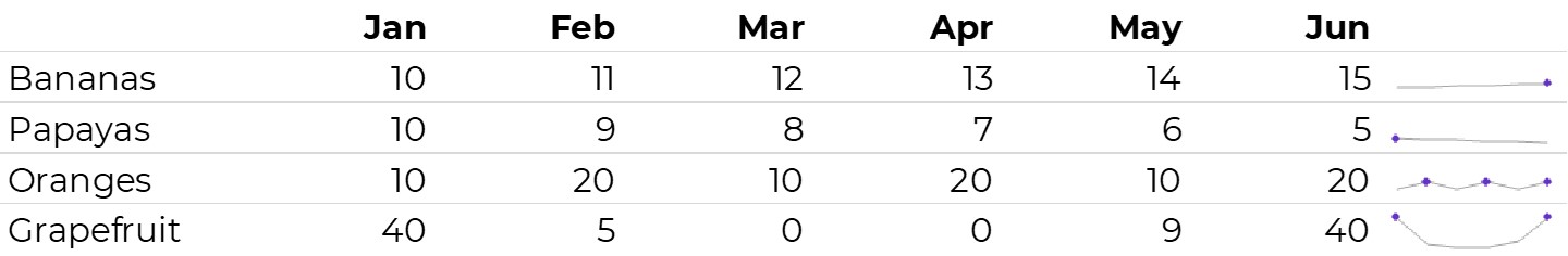
Sparklines
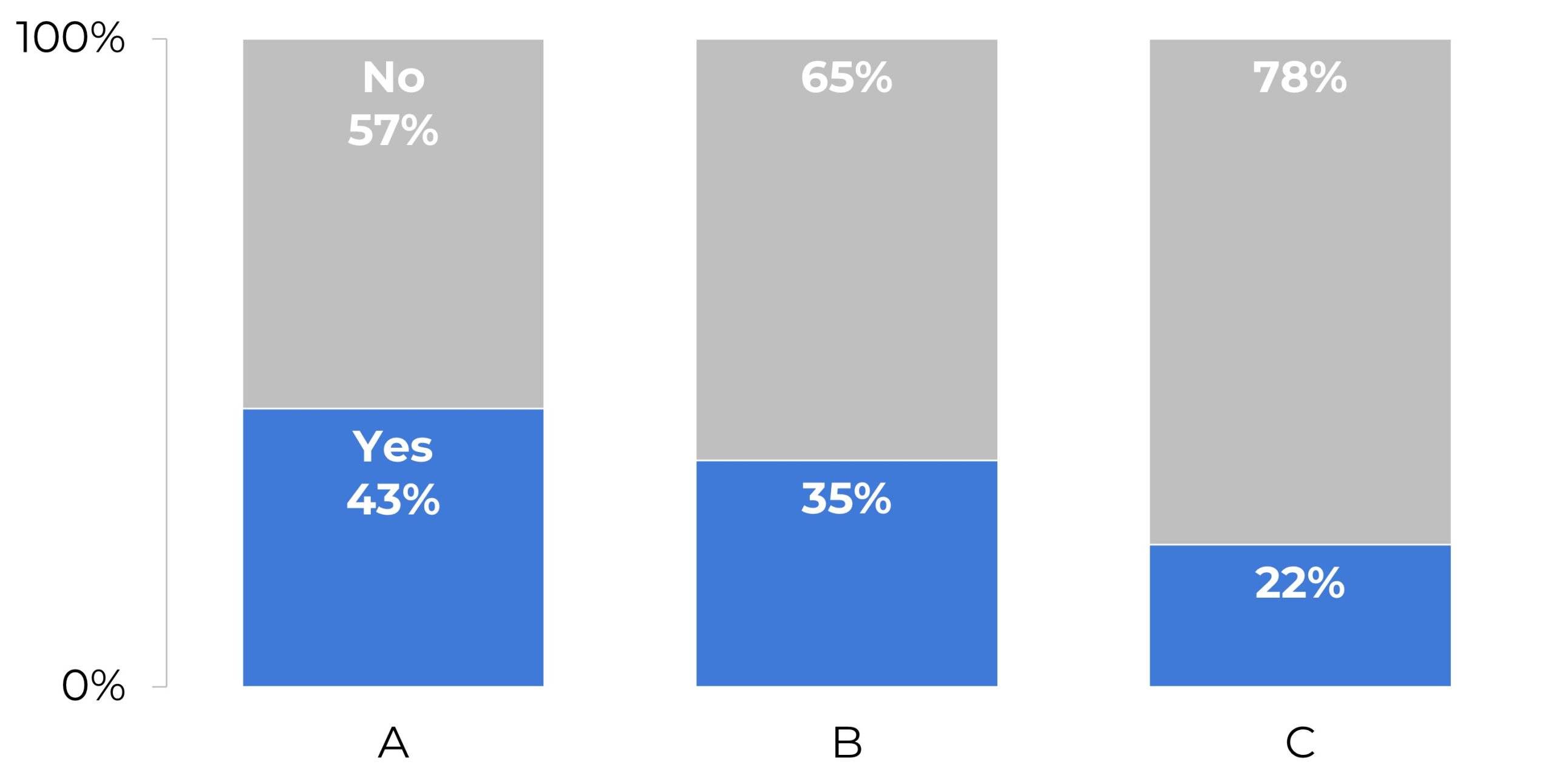
Stacked Bars
Stacked Columns
Static Dashboards
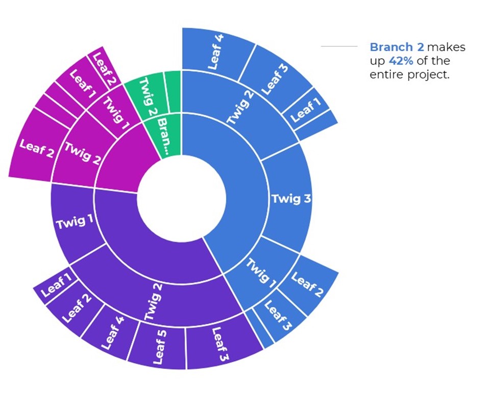
Sunburst Diagrams
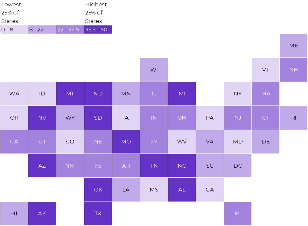
Tile Grid Heat Maps
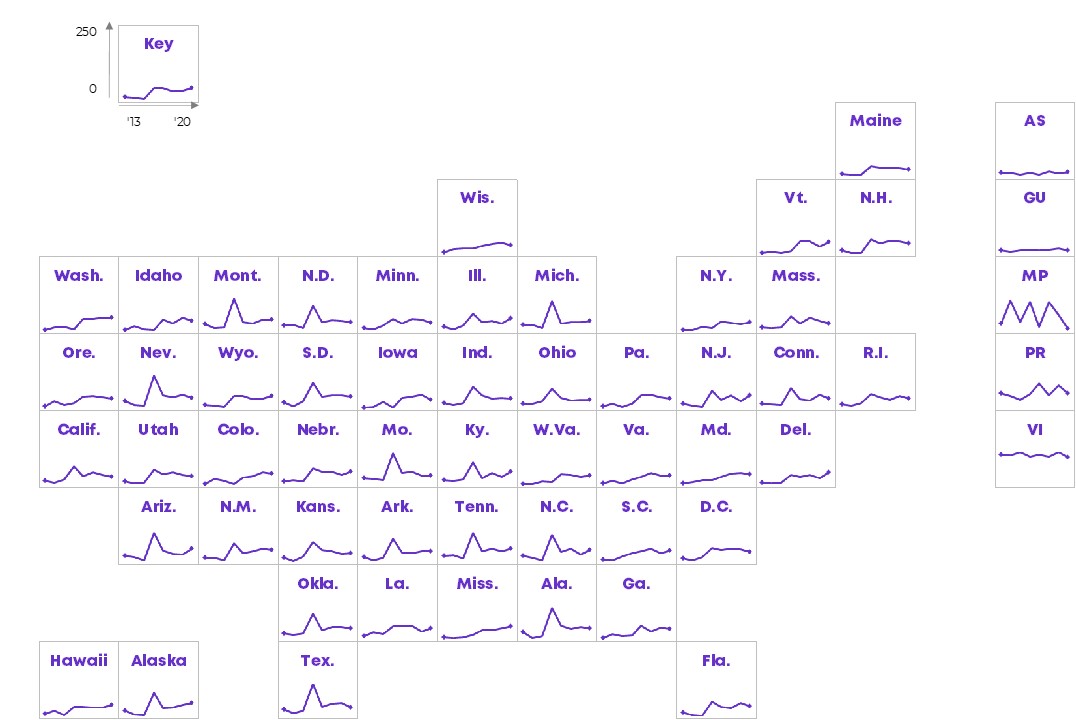
Tile Grid Trendline Maps
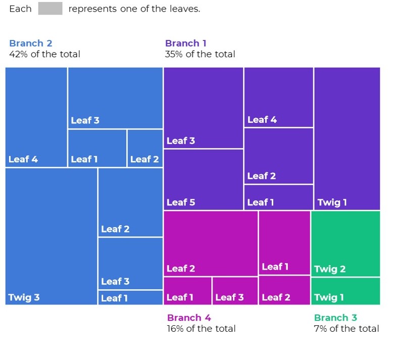
Tree Maps
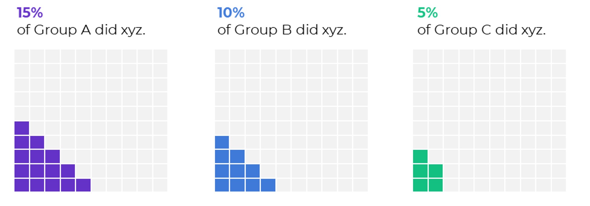
Waffles