• Skip to main content
  • Skip to footer
  • Home

The May 13 Group

the next day for evaluation

  • Get Involved
  • Our Work
  • About Us
You are here: Home / Archives for allblogs

allblogs

Feb 27 2023

New Infographic: Qualitative Data Saturation

This article is rated as:

I'm new to eval EA Traffic Light.jpg

I do some eval EA Traffic Light.jpg

Eval is my main role EA Traffic Light.jpg


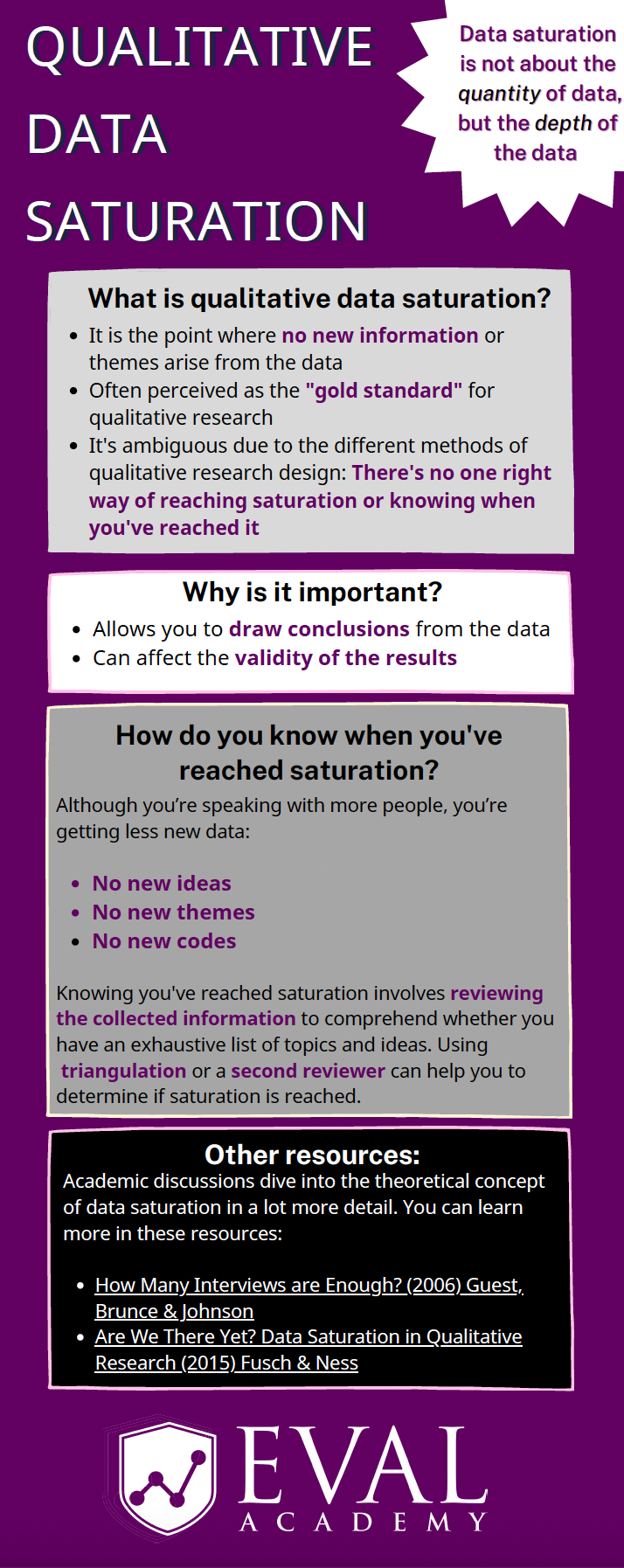
Eval Academy just released a new infographic, “Qualitative Data Saturation”

Who’s it for?

This infographic is for those who collect or who will be collecting qualitative data and are looking to support the validity of their results. It’s a helpful resource for those who are both new and experienced in evaluation!

What’s the purpose?

This infographic defines qualitative data saturation, lists why it is important and identifies how you know when you’ve reached saturation. It also includes links to further resources for those who are looking to dive a little deeper into the theoretical concept of qualitative data saturation.

What’s included?

A printable 1-page infographic that outlines qualitative data saturation.


Get the infographic


Learn more: related articles and links

You can learn more about qualitative data on Eval Academy through the following links:

  • How to conduct interviews

  • How to “Quantify” Qualitative Data

  • How to Transcribe Interviews Like a Pro

  • Interpreting themes from qualitative data: thematic analysis

  • How to use Calendly to schedule interviews like a pro

  • 3 Easy Ways to Quantify your Qualitative Data

  • Sampling and Recruitment 101

Some helpful Eval Academy resources to collect and track your qualitative data include:

  • Interview Tracking Log Template

  • Excel Interview Tracking Log Template

  • Standard Interview Guide Template

  • Standard Interview Information Letter Template

  • Standard Interview Consent Form Template

  • Standard Interview Templates Bundle

  • Focus Group Information Letter and Consent Form Template

  • Focus Group Moderation Guide Template


What do you think of our new infographic? Let us know in the comments below!

Written by cplysy · Categorized: evalacademy

Feb 27 2023

What you need to know about member checking

This article is rated as:

I do some eval EA Traffic Light.jpg

Eval is my main role EA Traffic Light.jpg


Member checking is a technique often used with qualitative methods to help validate findings. It can be used in evaluation to help validate, interpret, and analyze findings from interviews, focus groups, and other forms of qualitative data.

While commonly used in qualitative research, especially as it is included in qualitative research checklists, like COREQ, it’s less commonly used in evaluation and we think that should change!

In this article, we’ll review what member checking is and why, when, and how you should use it.


What is member checking?

In essence, member checking is when participants in qualitative research validate their data, checking for accuracy and validity. Member checking can happen informally during data collection when the researcher or evaluator summarizes and confirms their interpretation of what a participant said during data collection. This can look like an interviewer summarizing a participant’s statement mid-interview, allowing the participant to affirm or correct the statement. My personal favourite lead into this is, “So what I’m hearing you say is…”. 

This article will focus instead on formal member checking, whereby the researcher or evaluator reaches back out to participants after data collection to check their findings. This method is attributed to Lincoln and Guba, who argued its purpose is to validate, verify, and assess the trustworthiness of results. I’d argue that it can also be used to build trust with your participants, correct assumptions you have made, and lead to new insights and deeper understandings of the data.

Formal member checking can encompass a range of activities and can occur at different points during data collection and analysis.

  • Immediately after data collection: participants can review their transcripts and are invited to check the accuracy of the data. Participants can be given the opportunity to add, remove, or clarify their statements.

  • During data analysis: participants can be invited to review preliminary themes and how their quotes fit into these themes, leaving room for further discussion and (re)interpretation of data. Participants can also be involved in the theming and sense-making process.

  • After data analysis: participants can review draft reports with their quotes and contributions highlighted for their review. Often at this stage, participants are limited in their ability to change their quotes or provide additional context, but it gives them a clear idea on how their data is presented and used and provides an opportunity for participants to review if the right emphasis was placed on topics and themes.


When should you use member checking?

Now you may be thinking, ‘sounds great! How do I know when it’s a good idea to use member checking?’

Consider using member checking when:

  • You need to build trust with your participants. giving them the chance to edit or clarify what they said can help participants trust you, the evaluator. This can also be a valuable step if you know you’ll need to return to this same group for future data collection.

  • Your sample is small, and it might be easy to know who said what. Despite your best efforts to maintain confidentiality, it can be difficult if your sample is small. Giving participants the opportunity to redact statements, especially how they will appear in context, can help to preserve their confidentiality, or ensure that they are aware of what will be shared and how.

  • When the topic or content is sensitive. Member checking can support participant confidentiality, allowing them to review how you’ve used their information.

  • When you aren’t familiar with the context. Member checking can aid in interpretation and analysis and provide additional context.

  • You need enhanced validity. Member checking can add rigour and validity. Consider using it when other validation techniques, such as triangulation, are not possible. Using member checking can provide evidence that your interpretation and analysis are appropriate, accurate, and reflect the content of the discussion.

  • You are conducting a participatory evaluation. Member checking can be a participatory technique to include participants in data collection, analysis, and reporting. Member checking can support community buy-in for the evaluation and its results.

Avoid using member checking when:

  • You have a short timeline or small budget. Member checking takes extra time and therefore more money. Make sure you have the time and budget to do it justice.

  • Your participants are short on time or doing so will add undue burden. Member checking adds an additional burden to participants. For those that are busy or do not have a lot of capacity, member checking is another activity you are adding to their plate.

  • Participants will struggle with the concept of themes. For those of us in the research and evaluation world, the concept of summarizing information into themes is easy to comprehend. Avoid doing member checking using themed or summarized information with groups who may not understand how and why themes are used.

  • When your participants may have low (English) literacy levels. For those who are not comfortable or able to read well in English, member checking by providing a written summary or transcript is likely not a viable option. Feel free to get creative, though, if member checking is important for this group. Short videos or audio clips may be a way to get in touch with this audience.

  • You are not able to receive input or incorporate feedback. Member checking rests on the principle that participants can modify the transcripts or analysis. If you are unable to make changes, member checking is not an appropriate tool for that project.

  • When you won’t be able to do member checking close to the interview. Sometimes it takes a long time to gather and analyze data. Member checking loses its benefits when it is done a long time after data collection has occurred as participants may not recall the purpose or context as clearly.

  • When there are power imbalances between the evaluator and participant. In cases where the participant may not feel comfortable contradicting the evaluator or the findings, member checking may not provide the value or validity you are hoping for. In some cases, you may be able to use other people or methods to even out the power imbalance.

  • If reviewing their input may pose a risk to participants. In some cases, asking participants to review their contributions can be distressing, especially if the data are gathered about a sensitive topic. Additionally, if participants don’t see their contributions reflected in a summary or the themes, it may leave them feeling isolated or unheard.


What you need to consider when member checking

I’ve described some of the what, why, and when, but the real question remains, how do you actually do it? There’s a range of options for how to member check. You need to decide on a few key things: what to send them, how you want them to interact with what you’ve sent, what you will do with their contributions, and how much time they have.

Let’s start with what to send them. You can send participants their data in a range of forms, from their raw data (e.g., their transcripts), to a summary of their contribution, or their quotes in themes or in the context of the report. 

Next up, is how you will connect with them. Individual member checking can be done through a 1:1 conversation using a set of interview questions, an email asking them to reply with comments, or a survey asking for feedback on themes. Member checking can also be done in a group setting, especially when the data were gathered in a group (e.g., focus groups). You can host a group focus group or discussion, or even structure your session like a data party.

Note: while member checking can be done in a data party format, not all data parties are considered member checking. Member checking is specifically done with those who provided data. Data parties can include those who were not involved in data collection to support interpretation.

Next, you need to be clear with what you expect them to do with the information. Are they able to ask for information to be removed or to edit a quote? Can they offer additional context? What if they disagree with the theme or title?

Next, you need a plan for what you are going to do with the feedback. This should be determined in advance. Will you make the edits and re-send them for approval? What will you do with conflicting information? What happens if they don’t respond? Who has the final say about the findings and interpretation?

Finally, be clear on timelines. You should give participants a clear indication of when they should expect to receive the information you are asking them to check and how long they will have to provide feedback. The last thing you want is for someone to be away or not prepared to set aside time to review what you are provided.


In the comments, let us know about a time you’ve used member checking. How did it go?

Written by cplysy · Categorized: evalacademy

Feb 27 2023

3 Simple Steps that Took My Graph from Good to Great

After enrolling in Depict Data Studio’s Great Graphs in Excel course and watching many of the videos, I was excited to apply what I had learned.

My first chance came in the form of a front-end evaluation project for a children’s museum planning a new exhibition on dinosaurs.

Measuring What Kids Already Know about Dinosaurs

The museum wanted to understand what children and families already knew about dinosaurs – including whether they knew what other types of animals and plants existed at the same time.

I designed a fun card-sort activity, where parent-child pairs were asked to work together to sort 19 cards with images of different plants and animals into two piles:

  • one pile for those they thought lived at the same time as dinosaurs, and
  • one pile for those they thought didn’t live with dinosaurs.

Here’s a sample of a few of the cards we gave to families:

Cards with pictures of animals, humans, and trees that were used in the card sort activity.

Draft 1

For my first stab at a graph showing the results, I applied several of the best practices I learned about in Great Graphs:

  • I sorted my data from largest to smallest.
  • I applied color meaningfully – using the client’s brand orange to show the animals that did exist at the time of dinosaurs and gray to show those that didn’t.
  • I eliminated the unnecessary visual clutter from the Excel default graph and made some simple modifications (for example, increasing the width of the bars and the text font size).
  • I even added annotations highlighting interesting findings.

Here’s what my first version looked like:

Maia Werner-Avidon's first draft, which is a horizontal bar chart with about 20 categories. Some bars are orange and others are gray (to show whether the families got the answers right or wrong). There are call-out annotations describing a few of the bars, too.

Draft 2

I thought I was off to a pretty good start, but I wasn’t sure if my graph was clearly explaining that some of the answers were correct and some were incorrect, so I decided to bring my graph to Office Hours with Ann to see what else I could do.

Ann offered me three simple ideas that took this graph from good to great.

1. Group the bars to better show which responses were correct or incorrect.

Rather than order all the bars from largest to smallest, Ann suggested that I group all the correct answers together (ordered from largest to smallest) and similarly group all the incorrect answers together.

2. Add space between the groups to create a visual distinction.

Although the same effect could be achieved by creating two separate graphs, Ann showed me how to add a gap between two sets of bars in a single graph by simply inserting one (or more) blank rows in the source table. (Note from Ann: Learn more about adding blank rows in this tutorial, and view another example of intentional gaps here.)

To make the difference between the two groups even more obvious, we also added subtitles to indicate correct and incorrect responses.

3. Add icons for visual interest and whimsy.

This graph is for a children’s museum project about dinosaurs. This is the type of graph that is just calling for a touch a playfulness.

We found an adorable dinosaur icon in the free icons that are included with all Microsoft Office products.

We added an orange dinosaur icon to highlight the correct answers and a grey one with a slash through it to highlight the incorrect answers.

Here’s the final version of the graph that I included in my report:

Main Werner-Avidon's revised graph, which is still a horizontal bar chart with about 20 bars. In this version, the orange bars are grouped together at the top, and the gray bars are grouped together at the bottom. There are dinosaur icons showing whether families got the answers correct or incorrect, too.

A big improvement made in three simple steps and less than 30 minutes.

There’s a reason the course is called Great Graphs.

Connect with Maia Werner-Avidon

On LinkedIn: https://www.linkedin.com/in/maia-werner-avidon/

Learn more about Maia’s work at www.mwainsights.com.

Written by cplysy · Categorized: depictdatastudio

Feb 23 2023

The lost question.

What was that thing…

I believe it was important.

It had something to do with something we didn’t know…

I remember being really focused on it.

But at some point our conversation switched. Then all of a sudden we weren’t talking about it anymore. It was still there, in the background somewhere, but felt less important somehow.

Now it was all about activities, outputs, and outcomes. We had goals, and things that we were doing to get to those goals.

We started tracking numbers, which seemed important because we could make those numbers go up or down based on the things that we were doing.

Then days, months, or years went by and suddenly we were ready to write a report.

In this report we were going to put in all the lessons we learned. We were going to describe those methods, outputs, and outcomes. All that data we collected, we would put those into nice little charts and graphs.

People were really going to love this report.

Now we just need a story to put everything into perspective.

But I can’t help but feel like we’re forgetting something.

Solutions don’t make good stories.

I was going to make this the title because it’s true.

But it’s also a solution. So leading off a blog post about how solutions don’t make good stories felt a little ironic. Like ten thousand spoons when all you need is a knife.

If it’s not abundantly clear, the thing we were missing above was the question (or questions) that started everything.

Questions and problems are always the engaging things that spawn projects and drive people forward. It’s why all the good stories don’t usually begin until there is some kind of conflict, problem, challenge, or struggle.

If you want your report to tell a story, don’t start with methods or an outline. Start with the question that started everything. The one that you focused on so much at the beginning of your project that you now take for granted.

While people might search for answers, they start their search with questions.

What are yours?

I built my information design academy out of questions.

I was reflecting on a conversation I had with one of my academy members.

It was the kind of conversation I have a lot with the members of the academy. The one where I try to figure out why people join the thing that I offer. What are they hoping to get out of a virtual information design academy?

It’s always felt like I’m doing something wrong. That the burden of coming up with the content I teach shouldn’t fall onto their shoulders.

But after that particular conversation I had a new perspective.

Ever since I first started teaching online (with the original DiY Data Design back in 2015) I had this idea that I would create a thing and continuously ask the people who joined that thing what they were struggling with. What problems did they have that I could solve?

And over time I learned lots about the challenges and struggles of data people in a modern digital world. A world that requires us to think more creatively, design visually, and tell better stories if we want to have any chance of someone else experiencing our work and learning from our ideas.

I expected that one day I would learn enough to know specifically what I offered.

But my perspective now is different. Because the world keeps changing, and so do the questions.

The tools I used most five years ago are not the tools I mostly use today. And I bet they’ll keep changing.

My workshops have never been about providing solutions. They’ve been about answering questions.

So why fight it.

You are all brilliant.

And here is the other truth.

The people who join my information design academy (as well as the people who follow this blog) are amazing. I am reminded about this again and again and again through my interactions with many of you.

So why not just accept that I don’t have to build this academy alone. Every single member brings experiences, challenges, and solutions that can help us all grow. Why even pretend like I know it all, when that’s not what anybody really needs.

My bizarre information design academy pitch to you.

  • I don’t know what I’ll be teaching in a year, or even next month.
  • I will likely ask you, again and again, what you are working on, struggling with, or interested in learning.
  • I don’t have a sequential course designed to teach you a list of specific things based on a set of learning objectives (although I am building one I’m calling my baby steps course).
  • What I do have is a strong desire to help you be the best information designer you can be.
  • If you have a question I can’t help you answer, I won’t be able to let it go until I do.
  • I meet live weekly, now with a couple of time slots to make scheduling easier for members in different time zones.
  • I offer an included 1 on 1 call to every member for every quarter, because there is nothing like talking one on one.
  • I know some people join these things and never attend, so I create emails and other super low barrier connection tools so that no matter what, they can get some value out of the academy.
  • If someone is on the other side of the globe and wants to attend my sessions, I will add times late at night or early in the morning to ensure that they can.
  • I help data people become better designers, storytellers, and communicators. And I know that members are seeing positive results, like better jobs, promotions, and increased creative confidence.
  • And even though I’ve been doing this current iteration of the workshop for almost a year and half with only a small group, people still show up week after week after week.

So if any of that sounds good to you, and you want someone committed to helping you grow your information design skills then click here to learn more about the academy.

Or click here to just go ahead and register.

Written by cplysy · Categorized: freshspectrum

Feb 22 2023

Self Care Corner: Prioritize Your Lightest Weight

“What’s the lightest weight we can carry now?” This question was asked by a client during one of our project check-ins at the height of COVID-19. The client, like many organizations, experienced drastic shifts in their programming. Namely, deciding which programs and strategies were flexible enough to pivot to a virtual space while figuring out […]

The post Self Care Corner: Prioritize Your Lightest Weight appeared first on Nicole Clark Consulting.

Written by cplysy · Categorized: nicoleclark

  • « Go to Previous Page
  • Go to page 1
  • Interim pages omitted …
  • Go to page 98
  • Go to page 99
  • Go to page 100
  • Go to page 101
  • Go to page 102
  • Interim pages omitted …
  • Go to page 310
  • Go to Next Page »

Footer

Follow our Work

The easiest way to stay connected to our work is to join our newsletter. You’ll get updates on projects, learn about new events, and hear stories from those evaluators whom the field continues to actively exclude and erase.

Get Updates

Want to take further action or join a pod? Click here to learn more.

Copyright © 2026 · The May 13 Group · Log in

en English
af Afrikaanssq Shqipam አማርኛar العربيةhy Հայերենaz Azərbaycan dilieu Euskarabe Беларуская моваbn বাংলাbs Bosanskibg Българскиca Catalàceb Cebuanony Chichewazh-CN 简体中文zh-TW 繁體中文co Corsuhr Hrvatskics Čeština‎da Dansknl Nederlandsen Englisheo Esperantoet Eestitl Filipinofi Suomifr Françaisfy Fryskgl Galegoka ქართულიde Deutschel Ελληνικάgu ગુજરાતીht Kreyol ayisyenha Harshen Hausahaw Ōlelo Hawaiʻiiw עִבְרִיתhi हिन्दीhmn Hmonghu Magyaris Íslenskaig Igboid Bahasa Indonesiaga Gaeilgeit Italianoja 日本語jw Basa Jawakn ಕನ್ನಡkk Қазақ тіліkm ភាសាខ្មែរko 한국어ku كوردی‎ky Кыргызчаlo ພາສາລາວla Latinlv Latviešu valodalt Lietuvių kalbalb Lëtzebuergeschmk Македонски јазикmg Malagasyms Bahasa Melayuml മലയാളംmt Maltesemi Te Reo Māorimr मराठीmn Монголmy ဗမာစာne नेपालीno Norsk bokmålps پښتوfa فارسیpl Polskipt Portuguêspa ਪੰਜਾਬੀro Românăru Русскийsm Samoangd Gàidhligsr Српски језикst Sesothosn Shonasd سنڌيsi සිංහලsk Slovenčinasl Slovenščinaso Afsoomaalies Españolsu Basa Sundasw Kiswahilisv Svenskatg Тоҷикӣta தமிழ்te తెలుగుth ไทยtr Türkçeuk Українськаur اردوuz O‘zbekchavi Tiếng Việtcy Cymraegxh isiXhosayi יידישyo Yorùbázu Zulu