One year ago, I filed my LLC paperwork. Two weeks later, I gave notice at my full time job. Two weeks after that, I said goodbye to my old position. This post describes and celebrates the process of stepping into solopreneurship.
The post Celebrating 1 Year of Solopreneurship appeared first on Elizabeth Grim Consulting, LLC.
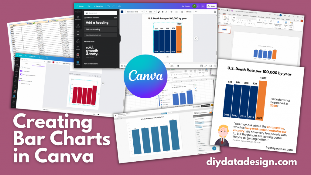
![How to find the chart builder in Canva. [Screenshot]](https://blog.evalcentral.com/wp-content/uploads/2022/04/image-13-1024x499-1.png)
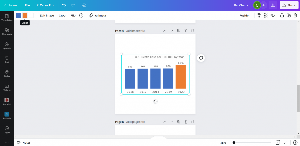
![Adjusting bar chart data in Canva. [Screenshot]](https://blog.evalcentral.com/wp-content/uploads/2022/04/image-12-1024x498-1.png)
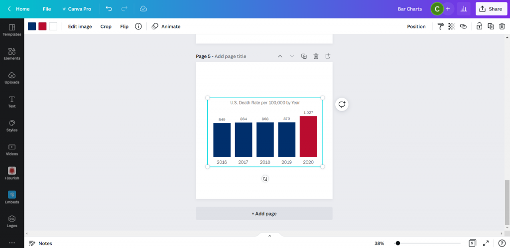
![Settings in Canva's chart builder. [Screenshot]](https://blog.evalcentral.com/wp-content/uploads/2022/04/image-15-1024x501-1.png)
![Copying charts out of Excel. [Screenshot]](https://blog.evalcentral.com/wp-content/uploads/2022/04/image-1-1024x543-1.png)
![Pasting charts into Canva. [Screenshot]](https://blog.evalcentral.com/wp-content/uploads/2022/04/image-2-1024x477-1.png)
![Chart pasted into Canva as a PNG.[Screenshot]](https://blog.evalcentral.com/wp-content/uploads/2022/04/image-4-1024x506-1.png)
![Saving Excel charts as SVG pictures. [Screenshot]](https://blog.evalcentral.com/wp-content/uploads/2022/04/image-1024x547-1.png)
![Importing an SVG chart into Canva. [Screenshot]](https://blog.evalcentral.com/wp-content/uploads/2022/04/image-3-1024x506-1.png)
![Saving an SVG chart with a highlight color in Excel. [Screenshot]](https://blog.evalcentral.com/wp-content/uploads/2022/04/image-7-1024x548-1.png)
![Creating a rainbow color bar chart in Excel. [Screenshot]](https://blog.evalcentral.com/wp-content/uploads/2022/04/image-5-1024x548-1.png)
![Adjusting a multi-color SVG chart in Canva. [Screenshot]](https://blog.evalcentral.com/wp-content/uploads/2022/04/image-6-1024x496-1.png)
![Pasting an Excel chart into PowerPoint [Screenshot]](https://blog.evalcentral.com/wp-content/uploads/2022/04/image-11-987x768-1.png)
![Importing a PowerPoint chart into Canva. [Screenshot]](https://blog.evalcentral.com/wp-content/uploads/2022/04/image-16-1024x499-1.png)
![Changing the color of a powerpoint chart inside Canva. [Screenshot]](https://blog.evalcentral.com/wp-content/uploads/2022/04/image-10-1024x499-1.png)
![Finding the Flourish app inside Canva. [Screenshot]](https://blog.evalcentral.com/wp-content/uploads/2022/04/image-17-1024x501-1.png)
![Choosing a template inside Flourish [Screenshot]](https://blog.evalcentral.com/wp-content/uploads/2022/04/image-18-1024x522-1.png)
![Creating a simple column chart using Flourish [Screenshot]](https://blog.evalcentral.com/wp-content/uploads/2022/04/image-20-1024x497-1.png)
![Adding a Flourish chart to a Canva presentation. [Screenshot]](https://blog.evalcentral.com/wp-content/uploads/2022/04/image-19-1024x523-1.png)
![Finding your connected Flourish charts inside of Canva. [Screenshot]](https://blog.evalcentral.com/wp-content/uploads/2022/04/image-21-1024x497-1.png)
![Using shapes to create a chart in Canva [Screenshot].](https://blog.evalcentral.com/wp-content/uploads/2022/04/image-22-1024x500-1.png)
![Measuring a bar using Pixels in Canva [Screenshot]](https://blog.evalcentral.com/wp-content/uploads/2022/04/image-23-1024x507-1.png)
![Zooming in to help measure a bar using Pixels in canva [Screenshot].](https://blog.evalcentral.com/wp-content/uploads/2022/04/image-24-1024x507-1.png)
![The measured pixel math bar chart. [Screenshot]](https://blog.evalcentral.com/wp-content/uploads/2022/04/image-25-1024x504-1.png)
![Grouping and adjusting the pixel math bar chart in Canva. [Screenshot]](https://blog.evalcentral.com/wp-content/uploads/2022/04/image-27-1024x465-1.png)
![Turning the bar chart into an infographic in Canva. [Screenshot]](https://blog.evalcentral.com/wp-content/uploads/2022/04/image-26-1024x506-1.png)