• Skip to main content
  • Skip to footer
  • Home

The May 13 Group

the next day for evaluation

  • Get Involved
  • Our Work
  • About Us
You are here: Home / Archives for cplysy

cplysy

Apr 01 2022

Creating Glue: Viewing Change as an Index

Change-making is not a singular thing, rather it is viewed more as an index. That means that the more of these different factors that are present, the greater the likelihood of change.

We recently concluded the first season of Censemaking: The Innovation Podcast looking at this idea of the index and introducing the last of the ten factors: glue. Glue brings together our strategies, processes, techniques and tools (one of the other factors).

Ten Factors for Change

The previous factors that have each been profiled in episodes in that first season are:

  1. Knowledge
  2. Skills
  3. Confidence
  4. Outcome Expectations
  5. Conditions
  6. Environment
  7. Social Support
  8. Time and Space
  9. Tools
  10. Glue

This first season has focused on the building blocks of change. These ten factors that if applied in earnest can help us to grow and transform organizations, communities, and ourselves. We can think of these in two groups: individual-focused change and shared-focused areas of change.

A big myth that we’ve covered this season of the podcast is that we are the masters of our own change and destiny. While we do contribute a big deal to our own change efforts, we can’t separate ourselves from the communities, organizations, families, and teams around us who enable, constraint and support change.

The more of these things, we do the better, the quality of our performance, the amount of persistence and endurance of our efforts. The more likely we are to change specifically glue are the techniques, the methods and the strategies for change. They are something that connects all of these other factors together in the implementation of some type of plan to make changes.

Lessons from Season One

The first is that change Isn’t a single thing. It’s more of a combination of things that we think of less than the list and much more as an index. Second, tools, techniques, strategies, and practice are the glue that ties all of these individual factors. Third, we can design change if we know what to do, and we can draw these 10 factors together to help us innovate and create a difference in the world we’re looking to make.

This is a design challenge. Glue is the systemic design of our organizations or our own personal practices that build up strategies to leverage all ten of these. We’re rarely successful with all of these, but by viewing them as an index it gives us something to focus on for improvement. We also can optimize those things working well to compensate for those areas that are not. Success comes because we have many avenues to change, not just one or two.

This is a different way to view change, but one that we’ve seen show the truth in our many years of working as change-makers and strategic designers.

If you want to learn more about this, please contact us and we can help. Censemaking: The Innovation Podcast is available wherever you get your podcasts.

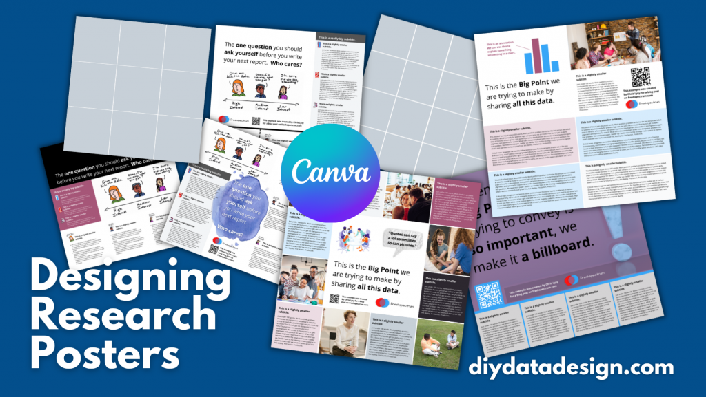
Photo by olia danilevich

The post Creating Glue: Viewing Change as an Index appeared first on Cense Ltd. .

Written by cplysy · Categorized: cameronnorman

Mar 27 2022

Comment on Why I love Perusall by How India Can Beat China?

How India Can Beat China?

blog topic

Written by cplysy · Categorized: danawanzer

Mar 25 2022

Organizational Trust and Wellbeing

If you’re looking to enhance the wellbeing of your organization you first need to have trust.

Trust is the anchor of any healthy relationship and wellbeing is all about creating connections to people and self. How do we create wellbeing in our organizations? How do we create trust if we don’t have it?

Trust Creation

Trust doesn’t come through grand gestures, but small acts that are done regularly, consistently, and persistently. We build trust through creating a trusting culture. Trusting cultures are those that foster a culture of wellbeing. They are all connected.

Trust is developed through four actions:

  1. Frequency of contact (familiarity). We trust others more when we understand and can relate to others.
  2. Quality of contact. When we develop the familiarity with others that allow us to be intimate, trust grows.
  3. Shared activities. Building things together brings people together through engendering a shared sense of accomplishment.
  4. Shared vision. When we can share our values, aspirations, and our perspectives it’s easier to come together and trust each other.

Most discussions of trust focus on the fourth part: values and beliefs. However, spend time on social media and you’ll see that sharing our beliefs and values can easily have the opposite effect. This is important, just not as the first step.

Our values come into play when we have the chance to work together, share space, and spend time together. Trust comes from time spent together and we can design for it.

Time matters, but so does the quality of that time. This means taking time to ask questions and to listen to others fully.

Once we do that, we can start designing and building things together because shared making is shared learning. Learning means that I am growing and when I learn with people I grow with them. This might sound simplistic, but it’s a powerful lesson we all can apply to our organizations.

Trust Building

Some simple means to build trust include:

  1. Create space at your regular meetings for personal sharing of stories.
  2. Support the direct one-to-one and small-group meetings that allow people to share their experience. When we do this we also enhance the ability to use After Action Reviews and learn through complexity.
  3. Set up physical spaces that support face-to-face interactions (or regularly use your Zoom or distance tools to create regular chat spaces) .
  4. Support asynchronous chat and responsible use of technology to scale conversations. This means using the right tools for the right task. We recommend you read Keith Ferrazzi’s take on becoming crisis agile in our organizing.

Resilient, compassionate teams come together by design. When we create a collective space to engage collectively to build trust we do better and our wellbeing increases.

These simple steps can yield enormous benefits. We’ve used these approaches with our clients and they continue to reap dividends. This is something that we do by design and with intention because doing so creates a leadership opportunity along the way. Trust by design gives us the chance to co-create a space together and share our experiences while building a better, healthier organization.

If you’re looking to create a culture of trust and wellbeing and want help in taking this forward, contact us and let’s grab a coffee.

The post Organizational Trust and Wellbeing appeared first on Cense Ltd. .

Written by cplysy · Categorized: cameronnorman

Mar 23 2022

How to design a research poster using Canva

Today’s post is a big one about designing research poster presentations using Canva. Even if you’ve never created a research poster in your life, I think this post can really help you get a solid jump on your next design.

Because ready or not, it’s happening. After a long COVID-19 break, a bunch of evaluation conferences are going to be live again. And with live conferences you also get actual live presentations. Including those big poster presentation nights.

In this post:

  • I’ll show you how to create a research poster, including a new approach I really appreciate.
  • Grid based design and why planning your poster in content blocks is a good idea.
  • A bunch of alternative poster styles that use the same underlying grid.
  • Free research poster Canva templates, and some tools to help you design your next poster.
Designing Research Posters using Canva by diydatadesign.com

The research poster presentation mindset.

So imagine yourself in a room standing in front of a research poster surrounded by people just like you. The attendees at the session might be holding drinks and are continuously running into old friends. Some glance at your work and keep right on walking. Others might ask you a question or two as they peruse your poster.

And there you are, standing in front of your poster that you’ve agonized over. The one you had to carry in a big tube through a crowded airport and then inside a crowded airport shuttle.

A research poster isn’t some stand alone document or social media infographic. It’s your wingman. Your partner in crime. It stays by your side, supporting the communication of your work. A better poster design won’t just help you communicate, it can also make your time in that room feel a little less awkward.

The usual approach to research poster design.

freshspectrum cartoon by Chris Lysy.
"Wow, that's a lot of words."
"Can you believe I was able to fit my entire master's thesis on a single research poster?"

Most research posters tend to just be adaptations of a research paper. As such, a lot of academics will simply take their paper title and put it at the top of the research poster. They will then create sections on the poster that mirror the sections in their paper.

Ultimately they end up with a research poster outline that looks just like a research paper outline. This is definitely not my preferred approach to research poster design. But if this is the way that you decide to create your poster, at least take some basic steps to ensure it’s readable.

Years ago, Stephanie Evergreen and Chris Metzner created a quick little guide on how to design a research poster for the American Evaluation Association’s Potent Presentations Initiative. Definitely check it out if you just want to polish an already created poster.

How to create a better research poster in less time.

I really like this poster approach outlined by Mike Morrison.

The gist, if you don’t feel like watching the video, is that research posters should really be designed more like billboards than infographics.

Because during a poster session there is a lot of competing information. Instead of trying to capture and retain attention from just a few attendees, design your poster to quickly deliver your biggest point. Reaching more people, but with a very specific point. And then use a QR code to link to the full paper and other information.

What is the standard size for a research poster?

Okay this is kind of a trick question. There are standardish sizes, but the people who decide on the size are almost always the ones putting on the conference.

In the past at least, the American Evaluation Association has required a square 44 inch by 44 inch design. Other common sizes include 36 inch tall by 48 inch wide and 42 inch tall by 56 inch wide.

But before you start designing, always check the specific conference’s website and follow their design process.

A research poster design process using Canva.

So for my research poster designs I’m going to use Canva.com.

Research Poster process

Instead of starting with a base template, we’ll just click on the “Create a design” and click custom size. I’ll be creating a square 48 inch by 48 inch poster.

Creating a custom design size in Canva.

Designing research posters with a Grid.

Research posters really just post a layout challenge. Everyone gets the same amount of space, you just have to choose how you will use that space.

I’ve created a couple of basic grids to use with my 48 inch square research poster. The grids themselves are just a series of square shapes. A lot of designers might just stick with 3 columns, but I like to have horizontal guides as well.

A 3 by 3 grid is going to give me 9 total blocks.

Creating a 3 by 3 grid in Canva.

A 4 by 4 grid is going to give me 16 total blocks.

Creating a 4 by 4 grid in Canva

The more blocks you have, the more flexibility you have in your design. But it also increases the complexity. Just remember that there is still a lot that you can do with a 3 by 3 grid.

Using content blocks to design your research poster.

I like to consider each square in my grid as a content block. I can order my overall design by changing the colors of individual blocks, or by deleting them.

Let’s say I want to create a large 2 block by 2 block panel for my big message. I just delete those four blocks in the upper left corner.

Tweaking your canva grid.

Now I can start designing by adding content.

Adding Content to your Canva grid.

Since I’m not at the point where I have the content all figured out, I can either fake some content or use some Lorem Ipsum filler text. There are some fun ones on the web you can find with a Google search. For my templates I’m using some filler text from Office Ipsum.

Template with filler text.

What size font should I use on my research poster?

I’ve seen some guidance that you should use at least 24 pt fonts. I usually bump it up a bit more.

I’ll use a body font, one or two sub heading fonts, and a large main message font. For me that ended up being 32 pt, 48 pt, 64 pt, and 128 pt. I also just used Open Sans (as it’s a really versatile font and I plan to just share out the templates).

Research poster examples.

Okay, so now I’m just going to play around with the grids and different content types. None of this is a real presentation, but I think you’ll see the utility.

Let’s start with the 3 by 3 grid.

This one is really simple, it uses 4 blocks for the big message content in the top left. It uses 2 blocks for the sidebar 1, 2, 3, content. And it uses the final bottom three blocks to expand on the image.

3 by 3 grid research poster version 1

Here is an alternative. It uses the same amount of content, but the order is switched around. I also added a different visual element to highlight the message in the middle.

3 by 3 grid research poster version 2

Here is a third alternative. It uses a little less content (The 1,2,3 sidebar is reduced by about 225 words) but uses a big of negative space and color to make the big message stand out.

3 by 3 grid research poster version 3

There is no perfect one way to create any design. Try different things out, pick the one you prefer. Each orientation will likely change the way the information is perceived at least a little, even with the same content. If you don’t trust your eye, ask others for their insight. But just remember that everyone’s taste is a bit different.

Now let’s play with the 4 by 4 grid.

So with the 4 by 4 grid I’m just going to use a lot of filler text and images. I just want you to get a sense of how this works, and the kinds of things that you can do.

In this example we use a series of charts (small multiple). This let’s you share a lot of data but still make it easy to understand. Each chart block uses 1 content block (out of 16). I used the two in the upper left for the big point. I used the two in the upper right for an image and the signature content.

4 by 4 grid small multiple chart research poster

Sometimes you’ll have a lot more text to share. Just remember that this entire fairly word heavy research poster still has under 1,000 words. If you push your word counts too high, you’re going to start making your poster super wonky.

4 by 4 grid text heavy research poster

Perhaps you are more a qualitative evaluator or researcher. Designing like this is really similar to designing a photo collage or scrapbook. It can be really efficient way to mix pictures and quotes.

The middle is 4 blocks. Then there are 6 picture blocks and 6 text blocks. Each text block has just over 100 words (including the subtitle).

4 by 4 grid qualitative research poster

Finally, sometimes you just want to make a big point and shout it across the room. In this example I increased the font size to 250. We still have some smaller 100 word blocks on the bottom, but this poster is really designed more to lead to an external document or website.

4 by 4 grid billboard research poster

Research poster templates.

So do you want all the Canva templates I shared in this post? Including the 3 by 3 and 4 by 4 grids You can get access to them here:

Research poster canva templates

Want the PowerPoint Research Poster Templates Instead?

Since I used a few premium Canva stock images I didn’t feel comfortable sharing the Power Power Templates. But here is the thing. All you have to do is go into Canva and save the set as a Microsoft PowerPoint.

If you don’t have Canva premium just switch out any premium stock photos before you download. This will make it a free download and not violate Canva’s terms.

Canva download as PowerPoint.

Design tools that can help support the research poster design process.

Canva Stock Icons

Canva has an integrated icon library. There are millions of icons which you can check out here.

Canva Images

Canva has an integrated stock photo library. You can also peruse the stock images here.

Canva Color Wheel

I wrote a whole post the other week on Color featuring a bunch of Canva tools. If you don’t already have colors set before you start your design, I suggest you check it out.

Canva Presentation Templates

Lots of research poster presentations also require handouts. Why not try making a simple slidedoc to go alongside your poster? Just use a Canva Presentation Template but add a bit more text. Enough that the person with the handout can read through without having you there to explain everything.

QR Code Monkey

Need to create a QR code for your poster? Here is a nice free site > qrcode-monkey.com

QRCode Monkey Screenshot

Written by cplysy · Categorized: freshspectrum

Mar 23 2022

Try This: Reproductive Justice & Program Design

Try this activity, and let me know how it goes for you. I partnered with a client organization to engage staff and board of directors in understanding the Reproductive Justice framework, and its application to organizational programming and other areas respective areas. We started with a RJ 101 session in December 2021, followed by a […]

The post Try This: Reproductive Justice & Program Design appeared first on Nicole Clark Consulting.

Written by cplysy · Categorized: nicoleclark

  • « Go to Previous Page
  • Go to page 1
  • Interim pages omitted …
  • Go to page 133
  • Go to page 134
  • Go to page 135
  • Go to page 136
  • Go to page 137
  • Interim pages omitted …
  • Go to page 304
  • Go to Next Page »

Footer

Follow our Work

The easiest way to stay connected to our work is to join our newsletter. You’ll get updates on projects, learn about new events, and hear stories from those evaluators whom the field continues to actively exclude and erase.

Get Updates

Want to take further action or join a pod? Click here to learn more.

Copyright © 2026 · The May 13 Group · Log in

en English
af Afrikaanssq Shqipam አማርኛar العربيةhy Հայերենaz Azərbaycan dilieu Euskarabe Беларуская моваbn বাংলাbs Bosanskibg Българскиca Catalàceb Cebuanony Chichewazh-CN 简体中文zh-TW 繁體中文co Corsuhr Hrvatskics Čeština‎da Dansknl Nederlandsen Englisheo Esperantoet Eestitl Filipinofi Suomifr Françaisfy Fryskgl Galegoka ქართულიde Deutschel Ελληνικάgu ગુજરાતીht Kreyol ayisyenha Harshen Hausahaw Ōlelo Hawaiʻiiw עִבְרִיתhi हिन्दीhmn Hmonghu Magyaris Íslenskaig Igboid Bahasa Indonesiaga Gaeilgeit Italianoja 日本語jw Basa Jawakn ಕನ್ನಡkk Қазақ тіліkm ភាសាខ្មែរko 한국어ku كوردی‎ky Кыргызчаlo ພາສາລາວla Latinlv Latviešu valodalt Lietuvių kalbalb Lëtzebuergeschmk Македонски јазикmg Malagasyms Bahasa Melayuml മലയാളംmt Maltesemi Te Reo Māorimr मराठीmn Монголmy ဗမာစာne नेपालीno Norsk bokmålps پښتوfa فارسیpl Polskipt Portuguêspa ਪੰਜਾਬੀro Românăru Русскийsm Samoangd Gàidhligsr Српски језикst Sesothosn Shonasd سنڌيsi සිංහලsk Slovenčinasl Slovenščinaso Afsoomaalies Españolsu Basa Sundasw Kiswahilisv Svenskatg Тоҷикӣta தமிழ்te తెలుగుth ไทยtr Türkçeuk Українськаur اردوuz O‘zbekchavi Tiếng Việtcy Cymraegxh isiXhosayi יידישyo Yorùbázu Zulu