• Skip to main content
  • Skip to footer
  • Home

The May 13 Group

the next day for evaluation

  • Get Involved
  • Our Work
  • About Us
You are here: Home / Archives for cplysy

cplysy

Mar 04 2022

Are they really demanding shorter reports, or just less to read?

So I had this idea in my head for a long time.

Given how the web has fundamentally changed the way we design and share information, eventually the new design methods will work their way into the evaluation world. Reports will change because the context has changed. And organizations will demand more from those that design their reports.

But I think I was wrong, at least on that last part.

I don’t think organizations are really demanding “more” from their evaluation report writers. They’re demanding less. Less pages, less words, less content, and ultimately less to read. And it just so happens that by demanding less, it makes creating high quality comprehensive reports a little bit harder. Because how do you fit all you need to say in just a handful of pages?

After decades as a researcher and evaluator, and a good chunk of years as an independent information designer, I think we need to change our mindset. It’s time to stop giving organizations at large credit for being contemporary or modern just because they are demanding less out of their individual reports.

Freshspectrum Cartoon by Chris Lysy.
"Next time could you write a shorter report? It would really help us to pretend like we read it and considered all the findings."

Better evaluation reports are NOT driven by demand.

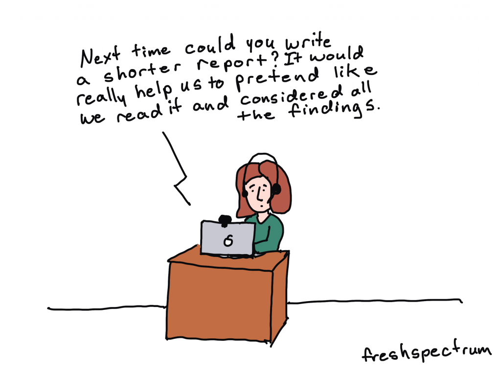
My inner skeptic tells me that the demand for shorter reports is often a demand for reports that are easier to ignore. Easier to just skim through and then toss in the trash, or more likely now-a-days, click away. It’s so much simpler to say you read the report when it was only 10 highly visual pages and not 100 text heavy pages.

Don’t get me wrong, this isn’t an argument for creating long boring reports. I do believe as professional evaluators that we should be focused on creating minimum viable reports for all of our different audiences.

Just don’t confuse the “demand for less” as simply a “demand for better.”

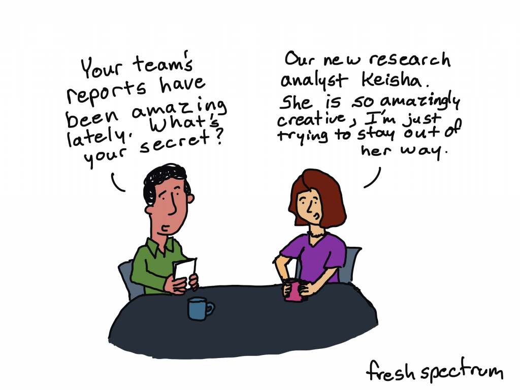
The real driver for better evaluation reports is not organizational demand. It’s individual evaluators, and evaluation teams, taking on the hard work of improving and modernizing their own reporting strategy.

It’s the evaluators who go above and beyond in designing their reports, not because they were asked to do so but because they believe that their work is important enough to be shared.

Freshspectrum cartoon by Chris Lysy.
"Your team's reports have been amazing lately. What's your secret?"
"Our new research analyst Keisha. She is so amazingly creative, I'm just trying to stay out of her way."

Stop waiting for permission, it’s up to you to create better reports.

The only reason I get to do the interesting information design work that I get to do is because someone in an organization decided to be a champion for better reporting.

The same holds true when I was just starting to get into design as an evaluator and research analyst at Westat. I didn’t get to practice my newly developing design skills because someone asked. I got to start creating interesting things because my boss didn’t tell me no.

Ultimately, your boss or your organization doesn’t know what it doesn’t know. If all they see when they get an evaluation report is a long boring thing that needs to be shorter so that it can be easily ignored, you have already lost.

If you believe in your work, you need to give them better not just shorter. You need to show them why your work is important, and why you are taking the time to create the report in the first place. You need to do such a good job sharing your work that they start to demand more.

YOU are the driver for better reports.

DiY Data Design Header Image
Registration closes Monday, March 7

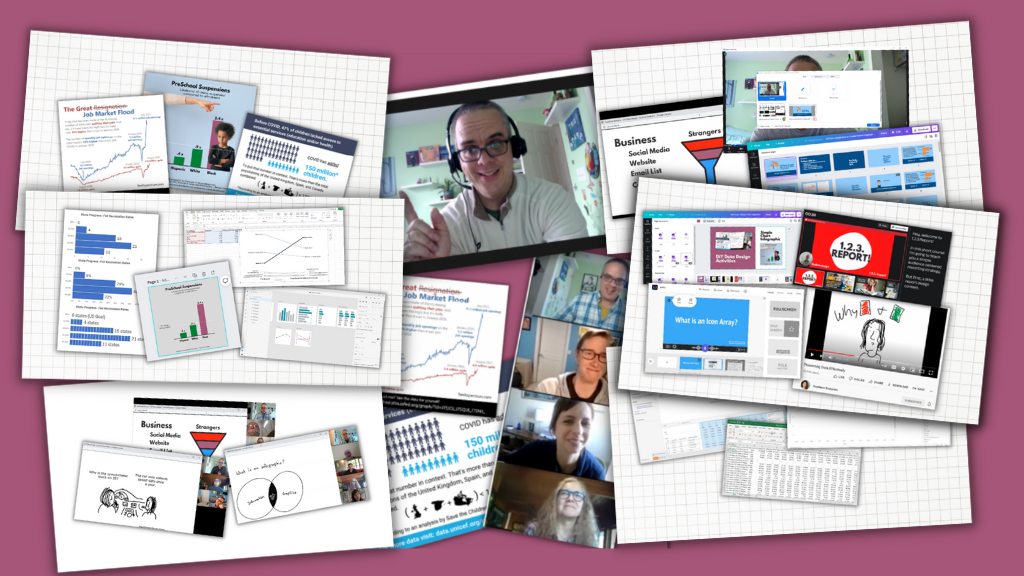
DiY Data Design Workshop – Spring Registration Closes on Monday.

Things to know.

  • Registration is still open until Monday at 11:59 PM Eastern.
  • After that, public registration won’t open again until June.
  • You can get a 15% off discount code by joining my free 1. 2. 3. Report! course.
  • I offer unlimited no explanation necessary scholarships of 25% off and 50% off, you can read more about that in the FAQ section of the registration page.

Written by cplysy · Categorized: freshspectrum

Mar 02 2022

Future Regrets

Have you ever thought: I wished I’d done [something] different?

We all have. Regrets are part of what defines us as humans.

Looking back over mistakes or missed opportunities can lead us forward into making better decisions about the future if we let it.

In our work, we’ve used the idea of Future Regrets as a strategy tool to help organizations envision possible future outcomes.

Here is how it works:

  1. Take an action that you’re currently seeking clarity on or debating as an organization (or individual). This can be an issue that you’re uncertain about and want to pursue.
  2. Pick a time point in the future when the results of your action (or inaction) will be likely known. To make things simple, we often use 6-months, 1 year, or 5 years as examples. The specific date isn’t that important – just enough to gain a frame on your activity.
  3. Inquire about those outcomes and whether you would have regretted not taking that initial action.

This approach allows us to see beyond short-term pain, struggle, and awkwardness to see long-term success (or possible failures). Rather than wait for regret to set in on a missed opportunity or failed venture we can learn about tomorrow, today. Try it with a variety of scenarios and give yourself time to consider different paths.

Power of Thought Experiments and Regret

Author Dan Pink has written about the role of regrets in shaping our lives and how we can benefit from them in dictating what we do. While this specific approach isn’t mentioned in his book, there are many others that are including the failure resume.

By bringing our future into our present we can regret less and succeed more.

If you’d like some help in using this approach in your work please contact us and let’s grab a coffee.

Photo by charlesdeluvio on Unsplash

The post Future Regrets appeared first on Cense Ltd. .

Written by cplysy · Categorized: cameronnorman

Mar 02 2022

Ask Nicole: The Best Way to Follow Up with Former Clients

Have a question you’d like to be featured? Let me know. In late Summer 2021, I started a strategic planning project with a new client organization. During the initial meeting, the Executive Director and I caught up a bit. This Executive Director had previously been a Co-Executive Director for a client organization I worked with […]

The post Ask Nicole: The Best Way to Follow Up with Former Clients appeared first on Nicole Clark Consulting.

Written by cplysy · Categorized: nicoleclark

Mar 01 2022

8 reasons why you should join my report design workshop community.

Before I was an information designer I was just a data guy. I learned to design because I got tired of seeing good evaluation work quickly fade into obscurity because it was poorly reported.

Now my days are spent helping evaluators in large organizations simplify and modernize their reports.

I created the DiY Data Design workshop community to teach the stuff I do with my own information design clients to my fellow evaluators. It initially launched about 6 months ago and has evolved quite a bit over that time.

For the next week (March 1 – March 7th at 11:59 PM) the workshop community is open to new members.

Here are 8 reasons why I think YOU should join us.

DiY Data Design Workshop Illustration

Reason 1: We learn better together.

This isn’t just a set of self-paced modules. It’s a community. Just about everything I teach is taught live to a group of aspiring data designers. The community is designed using the principles of an effective community of practice.

What does that mean? It means you also get to hear real questions from your peers. And you get to hear about other people’s experiences, and lessons learned, not just my own.

And when we learn together as a community, it amplifies the value and everyone wins.

The best thing about this group is meeting other people with a similar interest in using data for quality improvement but with expertise and insight from different fields!"

Reason 2: Less theory more practice.

If you want to become better at data design, create. Then create some more. Then create some more.

I love design theory and diving into the why behind how things work. But ultimately you don’t need an advanced degree in design to create a sleek effective modern report.

So we take shortcuts. Lots of shortcuts. And we don’t get bogged down in theory. Because you can always come back to that later.

My goal is to help you create better reports, faster.

freshspectrum cartoon by Chris Lysy

"I use lots of jargon because I care more about precision than you understanding my lesson."

Reason 3: You’ll get ongoing report support.

Every member gets access to an always open Zoom chat room. It’s a place where you can share your work and ask general questions.

But you can also ask really specific questions. You know the kind that you need answered because your report is due in a couple of days. And you’re stuck. And you need help.

Help is here.

Very much enjoying our creative reporting workshop with Chris. 

He has gone the extra length to help me with an annual report and gave feedback on an article I wrote. Our weekly sessions are informative and practical and helping me moving forward in my data and design journey!"

Reason 4: You don’t know what you don’t know.

Have you ever created printable infographics, interactive web reports, social media featured image infographics, data dashboards, qualitative illustrations, GIFs, animations, or videos?

I have.

Look, I’ve always been a jack-of-all-trades. And while I might not be the best at any one thing, I know a little about a LOT of things. So we cover a wide range of reporting topics.

Because while some things are hard to do, there are a lot of things that are fairly easy if you just knew how.

freshspectrum Cartoon by Chris Lysy

"So to create the histogram we're going to put the quantitative data in these happy little bins."

Reason 5: The stuff nobody else teaches.

Yes, we’ll occasionally use the normal tools everybody else teaches (i.e. Excel, PowerPoint, Tableau, Adobe CC).

But more often than not we’ll be using other tools. Because these other tools make creating easier and faster. They are also free to use and easy to learn. I’m talking about tools like Adobe Elements, Adobe XD, and Descript.

But the one tool we use most in this workshop, way more than any other data design workshop I know:

Canva.

More and more Canva has become my go to reporting tool for everything from infographics to dashboards to explainer videos. Because it’s easier to use and makes everything faster. And in this workshop, you’ll learn why.

freshspectrum cartoon by Chris Lysy

"Not sure how they did it. It's only a 3 page executive summary but it reads like a 50 page report."

Reason 6: Recipes, Recipes, Recipes.

Okay, so if you peruse through the DiY Data Design offerings you’ll notice a bunch of “Coming Soon” data design recipes. And when I say coming soon, I mean in the upcoming weeks not months from now. I already have a bunch created, I just need to get them onto the site.

Recipes focus on practical designs that we discuss as part of the workshop. They are things that you can create and adapt. They often come with supporting tools like templates and worksheets. Every recipe is also discussed and recorded prior to it showing up in the library.

You can expect to see around 50 recipes added over the next three months. And 100 recipes over the next six months.

DiY Data Design Example Recipe - Icon Illustrated 1 Pager
Here is an example data design recipe. Each recipe will also be linked to the video lesson where it was discussed.

Reason 7: Because YOU want to create better reports.

You know how everyone says it’s the audience that matters the most.

Well, that’s only kind of true. Most audiences are not actually demanding better reports. They’re simply ignoring the organizations that don’t take reporting seriously.

The person that matters the most is YOU. Because YOU can make your reports better, even if nobody demands it. And not because someone told you to, but because you believe in the power of your work. You believe in sharing data and evidence. You want people to see your work.

freshspectrum cartoon by Chris Lysy

"So there is no style guide, format requirements, content requests, or other additional guidance. Just keep it short?  
One quick follow-up, does anyone actually give a shit?"

Reason 8: Because there is NO RISK (and scholarships, and a coupon).

Starting this time around, all my member plans come with 30 days free. That means if you join and decide you don’t like it, just cancel within 30 days and you won’t be charged.

I’m also offering no explanation necessary scholarships (see the FAQs) of 25% and 50% off.

And, even if you don’t think you need a scholarship, you can still get 15% off by just enrolling in my free self-paced 1. 2. 3. Report! course.

Join us at DiYDataDesign.com

Written by cplysy · Categorized: freshspectrum

Feb 28 2022

How to Visualize Margin of Error Data in Excel with “Slider Plots”

Andrew Forsman is a Depict Data Studio student and self-described “data viz nerd” who has over 10 years of experience helping organizations plan for, execute, and learn from research and evaluations.

Andrew’s sharing examples of slider plots and step-by-step instructions for making them in Excel. Thanks for sharing, Andrew! –Ann

—

Hey everyone!  Andrew Forsman here from the Research & Evaluation Division (RED) of The University of Arkansas for Medical Sciences. Our group focuses on translating research into practice in fields like early childhood education, child nutrition, abuse prevention, and HIV education.

Much of my job involves working with faculty members and project leads to develop evaluation questions that lead to actionable data.

One of the biggest puzzles we face is how to translate those results (visually and verbally) so that everyone from expert audiences to laypeople can understand our findings and benefit from them.

The data viz world is full of options for visualizing basic data such as change over time, pre/post differences, and percentages/frequencies for a single point in time.

Sometimes however, your data (or your audience) demands a little more.

Case-in-point: When displaying margin of error is important.

The Challenge: Displaying Margin of Error Data

Back before the pandemic, one of our faculty asked for some help in visualizing her data for a conference on childhood nutrition.

I dressed it up the best I could, but it still fell far short of the best practices for data visualization. I figured there had to be a better way to display data with margins of error (a.k.a., the “95% confidence interval”), and set out to find it.

Spoiler alert: I didn’t find anything. So, a little bit at a time, over the course of several months, I built it myself. I call them “slider plots.”

Full disclosure: I didn’t know until after I developed these, but Stephanie Evergreen posted a rough sketch version of this idea using auto-calculated standard error bars back in 2017. Her title used “confidence intervals,” instead of “margin of error” so I missed it in my initial search.

While that means the basic idea behind my “slider plots” isn’t completely new, I’m still excited to build on her work and share this as a small step forward in chart design!

The Old Way

The “old way” involves using column charts with error bars.

The “old way” involves using column charts with error bars.

The New Way: Slider Plots

Slider plots can be vertical or horizontal. Here’s an example of a vertical slider plot that shows policy ratings from four different neighborhoods.

Here’s an example of a vertical slider plot that shows policy ratings from four different neighborhoods.

Here’s a second example of a vertical slider plot that shows teacher ratings in four different schools.

Here’s a second example of a vertical slider plot that shows teacher ratings in four different schools.

Here’s what a horizontal slider plot of those policy ratings would look like.

Slider plots can be vertical or horizontal. Here’s what a horizontal slider plot of policy ratings would look like.

And finally, here’s the horizontal version of the teacher ratings.

And finally, here’s what a horizontal slider plot of teacher ratings would look like.

Download the Excel File with Step-by-Step Instructions

The process to create slider plots follows many of the same steps as creating dot plots and adds a few more to create and customize your margin of error bars.

Start to finish (from creating a data table, to building your dot plot, through creating and customizing your error bars), there are 15 steps, plus a few optional sub-steps.

I’d like to list them all here, but this post would definitely get a TLDR citation from the blog police (Too Long, Didn’t Read).

While many of the steps are similar, vertical slider plots are easier to build so I recommend you start with those first.

The horizontal version may be harder to build, but it has the same readability advantages of classic dot plot we all know and love.

As a bonus, you can download a free Excel file with step-by-step instructions and screenshots, as well as an end-product template you can use to make the process much faster.

Andrew-Forsman_Slider-Plot-Instructions-1Download

Winning Hearts & Minds with Slider Plots

While slider plots do take some time to set up, the payoff for your effort is helping to expand the reach of data viz.

Many in the evaluation community have begun to adopt better data visualization practices to help communicate their work over the last few years, but there are still many spaces (workplaces, conferences, etc.) where we find resistance.

Some of that is fear of judgement; that we won’t be taken seriously as scientists by our colleagues if we present data in non-traditional ways.

If there’s one thing I’ve learned from being an evaluator in the early education space, it’s that if you want to change people’s minds (and then their behavior), you have to meet them where they are.

I’m under no illusions this chart type will suddenly convert all the data viz detractors or revolutionize the field.

However, the changes are small enough and familiar enough that they might be a bridge to expert audiences; a way they can slowly grow more comfortable with the idea that presenting data differently doesn’t make you less scientific.

Know Your Audience

As cool as it is to do something new, it’s important that I leave you with this reminder:

Most of the time, margins of error will not be important enough to visualize unless you’re dealing with an expert audience.

It will most likely confuse or distract less-advanced audiences from the point you’re trying to make.

However, you can try adding a little more explanation in the graph subtitle to bridge the gap (see my slider plots above for examples) if it’s critical for your lay audience to see the margins of error as well.

Connect with Andrew

LinkedIn: @aforsman3

Written by cplysy · Categorized: depictdatastudio

  • « Go to Previous Page
  • Go to page 1
  • Interim pages omitted …
  • Go to page 136
  • Go to page 137
  • Go to page 138
  • Go to page 139
  • Go to page 140
  • Interim pages omitted …
  • Go to page 304
  • Go to Next Page »

Footer

Follow our Work

The easiest way to stay connected to our work is to join our newsletter. You’ll get updates on projects, learn about new events, and hear stories from those evaluators whom the field continues to actively exclude and erase.

Get Updates

Want to take further action or join a pod? Click here to learn more.

Copyright © 2026 · The May 13 Group · Log in

en English
af Afrikaanssq Shqipam አማርኛar العربيةhy Հայերենaz Azərbaycan dilieu Euskarabe Беларуская моваbn বাংলাbs Bosanskibg Българскиca Catalàceb Cebuanony Chichewazh-CN 简体中文zh-TW 繁體中文co Corsuhr Hrvatskics Čeština‎da Dansknl Nederlandsen Englisheo Esperantoet Eestitl Filipinofi Suomifr Françaisfy Fryskgl Galegoka ქართულიde Deutschel Ελληνικάgu ગુજરાતીht Kreyol ayisyenha Harshen Hausahaw Ōlelo Hawaiʻiiw עִבְרִיתhi हिन्दीhmn Hmonghu Magyaris Íslenskaig Igboid Bahasa Indonesiaga Gaeilgeit Italianoja 日本語jw Basa Jawakn ಕನ್ನಡkk Қазақ тіліkm ភាសាខ្មែរko 한국어ku كوردی‎ky Кыргызчаlo ພາສາລາວla Latinlv Latviešu valodalt Lietuvių kalbalb Lëtzebuergeschmk Македонски јазикmg Malagasyms Bahasa Melayuml മലയാളംmt Maltesemi Te Reo Māorimr मराठीmn Монголmy ဗမာစာne नेपालीno Norsk bokmålps پښتوfa فارسیpl Polskipt Portuguêspa ਪੰਜਾਬੀro Românăru Русскийsm Samoangd Gàidhligsr Српски језикst Sesothosn Shonasd سنڌيsi සිංහලsk Slovenčinasl Slovenščinaso Afsoomaalies Españolsu Basa Sundasw Kiswahilisv Svenskatg Тоҷикӣta தமிழ்te తెలుగుth ไทยtr Türkçeuk Українськаur اردوuz O‘zbekchavi Tiếng Việtcy Cymraegxh isiXhosayi יידישyo Yorùbázu Zulu