• Skip to main content
  • Skip to footer
  • Home

The May 13 Group

the next day for evaluation

  • Get Involved
  • Our Work
  • About Us
You are here: Home / Archives for cplysy

cplysy

Nov 12 2021

How can we incorporate diversity, equity and inclusion in evaluation


In the past couple of years, there has been an increasing focus on diversity, equity, and inclusion (DEI) in evaluation. More and more practitioners are grounding their work in equity and providing guidance to other evaluators, including the Canadian Evaluation Society. Recognizing that equitable evaluation is an emerging area of work, this article aims to add to the growing discussion. While it does not include an exhaustive list of issues and strategies, it will help you introduce some changes to your evaluation practice. 

Grounding an evaluation in DEI means the evaluation is equity-focused, culturally responsive, and participatory. In addition, such evaluation examines structural and systemic barriers that create and sustain oppression. 

Inclusive and equitable evaluation requires continuous unlearning of old practices and learning of new ones. Questioning, practicing, and reflecting are also important in DEI. To bolster equity efforts, re-examine current practices and paradigms, since historically and presently, well-intentioned evaluation practices have at times dragged equity efforts, and in some cases, reinforced inequalities.  

Adopting DEI in evaluation starts with the organization. The implementation of DEI in the workplace is an integral step towards implementing an inclusive and equitable evaluation. In fact, it is challenging to implement equitable evaluation without organizational adoption and buy-in, as it requires explicit leadership support and the right organizational setting. DEI is not a quick fix; rather it is a continuous commitment to achieve equitable results. 

Adoption of DEI in an organization may include the following:  

  • An explicit DEI strategy and performance measurement plans;   

  • DEI systems embedded in the culture and practiced consistently;  

  • Visible commitment and accountability from leadership in incorporating DEI in decision making;  

  • DEI practiced in recruitment and career advancement; and 

  • Continuously evaluating DEI efforts, collecting data on DEI indicators, and adopting changes.  

Adoption of DEI in evaluation starts at the evaluation initiation.  


1. Evaluation Planning

Context 

Aim to understand the community and the system to successfully engage and partner with communities/program recipients. Learning about the social, cultural, historical, and political context is critical to implement values-based and culturally relevant evaluation that promotes equity and justice.  In addition, identify whose voice has been silenced, whose voice is seen as the “truth” and aim to understand the power dynamics driving the current reality.  

For example, to effectively evaluate a program focusing on public safety in Canada or USA, the evaluator needs to understand the current and historical violence and mistreatment of Black and Indigenous people by police and the legal system.  

Similarly, to evaluate vaccine hesitancy and/or resistance in Black and Indigenous communities, it is imperative to understand the widespread racism in medical research and medical care. Many in Black and Indigenous communities distrust medical professionals and the government, as they historically faced structural and systemic challenges in accessing services or being excluded from supports.  


Team selection 

Select a strong evaluation team with a good mix of skills, experience, knowledge, and perspectives. If possible, aim to have representation from the community that is being evaluated, and balance diversity in the team by considering gender, ethnicity, content knowledge, methodology expertise, and expertise and knowledge of participatory research and equity focused evaluation.   


Stakeholders 

Include key stakeholders in the evaluation. Stakeholders make the important evaluation decisions, starting from identifying which evaluation questions get asked, to methodology all the way to reporting. Intentionally and carefully select stakeholders to include in evaluation committees and evaluation activities other than data collection.  

Historically, individuals from marginalized communities have not had a chance to participate in evaluation beyond providing data. Involve community members as stakeholders, co-creators, and collaborators and provide appropriate compensation. In addition, determine the degree of stakeholder participation, and clearly identify stakeholder roles (e.g., participate, consult, or make decisions). In some cases, engage stakeholders separately if there are power dynamics that cannot be resolved.    


Evaluation Questions 

Evaluation questions are the backbone of an evaluation, as all efforts are focused on addressing these questions. As the driver of the evaluation, include evaluation questions relevant to all stakeholders, including and especially those coming from the community. It is a common practice to focus and prioritize evaluation questions from program funders or leaders; however, such practice does not examine the program recipients’ values, and systemic and structural causes of problems in the community. It is likely that evaluations that only focus on the funder’s questions perpetuate the cycle of inequity and fail to address the root causes of the problem that program is attempting to address. (See our article for more tips on writing evaluation questions.) 


Evaluation design

In the past, quantitative data has been viewed as more rigorous and accurate, however both quantitative and qualitative data have value in DEI evaluation. A mixed methods approach is ideal for equitable evaluation as it combines the strengths of quantitative and qualitative data, i.e., precise estimates, statistical differences, and breakdown into sub-groups with detailed descriptions, lived experiences and complex narratives. Although mixed methods is preferred, be sure to select an evaluation design that is suitable for the program, and context.  


2. Data collection and analysis

Culturally appropriate methodology 

Design the data collection approach to respect and fit the communities’ traditions, norms, and standards – of course, best practices in evaluation still should be applied.  

Minimize bias 

Bias is inevitable, however considerable efforts should be made to reduce all kinds of bias in data collection and analysis. Bias can occur in data collection and analysis, such as when surveys ask leading questions, or certain populations are over- or under- represented and the analysis failed to account for this situation. Make efforts to identify potential biases and strategies to address them, prior to and during the data collection and analysis stages.  


Balance inclusivity and burden 

Aim for adequate representation of marginalized communities in data collection, while considering the burden on the participants. Individuals from the community can provide valuable information; however, such benefits must be weighed against the harm done to individuals if the evaluation data collection efforts pose a significant burden.  

 Often, individuals from marginalized communities have served – and continue to serve – as a data source for evaluation and applied research purposes, with minimal benefit to the community. For example, the Downtown Eastside in Vancouver is home to the most marginalized and transient populations in Canada with high incidences of mental illness, substance use, communicable diseases, homelessness, and crime. The area has been a subject of extensive evaluation and research, serving as a data source for considerable literature published on peer-reviewed journals, reports, and dissertations. Although the evaluation findings from this area have influenced policies and practices locally and internationally (e.g., the use of safe consumption sites), the main problems and burden of disease observed in the area persist.  


Identity-based data 

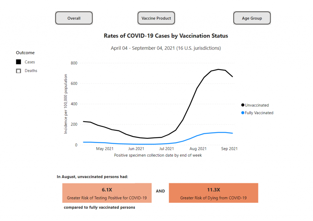
When collecting identity-based data such as ethnicity and gender, examine the utility, benefit, and relevance of the data to promote the well-being and rights of community members. Collecting identity-based data consistently from marginalized communities can demonstrate inequity in the system. For example, in the US, analyzing the burden of COVID-19 disease by ethnicity/race showed that Indigenous (2.4x), black (2.0x), and Hispanic/Latino (2.3x) communities were more likely to be infected, hospitalized and die from COV-19 as compared to white, non-Hispanic communities. 

To promote equity and inclusion, use the data appropriately and safeguard it to ensure confidentiality and security. In addition, 

  • ensure data quality to prevent further harm to marginalized communities; 

  • collect data that examine and reflect structural disadvantages, root causes and/or discrimination; and  

  • ensure that the evaluation team members involved in the collection, use, analysis and reporting of identity-based data are familiar with and adhere to privacy policy and legislation.  


3. Reporting

Before reporting

Prior to formally documenting the evaluation results in a report, discuss the main evaluation findings with stakeholders. These early conversations show all stakeholders how their contributions were used and provide them with the chance to correct any inaccuracies and to clarify any misrepresentations. The selection of participants in this activity should refer to the stakeholder mapping identified at the planning stage, paying special attention to members of marginalised communities, who are often left out of discussions due to multiple kinds of constraints. Facilitate these discussions in an inclusive manner, by providing adequate time and space for reflection and meaningful participation. 


Reporting

A good evaluation report will ensure the data is duly captured with balanced perspectives and fair representation of different points of view. The evaluation report is the most important evaluation deliverable, so methodology, limitations and findings need to be described in detail. When possible, the report should identify root causes and systemic and structural barriers.  

In addition, ensure that the evaluation report  

  1. uses language and terms that are suitable for the community (e.g., the use of pronouns); 

  2. uses images intentionally and critically to ensure that images do not perpetuate stigma (e.g., using images of homeless people when working on substance abuse program evaluation); and  

  3. visualization is appropriate and culturally relevant (e.g., the use of red dots on a city map to show service recipients can make individuals feel like they are problem or burden for their community).   


Overall, DEI in evaluation is a commitment to question our current standard of practice and continually reflect on our work to enhance programs, services, and systems for all, including marginalized and worst-off communities.  

Check out our Program Evaluation Standards article and resource.  


Sign up for our newsletter

We’ll let you know about our new content, and curate the best new evaluation resources from around the web!


We respect your privacy.

Thank you!


Sources:  

  • https://www.equitableeval.org/framework 

  • Dean-Coffey, J., Casey, J., & Caldwell, L. D. (2014). Raising the Bar – Integrating Cultural Competence and Equity: Equitable Evaluation. The Foundation Review, 6(2). https://doi.org/10.9707/1944-5660.1203 


Written by cplysy · Categorized: evalacademy

Nov 10 2021

Data Storytelling starts with Data Story Finding

You may have heard a data expert or two talking about data storytelling. But before you can tell a story, you need to find a story. This post walks through some strategies on how to do just that.

In today’s post.

  • The Graph is NOT the Story.
  • What is data storytelling?
  • Being able to find good stories is as important as good storytelling.
  • Sometimes the story just hits you in the face.
  • Putting the data into a line graph.
  • Surrounding the data with context.
  • Disaggregating interesting data points.
  • By viewing the chart through a single data point.
Freshspectrum cartoon by Chris Lysy.
"All the data was boring, so I just added some Pusheen cartoons to liven up the presentation."
"This chart is boring so I'll just eat this donut."

The Graph is NOT the Story.

I’ve heard lots of people say that data visualization is storytelling. But I always thought that was a bit disingenuous.

For me, data visualization is not storytelling, it’s story illustrating. The story itself is always much bigger and more meta than the chart or graph could ever hope to become.

It’s why Marvel can make millions upon millions of dollars adapting comic books into movies. Because the super hero stories don’t just make good books, they also make really good blockbuster action movies.

What is data storytelling?

While interpretations vary, most experts describe data storytelling as the ability to convey data not just in numbers or charts, but as a narrative that humans can comprehend.

The next chapter in analytics: data storytelling – MIT Sloan

There are some people in this world who tell fascinating stories.

I had a sociology professor in grad school who told some amazing stories. Talking about interviewing in opium huts or playing underground poker under the watchful eyes of the local police captain. But those great stories came from a life that was rich with experience.

Not all datasets are story rich. And while you might be able to package any data into a narrative format, that won’t make it a good story.

Good stories don’t just exist because someone knew how to tell a story. They just exist, and we need to find them before we can visualize them.

Freshspectrum cartoon by Chris Lysy.
"I'm sorry, but the only stories I get from this infographic are that you really like donut charts and don't understand the data."

Being able to find good stories is as important as good storytelling.

In a lot of ways story finding is really just data analysis.

A good analyst has an ability to find stories in datasets. While they might not be able to package the story, they can often pull up a chart or graph and walk you through what they see.

Finding good stories in datasets is a skill that most graphic designers do not have, because it’s a skill that takes years of practice. It’s the reason that my workshop focuses on helping data people become designers and not the other way around. I find it easier to teach someone who can find data stories how to package them into stories than to show someone who can design well how to find data stories.

But no matter where you fit in that spectrum, here are some strategies for finding the stories in your data.

Sometimes the story just hits you in the face.

Not all data stories require a lot of additional insight to find.

Take this chart from the CDC’s COVID Data Tracker. It shows the different rates of COVID-19 cases by vaccination status. The big story is pretty simple, unvaccinated people are at a greater risk of testing positive for COVID-19 and an even greater risk of dying from COVID-19. And when we see an overall case spike, that difference gets amplified.

Chart showing rates of COVID-19 cases by Vaccination Status from April 4, 2021 to September 4, 2021.
https://covid.cdc.gov/covid-data-tracker/#rates-by-vaccine-status
Chart captured on November 10 from the CDC’s COVID Data Tracker.

Putting the data into a line graph.

Narrative is often defined as a sequence of events. And given that line graphs are really representations of data over time, they make for really solid story telling devices.

You can find stories by putting your data into line graphs. Since the graph walks the data through time, your goal is talk through the parallel narrative. What does a spike in your line graph signify? What about a dip?

Since people are going to read your line graphs from left to right, annotations offer the chance to layout the story point by point.

Infographic created by Chris Lysy using data provided by the St Louis Fed.

Surrounding the data with context.

In research and evaluation we use a lot of descriptive statistics. Means, medians, and standard deviations can be helpful when trying to interpret a dataset. But descriptive stats often take data out of the original context.

One easy way to find stories in data is to add the context back into the picture. Yes, if the average is important visualize the average. But if your dataset is not too large, which includes many research and evaluation datasets, showing all the data gives you more to draw upon.

For instance, it’s one thing to tell the story that your program is performing above average. It’s another story entirely to say that you are performing better than all other programs for a particular indicator.

Oregon Outdoor School evaluation infographic
Infographic created alongside the Oregon Outdoor School evaluation team, this is an example version using fake data.

Disaggregating interesting data points.

If you have a percentage, step back and look at the underlying frequencies. Every percentage started with a numerator and denominator, look at those numbers. Do this even if you have to estimate the numbers based on the percentage.

UNICEF Infographic -
Before COVID, 47% of children lacked access to essential services (education and/or health)
COVID has added 150 million children. 
To put that number in context. That's more than the total populations of the United Kingdom, Spain, and Canada combined.
According to an analysis by Save the Children and UNICEF.
For more data visit: data.unicef.org/covid-19-and-children
Infographic created by Chris Lysy based on data provided by UNICE

By viewing the chart through a single data point.

If you are having trouble finding a larger story sometimes it’s helpful to focus on a singular data point. If every point is a person, try to see the data through the person’s eyes. What does the data say about their experiences. Whenever possible this is also a place for exploring supporting qualitative data.

I know I’ve done this in the past but I couldn’t find an example of my own to share. So here is an example from a USAID infographic. The data source for this infographic is certainly not individualized. But the infographic switches the perspective when talking through the data.

Infographic: Learning out of Poverty - Education is foundational to human development and has a clear multiplier effect with benefits in health, broad-based economic growth and poverty reduction.

A child born to an educated mother is more than 2x as likely to survive to age five.
Educated mothers are 50% more likely to immunize their children than mothers without an education.
Every extra year of school increases productivity by 10-30%
A girl who completes basic education is 3x less likely to contract HIV/AIDS
Educated women re-invest 90% of their income in their family. Men invest 30-40%
But still today:

1 in 4 women around the world cannot read this sentence
Girls make up 53% of the children out of school
98% of people who can't read live in developing countries.
Sources: The Global Campaign for Education and RESULTS Educational Fund, Make It Right, Ending the Crisis in Girls' Education 2007 | Literacy Matters Fact Sheet | Van der Graag and Tan, The Benefits of Early Childhood Education Programs: An Economic Analysis, World Bank (1998) | The Global Campaign for Education and RESULTS Educational Fund, Make It Right, Ending the Crisis in Girls' Education 2007 | Sperling, Gene and Barbara Herz, What Works in Girls' Education: Evidence and Policies from the Developing World, Council on Foreign Relations (2004) | The Global Campaign for Education and RESULTS Educational Fund, Make It Right, Ending the Crisis in Girls' Education 2007 | UNESCO. Global Monitoring Report 2011: The hidden crisis: Armed conflict and education. France: UNESCO Publishing, 43.
USAID Learning out of Poverty Infographic

What other story finding approaches have you used in your own work?

If you have an approach I would love to hear it. Just leave me a comment below.

Written by cplysy · Categorized: freshspectrum

Nov 09 2021

Designing a Prettier and More Effective Dashboard with Excel

Shawna Rohrman, Ph.D., is the Evaluation Manager for the Cuyahoga County Office of Early Childhood and its public-private partnership, Invest in Children. She enrolled in our Dashboard Design course and is sharing how she uses her new skills in real life. Thanks for sharing, Shawna! –Ann

—–

Using a dashboard has been central to my work as a program evaluator.

My office funds several early childhood programs that all differ in their program content, performance indicators, and outcomes.

As the person who reviews each program’s quarterly report showing progress on each of their performance indicators, I am also often asked to report overall performance for our office—for example, total number of families served or number of home visits made.

This can be unwieldy when looking across many reports, and it’s useful to have a document that allows us to assess progress across all the programs at once.

When I enrolled in Ann’s Dashboard Design course, my goal was to build on an existing document, making it easier to read and identify successes and areas for improvement.

From a Basic Many-Paged Table in Word…

Initially, our office used a table in a Word document to track quarterly performance across programs.

It served the basic function of being able to see, in one file, how each program was doing each quarter. But it was lacking in a few areas.

One was that, although the annual targets for indicators were clearly marked in red and there were quarterly totals, there was no annual or year-to-date total to compare to the target.

Additionally, although it was very helpful to have all the performance data in one place, it wasn’t especially easy to see trends from quarter to quarter and the table split across two pages.

Initially, our office used a table in a Word document to track quarterly performance across programs. It served the basic function of being able to see, in one file, how each program was doing each quarter. But it was lacking in a few areas.

…To a One-Page Visual Overview of Key Performance Metrics

The first thing I did to make data tracking easier was move to Excel.

Even before taking Ann’s Dashboard Design course, I knew Excel was the smarter choice just for the ability to use formulas.

I also worked with my colleagues—the main audience of this internal performance-monitoring dashboard—to determine what features would be most useful. We came up with a few that make the dashboard much more user-friendly.

First, we chose a few key indicators to include on a cover page (pictured below). This allowed us to see the most critical data for each program all on one page, rather than having to scroll or flip through several pages.

In this Excel workbook the cover page is followed by separate worksheets, each showing one program’s data on their full list of performance indicators, which is helpful when we are taking a deeper dive into one program’s work.

In this Excel workbook the cover page is followed by separate worksheets, each showing one program’s data on their full list of performance indicators, which is helpful when we are taking a deeper dive into one program’s work.

Second, we all agreed the dashboard needed year-to-date totals to compare with the yearly targets.

This is especially helpful for some indicators, like number of individuals served, where many people continue to participate in a program from quarter to quarter.

Adding up the quarterly number served would count longer-term participants more than once; the unduplicated total is essential for understanding whether the program is meeting its contract target.

I took what I learned in Ann’s Dashboard Design course and added a third feature to visualize progress toward the yearly target: checkboxes and progress bars.

The checkboxes allowed us to see whether, at the end of each quarter, the program was on track to meet the yearly target. So, for example, a program would have to exceed 50% of the performance target at the end of Q2 (halfway through the year) in order to be “on track.”

The progress bar shows exactly what percent of the yearly goal has been achieved year-to-date. I used helper cells outside the print area to determine whether the checkboxes would be filled or empty.

Finally, we found it helpful to use sparklines (another tool learned in Ann’s class!) to succinctly show how performance changed from quarter to quarter.

In 2020, the second quarter was an especially unusual time as programs adjusted to the start of the pandemic. Seeing dips and spikes during that time helped us get a quick sense of what was working and what was not, and we were able to use that information to drill down with program staff.

The Outcome: More Effective Use of Data in Decision-Making

Even with just these few changes (and using a program nearly everyone can access!), our new performance monitoring dashboard has made it so much easier for our team to review quarterly progress in one place and visualize how our system of early childhood programs are working for children and families in the county.

The dashboard has become a quarterly staple at our staff meetings, where we review as a group and use the data to generate next steps.

It is also easy to share with senior leadership, so they can see at-a-glance the important work our programs are doing.

Written by cplysy · Categorized: depictdatastudio

Nov 05 2021

The Data Cleaning Toolbox


The end goal of collecting data is to eventually draw meaningful insights from said data. However, the transition from raw data to meaningful insights is not always a linear path. Real-world data are messy. Often, data will be incomplete, inconsistent, or invalid. Therefore, it is imperative that data be cleaned to correct for these errors, or “realities,” prior to analysis. Otherwise, analyzing messy data will result in incorrect interpretations and unnecessary headaches. 

This guide is designed with real-world data in mind. Data are prone to human-error and this guide will help you correct those errors, as well as provide tips on how to minimize these errors in the future. Why is this important? Because data cleaning is time consuming. It is not uncommon to spend 50+% of your analysis time on data cleaning and preparation. 

By reducing the amount of time required to clean data, through the methods outlined in this guide, your time can be better spent on analysis and drawing insight from the data. 


Identify the Problem

Before data cleaning, it is critical to identify problems within the data set. Sometimes these issues are apparent, such as wonky date formats or missing data. Other times, these issues are more obscure and hidden. This is often the case with open text responses which often include slight spelling errors or extra spaces. 

A quick and dirty method to identify some of these issues quickly is to insert the data into an Excel data table [Insert > Table > Select Data Range]. The data table envelopes the full data set and automatically adds filters to each column of data (Note: ensure that you have selected the correct column headings). Now within the data table you can simply click the filter arrow, which provides a full list of all unique values.

Numerical data are not immune to data entry issues either. However, these issues usually result in nonsensical results (e.g., a value of 8 for a question with a scale from 1 to 5) or outliers. It is possible to use the data table approach above to find incorrect numerical data entries too. This can be efficient for Likert scale questions coded as numbers. However, this approach can be laborious when data span larger ranges (e.g., height and weight data). For these data, a quick scatterplot can be used to visualize the data.

With data issues identified, you can begin cleaning the data. The following sections of this guide will address common data issues and how to clean them using Excel.

Common Data Issues

The following section identifies several common issues with data quality. Each issue will be discussed separately with tips on how to identify these issues and, importantly, how to address these issues.

The data issues that will be addressed include: 

  • Missing data 

  • Date data 

  • Inconsistent data 

  • Invalid data 

  • Duplicate data 


Missing data

Missing data may be negligible in some instances but have the potential to cause serious issues during the analysis phase. Negligible instances include a few blanks (i.e., literal blank cells) that are not calculated in summary statistics, such as sums and averages. These missing values usually have a minor, if any, impact on analysis. Blank cells are unlikely to cause significant problems. If, however, you have used placeholders (e.g., 0 or 99 are common), these placeholders can mistakenly be used in analysis and significantly change the results. 

In the table below, each column has identical data. The only difference is how missing data are treated: blanks, NA, 0 and 99. At first glance, all looks fine. When we begin to analyze the data, we see issues emerge. The subsequent table summarizes each column without accounting for missing data values/codes. We can see there is variation between most approaches. 

We can clearly see that numerical placeholders can cause issues in calculating summary statistics. Both NA and blanks resulted in the correct result in this example. However, leaving cells blank may lead to a few questions. Are the cells blank because data are missing? Or are cells blank because of an error in the data entry process? 

The best approach for handling missing data is to communicate effective data entry protocols with all data entry personnel. However, this is not always possible before receiving the data. Therefore, you can use the following method to correct your missing data entries. 

Method 1: Find & Replace 

  • ‘Find & Replace’ can be used to quickly standardize missing values within a spreadsheet. For example, if 99 is used to denote missing data, simply highlight the full spreadsheet, and do a ‘Find & Replace’ (CTRL + H). Simply ‘Find’ the 99 values within the selected range and ‘Replace’ with NA. 

Tips for handling missing data

  • Use “Blanks” or NA as the default cell value for missing data. There are a few options when working with missing data. We suggest that missing values be left “Blank” or that NA be used as a placeholder. The reason we suggest two options is that analysis, especially analysis external to Excel, requires different handling of missing values. For example, R statistical software requires missing values to be coded as NA. But for SPSS, numerical fields cannot have text values. Understand the requirements of any statistical software you may be using outside of Excel, and select the most appropriate option. However, within Excel, using “Blanks” or NA work well in most situations. 

  • Avoid using numerical placeholders where possible. If you have agreed on using a numerical placeholder, the analyst, and anyone working with the data, should be made aware of the fact. The placeholder should also make sense. For example, if you have an age variable, using 99 as a placeholder could cause problems as 99 could be a valid age. In this instance, using a different placeholder would be necessary. 

  • Be consistent. Regardless of how the data are entered, a single, agreed upon format should be the default. If communicated properly, any code value could be used to denote missing data. 


Date data

Date formatting can cause major headaches when working with data. Dates can be coded in myriad formats. Further, within Excel, it is not uncommon to have dates formatted as text or numbers. When this is the case, any attempt at sorting the data by date or subsetting by date range becomes infinitely more difficult. 

In our work, it is common to receive data where dates have been coded in two or more formats. The more formats, the more difficult the data cleaning process becomes. With small datasets, manually fixing date formatting is an option. However, as the data set becomes larger, this option becomes less desirable. Re-entering hundreds of dates manually is both time consuming and prone to human error. 

Shown below, text date formats can be disguised within the data set. These may be difficult to detect when data are extensive. Therefore, there are a few steps that should be taken immediately when dealing with date data. 

  1. Highlight the date column and right-click the highlighted area. Select ‘Format Cells…’ and convert all cells to a consistent date format. 

    • Tip: Select a different format than that currently displayed. If all cells change to the new format, your dates are all in the date format and you can move forward with your analysis. 

  2. Convert your data to a data table if you have not done so already. Click the arrow within the date heading to view all dates. If the data are all dates, they will be aggregated into Year and Month sub-categories. Text will display separately. 

Following the previous two steps should help you identify if there are any issues in date formatting within your data set. If you find issues, it is time to fix these date inconsistencies. This task can be approached in a few different ways. As mentioned already, with small datasets, manually fixing dates can be used. However, this is rarely feasible, and the following methods will be more pertinent to most real-world data. 

Method 1: VALUE function 

  • The VALUE function converts text from a recognized format (e.g., a number or date) into a numeric value. This approach is both fast and effective in dealing with dates that are entered as text. However, text needs to be spelled correctly for the VALUE function to work properly. 

Method 2: Find & Replace 

  • Sometimes a simple ‘Find & Replace’ is all that is required to clean date data. This is most effective when dates have a similar structure, but have inconsistencies in the delimiter between month, day, or year values. Simply highlight the column with date data and do a ‘Find & Replace’ (CTRL + H). For example, a period may have been used instead of a comma. ‘Find’ the ‘.’ within the date range and ‘Replace’ with ‘,’. 

Tips for handling date data 

  • Be consistent. Regardless of the date format, convert all dates to the same format. 

  • Convert text string data to a date serial number if possible. Text data will cause issues when sorting dates and will error out any formulae using dates. 

  • Communicate to date entry personnel on an agreed upon format for all dates. 


Inconsistent data

Inconsistencies in data often result from open text responses. This is where punctuation and spelling play an important role in data entry and analysis. Excel is often quite good at identifying the same word with differing punctuation (e.g., Female, female, FEMALE). However, this is not the case with external statistical software like R. Further, misspellings and differing nomenclature can result in even more issues (e.g., F, Fem, woman). 

Inconsistent data can be addressed using one or more of the following methods. For more variable or complex text entries, other software (e.g., OpenRefine) can be leveraged for cleaning the data. 

Method 1: PROPER. UPPER, and LOWER Functions 

  • Using the PROPER, UPPER, or LOWER functions can help correct text data that vary in their capitalization or lack thereof. The PROPER function capitalizes the first letter of each word, while UPPER and LOWER functions convert all letters to upper care or lower case, respectively. To use these functions, simply enter the formulae as: “=PROPER(reference cell)”. Replace PROPER with UPPER or LOWER if needed. The reference cell is the cell that you want to correct (the reference cell is B2 for all of Row 2, B3 for all of Row 3, etc.). 

Method 2: Find & Replace 

  • Sometimes words are misspelled or entered in a format that does not align with the other data entries. Depending on the amount of variation within the data, a simple ‘Find & Replace’ could work. 

Method 3: Sort, Filter, and Correct 

  • While the first two methods will work for most cases, sometimes it is more feasible to go with manual edits. With data in a table format, you can sort the data alphabetically and filter by specific values; this will allow you to target inconsistencies in the data. With the data sorted and filtered, you can easily make manual edits to the inconsistent data entries. Just ensure that if you are making manual edits, that the new entries are accurate. 

  • Note, that with manual edits, there is still an increased probability of human error. The more “human” manipulation of data, the more likely an error could occur that you cannot easily catch (e.g., accidentally copying and pasting “female” over “male” by selecting one too many cells). If possible, limit the amount of manual editing within your Excel worksheets. 


Tips for handling inconsistent data 

  • Be consistent. Convert all entries into a single, pre-determined format and be consistent throughout the spreadsheet. 

  • Be careful when using data tables. Data tables do not highlight differences between the different spellings of a word. Excel may handle differences in capitalization well, but external statistical software does not. Convert everything to the same format to improve data quality across all software and platforms. 

  • Communicate data entry requirements to all personnel. Consistently entered data is markedly easier to work with. 


Invalid data

Invalid data usually stem from one of two causes: (1) incorrect data entry, or (2) errors in Excel functions. Unless familiar with the acceptable range of values for a given variable or question, invalid data can go undetected. For example, a questionnaire may ask respondents to rank their satisfaction on a scale of 1 and 5. In this case, a value of 0 or 6 would be invalid. However, without prior knowledge and context, these values may go undetected and results from subsequent analyses will be inaccurate. 

In the above example, the issue is the result of data entry error. This issue can be addressed in a few different ways depending on if the error is consistent or not. 

Errors may be more extreme than the previous example and fall completely outside the acceptable range. For these data, different approaches will need to be implemented to best address the underlying issue. Consistent errors bring into question the validity of the entire data set, while one or two errors can be chalked up to human error. 


Method 1: Check Data Ranges 

  • For numerical data, it is easy to check the range of a given data set. Simply highlight the column of the desired variable and a few summary statistics will be provided in the bottom right corner of the Excel worksheet (Note: you may need to right click and customize the status bar). Valuable statistics include the average, minimum value, and maximum value. You can immediately detect abnormalities in the data if the data values are outside the expected range. 

Dealing with invalid data often results in assumptions and judgement calls needing to be made. This becomes increasingly difficult with data with numerous invalid data. The following flow chart provides questions that should be asked when evaluating data. When invalid data are encountered, work through the steps and make corrections as needed.

Tips for handling invalid data 

  • Apply a function to bring data into the expected range if appropriate. This assumes data were entered incorrectly on a consistent basis. 

  • Remove invalid data if the invalid responses are few and random. 

  • Question the data validity if invalid data are extensive. Communicate with data entry personnel to determine if there were errors made during data entry. 


Duplicate data

Duplicate data result from repeated values. These duplications may result from multiple data pulls of a given database, double entries during the data entry process, or duplicate data submissions. It is important to identify duplicates prior to analysis. Duplicate values, when left unchecked, can skew the results of analysis by inflating data counts and influencing averages and other statistical measures. 

The end goal of this section is to eliminate all identical records except for one. In Excel, this process is relatively straightforward. 


Method 1: Remove Duplicates 

  • To remove duplicate values, first highlight the range of cells from which you want to remove the duplicates. In the ribbon above the spreadsheet select Data and Remove Duplicates. The Remove Duplicates menu will appear (shown below), and you can select the columns from which you want to remove duplicates. 

Tips for handling duplicate data 

  • Identify if the data is at risk of having duplicates. Were the same data pulled multiple times? Have several people worked on the data entry process? 

  • If in doubt, run a quick Remove Duplicates check to determine if there are duplicates in the data. You may want to test this before cleaning the data fully. In the process of the data cleaning process, you may inadvertently code values differently resulting in non-duplicates where there could potentially be a duplicate. 


This guide outlines common real-world data issues and approaches for handling these data issues. While I outline the process for dealing with these data issues, it is more time effective to deal with these issues during the data collection phase. Consistency in data entry is crucial for accurate analysis of the data. To move toward consistency, open communication with data entry personnel is key.

Despite best efforts, data will rarely be in a fully clean state. Most errors tend to arise from human error – going slow and checking data consistency and accuracy along the way will drastically reduce headaches down the road. Hopefully this guide will ease the process of getting raw data into a usable state.


Sign up for our newsletter

We’ll let you know about our new content, and curate the best new evaluation resources from around the web!


We respect your privacy.

Thank you!


Sources:

Four Common Data Entry Mistakes (and How to Fix Them) 

Three Steps for Painless Data Entry  

Preventing Mistakes in Survey Data Entry 

Common Issues with Survey Data Entry (and How to Solve Them)  

Easy tricks to clean and analyze data in Excel 

Cleaning Messy Text Data is a Breeze with OpenRefine  


Written by cplysy · Categorized: evalacademy

Nov 05 2021

Evaluation Roundup – October 2021

Welcome to our monthly roundup of new and noteworthy evaluation news and resources – here is the latest.

Have something you’d like to see here? Tweet us @EvalAcademy!

New and Noteworthy — Reads

Impact assessment and evaluation tools handbook

LIAISON, an EU-funded research and innovation project, recently funded the development of a handbook that contains tools for evaluation and impact assessment of any initiative involving interactive innovation. They define ‘interactive innovation’ as “the collaboration between various actors to make the best use of complementary types of knowledge (scientific, practical, organizational., etc.) in view of co-creation and diffusion of solutions/opportunities ready to implement in practice.” The handbook contains 37 tools to evaluate and assess the impact of interactive innovation. Each tool is simply explained in a step-by-step format and contains the purpose, background, and logic for the tool.

Evaluation of International Development Interventions

The Independent Evaluation Group of the World Bank has a document titled Evaluation of International Development Interventions: An Overview of Approaches and Methods. The document was produced to support evaluators in broadening their methodological repertoire so evaluators can better match methodologies with evaluation questions – particularly in a world of increasing complexity. The guide provides an overview of evaluation approaches and methods that have been used in international development evaluation. The overview of each approach and methods contains a brief description, variations in the approach, steps in the approach, advantages and disadvantages of the approach, and a list of additional resources related to the approach.

A guide for using administrative data to examine long-term outcomes

The Office of Planning, Research and Evaluation of the U.S. Department of Health and Human Services recently published a guide focused on how to use administrative data as a potentially low-cost way to track long-term effects of policy or program interventions. The guide is intended for evaluation teams, including funders, sponsors and evaluation research partners, and is structured to address three phases of effort: 1) Consider the value and practicality of long-term follow-up, 2) Prepare for long term follow-up by identifying and satisfying necessary legal and human subjects research requirements, and 3) Assess the data to determine if it is suitable for answering the proposed questions.

A guide for developing an RFP for evaluation services

We’ve all come across poor RFPs. When it comes to RFPs for evaluation this is a common occurrence. If you commission evaluations or know someone who does, then take a look at this guide created by Public Profit. The guide outlines key questions that should be addressed in the RFP, documents that should be shared, and logistics to consider through the procurement process.

Network training and toolkit

Converge has a thorough toolkit that includes templates and guides for network leaders. The templates and guides can be used throughout the network design and development process. It includes network charter templates, framing questions, group agreements, an inventory of tech tools, and a lot more!

New and Noteworthy — Courses & Events

EVAL21

  • Organized by: American Evaluation Association

  • Date: November 8 – 12, 2021

  • Type: Virtual Conference

Participatory Evaluation: Community-Based Assessment and Strategic Learning Practices

  • Organized by: Tamarack Institute

  • Date(s): November 17, 2021

  • Type: Virtual Workshop

Applying the “L” in MEL (Measurement, Evaluation & Learning)

  • Organized by: Clear Horizon Academy

  • Date: November 26, 2021

  • Type: Online Course

Evaluation ManagemenT

  • Organized by: EnCompass Learning Center

  • Date: December 7, 9, 14, & 16

  • Type: Online Course

Written by cplysy · Categorized: evalacademy

  • « Go to Previous Page
  • Go to page 1
  • Interim pages omitted …
  • Go to page 153
  • Go to page 154
  • Go to page 155
  • Go to page 156
  • Go to page 157
  • Interim pages omitted …
  • Go to page 304
  • Go to Next Page »

Footer

Follow our Work

The easiest way to stay connected to our work is to join our newsletter. You’ll get updates on projects, learn about new events, and hear stories from those evaluators whom the field continues to actively exclude and erase.

Get Updates

Want to take further action or join a pod? Click here to learn more.

Copyright © 2026 · The May 13 Group · Log in

en English
af Afrikaanssq Shqipam አማርኛar العربيةhy Հայերենaz Azərbaycan dilieu Euskarabe Беларуская моваbn বাংলাbs Bosanskibg Българскиca Catalàceb Cebuanony Chichewazh-CN 简体中文zh-TW 繁體中文co Corsuhr Hrvatskics Čeština‎da Dansknl Nederlandsen Englisheo Esperantoet Eestitl Filipinofi Suomifr Françaisfy Fryskgl Galegoka ქართულიde Deutschel Ελληνικάgu ગુજરાતીht Kreyol ayisyenha Harshen Hausahaw Ōlelo Hawaiʻiiw עִבְרִיתhi हिन्दीhmn Hmonghu Magyaris Íslenskaig Igboid Bahasa Indonesiaga Gaeilgeit Italianoja 日本語jw Basa Jawakn ಕನ್ನಡkk Қазақ тіліkm ភាសាខ្មែរko 한국어ku كوردی‎ky Кыргызчаlo ພາສາລາວla Latinlv Latviešu valodalt Lietuvių kalbalb Lëtzebuergeschmk Македонски јазикmg Malagasyms Bahasa Melayuml മലയാളംmt Maltesemi Te Reo Māorimr मराठीmn Монголmy ဗမာစာne नेपालीno Norsk bokmålps پښتوfa فارسیpl Polskipt Portuguêspa ਪੰਜਾਬੀro Românăru Русскийsm Samoangd Gàidhligsr Српски језикst Sesothosn Shonasd سنڌيsi සිංහලsk Slovenčinasl Slovenščinaso Afsoomaalies Españolsu Basa Sundasw Kiswahilisv Svenskatg Тоҷикӣta தமிழ்te తెలుగుth ไทยtr Türkçeuk Українськаur اردوuz O‘zbekchavi Tiếng Việtcy Cymraegxh isiXhosayi יידישyo Yorùbázu Zulu