[…] clients, colleagues, and research participants further drove this point home for me. In my first post, I wrote about how important question-posing is for social and emotional learning and how museum […]
Síntesis de evaluaciones: tesoros, oportunidades y retos

Seguimos hablando de “Síntesis” con el documento “Compendio revisado de métodos de evaluación (2019-2020)”, del “Grupo de trabajo de métodos” del Grupo de Evaluación de Naciones Unidas (UNEG), donde encontramos que la síntesis de evaluaciones intenta (1) combinar el conocimiento de evaluación existente y los hallazgos relevantes para un tema en forma de nuevos productos de conocimiento, para (2) apoyar una mejor difusión de los resultados de las evaluaciones y (3) ayudar en el diseño de nuevas evaluaciones. (4) Aborda el desafío de la “sobrecarga de información”, (5) entregando productos que destilan evidencia relevante para la toma de decisiones y (6) se lleva a cabo siguiendo un proceso bien estructurado.
A continuación se exponen ventajas, desventajas, oportunidades y retos:
1.Ventajas
• Ahorro en costos directos e indirectos (tanto para evaluador@s como para los grupos evaluados).
• Se enfoca en analizar factores estructurales / comunes de éxito / fracaso.
• Aumenta la percepción de solidez a medida que se basa en hallazgos anteriores, en lugar de comenzar desde cero.
2.Desventajas
• El acceso restringido a / disponibilidad de evaluaciones adecuadas (es decir, aquellas que han evaluado el mismo tema, en contextos similares y con los mismos objetivos) puede afectar la viabilidad / calidad de una síntesis.
• Recursos y tiempo disponibles para el trabajo de síntesis.
• Los métodos de revisión sistemática pueden ser complejos (como métodos de búsqueda integrales y metanálisis).
3.Idoneidad
Este método tiene varias aplicaciones posibles:
• Puede aplicarse para informar el diseño de una nueva evaluación: una síntesis de los hallazgos de evaluaciones anteriores sobre el tema y / o la región geográfica sujeta a evaluación puede informar las discusiones sobre los objetivos y el alcance de una nueva evaluación.
• Puede complementar la evidencia recopilada por una evaluación: una síntesis de los hallazgos de evaluaciones anteriores sobre el tema y / o la región geográfica sujeta a evaluación se puede utilizar para propósitos de triangulación y / o llenar vacíos en la evidencia evaluativa.
• Puede evitar la necesidad de una nueva evaluación: cuando existe suficiente evidencia, una síntesis puede satisfacer las necesidades de información de los tomadores de decisiones, sin la necesidad de recopilar datos primarios adicionales.
4.La Síntesis no debería utilizarse en los siguientes casos:
• Cuando no hay suficiente evidencia disponible para la síntesis.
• Cuando los usuarios esperan que los datos primarios sean la principal fuente de evidencia evaluativa.
Social Network Analysis and Evaluation: Learnings From the Evaluator and the Client
This past year, our team at Three Hive Consulting worked with a community development initiative to evaluate their activities. A key function of the initiative was to serve as a connector and integrator, bringing together different individuals, groups, and organizations who were all interested in strengthening the lives of the citizens in a specific community.
One of the goals of the initiative was to create community linkages and foster collaboration. We chose social network analysis (SNA) as the methodology to understand how the initiative had affected the relationships and collaborations in the community.
Before we jump into what we learned, and what the client thought, let’s back up and review what an SNA is and how our team used the methodology for this client.
What Is A Social Network Analysis?
An SNA is a quantitative approach to measure the strength and types of relationships within a network. It examines how different players relate to each other and assesses the characteristics of those relationships.
An SNA focuses on network structure, rather than the individual characteristics of the partners.
Data about who is included in the network, how they are related, and how they are working together is collected to create a picture of the relationships in that specific network.
The focus of a SNA is to understand the network structure rather than the individual characteristics of the partners in the network.
What Is Social Network Analysis Used For?
An SNA can be used in an evaluation to measure how groups of people are working together to achieve a common goal. It’s a particularly useful tool when addressing complex issues where multiple players are working towards a common outcome.
When the functioning of the network can impact whether the group achieves its goal, an SNA analysis can uncover insights about how the players are working together and pinpoint areas for improvement- where relationships can be strengthened or built.
A Social Network Analysis is also useful for community development or population health initiatives where the actions of a group of players contribute to change.
Social network analyses can help to answer questions such as:
-
Who is connected to whom?
-
How well are the existing relationships working?
-
How connected are different sectors within the network?
-
How strong are these connections?
-
Do these connections have directionality?
-
Who are the central players and outliers?
-
-
Where do relationships need to be built or strengthened?
-
How is power shared within a network?
-
Who shares resources with whom? What kind of resources?
How Did We Use Social Network Analysis?
One of the first steps in a social network analysis is bounding the network; which means deciding who is or isn’t considered part of the network.
In our case, the evaluation sub-committee, which was made up of community partners and staff from the initiative, listed who the initiative was directly working with and categorized each partner by sector (e.g. faith, education, recreation) and by the type of community capital they provided (e.g. natural, built, social, financial).
We used the PARTNER Platform by Visible Network Labs to send the survey and analyze the data.
Although the use of the PARTNER platform simplified the process, gathering the data was still time-intensive for all involved to achieve the high response rate (>75%) required for data accuracy.
While using the PARTNER platform also simplified data analysis, sense-making was, again, time-consuming.
The data from the survey was complex. We as evaluators looked to find the overarching trends in the data, then worked with the evaluation sub-committee to delve into the nuances and understand what the data meant to them.
For example, we generated a map of which partners were sharing resources with each other (see graph below). The colour coding represented the partner’s sector.
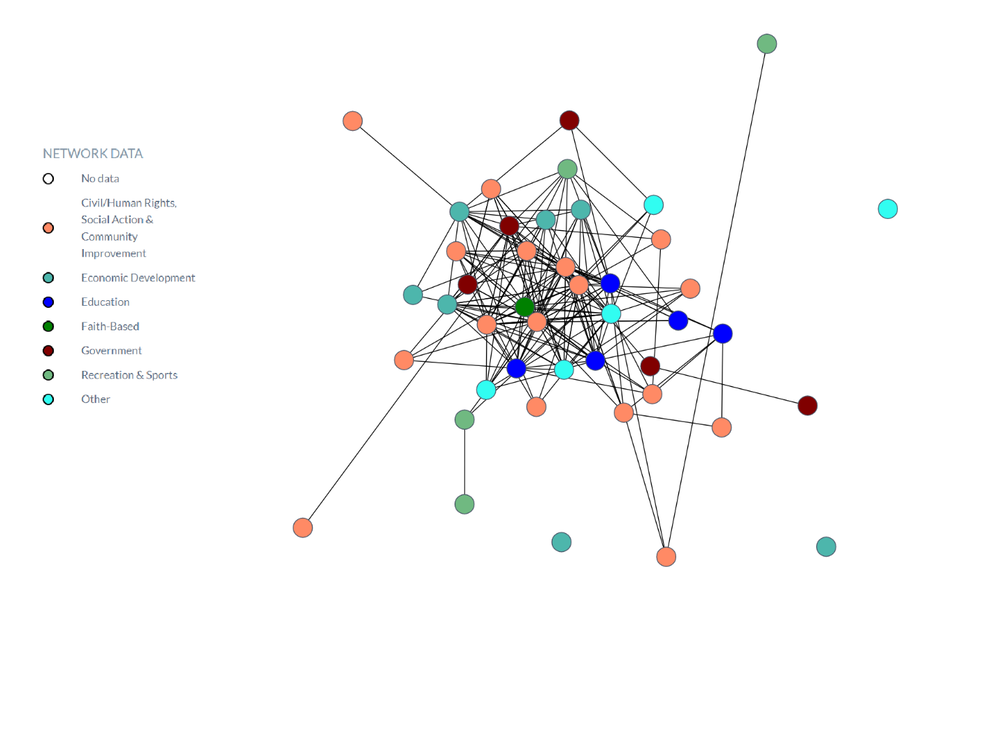
The SNA generated many maps like this, which helped the client visually see which organizations were connecting with each other and who was being left out. However, when it came to understanding what the map meant for contributing to the initiative’s success, we needed more context.
We presented these maps to the evaluation sub-committee and together we worked to make sense of the data. Some maps and insights were more relevant and inspired ideas for action based on who could be collaborating more or which two unconnected partners might work well together.
We also generated value, trust, and connectedness scores for the network as a whole and for each individual partner.
When we compared each partner’s degree of trustworthiness with how well connected they were, an interesting pattern emerged. Visualizing these results allowed us to identify partners who were highly trusted but not well connected (black dots in the graph below).
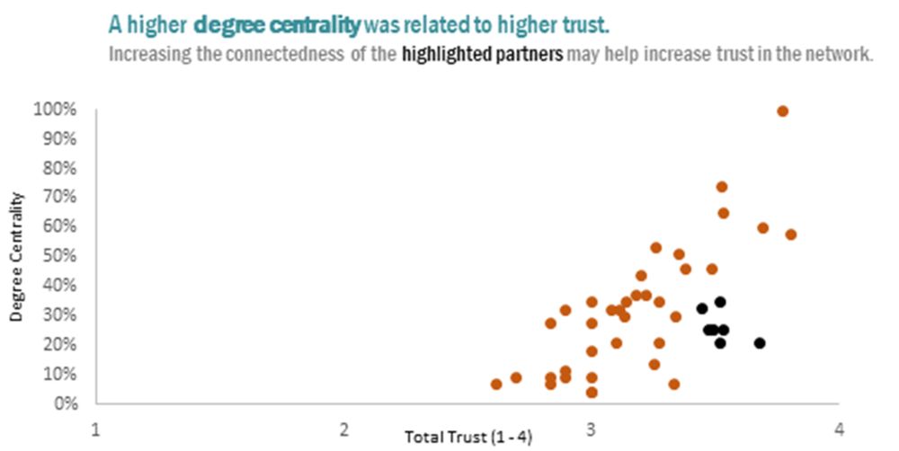
Again, it was up to the evaluation sub-committee to put these results into context, using their knowledge of the partners to decide this was an expected result or whether connecting these highly trusted but not well-connected partners was feasible and relevant to achieving the network’s goals.
In some cases, a highly trusted but not well-connected partner may only be involved in the network’s work tangentially and it wouldn’t have made sense to connect them with more organizations.
To learn more about using the results, we asked our client how the social network analysis was useful to them.
Client Perspective
About the overall experience:
“Being invited to design and create a Social Network Analysis was a meaningful experience. It was helpful to consider different variables of our network, that perhaps had only been tacitly considered – like value and trust. Or, we had considered these things, as they come up regularly in partnerships, but we hadn’t formalized the concepts or explored how they could be measured. Learning more about this was insightful and empowering.”
About visualizing the connection in the network as a map:
“Practically, I had a visual understanding of our network and saw right away that meaningful connections needed to be made between some of our partners. Having partners collaborating with us does not mean that they are collaborating with each other, or even aware of each other. We have used this insight to connect more people to [one organization], as well as linking some of our partners from the business sector into what have traditionally been agency-dominated conversations exploring food security. “
About using the trust and value scores:
“In some ways, the obvious is profound and humbling. We were well connected, in our network, but we were also shown to be trusted and valued. This was immediately encouraging and affirming, especially when considering that we haven’t always delivered, or moved forward with clarity, or met the expectations of all stakeholders.”
About using the recommendations:
“The recommendations in the final report have been very valuable and will inform strategy, especially over the next 11 months…[for example] we are working to improve our communication with partners and employing a number of different methods. We have intentionally started… to share information and to host projects and groups. It is working.”
What we Learned From Conducting A Social Network Analysis
A social network analysis must be a collaborative effort
Everyone needs to be on board with taking a collaborative approach to the project; from deciding who is included in the network and how to categorize them, to encouraging partners to participate in the survey, and understanding the data in context.
Interpret the data with the client to make it more meaningful
Understanding how groups work together requires an understanding of the context and a level of detail that an external evaluator doesn’t have. The data only became useful once we started asking the client what it meant to them. If a client isn’t willing to work through the data and generate insights and recommendations together, the SNA loses much of its value.
Your social network analysis will take time
The biggest lesson here was how much time and effort it takes to conduct a meaningful social network analysis. It takes communication and follow-up with network members to get buy-in and a high response rate on the network survey. Analyzing the results and making sense of the data must be done in conjunction with those involved in the network.
Clearly defining your network is extremely important
Without a clearly defined network, an SNA can quickly become bloated and confusing. A network should have clear inclusion or exclusion criteria and include a clear definition of the goal the network is working towards. An SNA may not be very useful when a group of organizations or people are not working towards a specific goal.
To learn more about applying evaluation in practice, check out more of our articles, or connect with us over on Twitter (@EvalAcadmey) or LinkedIn.
Sign up for our newsletter
We’ll let you know about our new content, and curate the best new evaluation resources from around the web!
We respect your privacy.
Thank you!
Síntesis de evaluaciones

Desde la plataforma BetterEvaluation comparten este post “Sintetizar datos a través de evaluaciones“, donde se presentan enfoques y técnicas con el objetivo de responder a preguntas sobre un tipo de intervención en lugar de sobre un solo caso, respondiendo a preguntas como “¿Funcionan estos tipos de intervenciones?” o “¿Para quién, de qué manera y en qué circunstancias funcionan?” La tarea consiste en localizar la evidencia (que a menudo implica búsquedas bibliográficas en bases de datos, con especial énfasis en la búsqueda de estudios inéditos), evaluar su calidad y relevancia para decidir si incluirla o no, extraer la información relevante y sintetizarla. Las diferentes opciones utilizan diferentes estrategias y tienen diferentes definiciones de lo que constituye evidencia creíble.
Opciones para sintetizar procesos y/o productos evaluativos:
- Lecciones aprendidas del proceso evaluativo: las lecciones aprendidas pueden desarrollarse a partir del proceso de evaluación a medida que los evaluadores reflexionan sobre sus experiencias al realizar la evaluación.
- Mejor síntesis de evidencia: una síntesis que, como una síntesis realista, se basa en una amplia gama de evidencia (incluidos estudios de casos individuales) y explora el impacto del contexto, y también se basa en un enfoque iterativo y participativo para construir y usar una base de conocimientos. .
- Revisión sistemática: una síntesis que adopta un enfoque sistemático para buscar, evaluar, extraer y sintetizar evidencia de múltiples estudios. (1) Metanálisis, (2) metaetnografía y (3) síntesis realista son diferentes tipos de revisión sistemática.
3.1. Metanálisis: un método estadístico para combinar evidencia numérica de estudios experimentales (ya veces cuasi-experimentales) para producir un tamaño de efecto promedio ponderado.
3.2 Meta-etnografía: un método para combinar datos de evaluación e investigación cualitativa, especialmente datos etnográficos, mediante la traducción de conceptos y metáforas entre estudios.
3.3. Síntesis realista: sintetizar toda la investigación existente relevante para hacer recomendaciones de políticas basadas en evidencia.
- Valoración rápida de la evidencia: un proceso que es más rápido y menos riguroso que una revisión sistemática completa, pero más riguroso que la búsqueda ad hoc, utiliza una combinación de entrevistas a informantes clave y búsquedas bibliográficas específicas para producir un informe en unos pocos días o unas pocas semanas.
- Síntesis narrativa textual: dividir los estudios en grupos relativamente homogéneos, informar las características del estudio dentro de cada grupo y articular similitudes y diferencias más amplias entre los grupos.
- Recuento de votos: comparar el número de estudios positivos (estudios que muestran beneficios) con el número de estudios negativos (estudios que muestran daños).
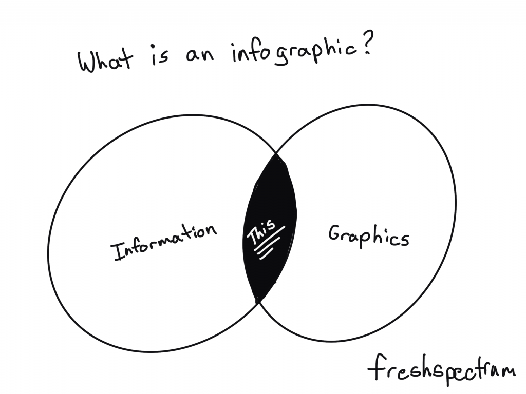
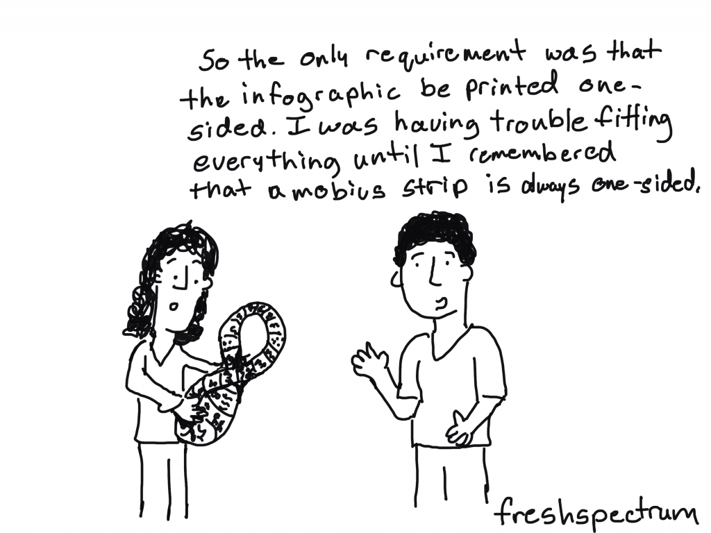
What is an Infographic?
So let’s not overthink this one.
Infographics are the result of asking graphic designers to illustrate data and other information. We can find examples across history of people mixing pictures and text to convey information. There is no singular style and an all encompassing definition is probably not all that useful.
For me, infographics are just a way to adapt a body of work (say a report or a paper) to meet the needs of a particular audience.
We live in a visual world. And visual reports are slowly becoming the norm, not an exception.
But for a lot of organizations, those fearful of stepping too far away from their normal practices, going all in on visual reporting is a lot to ask. Infographics offer a kind of stepping stone.
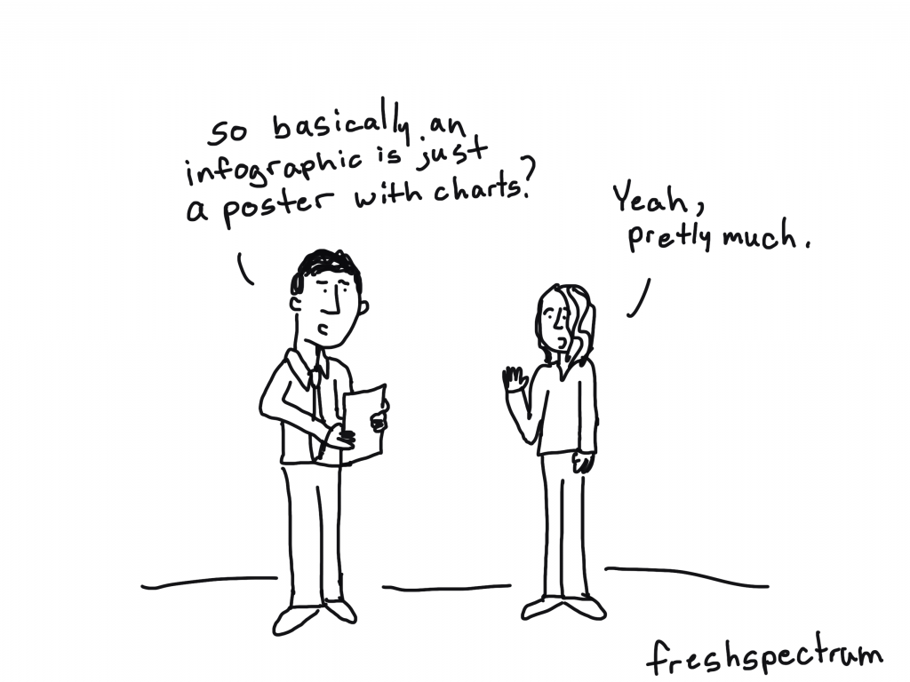
Infographic design as poster design.
The easiest way to think about an infographic is to look at it like a poster.
Posters are purposeful visual communication tools. Posters outside a movie theatre show you what’s playing. Posters outside a music venue tell you what artists are going to be appearing soon, and where else they are playing. Posters in the airport security line tell you how to prep for your turn through the metal detectors.
Yes, you can communicate some useful information. But rarely ever does a poster offer anything comprehensive. Comprehensive is just not the point. Speaking directly and efficiently to an audience is the point.
What tools should I use?
I would suggest using design tools for your infographics. Tools like Adobe XD, Adobe Illustrator, Adobe Photoshop, Sketch, Canva, or even Power Point can be used to make nice infographics.
I would avoid trying to create infographics using analysis tools or dashboard tools (like Tableau, R, or Excel). Same with word processing tools like Word. You can create infographics using anything, but that doesn’t mean you should.
Examples of Infographic Styles
Just because there isn’t one way to create an infographic doesn’t mean we have to start from scratch. There are all sorts of styles and examples on the web. The type you choose really depends on your information and your specific audience needs.
I’ll share some links where you can find good examples at the end of the post, but before that, here are some basic styles.
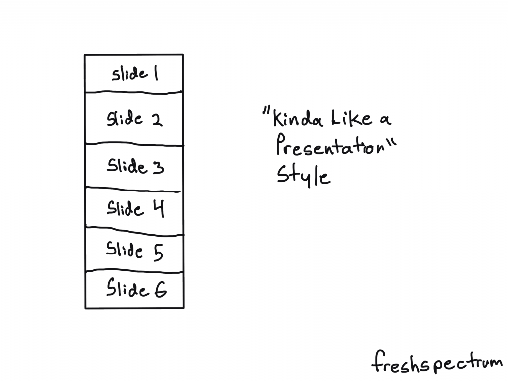
The “Kinda Like a Presentation” Infographic
These infographics used to be all the rage a decade ago. Basically you create your infographic like it’s a power point slide deck (or slide doc). Then you sequence the panels (slides) like you would with a presentation.
Just remember that you won’t be standing in front of the slides when you share it. So you want to make sure people can read it from top to bottom.
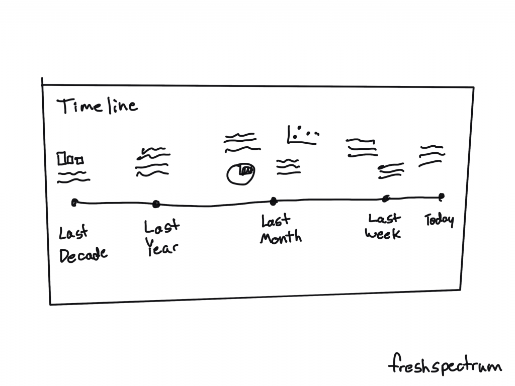
The Timeline Infographic
It’s a timeline. You annotate it with words, dates, pictures, and charts. The timeline itself provides the narrative underpinning.
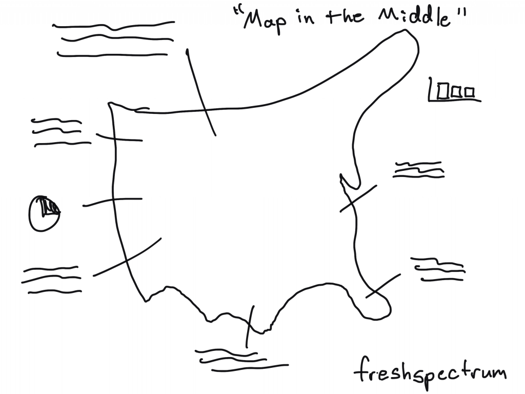
The “Map in the Middle” Infographic
It’s a map. You annotate it with words, pictures, and charts.
People like maps.
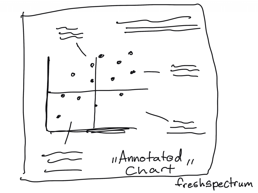
The Annotated Chart Infographic
You start with an interesting chart. Then you annotate it with words, pictures, and other charts.
This is a nice infographic if you have some kind of marquee chart to feature.
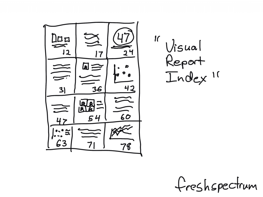
The “Visual Report Index” Infographic
This is an infographic that pairs really well with a longer report.
You just take out quotes, graphics, and charts and put them with their page number. The person reading the infographic will know exactly where to go in the report if they want to dive deeper beyond the single fragment.
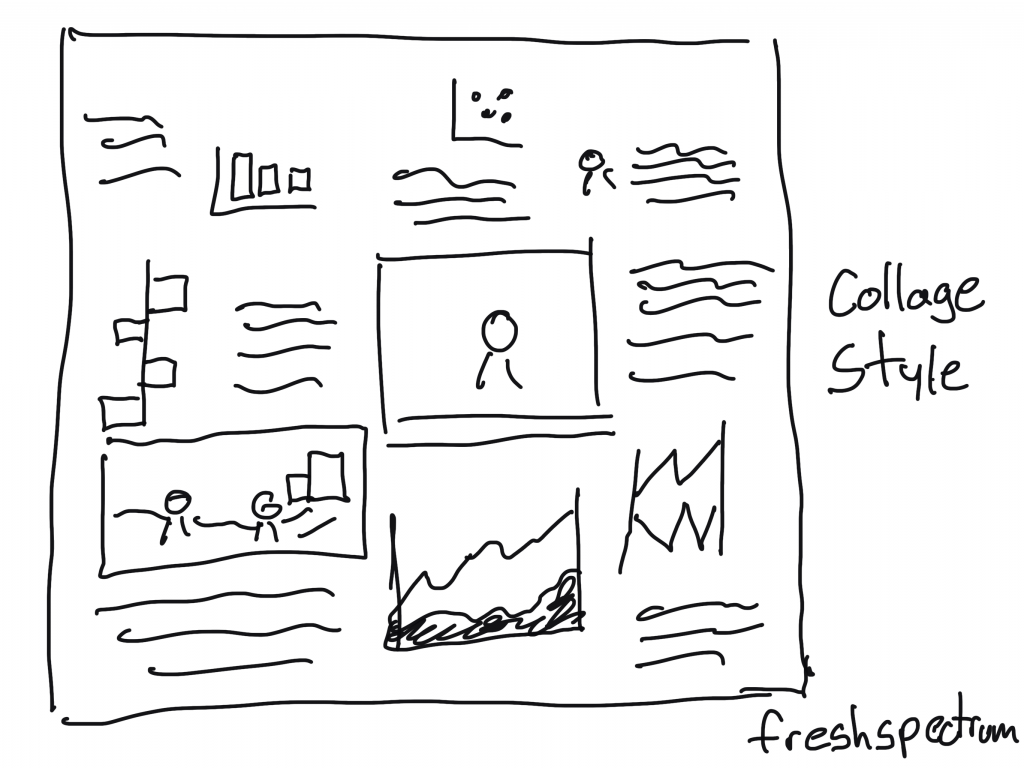
“Collage Style” Infographic
For the people really good at creating scrapbooks. You can pull together a bunch of information in the style of a collage.
The “Menu Style” Infographic.
With this style you basically just mimic a restaurant menu. But instead of pictures and descriptions of the food, you have charts and annotations.
You could also add page numbers to make index style.

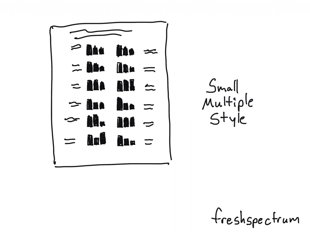
Small Multiple Style Infographic
Small multiples make really solid infographics. You just start with one chart then repeat it over and over again. For example, if you have a program with 20 sites, you create the same chart for all 20 sites then put them together on the same page.
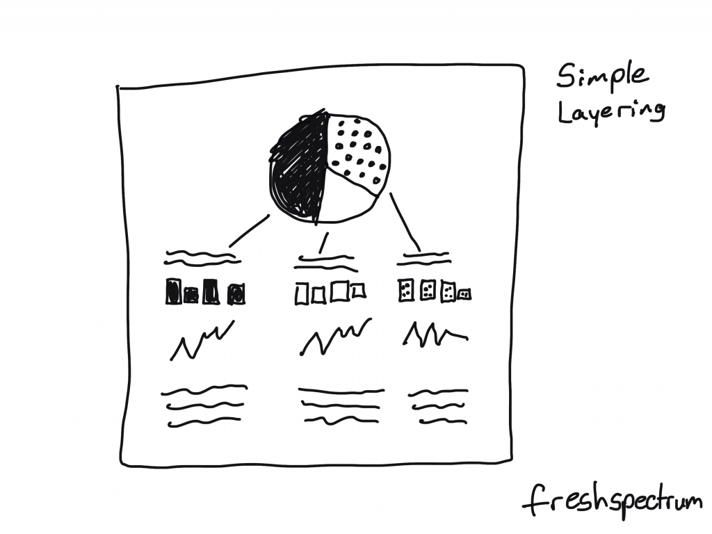
Simple Layering Infographic
Start with one chart.
Then for each of the categories shown in that first chart, you’ll create subsequent charts or share other specific information. This is similar to how you might create an interactive dashboard, showing multiple levels of data, but with an infographic you’ll just do that on one page without the required clicks.
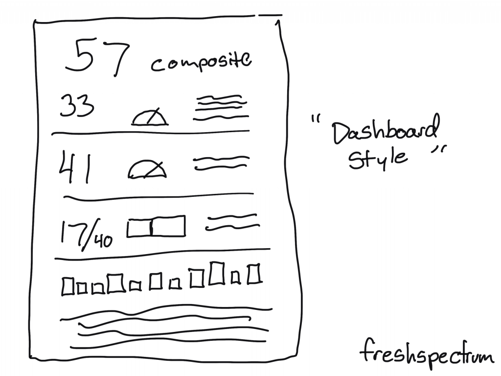
“Dashboard Style” Infographic
This is usually what I suggest when a client wants a dashboard but the data doesn’t continuously update. You create a dashboard look, but then you can release once a month (or once a year).
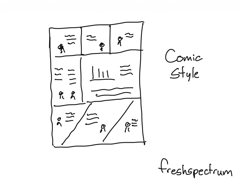
Comic Style Infographic
So for this one you create your infographic like it’s a comic or a graphic novel. I really like this approach, and not just because I draw cartoons.
Some Example Infographics
I shared a bunch of styles, but there are tons more out there. Seriously, I could have kept going on and on (diagrams, pathways, flow charts, etc.).
But instead of that, at this point you’re probably just hoping to find some links with good examples. So here you go: