• Skip to main content
  • Skip to footer
  • Home

The May 13 Group

the next day for evaluation

  • Get Involved
  • Our Work
  • About Us
You are here: Home / Archives for cplysy

cplysy

Oct 30 2020

Participatory Evaluation (Easy 4-H Example)

Written by cplysy · Categorized: connectingevidence

Oct 28 2020

La fuerza: Admitir nuestro fracaso en la respuesta al COVID

Fuente https://www.intracen.org/uploadedImages/intracenorg/Content/Redesign/Audience/policy_makers/

Es difícil para las instituciones públicas y organizaciones de desarrollo reconocer que no cumplimos con nuestras metas y objetivos; es tan difícil confrontarse a cómo la opinión pública o los financiadores reaccionarán ante tal fracaso (aunque no nos preguntamos tanto acerca de la opinión de l@s beneficiari@s de nuestras acciones). La paradoja es que hacemos todo lo posible para evitar hablar de las situaciones de fracaso, aunque (en teoría) todos sabemos que el fracaso es el mejor maestro y tenemos que estar abiertos y hablar sobre nuestros fracasos para poder aprender. Más que eso, reconocer abiertamente el fracaso es a menudo un catalizador para la innovación que hace que nuestro trabajo sea bueno o excelente.

Para abordar este enigma, necesitamos un cambio de paradigma en la forma en que la sociedad civil ve el fracaso. Esto podría comenzar con un diálogo abierto y honesto sobre lo que funciona y lo que no es así. De la mism forma que ya contamos que se propone en el sitio “Admitting Failure” para respaldar y alentar a las organizaciones a (no sorprendentemente) admitir el fracaso.

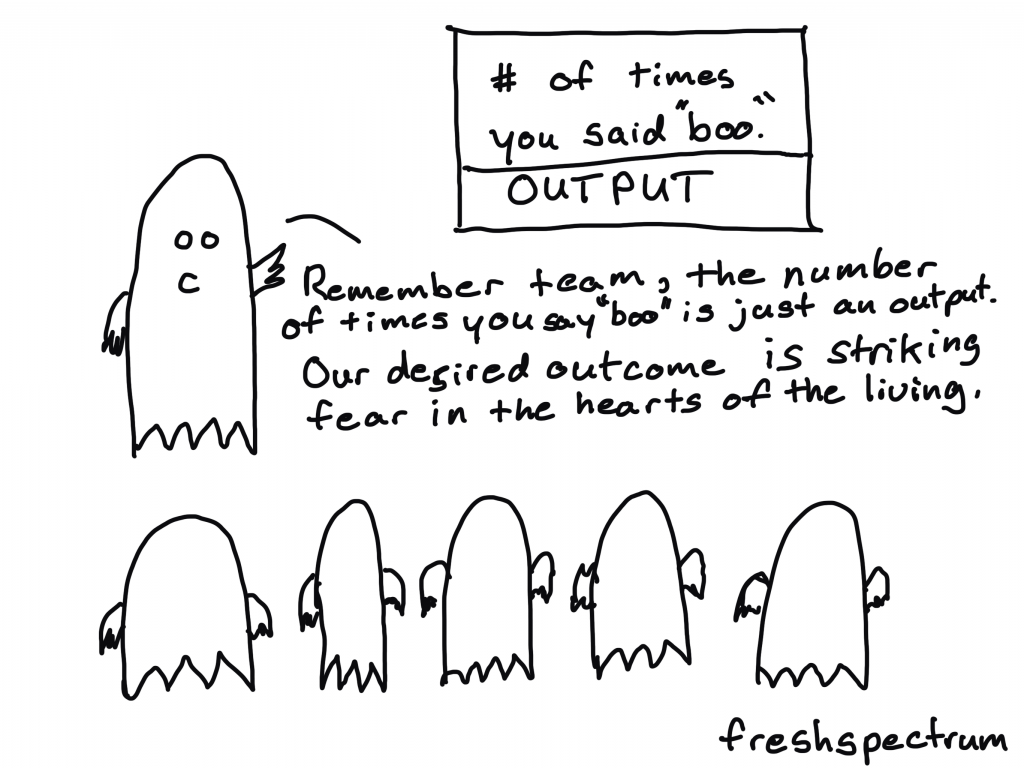
El miedo, la vergüenza y la intolerancia al fracaso llevan nuestro aprendizaje a la clandestinidad y obstaculizan la innovación.

El cambio de paradigma es así : El fracaso es la fuerza. Las organizaciones más eficaces e innovadoras son aquellas que están dispuestas a hablar abiertamente sobre sus fracasos porque el único fracaso realmente “malo” es el que se repite.

Quizás algo así podríamos hacer con nuestra respuesta al COVID, añadir tantas historias de fracaso, reconocer nuestros fracasos y, al mismo tiempo, encontrar los incentivos para cambiar, como personas y como sociedad, nuestra reacción ante ese fracaso, de cara a aprender, mejorar y terminar cuanto antes con esta pesadilla cíclica…

Written by cplysy · Categorized: TripleAD

Oct 28 2020

Practice Proximity


Six Hacks for Renovating Your Evaluation Report

Part 3

This series of posts walks you through how to reno your evaluation reports using six of Canva’s design lessons. Part 1 focused on how to take your audience on a journey using storytelling techniques. Part 2 focused on how to format your report with a consistent, cohesive look using colour and font. Part 3 in this six-part series focuses on formatting your report by grouping and spacing elements in your report to enhance readability.

In this blog series we have talked a bit already about how our brains like to consume information. In a nutshell, human brains crave visual cues – they are constantly searching for patterns to make learning easier. Let’s dig a bit deeper into human perception and explore how simply arranging elements on a page can make all the difference when it comes to engaging your audience in your report.


Gestalt Principles

Does this image look familiar? 

Picture1.png

The image above is called Rubin’s Vase; it can either be seen as a vase-like object or as two faces. The Rubin Vase was made famous by Gestalt psychologists. Gestalt psychologists are known for their research that attempts to understand perception and how the human eye perceives visual elements. In fact, they have come up with a number of principles that describe how the human eye perceives visual elements. Gestalt principles explain how our eyes perceive shapes as a single, unified form rather than separate elements. Rubin’s Vase is an example of that – our brains tricking our eyes into perceiving interesting wholes out of seemingly meaningless individual elements. The figure below illustrates the Gestalt principles. The principle we are going to focus on in this article to create more accessible, readable reports is, you guessed it, proximity!


The Principle of Proximity

The principle of proximity states that objects that are close together are perceived as a group. The shapes of the left appear to have no relation, but when we organize them together, they are no longer viewed as separate objects but groupings. We can easily leverage this principle in our reporting by 1) grouping like things together, and 2) embracing white space. Let’s take a look at how we reno’d a recent report using proximity principles. 

Screen Shot 2020-10-27 at 1.21.23 PM.png


Grouping Like Things

Reports are often comprised of text. Grouping text is best done through sensible paragraph use – one topic with one objective to prove. Below are two images from a recent report we drafted.

The image on the left shows the initial draft of a recent report where we dumped a bunch of text onto the page as part of our writing process. When we went to format the draft, we took that text and used the proximity principle to separate the text into three topic areas. As discussed in the last article, headings help with readability; however, even without the headings you can see the grouped text in separate paragraphs helps our reader understand that the information grouped together is similar but different from the other paragraphs.  

Screen Shot 2020-10-27 at 1.22.07 PM.png

The image on the right also illustrates how call out boxes can be used to delineate information by grouping it to one area of a page. We wanted our readers to know the questions we asked participants and so we grouped the questions in a call-out box and then grouped each question together in a bullet within the call-out box. By grouping the questions together into a bulleted list, readers can easily identify each question as opposed to including them in a paragraph above.

In addition to describing the most significant change (MSC) methodology we wanted to show how we implemented it. The image below illustrates our MSC process. You can see that we didn’t use borders around the steps or lines connecting the descriptions to the steps. We didn’t need to clutter up the illustration with those elements because we used the proximity principle. Our eyes can look at the groupings of text on the right and see that they are separate steps because they are separated by space.

Picture4.png


Embracing White Space

The second way to practice proximity is to embrace white space. We want to practice proximity, but not to the point where we group too many things together and end up with a busy report. White space is your counterbalance to report busyness; it is the areas between the elements on a page. When I open a report and there are pages and pages cramped with text, graphs and other items, I want to close it as quickly as I opened it. I get the same feeling when I enter a room full of furniture, pictures and other clutter – overwhelmed and wanting to leave. White space creates the visual breathing room your audience needs to capture and hold your audience’s attention.

Picture5.png

Creating white space is perhaps one of the easiest but most effective ways I use to format a report. The following images show the same report described above. The image on the left shows the original page from a draft of the report. You can see there was a lot going on.

The two pages below illustrate how we infused some white space to simplify how the same information was communicated. It can sometimes add length but since it helps to engage my audience I make that trade-off every time.

Picture6.png


Take a look at some of the reports you are creating. Are there opportunities to practice proximity? Try it out and make sure to stay tuned for the fourth article in our six-part series, “Make it pop” where I show you how to highlight the most important takeaways in your report by playing up differences.

Article thumbnail image source: Canva


Sign up for our newsletter

We’ll let you know about our new content, and curate the best new evaluation resources from around the web!


We respect your privacy.

Thank you!


Written by cplysy · Categorized: evalacademy

Oct 28 2020

Halloween Cartoons 2020 Edition

Happy weirdo 2020 Halloween everyone!

Mask Wearing Monster

Which one is really the monster?

Also, it’s hard to remember to cover the nose when drawing cartoon characters with masks.

A boo is an output

Not sure how many output/outcome cartoons a single illustrator needs to draw. But here is another seasonal version.

Oh no, we only have output data!

You know, I could probably do a whole book just riffing on outputs and outcomes. It would likely not be that good, but when has that ever stopped anyone.

The candid conversation Dr. Frankenstein needed.

So I read the original Frankenstein for the first time last week.

Couldn’t help but think things would have gone way differently if Dr. Frankenstein had chosen to work with an evaluator before creating his monster.

It’s Alive! Alive!

Thinking about Frankenstein’s work as if it were a program made me think about the kickoff meeting.

Been a little preoccupied this year.

This might not come as a surprise, but to be clear, I am one of those optimistic but anxiety-filled democrats you read about in the papers.

Yes, 2020 is scary.

But I think it would be much scarier if we didn’t see any real positive changes as a result of our collective experiences.

Coming in 2021?

As an aside, this seems like a real missed market opportunity.

ALL the Cartoons

So I just put a post up for all of my Patrons. In post there is a dropbox folder.

In that dropbox folder there are around 2,500 cartoons and illustrations. Pretty much everything I’ve drawn in one place (good, bad, published, unpublished).

Now is not a bad time to become a Patron of mine. Not only do you get access to ALL the Cartoons, join at even the lowest level and you’ll also get put into a drawing for an autographed copy of my book.

And at the higher levels, no drawing necessary, I’ll just send you the book.

Written by cplysy · Categorized: freshspectrum

Oct 27 2020

Listening to What Data Users *Say* They Need… but Giving Them What They *Actually* Need

I recently had the chance to talk with Zach Bowders on his podcast, Data + Love. Zach is a data analyst, a Tableau Public Ambassador, and passionate about data visualization and data storytelling.

We sat down at night after our kids were in bed (8 pm for Zach and 9 pm for Ann!) and talked about how to distinguish between IT and data professionals, how to narrow what users *actually* need, understanding your audience and how to speak up when data isn’t useful.

Watch Our Conversation

Listen to the Podcast

Prefer to listen? Download the episode here. 

Distinguishing between IT Professionals and Data Professionals

We discussed an idea Zach brought up in a previous podcast: The difference between a traditional IT role and a data professional.

Those working in the traditional IT role typically receive instructions or a request. Let’s pretend they’re being asked to make a dashboard. Sometimes it’s a specific request with lots of planning, and you can tell the person making the request really thought things through. They might’ve even requested a specific chart type, like “Make a bar chart about xyz topic.”

Those working as a data professional also might receive those requests. The value-add of the data professional is that you’re supposed to push back a little bit. Professionally and respectfully, of course. You read between the lines of what’s requested and then give them what they actually want and need. The value you can add is to ask more questions and dig deeper. You might ask what the data’s going to be used for and what types of actions will be taken based on that data.

Zach added, “A data professional is not more skilled than the IT worker. It’s not to say one is better than the other, just that they’re different roles.”

“You could easily put together something that is technically correct and absolutely worthless,” he explained.

Designing Three Dataviz Ideas to Narrow Down What Users Actually Need

Here’s what I recommend:

  • You listen to the request for data. You’re listening, you’re nodding, not interrupting, asking clarifying questions.
  • You come up with three ideas. I call these “ideas,” not “makeovers.”
  • Idea #1: The original.
  • Idea #2: Slightly different.
  • Idea #3: Very different. (This is usually the winner, and what people actually need).  

For example, I recently worked I worked with a transportation agency. Their original graph was a pie chart with seven or eight slices representing their revenue sources. It was 3D, had a separate legend, and used tiny font… All of the usual challenges.

Here are the ideas I presented to them:

  • Idea #1: An easier-to-read pie chart. We developed a pie chart with one dark slice and the rest grayed out. We also used direct labels in lieu of the separate legend.
  • Idea #2: A bar chart to make it easier to compare each revenue source.
  • Idea #3: An icon array focusing on how one-third of their revenue comes from ticket sales.

Understanding Who Your Audience Is

Zach and I both agreed that understanding your audience is paramount.

“One of the things I find most important in terms constructing a data viz is your understanding of who the audience is – who is this for?” Zach said. “Because if you don’t know who it’s for, it has to be for everyone. And if it’s for everyone, it’s really for no one. It’s impossible to satisfy all audiences, to bridge all gaps.”

Zach said that people been pictorially expressing ideas for a very long time and that a big part of the process of taking something visual and explaining it to someone is the idea of closure. He explained that, “In the sense that in everything you create, there’s a silent partner that you have (a second creator) which is the audience. So, when you’re constructing your visualization, you and the audience are both pouring meaning into it. You’re not always going to be able to stand next to it, hold their hand and explain exactly what it means.”

He went on to share an example about a grocery store aisle with two-liter bottles. You can see part of the image on each one but you can’t quite see what they are. But it’s enough from your life experience to put together, “Oh! It’s a row of Pepsi logos.” You don’t see a single complete logo, but you can take the incomplete thoughts and knowledge of grocery stores to figure out what it is.

Zach said that this is true of when you’re working on a data visualization project. The people at the organization you’re working with have an understanding of their organization and their data, but also in terms of visual language in general. 

He said that the better you can understand their level of literacy, confidence, and competence with the data, the better you can leverage their own creative ability that they’re bringing to it to figure out what you don’t need to say.

“Part of it is, what you need to bring to it. And the other part is, what can you leave out?” said Zach. “If you’re working on some geographic data and people are wanting to know what sales look like for the United States, what’s the real question they’re asking? Do they really want to see all 50 states? They may, and that may be valid, but if they’re really wanting to see the winners to losers, you may be able to get away with two bar charts showing the top five and bottom five states. That might be exactly what they need. The temptation would be to show all 50 states. They don’t need that. They know there’s 50 states. You don’t have to remind them of that. For the most part, you can leverage many of those ideas as use them as a silent partner to help you get your ideas across better.”

Technical vs. Non-Technical Audiences

One of the most important things to understand about your audience, is not just their titles or roles but whether your audience is technical or non-technical.

A technical audience is people who love data and want to dig deeper into it (both inside and outside of work). They love decimal points and tables. Data isn’t a chore for them. In my experience, this is about 1% of the population.

About 99% of the world is likely non-technical. They don’t like data, find it to be a chore, and would rather do something else. They’re very smart, highly educated, and hard-working, but they have a skill other than data.

If you can identify which you are and which your audience is, you can then recognize when there might be a difference. This helps you determine the right chart type and the right dissemination format. Whether your audience is technical or non-technical informs all design decisions.

Connect with Zach Bowders

Data + Love Podcast: https://www.buzzsprout.com/739517

Twitter: @ZachBowders

Written by cplysy · Categorized: depictdatastudio

  • « Go to Previous Page
  • Go to page 1
  • Interim pages omitted …
  • Go to page 223
  • Go to page 224
  • Go to page 225
  • Go to page 226
  • Go to page 227
  • Interim pages omitted …
  • Go to page 304
  • Go to Next Page »

Footer

Follow our Work

The easiest way to stay connected to our work is to join our newsletter. You’ll get updates on projects, learn about new events, and hear stories from those evaluators whom the field continues to actively exclude and erase.

Get Updates

Want to take further action or join a pod? Click here to learn more.

Copyright © 2026 · The May 13 Group · Log in

en English
af Afrikaanssq Shqipam አማርኛar العربيةhy Հայերենaz Azərbaycan dilieu Euskarabe Беларуская моваbn বাংলাbs Bosanskibg Българскиca Catalàceb Cebuanony Chichewazh-CN 简体中文zh-TW 繁體中文co Corsuhr Hrvatskics Čeština‎da Dansknl Nederlandsen Englisheo Esperantoet Eestitl Filipinofi Suomifr Françaisfy Fryskgl Galegoka ქართულიde Deutschel Ελληνικάgu ગુજરાતીht Kreyol ayisyenha Harshen Hausahaw Ōlelo Hawaiʻiiw עִבְרִיתhi हिन्दीhmn Hmonghu Magyaris Íslenskaig Igboid Bahasa Indonesiaga Gaeilgeit Italianoja 日本語jw Basa Jawakn ಕನ್ನಡkk Қазақ тіліkm ភាសាខ្មែរko 한국어ku كوردی‎ky Кыргызчаlo ພາສາລາວla Latinlv Latviešu valodalt Lietuvių kalbalb Lëtzebuergeschmk Македонски јазикmg Malagasyms Bahasa Melayuml മലയാളംmt Maltesemi Te Reo Māorimr मराठीmn Монголmy ဗမာစာne नेपालीno Norsk bokmålps پښتوfa فارسیpl Polskipt Portuguêspa ਪੰਜਾਬੀro Românăru Русскийsm Samoangd Gàidhligsr Српски језикst Sesothosn Shonasd سنڌيsi සිංහලsk Slovenčinasl Slovenščinaso Afsoomaalies Españolsu Basa Sundasw Kiswahilisv Svenskatg Тоҷикӣta தமிழ்te తెలుగుth ไทยtr Türkçeuk Українськаur اردوuz O‘zbekchavi Tiếng Việtcy Cymraegxh isiXhosayi יידישyo Yorùbázu Zulu