• Skip to main content
  • Skip to footer
  • Home

The May 13 Group

the next day for evaluation

  • Get Involved
  • Our Work
  • About Us
You are here: Home / Archives for cplysy

cplysy

Jun 04 2020

Evaluation as Protest

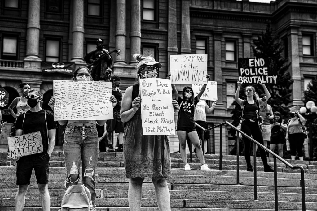
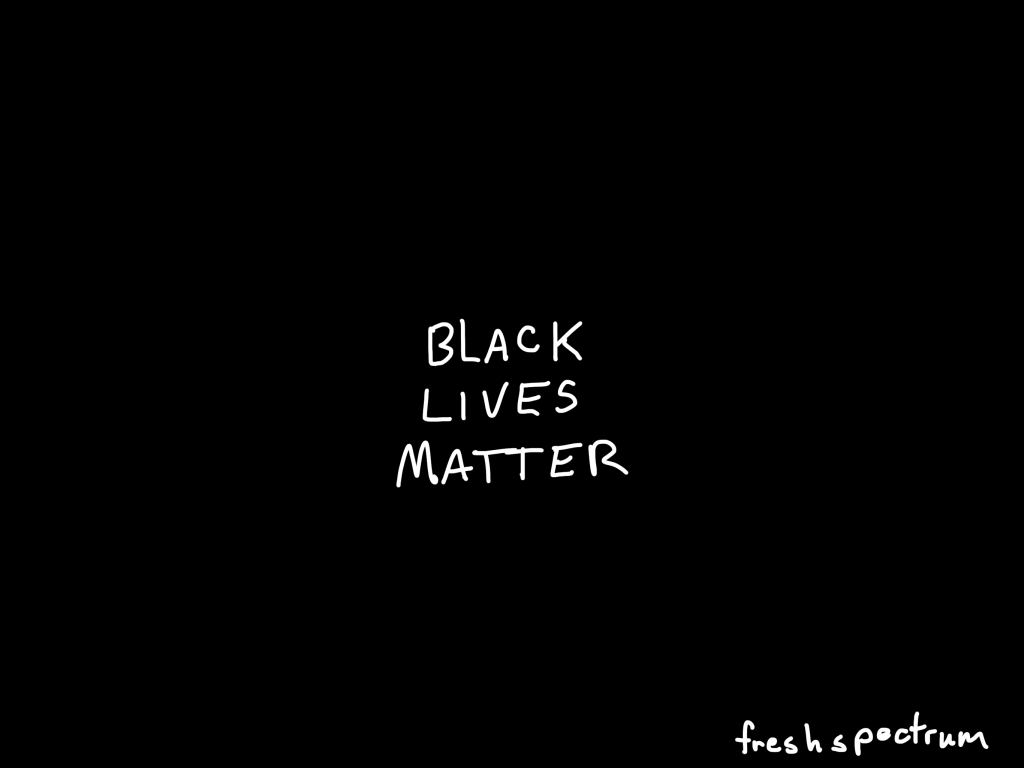
Ahmaud Arbery. Sean Reed. Breonna Taylor. Tony McDade. George Floyd. When does this racial terror end?

For the past three months, our communities have been inundated with painful stories and images of Black people targeted, harassed, arrested, and killed by police and racist vigilantes. As Black people all across the country grapple with the aftermath of an unprecedented global pandemic, somehow Black people also have to figure how to stay alive while jogging, buying groceries, and yes — even while sleeping.

Color of Change – State of Emergency: End the War on Black people!

It should never have taken this amount of publicly shared violence to engage white people like me in active anti-racism. I appropriately sit with that discomfort thinking of moments across my life where I could have, and should have, said something or done something to show opposition.

I know I am not alone, and many of my dear readers are thinking the same. I’ve spent the last week signing petitions, following up with friends, donating to anti-racist causes, and calling out racist posts from extended family and childhood friends. Going to facebook for me is like visiting my hometown and feeling uncomfortable in the overwhelming whiteness. I hate it, but burying it deep within and pretending it’s not a part of me won’t make it go away.

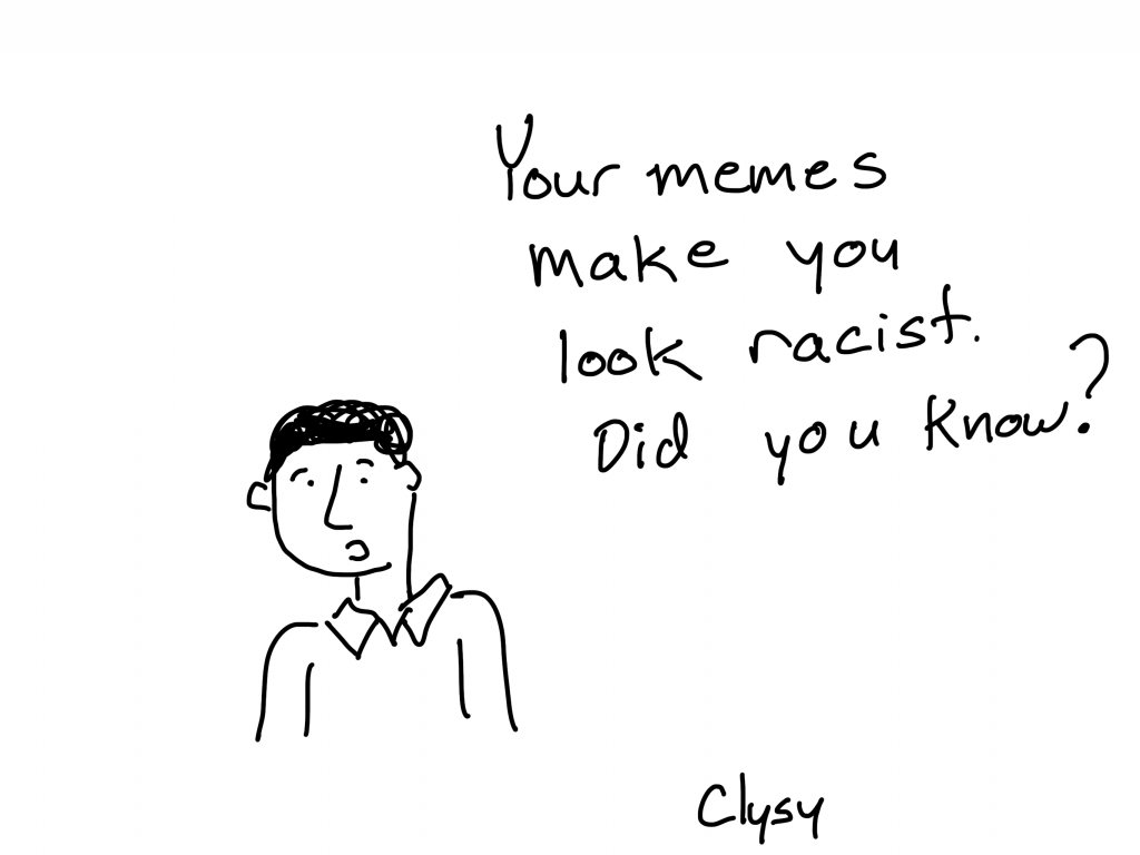
<Someone’s comment on my comment> Calling someone or something racist, is the last resort of an idiot.”

<My response> in my defense, it was my first resort to call the string of racist memes racist.”

Excerpt from a recent comment conversation I had on Facebook. Basically I called a cousin out on a string of racist memes he was sharing, then had an opportunity to exchange pleasantries with him and his friends…

But as my wife and I sat discussing what we could do to be better allies and accomplices, I started to think about how we could embrace our evaluation skill-set to support anti-racism efforts in a systematic and practical way.

So that’s what this post is. It is a brainstorm on action-oriented contributions. It’s not complete, so if you would like to add your own thoughts, please do.

I offer these observations as one human clinging onto her hopes for humanity.

I invite each of us to remember and unleash our humanity in the work we need to do to make us worthy of this planet and each other.

My simmering rage both fuels and exhausts me. It keeps me alive with a deeper level of understanding in my body and in my soul not just in my head of what is at stake: Everything.

Jara Dean-Coffey from her post on the Equitable Evaluation Initiative website: Embodied Knowledge: Simmering Rage | A note from Luminare Group Founder & EEI Director

To my BIPOC readers, colleagues, and friends.

I pledge to be a supportive ally and accomplice.

Your life matters. Your family’s lives matters. Your friend’s lives matter.

This is no little problem that will away go away when things “return to normal.” The evidence of inequality between BIPOC and white members of this country is pervasive a deep.

I am nowhere near perfect, but I will always listen. Even if the conversation is hard.

Reminder: check on your Black friends, family, colleagues, and students. We are not ok. A few have asked me what could/should this look like? Be honest, be vulnerable, be compassionate. Here are screen shots of an email I sent to my students and colleagues of African descent. pic.twitter.com/KVVJayflDi

— Ayesha Boyce (@AyeshaBoyce) June 1, 2020

My digital office door is always open. I usually say that I offer one 30 minute consultation for free. But that’s pretty much bunk, we can chat longer and it could be more sessions.

In other words, if you ever want to chat, I’m here. And I’m not going to try to sell you on anything. But I can make a pretty good thought partner.

Things I’m particularly good at for thought partnering:

  • Coming up with digital strategies.
  • Designing digital training programs.
  • Evaluating digital efforts.
  • Actionable data reporting.

Breaking the Cycle

It’s not a new problem.

It’s just being caught on tape.

Breaking the cycle starts with understanding that a cycle exists.

What is James Baldwin thinking more than 50 years after this interview, which could be written today? (You will notice that nothing I post anywhere in my own words started with me–it is common knowledge among BIPOC thinkers and writers and artists. White investment in individualism means that white leadership always tries to individuate themselves from these repeated patterns of behavior–they are somehow different–even when they demonstrate the documented behavior.)

A post from Vidhya Shanker on LinkedIn.

Working within the Evaluation Guiding Principles

You want to know something neat about being evaluator. Most of the time we work for a client who is paying us to evaluate a program or activity. Or we work for an agency that is paying us to evaluate a whole set of programs or activities. The majority of the time, we receive compensation for our work.

But if you read our guiding principles, you’ll see very little specifically connected to how we serve our bill-paying clients. Our client is only one part of the broader stakeholder groups we serve.

You don’t need a client to evaluate a program and deliver professional services. You just need stakeholders.

So why not use our skills as evaluators to systematically evaluate programs as we strive to contribute to the common good, regardless of whether or not the targeted programs have requested our services.

We just need stakeholders.

Short Version of the AEA Guiding Principles

A. Systematic Inquiry: Evaluators conduct data-based inquiries that are thorough, methodical, and contextually relevant.

B. Competence: Evaluators provide skilled professional services to stakeholders.

C. Integrity: Evaluators behave with honesty and transparency in order to ensure the integrity of the evaluation.

D. Respect for People: Evaluators honor the dignity, well-being, and self-worth of individuals and acknowledge the influence of culture within and across groups.

E. Common Good and Equity: Evaluators strive to contribute to the common good and advancement of an equitable and just society.

Stakeholders – individuals, groups, or organizations served by, or with a legitimate interest in, an evaluation including those who might be affected by an evaluation.

Full Version AEA Guiding Principles [PDF]Download

Sharing Evidence to Guide Practice

I get asked a lot for best practices in evidence sharing. Organizations that do a good job of sharing data in an actionable format.

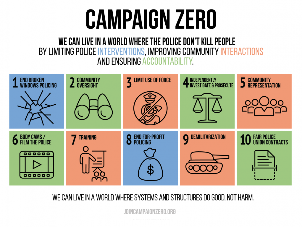
Campaign ZERO’s website is that (JoinCampaignZERO.org). This is information design at its best. If you have data and evidence to share that you hope could become actionable, I suggest treating this site as a blueprint for how it’s done.

My favorite page on the site is the solutions page. Here is how it’s structured.

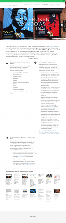
  • It starts with a quick overview and index. The visual is a breakdown of 10 individual solutions (which are color coded into 3 different mega-categories).
  • Clicking on individual solution categories will take you to individual solution focused-pages. But all information is also shared by scrolling down. This allows you to link to and share individual solutions, but also to lazy scroll through everything (IMPORTANT for digital engagement).
  • As you scroll down through the solutions you are aided by a simple bullet point sidebar menu for quick jumps.
  • Each solution section starts with an image (IMPORTANT for digital sharing and reader orientation).
  • An intro paragraph gives a summary, equipped with a soundbite style data point (AWESOME for Social Sharing).
  • Individual Solutions are Icon Illustrated. Supporting examples and evidence are linked.
  • The section ends with linked research. It features a high authority source mix of news/magazine articles and journal articles. All research is accessible by clicking (and not hidden behind academic paywalls).
  • And finally, the whole site is built on SquareSpace. You don’t need a super expensive custom developed website to share data and evidence.

Campaign ZERO was developed with contributions from activists, protesters and researchers across the nation. This data-informed platform presents comprehensive solutions to end police violence in America. It integrates community demands and policy recommendations from research organizations and President Obama’s Task Force on 21st Century Policing. Together, we will win.

The Campaign Zero Planning Team (a.k.a. amazing people you should really follow on Twitter):
@deray, 33, is a protestor, dedicated to ending police and state violence.
@samswey, 29, is data scientist who leads the development of research, digital tools and platforms to end police violence and systemic racism in America.
@MsPackyetti, 33, is a St. Louis native raised in a tradition of social justice.

Localizing Critical Data

You can compare your city/state and download the full database at MappingPoliceViolence.org

I want to mention two more sites from the same team who brought us Campaign Zero.

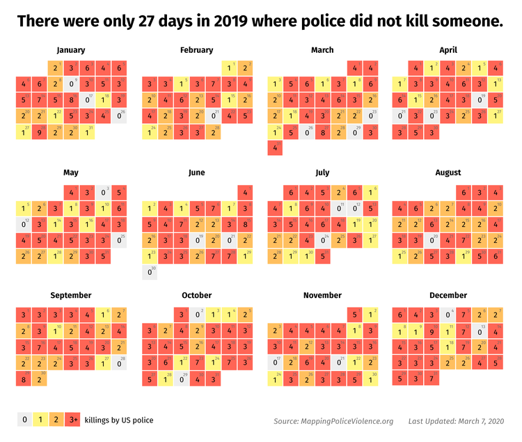
The first is MappingPoliceViolence.org

This site uses secondary sources to map police violence across the country. The data combines products of crowd-sourced sources with original research to paint a picture not currently shared by law enforcement agencies. The methodology is fully transparent and the full database is available for download.

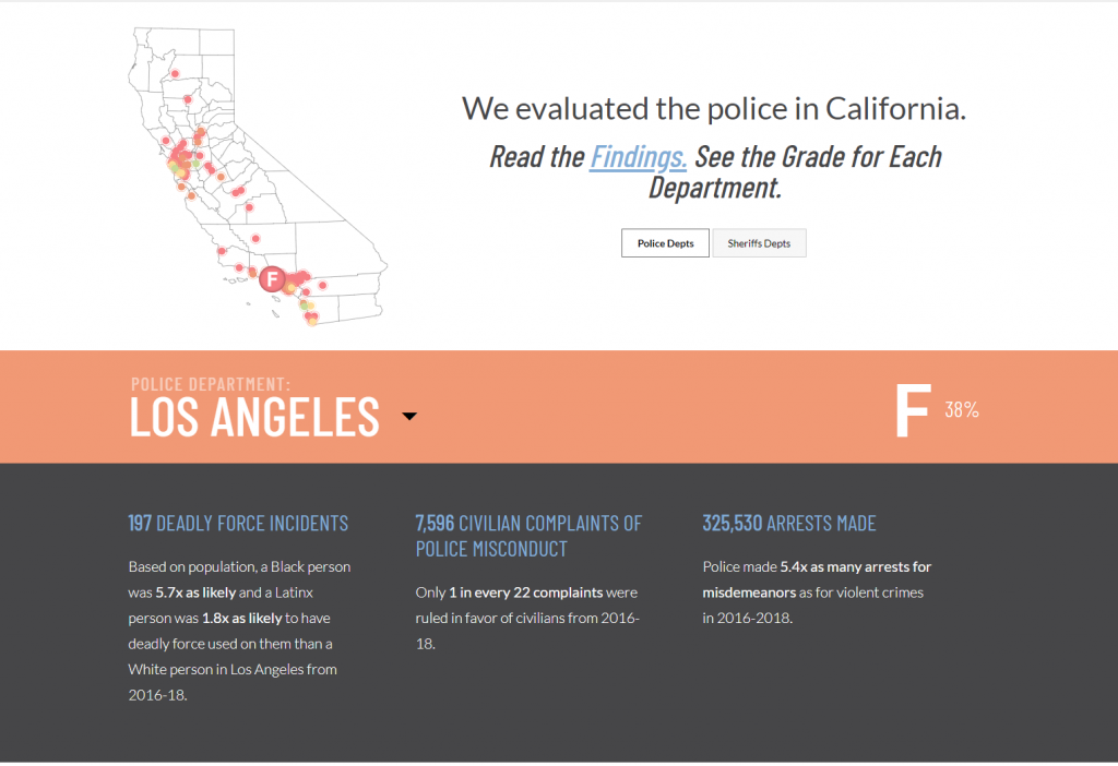
The second is PoliceScorecard.org

The Police Scorecard provides a deep dive into the actions and policies for police forces in California. The score card, which grades individual police departments, is systematic and transparent in its evaluative approach. The overall mission is to expand the work nationwide.

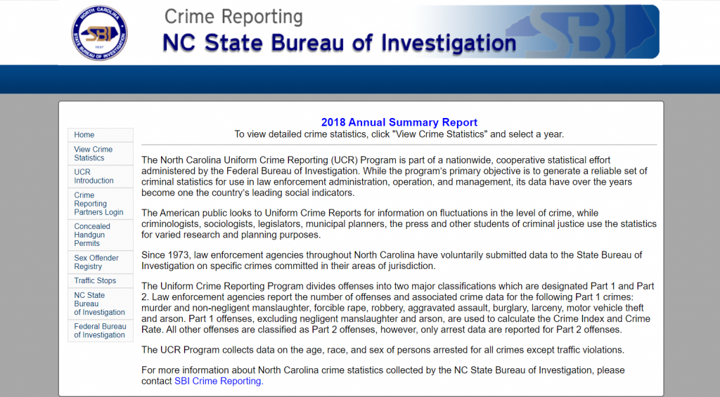
Crime data is collected and reported much in the same way as it has for the last two decades. Seriously, not an overstatement. In the year 2000 I was a criminology major in undergrad. Looking at the Uniform Crime Reporting data and the National Victimization Crime Survey data creates flashbacks to my college days.

Sites like Mapping Police Violence exist because our current national data systems do not answer important evaluative questions in a meaningful way (if at all).

Ask some questions and try to find the answers. You shouldn’t need a Masters and two decades of data experience to find them. We also can’t wait for the bureaucracy to get their data act together.

Start local. Find the answers. Share the answers.

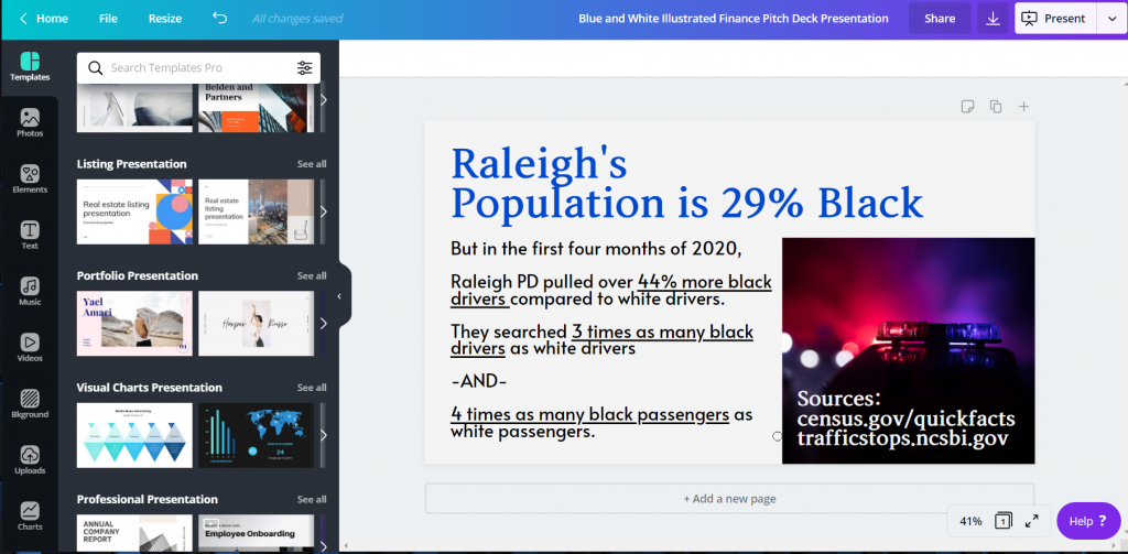
Break down the cryptic national data and put it into local context. Then working with social justice organizations in your area, share the data in a digestible format. Here are some examples of questions that should be easy to answer, but often are not.

  • What police departments exist in your area?
  • Is the police department demographically representative of the local area?
  • Has the police department been involved in a shooting?
  • Is there evidence that suggests racial profiling in arrests?

Adapting Data for Social Sharing

How many clicks does it take you to find the data you want to find?

Lots of potentially useful data gets buried in poorly designed public websites and warehouses.

But if you are the kind of person who can adapt this information into useful guidance, it’s worth time and effort to explore these public sources. Yes, it would be great if our public organizations prioritized useful dissemination efforts. But we can’t wait for that happen.

Here is one way you can take data you find and adapt it into a useful format.

  • Think of an audience you would like to reach. For example, a local mayor’s office or county executive.
  • Think of a finding you believe might influence or move them to action.
  • Find a simple template in Canva for a social media post or presentation.
  • Create an image that shares data for that specific audience. Annotate that data, mention the audience and others who you believe could help the chart reach its intended target.

Rubric Supported Digital Content Analysis

In the modern era, websites and social media streams are the digital manifestations of a police department’s strategy. You “should” be able to find quite a bit about the policies and overall composition of an agency through reviews of publicly available information.

A scroll through a website is not a bad place to start deciphering a department’s strategy. But as an evaluator, you can do it systematically.

Create a basic rubric. It could be as simple as a list of questions you have about the department’s policies. (Such as, does this police department employ the use of body cameras or does it train on de-escalation techniques?). Then systematically go question to question, sourcing the specific answers as you go. Also rate based on the completeness of the answers (such as answered, partially answered, incomprehensible, or no information provided).

You could then take a further step, sharing your findings with the police department and asking them to fill in the blanks. Or you could report as it is, since complete or not this is the public face of the department.

Wondering what you might want to review? Building off the work of others is always the best place to start when available. Again I will advocate for Campaign ZERO.

Modeling Systems of Oppression and White Supremacy

Evaluators love logic models.

But for the most part we tend to develop models based on program activities designed to bring positive change.

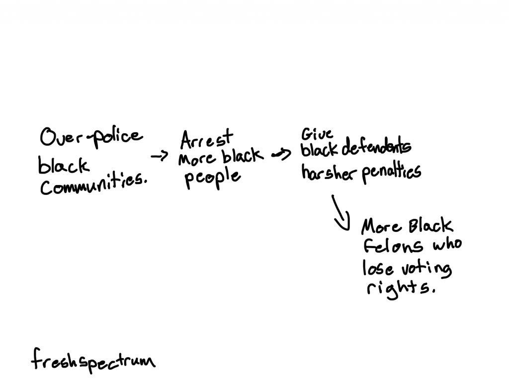
But what if you believe that the system is not broken and in need of a fix. It’s working exactly as designed (to help the rich grow richer and maintain white supremacy).

Therefore the working systems of oppression need to be broken.

Use the skills you have to model white supremacy. Instead of creating a theory of change, develop a theory of oppression. Understanding how our systems and societal structures perpetuate inequality and maintain white supremacy is a step towards breaking the harmful causal mechanisms.

Systematically Documenting Community Stakeholder Experience

The world is complex.

One way to jump into that is to develop super sophisticated, and often utterly confusing, diagrams or algorithms in an attempt to map out our analyze through the complexity.

But an easier way I find is to put a focus on the stakeholders of interest. Tell the story of a person showing how they navigate a system you are trying to change. Then do it over and over, with different people.

Be intentional, and systematic. Document your approach and your methods.

For instance, what if you started with a black male high school sophomore with college aspirations. Given his age and home life, start pulling together the descriptive data on outcomes and challenges.

Think through current events. What is the likelihood that he would join his peers in a local peaceful protest near a downtown church? Then maybe face tear gas and rubber bullets as the police attempt to clear the path for a presidential photo opportunity.

Human lives are complex. Stories are data.

Single stories can be powerful. Collections of stories built systematically over time integrating numbers, images, and video can be hard to ignore.

With cell phones everywhere, more individual stories are coming to light. Reporters report and move on, it’s the way their field is designed. But as an evaluator, you can collect and synthesize.

Evidence Supported Political Activism

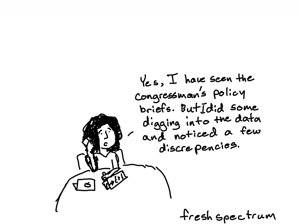
You can, and should, be in touch with your political representatives.

Let them know what you think.

But if you want to strengthen your argument. Bring data to your calls, to your emails, to your tweets, and your comments.

What other ways do you think we can leverage our skills as evaluators to support anti-racist actions?

This was all just a brainstorm. There is so much more we can do. Would love to hear your thoughts.

Written by cplysy · Categorized: freshspectrum

Jun 03 2020

Evaluation for Change

Change is everywhere it seems and while it can be said it is the only constant what we are seeing is an increase of change on a massive scale.

However, as the protesters across the United States, Canada and beyond are making clear: there is a big difference between talk of change, the process of change, and the outcome of change efforts. Evaluation can be a powerful tool to help us distinguish these things together as they can be conflated too easily.

Here are three things to consider when seeking to make these distinctions that can be applied anytime, but become more salient when focused on large-scale change efforts where much is happening simultaneously.

Document your baseline

A baseline is a starting point and while it would be great to have data from yesterday, if we are seeking to gather change-related data today that means this is your baseline. Too often baselines are forgotten because any effort to measure or track change needs to answer the question: change in relation to what?

How? Pick the most convenient, proximate moment to gather data. Aim to capture descriptive data of what is happening, time data (see below), and also any numerical aspects of the phenomenon you can. These can be such things as cases of something, number of participants involved, descriptions of the current situation. From this, you can later build a backstory that can help lead to the present moment.

For example, George Floyd was arrested and killed by a police officer on May 25, 2020. It is possible to use that as a baseline for what came next and later build the backstory by showing the many different incidents of a similar nature that may have happened locally, nationally, and beyond to illustrate historical patterns of things like police behaviour, protests, violence, racism or otherwise depending on what changes one seeks to make.

Gather real-time data whenever possible

It’s tempting to gather data after an event (e.g., protest, policy decision, etc.) has taken place (and sometimes that’s unavoidable), however, there is much evidence that we lose perspective and critical information in our post-event reflections that often fail to capture critical details of what actually happens.

How? During the COVID-19 pandemic we have seen many examples of this with live reports from doctors, nurses, and other caregivers working the front-lines of healthcare responses. We’ve seen infectious disease specialists giving interviews on television, exchanging data and opinion via email and Twitter, and through first-hand accounts of citizens dealing with the various policy decisions made. These micro-narratives can make for a strong experiential case for what is happening and what effects the event is having. Reviewing social media posts, proposing online diaries (e.g., selfie video testimonials) or using ‘speakers corner‘ sites or physical booths to allow people to document what they feel, think, say, and do in real-time will provide a more accurate and adaptive means of understanding what is happening as it happens, rather than just retrospectively.

Timestamp your data

Time is a critical contextual factor that can help us understand what happens, why it happens when it does, and to better make sense of the outcomes. The Greeks classified two types of time: Chronos (‘clock time’) and Kairos (‘relative’ time) . Determining what time (as in hour, date etc..) can help you to organize things in chronological order and see relationships between change-making efforts. Relative time — proximity — helps us see the effect of certain activities in relation to others.

How? Modern recording tools often have this built into them, but for the evaluator it is important to record when things happen and document the sequencing of things. Big events like the two we’ve used — the race riots and pandemic — have so many moving parts that it quickly gets difficult to remember retrospectively what happened in what order. This is critical if we want to develop a theory of change or explain what happened as part of the change process.

These three things are all simple and can be done with tools like phone cameras and gathering things in a spreadsheet. More sophisticated ways are available as well and, ideally, there is a method and plan prior to a change initiative taking place. But as we’ve seen, sometimes change just happens. If it does, you’ll be ready to capture it and learn from it before it comes to pass and be able to tell if it doesn’t.

Stay and be safe.

If change is something you need help understanding and documenting, don’t hesitate to reach out and contact us. Evaluating, supporting, and guiding change efforts is what we do.

Photo by mana5280 on Unsplash

Written by cplysy · Categorized: cameronnorman

Jun 03 2020

Unbecoming & reimagining: Leaning into values and fears

This blog post has been a long time coming. I have struggled with voicing my thoughts for a couple of years. I am embarrassed that it took a national crisis and more murders of people of color like Ahmaud Arbery, Breonna Taylor, and George Floyd for me to lean into the fear and vulnerability to write. I am ashamed that I became afraid to use my voice publicly for justice and equity for fear of losing potential clients when people are losing their lives. I recognize that these fears, while real for me, are a privilege. This guilt, shame, and embarrassment are also privileges — white privilege. I have privilege simply because of the color of my skin, and I need to intentionally and consistently use that privilege to enact change.

Written by cplysy · Categorized: elizabethgrim

Jun 02 2020

Reaching Youth Where They Are

CCAPSA Youth Advisory Team
Hi everyone-
So many community-based prevention programs are trying to pivot, to change the way they are working in communities in the midst of the Covid-19 pandemic. Since prevention and nonprofit leaders who work with youth can’t go into schools, churches, or community-based afterschool programs at this time, they must get creative in order to reach teens.  
 
In this week’s blog, I am joined today by my client, LaTreece Roby. LaTreece is the Program Director for the Cobb County Alliance to Prevent Substance Abuse (CCAPSA). LaTreece leads a federally-funded Drug-free Coalition and a state-funded Alcohol & Substance Abuse Prevention Project. Both efforts aim to reduce underage drinking through environmental change strategies.

A couple of weeks ago, I asked LaTreece to join me on a call with some of my other substance abuse prevention clients because LaTreece is an absolute Rockstar when it comes to technology and social media to reach the youth. She is a big believer in going to where our youth are. In this blog, I want to share some of her tips.
 
LaTreece often says that kids are already on social media, so why not go to where they are?
 
One of the first thing that CCAPSA did to increase community engagement was to purchase ads on 200 shopping carts in two different grocery stores. These ads included a “call to action” prompting parents to opt into a text back program. The effort, which cost about $4500 for the year, resulting in 60 people signing up for the campaign in the first 30 days.
 
CCAPSA uses a program called CityGro to manage their text back campaign. The parents who choose to connect to the coalition, receive weekly conversation starters like, “Spring break is around the corner. Try asking your teen how they feel about alcohol and spring parties.” or “E-cigarettes are becoming increasingly more popular. Start the conversation with your child by asking them what do they know about the dangers of vaping.” The coalition is steadily increasing the number of community members who are opting into the campaign.
 
The coalition is maximizing its reach through strategically planning events with community partners.  In partnership with Georgia Prevention Project and their college advisory council,  the coalition was able to co-hosted a “virtual” Rx drug take back day. Takeback days are usually sponsored by the https://www.dea.gov (DEA) but since those are not happening right now, the partners sponsored a Facebook live event and had 1500 people tune in. Through the integration of survey monkey and CCAPSA’s website, his event resulted in local community members being able to request packets of a prescription drug disposal solution that had been donated to the coalition. 

CCAPSA uses Instagram, Snap Chat and Tik Tok because these are the platforms that youth interact with on a daily basis. LaTreece’s advice to my coalition leaders was to go where the kids are.  LaTreece also advised the leaders that when trying to increase Instagram followers the easiest method is the, “I follow you; you follow me back method.” Youth typically follow this unwritten.  This makes searching hashtags that include local high school names or popular local attractions an easy way to lead you to future Instagram followers in your area. LaTreece wanted the group to remember, especially for those of us who are a little bit older, that the youth today are digital natives. They’ve grown up in a digital world. Teens consume and rapidly obtain information in the palm of their hand. Social media is a good way to get good information to them.  
 
Before the pandemic, the youth advisory councils used QR codes on posters, cards and info graphics to disseminate prevention content to their friends and lead them the coalitions social media platforms. Even amidst the pandemic, the coalition has been successful in engaging youth. Every Thursday at 12 o’clock they host “Teen Talk” with their Youth Advisory Council, sometimes having more than 30 students joining. They use GroupMe as a way to keep continuous contact with the students and remind the students about Teen Talk.  The coalition had a partnership with Kennesaw State University and the “Adopt a School” program.  This program provided 6 KSU student mentors to work on opioid prevention projects with the youth advisory council. These KSU students were instrumental in keeping the teens engaged during the Teen Talks. During one talk, the KSU students used kahoot.com to create a game that incorporated themes from popular tv shows and music into a trivia game educating on opioid misuse.  A few weeks ago, I joined and gave a mini-webinar on developing good survey questions. CCPASA leaders make the activities fun and interactive and it’s their youth that are making key decisions. The adults are there just to bounce ideas off of and make sure things stay appropriate.

LaTreece’s last reminder to the group is that teens often feel unsupported by their communities and by schools. So LaTreece’s advice is to connect with teens and make sure they feel supported. “We need to go where they are in terms of technology and learn to speak their language. There is a lot of harmful information that they have access to through Instagram, Snapchat and other online platforms. Why not spread messages of hope and positive lifestyles through those very same channels?”
 
Some of my other clients are putting LaTreece’s advice into practice please contact me or LaTreece if you need any more information.

Written by cplysy · Categorized: communityevaluationsolutions

Jun 02 2020

Teaching + Knowledge = Passion for Data Viz

One of the primary reasons for taking Ann’s data visualization course, Great Graphs, was to learn better ways to use Microsoft Excel as a visualization tool.

I am so excited to share how grateful I am to Ann and her colleagues for putting together an online training to share their talents with me. 

In return, I am paying it forward by teaching my Advanced Excel students at Central Washington University a tiny portion of how they can use Excel as a data viz tool and application. 

Here’s how my own work and my students’ work evolved after taking the data visualization course.

My Own Challenges to Communicating Results

One of the biggest challenges I faced as an evaluator was to show “differences” between “pre & post” or “before & after” an intervention other than a typical table of numbers.

Most evaluation reports were made up of narrative and making references to tables of results. When I heard about Ann K. Emery and how she used Excel to produce dynamic and creative stories about programs, I was all about learning more and so I enrolled in Simple Spreadsheets and Great Graphs last year.

Before: Tables to Show Pre-Post Differences

Here’s what my own work looked like before taking two of Ann’s courses—a table with key statistics.

Here’s what my own work looked like before taking two of Ann’s courses—a table with key statistics.

After: Dot Plots to Show Pre-Post Differences

I used several of Ann’s lessons in Great Graphs to create more visually appealing and easier to read charts to show differences in the intervention of leadership education for teens.

For example, I used Ann’s step-by-step process to create a dot plot chart to show the pre- to post-test difference.

She provided a template that walked me through each step of creating the dot plot and now I have the template to keep creating dot plots:

For example, I used Ann’s step-by-step process to create a dot plot chart to show the pre- to post-test difference.

Here’s what my work looks like now:

Here’s what my work looks like now after using Ann's methods.

Editing My Own Visuals

In addition to the dot plots, Ann provided clear instructions for how to work create, edit, declutter, and place charts in a variety of reporting formats.

Before: A Black and White Table with Little Font Size Variation

The next example is related to an individual survey item which was statistically significant between the participant and comparison group.

Before: A Black and White Table with Little Font Size Variation

After: Using Dark Colors and Larger Font Sizes to Highlight Key Details

The same information is included in each chart, but hopefully the “After” is easier on the eyes!

The same information is included in each chart, but hopefully the “After” is easier on the eyes!

Training University Students on Data Visualization

I also wanted to expose these tools and applications to students that are enrolled in the Advanced Excel Spreadsheets course at Central Washington University.

First, I require students to sign up for Ann’s Soar Beyond the Dusty Shelf Report mini course so they can get acquainted with what data visualization is and how they can use Excel beyond just pivot tables, what if statements, and business intelligence applications.

Next, there is one assignment for the students to use an existing set of data (i.e. work-related, volunteer project for non-profit, or choose a data set I provided for them) and create a “before” and “after” data viz using the tools and techniques from the mini course and an extensive review of Ann’s blog.   

A University Student’s Before-After Transformation

One of my students, Kelly, volunteers for a small newly organized non-profit organization. They needed help developing an overview of their organization and information showing how they are good stewards of financial donations.

Before: A Table

Here’s what the information used to look like: a table.

Here’s what the information used to look like: a table.

After: A One-Pager with Graphs and Narrative

Kelly provided a one-page document that briefly explained the organization’s mission and program, along with their non-profit status. 

She included two column charts as the data visualization portion of the document representing dashboard of finances (income) and stewardship of funds (expense/costs) to clearly define the majority of the contributions are in direct support of immigrant families. 

She also included small narrative blocks to briefly highlight grant and corporate donors, in the first block, and that the majority of funds raised go to directly support immigrant families.  Both corporate contributions and direct support of immigrant families were the two items that this organization wanted clearly stated.

After: A One-Pager with Graphs and Narrative

I love to learn and one of my professional goals continues becoming a better communicator of information using data visualization tools and techniques.  I am going to continue seeking out opportunities with Ann and her team and learn more about data viz every day! 

Connect with Lori

Connect with Lori Thompson on LinkedIn: https://www.linkedin.com/in/lori-a-thompson-ph-d-8023b85a/.

Written by cplysy · Categorized: depictdatastudio

  • « Go to Previous Page
  • Go to page 1
  • Interim pages omitted …
  • Go to page 256
  • Go to page 257
  • Go to page 258
  • Go to page 259
  • Go to page 260
  • Interim pages omitted …
  • Go to page 304
  • Go to Next Page »

Footer

Follow our Work

The easiest way to stay connected to our work is to join our newsletter. You’ll get updates on projects, learn about new events, and hear stories from those evaluators whom the field continues to actively exclude and erase.

Get Updates

Want to take further action or join a pod? Click here to learn more.

Copyright © 2026 · The May 13 Group · Log in

en English
af Afrikaanssq Shqipam አማርኛar العربيةhy Հայերենaz Azərbaycan dilieu Euskarabe Беларуская моваbn বাংলাbs Bosanskibg Българскиca Catalàceb Cebuanony Chichewazh-CN 简体中文zh-TW 繁體中文co Corsuhr Hrvatskics Čeština‎da Dansknl Nederlandsen Englisheo Esperantoet Eestitl Filipinofi Suomifr Françaisfy Fryskgl Galegoka ქართულიde Deutschel Ελληνικάgu ગુજરાતીht Kreyol ayisyenha Harshen Hausahaw Ōlelo Hawaiʻiiw עִבְרִיתhi हिन्दीhmn Hmonghu Magyaris Íslenskaig Igboid Bahasa Indonesiaga Gaeilgeit Italianoja 日本語jw Basa Jawakn ಕನ್ನಡkk Қазақ тіліkm ភាសាខ្មែរko 한국어ku كوردی‎ky Кыргызчаlo ພາສາລາວla Latinlv Latviešu valodalt Lietuvių kalbalb Lëtzebuergeschmk Македонски јазикmg Malagasyms Bahasa Melayuml മലയാളംmt Maltesemi Te Reo Māorimr मराठीmn Монголmy ဗမာစာne नेपालीno Norsk bokmålps پښتوfa فارسیpl Polskipt Portuguêspa ਪੰਜਾਬੀro Românăru Русскийsm Samoangd Gàidhligsr Српски језикst Sesothosn Shonasd سنڌيsi සිංහලsk Slovenčinasl Slovenščinaso Afsoomaalies Españolsu Basa Sundasw Kiswahilisv Svenskatg Тоҷикӣta தமிழ்te తెలుగుth ไทยtr Türkçeuk Українськаur اردوuz O‘zbekchavi Tiếng Việtcy Cymraegxh isiXhosayi יידישyo Yorùbázu Zulu