• Skip to main content
  • Skip to footer
  • Home

The May 13 Group

the next day for evaluation

  • Get Involved
  • Our Work
  • About Us
You are here: Home / Archives for cplysy

cplysy

Sep 25 2023

Redesigning a Thesis Chapter

I’m an epidemiologist and public health researcher who studies health policies on infectious disease.

I got the opportunity to work with a public health agency which I was really exited about.

Until I had to present my research to a group of policy makers…

Before: The Dusty Shelf Report

Condensing two full chapters—73 pages of my thesis—into a short report for the policy making group seemed like an impossible task.

That’s when Report Redesign came to the rescue!

As this research was being conducted in an academic setting, I couldn’t entirely do away with all the technical details (or what Ann would call the Dusty Shelf Report 😊).

But I did manage to apply the 30-3-1 principles to summarise the two chapters into:

  1. a shorter 23-page report (with appendices) and
  2. 11 slides for a 10-minute presentation to the policy making group.

Choosing the Final Outputs: A Short Report and a Slideshow

Working with the public health agency, I realised that although they were expecting the technical details on the study methods and results to be included, the overall format expected was different compared to what I had been used to in academia.

They wanted slides which were to be presented to the policy making group and an accompanying report with more details on the study in case some of the members wanted more detailed information.

I thought this would be a good opportunity to apply some of what I had learnt during the Report Redesign course.

Choosing Which Findings to Include

We had a few meetings with the research group to identify the most important findings to include in the presentation and report.

Given the audience was technical, we agreed to include:

  • An overview of the study
  • A sentence on what the goals/aims of the study were
  • Survey respondent characteristics
  • Results section that highlighted responses to main questions in the survey
  • Limitations

Just focusing on these areas, I was able to whittle down the two thesis chapters into 23 pages with some additional information in the appendices.

The Shorter Report

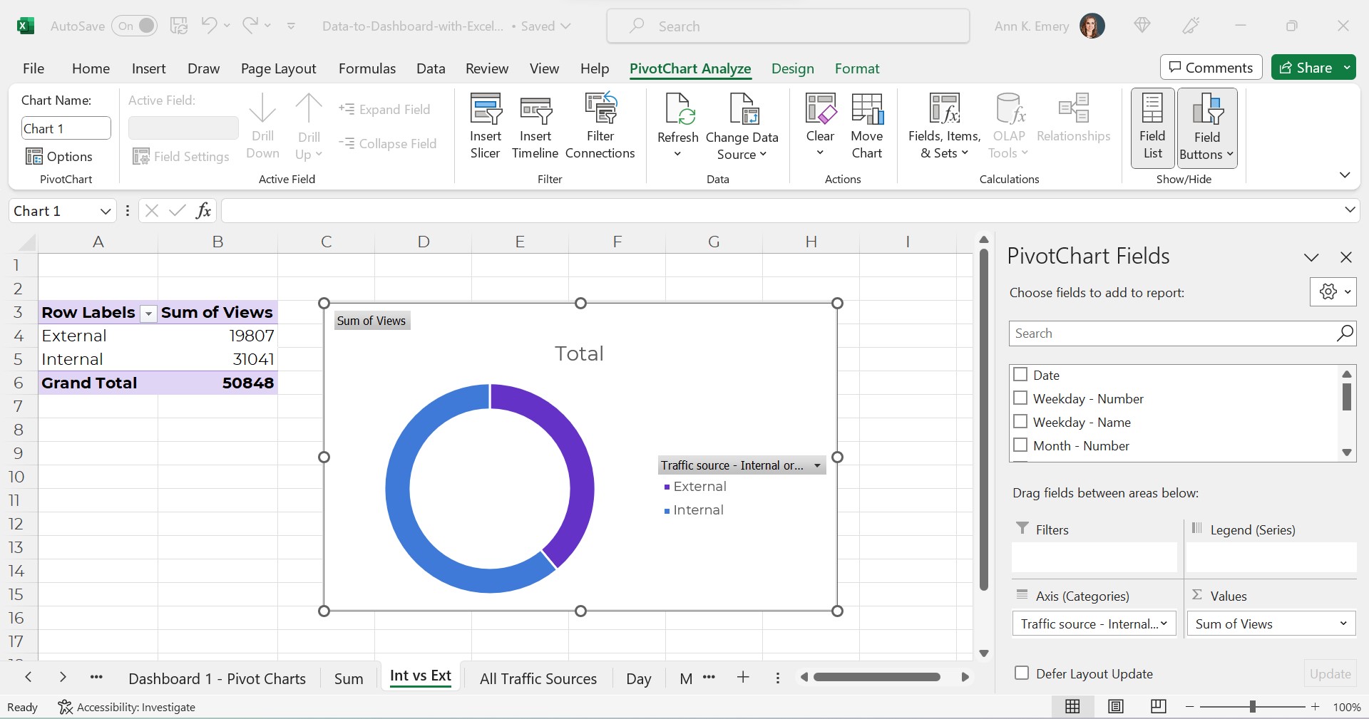
In the original version of the write-up, I did have some tables, but they were too technical (too many decimal places; statistical terms like p-values).

I also had some graphs that used the default settings made within my software program without any editing.

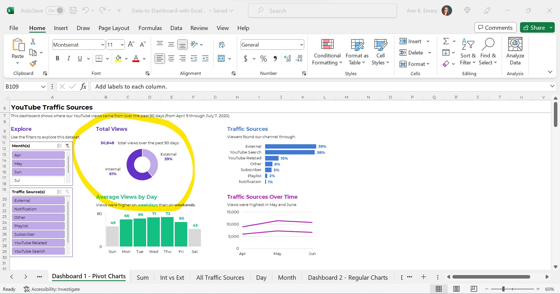
For the report, I aimed to have one or more visuals on every single page (a goal covered in Report Redesign).

This included flow charts, graphs, tables, text boxes, and icon arrays. Whatever was needed to best communicate the takeaway finding from the research.

The agency was going to use their own design team for the final branding and layout, so I didn’t have to bother with that.  

The Presentation Slides

I further had to whittle down the report into 11 slides for the presentation.

I decided to limit the background information and focus on the key results.

Written by cplysy · Categorized: depictdatastudio

Sep 25 2023

El concepto de valoración de la preparación organizacional

Una valoración de la preparación organizacional (readiness assessment) es una medida formal de la preparación de nuestra organización para sufrir un gran cambio o asumir una nueva intervención importante o relevante. No queremos lanzarnos a un gran cambio, intervención, estrategia, programa o proyecto sin saber si nuestra organización tiene las capacidades y los recursos para lograrlo de manera efectiva.
Realizar una valoración de la preparación organizacional nos brinda el conocimiento y la seguridad de que el esfuerzo propuesto por nuestra organización tendrá éxito si decide seguir adelante y hacerlo. También puede salvar la reputación de nuestra organización al permitirle evitar un fracaso potencialmente importante por participar en una intervención que no estaba preparada para completar.
Una valoración de preparación generalmente evalúa lo siguiente:

  • Metas y objetivos del intervención
  • Expectativas e inquietudes
  • Apoyo al liderazgo del intervención.
  • Capacidad de adaptarse al cambio.
  • Formas de minimizar el posible fracaso de la intervención
  • Gobernanza de la intervención y toma de decisiones.
  • Otras necesidades críticas de la intervención

Written by cplysy · Categorized: TripleAD

Sep 20 2023

Try This: In Person vs Online Workshop Prep

Try this out and let me know how it goes for you. As an introverted workshop facilitator, I used to believe that online workshops were easier to facilitate than in person ones. Now I see that online workshops aren’t easier or harder; they just have their own set of quirks. There’s benefits and drawbacks to […]

The post Try This: In Person vs Online Workshop Prep appeared first on Nicole Clark Consulting.

Written by cplysy · Categorized: nicoleclark

Sep 19 2023

How to create video explanations

Today’s blog post will walk you through a method you can use to create explanation videos using Canva and Zoom.

The concept was designed as a simple way to walk an audience through a some type of model (ex. logic model, theory of change, etc.).

The Concept Video

This video was recorded using Zoom and edited with Canva. It is embedded here using Canva’s Embed feature.

The Basic Steps.

There are eight basic steps in this process.  Let’s go ahead and walk through each one.

  1. Write the script.
  2. Record the video.
  3. Drop it into Canva.
  4. Setup your initial frame.
  5. Split the scenes.
  6. De-emphasize the model.
  7. Add transitions.
  8. Export your video.

Step 1. Write the script. 

Pretend like you are explaining your model to a colleague.  Break it down into little pieces and walk through piece by piece.

Step 2. Record the video. 

Now that you have the script, record yourself or someone else reading the script.  I suggest using Zoom, because you probably already know how to use it.  I also suggest downloading the recording to your computer in high definition.  As you read the script, pause slightly between segments to leave room for video transitions.

Step 3. Drop it into Canva. 

Now that you have a video, click the button to create a 1920 by 1080 video in Canva.  Once you have the file started, drop in the video.

Step 4. Setup your initial frame. 

I like going full screen for the introduction and closeout, but for the majority of the video I want it to be me alongside the actual model.  You can set this up by adding in a frame and dropping the video inside.

Step 5.  Split the scenes.

Once you have the general look, go through and split your video by scene.

Step 6. De-emphasize the model. 

To focus audience attention, you can take a simple model and emphasize what you want the audience to see.  OR, you can take a bold model and de-emphasize what you don’t want the audience to see.  This is what I will do scene by scene, making use of the transparency slider in Canva.

Step 7. Add transitions. 

I have Canva Pro, and with that some extra transition options.  My favorite to use is the match and move transition.

Step 8. Export your video. 

After you are through, make sure to watch it a time or two just in case you need to edit something.  Then when you are happy, download the video.

Bonus. Embed your video.

Did you know that you can embed video right from Canva? Only caution, from personal experience, some organizations block Canva. But if it works for your audience, embedding straight from Canva certainly saves extra steps.

How are you using Video in your reporting?

Doing anything interesting with video? Have you ever used Canva to edit video? Leave a comment and let me know.

Written by cplysy · Categorized: freshspectrum

Sep 18 2023

How to Make Interactive Dashboards in Excel

Want to make an interactive dashboard in Microsoft Excel?

Interactive (a.k.a. dynamic) dashboards are a great option for technical audiences that have the time and interest to explore the data for themselves.

They’ll look something like this:

Interactive dashboards are easy to create — sort of. It depends on your existing skill level.

You’ll need four pieces:

  1. A Clean, Contiguous Dataset (maybe stored as an Excel Table)
  2. Pivot Tables
  3. Pivot Charts
  4. Slicers

Are you already using these four features regularly? Great! Linking them together in a dashboard will be easy for you.

Are you new to Excel Tables, pivot tables, pivot charts, or slicers? Be patient with yourself. You’ll need to be fluent in the building blocks before you can put them together seamlessly.

Let’s walk through each of the four pieces in more detail.

Step 1: Build the Clean, Contiguous Dataset

From previous blog posts, you know that table is a tricky term.

There are several different types of tables, like datasets vs. tabulations. In short, a dataset is the underlying numbers, and the tabulation is the summary table.

The Raw Dataset

To build our interactive dashboard, we’ll start with our raw dataset.

This is semi-fictional data. We’re pretending that we’ve downloaded YouTube stats directly from YouTube.

The raw dataset would look something like this, with one entry per date and traffic source.

It’s raw because this is exactly what it looks like when downloaded from YouTube. We haven’t made any changes (yet!).

The Clean Dataset

Next, we’d clean the dataset.

We might check for and deal with duplicates.

We might check for and deal with missing data.

We might add lots of new columns of recoded data. For example, if I want to make a donut chart comparing the internal and external traffic sources, then I’ll need a column (a variable) that categorizes each traffic source as being internal or external.

If I want to make a graph that compares YouTube visits by day of the week (Monday vs. Tuesday views), then I’ll need a column that turns MM/DD/YYYY into weekday. And so on.

(You can learn more about cleaning, recoding, and transforming datasets inside Simple Spreadsheets, my prerequisite course. Again, you’ll need to be 100% fluent in these skills. Otherwise, dashboards will feel daunting.)

Years ago, a coworker taught me to turn all my new variables red so my Future Self could find them. As you can see, I still follow that advice today.

The clean dataset would look something like this:

Required: A Contiguous Dataset

As usual, my clean dataset is contiguous.

In other words, all the cells are touching or sharing a border.

I don’t have dozens of mini datasets (like one per month, or one per traffic source).

You can learn more about contiguous datasets and why they’re necessary for dataviz in this blog post.

Optional: An Excel Table

Next, we might transform our clean dataset into an Excel Table. This step is optional.

As explained in this blog post, Excel Tables are helpful when we need to append tables (that is, when we’ll be adding more rows over time).

Alright, that’s it for the first piece! We’ve got a single, clean, contiguous dataset as our base. We might store it as a regular ol’ table/dataset. Or, we might turn it into an Excel Table for easy appending.

Step 2: Tabulate the Dataset with Pivot Tables

We can tabulate our dataset with either (1) formulas or (2) pivot tables. You can learn more about the pros and cons of each approach in this blog post.

In short, if we’re aiming to build an interactive dashboards… which has to involve slicers… which have to involve pivot charts… then we simply have to use pivot tables.

Again, interactive dashboards are easy — sort of. You have to understand all the nuances of when to use regular ol’ tables vs. Excel Tables, and when to formulas vs. pivot tables, in order to work both backwards and forwards and put everything together quickly and correctly.

Our pivot tables will look something like this:

Interactive dashboards involve pivot tables — plural.

We’ll need one pivot table for each of our charts.

In the finished example, there were four charts + a sum of the total views. That means there are five separate pivot tables behind the scenes.

If you’re familiar with pivot tables, great! Building a few pivot tables for your dashboard will be easy.

If you’re brand new to pivot tables, no worries! I’ve got plenty of beginner-level blog posts to get you started.

Step 3: Build (and Format) the Pivot Charts

Next, we’ll simply add a pivot chart to each of our pivot tables.

In case you’re brand new to pivot charts, here’s how you add them:

  • Click on the pivot table to activate it.
  • Go to the Insert tab.
  • Choose which chart type you’d like (bar, line, donut, etc.).
  • That’s it!

Please, don’t forget the formatting!!!

Our unformatted chart — which doesn’t pass 508/ADA compliance guidelines — would look like this:

The formatted chart would look like this.

Do you notice the binary color-coding, white outlines around touching shapes, and the direct labels?

Once we’ve built and formatted each of the charts, we’ll simply cut and paste them together into a new sheet. That’s where our soon-to-be-completed dashboard will live.

Step 4. Add a Slicer(s)

Finally, we’ll add a slicer(s) to the first pivot chart.

A slicer is just a fancy name for a filter. They’ve existed in Excel since 2010 (!!!). But, don’t worry if you haven’t seem them or used them before. It takes years for new features to be widely adopted. (Hence the point of blog posts like these — to introduce you to features you might not have discovered before.)

Connect the Slicer to the First Chart

In case you’re brand new to slicers, here’s how you add them:

  • Click on one of the pivot charts to activate it.
  • Go to the Insert tab.
  • Click on the Slicer option.
  • You’ll see a list of all the variables. In this example, our variables from the clean dataset are Date, Weekday – Number, Weekday – Name, Month – Number, Month – Name, Traffic Source, Traffic Source – Internal or External and Views. If I want viewers to be able to slice and dice by month, then I’d select Month – Name to feed into the slicer.
  • That’s it!

Connect the Slicer to the Rest of the Charts

The slicer won’t automatically be connected to all of our charts.

We’ll need one more step:

  • Click on the slicer to activate it.
  • Go to the Slicer tab.
  • Click on the Report Connections button.
  • We’ll see a list of all our pivot tables. Check all the boxes.
  • That’s it! Now, when we filter data with the slicer, all the charts will correctly filter and change, too.

Final Formatting

As usual, we’ll make sure to follow dataviz best practices.

We’ll need to:

  • Add words. We’ll need a title, date, subtitles, and explanatory text. Yes, there’s concatenation behind the scenes that automatically writes the sentences for me.
  • Use brand colors and brand fonts.
  • Color-code by category. (One brand color per category/section/chart.)
  • Leave plenty of white space between the charts. My rule of thumb: A thumb’s width (a half-inch or inch of white space between each chart).

Now it’s time to sit back, relax, and let our colleagues have fun exploring the dashboard for themselves.

Learn More

If this tutorial is easy for you, then congrats!!! You’re all set. Go forth and build magnificent, accessible, interactive dashboards for your technical-minded colleagues.

If this tutorial was jargony for you, don’t worry!!! You can walk through each of the steps in more detail, and download the spreadsheets to follow, and come to live Office Hours inside the Dashboard Design course.

Written by cplysy · Categorized: depictdatastudio

  • « Go to Previous Page
  • Go to page 1
  • Interim pages omitted …
  • Go to page 72
  • Go to page 73
  • Go to page 74
  • Go to page 75
  • Go to page 76
  • Interim pages omitted …
  • Go to page 304
  • Go to Next Page »

Footer

Follow our Work

The easiest way to stay connected to our work is to join our newsletter. You’ll get updates on projects, learn about new events, and hear stories from those evaluators whom the field continues to actively exclude and erase.

Get Updates

Want to take further action or join a pod? Click here to learn more.

Copyright © 2026 · The May 13 Group · Log in

en English
af Afrikaanssq Shqipam አማርኛar العربيةhy Հայերենaz Azərbaycan dilieu Euskarabe Беларуская моваbn বাংলাbs Bosanskibg Българскиca Catalàceb Cebuanony Chichewazh-CN 简体中文zh-TW 繁體中文co Corsuhr Hrvatskics Čeština‎da Dansknl Nederlandsen Englisheo Esperantoet Eestitl Filipinofi Suomifr Françaisfy Fryskgl Galegoka ქართულიde Deutschel Ελληνικάgu ગુજરાતીht Kreyol ayisyenha Harshen Hausahaw Ōlelo Hawaiʻiiw עִבְרִיתhi हिन्दीhmn Hmonghu Magyaris Íslenskaig Igboid Bahasa Indonesiaga Gaeilgeit Italianoja 日本語jw Basa Jawakn ಕನ್ನಡkk Қазақ тіліkm ភាសាខ្មែរko 한국어ku كوردی‎ky Кыргызчаlo ພາສາລາວla Latinlv Latviešu valodalt Lietuvių kalbalb Lëtzebuergeschmk Македонски јазикmg Malagasyms Bahasa Melayuml മലയാളംmt Maltesemi Te Reo Māorimr मराठीmn Монголmy ဗမာစာne नेपालीno Norsk bokmålps پښتوfa فارسیpl Polskipt Portuguêspa ਪੰਜਾਬੀro Românăru Русскийsm Samoangd Gàidhligsr Српски језикst Sesothosn Shonasd سنڌيsi සිංහලsk Slovenčinasl Slovenščinaso Afsoomaalies Españolsu Basa Sundasw Kiswahilisv Svenskatg Тоҷикӣta தமிழ்te తెలుగుth ไทยtr Türkçeuk Українськаur اردوuz O‘zbekchavi Tiếng Việtcy Cymraegxh isiXhosayi יידישyo Yorùbázu Zulu