• Skip to main content
  • Skip to footer
  • Home

The May 13 Group

the next day for evaluation

  • Get Involved
  • Our Work
  • About Us
You are here: Home / Archives for cplysy

cplysy

Sep 11 2023

How to Make a Series of Matching Dashboards in Excel

Do you need a series of matching dashboards?

One per program, school, or state?

Copying and pasting is tedious and destined for typos.

Instead, produce a series of matching dashboards through the magic of lookup functions and drop-down menus.

Save time with my automation process.

You’ll create one template and then auto-magically populate it with the rest of the data.

Want to give it a try?! Here’s how.

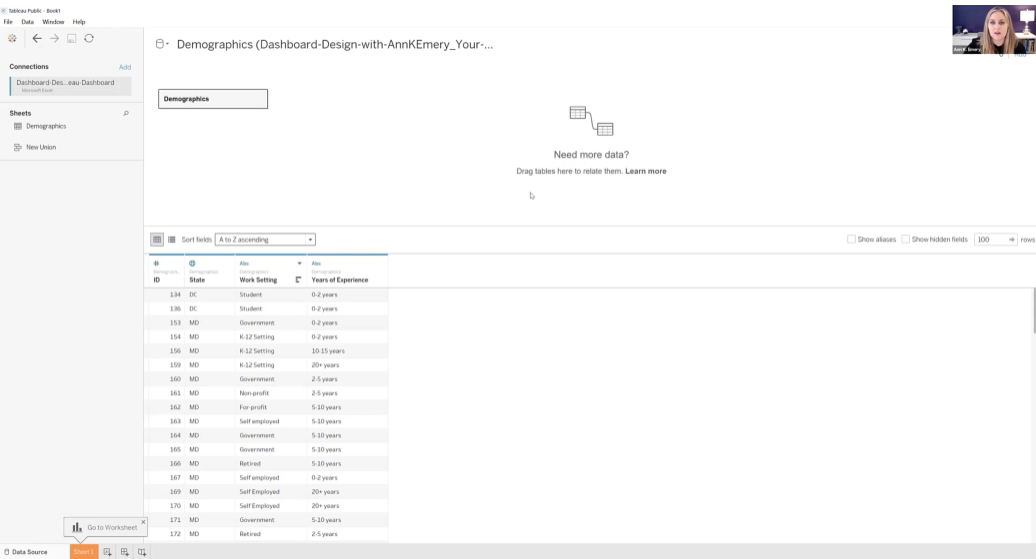
Step 0: Get Your Dataset into Excel

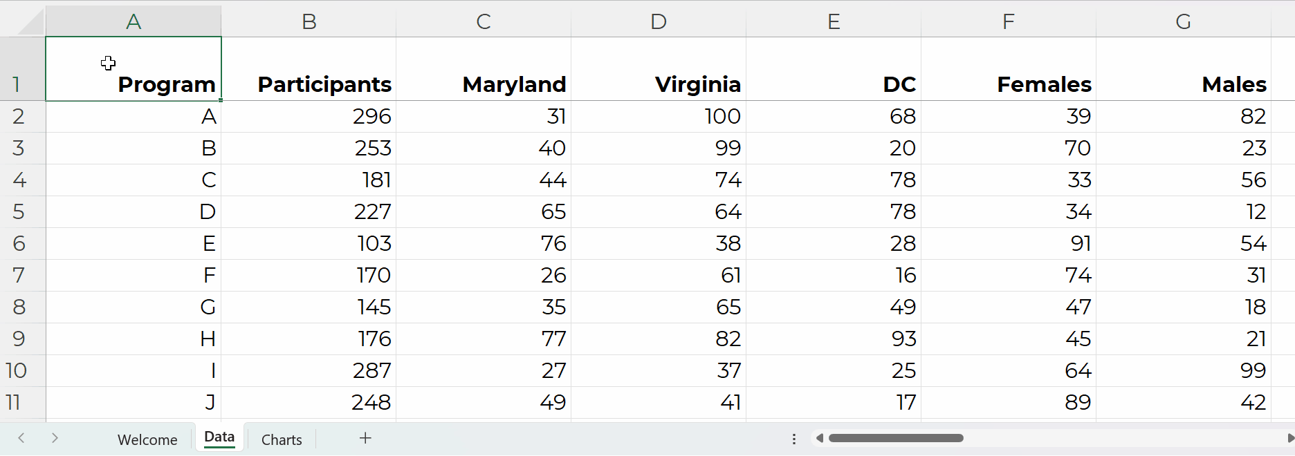
Let’s pretend we want one dashboard per program.

Our dataset might look something like this.

(These are fictional numbers, and they don’t add up to the correct denominators, so don’t look toooo closely, ha!)

Step 1: Build the Drop-Down Menu

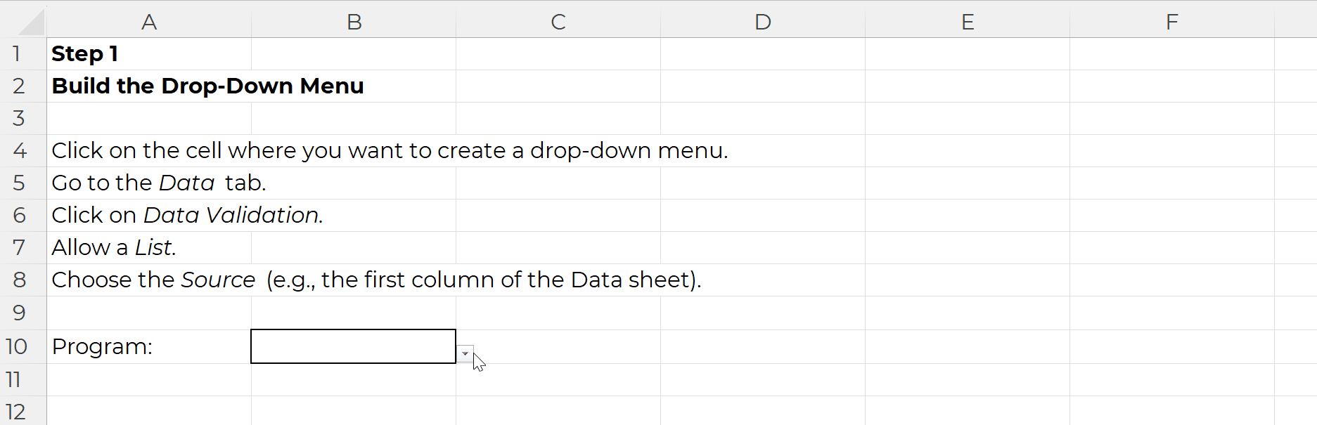
Click on the cell where you want to create a drop-down menu.

Go to the Data tab.

Click on Data Validation.

Allow a List.

Choose the Source (e.g., the first column of the Data sheet).

It’ll look like this:

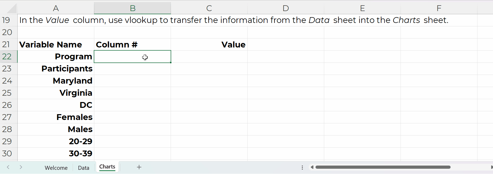
Step 2: Build the List of Variables

In the Variable Name column, use Paste Special to transpose the headers from the Data sheet into this Charts sheet:

In the Column # column, tell Excel where that variable lives in the Data sheet.

For example, the Program name is in the first column of the Data sheet, so type 1.

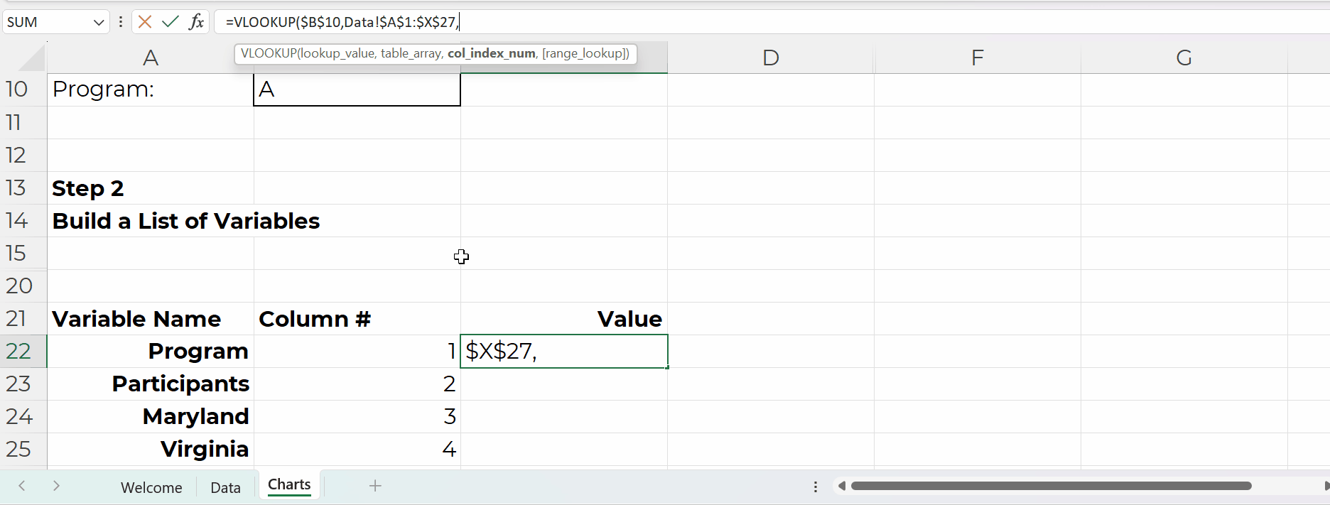
In the Value column, use vlookup to transfer the information from the Data sheet into the Charts sheet.

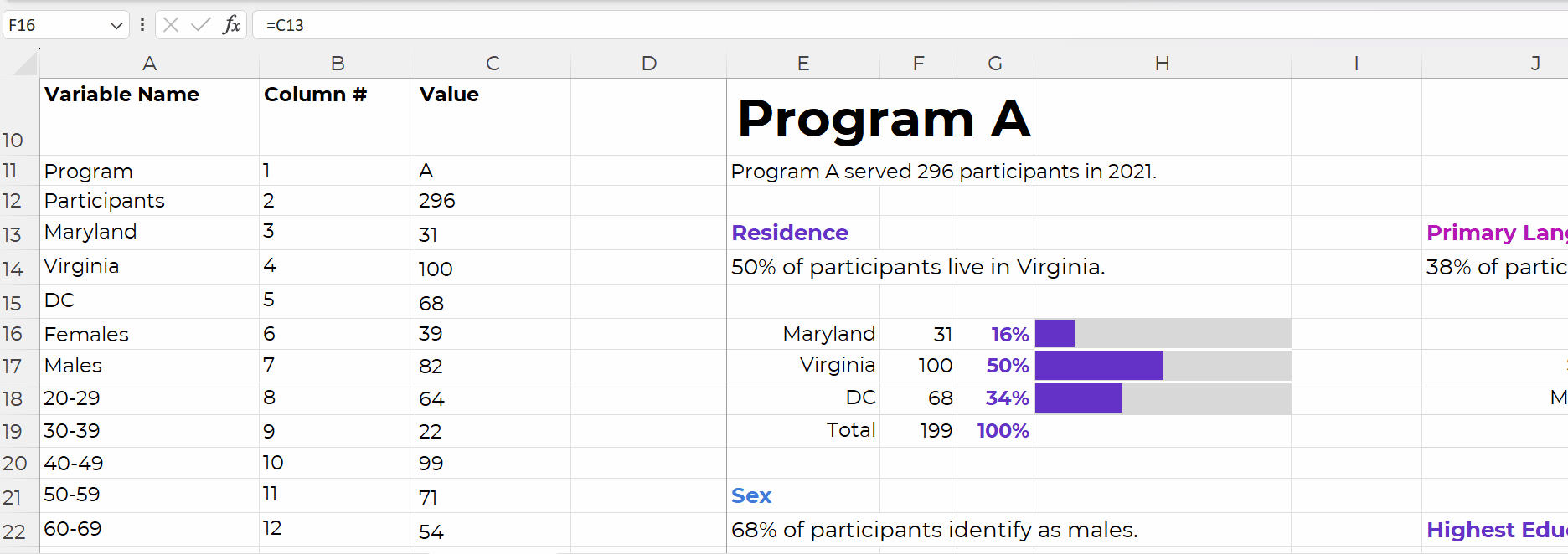
Step 3: Build the Charts

The charts are simply linked to the values off to the left, like this:

We’re obviously not limited to bar charts.

In real-life examples, I’ve used waffles, icon arrays, lines, donuts, lollipops, histograms, and choropleth maps.

I just wanted to keep the charting piece as simple as possible for this example (so your brain could focus on the links between the drop-downs, lookup formulas, and charts).

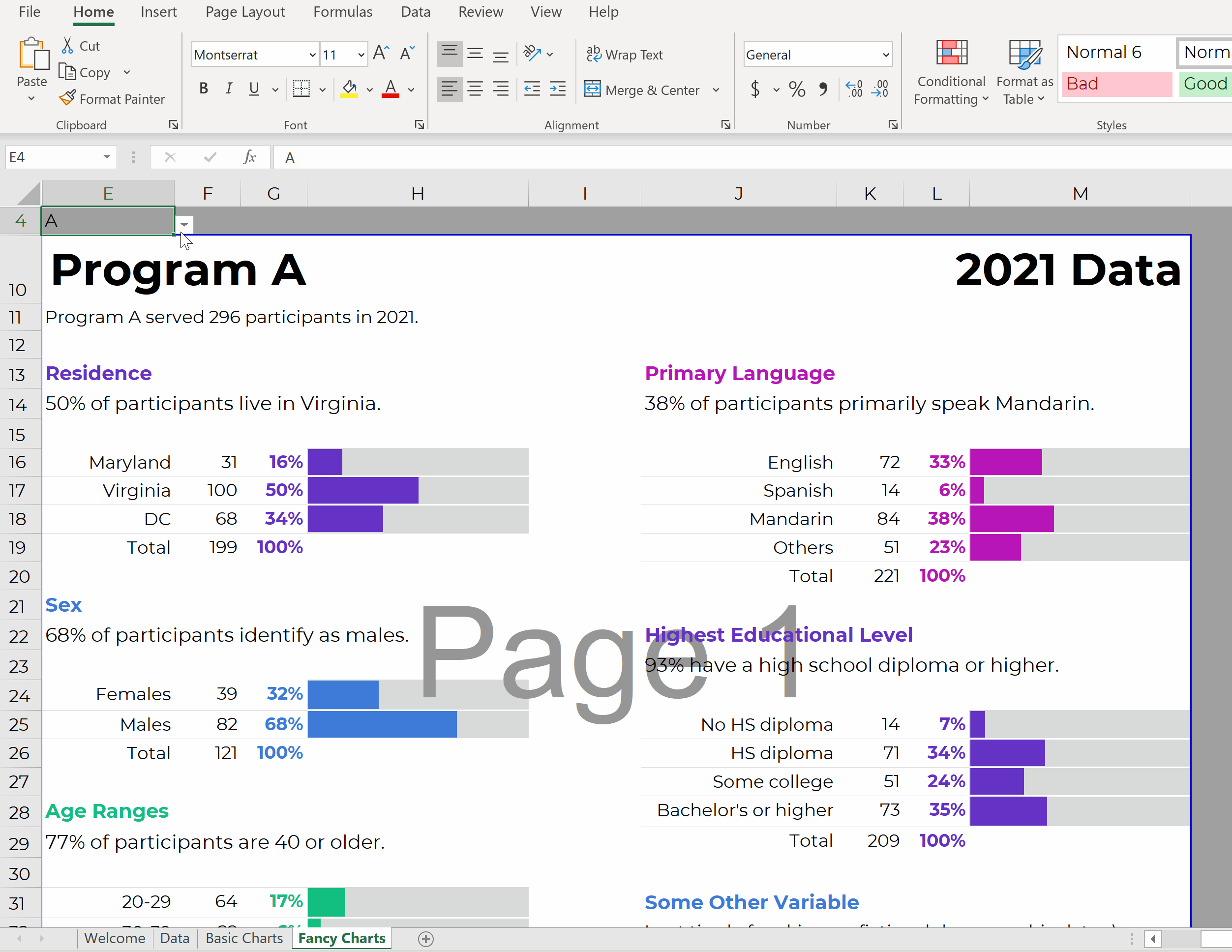
Once the charts are finished, use concatenation to write sentences, like this:

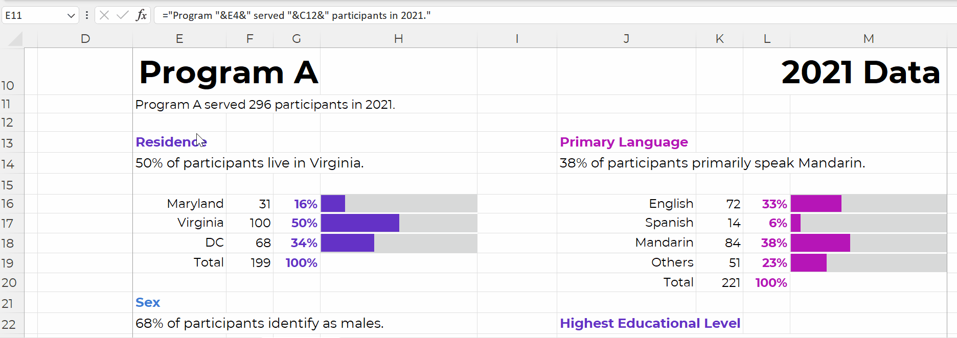
Time for the final touches. You’ll add a title and subtitles; color-code by category; and set everything to be printer-friendly and PDF-friendly, like this:

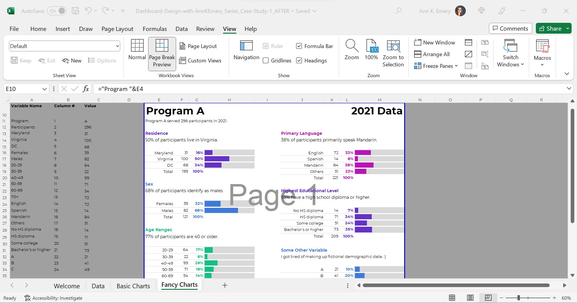
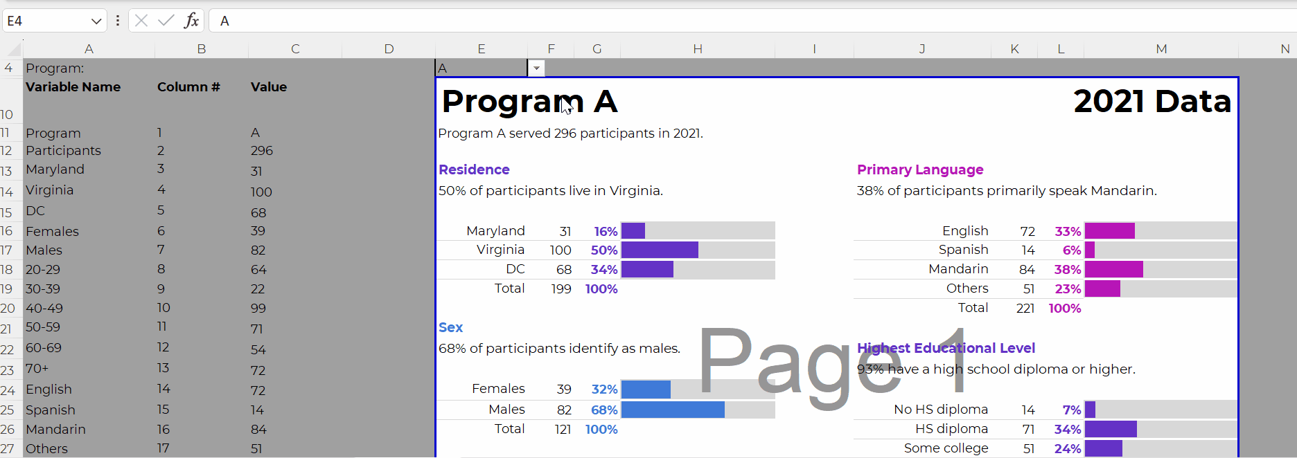
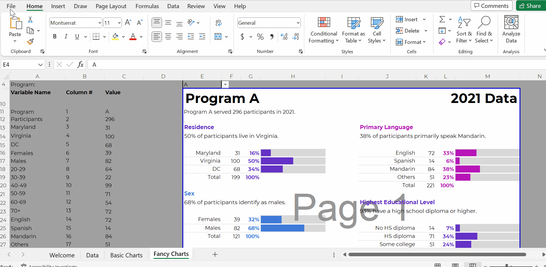
Everything is linked!

When you select the program name from the drop-down menu…

That program’s data feeds into the Values column (thanks to the lookup formula)…

And that program’s data feeds into the charts.

Don’t worry; the recipients won’t see the formulas behind the scenes. And they won’t see the Page 1 watermark-ish mess.

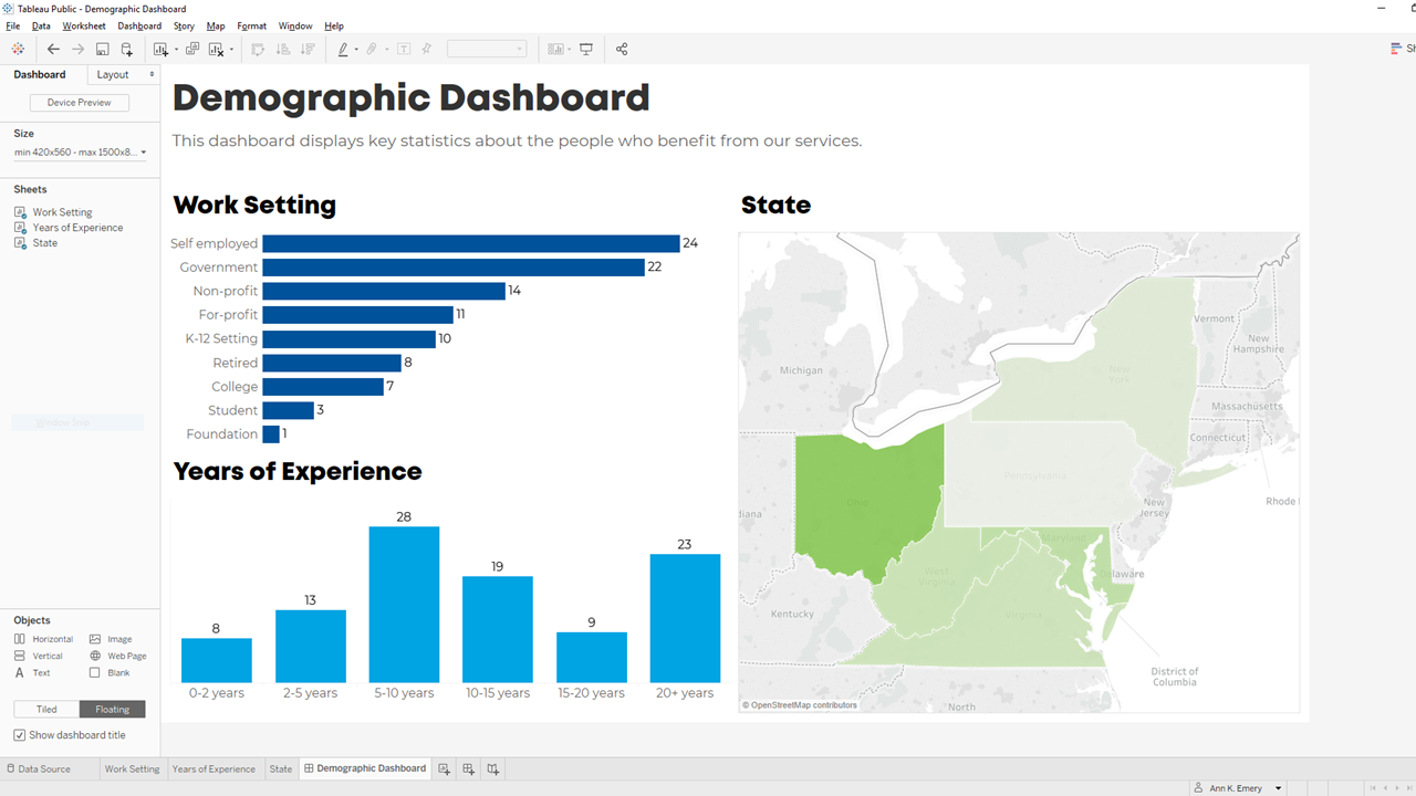
They’ll see their own PDF, with their own data, like this:

In real-life projects, we sometimes add all these dashboards to the appendices of technical reports (simply by using Acrobat to combine PDFs).

Work Hard Once

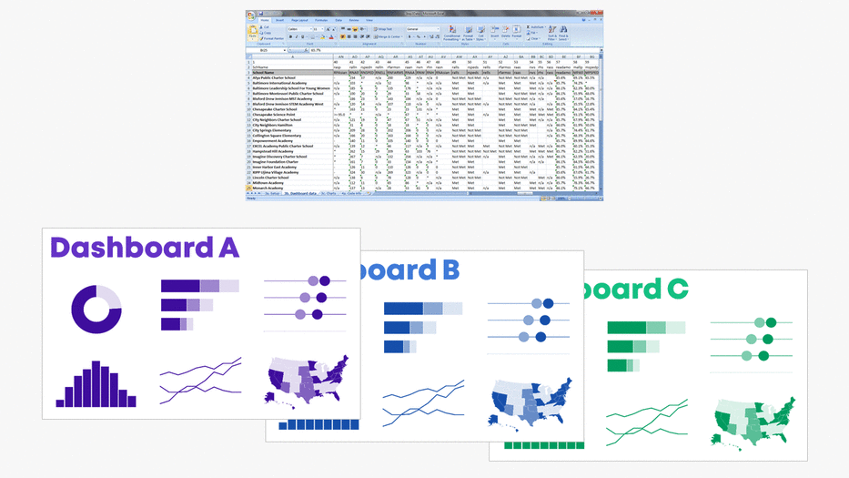
With this process, you can create one template and auto-magically populate dozens or hundreds of matching dashboards.

No typos!

No tedious copying-and-pasting from Excel into Word or PowerPoint!!

Work hard once!!!

Create one template, and then let the drop-down menus do the heavy-lifting.

Real-World Case Studies

I’ve used this process in consulting projects to:

  • Design matching 2-pagers for every state, territory, and tribal area that offers home visiting services (State A had its own 2-pager, State B had its own 2-pager, etc.)
  • Design matching 4-pagers for each grantmaking area for a foundation’s board meetings (Focus Area A had its own 4-page dashboard with key metrics, Focus Area B had its own dashboard, etc.)
  • Design matching 10-page survey results tables for every university that responded to a survey (University A saw their own survey results, University B saw their own survey results, etc.)
  • …and a dozen more over the past decade.

Your Turn

What sorts of how-to questions do you have for me?

Comment below and I’ll answer as many as I can.

Written by cplysy · Categorized: depictdatastudio

Sep 07 2023

How to create simple infographics.

Stop overthinking infographics. Not every infographic needs to be a fully illustrated well-developed story. It can be enough to just share a simple factoid or quote and give it some pretty colors.

In my workshops I tend to call simple infographics, micrographics. But you also might see them mentioned as featured images, small infographics, or social graphics.

But let’s just look at an example. Take the following shared on UNICEF’s twitter account.

Children are more vulnerable to air pollution because they breathe faster and take in more pollutants.

The recently published General Comment 26 affirms that children have a right to a clean and healthy environment.

Let’s work together to make this a reality. #WorldCleanAirDay pic.twitter.com/LVtnb8CgU5

— UNICEF (@UNICEF) September 7, 2023

Clearly, there is not much to soak in here. There is a factoid, “99% of the world’s population breathes polluted air” with simple colors and basic illustration of a lung. It also shows a few social media hashtags and names the source program.

There is NOTHING deep about this micrographic.

But it serves a purpose as a transition tool. One goal of this image is to share a fact, but the bigger goal is to engage the reader into digging deeper.

Creating Simple Infographics in Canva.

Canva is by far my favorite tool for creating micrographics. It’s just so darn simple.

I created a sample set of templates as examples for the tips in this blog post. Just to note, I did use Canva pro when making these templates. So there may be a few elements you would need to swap out if you wanted to use any of these in the free version.

But the techniques are so simple, it’s probably easier to just create your own.

7 Tips for Creating Simple Infographics

Tip 1. Add a photo in the background but make it transparent.

One of the easiest ways to use a photo, but stay on brand colors, is to start with the background in a color of your choosing. Then add a photo on top, turning down the transparency. This will let the color shine through.

Tip 2. Add some text effects.

Sometimes the text just doesn’t pop, or the backdrop isn’t interesting enough to draw attention. Using a text effect might help a little. I like using “Lift” or “Neon” effects in Canva to help text stand out a little, especially when the background isn’t light or dark enough to provide good contrast.

Tip 3. Sometimes a block of color is enough.

Not everything has to be fancy. A solid block of color in the background might be enough to have your micrographic stand out in a social media feed. And the lack of extra flair can help your audience retain focus on the text.

Tip 4. Photo effects can be used as well.

With a micrographic you really want there to be enough contrast between the text and background. So using photos can be complicated. I showed one way to filter up top, but the simple way is just to use one of Canva’s photo filters.

Tip 5. Use gradients

A gradient will just merge two different colors in your background. You just choose the colors and style in Canva’s color menu.

Tip 6. Simple quote with a solid background.

When using images that don’t give sufficient contrast, one simple way to adapt is to just give the text some background. You can do this manually with shapes or use the Canva Background text effect.

Tip 7. Simple photo masks using Canva frames

One of Canva’s basic tools is a type of photo mask they call Frames. A simple frame let’s you use photos without taking over the space needed for the text.

Just have fun with it.

Evaluators and researchers are notorious for overthinking creative work. Whether it’s from a lack of practice or just an underdeveloped creative confidence, it’s something I see all the time.

Over and over again I hear stories where an evaluator spend weeks working on a long infographic, data dashboard, or report only to get crickets in response.

But then they end up working on some other kind of passion project or side work and just spend a little time creating something fun. And it’s the fun thing, that took very little time, that people love.

It’s okay to have fun when designing.

And if anyone complains, you can tell them I said it was okay.

Written by cplysy · Categorized: freshspectrum

Sep 06 2023

Ask Nicole: We’ve Hired Too Many Consultants

Have a question you’d like to be featured? Let me know. It’s been a while since I’ve touched on a consulting-specific topic, and this month’s Ask Nicole touches on something I’ve been noticing over the past year. Why do nonprofits hire consultants? Specifically, why do nonprofits hire multiple consultants at the same time? From a […]

The post Ask Nicole: We’ve Hired Too Many Consultants appeared first on Nicole Clark Consulting.

Written by cplysy · Categorized: nicoleclark

Sep 04 2023

How to Make Your First Tableau Dashboard

Want to get started with Tableau?

Here’s a step-by-step guide to making your very first Tableau dashboard.

In less than an hour, you’ll be able to install the free version of Tableau, add your dataset, create a few charts, and then combine then into a dashboard. You’ll still have time left for formatting, too.

Step 1: Figure Out Which Version of Tableau You Need

There are a few options:

  • Public: Free BUT your datasets and graphs will be publicly available.
  • Desktop: Paid; about USD $1,000/year per user.
  • Server: Paid.

This article compares the versions in more detail.

Step 2: Download Tableau Public

If this is your very first dashboard, I’d recommend starting with the free version, Tableau Public.

Here’s how you’ll install it:

  • Visit https://public.tableau.com/en-us/s/download
  • Enter your email address and click Download the App.
  • The download begins automatically.
  • It takes about 5 minutes.

Step 3: Import or Connect Your Dataset

Now, you’ll need to connect your dataset to Tableau.

You can add datasets from Excel, Sheets, QuickBooks, etc.

In this example, let’s pretend we’re visualizing demographic data from an Excel spreadsheet, like this:

Here’s how you’ll add your dataset to Tableau:

  • Open Tableau Public.
  • Connect to a File: Microsoft Excel. Open your file.
  • You’ll see the names of the Excel Sheets on the left.
  • Drag in the sheet(s) you want to use for your Tableau dashboard.
  • Pre-filter if needed.
  • Connect multiple tables if needed. Joins combine the columns of two datasets, and unions combine the rows of two datasets. Joins are most similar to lookup functions in Excel. Unions are most often used when more data is coming in, and you need to add more rows to the bottom of the dataset.

The preview of your spreadsheet will look like this inside Tableau:

Step 4: Drag and Drop Variables to Create One Visual at a Time

We’ll build one chart at a time. Then, in a moment, we’ll combine them into a dashboard.

First, let’s visualize the Work Setting data in Sheet 1. We would drag Work Setting into Rows and Demographics (Count) into Columns. Congrats! You’ve got your first bar chart.

Next, we’ll drag and drop variables to create a Years of Experience histogram.

Finally, we’ll create a color-coded (“choropleth”) map by State.

We’ll create a bar or column chart first, and then simply change it into a map with the Show Me menu.

Step 5: Combine the Sheets into a Dashboard

Now, let’s combine our three individual graphs into a single dashboard.

Here’s how:

  • Along the bottom, click on the icon to create a New Dashboard.
  • Then, in the Dashboard tab on the left:
    • Choose the device (Desktop, Tablet, phone, etc.).
    • Adjust the size as needed.
    • Drag the Sheets into the main dashboard area.
    • Add Objects as needed (e.g., Blank to add some white space between visuals).
    • The individual graphs can be tiled or floating. I prefer tiled.
    • Check the box to Show dashboard title.

Step 6: Format, Format, Format!

It’s easy to create graphs in Tableau.

Like many software programs, it’s not so easy to format them to be Accessible (508/ADA compliant) and accessible (intuitive).

Here are some bare-minimum edits to get you started.

Apply brand fonts. Go to Format –> Workbook to change all the fonts in your file at the same time (rather than changing one visual at a time). Here’s an article with more info.

Apply brand colors. I personally just go to Marks –> Colors –> More Colors and enter the RGB or HEX codes. Or, here’s an article with a coding option.

I love color-coding by category (i.e., one brand color per graph). This is an easy way to make a dense dashboard feel not-so-dense.

Apply a text hierarchy. Make sure the dashboard title is largest, boldest, and darkest. You’ll also need Heading 1s, and you might need Heading 2s.

As usual, left-aligned text is faster to read then centered or justified text.

As usual, horizontal text is faster to read than diagonal or vertical text.

Don’t forget to turn bulleted tooltips into complete sentences for an extra boost of accessibility.

Your formatted dashboard might look something like this:

Step 7: Share the Dashboard

That’s it! Let’s share it with colleagues.

In the upper left corner, click on File. Choose Save to Tableau Public. Log in. Or, create a username.

Once the dashboard is saved to Tableau Public, you can save the dashboard as an image file, a PDF, a PowerPoint slide, etc.

Learn More

If you’d like to learn more about getting started with Tableau, check out Dashboard Design. This 4-course bundle includes a half-day course on Tableau.

Written by cplysy · Categorized: depictdatastudio

Sep 03 2023

Michael Scriven, su legado para la disciplina de la evaluación

Murio el 28 de Agosto (1928-2023). Scriven hizo importantes contribuciones en los campos de la filosofía (lógica y filosofía de la ciencia), el pensamiento crítico y, más notablemente, la evaluación. De hecho, se puede afirmar que él (junto con Donald Campbell) ayudó a crear y desarrollar el campo de la evaluación como una disciplina de investigación tal como la entendemos ahora, como una transdisciplina (otra invención de Scriven) con importantes revistas e institutos, y en estos momentos es un campo reconocido de estudio académico y profesional. En particular, desarrolló el campo de la evaluación en aplicaciones informáticas y de educación. Sus principales ideas sobre la evaluación basada en resultados, la evaluación formativa y sumativa (Scriven ideó estos conceptos), se tienen en cuenta en algunas definiciones de evaluación (basada en el mérito, el valor y la importancia), inventó la evaluación sin objetivos y sin costo, desarrolló la principal metodología como lista de verificación, creó el Evaluation Thesaurus y sigue siendo uno de los profesionales de evaluación más conocidos del mundo.

El trabajo de Scriven en educación influyó en el trabajo de muchos académicos, incluido el de Robert E. Stake, Ernest R. House, Benjamin Bloom y Gene V Glass.

Escribió más de 400 publicaciones académicas y formó parte de los consejos de revisión editorial de 42 revistas.

Michael Quinn Patton habla en este video sobre el legado de Michael Scriven:

Tribute to Michael Scriven’s Legacy

Written by cplysy · Categorized: TripleAD

  • « Go to Previous Page
  • Go to page 1
  • Interim pages omitted …
  • Go to page 74
  • Go to page 75
  • Go to page 76
  • Go to page 77
  • Go to page 78
  • Interim pages omitted …
  • Go to page 304
  • Go to Next Page »

Footer

Follow our Work

The easiest way to stay connected to our work is to join our newsletter. You’ll get updates on projects, learn about new events, and hear stories from those evaluators whom the field continues to actively exclude and erase.

Get Updates

Want to take further action or join a pod? Click here to learn more.

Copyright © 2026 · The May 13 Group · Log in

en English
af Afrikaanssq Shqipam አማርኛar العربيةhy Հայերենaz Azərbaycan dilieu Euskarabe Беларуская моваbn বাংলাbs Bosanskibg Българскиca Catalàceb Cebuanony Chichewazh-CN 简体中文zh-TW 繁體中文co Corsuhr Hrvatskics Čeština‎da Dansknl Nederlandsen Englisheo Esperantoet Eestitl Filipinofi Suomifr Françaisfy Fryskgl Galegoka ქართულიde Deutschel Ελληνικάgu ગુજરાતીht Kreyol ayisyenha Harshen Hausahaw Ōlelo Hawaiʻiiw עִבְרִיתhi हिन्दीhmn Hmonghu Magyaris Íslenskaig Igboid Bahasa Indonesiaga Gaeilgeit Italianoja 日本語jw Basa Jawakn ಕನ್ನಡkk Қазақ тіліkm ភាសាខ្មែរko 한국어ku كوردی‎ky Кыргызчаlo ພາສາລາວla Latinlv Latviešu valodalt Lietuvių kalbalb Lëtzebuergeschmk Македонски јазикmg Malagasyms Bahasa Melayuml മലയാളംmt Maltesemi Te Reo Māorimr मराठीmn Монголmy ဗမာစာne नेपालीno Norsk bokmålps پښتوfa فارسیpl Polskipt Portuguêspa ਪੰਜਾਬੀro Românăru Русскийsm Samoangd Gàidhligsr Српски језикst Sesothosn Shonasd سنڌيsi සිංහලsk Slovenčinasl Slovenščinaso Afsoomaalies Españolsu Basa Sundasw Kiswahilisv Svenskatg Тоҷикӣta தமிழ்te తెలుగుth ไทยtr Türkçeuk Українськаur اردوuz O‘zbekchavi Tiếng Việtcy Cymraegxh isiXhosayi יידישyo Yorùbázu Zulu