• Skip to main content
  • Skip to footer
  • Home

The May 13 Group

the next day for evaluation

  • Get Involved
  • Our Work
  • About Us
You are here: Home / Archives for allblogs / depictdatastudio

depictdatastudio

Aug 13 2024

Unlocking Creativity: Simple Steps for Non-Designers to Build Powerful Visual Frameworks

by guest author Kate Hall

Creating a Customer Service Visual Framework

I present a lot and have given customer service presentations in different forms and fashions for over 15 years. I usually get compliments on my presentations, but I wanted to make sure the information I was presenting was sticking with people. I needed to refresh a customer service presentation and decided to use it as an opportunity to apply the lessons from Powerful Presentations I was learning.

I had my framework in my head, but I was skeptical that with my skill level I could create something useful and decent to look at.  I am a librarian, not a graphic designer.

Kate Hall's visual frameworks, before and after images

Begin at the Very Beginning…..It’s a Very Good Place to Start

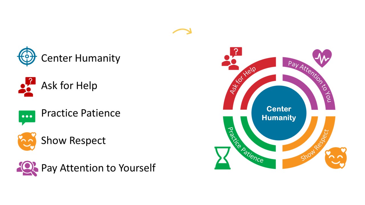
Despite my doubts, I began.  Focusing on my outline, I had 5 areas I wanted to touch on.  I matched icons to each and then thought about what I could construct to bring them all together.  I realized that the Center Humanity portion was a target with four sections.  So that is where I started. 

Be Literal

I decided to be very literal and created a circle and wrote center humanity and put it in the center of the target icon.

This was the central point I wanted people listening me to take away.  That each person they interact with is another human being and we should remember that first and foremost in every customer service interaction.

Combine the Elements

I then put one section near each of the quadrants on the target and added the wording below.  I gave each its own color so that in my slide deck each would have a separate color to help tie people’s brains to that section. 

At this point, I had done nothing too hard, downloaded a few icons, recolored them, and added wording.  I could have stopped here and I think it would have been ok.

Pause for Reflection

But I chose to get some feedback to see if I could make it better.

At this point I paused and brought it to Office Hours for suggestions. 

Shout out to all the fabulous people who shared ideas with me and helped make this visual framework more meaningful for my presentation.

Tweak for More Impact

I received lots of great ideas and my head was spinning with all the different ways I could possibly update my visual to resonate more with my audience.  I decided to start by making the target look more like a target while keeping the center humanity in the center. 

Add More Visual Cues

I wanted to make the four other sections clearer and tie things together. I took a duplicate of the target icon and recolored it and then used the crop tool to shrink it to only one quadrant.

This is what it looked like when I was finished. 

Rinse & Repeat

I then did the same for Green, Red, and Purple.

Four Quadrants

This is what it looked like when I was finished with all the quadrants. 

I was liking where it was going and thought this would stick in people’s heads better than the original. 

Keep Centering Humanity

I was hooked on keeping the circle and plopped it on top of all the different graphics I had just created. 

This would be an easy graphic to chunk and use in my slide decks and I felt like I was on the right track.

Adding Icons

I changed some of the icons after thinking through what I was trying to convey and added them by each section. 

I was getting closer, but it still didn’t feel finished to me.

Librarians Love Words

I thought I could get away with leaving the words off and just having the icons, but it looked too bare to me.  I used Word Art and after a bunch of trial and error got the words to curve at the right angle. 

It now felt complete. 

I used the Group tool to group all of the separate graphics together and saved it as an Image.

Success!

And while I thought it was pretty great, I didn’t know if it would be helpful for attendees.  But it was! 

In the feedback, one attendee wrote that they printed off the framework and put it on their desk as a reminder to them to follow the 5 steps. 

That made my day and solidified for me why having a visual framework is so helpful.  We don’t want to just give people presentations, we want what we share to stay with people and be useful. 

Kate Hall's visual frameworks, before and after images

Written by cplysy · Categorized: depictdatastudio

Aug 06 2024

Your Dataviz Icons: Too Big and Too Dark?

If your boss doesn’t like your icons… they’re probably too big and too dark.

Just like all your graphs, maps, and diagrams, your icons deserve some TLC, too.

Icons can get cartoonish or steal the show if they’re not formatted well.

What’s Inside

  • 0:00 Intro
  • 0:31 This Case Study
  • 1:47 Smaller Icons
  • 2:14 Colored or Gray Icons
  • 2:37 Review of the 4 Options
  • 3:10 How to Insert New Icons
  • 3:33 The Icon Menu in Word
  • 4:21 Editing the Default Icons
  • 5:26 Special Guest

Transcript

Ann K. Emery: [00:00:00] Your icons might be too big or too dark. In this video, I’m going to show you a few variations side by side so you can sit back and compare. And at the end, stick around if you’d like a how to tutorial, because I’m going to show you how to get started with icons that are built right inside of good old Excel and PowerPoint and Word.

I’m Ann Emery. You’re watching Dataviz On The Go, the series where I make quick tutorials for you as I’m racing around between my conferences and consulting and podcasts and blog posts and workshops. And speaking of workshops, I was just giving a half day virtual workshop. And one of the case studies that we looked at from that group looked something like this.

This obviously isn’t their real report, but the report was structured more or less like this. They had the report title right here at the top. They had a couple introductory paragraphs. And then they had looked through their whole full report and pulled out five key highlights. I love using icons like this for highlights.

I [00:01:00] just wanted to fine tune these a little bit and show them a few variations, which I’m going to show to you in a moment. Okay, these obviously aren’t their real icons, but the icons were this size. One by one inch, and this color, filled in black icons. And then below there, they had all the rest of the stuff.

And on the following pages, pages two, three, four, and so on, they had lots of graphs and maps and diagrams and all sorts of other visuals. I worried that these icons were stealing the show. I wanted them to be the main character, but not like the in your face main character. So, hence the variations. Let me zoom out and show you a couple ideas side by side, okay?

The first thing that we played around with was what if we made the icons just a little bit smaller? We go from one by one inch to half inch, so they’re still the main [00:02:00] character, just not so in your face. Okay, look at just the difference in ink, right? Now you can see all the words, you can see the little boxes underneath them a little bit better.

Let me show you a couple more options. What if instead of default black icons, we try either a brand color or gray. You would use your real brand color. I’m using the Depict Data Studio purple right here. So this would look a little bit different, of course, or a light gray.

One by one inch, solid colored black, smaller black, or my personal favorites, brand color or gray. If you ever try icons and your boss is like, I don’t like them. Get them out of there. Remove them. It’s probably because they’re too big and too dark. Nobody likes icons that are [00:03:00] too big and too dark. They almost look cartoonishly big.

So try making them smaller, try making them a brand color, or try making them lighter. In case you’re new to icons, let me give you a quick, quick 101 level tutorial. They’re here. They’re under insert, and then there’s the icons button. You have to be on the latest version of Word to see these though. So if you don’t see the icons button, you’re going to have to go update your Word to get these built in icons.

Insert icons. You click on that. You get the menu. You go through. You enjoy all the nice icons, right? There are filled versions. There are outlined versions. You’re going to pick one or the other. I picked filled. In this case, you want consistency. I wouldn’t do filled outline, filled outline. That would be weird.

There’s also a search bar in case you need it. In real life, I almost never use any of these icons. I usually use these symbols in a lot of my graphs to talk about like, [00:04:00] you know, we met the target, we met the objective, or this thing increased, this thing decreased, or I’ll do numbered lists with these fancy icons.

The numbers with the circle around them. Okay. Insert icons, pick your icon. Let’s pick the barn. Why not? Let’s go with the barn for today. I’m feeling in a barn mood. By default, look, it gives you the size that it gives you. It gives you one by one inch icons and it gives you black. You can edit this. When you first insert the icon, it pulls up the editing features.

You don’t have to do anything special, but in case you’re clicked off, you know, you’re editing this later. All you have to do is. Click on your icon. It’s going to pull up this graphics format tab for you. And in there, you can adjust the fill. You could make it a brand color. These are my theme colors already added into this file, or you could make it a nice gray.

You can also [00:05:00] adjust the size instead of one inch by one inch, maybe do a half inch. That’s typically the size that I pick for Word. Typically for PowerPoint, because PowerPoint is going to be a bigger screen, one inch is typically okay on PowerPoint. I just want you to know you have control over this. You have control over the color and the size.

So you can make intentional design choices and not just stick with whatever Excel gives you or Word gives you by default. Don’t forget to like, subscribe, and share! Hi baby, what do you see?

Written by cplysy · Categorized: depictdatastudio

Jul 30 2024

How to Make Maps in Excel (& File to Download)

This tutorial was inspired by a foundation I work with.

We were brainstorming what type of map to make.

  • Maybe a color-coded map, showing how many grants they gave out in each state?
  • Maybe a one-color map, showing which states they worked in at all?

Both of these maps are possible in good ol’ Excel. Here’s how.

What’s Inside

  • 0:00 Welcome
  • 0:09 What You’ll Learn: 2 Types of Maps in Excel
  • 0:49 1st Map: Setting Up the Table
  • 1:05 The “Convert to Geography” Button
  • 1:53 Inserting the Brand New Map
  • 2:19 Recommended Edits for Color-Coded Maps
  • 2:46 2nd Map: One-Color Map
  • 3:14 Recommended Edits for One-Color Maps
  • 4:01 The Finished Products
  • 4:08 Get In Touch

Download the File

Download the Excel file here: https://depictdatastudio.gumroad.com/l/MapsInExcel

Transcript

[00:00:00] Hi, I’m Ann Emery. Welcome back to Dataviz On The Go, the series where I make quick tutorials for you in my spare moments between workshops.

And in this tutorial, we’re going to make this two different types of maps inside Excel. This is fake data, but inspired by a real project, inspired by a foundation that I work with, and we were brainstorming what type of map we wanted to make.

So I’m going to show you how to make maps in Excel. They’re new ish. A lot of people don’t even know that they exist. So I’m going to give you the gist of what you need to do behind the scenes to make this work. And I’m going to show you how to make a color coded map with a dark light contrast. And a one color map.

As you can see from the tables up above, we have to set up the tables a little bit differently to get these two different types of maps. All right, on to the demo. So here’s what we’re going to do. We’re going to set up our table and we’ll pretend that we’re working in these different states. And [00:01:00] which one should I do?

I don’t know. It doesn’t, it doesn’t matter. Well, let’s do like Washington state. We can do California. And then the key thing is after you type the third one, You’re gonna cross your fingers. You’re gonna hope that you see this magical button right here. Do you see it? I know it’s small on my screen. Can you see it?

It says convert to geography ding ding ding That’s the one we want you’re gonna click that button because without it the map might not work Might not work. Okay, so click that magic button. It’s gonna add these little map icons that are Again, the key, the magic that you need to avoid any issues. Okay.

And then we’re going to call this like number of grants funded, something like that, you know, whatever your number is, whatever your percentage is, whatever your currency is in real life. And let’s just put in some sample placeholder data here. Then you’re going to highlight your whole table. You’re going to go up to the insert tab and you’re going to grab [00:02:00] a filled map, AKA color coded map, heat map, choropleth map, uh, filled map is Excel’s lingo for this, where it gives you a dark light gradation, right?

It draws attention to the darker colors here. You have to do a little bit of formatting for this. You would probably want to. You know, make the font bigger, make the font darker. You get to choose where you put the legend. You can fill in your own brand colors here. You can decide if you want the states where you didn’t work to be gray, maybe you want them to be white, you get editing power over all that.

If you have questions about the edits, What’s possible, how to do it. Comment below this video. I will help you out. I’ll make a longer tutorial on this if you want. Okay. And then the other type of map would be if you just want to show states where you worked, you know, which is different. Like it’s like where we worked versus didn’t, you have to put in the same number for every state.

You can do a one, one [00:03:00] means, yeah, we worked there versus zero would mean. We didn’t. We didn’t work there. It’s binary. You’re turning it into a binary data set, therefore a binary map. Now on the binary maps, I do recommend a little bit of fine tuning here. Like you wouldn’t, why would you have a legend for the binary map?

That would be really weird. Why would you just have a one here? That’d be silly. And then by default, Excel is going to choose kind of a, a mid. Shade, this is my brand purple. My theme colors are filled in, of course. By default, it’s going to be kind of light, which I don’t think stands out enough against the gray.

So I’d recommend right clicking on any of these filled states. You go to the bottom of the menu, format data series. And then when you open up the series color toggle, you get to choose what fills in. I’m going to choose the main. Accent one color for the lowest and the highest because I just want it to be a one color map, right?

Check out that color contrast. Isn’t that a [00:04:00] little bit nicer your finished products again with a little bit more fine tuning and editing? Would look something like this. Give it a try. Let me know what types of issues do you run into? What types of maps are you curious about making? And then of course, for when you make these for your real data, get in touch.

I’d love to see how you adapt this for your workplace. 3, 2, 1 Don’t forget to like, subscribe, and share!

Written by cplysy · Categorized: depictdatastudio

Jul 23 2024

Breaking Barriers with Accessible Data Visualization

A couple months ago, I recorded a podcast about Big A and little a accessibility.

Today, it’s live!

You can listen here: https://em360tech.com/podcast/breaking-barriers-data-visualization

This is a short listen (15 min) with some techniques that are hopefully super obvious if you’ve been following my work for a while.

It’s also a good one to forward to colleagues who are just learning about dataviz and accessibility.

Chapters

00:00 – Introduction

00:54 – Defining Accessibility in Data Visualization

02:17 – Big A Accessibility Tips

06:36 – Little a Accessibility Strategies

12:28 – The Future of Data Accessibility

Written by cplysy · Categorized: depictdatastudio

Jun 25 2024

How to Write Dynamic Takeaway Sentences inside Interactive Excel Dashboards

I’m a big fan of takeaway text: for reports, for presentations, and even for interactive dashboards.

Sometimes people think that takeaway text isn’t possible for dynamic dashboards in Excel. They worry that they’ll have to write each sentence by hand. False!

In this video, you’ll learn about two ingredients:

  • Concatenation: You’ll use the ampersand (&) to join the content from a few cells together.
  • Helper Cells: There are pivot tables, helper tables (with lookups), and more concatenation to write out the graph labels.

You can write takeaway sentences about:

  • The most or least (the poles)
  • The averages
  • Anything else you think your audience might be interested in

Your Turn

Download this Excel dashboard and follow along: https://depictdatastudio.gumroad.com/l/Demographics-Dashboard

Written by cplysy · Categorized: depictdatastudio

  • « Go to Previous Page
  • Go to page 1
  • Interim pages omitted …
  • Go to page 8
  • Go to page 9
  • Go to page 10
  • Go to page 11
  • Go to page 12
  • Interim pages omitted …
  • Go to page 37
  • Go to Next Page »

Footer

Follow our Work

The easiest way to stay connected to our work is to join our newsletter. You’ll get updates on projects, learn about new events, and hear stories from those evaluators whom the field continues to actively exclude and erase.

Get Updates

Want to take further action or join a pod? Click here to learn more.

Copyright © 2026 · The May 13 Group · Log in

en English
af Afrikaanssq Shqipam አማርኛar العربيةhy Հայերենaz Azərbaycan dilieu Euskarabe Беларуская моваbn বাংলাbs Bosanskibg Българскиca Catalàceb Cebuanony Chichewazh-CN 简体中文zh-TW 繁體中文co Corsuhr Hrvatskics Čeština‎da Dansknl Nederlandsen Englisheo Esperantoet Eestitl Filipinofi Suomifr Françaisfy Fryskgl Galegoka ქართულიde Deutschel Ελληνικάgu ગુજરાતીht Kreyol ayisyenha Harshen Hausahaw Ōlelo Hawaiʻiiw עִבְרִיתhi हिन्दीhmn Hmonghu Magyaris Íslenskaig Igboid Bahasa Indonesiaga Gaeilgeit Italianoja 日本語jw Basa Jawakn ಕನ್ನಡkk Қазақ тіліkm ភាសាខ្មែរko 한국어ku كوردی‎ky Кыргызчаlo ພາສາລາວla Latinlv Latviešu valodalt Lietuvių kalbalb Lëtzebuergeschmk Македонски јазикmg Malagasyms Bahasa Melayuml മലയാളംmt Maltesemi Te Reo Māorimr मराठीmn Монголmy ဗမာစာne नेपालीno Norsk bokmålps پښتوfa فارسیpl Polskipt Portuguêspa ਪੰਜਾਬੀro Românăru Русскийsm Samoangd Gàidhligsr Српски језикst Sesothosn Shonasd سنڌيsi සිංහලsk Slovenčinasl Slovenščinaso Afsoomaalies Españolsu Basa Sundasw Kiswahilisv Svenskatg Тоҷикӣta தமிழ்te తెలుగుth ไทยtr Türkçeuk Українськаur اردوuz O‘zbekchavi Tiếng Việtcy Cymraegxh isiXhosayi יידישyo Yorùbázu Zulu