• Skip to main content
  • Skip to footer
  • Home

The May 13 Group

the next day for evaluation

  • Get Involved
  • Our Work
  • About Us
You are here: Home / Archives for allblogs / evalacademy

evalacademy

Sep 27 2023

Data Visualization Applications: Bar Charts

This article is rated as:


This will be the first installment in our Data Visualization Applications series. Here we will outline how to transform your data into effective data visualizations using our own tried and tested Data Visualization Best Practices. And what better place to start than the simplest, and most effective, data visualization: the bar chart.

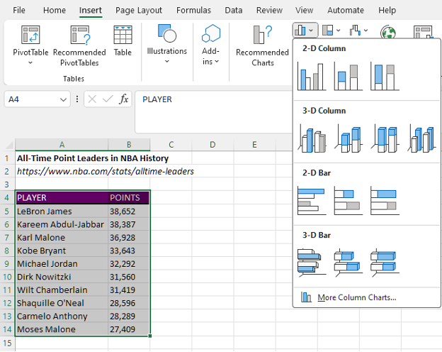
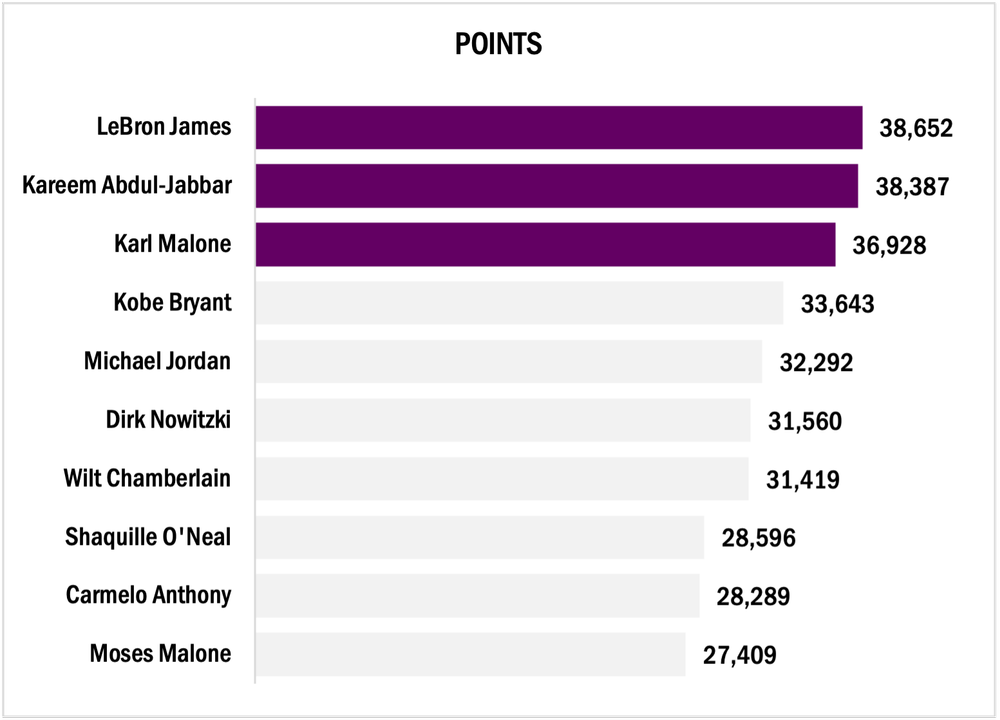
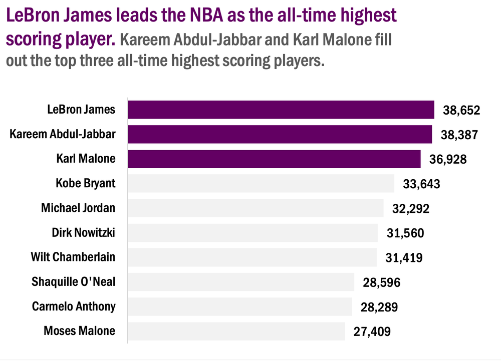
For this tutorial, we will look at the all-time highest-scoring NBA players. Feel free to pull more NBA statistics or use your own data to practice the fundamentals behind creating an engaging bar chart.

The following tutorial assumes that your data are both reviewed and cleaned. However, this is rarely the case. If you need help getting your data to a workable state, here are some resources to help:

  • The Data Cleaning Toolbox

  • Let Excel do the Math: Easy tricks to clean and analyze data in Excel

  • A Beginner’s Guide to PivotTables


Initial Chart Selection

  1. Highlight the data will be included in the bar chart.

  2. Navigate to Insert along the top ribbon of Excel.

  3. Within Insert go to Charts > Clustered Bar.

Applying Data Visualization Best Practices

This section will outline the process to transform the initial bar chart into something much more engaging by applying data visualization best practices.


First Impressions

Before editing the bar chart, review the initial bar chart output and ask questions:

a) Are the data ordered properly?

b) Does the data require data labels?

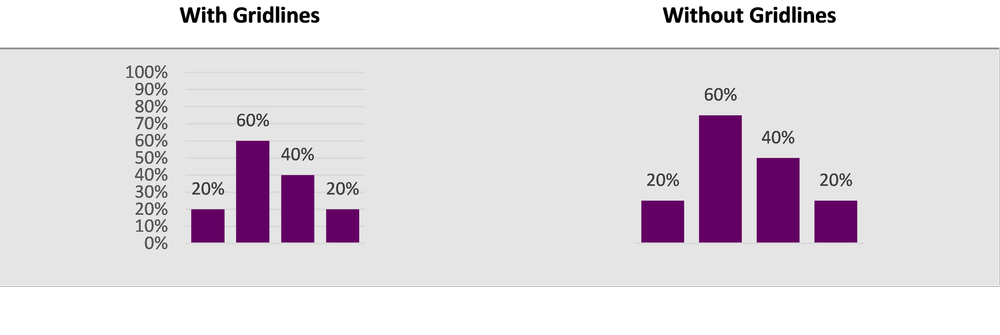
c) Are gridlines beneficial to the overall interpretation of the data?


Simplify

  1. Remove unnecessary gridlines by left clicking on any gridline and hitting Delete.

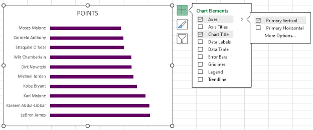
  • Alternatively, hover over the chart with your mouse until a + (Chart Elements) icon appears in the top right.

  • Within Chart Elements toggle off the Gridlines option to remove the gridlines.

2. Remove the x-axis labels by left clicking on the axis labels and hitting Delete.

  • Again, you can use the Chart Elements menu to remove the x-axis.

  • Under the Axes option, toggle off the Primary Horizontal axes.


Reorder the Data

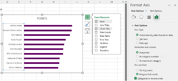
1.     Left click on the y-axis to highlight.

2.     Next right click on the y-axis and select the Format Axis option.

  • Alternatively, select the y-axis and use the keyboard shortcut Ctrl + 1 to open the Format Axis menu.

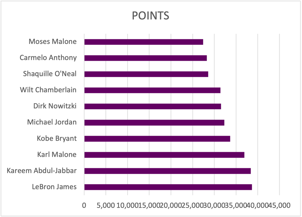
3.     The data are presented in ascending order. To switch to descending order, toggle on the Categories in reverse order option.


Add Data Labels

1.     Left click on any bar within the bar chart.

2.    Right click in the highlighted bar and Add Data Labels.

  • Or use the Chart Elements menu to toggle on Data Labels.


Improve the Appearance
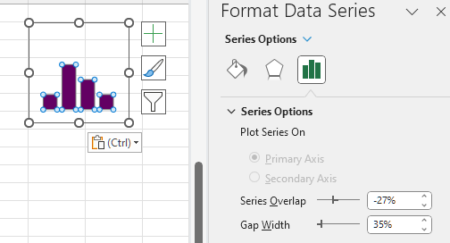
Bar Thickness

1.     Left click on any bar within the bar chart.

2.    Right click in the highlighted bar and Format Data Series.

  • This menu can also be accessed using the Ctrl + 1 keyboard shortcut.

3.     Adjust the Gap Width to 35% (or your preferred bar width).

  • Note: A smaller Gap Width results in a wider bar, and vice versa.
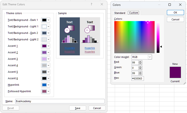

Adjust Colours

1.     Apply your colour palette to the bar chart by right clicking on any bar and selecting the Fill option.

  • If all bars are highlighted, colour will be applied to all bars.

  • You can individually select single bars (ensure only one bar is highlighted) and follow the same step to apply colour to a single bar.

2.     Highlight the top three bars using your primary colour (check to see if you have a style guide).

3.     Mute the other bars with a secondary, muted colour.

Using a darker colour to highlight key information will direct the reader’s attention to important detail. By muting other bars, the focus is further drawn to the primary information.


Adjust Fonts

1.     Left click on the chart to highlight the entire bar chart.

2.     In the Home tab, select your Font of choice.

  • Ensure that your chart font is sans serif to the best results.

3.     Fonts can be selected by scrolling through the list of fonts or by typing in the name of the font if you already know the name of the font you will be using.

4.     With the chart still highlighted, adjust the Font Size to 9 pt.

5.     Next, change the Font Color to Black.

  • The default font colour is a dark grey that is not as sharp as crisp, black font. Change the colour for improved readability.


Improve the Chart Title

Excel will pull the column heading as the chart title for your bar chart. However, this title is often uninformative without more context. Instead of keeping a vague chart title, craft something much more informative that describes the data being presented.

1.     Left click on the Chart Title.

2.     Type in the improved title and hit Enter.

  • The chart title will be edited in the function bar above your spreadsheet.

  • Also, by right clicking on the title and selecting Edit Text you can edit the text directly within the chart.


Final Tweaks

1.     Emphasize the chart title by increasing the main point to 14 pt font.

  • The subtitle (if any) can be deemphasized using a slightly smaller font of 12 pt.

  • Note: When drafting the title within the chart itself, you will have to click and highlight the section to which you wish to apply changes.

2.     Further emphasize the title by using your primary colour in the text of the main title.


Final Thoughts

There are myriad ways to present your data. However, using simple, clean data visualizations will greatly improve the impact and effectiveness of your visualizations. The simple bar chart is among the most effective means of presenting data and should not be overlooked.

Written by cplysy · Categorized: evalacademy

Sep 27 2023

Data Visualization Best Practices: A Practical Guide for Getting the Most out of your Data Viz

This article is rated as: 

Data visualization is a powerful means of effectively telling stories with data. Too often the key messages of our data are lost to the confines of some burdensome table or cluttered chart attempting to present too much information. Here I will outline simple processes to transform your data and make your charts more engaging.


Understand Your Data

It is tempting to jump straight into data visualization, but it is important to take a step back and think about why you are visualizing the data. Specifically, you should be clear on the purpose and context for your data visualizations. This is the time to reflect on your evaluation questions and determine how you may best address these questions with your data visualizations. Understanding why you are visualizing the data and how the data reflect your clients’ goals will improve both the clarity and impact of your visualizations.

Much of the understanding of your data may fall within your initial data exploration and analysis. However, it is just as important to question the data and resulting analyses prior to data visualization. Revisiting the data and resulting analyses will refine what should or should not be visualized and hone your decisions on which visuals will best tell the story of the data. Here are a few prompts to get you thinking about your data:

  • Are there any gaps in the data (either missing data files or incomplete data files) that are otherwise critical for addressing the evaluation questions?

  • Do I understand the data received? For example, are column headings clear or do I need clarification (e.g., a data dictionary) to better understand the data?


Chart Selection

While Excel does provide some chart recommendations, these are often far from ideal. It is better to reflect on the data at hand to answer a few questions that will guide you toward an appropriate data visualization. Luckily, we have a data viz decisions tree to help you get started in selecting the correct chart.

However, broadly speaking, many chart decisions for most evaluations can be narrowed by reflecting on the type of data and deciding from a handful of chart types. Despite there being an endless myriad of charts to choose from, data are best presented simply. Stick to the fundamentals and your data visualizations will be more coherent and will better convey your client’s stories.


The above chart selections are but a handful of all the data visualization possibilities. However, each of these charts can be customized to suit your evaluation questions. For example, bar charts can be replaced with lollipop charts and line charts can be replaced with area charts. However, master the basics before adding variation and complexity into your data visualizations.


Building the Foundation for Better Data Visualizations

Just as there are nearly infinite different data visualizations to choose from, so too are there an infinite number of ways to format your data visualizations. That being said, if you focus on building a few foundational data visualizations, with presets that accentuate your data, then your starting point becomes much clearer.


Data Points

Bar Width

Bar and column charts are the bread and butter of data visualization. They are simple in their execution but are unparalleled in their ability to present data effectively. Personally, I find the default bar widths to be too narrow. Broadening the bar widths helps fill out the bar (or column) chart to better accentuate the data.

Adjusting bar widths:

  1. Left click on any bar within your chart.

  2. Right click (or use the keyboard shortcut Ctrl + 1) to Format Data Series.

  3. Adjust the bar width by changing the Gap Width.

  • A smaller percentage increases the bar width, while a larger percentage decreases the bar width.

  • 35% is my preferred bar width for most data visualizations. However, this may vary depending on the number of categories presented.


Line Thickness

A pencil thin line when presenting time series data can be hard to read. Thicken the line and trends will be much more apparent. While the Excel default is not bad (2.25 pt), often a slightly thicker line will be easier to read. This becomes even more useful when presenting multiple lines in a single chart. Thickening the line of interest will make it pop and better emphasize the most important information.

Adjusting line widths:

  1. Left click on the line within your chart.

  2. Select the Fill & Line heading.

  3. Adjust the line width by changing the Width.

  • Between 2.5 – 3.0 pt is my preferred sweet spot for emphasizing key data.


Marker Size (for Line Charts)

Depending on the data, you may opt to include or exclude markers in your line charts. With extensive time series data covering dozens of data points, data markers can become an eyesore. However, with a few select points, the use of markers can help to highlight your data points.

Adding Data Markers:

  1. Left click on the line within your chart.

  2. Select the Fill & Line heading.

  3. Go to the Marker tab at the top of the Format Data Series menu.

  4. Under Marker Options you can select a Built-in option with varying shapes. Although I recommend only using the filled circle if adding in data markers.

Data Marker Tips:

  1. If size permits, a larger data marker will allow for data labels to be centred nicely within the data marker itself. A marker size of 3-5 pts larger than your data label font is typically sufficient.

  2. With longer time series data, you can opt for smaller data marker (5 pt) to highlight each point within the time series.


Colours and Fonts

Colour Palettes

Sometimes we are constrained when it comes to selecting a colour palette. That is, our client may already have colours pre-selected based on their own company colour palette. However, there are items within our control that will make our data visualizations pop. For example, we can use a client’s main colour to emphasize important information. Or we can use a gradient of their main colour to present like information, as in a stacked bar chart.

Colour Palette Tips:

  1. Create your own palette to build a custom set of colours with primary and secondary colours for your data viz.

  2. Darker, more saturated colours draw attention first. Reserve these colours for highlighting the key information in your data visualizations.

  3. Gradients of the primary colour can be useful in presenting like data, such as in stacked bar charts.

  4. Avoid using green and red to exclusively mean good or bad results. It is better to use colour to emphasize the key message rather than focus on an arbitrary distinction of desirable and undesirable results. Undesirable results, if highlighted, can bring attention to areas for improvement.

Creating a Colour Palette:

  1. Left click on the Page Layout tab at the top of Excel.

  2. Under Colors you will be provided with some default Office colour palettes. To create your own custom colour palette, click on Customize Colors… at the bottom of the dropdown menu.

  3. Within Customize Colors… you will be given the option to modify text, accent, and hyperlink theme colors. Simply click on any colour you wish to change. Use More Colors… to get more options for updating your colour palette.

  4. Customizing your colours works well if you have the Hex codes.

  5. Save the colour palette after providing a suitable Name to reference the palette in the future.


A Few Resources for Picking a Colour Palette:

  • Coolors: Import an image or logo to extract colours and colour palettes

  • Microsoft PowerToys: The Color Picker tool within this Microsoft application will allow you to get colour codes from any image on your screen.

Sharing a Colour Palette:

  1. Left click on the Page Layout tab at the top of Excel.

  2. Under Themes located the Save Current Theme… option (ensure that your desired colour palette is already selected).

  3. Save your colour palette on your computer or within a shared team folder.

  4. Simply link or email the colour palette to any other team member that may require the use of the colour palette.


Fonts

Similarly, fonts may be pre-determined by your client or team. However, when it comes to data visualizations, always opt for a sans serif font. Serif fonts will clutter your charts and make smaller data labels more difficult to read, as these fonts use valuable space with your charts.

Font Tips:

  1. Always use sans serif fonts for data visualizations.

  2. Condensed fonts may help free up valuable space within your data visualizations (I have found some success with Franklin Gothic Medium Cond).

While the theme fonts for a project may be preselected, we usually have control over the size of said font. For data visualizations, consistency is the most important aspect when deciding on font sizes. Nothing is more distracting than identical looking charts with varying font sizes.

Font Size Tips:

  1. Titles and headings (should) emphasize the key findings of each data visualization and, thus, should be the largest. Reference your company or client’s style guide if available. If not, fonts of 14 pt size are good for main titles with a slightly smaller font (12 pt) being good for subtitles.

  2. Axis font size only needs to be large enough that they are easily readable. I usually default to a 9 pt font for axis labels.

  3. Similarly, data labels only need to be large enough to read. Like the axis font, I default to a 9 pt font. Although, you can use a large font or bolding to emphasize key values.


Miscellaneous

Gridlines

Often, data points will already be labelled. If so, gridlines are just visual clutter that offer little for the overall comprehension of your visualization; actually, they may even hinder the overall interpretation of a data visualization.

Gridline Tips:

  1. If data points are labelled, scrap the gridlines for a cleaner, more aesthetic looking visual.

  2. If you are presenting many data points, keep the gridlines. Sometimes labelling too many data points clutters the end visual. Drop data labels in favour of gridlines if this is the case.

  3. If including gridlines, adjust the Bounds of the axis to appropriate units. Too many major gridlines and the message will be lost.


Y-Axis Scaling

If possible, always start with a zero baseline on the y-axis. Keeping a consistent baseline will allow for more direct comparison between similar charts, while not overemphasizing otherwise minimal differences between data points.


Additional Tips and Recommendations

  • Remove the clutter. To get the most out of data visualizations, it is best to strip each chart to only what is necessary. Titles can be replaced with your own custom, engaging titles that actually explain what the data show. Gridlines can be dropped if your data bars are already labelled. Clutter is distracting, so focus each data visualization down to the critical pieces of information and highlight them. This will make your data visualizations appear more professional with the added benefit of being interpretable. For more tips on creating better data visualizations, check out our top seven tips.

  • Use chart templates to save time. Formatting charts from scratch is time intensive, so leverage the use of custom chart templates to quickly convert similar charts into the same style. This will maintain consistency across your visuals while saving you precious time.


Wrapping Up

There are many things to consider when building data visualizations. From chart selection to formatting, this guide is designed to narrow the scope of what makes a good data visualization by stripping away the need for overly complex and burdensome data visuals. By focusing on a few basic chart types and fundamental chart formatting tips, you will be able to craft custom and effective data visualizations no matter the data thrown your way.

Written by cplysy · Categorized: evalacademy

Sep 25 2023

Building Capacity in Evaluation

This article is rated as:


Most evaluators are hired to evaluate something: a program, grant-funded activities, a new approach. But what do you do if you get asked to build capacity in evaluation? That is, to help another team or organization do their own evaluation?

There are a few courses available (hint check out our Program Evaluation for Program Managers course!) but maybe they want an evaluation consultant’s help to design the process and tools in a way that can be sustained in-house. This was exactly the ask on a recent contract for me.

The Ask:
Help us evaluate our impact in a way that we can monitor, review and sustain on our own!

The start of this work wasn’t all that different from a program that I would evaluate. I sought to find out: “What do you want to know and why?”, and “How will you use it?”. I held the same kick-off meeting as I normally do (check out: The Art of Writing Evaluation Questions; Evaluation Kick-Off Meeting Agenda (Template); How to Kick Off Your Evaluation Kick-Off Meeting). I figured, at the end of the day, this was still about designing a program evaluation. The key difference was that instead of our team implementing the evaluation, we had to train their staff to do it: the data collection, the analysis and the resulting action.

After understanding what they wanted to be able to monitor by outlining key evaluation questions, we started working on a toolkit. We had a vision that a toolkit could be a one-stop shop for all things related to this evaluation – a place any member of the organization could reference to understand the process and learn how to do it.  At the start of this journey, our proposed table of contents for this toolkit was quite vague and high-level, including sections like “What is the process?”, “Where do I find the data collection tools?”. But the more we field tested (more on this later), the more we kept building out what the toolkit included.

I gained a lot of learnings from this process. Here are some of my top takeaways:

Consent. As evaluators we can’t take for granted that others know about the informed consent process. Most staff at an organization probably don’t go about collecting personal information and experiences and likely haven’t thought about informed consent in a meaningful way. Therefore, a big part of our toolkit focused on defining consent: why it’s important and processes to obtain consent. We even shared some Eval Academy content: Consent Part 1: What is Informed Consent, Consent Part 2: Do I need to get consent? How do I do that?.

Confidentiality and anonymity: Part of consent covers whether or not obtained information will be kept confidential or anonymous. This raised another key learning: most staff don’t think about what this actually means or how it’s done. Often staff assume (correctly or incorrectly) that their organization has policies in place, and they wouldn’t be allowed to do things if it was unethical. This isn’t always true. We included in the toolkit some key information on what confidentiality and anonymity mean, and how they applied in their specific context. For more on this, check out our article Your information will be kept confidential: Confidentiality and Anonymity in Evaluation!

Interviewing skills. For their evaluation, the organization wanted to use volunteers with a range of backgrounds to do some client interviews. This triggered our team to figure out how to build capacity in interviewing. We came up with Tip Sheets for Interviewing, then created and recorded some mock interviews for training purposes. Because we wouldn’t be there to run the training, we wanted to make sure these volunteers were offered some direction, so we included a worksheet for the trainees to reflect on the recorded interviews as part of their training: Why was the interviewer asking that? Why was that wording used? What did the interviewer do when the interviewee said this…? etc.  We provided materials on role clarity of an interviewer – not as a therapist, but as an empathetic listener, and ensured that the interviewer would have access to a list of community resources if needed. We also raised some awareness about vulnerable populations, about offered some preparation for scenarios that might occur with individuals who are feeling distress.

Analysis. Completing data collection is just part of an evaluation. We knew this organization didn’t have a lot of capacity or expertise to be diving into Excel spreadsheets, so we built them a dashboard. They could gather survey data in Excel and auto populate a dashboard at any time, that would visualize key learnings for them. We included a step-by-step instruction guide to help them out. We also wanted to make sure that the organization understood what it means to be the keeper of data, so we shared our Eval Academy data stewardship infographic.

Reporting and reflection. The dashboard was a good start, but we really wanted to support this organization to use the information they were gathering. Also, some data were qualitative and not well represented in the dashboard. We built a report template with headings that signalled where to find information that may answer their key questions. We also built a list of reflective questions that would help them to think about what their data showed and what potential actions were possible which you can access here: Questions to Get You Thinking about Your Data

This all sounds kind of straight forward, right? We thought about what a team needs to know about evaluation and built them those things. Not so! This entire process was iterative – more of a two-steps-forward-one-step-back kind of journey. With each new idea “Ah, they need to know about consent”, we’d learn of something else to add “Oh, they also need to know more about confidentiality”.  To help with this process we did a lot of field testing.

We loosely followed a Plan Do Study Act quality improvement format. We’d get a staff member to test the process on 3 – 5 clients, we’d huddle and talk about what worked well, what didn’t and what unexpected things we encountered, then we tweaked and repeated. Eventually we landed in a spot that seemed to work well.

At the end of it all, the Toolkit (now with a capital T!) was pretty large, and we ended up breaking it up into three core sections.

  1. Describing the process. Who does what when, what roles requirements exist for various roles, links to find data tools, and links to resources. We also included some email invitation templates and scripting for consent, and a tracking log.

  2. Training. The second section focused on those niche skills that may come as second nature to a seasoned evaluator – this is where we included mock interview recordings, tip sheets, confidentiality and consent primers, when and if to disclose information, and how to be a good data steward.

  3. Reporting. The final section described what to do with the information – the dashboard, the report, the reflective questions and a recommended timeline.  We created step-by-step instructions for how to get data from an online survey platform into the dashboard and from the dashboard into the report.

This was a really different experience for me and I learned a lot about slowing down, explaining process, and not making assumptions. It’s strange not to follow-up to see how the process is working. We left them with the final recommendation that all evaluation processes should be reviewed – there is risk in going into auto-pilot. Evaluation processes are only worthy if they are answering key questions and providing actional insights.  I think it was really insightful and good future planning for this organization to understand the value of evaluation and to want to learn more about it so they could do it on their own.

Written by cplysy · Categorized: evalacademy

Aug 29 2023

Survey Design Part 1: Planning for your Survey – A review of Designing Quality Survey Questions (2019) by Robinson and Firth-Leonard

This article is rated as:


You’ve determined that you need a survey to gather information from a specific population you serve. But where do you start? I recently read the book Designing Quality Survey Questions (2019) by Sheila B. Robinson and Kimberly Firth Leonard, which if you are still a survey design novice, would be a great resource.


In the book, Robinson and Leonard discuss the iterative process of designing a survey. The book is divided into three parts: planning and predesign, drafting questions, and finalizing the survey. Each of these parts is seen as a loose phase in survey design and development; I emphasize loose as this is an iterative process. To best cover the three main components of survey design, I have chosen to follow a similar flow. I found the drafting questions and the finalizing of the survey sections more useful in the drafting of a survey, however, the planning and predesigning section is still an important aspect in survey design and does need to be covered.


Why quality survey design?

The book begins with why survey design is important before the authors even discuss how to design quality surveys. They emphasize the need for quality surveys to get people to want to complete your survey as people are now inundated with survey requests. Part of Robinson and Leonard’s aim in this book is to help you improve on your survey design which in turn would help improve respondent experience and data quality. Throughout the book, they emphasize respondent experience over ease of analysis. The authors see respondent experience as imperative to quality survey design. I see their point here, as frequently I haven’t finished a customer experience survey because my choices didn’t make sense, they had too many textboxes, or the survey itself was too long.


Articulate the purpose

In the planning and predesigning phase, the aim is to understand and articulate the purpose of the survey, along with what the survey can measure, and start to understand the survey respondents. At this phase, the evaluator would determine what knowledge they hope to gain through the use of the survey. The authors included evaluation question(s) that the survey would inform, how the information will be used, and who will use that information as part of the clearly articulated purpose of the survey.


Ensure the survey is the right tool

After articulating the purpose, this is when the evaluator would determine if a survey was the right tool to gather the information. Robinson and Leonard articulate the purpose as 1) understanding why you have chosen to use a survey, and 2) outlining what is planned for the results to help ensure a survey is the correct tool. As they view survey design as iterative, you could reverse these steps if that process made more sense to you. Personally, I think these are really happening at the same time.

The authors then review what can be measured by a survey, including respondent’s attributes, behaviours, abilities, and thoughts. The authors also articulate the advantages and limitations to using the survey tool.


I appreciate the authors spending time outlining the advantages and limitations of the survey tool, to help the evaluator determine if this is indeed the tool for the evaluation questions and potential respondents. I wouldn’t spend time developing a survey when interviews would be a better method.


Survey respondents

Robinson and Leonard devote an entire chapter to understanding respondents, which makes sense to me as the whole purpose of the survey is to gather information from this group, so respondents need to be understood as in-depth as possible by the evaluator. The authors start this chapter with the four cognitive tasks respondents must use in answering surveys: comprehension, retrieval, judgement, and response.

They then examine the potential respondents’ willingness and ability to participate in a survey. They ask questions such as:

  • Do the types of questions and the nature of the questions encourage respondent participation?

  • Can the potential respondents remember that information, or understand the questions and the language used?


To help with comprehension, the authors do mention the QUAID (Question Understanding Aid) tool that was developed by the Institute for Intelligent Systems at the University of Memphis. This tool can give some feedback on the language used and may be helpful with comprehension. Robinson and Leonard stress that with any tool they suggest, it doesn’t replace field testing or getting feedback from other people in the process of survey design but may help get your tool closer to a final version prior to pre-testing. The authors cover pre-testing the survey later in the book, after drafting survey questions.

The authors then discuss the importance of understanding the context and culture of the potential respondent population. There are several questions the evaluator should consider, such as:

  • What is the current political, environmental, economic, organizational, and cultural context?

  • How does the cultural background of the evaluator differ from that of the respondents and how can the evaluator be respectful and responsive to this?

  • What about the power dynamics; who had the power and privilege or at least who has the perceived power and privilege?


Overall, I found this book a helpful resource in survey design. This book is great for someone new to survey design and could be a great resource for those more experienced as they do give many examples and list other resources for further information at the end of every chapter. I found the later chapters around crafting survey questions and drafting the survey more useful and will review these chapters and any tips and tricks that would be useful in a later article.


Stay tuned for Part 2 of survey design that will explore how to draft quality survey questions.

Written by cplysy · Categorized: evalacademy

Aug 29 2023

Podcast Review: Indigenous Insights: Episodes 1 and 2

This article is rated as:


While looking for my next audiobook, I came across Gladys Rowe’s podcast, Indigenous Insights: An Evaluation Podcast and an Indigenous perspective on evaluation piqued my interest. The podcast is available on Spotify, Audible, and on her website gladysrowe.com. Rowe is a member of Fox Lake Cree Nation in Northern Manitoba and holds a PhD in Interdisciplinary Studies from the University of Manitoba. For further information on Rowe check out her bio on her website.


If you are hoping to get a step-by-step process on how to do Indigenous evaluation, this is not the podcast for you. The episodes are more about experiences in doing Indigenous evaluation than a process to follow. It is about what each guest has learned in their journey. It is more akin to a learning circle where you are listening to an elder share their experiences and you are expected to reflect on it and find your own learnings. This aligns with Rowe’s aim for this podcast, to provide a space for those in Indigenous evaluation to learn from one another and to each build our own Indigenous evaluation bundle. I think the learning circle style furthers Rowe’s desire to elevate Indigenous voice and experience as I found this type of learning common when participating in Indigenous teachings.


If you are looking for somewhere to start to get your feet wet in Indigenous evaluation, this might be a good place. The podcasts are easy to follow. I found the storytelling format to be engaging. The sound quality is consistent so the speakers can be heard throughout. This is also not a podcast you would need to listen to most of the episodes in order, so you could jump around to the guests you would find most interesting.


On each episode, she talks with a different researcher or evaluation practitioner about their experiences in Indigenous evaluation. Most of the episodes are approximately 40-50 minutes long, during which she hosts a discussion with one or two guests. The first episode is the shortest of the series as it serves as an introduction to who Rowe is and the aim for the podcast series.


I like how Rowe positions Indigenous evaluation in episode one. She describes Indigenous evaluation as being grounded in Indigenous ways of knowing, being, and doing. “The projects, questions, methods, and meaning making are relational, iterative, and lived deeply within our hearts and spirits.” She sees Indigenous evaluation being more than just bringing methodologies and tools to complete this work but needing to bring her whole self. I found bringing my authentic, whole self into Indigenous work is needed. Through my experiences with Indigenous organizations, I have found that if you didn’t come with your authentic self, you won’t be trusted or ever fully accepted by the community.


Rowe also emphasized the need for evaluation to ensure Indigenous community priorities are central and the “wisdom of those with lived experience” are highlighted. I found that Bremner, her first guest in episode two, further expands on these ideas in episode two and makes some compelling points through his use of stories and examples.


In just the first couple episodes, you can get a feel for what the flow may look like for this series. In the first episode, Rowe talks about her relationship to the land, connection to the Indigenous community, her educational and work background, and her learnings in conducting Indigenous evaluation. A similar flow continued in the next episode with Larry Bremner. This is like providing a personal land acknowledgement which includes the individual’s relation to the land, the historical people who lived on the land, and who their own ancestors are. If you are interested in developing your own land acknowledgement you could use some of the format found in the introductions of these podcasts or the University of Saskatchewan has their own video series of how to create one.


In episode two, Larry Bremner, through his use of stories, discussed how evaluation needs to come from the community and benefit that community. He described Indigenous evaluation as being about “social, environmental, and economic justice.” For evaluation to benefit the Indigenous community, he saw the need for the evaluation and its priorities to be set by the community. Frequently evaluation was done by external bodies and did not reflect the priorities or realities of the community. Therefore, many of these evaluations had no lasting effect on the community. The benefits for the community need to be first and foremost in the evaluation. I found it interesting that he then linked the use of evaluation to further colonize Indigenous peoples which does help explain why there is a lack of trust in evaluation processes.


Part of Bremner’s evaluation experience related to the importance of the evaluator as an embedded member of the community, in this way, the evaluator becomes part of the story. The evaluator is an active participant of the community and is a trusted member of the community. To me, this relates back to Rowe’s comments about bringing your whole self into the work. I have seen how Indigenous people will not trust and accept someone into their community who is seen as fake. A program can be successful, or not, based on who the facilitator is and what they bring of themselves to the project. If the evaluator isn’t genuine, it will be seen, and community members will not engage with that person.


By the evaluator being part of the community, the evaluator knows which ceremonies it is appropriate to participate in and when not to. Through this participation and observation, key findings can be witnessed that would never show up through a questionnaire. Bremner did give an example of a ceremony he didn’t participate in but could observe the outcome of that ceremony through the conversation with the participant later. Again, the participant only shared this knowledge because he was a trusted part of the community.


Bremner provides some insight into the concept of knowledge ownership, where the owner is credited for that knowledge. He saw the other side to that being where knowledge is taken and used elsewhere without giving credit to those who originally gave it. I found it interesting that he connected this to the appropriation of Indigenous knowledge. Ultimately, I believe this is frequently the concern with evaluations that happen in Indigenous communities.


There are other learnings you could glean from Bremner’s stories. These are just a few of the topics he discussed.

Overall, I found these episodes to be packed with ideas and concepts that could further influence how anyone might approach evaluation or really any work within Indigenous communities.


Episode 1: S01E01: Indigenous Insights – Making Introductions

Episode 2: S01E02: Indigenous Insights – Larry Bremner


Have an evaluation podcast you love? Drop it in the comments below!

Written by cplysy · Categorized: evalacademy

  • « Go to Previous Page
  • Go to page 1
  • Interim pages omitted …
  • Go to page 10
  • Go to page 11
  • Go to page 12
  • Go to page 13
  • Go to page 14
  • Interim pages omitted …
  • Go to page 43
  • Go to Next Page »

Footer

Follow our Work

The easiest way to stay connected to our work is to join our newsletter. You’ll get updates on projects, learn about new events, and hear stories from those evaluators whom the field continues to actively exclude and erase.

Get Updates

Want to take further action or join a pod? Click here to learn more.

Copyright © 2026 · The May 13 Group · Log in

en English
af Afrikaanssq Shqipam አማርኛar العربيةhy Հայերենaz Azərbaycan dilieu Euskarabe Беларуская моваbn বাংলাbs Bosanskibg Българскиca Catalàceb Cebuanony Chichewazh-CN 简体中文zh-TW 繁體中文co Corsuhr Hrvatskics Čeština‎da Dansknl Nederlandsen Englisheo Esperantoet Eestitl Filipinofi Suomifr Françaisfy Fryskgl Galegoka ქართულიde Deutschel Ελληνικάgu ગુજરાતીht Kreyol ayisyenha Harshen Hausahaw Ōlelo Hawaiʻiiw עִבְרִיתhi हिन्दीhmn Hmonghu Magyaris Íslenskaig Igboid Bahasa Indonesiaga Gaeilgeit Italianoja 日本語jw Basa Jawakn ಕನ್ನಡkk Қазақ тіліkm ភាសាខ្មែរko 한국어ku كوردی‎ky Кыргызчаlo ພາສາລາວla Latinlv Latviešu valodalt Lietuvių kalbalb Lëtzebuergeschmk Македонски јазикmg Malagasyms Bahasa Melayuml മലയാളംmt Maltesemi Te Reo Māorimr मराठीmn Монголmy ဗမာစာne नेपालीno Norsk bokmålps پښتوfa فارسیpl Polskipt Portuguêspa ਪੰਜਾਬੀro Românăru Русскийsm Samoangd Gàidhligsr Српски језикst Sesothosn Shonasd سنڌيsi සිංහලsk Slovenčinasl Slovenščinaso Afsoomaalies Españolsu Basa Sundasw Kiswahilisv Svenskatg Тоҷикӣta தமிழ்te తెలుగుth ไทยtr Türkçeuk Українськаur اردوuz O‘zbekchavi Tiếng Việtcy Cymraegxh isiXhosayi יידישyo Yorùbázu Zulu