• Skip to main content
  • Skip to footer
  • Home

The May 13 Group

the next day for evaluation

  • Get Involved
  • Our Work
  • About Us
You are here: Home / Archives for allblogs / evalacademy

evalacademy

Oct 31 2023

Encrypting and Anonymizing Personally Identifiable Information (PII) in Raw Data

This article is rated as:


Introduction

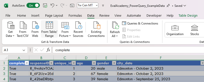
As evaluators, we are presented with a swath of data from varying sources, which often contains personally identifiable information (PII). PII includes any data which can be used to identify an individual. These data may include, but are not limited to:

  • Names

  • Date of birth

  • Addresses

  • Email addresses

  • Personal health numbers (PHNs)

Within Canada, there are data protection laws to safeguard PII, including the Personal Information Protection and Electronic Documents Act (PIPEDA) at the federal level and the Personal Information Protection Act (PIPA) in some provinces, such as Alberta. Each jurisdiction is likely to have its own major legislation, such as the U.S. Privacy Actand Health Insurance Portability and Accountability Act (HIPAA) in the United States or the General Data Protection Regulation (GDPR) in the European Union. While this article will not explore the details of these Acts, it is important to be aware of such legislation to ensure data are handled appropriately.

Under such legislation, PII is generally defined as: “personal information including any factual or subjective information, recorded or not, about an identifiable individual.”

In this article, we will outline some best practices for handling raw data to protect PII. For additional information, check out how to keep information confidential and anonymous.


Identify & Classify PII

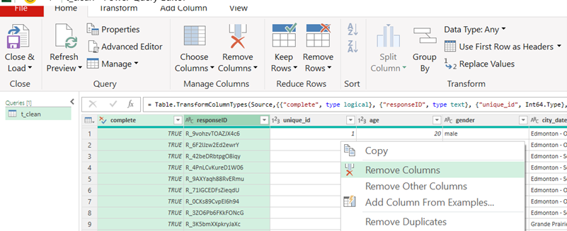
Whether receiving data from within your organization (as an internal evaluator) or receiving data from a client’s organization (as an external evaluator), it is essential to review and identify all PII being collected. However, as PII can be any information that directly or indirectly identifies an individual, the process of identifying PII takes practice. For example, most demographic data could potentially reveal a person’s identity. However, while a full name directly identifies an individual, demographics like age or gender, when considered separately, may not be sufficient to identify an individual. It may require several demographic data combined to identify an individual. In such cases, it is necessary to categorize the PII in each data source to determine its relevance for the evaluation. If not essential, the PII should either not be collected in the first place or, if already collected, should be either removed or anonymized to maintain personal confidentiality.

During this identification and classification process, PII should be evaluated on:

  • The relevance of the PII being collected.

    • Are the PII required to adequately address the evaluation questions?


Note: Data being collected may serve other primary purposes, such as supporting registration, service delivery, etc. As evaluators, we do not delete or anonymize information from raw data sources being used to support operations but, rather, delete or anonymize information from our working data files to reduce the risk of unauthorized access to PII.


  • The sensitivity of the PII being collected.

    • Non-Sensitive PII: information easily gathered from public records, directories, or websites, including date of birth, gender, or postal code.

    • Sensitive PII: information that could potentially result in harm to the individual if data are breached, including personal health numbers (PHNs) or social insurance numbers (SINs).

Classifying data based on whether it is required for the evaluation, and on the sensitivity of said data, will inform your next steps. Required data containing PII may be worked with if appropriately managed and safeguarded (e.g., encrypting sensitive data). However, inessential data containing PII should be deleted (where appropriate) or anonymized to best protect the individual. With all PII, it is important to consider and abide by any information sharing agreements in place between your organization and the data owners (whether internal or external).


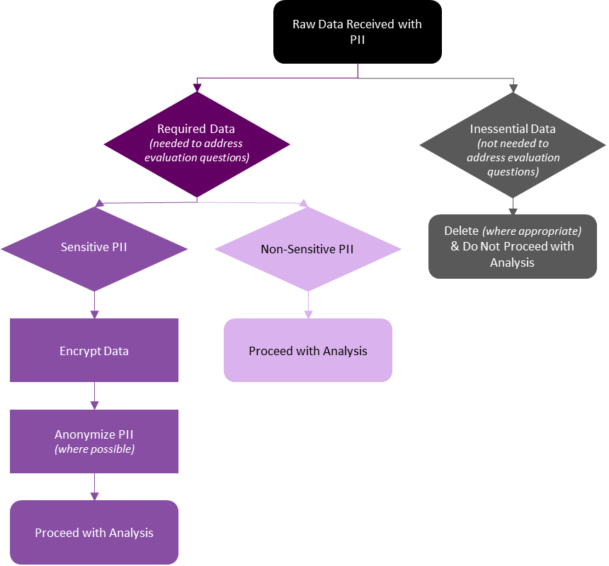
Inessential Data with PII

Data containing PII that are not required for your evaluation should be deleted or otherwise excluded from your analysis. However, methods for managing inessential data containing PII will be organization or context specific. Refer to your data privacy manual or connect with your data privacy officer as to next steps.

If inessential data with PII were collected, next steps may include:

  • Reporting to the client and/or data owner that PII were received.

  • Discussing with the client and/or data owner whether all data require deletion, or whether only the PII require deletion.

    • These conversations will determine whether you can personally remove the PII, or whether the data owner needs to remove the PII and resend the data.

  • Determining whether a full review of your information sharing agreement is required.

    • Do individuals need to be contacted about a breach in their personal information?

The key is to be aware of and eliminate inessential PII from raw and analysis files whenever possible. While these data may be harmless (e.g., inessential but non-sensitive), it is best practice to not store PII that will not be directly used in your evaluation.


Required Data with PII

If the PII are required for your evaluation, it is necessary to determine the sensitivity of said PII. Non-sensitive PII may not require any additional steps to safeguard the personal information, but sensitive PII will require additional safeguards (if not already in place).


Required and Sensitive PII

Required and sensitive PII need to be treated with additional care to protect the identities of the individuals captured in the raw data. These steps are best completed in the early stages of data collection but can be implemented in the data cleaning and analysis process if necessary. While these methods are not always necessary for non-sensitive data, they support data security for all PII and other sensitive data.


Encryption

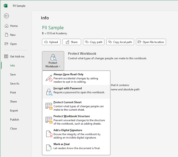
Encrypting the raw data is essential to protect PII from unauthorized access. Encryption, “a security method for safeguarding data from unauthorized access”, is particularly important while data are in transit (e.g., when data are moving between devices via email), as data are more vulnerable while on the move. However, data at rest (e.g., when data are saved to your laptop’s drive) should also be encrypted.


How to Encrypt an Excel File:

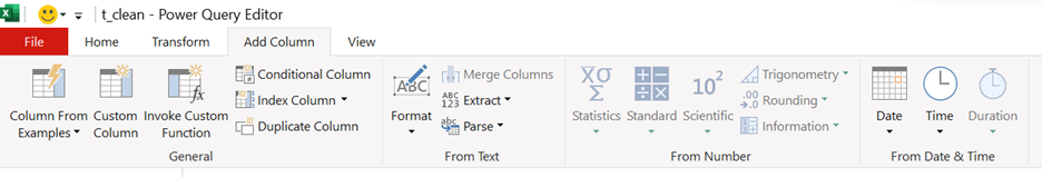
  • Go to the File tab in the top left corner of Excel

  • Under Info select Protect Workbook and Encrypt with Password

  • Enter and re-enter your password

  • The Excel spreadsheet will now be Encrypted


Note: Do not store your password with the encrypted file (e.g., saved to the same folder). Keep passwords private and separate from the data. If necessary, consider using an encrypted password management software.


Encrypt Multiple Files or Folders:

Usually encrypting the individual Excel file is sufficient. However, when storing larger amounts of PII or other sensitive data, you may consider using encryption software to safeguard your data. These can range from free open-source software (e.g., AESCrypt, VeraCrypt) to paid alternatives (e.g., AxCrypt, Folder Lock). If your organization uses a business communication platform like Microsoft Teams, your data are likely encrypted both in transit and at rest within the platform. However, you should thoroughly research any encryption software you may be using to ensure it meets your needs and adequately protects your sensitive data.


Anonymize PII

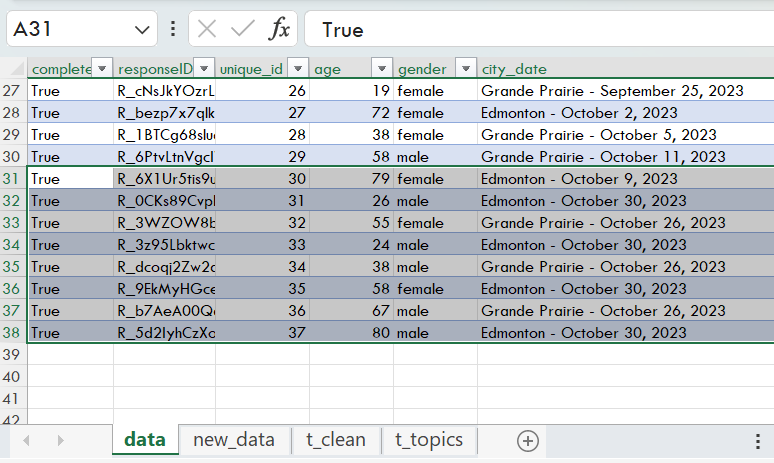
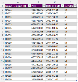
Anonymizing your PII is an additional method to protect your sensitive data. While there are numerous methods for anonymizing PII, a quick and efficient method is to use unique identifiers to replace some of the PII, such as names and personal health numbers (PHNs).


Creating Unique Identifiers:

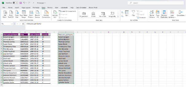
  • Identify which PII need to be anonymized. In this example, we will use First and Last Name.

    • Note: You may replace names with a unique identifier and still get accurate counts of unique individuals. However, you may still need unaltered date of birth or gender information for demographics analyses.

  • Get a unique list of First and Last Names by removing duplicates (if any)

    • Copy and paste (Ctrl + C, Ctrl + V) a duplicate list of the column you wish to anonymize

    • Highlight the new column and navigate to the Data tab

    • Select Remove Duplicates under the Data Tools section


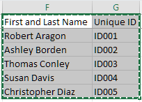
  • Insert your anonymous code to the right of each unique First and Last Name

    • Use any random identifier that does not hint at the PII you are anonymizing

    • For ease, you can use sequential numbering with an ID prefix

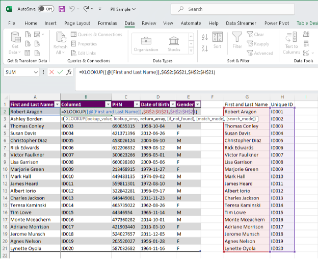
  • Create a new column next to First and Last Name by right clicking on Column B and Insert. This will insert a blank new column next to First and Last Name.

    • Use the formula XLOOKUP to pull the unique identifier from your Unique ID table

=XLOOKUP([@[First and Last Name]],$G$2:$G$21,$H$2:$H$21)


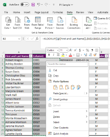
  • Replace the XLOOKUP formulae with raw Values

    • Highlight everything in Column B

    • Copy the column (Ctrl + C)

    • Right click in Cell B2 and Paste Special > Values (V)


  • Remove the original First and Last Name column

    • Right click on Column A and Delete


  • Next, copy and paste (Ctrl + C, Ctrl + V) the Unique ID table into a separate Excel document

  • Encrypt (see above) the new Excel file containing the Unique ID table

    • This encrypted Excel file will act as a key should you need to add more unique individuals to the data set

    • This will also provide you a method of re-identifying individuals, if required


Next Steps

Encrypting and anonymizing PII provide the backbone of protecting sensitive information that are required within your evaluations. These methods provide peace of mind that individuals’ data are safe against potential data breaches. Just remember to save passwords for encrypted files in a safe place separate from the data files or consider having a password convention within your team or organization to access these encrypted files.

However, data security does not stop with encryption and anonymization. For example, data should be retained for only as long as they are required and deleted when no longer required. Clear policies on data retention and deletion will ensure that you are not holding on to unnecessary data. Further, employees within your organization and/or within your clients’ organizations should be trained and aware of data privacy and security to help protect PII.


Wrapping Up

While we outline the initial steps to protect PII, it is important to continually monitor your data security measures. Following these best practices will set you and your organization on the right path in protecting PII and other sensitive information.

Written by cplysy · Categorized: evalacademy

Oct 30 2023

In defence of long reports.

This article is rated as:


116, 78, 54, 47 – These are not my golf scores, or my typing speed, or even the number of CDs I owned in the 90s.

These are my report lengths, in pages.


My name is Bonnie and I write long reports.


There I said it. It’s out there. Are your eyes wide? Jaw on the floor? That’s ok. Actually, I’m not all that ashamed. I may be in the minority here, but I think long reports have a place.

Stephanie Evergreen, Ann Emery, and Chris Lysy are all people in the evaluation and reporting field that I follow, respect, and learn from. They are also all people who offer warnings about long reports. Each of these three gurus shares the familiar song about having three versions of a report, usually something like 1 – 3 – 25: here’s Stephanie’s take on it, Ann’s is here and Chris’ here. We even have our own version here at Eval Academy! The idea is that 25 – 30 pages should suffice for your “final report”. This page limit should be enough to get your findings across in a way that remains accessible to your audience(s). A three-page version is for those higher-ups, or peripherally engaged partners who just want the key takeaways, and perhaps aren’t tasked with key decision-making based on findings. And finally, the one-page version may be for the public or to post on a website.

So how do I defend my long page counts? In a few ways:

1. If you don’t write it down, it will get lost. Chris Lysy from Fresh Spectrum has written a lot about reporting. I am a subscriber to his thoughts that these long reports aren’t reports per se but perhaps “documentation”, a place to document the nitty gritty details: What did we do? What did we measure? What did we learn? The purpose of a document, rather than a report, is to build organizational memory or create a historical record. Whatever you want to call it, if you don’t write it down, it will get lost. I’ve definitely had times where I’ve gone into the archives of past projects to recall just how I phrased that question, etc. Long reports documents do have value by housing all of this information in one place. Here are some of Chris’ articles sharing more details on the distinction between the two, that I won’t plagiarize here: The two types of report. (freshspectrum.com) In defence of the 200-page report (freshspectrum.com).

2. Design matters. We’ve written a lot at Eval Academy about how to create quality reports. We walk the walk too. I employ lots of principles to make sure each of my 100+ pages are high quality. This includes:

a.     Use of white space

b.     Use of visuals: images, charts

c.      Page breaks

d.     Title pages

e.     Use of colour to link (or separate) ideas

So yes, my 100+ page report could probably be crammed into 70% of the space but it wouldn’t be fun to read. (I hear you Chris Lysy – see cartoon), but I offer you this: if the report is not a report but a document for knowledge preservation, and your project manager, at the very least, IS going to read it, then good design goes a long way.

3. There’s always the executive summary. I dedicate a fair bit of time to crafting a quality executive summary. It varies in length too, usually from one to five pages. Often, I’ll set the (long) report/document aside for some time, then return to it and try to read it through with fresh-ish eyes while I take notes on what the key takeaways are in each section. I ensure that each point is covered clearly and with appropriate context in the executive summary.

4. I use appendices. Appendices tell a reader “Hey, here’s more information if you’re super keen on this, but we think you can gain the key insights without this additional detail.” I use appendices to give details about survey respondents, response rates, methodologies, frameworks, or approaches. They add length to a report, for sure, but some readers will get to the appendices and feel a little relief that the body of the report was actually much shorter than expected! (Bonus!)  Side note: I think most people don’t count appendices in overall report length, but I do, because when a reader opens the document, the first thing they’re going to see is the total page count. They don’t know how many pages are body and how many are appendices.

5. I do actually follow the 1-3-25 method. Kind of. The 100+ page report isn’t the only deliverable I give a client. I’ll pull out the executive summary into a more shareable PDF, and sometimes I’ll create another version that aggregates the summaries of each section, so it gives just a little more detail than an executive summary does, without all the detail. So, in my 116-page example (yes, that’s real), I had a 5-page executive summary, and a 25-page version that included background, summaries for each outcome, recommendations, and limitations. I also always offer to give presentations. No matter how long or how well-designed a report is, some people will just want to hear what was found. This is also your opportunity to facilitate discussions about “now what?” – what can or should be actioned? So, I do subscribe to the many-version method, it’s just that my way is (1 – 5)-25-50+ (or however long it needs to be to get it all down).


As the writer of these long reports, I’ve found added benefit that ultimately makes for a higher-quality evaluation for the client. Long reports help me to reflect on all the data and all the findings – I am better able to make connections and triangulate data when I aim for comprehensiveness. This is especially true if a team has been working on the evaluation; the writer gets the benefit of diving into all of the collected data. As I’m writing up all the results, I’ll reflect on what that means, is there a recommendation to come from it, is this a surprise finding, is this something we want to highlight, etc. Instead, if I aim for brevity, and, as an example, distill our 15 participant interviews into a singular primary theme that “participants were satisfied” it loses value, it loses context and loses the opportunity to learn and do better. Writing the report gives me an extra opportunity to think about the data and the evaluation.


Now, I am a self-professed more-is-more person. I like to read all the details on a subject to be well informed to make a decision. I’m that person searching 30 hotel reviews for my two-night weekend away. I’m that person who gets emailed an 80-page report and carves out time in my calendar to read it. I know there are others like me out there. But, if you’re a less-is-more person, I’ve got you covered there too, with shorter versions of the report, or presentations. I’m not saying that these long reports should be our only report, I’m just trying to defend their place in the world.

Long reports can also serve other roles. Detailed reporting is one way to build capacity. Perhaps a novice evaluator will pick it up and learn about how to implement a certain framework or other evaluators will gain some knowledge about how to ask about demographic diversity, or perhaps other project managers or evaluators will learn what not to do!

Long reports also honour transparency and accountability. There’s no hiding holes in methodology when you detail everything you did in your appendices. There’s no hiding the small sample sizes, poor response rates or missed audiences when you have limited sections or include data tables. There’s no hiding how well each evaluation question or outcome is (or isn’t) addressed.


So, if I have you convinced that long reports have value, here’s a couple of tips if you’re starting down this garden path:

1. It’s easy to get into information overload. Practice plain language wherever possible. Keep sentences short and cut out redundant phrases. Keep your key messages and interpretations front and centre. Long reports are not a license for poor writing or unnecessarily long narrative. It is even more important to be concise, stick within the scope of the evaluation and avoid tangential or meandering content.

2. Plan it out. Ultimately long reports cost money in paying for your time. Don’t get caught without a plan. Maybe you’re following a specific evaluation framework, or plan to set up your report by evaluation question or outcome. Whatever you plan to do, map it out. I’ll often take one of my kids’ pieces of construction paper, a good ol’ Sharpie and map out all the data I have to sections that I envision in the report, so I know ahead of time what goes where. I find this planning step efficient and cost-effective.

3. Know your audience. Will a 100-page report catch them off guard? Do they have the capacity to engage with it? Whenever I know that a report is going to be long, I begin to prepare my audience, even to the point of asking them to have dedicated time set aside for review so as to not derail any timelines. Still, not everyone will read it. It is ok to ask certain people to review only certain sections.

4. Make it easy to review. True for any report, but particularly the long ones, feedback from multiple reviewers can put you in a nightmare world of version control. I’m a big fan of using hyperlinks, not attachments, to mitigate version control disasters. It also helps to set clear deadlines for when you need reviews complete.


So, is anyone brave enough to share their longest report lengths? I’m curious to learn if I’m alone out there in the 100+ page club. I hope I’m not coming across as proud of this, but I’m also not ashamed of it. Projects, and therefore, evaluations are becoming more complex. I am currently working on two projects that are essentially three in one: three mini projects under a larger umbrella. These, I anticipate, will not be short reports. So, I am an advocate of building repositories of knowledge, and of doing reports “for posterity’s sake” but that doesn’t mean they have to be long and boring. Quality reporting is still quality reporting.

Written by cplysy · Categorized: evalacademy

Oct 30 2023

Data Visualization Applications: Lollipop Charts – An Alternative to Bar Charts

This article is rated as:


This is an accompanying piece to our Data Visualization Applications: Bar Charts tutorial.  While the standard bar chart is one of the simplest and most effective data visualizations, we sometimes want alternatives to freshen up our reports. This is where the lollipop chart comes in. It presents the same data as a bar chart, but in a slightly different package that works well with numerous bars of data.

Again, we will use the all-time highest scoring NBA players data for this tutorial.

If your data are not structured for analysis yet, here are a few resources to get your data ready for analysis:

  • The Data Cleaning Toolbox

  • Let Excel do the Math: Easy tricks to clean and analyze data in Excel

  • A Beginner’s Guide to PivotTables


From Bar to Lollipop

While I will always suggest starting with the bar chart, sometimes we want to mix things up. A nice way to freshen up your data viz game is by incorporating lollipop charts into the mix. They present the same data as a bar chart but in a new, refreshing way. However, I would stress that the tried-and-true bar chart still wins 9 times out of 10. But on that rare occasion, a lollipop chart is a nice alternative.


Setting Up the Data

While the data presented are identical, we need some additional helper columns to align everything within our lollipop chart. Using the NBA data from the bar chart tutorial the new helper columns will appear as such:

X-AXIS (LABELS): These are used as placeholders to insert our data labels to the left of each lollipop. These will always be set at zero (0) regardless of how many data labels you are using.

Y-AXIS (SPACERS): These space out our data points such that each player is presented on their own line within the lollipop chart. These are manually selected. Using incremental values (e.g., 1, 2, 3, …, n) will provide even spacing for the lollipop chart. Just note that the largest y-value will be placed highest (i.e., at the top) on the resulting chart.

Note: The Y-AXIS (SPACERS) will be used for both the data labels and the actual data lollipops (in this case, points scored by NBA player).


The Scatterplot

While lollipop charts present data identically to the bar chart, it is created using a scatterplot. Following these steps will get you to a clean lollipop chart in no time.

1. Insert a blank Scatter chart.

  • Insert > Charts > Scatter.

2. Right click on the blank Scatter chart and Select Data.

3. Under Legend Entries (Series) and Add data.

4. First select the POINTS data by clicking in Series X values: and highlighting the POINTS values.

5. Next, select the Y-AXIS (SPACERS) by clicking in Series Y values: and highlighting the Y-AXIS (SPACERS) values.

6. Follow Steps 4 & 5 for the LABELS data.


Improve the Appearance

Remove Gridlines

1. Left click on the horizontal gridlines and hit Delete.

  • Alternatively, use the Chart Elements menu to toggle off the Primary Horizontal gridlines.

2. Repeat the process for the vertical gridlines. Left click and Delete.

  • Again, you may use the Chart Elements menu to toggle off the Primary Vertical gridlines.


Scale and Delete Axis Labels

1. Delete the x-axis labels. Left click and Delete.

2. Before deleting the y-axis labels, right click on the y-axis and select Format Axis.

3. Set the Bounds of the y-axis to fit the range of your y-axis labels (in this case, from 0 to 9).

4. With the Bounds set, delete the y-axis labels. Left click and Delete.


Adding in Data Labels

1. Right click on any data point presenting the POINTS (far right) and Add Data Labels.

  • This can also be accomplished through the Chart Elements menu.

2. The labels will present the Y-value by default. However, we want to present the X-value for these data points. To do this, right click on any data label and toggle off Y Value and toggle on X Value.

3. Repeat Step 1 for the data label points (far left).

4. These labels need to be shifted to the left of the data points. Right click on any data label and Format Data Labels.

5. The default Label Position is Right, but we want to select Left.

6. Next, we need to insert the player names. The label points are placeholders for the NBA players. To replace these points, right click on any data label and Format Data Labels.

7. Toggle on Values From Cells and highlight the PLAYER list and toggle of Y-VALUE.


Creating the Lollipop

1. Select any of the data points to the far right and navigate to Chart Design at the top right of Excel.

2. Go to Add Chart Element > Error Bars and select the Percentage option.

  • This can also be accomplished through the Chart Elements menu. Again, just toggle on the Percentage error bars.

3. The vertical error bars are not required. Left click and Delete.

4. For the horizontal error bars, right click and select Format Error Bars.

5. Under Direction toggle the Minus option.

6. Under End Style toggle the No Cap option.

7. And lastly, under Error Amount change the Percentage to 100%.


Cleaning Up

1. Remove the legend at the bottom of the chart by left clicking and Deleting.

2. Select the data points on the far left and change the Fill to No Fill.

3. Update your fonts and colours according to your style guide.

  • Note: Refer to the bar chart tutorial for suggestions on fonts and colours.

4. Insert an appropriate title that highlights the key message for the data.


Make the Lollipop Pop

1. Right click on any error bar and change the Outline to your primary colour.

2. In the same Outline menu, change the line Weight to a 1.5 pt thickness.

3. Right click on the data points to the far right and select Format Data Series.

4. Under Fill & Line go to the Marker section.

5. In Marker Options change the Size of the markers to 8 pt.


Final Thoughts

If you are looking to expand your repertoire and insert new visuals into your reports, the lollipop chart can be a nice alternative to the standard bar chart. However, be sure to use alternatives like the lollipop chart to supplement, not replace, your standard charting for the most impact.


Let us know how you’ve used Lollipop Charts in the comments below!

Written by cplysy · Categorized: evalacademy

Oct 30 2023

Power Query for Data Preparation in Excel: An Introduction and Walk-Through for Beginners

This article is rated as:


Introduction

If you’ve ever needed to analyze primary quantitative data yourself, you may know that a lot of the process is not spent on the analysis itself, but on preparing your data for analysis. Data preparation is the process of reworking your raw data into a useable format for your planned analysis, which is often time consuming, tedious, and prone to human error (especially if you have to repeat these steps on a recurring basis). If this is your first time preparing a dataset for analysis, check out some of our other helpful resources like ‘The Data Cleaning Toolbox’ and ‘Cleaning Messy Text with OpenRefine’ to learn more!

If you’re familiar with the data preparation process, then you know that it can be extra time consuming for recurring analyses where data is updated and needs to be re-analyzed for reporting at regular intervals. This is where Power Query, a tool designed specifically for data preparation integrated with Microsoft Excel, can be a game changer to your analysis workflow. Power Query lets you complete the data preparation task once while it records the steps you take so it can re-run automatically at the click of a button. In this article, I’ll guide you through my process of preparing a raw dataset for a recurring monthly analysis using Power Query and Excel and provide step-by-step instructions so you can try your hand at Power Query yourself.

To show you a little bit of what Power Query can do in helping you prepare your data, download this mock dataset and follow the steps below. If you’re using Excel 2016 or later, Power Query will be pre-installed. If you run into trouble accessing Power Query, check out some trouble shooting steps from Excel Campus here: https://www.excelcampus.com/install-power-query/

Below, I’ll walk you through different steps that I often take when setting up data prep queries. It is important to remember that the exact steps you take, and the order in which you take them, will vary depending on how your data is formatted and your own analytic goals! In this article, we’ll cover the following topics:

Click on any topic name to jump to the relevant section if you’re in a hurry!

  1. Exploring your dataset

  2. Loading data into Power Query

  3. Navigating the Power Query Editor

  4. Naming your queries

  5. Transforming your data

    • Transformations in the data preview

      1. Removing Variables

      2. Renaming Variables

      3. Changing Data Type

      4. Reordering Variables

    • Transformation in the Transform tab

      • Adding a Prefix

      • Capitalizing All Words

      • Splitting Columns by Delimiter

    • Transformations in the Add Column tab

      • Adding Date-Based Columns

      • Creating Custom Columns from Examples

  6. Loading your data as a table

  7. Creating Additional Queries

    • Remove Columns in new query

    • Split Columns in new query

    • Trim Text

    • Unpivot Columns

  8. Refresh Queries to Auto-Update Analyses

  9. M Programming Language Resources


Power Query Walk-Through

Open the downloaded file in Excel, and follow these steps to explore Power Query for the first time:

1. Explore your dataset

Link to above video: https://www.loom.com/share/b93a6d69fa8d4eb3ac0d4cd3d0e3f77f?sid=7edbd424-a68c-420c-9887-4218654bc889


When preparing for any analysis, it is important to explore your dataset to understand what types of variables you have to work with and create a plan. I created this small dataset to mimic a short survey that we might use to gauge the satisfaction of attendees of health-related programs across two Alberta cities. You will see that there are two worksheets in the file you have downloaded: data and new_data. For the first part of this tutorial, we will be working with only the data in the ‘data’ worksheet!

 In the data worksheet, you’ll see that we have information about respondents’ demographics (age, gender), the program they attended (‘city_date’, ‘program_name’), their ratings of that program, and topics they would be interested in seeing in future program sessions (‘future_topics’). There are also two columns that contain meta-data, which is sometimes automatically collected by survey platforms (‘complete’, ‘responseID’).

There are a few key pieces of information that our clients have requested, which influences how I decide to prepare my data. Based on this, I plan to analyze the following pieces of information:

  1. The demographic of survey respondents (age, gender)

  2. The distribution of respondents over program types and sessions (program_name, city_date)

  3. How respondents rated the program they attended, overall, by program type, and by session location

  4. The most popular ‘future_topics’ among respondents, to inform the topic of our next session

My plan is to use Power Query to create two new tables from this data: one table of clean demographic, program, and rating data, and one table of future topics selected by respondents.

2. Load data to Power Query editor

Link to above video: https://www.loom.com/share/7ece78dc1c45435c863af8d6763a341a?sid=35e8a6cc-8f2b-454e-9298-925e93ad8ad1


There are tons of ways to load data to the Power Query editor, ranging from data within your active Workbook to external data saved on your device, in the cloud, or published online. To keep it simple, you’ll be loading data from the workbook. Start by formatting the dataset as a table (select the data range including headers then click ‘Insert’ > ‘Table’. Ensure ‘My table has headers’ is checked and click ‘OK’). It’s good practice to give your tables meaningful names, so let’s rename this table ‘t_raw’ in the ‘Table Name’ field of the Table Design ribbon up top.

Now that your data is in a table, click anywhere within the table and navigate to the ‘Data’ tab in the top ribbon. To the far left you should see a section called ‘Get & Transform Data’ – click ‘From Table/Range’ to load your table of data into the Power Query editor.

3. Navigating the Power Query Editor

Link to above video: https://www.loom.com/share/85c3091dff4041b3862bf19b7a30c6d3?sid=cf285bf2-dd97-44be-8a45-1220b7fef165


You should now have the Power Query editor open in a new window. There are six main sections in the Power Query editor that I’ll refer to throughout the next steps:

  • Ribbon: Like Excel, this ribbon contains command buttons organized across a few different tabs. For this tutorial, you’ll mostly be working in the Home and Transform tabs, but you might want to take a look through the Add Column and View tabs as well.

  • Queries List: This is where all the queries you’ve created within your file will be listed. Since this is your first query, there is just one in your list so far (but by the end of this walk-through there will be two). 

  • Formula Bar: Power Query uses a formula language called M in the background to execute the transformations you will be applying to your data. Although Power Query displays this code, you don’t need to know how to code to use it! We won’t get into M code in this article, but if you’re interested in learning more, I’ve listed some great resources at the end of this article that you can check out.

  • Data Preview: As the name suggests, this section shows a preview of your data. This preview will change as you apply steps and is useful to make sure your transformations are working as you intended before you load your transformed data as a new table. The green bars below the column headers are useful in exploring your data, as they indicate missingness or errors within your variables. Hover over these bars to see detailed information about each variable!

  • Properties: Here is where you can rename your query, which is an important step in keeping your file easily manageable especially as you apply multiple queries.

  • Applied Steps: This is where Power Query records each transformation you apply as a ‘step’. You’ll notice two steps listed already, which were automatically applied by Power Query:

    • The ‘Source’ step refers to the data import from your data source, while the ‘Changed Type’ step refers to Power Query’s automatic transformation of data types based on the values within variables. You can click on the ‘Source’ step to see a preview of what the data looked like before Power Query applied the Changed Type step.

4. Naming your Query

Link to above video: https://www.loom.com/share/2cbce025de6e45d587db64aaa24c34dd?sid=056ee9c5-3c14-4d9a-ab1b-8905eccc61d3


Giving your query a meaningful name is one of the most important steps in keeping your file easy to manage (especially when working with multiple queries). The purpose of this query is to clean up your raw data into a table of clean data that you can use for analysis, so let’s rename this query ‘t_clean’.

5. Applying Transformations

As you’ve probably guessed by now, there are nearly infinite ways you can transform data in Power Query depending on the format of the raw data and the end goal of your data preparation. We’ll cover the basics using transformations directly in the Data Preview, as well as Transform and Add Columns tabs in this article.

Transformations in the Data Preview Section

Removing  Variables

Link to above video: https://www.loom.com/share/94b4a8d1be1c431683d357622a1dd7e8?sid=542f26a5-5061-4343-922e-1b6e938433b3

This dataset includes metadata which isn’t useful for your analysis. To remove these columns, simply hold ctrl (cmd on Mac) and click the column headers for the columns you want to remove, then right click and select ‘Remove Columns’.

You’ll notice that Power Query automatically added ‘Removed Columns’ to the list of Applied Steps – I like to rename my steps in case I need to make changes (especially when working on queries with many steps). To do this, right click on the step name, and select ‘Rename’, then specify a meaningful name for the step. Here, I’ll just add “metadata” to the step name to remind me of which columns I removed at this step.

Renaming Variables

Link to above video: https://www.loom.com/share/645e675d3e2b40e59260e45c76ff64a3?sid=4118fb79-fa13-4f1c-bf4a-0ba1d5f078c6

Depending on the source of your data, your variable names may or may not be meaningful. In this case, your variable names do tell us something about the variable itself, but let’s rename the unique_id variable to make it shorter. Right-click on the column header and select ‘Rename’, then type in a new meaningful name for your variable. For this, I chose the name ‘ID’. Hit Enter or click away and Power Query will add an applied step – rename this step to indicate which column(s) was renamed in case you want to undo this in the future.

Note: You can also double-click on column headers, or use F2 with the column selected to rename your variables!

Changing Data Types

Link to above video: https://www.loom.com/share/fbad03a1acec491a8f7d99d3b0b2e654?sid=296467bb-0fde-4e95-946c-a76dd5f23b5e

Power Query automatically updates data types based on the values within each column when it imports the data, but it doesn’t always get it perfect. I like to double check that each variable is assigned the correct data type, and update any that aren’t quite right. For example, Power Query saw that the variable ‘unique_id’ contained only numerical values and assigned it a numeric data type, which is indicated by the ‘123’ icon in the header of the unique_id header. Although it is right that these are numeric values, you won’t be treating them as numbers – you can change the data type of the unique_id variable to Text by clicking on the data type icon (the ‘123’ in the column header) and selecting ‘Text’ from the drop-down menu. By doing this, Excel will recognize these values as non-numeric, and will automatically count (instead of sum) these values when used in Pivot Tables.  

Remember to rename your Applied Step. I went with ‘Changed Type – ID to Text’

Reordering Variables

Link to above video: https://www.loom.com/share/785729012bdf4bd28e55110503ee8e2b?sid=2bdb4058-8820-400c-9570-908c421331e8

At this point, the data should be organized pretty well, with the ID variable to the far left, followed by demographics, program information, ratings, and future topics. In the case that youe wanted to reorganize variables, you could do so by simply clicking and holding down in the column header and dragging it to the desired location.

Transformations in the Transform Tab

Adding Prefixes

Link to above video: https://www.loom.com/share/6ea375ed197b4d62a5466fd0bd415dab?sid=59dc8a4e-f7fb-4fdf-90e1-66e17b13b269

Even though you have now told Power Query to change the ID variable type to text, sometimes working with numeric values that are treated as non-numeric values can get confusing (especially towards the end of a long day!). I often like to add text values as prefixes to my ID values to prevent this by selecting the ID column, clicking ‘Format’ in the Transform ribbon, and choosing ‘Add Prefix’. Then I simply specify the text characters I want to add (here I went with ‘ID’) and click ‘OK’.

 Capitalizing All Words

Link to above video: https://www.loom.com/share/f86e3b88fe6c44a6a20fcc025095be8d?sid=f268d955-3004-4e85-ab01-1fd17433af8f

You may have noticed that the values in the gender and ratings variables are all in lower case. Although this doesn’t impact your analysis, it might be worthwhile to capitalize the beginning of each word to improve the look of the data if you will be sharing this file with clients or the public. To do this, select the column you want to reformat (hold ctrl or cmd to select multiple columns), then go to the ‘Transform’ tab in the ribbon and select ‘Format’, choosing ‘Capitalize Each Word’ from the drop-down menu.

Split Column by Delimiter

Link to above video: https://www.loom.com/share/cd89cce33db246b0b6b2491d9e570dfd?sid=8e66ef35-32f1-4abb-ae69-b030f1c79169

This is probably one of my most used basic transformations in Power Query as it allows us to separate a single column containing multiple pieces of data into multiple columns each containing one piece of data. In this case, you’ll use it to separate out the city_date variable into two columns, one containing the city the session was held in, and one containing the date of the session. Click on the city_date header to select the column, then click ‘Split Column’ under in the Transform tab of the ribbon, then choosing ‘By Delimiter’ from the drop-down menu.

Note: You can also find the ‘Split Column’ option in the Home tab.

‘Delimiter’ refers to the character or symbol that indicates the beginning or end of a data item. In this case, the delimiter is a hyphen surrounded by one space on each side. In the pop-up box that appears, Power Query likely recognized that a hyphen would be used as the delimiter automatically, but it didn’t include the space on either side of the hyphen. In this case, the left over spaces would live at the end of the city name and the beginning of the date value, which shouldn’t impact your analysis, but it is good to be aware of! To avoid any issues, I like to add a space on each side of the hyphen in the Split Column by Delimiter options window:

Click ‘OK’ – Power Query should have split your city_date column into two, which it automatically renamed city_date.1 and city_date.2 – let’s rename these to something meaningful (I went with ‘city’ and ‘session_date’) following the same process you used to rename your ID variable. You may have also noticed that Power Query automatically recognized the new session_date variable as a date and applied a Changed Type step automatically. Let’s update the names of your steps to something meaningful before moving on.

Transformations in the Add Column Tab

At this point, your data is pretty well prepped for the first table we planned, but let’s go one step further to explore some options in the Add Column tab.

Adding Date Field Columns

Link to above video: https://www.loom.com/share/800a0e6c9e3c450d9ff021cde7392804?sid=85d5b83a-d65f-4a62-a002-77d770f200be


Maybe we are expecting to continue running sessions over the next 2 years and know that eventually, your client will want to see if respondents’ ratings of the sessions improve over that period. Although you could use the existing session_date variable, you might want to have a column that contains the year data only. You can do that by selecting the session_date column, then clicking ‘Date’ in the From Date & Time section to the far right of the Add Column ribbon and choosing ‘Year’ from the drop-down menu. You’ll notice that Power Query has added a column containing only the year data to the end of your data set. Let’s click and drag to move the Year variable next to the session_date variable.

Custom Columns From Examples

Link to above video: https://www.loom.com/share/4d17987659054c3482061278876a6731?sid=0e7b5fe0-3242-4882-9460-5c0691f77c3f


Another super useful option in the ‘Add Columns’ ribbon is ‘Column From Examples’, which allows us to show Power Query examples of values that you want in a new column based on an existing column, and lets it fill in the rest automatically. Let’s test this out by creating an age range variable based on the respondent’s age. Select the age column header, then click on the drop-down arrow for ‘Column From Examples’ in the far left of the Add Column ribbon and choosing ‘From Selection’. Now you should see a blank column in the right of the Data Preview section with the age column header highlighted in green. I first entered 20-29 in the new column for row 1, which Power Query interpreted as creating a 9-year age range starting from the specified age, which isn’t exactly what I wanted.

The more examples you provide, the better Power Query will be able to auto-fill the remaining rows, so I typed in 60-69 in the next row. This was enough information for Power Query to auto-fill the rest of the rows with the age ranges I was looking for!

Update the column name by double-clicking in the column header and entering ‘age_range’, then click OK. You now have an age_range column at the end of your data set – click and drag it to beside the age variable, then rename your steps.

Note: You can name variables using any convention that you like. I prefer to separate multi-word variables using underscores to maintain consistency across my work, but do whatever works best for you and your organization!

6. Close & Load To…

Link to above video: https://www.loom.com/share/b365d9fb6caa427a8e858ee6dd432655?sid=11e21e34-abf6-4ae8-bb17-cfbf7e985441

Our data for the first clean table we planned is ready! To submit this query and load your clean data into a table within your Excel workbook, go to the Home tab of the ribbon, select the ‘Close & Load’ drop-down menu, and choose “Close & Load To…”.

A pop-up window will open asking how you want to view this data, and where you want to put it in your workbook. In this case, you will want to view it as a table, and add it to a new worksheet, so leave the selections as they are and press OK.

You should now have a new table containing the transformed data in a new worksheet that is ready to be summarized in Pivot Tables.

7. Creating Additional Queries

Link to above video: https://www.loom.com/share/d3017afe07624cb3ab4250bcfa809865?sid=e0fa6fc2-b34b-4312-a094-eeef9d560b7e


We still need to analyze the most commonly selected topics among respondents for future sessions, which is something we didn’t prepare for in our first query. Although you could probably make this work all within one query, it would add lots of extra steps and likely involve some coding in M to achieve. Instead, I find it easier to create a separate table for this type of data, where each selected topic selected by a respondent is listed in a separate row along with its corresponding ID value, program name and session location. This makes it a breeze to analyze using Pivot Tables!  

To create a new query, repeat ‘Step 2. Load data to the Power Query editor’ from above, this time using the table you just created (t_clean) as the source. Rename this new query to t_topics to remind you that this query is used to create your topics table.

Hint: If you’re not sure how to use your t_clean table as the source for your new query, simply click anywhere within the t_clean table, then select ‘From Table/Range’ in the ‘Get & Transform Data’ section of the ‘Data’ tab!

Remove Unnecessary Variables

Link to above video: https://www.loom.com/share/2eb7f5ca3e6248bd9cd41c6273e92164?sid=f92122cd-a44d-41be-9899-520e6f0868a6


Since you have the data you need for the first few analysis goals in your t_clean table, you don’t need them to also appear in your t_topics table. Using Power Query, remove all the columns except for ID, program_name, city, and future_topics.

Split Column by Delimiter

Link to above video: https://www.loom.com/share/7f359951a8e7463b96ba0c9535404a0a?sid=f091bd75-d515-41f9-8835-3f7c52ad87c8


Now, let’s split the future_topics column by a delimiter. Power Query should recognize that the delimiter you’ll be using is a comma, but you can change this to ‘Custom’ and type in a comma followed by a space if you want to save yourself a step down the line. Since there can be more than one delimiter in this column, and you want each selected topic to be in its own column (which you will soon turn into rows), double check that ‘Each Occurrence of The Delimiter’ is selected, and then click OK.

You should now have four new columns in place of the future_topics column. Note that the number of columns created will depend on the maximum number of delimiters within the variable.

Trimming Text

Link to above video: https://www.loom.com/share/1fb16cabcf49441a95540e1446f280f4?sid=2956a5f4-0ee9-49b0-835b-54791cb71168

If you chose to enter a comma followed by a space as a custom delimiter in the last step, you can move on to Unpivoting Columns. Otherwise, you may want to remove the spaces that now live at the beginning of each selected topic value after the first. To do this, hold ctrl (or cmd on Mac) and click to select future_topics.2, future_topics.3, and future_topics.4 columns, then click ‘Format’ in the Transform ribbon and select ‘Trim’ from the drop-down menu. This tells Power Query to remove any unnecessary spaces at the beginning or end of character strings to keep your data tidy and consistent.

Unpivoting Columns

Link to above video: https://www.loom.com/share/c462a154d66941a0b8a8ab6dd26661ca?sid=0d9e3e2e-2378-4cac-bd77-b62bc64609fe

Now you can transform your wide data set (which has many columns and just one row per respondent) into a long data set (where there are many rows and fewer columns per respondent). You only want to unpivot the topics columns, so hold ctrl (cmd on Mac) and click to select each of the future_topics columns, then click the drop-down arrow beside ‘Unpivot Columns’ in the Transform ribbon and choose ‘Unpivot only selected columns’.

Now you can see that each respondent has multiple rows, but just two columns for their selected topics (compared to the four you had after splitting). In this case, it’s not important to know the order that topics were selected in, so the Attributes column is not needed. Let’s remove it, and then rename the ‘Value’ column to ‘selected_topic’.

Now your data is ready to be analyzed to determine the most commonly selected topic overall, by program name, and by location. Let’s close and load this data as a table to a new worksheet, following ‘Step 6. Close & Load To…’ from above.

8. Using Power Query to easily update analyses with new or updated data

Link to above video: https://www.loom.com/share/8016289c22414f4a8fb15c6cb12dcae0?sid=626ee17e-e096-4f32-8462-7979d9fd2a59

Using your new t_topics table, you can now use Pivot Tables (check out our Pivot Table article here!) to analyze the most popular topics for future sessions among respondents overall, and broken down by program name.


The best part about Power Query is that once you’ve applied all the transformations you need to get your data prepared for your analysis, when new data is added to the data set, you can simply hit ‘Refresh All’ in the Data tab of Excel, and Power Query will automatically apply the transformations to your new data saving you time when working on recurring analyses! Let’s test this out by copying the data from the new_data worksheet into your t_raw table in the data worksheet, then clicking ‘Refresh All’ in the Data tab of the Excel ribbon.

Copy data (excluding headers) from the new_data worksheet by selecting it and using ctrl + c (or cmd + c on Mac) to copy the new data…

… and ctrl + v (or cmd + v on Mac) to paste it in the first row below your original raw data table.

Next, select the table you want to update, navigate to the Data tab ribbon, click ‘Refresh All’ and watch Power Query work its magic! Your table should update with the new data values formatted according to the steps you applied in the Query connected to the table.

Repeat this ‘Refresh All’ step for each queried table in your workbook. As long as your new data is in the same format each time, Power Query will be able to apply all the steps you’ve specified across all your queries with just one click, and seamlessly update any connected Pivot Tables or formulae you may have applied in your workbook!


Before refreshing with new data:

After data refreshing with new data:

Now that you’ve had some practice applying basic transformations using Power Query and Microsoft Excel, you’re ready explore the hundreds of other options available in Power Query in your own data preparation tasks!

 M Programming Language Resources:

Interested in applying more advanced queries using M in Power Query? Check out these M Language resources:

  • Quick tour of the Power Query M formula language by Microsoft:
    https://learn.microsoft.com/en-us/powerquery-m/quick-tour-of-the-power-query-m-formula-language

  • Power Query M Formula Language Guide by Microsoft:
    https://learn.microsoft.com/en-us/powerquery-m/

  • Basics of M: Power Query Formula Language by RADACAD:
    https://radacad.com/basics-of-m-power-query-formula-language

  • Free M Code Class from Basic to Advanced: Power Query Excel & Power BI, Custom Functions 365 MEC 12 by ExcelIsFun on YouTube: https://www.youtube.com/watch?v=3ZkIwKBVkVE


Do you see this being helpful in your own data preparation work? Let us know in the comments!

Written by cplysy · Categorized: evalacademy

Sep 28 2023

New Template: Telephone Survey Introduction

This article is rated as:


Eval Academy just released a new Template: “Telephone Survey Introduction Template”


 Who’s it for?

This template is for anyone who conducts phone interviews for their evaluation!

Once filled out, it can become a useful reference to guide you through any situation encountered over the phone while reaching out to participants.


What’s the purpose?

This Telephone Survey Introduction Template will help you to:

  • Feel prepared when addressing survey participants over the phone

  • Handle a variety of possible scenarios with professional and ethical conduct


What’s included?

A 6-page fully customizable document that includes:

  • A cover page

  • Table of contents

  • Template description and instructions for use

  • Telephone Survey Introduction Template with a sample script


Download the Telephone Survey Introduction Template now!


Learn more: related articles and links:

You can learn more about collecting data with professional and ethical conduct in the following Eval Academy articles:

  • How to conduct interviews

  • Consent Part 1: What is Informed Consent

  • Consent Part 2: Do I need to get consent? How do I do that?


Other Eval Academy resources that you might be interested in checking out:

  • Focus Group Information Letter and Consent Form Template

  • Standard Interview Guide Template

  • Standard Interview Information Letter Template

  • Standard Interview Consent Form Template

  • Tips for conducting interviews

  • Standard Interview Templates Bundle


What do you think of our new template? Let us know in the comments below!

Written by cplysy · Categorized: evalacademy

  • « Go to Previous Page
  • Go to page 1
  • Interim pages omitted …
  • Go to page 9
  • Go to page 10
  • Go to page 11
  • Go to page 12
  • Go to page 13
  • Interim pages omitted …
  • Go to page 43
  • Go to Next Page »

Footer

Follow our Work

The easiest way to stay connected to our work is to join our newsletter. You’ll get updates on projects, learn about new events, and hear stories from those evaluators whom the field continues to actively exclude and erase.

Get Updates

Want to take further action or join a pod? Click here to learn more.

Copyright © 2026 · The May 13 Group · Log in

en English
af Afrikaanssq Shqipam አማርኛar العربيةhy Հայերենaz Azərbaycan dilieu Euskarabe Беларуская моваbn বাংলাbs Bosanskibg Българскиca Catalàceb Cebuanony Chichewazh-CN 简体中文zh-TW 繁體中文co Corsuhr Hrvatskics Čeština‎da Dansknl Nederlandsen Englisheo Esperantoet Eestitl Filipinofi Suomifr Françaisfy Fryskgl Galegoka ქართულიde Deutschel Ελληνικάgu ગુજરાતીht Kreyol ayisyenha Harshen Hausahaw Ōlelo Hawaiʻiiw עִבְרִיתhi हिन्दीhmn Hmonghu Magyaris Íslenskaig Igboid Bahasa Indonesiaga Gaeilgeit Italianoja 日本語jw Basa Jawakn ಕನ್ನಡkk Қазақ тіліkm ភាសាខ្មែរko 한국어ku كوردی‎ky Кыргызчаlo ພາສາລາວla Latinlv Latviešu valodalt Lietuvių kalbalb Lëtzebuergeschmk Македонски јазикmg Malagasyms Bahasa Melayuml മലയാളംmt Maltesemi Te Reo Māorimr मराठीmn Монголmy ဗမာစာne नेपालीno Norsk bokmålps پښتوfa فارسیpl Polskipt Portuguêspa ਪੰਜਾਬੀro Românăru Русскийsm Samoangd Gàidhligsr Српски језикst Sesothosn Shonasd سنڌيsi සිංහලsk Slovenčinasl Slovenščinaso Afsoomaalies Españolsu Basa Sundasw Kiswahilisv Svenskatg Тоҷикӣta தமிழ்te తెలుగుth ไทยtr Türkçeuk Українськаur اردوuz O‘zbekchavi Tiếng Việtcy Cymraegxh isiXhosayi יידישyo Yorùbázu Zulu