• Skip to main content
  • Skip to footer
  • Home

The May 13 Group

the next day for evaluation

  • Get Involved
  • Our Work
  • About Us
You are here: Home / Archives for allblogs / freshspectrum

freshspectrum

Mar 22 2023

Good Intentions, Bad Websites

Dear research and evaluation community, we have a website problem.

The problem? Many of our websites suck.

I’m talking about resource sites, toolkits, organization homepages, project websites, communities of practice, association sites, learning communities, online reports, etc…

As an evaluator who has been developing websites personally and professionally for 15 years now, I wanted to use this post to share some of the website issues common in our field.

Issue 1: Someone else’s problem

Who takes ownership over your organization website’s content?

It seems like a simple question, but there is probably not an easy answer. A lot of organizations have someone who is responsible for the technical side of the website. They might also have someone responsible for social media or marketing. But as for overall content…

Often individual groups are responsible for their own content. There is some kind of bureaucratic process they use to submit content for publication on the website. The tech people make sure it functions. But nobody checks to see if it works.

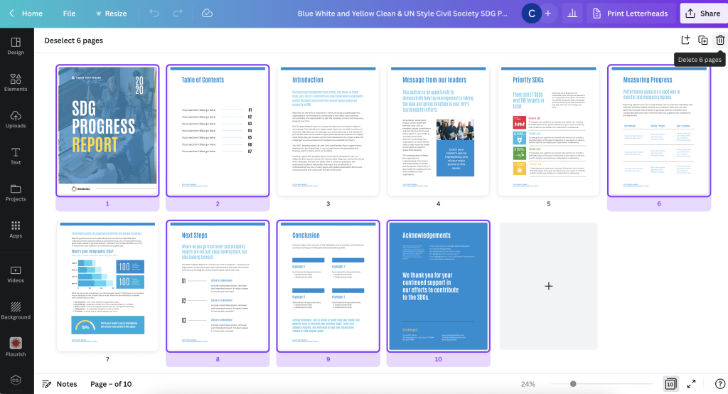
Issue 2: Beautiful ghost towns

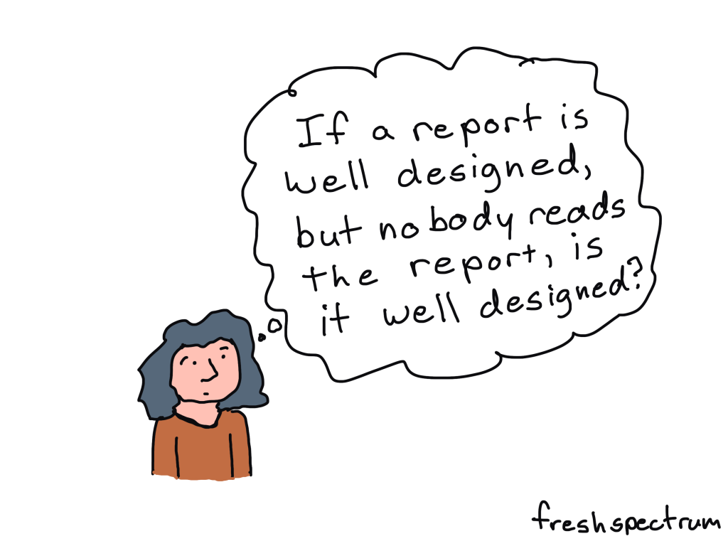
Just because your website looks like a well-designed website doesn’t mean it is well-designed.

You can have a website that looks beautiful with fancy features. You might even get complements on how cool it looks. But building something beautiful isn’t the same thing as building something effective.

Can you tell the difference?

Issue 3: Check the box websites.

This kind of website is all over the place in the evaluation world. It includes all sorts of resource websites, association websites, and digital toolkits.

It’s kind of like building a school curriculum based on what you think kids should learn, but then never checking to see whether or not they’ve learned anything.

You have a checklist of all the things you think should be part of the site. And then you build the site with all of those things. Then you never look at it again.

Issue 4: Owning a search.

How do you think people find your website?

Most of the time, it probably involves Google.

How do people use Google?

They search for stuff.

What do they search on Google to bring them to your page?

Serious question, have you checked to see if that actually happens? Pretty sure most organizations would be surprised to see the searches that do or do not bring people to their websites.

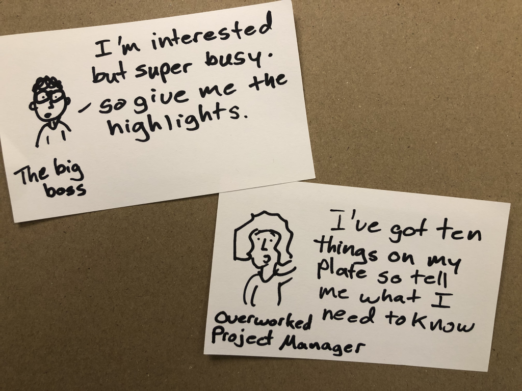
Issue 5: Output focused.

Evaluators are really good at calling out programs for focusing too much on outputs and not enough on outcomes.

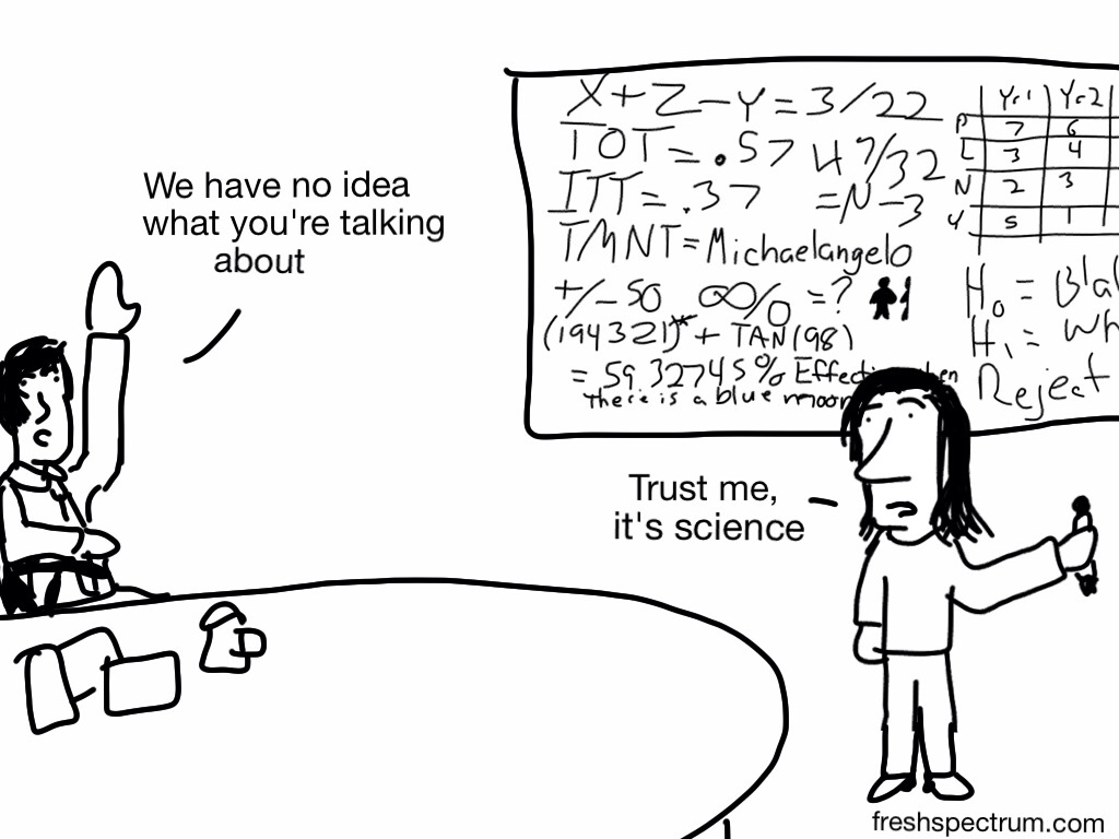
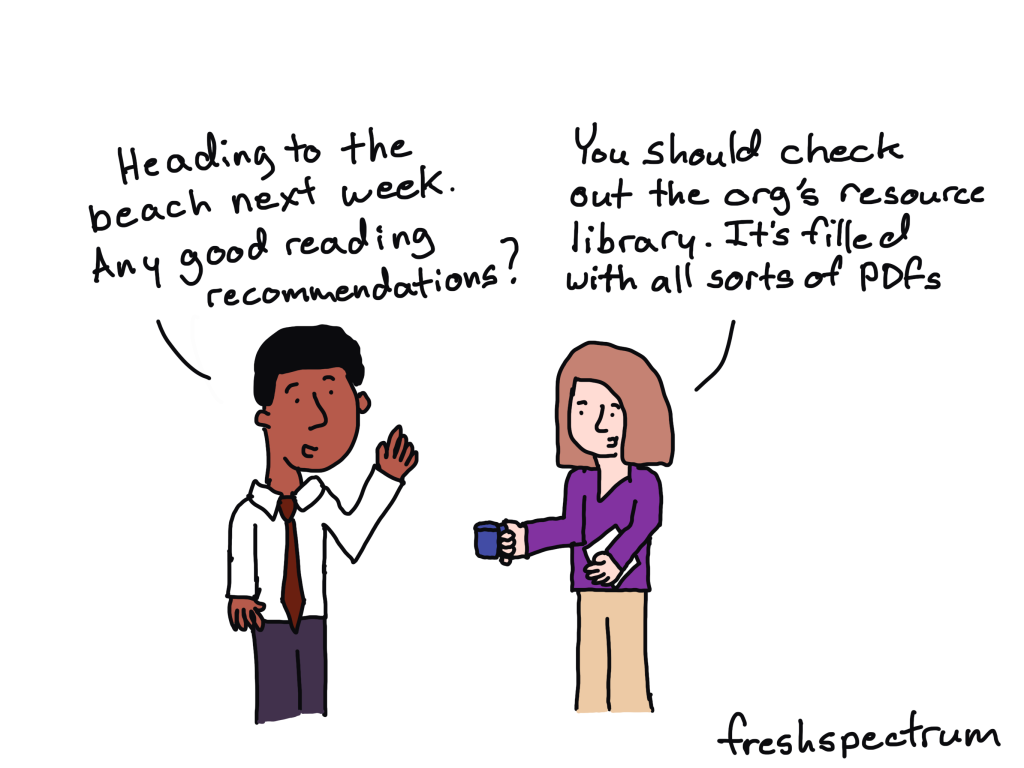
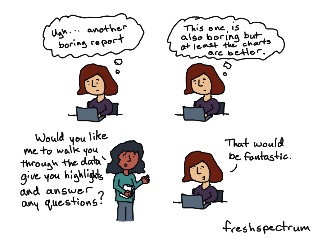
But then you ask them to evaluate a website and they give you page views, downloads, plays, and other output data. In other words, a bunch of who cares vanity metrics.

The problem is that determining good outcome measures requires a thoughtful digital strategy. And much of the time, that just doesn’t exist.

What to do about it.

Four steps.

  1. Develop an outcome focused digital strategy.
  2. Implement the digital strategy.
  3. Evaluate the effectiveness of the digital strategy.
  4. Iterate your strategy based on collected data.

Want help?

You might know me for this blog or for my cartoons. But digital strategy and digital evaluation is the stuff I do as a consultant. I have a big contract ending this summer, and so some of my time might be opening up.

If you want to learn more about me or my digital strategy consulting, check out my about page.

If you have any interest in working with me, let’s chat > https://calendly.com/clysy/30min

Written by cplysy · Categorized: freshspectrum

Mar 15 2023

Designing an Executive Summary with Canva

Design is a process. So is creativity. In today’s post I’ll walk you through the process I would use to design an executive summary style report using Canva.

Step 1. Simple Mini Personas

Take a notecard and draw a little picture of a person. Don’t worry about the art, stick figures are fine. Then give them a little quote as if they are talking directly to you, the report designer telling you what they would like to read.

I used to have a more involved process for personas in the past, but simple is easy and easy is more likely not to be skipped.

Step 2. Pick a Type of Report

So I titled this post as designing an executive summary. But here’s the thing, there are other options that you could use to reach the same audience with the same types of information.

An executive summary is pretty status quo, so is a presentation. But something like a slidedoc, blog post, or long email could fulfill the same purpose. And they also might be more likely to be read.

For the sake of this blog post, let’s pretend you work in a fairly old-fashioned organization who balk at something beyond the status quo. And at least at the moment, you’re not in the mood to ruffle feathers.

Step 3. Peruse Existing Canva Templates

Yes, this step happens before you start writing.

You can search reports, but you can also put in other search terms that might get you closer to the kind of report you want to write. Our goal here is not to settle on our final report style, but find a report style that just feels right for the audience we are trying to reach.

I found nice sets of templates Canva has in their library on building out SDG Progress Reports. There are bunch here to choose from and they work really well as basic templates for evaluation reports.

Clicking on a template will show you the different page layouts offered at the start.

I have seen executive summaries that are 2 pages, 4 pages, 6 pages, and some that are far longer. For most situations though I suggest going as short as possible but still delivering your key insights.

Step 4. Build a Basic Report Spread.

Given the shorter format, you’ll likely only need a few of the pages inside the spread. Since we are talking a super short report, you will likely NOT use a title page or table of contents. Instead you’ll choose a few of the more heavier content pages.

Let’s say we are creating a 4 page executive summary. You think this should give you enough room to say what you need to say. Using the base template page layouts, choose 4 that feel the way you want your report to look.

The title page for your Executive Summary should have space for a title, a sub title, some narrative, and picture or chart.

Step 5. Open up Word or Google Docs

Canva is a better design tool than word processor. For the writing part you’re better working in a program designed for writing.

The difference between this process and most other report writing processes is that we have a goal in mind. Based on template you chose, you have a basic idea of how many words you can write on each page.

If you write lots more, or lots less, this will change the look of the report. In other words, it will break the template. If that’s your choice, do this intentionally. You might even want to reconfigure your report design to make sure it still works for the text you are writing.

Step 6. Fill your Template with your Words

Okay, now it’s time to fill your template. This will probably involve a bit of redesign and tweaking, but you’re going to be in far better shape than if you had just started this whole process with a draft in Word.

I’d suggest sharing as a standard PDF. But you can also download as a PowerPoint if you need to codesign the final document with others on your team.

Want to learn more about my reporting approach?

I have a free eBook for that. You’ll also find other free goodies in my resource library.

Written by cplysy · Categorized: freshspectrum

Mar 09 2023

Your report is not broken.

Is nobody reading your report?

Have you put tons of work into something then shared it out to the world, only to hear nothing in return?

It might be easy to think that you’re to blame. If only you knew how to design a better report or create better charts, everything would be different…

But there is another possible reason why nobody is reading your report.

Most people don’t actively look for reports to read.

Are you old enough to remember back to the early 2000s when the whole world was switching from CDs to MP3 players?

It’s not because the quality of mp3 music was better. It was just more convenient.

In 2001 when the first iPod was released, Apple boasted that you could put 1,000 songs on it. That’s 100 times more than your standard CD. Which was great, because you could fill it with all that music you illegally downloaded off of Napster.

Even the most well designed reports with the best charts and the nicest formatting are kind of annoying to read on a smartphone. You can do it, but chances are you won’t.

It’s not because all reports are bad, plenty have gotten better. But there are way more convenient media channels you can use to learn about the organizations you are interested in learning about.

Here are just a few:

  • Blog posts
  • Social media threads
  • Youtube videos
  • Webinars
  • Email newsletters

Every single one of those you can consume just as easily on a smart phone as you can on any other device. They are way more convenient compared to your standard PDF report (or even fancy HTML reports and dashboards).

It’s not what you report but how you report.

This is my biggest gripe with many data visualization courses.

They will help you improve the quality of your charts and reports. But having the ability to create nice looking reports offers no guarantee that anyone will read them.

You don’t just need to be more creative in what you report, you need to be more creative in how you report. In other words you need to change your mindset from the noun report to the verb report.

It’s why I teach information design and run the academy.

Because while it’s good that the quality of reports are getting better, what our field needs is more people who can successfully inform, engage, inspire, and convince.

Resource Library Updates

Just as any FYI, my free resource library is going to be updated regularly. I will be adding more free resources, but also taking resources I currently offer away.

For instance, I just added my You can do creative things eBook. And 80 of you have downloaded it this last week. This will stay up for at least a few months, so you can wait a little if you don’t feel like downloading it now.

About 144 of you have taken my 10 part free email course on micrographics over the last 5 months. At the end of this month it will become an exclusive just for members of my information design academy.

So if you want to take the free course while it’s still free, I’d suggest doing that now!

Written by cplysy · Categorized: freshspectrum

Mar 02 2023

Information design is not data visualization.

Referring to data visualization as information design is like referring to survey design as evaluation.  Yes, evaluators tend to design surveys.  But there is way more to being an evaluator than designing a survey.

Learning how to be an information designer requires more than learning how to create nice looking charts, infographics, presentations, and reports.  And while designing all these different things usually falls into the realm of information design, there is so much more you can learn.

A few non-dataviz information design challenges…

  • How do I get my boss to give me the go-ahead on creating a new design?
  • When should I not use a chart?
  • How do I inspire an audience?
  • How do I simplify this information?
  • What communication forms could I use to share this information?
  • How do I find stories in this information?
  • I have access to lots of things, where do I even start?
  • How do I do creative work when I’m not inspired?
  • When should I keep things complicated?
  • How can I limit iterations and feedback loops?
  • Can I adapt this long report into a website?
  • Can I turn this website into a string of social media infographics?
  • How do I shepherd a team-based creative project to completion?
  • How do I know if my designs are working?
  • Do I have access to the right tools?
  • How do I make this more accessible?
  • How do I get better feedback from my team or boss?
  • What would make this report interesting?
  • How do I cocreate this design with my audience?
  • How do I deal with rejection?
  • Do I need to listen to this feedback?
  • Could this dashboard be an email?
  • How do I win a design argument with my boss?
  • How do I test my design?
  • When should I use a grid?
  • What fonts should I use?
  • Is this a good color?

Information design is not one thing but lots of little things.

For data people like us, data visualization is certainly part of information design. It’s just not anywhere near all of it.

When I started teaching information design I thought I could build out a series of self-paced modules to answer a lot of the questions I was getting asked.  Then I could just teach a few tools and that would create enough value to be worth buying.

But the more I talked to data people about their struggles and challenges the more little questions I would find myself answering.  It’s why my workshop is now an academy built around a community. It’s why I teach live.  Because developing your information design skills isn’t about learning one big skill or tool but learning lots and lots of little things.

And whenever anything requires lots and lots of little things, the best thing you can do for yourself is to find a supportive community.  Preferably one with a facilitator who really really cares about your progression and wants to see you find your best.

Because a good information designer can create nice looking charts, infographics, presentations, and reports. 

A great information designer can inform, engage, inspire, and convince.

We need more great information designers.

My latest eBook on doing creative things.

Over the last decade I’ve learned a lot about doing creative work professionally.  I tried to think about the things that were the same whether I was designing charts, drawing cartoons, or developing online learning communities. It takes more than just technique and artistic talent to create on a deadline.

I decided to put 10 of my favorite tips and strategies into an eBook.

The eBook is free, you can download it here.

Click here to get the eBook.

Written by cplysy · Categorized: freshspectrum

Feb 23 2023

The lost question.

What was that thing…

I believe it was important.

It had something to do with something we didn’t know…

I remember being really focused on it.

But at some point our conversation switched. Then all of a sudden we weren’t talking about it anymore. It was still there, in the background somewhere, but felt less important somehow.

Now it was all about activities, outputs, and outcomes. We had goals, and things that we were doing to get to those goals.

We started tracking numbers, which seemed important because we could make those numbers go up or down based on the things that we were doing.

Then days, months, or years went by and suddenly we were ready to write a report.

In this report we were going to put in all the lessons we learned. We were going to describe those methods, outputs, and outcomes. All that data we collected, we would put those into nice little charts and graphs.

People were really going to love this report.

Now we just need a story to put everything into perspective.

But I can’t help but feel like we’re forgetting something.

Solutions don’t make good stories.

I was going to make this the title because it’s true.

But it’s also a solution. So leading off a blog post about how solutions don’t make good stories felt a little ironic. Like ten thousand spoons when all you need is a knife.

If it’s not abundantly clear, the thing we were missing above was the question (or questions) that started everything.

Questions and problems are always the engaging things that spawn projects and drive people forward. It’s why all the good stories don’t usually begin until there is some kind of conflict, problem, challenge, or struggle.

If you want your report to tell a story, don’t start with methods or an outline. Start with the question that started everything. The one that you focused on so much at the beginning of your project that you now take for granted.

While people might search for answers, they start their search with questions.

What are yours?

I built my information design academy out of questions.

I was reflecting on a conversation I had with one of my academy members.

It was the kind of conversation I have a lot with the members of the academy. The one where I try to figure out why people join the thing that I offer. What are they hoping to get out of a virtual information design academy?

It’s always felt like I’m doing something wrong. That the burden of coming up with the content I teach shouldn’t fall onto their shoulders.

But after that particular conversation I had a new perspective.

Ever since I first started teaching online (with the original DiY Data Design back in 2015) I had this idea that I would create a thing and continuously ask the people who joined that thing what they were struggling with. What problems did they have that I could solve?

And over time I learned lots about the challenges and struggles of data people in a modern digital world. A world that requires us to think more creatively, design visually, and tell better stories if we want to have any chance of someone else experiencing our work and learning from our ideas.

I expected that one day I would learn enough to know specifically what I offered.

But my perspective now is different. Because the world keeps changing, and so do the questions.

The tools I used most five years ago are not the tools I mostly use today. And I bet they’ll keep changing.

My workshops have never been about providing solutions. They’ve been about answering questions.

So why fight it.

You are all brilliant.

And here is the other truth.

The people who join my information design academy (as well as the people who follow this blog) are amazing. I am reminded about this again and again and again through my interactions with many of you.

So why not just accept that I don’t have to build this academy alone. Every single member brings experiences, challenges, and solutions that can help us all grow. Why even pretend like I know it all, when that’s not what anybody really needs.

My bizarre information design academy pitch to you.

  • I don’t know what I’ll be teaching in a year, or even next month.
  • I will likely ask you, again and again, what you are working on, struggling with, or interested in learning.
  • I don’t have a sequential course designed to teach you a list of specific things based on a set of learning objectives (although I am building one I’m calling my baby steps course).
  • What I do have is a strong desire to help you be the best information designer you can be.
  • If you have a question I can’t help you answer, I won’t be able to let it go until I do.
  • I meet live weekly, now with a couple of time slots to make scheduling easier for members in different time zones.
  • I offer an included 1 on 1 call to every member for every quarter, because there is nothing like talking one on one.
  • I know some people join these things and never attend, so I create emails and other super low barrier connection tools so that no matter what, they can get some value out of the academy.
  • If someone is on the other side of the globe and wants to attend my sessions, I will add times late at night or early in the morning to ensure that they can.
  • I help data people become better designers, storytellers, and communicators. And I know that members are seeing positive results, like better jobs, promotions, and increased creative confidence.
  • And even though I’ve been doing this current iteration of the workshop for almost a year and half with only a small group, people still show up week after week after week.

So if any of that sounds good to you, and you want someone committed to helping you grow your information design skills then click here to learn more about the academy.

Or click here to just go ahead and register.

Written by cplysy · Categorized: freshspectrum

  • « Go to Previous Page
  • Go to page 1
  • Interim pages omitted …
  • Go to page 20
  • Go to page 21
  • Go to page 22
  • Go to page 23
  • Go to page 24
  • Interim pages omitted …
  • Go to page 54
  • Go to Next Page »

Footer

Follow our Work

The easiest way to stay connected to our work is to join our newsletter. You’ll get updates on projects, learn about new events, and hear stories from those evaluators whom the field continues to actively exclude and erase.

Get Updates

Want to take further action or join a pod? Click here to learn more.

Copyright © 2026 · The May 13 Group · Log in

en English
af Afrikaanssq Shqipam አማርኛar العربيةhy Հայերենaz Azərbaycan dilieu Euskarabe Беларуская моваbn বাংলাbs Bosanskibg Българскиca Catalàceb Cebuanony Chichewazh-CN 简体中文zh-TW 繁體中文co Corsuhr Hrvatskics Čeština‎da Dansknl Nederlandsen Englisheo Esperantoet Eestitl Filipinofi Suomifr Françaisfy Fryskgl Galegoka ქართულიde Deutschel Ελληνικάgu ગુજરાતીht Kreyol ayisyenha Harshen Hausahaw Ōlelo Hawaiʻiiw עִבְרִיתhi हिन्दीhmn Hmonghu Magyaris Íslenskaig Igboid Bahasa Indonesiaga Gaeilgeit Italianoja 日本語jw Basa Jawakn ಕನ್ನಡkk Қазақ тіліkm ភាសាខ្មែរko 한국어ku كوردی‎ky Кыргызчаlo ພາສາລາວla Latinlv Latviešu valodalt Lietuvių kalbalb Lëtzebuergeschmk Македонски јазикmg Malagasyms Bahasa Melayuml മലയാളംmt Maltesemi Te Reo Māorimr मराठीmn Монголmy ဗမာစာne नेपालीno Norsk bokmålps پښتوfa فارسیpl Polskipt Portuguêspa ਪੰਜਾਬੀro Românăru Русскийsm Samoangd Gàidhligsr Српски језикst Sesothosn Shonasd سنڌيsi සිංහලsk Slovenčinasl Slovenščinaso Afsoomaalies Españolsu Basa Sundasw Kiswahilisv Svenskatg Тоҷикӣta தமிழ்te తెలుగుth ไทยtr Türkçeuk Українськаur اردوuz O‘zbekchavi Tiếng Việtcy Cymraegxh isiXhosayi יידישyo Yorùbázu Zulu