• Skip to main content
  • Skip to footer
  • Home

The May 13 Group

the next day for evaluation

  • Get Involved
  • Our Work
  • About Us
You are here: Home / Archives for allblogs / freshspectrum

freshspectrum

Feb 15 2023

What’s so special about UX research with Joanna Prout

Over the coming year I hope to spend a little time on this blog showcasing some of the members of my Information Design Academy.

In today’s post we’ll hear from Joanna Prout. Joanna is currently exploring a career transition from research and evaluation into the field of user experience research. I asked her to share some of the lessons she has learned through her exploration.

Who is Joanna Prout?

Joanna is a researcher, evaluator, and PhD Psychologist currently working as a leader researcher for the University of Maryland School of Medicine. You can learn more about Joanna, and follow her work, by visiting her LinkedIn profile. 

What is User Experience Research?

Before we get to Joanna’s lessons, let me give you a couple of resources that will provide you with a basic intro to UX research.

UX (user experience) research is the systematic study of target users and their requirements, to add realistic contexts and insights to design processes. UX researchers adopt various methods to uncover problems and design opportunities. Doing so, they reveal valuable information which can be fed into the design process.

UX Research – Interaction Design Foundation

User-experience research methods are great at producing data and insights, while ongoing activities help get the right things done.

UX Research Cheat Sheet – Nielsen Norman Group

Now let’s get into the 4 lessons Joanna shared with me over email (in her own words).

1. Think about what the product is.

A big shift in learning about UXR was thinking about anything that I was doing research about as a “product.”  Once I understood that anything can be a product, it didn’t have to be like a blender that could sit on a shelf at a store, the transition became easier because I realized that I already had done research about products like trainings, online resource centers, data dashboards, etc.

This shift in thinking helped me realize that all the research I did should be aimed at improving the product we were creating. Digging into data just because it is  “interesting”  can be fun but it is less likely that this work will be used because there aren’t clear connections to action steps.

2. Generative Research is key.

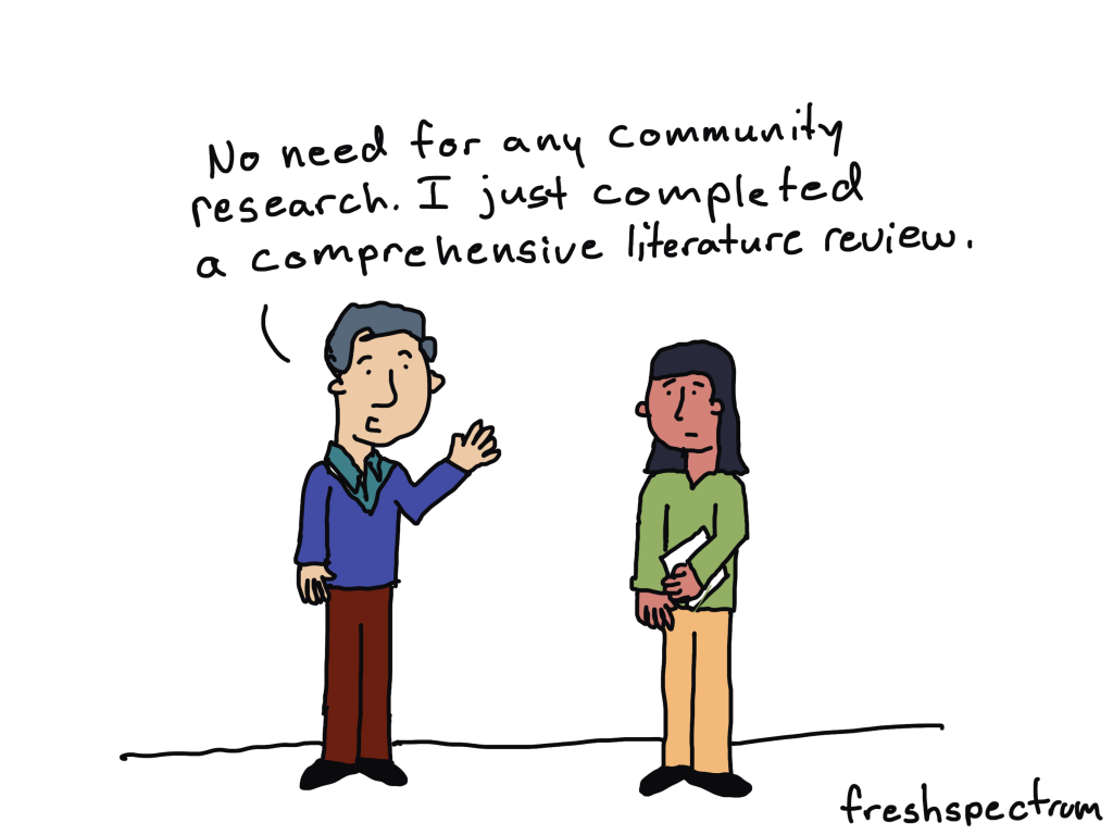
Another thing I learned about was generative research – this isn’t really done at my university position because we assume we know what is best for people or what people need based on science.  However, the guidelines provided by science are typically very broad and the product will need to be tailored to the specific users.  Actually talking to the people you hope will use your product can make it work a lot better! 

3. Research as a tool to build community and get buy-in.

Academic research for me was pretty removed from the world and the people it was about or for.  With generative research and iteration,  it is easier to get buy-in because all the stakeholders can be involved in creating and refining the product.  Doing 1:1 interviews with people at the start of our Data 2 Action toolkit helped me build relationships with key people because I got an hour just to get to know them. 

Summative and evaluative work is similar– if you  work closely with the people who will use it then you are more likely to get reports that they will be excited to use.  The limitation here is that there has to be flexibility– this kind of research isn’t going to be the same as very controlled studies where the goal is to determine if the null hypothesis is true.  So, there is a lot of ambiguity that you just have to be comfortable with.

4. UX Research has a Great Community.

Those are some thoughts!  The other great thing about UXR is the community.  In academia people will purposefully not help you because they don’t want you to scoop their findings and take their grant money.  There may be some of that in industry but in general people have been really open to volunteering their time & resources just to help me.

Have you done your own research into the fields of UX Research or UX Design? What have you learned?

This is Chris again.

For myself, I have incorporated a number of UX Design methods into my overall information design practice. I find the set of methods really useful for my work.

I know there are other evaluators and researchers who have jumped into jobs in tech as UX Researchers and UX Designers. Are you one of them? Have you explored these areas? Let us know in the comments what you have learned.

Oh, and if you want to be cool like Joanna, consider joining us and becoming a member > Information Design Academy.

Written by cplysy · Categorized: freshspectrum

Feb 08 2023

Where we Fail

In today’s post I want to address one those elephants in the room. It’s about the biggest reason why data people have trouble producing creative work.

We are all creative, but some of us have way more practice.

You want to know what I’ve learned in my decade long transition from data analyst to information designer?

We all have the capacity to improve our creative work. It requires a bit of training, regular practice, inspiration, and support. Just like everything else you want to learn.

And if you are like most of the people who follow this blog. People who come out of institutions of higher education with graduate degrees in social sciences. You almost certainly have not had the creative training or years of practice necessary to expect professional results.

Increasing Creative Expectations

In the days before the internet you could write longer reports. You could deliver somewhat dull presentations. You could share executive summaries in black and white that didn’t include any pictures.

And nobody would complain. And it wouldn’t feel like the wrong thing to do.

Now don’t get me wrong, like now it wasn’t the best way to share your findings. But nobody expected you to do anything different. You could have quite a successful career just doing your data work and leaving the creative stuff to other people.

Times have changed.

Increasingly researchers and evaluators of all ages are being asked to produce professional quality creative work. This includes well-designed visual reports, infographics, visual presentations, and sometimes even things like video and web design.

And while I think this is ultimately a good thing, there is one big problem.

Our Fields Offer Next to Zero Creative Training

When you were in college or grad school, did you take any design courses?

  • Did you take a course in user experience design, human centered design, or the principles of graphic design?
  • How about any courses on digital communications or content strategy?
  • Did you learn how to report like a journalist or how to effectively share your work through email and social media?

For most of us in the research and evaluation world, the answer to all those questions is “no.”

To all the managers out there in the world, no more excuses.

If you want your research and evaluation employees to produce professional quality creative work you need to give them the proper creative training and support.

Our education systems and academic programs will take a lot longer to change and adapt. And even when they do, it will be years and years before you see the change reflected in your talent.

And if you want somewhere to send them to get that support and training, that’s why I do what I do.

Written by cplysy · Categorized: freshspectrum

Feb 03 2023

Flirting with Burnout

This is one of those oversharing kinds of blog posts filled with me being vulnerable. If you don’t like reading about people’s feelings, please feel free to skip this post.

I love my work.

  • As a consultant I get the chance to work with amazing clients doing work that feels right.  
  • Since I have no boss, I have almost complete control over my schedule.
  • I absolutely love teaching information design and helping data people rediscover their creative passions. 
  • And to top it off, I get to draw cartoons.

But I also struggle.  

  • My creative brain has a way of leading me down rabbit hole after rabbit hole, even when deadlines approach (or especially when deadlines approach).
  • I have a strong desire to help everyone with everything.  And I seek out problems even if I have things I need to get done for myself, my job, or my family.
  • I also cope with regular bouts of anxiety and depression.

When burnout approaches.

It’s now been over six and a half years since I first left the comforts of a stable full time job for the freedom and instability of an independent business.  And over that time I’ve learned a lot more about myself.

I’ve also started to become more aware of the signs of a potential burnout.  And I’ve noticed a few lately.

  • My process starts to break down, and my self-imposed deadlines on things like blog posts and email newsletters start to slide.
  • I feel more exhausted, even though my sleep schedule hasn’t changed.
  • Procrastination, which is always a struggle, becomes even more so.
  • And self-doubt increases.  

Unlike professions such as health care or social work, however, burnout often carries a stigma when it comes to the fields of photography, design, and other professions dismissed by many in the outside world as fun hobbies rather than actual work. In truth, attitudes like these only make recognizing and overcoming burnout all the more challenging, and potentially increase the mental health risks for creative professionals.

How to Combat Creative Burnout

Something’s gotta give.

I’ve decided to take preemptive action to free up some time and mental space.

What I’m keeping

  • I’ll still draw cartoons. It’s fun and therapeutic.  Cartoons help me to create a deeper connection with others in the evaluation world.  
  • I’ll still share those cartoons on LinkedIn.  I love the comments and conversation that they bring.
  • I’ll still write blog posts. Writing for this blog gives me energy and rarely ever feels like a drag.
  • I’ll still be working hard for my current clients.  This is important work and sustains my business.
  • I’ll still be leading the information design academy. This is a passion project that I still dream will one day be my primary thing.  I love it more than anything else I do.

What I’m dropping.

Patreon.  

I love that people support my comics, and my patrons have helped me to power through past struggles.  But Patreon also makes me feel like I’m not doing enough for those that support my work.

This is not based on demands made by my Patrons, because they have been one of the most supportive groups in my life.  But my own feelings are that in order to do Patreon right, I need to put time into building a community and providing continuous value just for my supporters.

It creates a pressure. And I always feel like I’m failing my patrons. And as much as I don’t want to, I feel like I need to let the service go.  So from now on, if you would like to support me and my comics, consider joining my information design academy (or share my academy with your friends and colleagues). 

And if you are currently, or have been in the past, one of my patrons.  Thank you for all the support, it has meant so much. 

Barriers to my Information Design Academy.

I’ve been trying to follow a specific model for my information design academy.  It involves opening quarterly with cohorts and using an application for enrollment.

But as much as I see the potential value in these approaches, they also don’t work for me.  Mostly because they add barriers.  They also add extra administrative work.

Every person who has taken the time to apply for my information design academy has been awesome, each in their own way.  I want every one of them to join the academy if they want, when they want.

I’m also impatient.  I want them to be able to join now if they’d like, or whenever they need it.  I also know that I can help onboard anyone as we go, and the group is very likely to remain small enough to keep that personal touch.

And if it does start to get larger (which I would like) I have the space to schedule more live sessions to keep up the conversations and personal support.

So, I’m taking down the barriers. 

The academy is going to be cheaper again. $599 each year or $179 each quarter. There is a discount and a scholarship if you need to pay less.  I put the coupon codes on the actual registration page so they are impossible to miss.

You can join anytime.  And if you join and don’t think it’s actually right for you, tell me and I’ll give you your money back. You can learn more about the academy here.

The feeling that I need more clients.

My big CDC contract goes through the fall.  And I’ll admit that I am a bit anxious as to what will happen when the cooperative agreement expires.  I should know sometime in the spring what the future may hold.

But for the moment, I’m fine.  I could add zero more clients between now and September and continue to be financially stable.  

I’m tired of letting my fear of an uncertain future rule my present.  So I’m going to try to let it go.

Now for you.

Writing this post made me feel nervous.  It was a whole lot of personal oversharing and will likely lead to a bunch of unsubscribes.

But I know from years of occasional oversharing that this kind of post is valuable.  Because you might also be at risk of burnout.  And sometimes it’s good to know that you’re not alone.

While I appreciate your support, there are many others out there who need it more than I do.  I’ll be okay.  While I’m flirting with burnout, I think I can keep it at bay.

But if you’re flirting with burnout, I hope this post helps you in some small way. Pay attention to the signs and don’t be afraid to ask for help.

Written by cplysy · Categorized: freshspectrum

Jan 31 2023

What type of data designer are you?

Taking the next steps in your data design journey starts with knowing yourself.

I remember when I first started getting into data visualization design. When bloggers would go to define data visualization design they would often share a type of Venn diagram. On the Venn you would usually find one of the circles focused on design, a second circle focused on data analysis, and a third focused on technology or code.

For far too long I tried to make my way to the center of that diagram. I learned a little about a lot and really started to become the cliche, “jack of all trades, master of none.”

I don’t suggest following the same path.

Picking a data design direction.

It doesn’t hurt to dabble a little in all things data design. It’s really the only way you’re going to find the path that’s right for you.

But if you truly want to develop your skillset, a little bit of focus is going to be helpful. From my experience there are generally five different pathways to take if you want to grow as a data designer. They end up being a kind of personality type.

  1. The Coder
  2. The BI Developer
  3. The Graphic Designer
  4. The Microsoft MVP
  5. The Practical Creative

For me now-a-days, I am mostly number 5 with a minor in number 3.

Which type are you?

I put together a short little quiz.

I’ll probably tweak it a bit in the future or make it a little more comprehensive. But for now it exists to give you a least a basic idea of which path you might want to follow.

At the end of the quiz I also leave with you some advice and websites to check out based on your answers. I also let you know if you should consider my information design academy, or not. Like I’ve said in the past, the academy is not for everyone.

If you do take the quiz, I would love to see what you think of your results in the comments.

Written by cplysy · Categorized: freshspectrum

Jan 25 2023

How to use AI to make your reports readable [ChatGPT & the Hemingway App]

Are you a little hesitant about all this AI stuff? Me too. But these new AI tools can actually be pretty dang useful and easy to use.

For the most part I’m a new tech skeptic. Before I add another tool to my personal toolkit, I want it to be beyond that early adoption phase. So when everyone started getting excited about AI writing tools like ChatGPT and AI design tools like DALL-E I didn’t immediately hop on the bandwagon.

But after a bit of play, it’s hard not to be impressed by ChatGPT. Not because of its future potential but because of its immediate practical usefulness. This post is going to be about one of those practical uses.

How can we use AI tools to make long “academic” reports and guides a little more readable?

“This is too easy to understand” -Said no one ever.

Before we get into the challenge, let’s start with an underlying assumption. There is no value in making anything harder to read.

Or, in other words, just because many in your audience have advanced post graduate degrees does not mean you should be writing for a post graduate reading level.

The Challenge – Starting with a Guide

Using Education Indicators: A Forum Guide for State and Local Education Agencies

In order to find a report or guide for this challenge I just picked a US government agency at random. I then scrolled down the publications list and picked the first large report-like thing I could find. This guide from the Department of Education’s National Center on Education Statistics met that criteria.

My challenge is to pick a section of the report and then use free AI tools to:

  • assess the readability
  • and rewrite the section to make it shorter and more readable.

Picking a Section – Why Education Indicators Matter

So the following text comes from page 2 (part of the guide’s introduction). This is a space where you want the guide to be easily readable and somewhat free from Jargon. I don’t think that’s the case here. This section can definitely be shorter and more readable.


Why Education Indicators Matter 

Education indicators are critical to multiple areas of agency activities. They allow agencies to monitor student achievement and goals, identify gaps in student performance for potentially vulnerable populations, and evaluate the effectiveness of new policies and practices. Indicators inform important analyses, such as benchmarking, comparing groups, and assessing the benefits of funding allocations. They can offer greater transparency to stakeholders by providing easily accessible information and offering a means of clearer communication. 

Education agencies use indicators for varied strategic purposes. For example, districts trying to fill course vacancies need workforce and staff data about teachers, such as certifications or professional development, to help ensure effective placement. By providing shared metrics across the education system, indicators also help increase stakeholder understanding and lay the foundation for tools such as crosswalks to state report card data. 

Because a single assessment, such as a final exam score, rarely yields a complete picture of a student’s learning, indicators that use multiple measures and multiple types of assessment help teachers and schools realize a more complete picture of an individual student’s needs. This picture helps educators better allocate limited intensive intervention resources. Indicators also often are used to allocate resources and help direct (or redirect) funds for students and staff. 

At the classroom level, indicators can help teachers personalize instruction for groups and individuals. By collecting a range of data, analyzing them, and giving them to classroom teachers, agencies support their educators as they address specific student needs and make data-informed decisions to improve learning. 

Many advancements in education have impacted indicators, including changes to data systems (such as improved longitudinal data systems), federal data collections and accountability systems, legislation, mandatory public reporting, privacy protections and data security. In recent years, some agencies have considered adjusting their approaches to standard practices like attendance and grading, which will influence the use of indicators. Agencies also may consider making temporary changes in response to major events (such as those related to the coronavirus disease [COVID-19] pandemic) permanent. Formalizing these types of changes to indicators related to grading standards, graduation requirements, or disciplinary methods will affect data comparability. New indicators also have emerged as key sources of information for decision-making. For example, learning modality data that track whether students are attending school in person, virtually, or in a hybrid model have become increasingly important as agencies work to understand student learning conditions and outcomes. 

As the design and use of education indicators shift with agencies’ changing needs, advances in technology, and outside influences, many data experts have noted the need for a wider range of measures, including those that would address issues like social-emotional learning, engagement, expectations of teachers, rigor of assignments, alignment with grade level, and educator practices.


Assessing Readability with the Hemingway App

So my plan is to use AI tools to both assess the readability and rewrite the text.

The tool I’m going to use to assess readability is the Hemingway App. It’s simple to use (just copy paste) and doesn’t even require you register for an account. If you like it, you can also download an inexpensive desktop app version that can be used without an internet connection.

I ran the original text through for an initial assessment.

According to the Hemingway app the readability for this section is Post-Graduate. There are 457 words and 15 of the 19 sentences are very hard to read.

Rewriting with ChatGPT

The next step is to use ChatGPT to shorten the section and then increase the readability.

At the time this blog post was written ChatGPT is available as a Free Research Preview. It is also currently on its January 9 release. At the moment you need to register for an account but the tool is otherwise free to use.

I asked chat GPT to “Rewrite the following in 100 words” and then I pasted in the text I shared above. Here is what the tool gave me (the only thing I changed was to add a few paragraph breaks).


Education indicators are vital for monitoring student achievement and identifying gaps in performance for vulnerable populations. They also evaluate the effectiveness of new policies and practices and inform important analyses such as benchmarking, comparison of groups and assessing the benefits of funding allocations. They offer greater transparency to stakeholders by providing easily accessible information and clearer communication.

Indicators are used for strategic purposes such as filling course vacancies and allocating resources. They can also help teachers personalize instruction and make data-informed decisions to improve learning. Many advancements in education have impacted indicators such as changes to data systems, federal data collections, legislation, and privacy protections.

In recent years, some agencies have considered adjusting their approaches to standard practices like attendance and grading which will influence the use of indicators. Some new indicators have emerged as key sources of information for decision-making such as learning modality data. As the design and use of education indicators shift with agencies’ changing needs, advances in technology and outside influences, the need for a wider range of measures has become increasingly important.


Now that I have new text, let’s run it through the Hemingway App again.

Okay, so the text is shorter, it moved from 457 words to 177. But still not an easy read. Hemingway labeled it as post-graduate readability with 9 of 9 sentences marked as very hard to read.

Iteratively Changing the ChatGPT Prompts

So now I’m going to iterate using only the two AI tools back and forth. I’ll rewrite with ChatGPT and assess with Hemingway.

Iteration 2 – Rewrite the following in 100 words for a high school reading level

ChatGPT reply

Education indicators are important tools that help schools and other education agencies keep track of student progress and success. They allow agencies to monitor student achievement and goals, identify areas where students may be struggling, and evaluate the effectiveness of new policies and practices.

Indicators also help agencies make important decisions about how to allocate resources and support teachers. They can provide more transparency and clear communication to stakeholders. Indicators are used for various strategic purposes, such as filling course vacancies or allocating resources. They can also help teachers personalize instruction and make data-informed decisions to improve learning.

New advancements in education have impacted indicators, including changes to data systems, legislation, and privacy protections. Some agencies have considered adjusting their approach to standard practices like attendance and grading, which will influence the use of indicators. Indicators are also emerging as key sources of information for decision-making, such as learning modality data that track how students are attending school.

As the design and use of education indicators continue to evolve, experts have noted the need for a wider range of measures.

Hemingway App assessment

Readability went from Post-Graduate to Grade 15. There are still a lot of very hard to read sentences according to Hemingway.

Iteration 3 – Rewrite the following in 100 words for a middle school reading level.

ChatGPT reply

Education indicators are tools that schools use to track student progress and success. They help schools know how well students are doing, identify areas where students may need extra help, and evaluate new policies and practices.

Indicators also help schools make decisions about how to use resources to support students and teachers. They can provide more information to people who are interested in the school and make communication clearer.

Schools use indicators for different reasons, like filling open spots in classes or allocating resources. They can also help teachers personalize instruction and make decisions based on data.

Advances in education have affected indicators, like changes to data systems, laws, and privacy rules. Some schools have considered changing how they track things like attendance and grading, which will affect how they use indicators. Indicators can also be used to track new things, like how students are attending school.

Experts say that more indicators are needed to track different aspects of student and teacher performance.

Hemingway App assessment

By asking for a middle school reading level ChatGPT wrote something that the Hemingway App labels as a Grade 12 reading level. This version is down to 163 words with fewer very hard to read sentences.

Iteration 4 – Rewrite this for 4th graders.

ChatGPT reply

Indicators are like signs that schools use to check how well students are doing. They help schools see where students might need extra help and how to make new rules that work well. Indicators also help schools decide how to use resources to help students and teachers. They give more information to people who want to know about the school and make it easier to talk about what’s happening.

Schools use indicators for different reasons, like making sure there are enough teachers for all the classes or deciding where to put resources. They can also help teachers teach in a way that works best for each student and make decisions based on information.

Sometimes, new ways of doing things in school can change the way indicators are used. For example, some schools are thinking about changing how they track attendance or grades, which will affect how they use indicators. Indicators can also be used to track new things, like how students are going to school. Some people say we need more indicators to check different things about students and teachers.

Hemingway App assessment

By asking ChatGPT for 4th grade, we made it to grade 10. Now there are only 2 of 10 sentences that are very hard to read.

3 Final thoughts on this approach.

1. Tools like the Hemingway App give us a way to assess our writing “externally.”

One of the challenges we face making better reports is that the reports you are trying to improve were written by human beings. And for many of us, it’s hard to tell our fellow human beings that their work is way too long, too boring, or too jargon filled. So if that’s you, you can just let the tool tell them their stuff is hard to read.

2. ChatGPT gives you a good first revision pass (or second, or third).

It can be really tough for a person to take something that’s 450 words and bring it down to 180 words. But ChatGPT isn’t going to grumble about it. Using the tool conversationally to help you wordsmith and simplify can really take a lot of the effort out of revisions.

3. From Human to AI to Human again.

I think the biggest opportunity exists in folding AI into your overall writing process. It’s not a replacement. The stuff that ChatGPT wrote (and Hemingway assessed) could definitely be improved with a little human intervention from a good editor. But the overall amount of work involved gets cut down significantly.

What are your thoughts?

Is this something you would try? Why or why not? Let me know in the comments.

Written by cplysy · Categorized: freshspectrum

  • « Go to Previous Page
  • Go to page 1
  • Interim pages omitted …
  • Go to page 21
  • Go to page 22
  • Go to page 23
  • Go to page 24
  • Go to page 25
  • Interim pages omitted …
  • Go to page 54
  • Go to Next Page »

Footer

Follow our Work

The easiest way to stay connected to our work is to join our newsletter. You’ll get updates on projects, learn about new events, and hear stories from those evaluators whom the field continues to actively exclude and erase.

Get Updates

Want to take further action or join a pod? Click here to learn more.

Copyright © 2026 · The May 13 Group · Log in

en English
af Afrikaanssq Shqipam አማርኛar العربيةhy Հայերենaz Azərbaycan dilieu Euskarabe Беларуская моваbn বাংলাbs Bosanskibg Българскиca Catalàceb Cebuanony Chichewazh-CN 简体中文zh-TW 繁體中文co Corsuhr Hrvatskics Čeština‎da Dansknl Nederlandsen Englisheo Esperantoet Eestitl Filipinofi Suomifr Françaisfy Fryskgl Galegoka ქართულიde Deutschel Ελληνικάgu ગુજરાતીht Kreyol ayisyenha Harshen Hausahaw Ōlelo Hawaiʻiiw עִבְרִיתhi हिन्दीhmn Hmonghu Magyaris Íslenskaig Igboid Bahasa Indonesiaga Gaeilgeit Italianoja 日本語jw Basa Jawakn ಕನ್ನಡkk Қазақ тіліkm ភាសាខ្មែរko 한국어ku كوردی‎ky Кыргызчаlo ພາສາລາວla Latinlv Latviešu valodalt Lietuvių kalbalb Lëtzebuergeschmk Македонски јазикmg Malagasyms Bahasa Melayuml മലയാളംmt Maltesemi Te Reo Māorimr मराठीmn Монголmy ဗမာစာne नेपालीno Norsk bokmålps پښتوfa فارسیpl Polskipt Portuguêspa ਪੰਜਾਬੀro Românăru Русскийsm Samoangd Gàidhligsr Српски језикst Sesothosn Shonasd سنڌيsi සිංහලsk Slovenčinasl Slovenščinaso Afsoomaalies Españolsu Basa Sundasw Kiswahilisv Svenskatg Тоҷикӣta தமிழ்te తెలుగుth ไทยtr Türkçeuk Українськаur اردوuz O‘zbekchavi Tiếng Việtcy Cymraegxh isiXhosayi יידישyo Yorùbázu Zulu