• Skip to main content
  • Skip to footer
  • Home

The May 13 Group

the next day for evaluation

  • Get Involved
  • Our Work
  • About Us
You are here: Home / Archives for allblogs

allblogs

Feb 13 2023

Contextualizing Data for Clarity

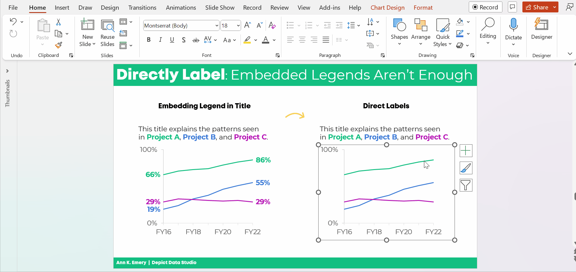
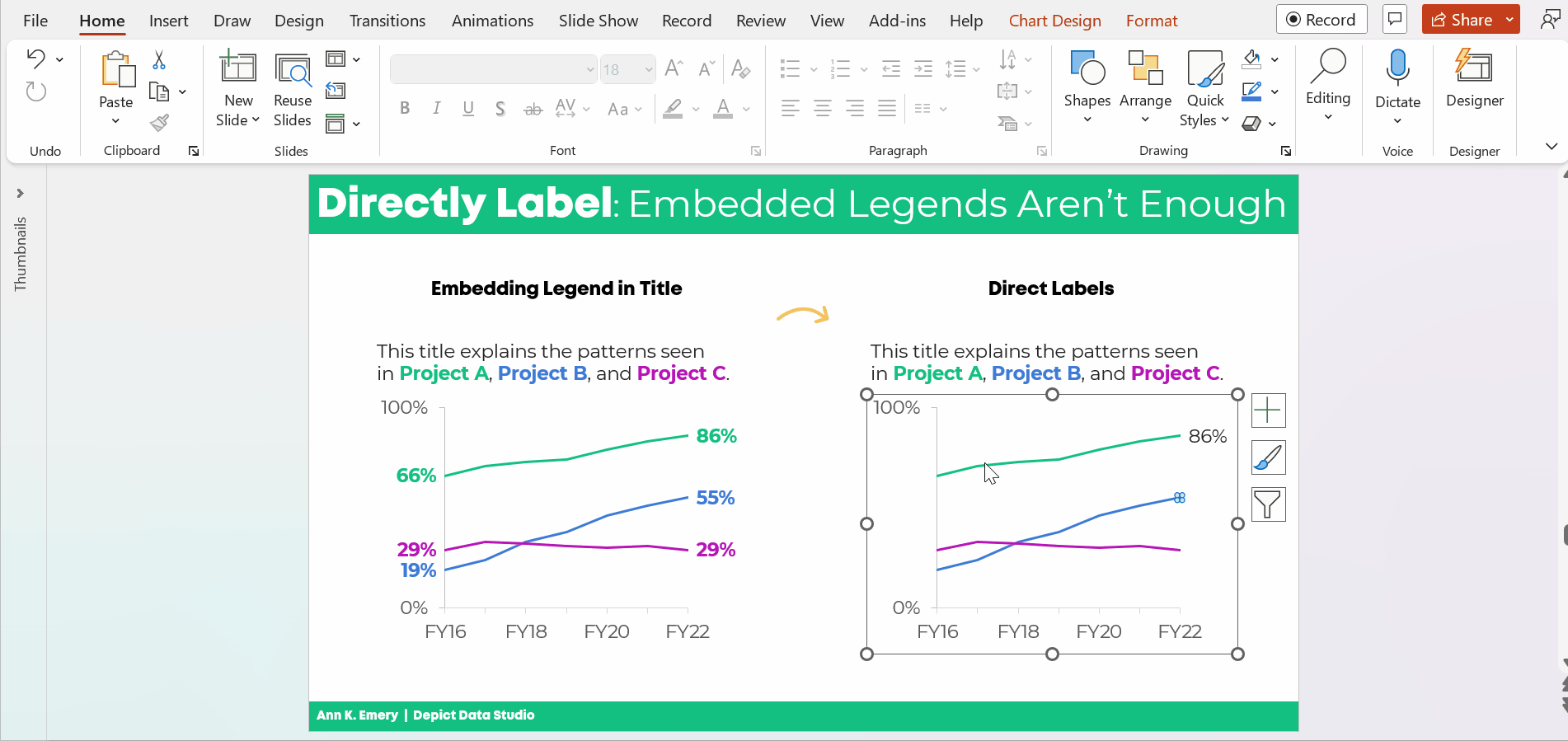
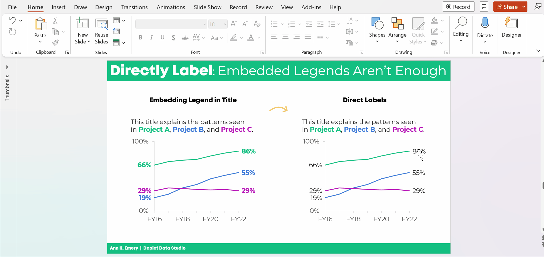
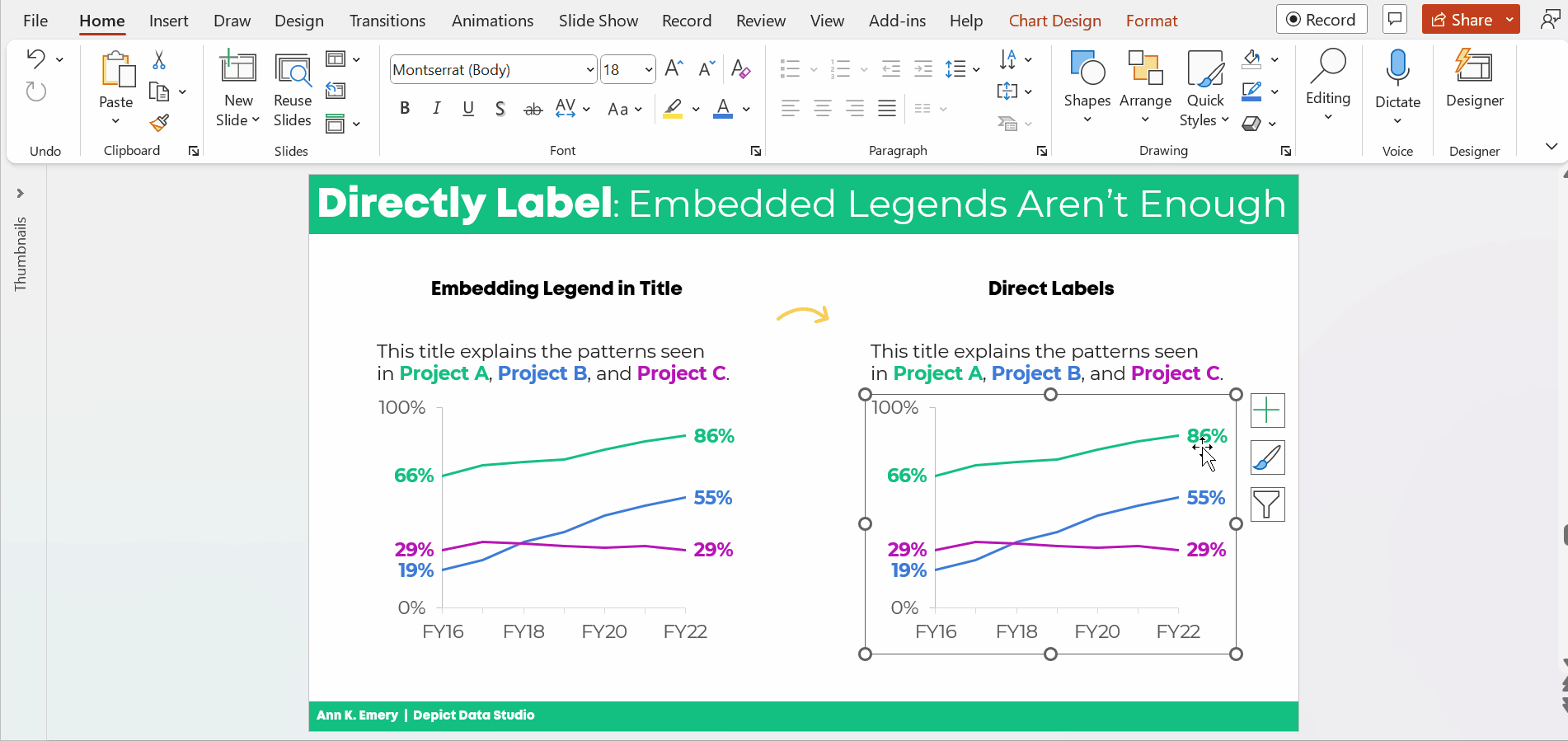
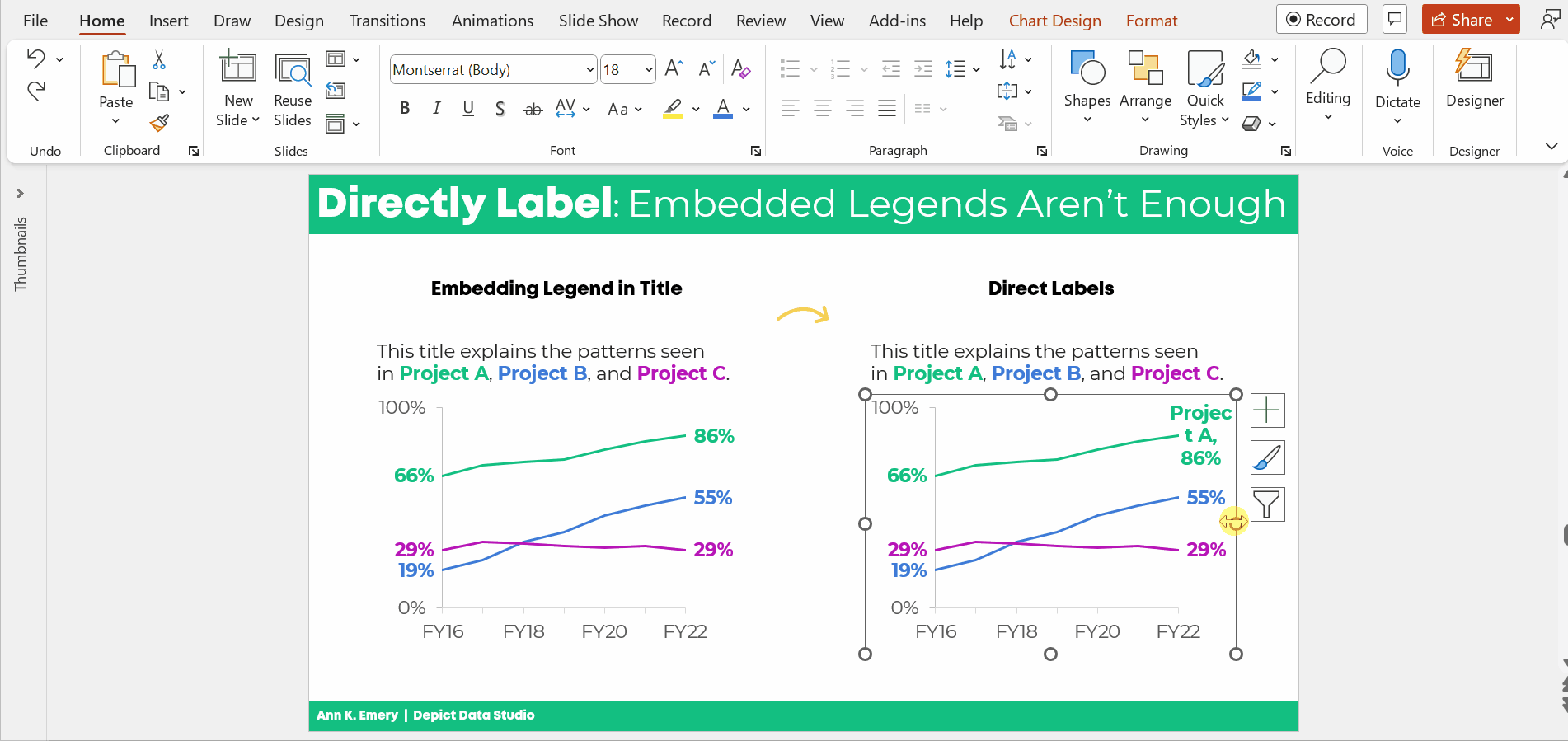
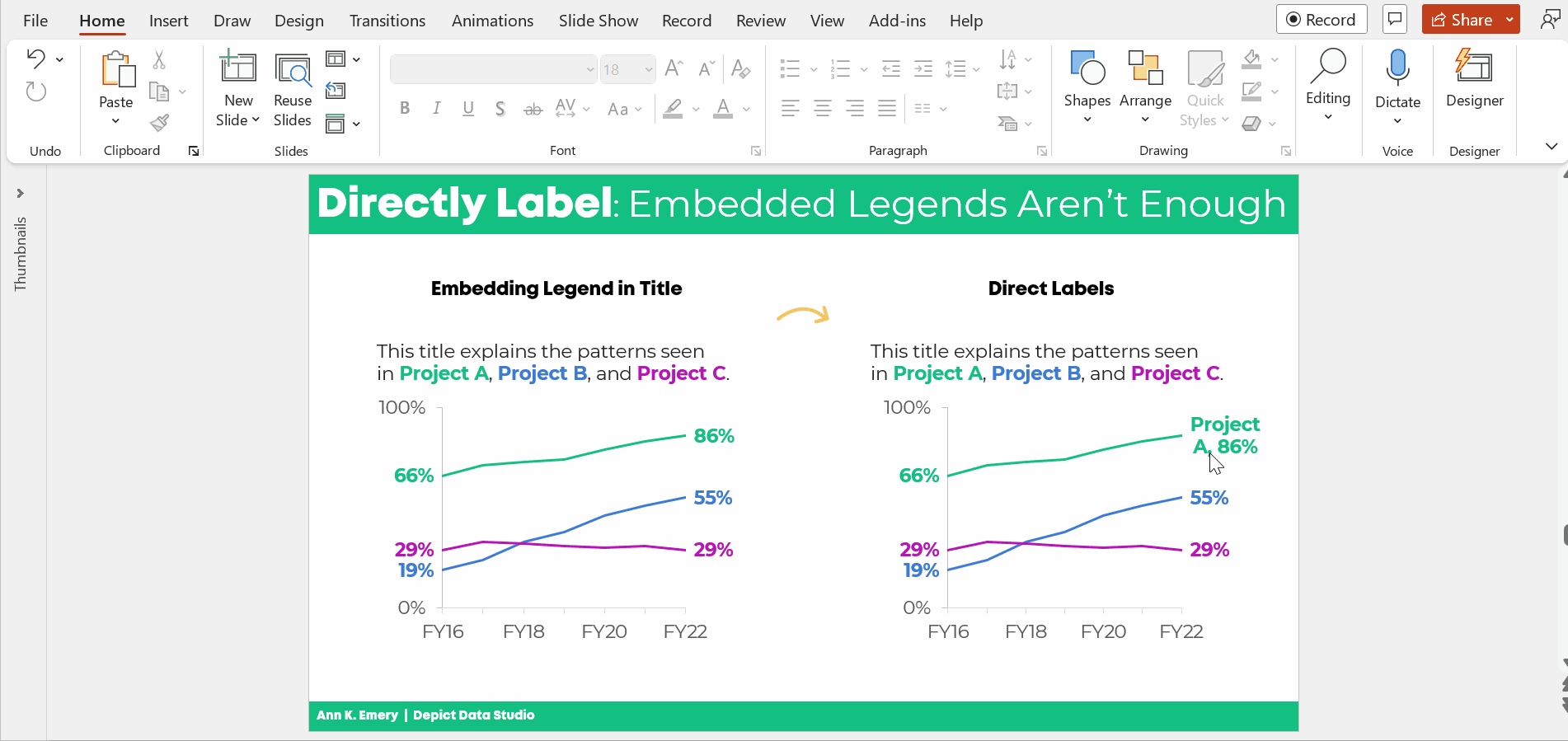
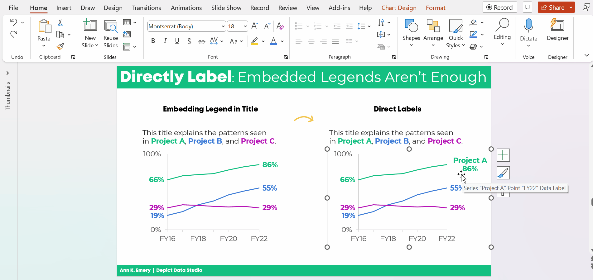
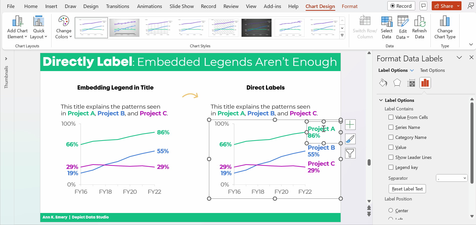
Data represents people. Adding context to numbers and percents is one way to help partners connect with the stories and lives behind the data. Ultimately, context provides clarity, meaning, and insight. This blog post shares four ways to contextualize your data.

The post Contextualizing Data for Clarity appeared first on Elizabeth Grim Consulting, LLC.

Written by cplysy · Categorized: elizabethgrim

Feb 09 2023

Going Beyond Asking Why: A New Look at 5 Why’s

Why ask Why?

We’ve used the 5 Why’s as a powerful, simple vehicle for fostering conversations about why we do things. Often, particularly with well-established programs and services, we lose the connection between the rationale behind why something was done and what value it brings.

A technique called the 5 Why’s could help us get closer to this core reason and explanation. We wrote an explainer of this technique.

While useful, the technique can sometimes feel repetitive and draw people away when it seems like we’re all just emulating a 5-year-old asking “why” all the time.

John Nash has written a great Twitter thread that provides some creative, valuable alternatives to using ‘why’ questions to follow-up our initial queries. These can be helpful in making the most of the method in your next design exploration.

His prompts include:

  • What feels critical about that?
  • Why is that, do you think?
  • Tell me more about why that’s important to you.
  • I see. How so?
  • What makes that important?
  • Can you give me your perspective on why that is crucial?
  • Why do you feel that way?
  • Can you share more about why that is a priority?
  • What makes that critical?
  • Why do you think that is a key consideration?
  • Can you describe why that is essential?
  • Can you elaborate on why that matters to you?
  • Why does that feel important?
  • Can you expand on why that’s a must-have?
  • What makes that a high-priority item for you?
  • Why is that a concern for you?

Thanks, John, for such an outstanding contribution to the field and extending the method. Try these for your next journey into the why of designing your services and strategy.

If you’re looking to find or clarify your why’s and build strategy and great services around them, let’s chat. We can help you.

Image credit:  Jon Tyson on Unsplash

The post Going Beyond Asking Why: A New Look at 5 Why’s appeared first on Cense Ltd. .

Written by cplysy · Categorized: cameronnorman

Feb 09 2023

Surviving Awkward Facilitation Moments

Plan, reflect, and prepare for next time. As the world continues to reopen, conferences and meetings that transitioned from in-person to online during the COVID-19 pandemic are returning as in-person events. As a core component of my work, facilitating meetings and workshops occurs frequently. Whether for a client meeting or more publicly in a workshop setting, […]

The post Surviving Awkward Facilitation Moments appeared first on Nicole Clark Consulting.

Written by cplysy · Categorized: nicoleclark

Feb 08 2023

Where we Fail

In today’s post I want to address one those elephants in the room. It’s about the biggest reason why data people have trouble producing creative work.

We are all creative, but some of us have way more practice.

You want to know what I’ve learned in my decade long transition from data analyst to information designer?

We all have the capacity to improve our creative work. It requires a bit of training, regular practice, inspiration, and support. Just like everything else you want to learn.

And if you are like most of the people who follow this blog. People who come out of institutions of higher education with graduate degrees in social sciences. You almost certainly have not had the creative training or years of practice necessary to expect professional results.

Increasing Creative Expectations

In the days before the internet you could write longer reports. You could deliver somewhat dull presentations. You could share executive summaries in black and white that didn’t include any pictures.

And nobody would complain. And it wouldn’t feel like the wrong thing to do.

Now don’t get me wrong, like now it wasn’t the best way to share your findings. But nobody expected you to do anything different. You could have quite a successful career just doing your data work and leaving the creative stuff to other people.

Times have changed.

Increasingly researchers and evaluators of all ages are being asked to produce professional quality creative work. This includes well-designed visual reports, infographics, visual presentations, and sometimes even things like video and web design.

And while I think this is ultimately a good thing, there is one big problem.

Our Fields Offer Next to Zero Creative Training

When you were in college or grad school, did you take any design courses?

  • Did you take a course in user experience design, human centered design, or the principles of graphic design?
  • How about any courses on digital communications or content strategy?
  • Did you learn how to report like a journalist or how to effectively share your work through email and social media?

For most of us in the research and evaluation world, the answer to all those questions is “no.”

To all the managers out there in the world, no more excuses.

If you want your research and evaluation employees to produce professional quality creative work you need to give them the proper creative training and support.

Our education systems and academic programs will take a lot longer to change and adapt. And even when they do, it will be years and years before you see the change reflected in your talent.

And if you want somewhere to send them to get that support and training, that’s why I do what I do.

Written by cplysy · Categorized: freshspectrum

Feb 06 2023

Embedded Legends Aren’t Enough

I see these graphs a lot:

The graph title tells us which line is which.

In dataviz lingo, we call it “embedding the legend” in the graph title.

What a clever style!

But it’s not colorblind-friendly or grayscale-friendly.

Let’s compare embedded legends (on the left, YUCK) with direct labels (on the right, YAY).

Ann K. Emery shows two graphs. The graph on the left has color-coded words in the title (a.k.a. embedding the legend). The graph on the right also has direct labels.

Not Legible for Colorblind People

Although embedding the legend in the graph title is popular, it’s not colorblind-friendly.

Here’s a preview of what the two styles would look like for someone with red-green colorblindness. (I uploaded a screenshot to https://www.color-blindness.com/coblis-color-blindness-simulator/.)

Ann K. Emery shows how to test your draft to see if it's colorblind-friendly.

If you’re required to follow 508 compliance in your workplace (if your project is funded by the U.S. Federal government), then embedding the legend in the graph title isn’t 508 compliant, either.

One of the 508 guidelines goes something like this: Viewers shouldn’t have to rely on color alone to understand the graphic.

In the embedded legend version, we are asking our audience to rely on color alone. Oops! That’s where the direct labels save the day.

“But Ann, just choose colors that are colorblind-friendly!”

No no no no. I don’t think we should be choosing random colors for our graphs.

I want you to use your organization’s brand colors in your graphs. Brand colors remove guesswork. No more sitting down to think about which colors look like. Brand colors also help us avoid Frankensteined graphs. No more pages 1-5 of your document in colors that Bob likes, followed by pages 6-10 in colors that Joe likes.

Not Legible in Grayscale

Embedding the legend isn’t grayscale-printing friendly, either. We wouldn’t want our audience to guess which shade of gray is which.

(Again, I uploaded a screenshot to https://www.color-blindness.com/coblis-color-blindness-simulator/.)

Ann K. Emery shows how to test your draft to see if it's grayscale-friendly.

How to Directly Label Graphs in Excel, PowerPoint, or Word

“Ann, how do I directly label the graph in Excel??”

I don’t recommend using text boxes. They’re such a pain! It takes forever to add the text boxes, align them, and group them. When we re-size the graph—making it taller or smaller, for example—the text boxes have to be re-aligned. Ugh.

There’s a better way.

Add the Numeric Labels

In today’s example, I’m using PowerPoint. You can do this through Excel and Word, too.

And in today’s example, I’m labeling the endpoints. Sometimes labeling every. single. point. pulls our audience into the weeds when we need them to be thinking at a higher, strategic level.

Here’s how to add percentages to the endpoints.

Click on the line once. All the dots will be selected.

Click on the right-most point again. Only the right-most point will be selected.

Right-click on that right-most point. On the pop-up window, choose Add Data Label. It should be singular (Add Data Label) and not plural (Add Data Labels). If you see the plural version, it means you’ve still got all the points selected.

Ann K. Emery's GIF showing you how to directly label your line graphs in Microsoft Excel.

Then, do the same thing to the left-most point.

Don’t forget to move the label to the left of the point.

Here’s how: Once you’ve got the percentage label, click on it again, twice. Right-click and choose Format Data Label. In the sidebar, go to Label Position and choose Left.

Ann K. Emery's GIF showing you how to directly label your line graphs in Microsoft Excel.

Repeat the steps to add percentages to the other lines.

Color-Code the Labels to Match the Lines

This is an extra visual cue for our audience. We want them to know which label belongs with which line.

Click on the labels to activate them.

Go to the Home tab and change the font color just as you normally would.

Make sure that colored fonts are bold, not regular. A good rule of thumb for color contrast accessibility is that colored fonts should be bold.

(It’s harder to read colored font than black font, so the way we make the colored font easier to read is to make the letters thicker. You can learn more about color contrast rules at https://webaim.org/resources/contrastchecker/.)

Ann K. Emery's GIF showing you how to directly label your line graphs in Microsoft Excel.

Add the Category Label

Click on that right-most percentage, twice.

Right-click and choose Format Data Label.

Check the box for either Series Name or Category Name. (Series Name vs. Category Name depends on how your data table is organized. Just check and uncheck the boxes until you get the right label.)

Make sure to un-check the Leader Lines box, too. Otherwise you’ll get cluttered connecting lines later on.

Ann K. Emery's GIF showing you how to directly label your line graphs in Microsoft Excel.

Make Sure the Labels Fit

The wrapped text is awkward and hard to read.

We need to make the graph wider.

Sometimes I need to expand the interior of the chart, too. In Excel lingo, this inner border is called the Plot Area.

It looks like this:

Ann K. Emery's GIF showing you how to directly label your line graphs in Microsoft Excel.

Adjust the Separator

This step is optional.

The “separator” is the comma, period, space, or new line that separates the percentage from the words.

In this example, I’m going to use New Line. The percentage will be on one line, and the words will be on a second line. (I’m controlling the text wrapping.)

To adjust the separator: Click on the right-most label, twice. Right-click and choose Format Label. Go to the Separator drop-down menu.

You’ll see me widening the label, too.

Ann K. Emery's GIF showing you how to directly label your line graphs in Microsoft Excel.

Left-Align the Label

Left-aligned text is faster to read than centered text.

And, left alignment ensures that the label is right beside the line.

Simply select the label, go to the Home tab, and use the alignment button.

Ann K. Emery's GIF showing you how to directly label your line graphs in Microsoft Excel.

Change Which Comes First: The Percentage or the Words

This step is optional.

We can change which comes first (well, which one’s on top): the percentage or the words.

Kudos to Nick Visscher for teaching me this tip!

Here’s how: You double-click within the label until you see the gray fill around the percentages/words. Then, on the drop-down menu, select which element should come first or second.

Ann K. Emery's GIF showing you how to directly label your line graphs in Microsoft Excel.

That was a lot of steps, sheesh!

I covered them as thoroughly and slowly as possible. In real life, once you get the hang of it, this would take 60 seconds from start to finish.

The Bottom Line

Embedding the legend is fine.

But it’s not enough on its own.

We also need to directly label the data.

Ann K. Emery says that embedding the legend is fine. But it's not enough on its own.

Download the Spreadsheet

Want to explore the graph a bit more? You can download my Excel spreadsheet here: https://depictdatastudio.gumroad.com/l/EmbeddedLegendsArentEnough

Written by cplysy · Categorized: depictdatastudio

  • « Go to Previous Page
  • Go to page 1
  • Interim pages omitted …
  • Go to page 100
  • Go to page 101
  • Go to page 102
  • Go to page 103
  • Go to page 104
  • Interim pages omitted …
  • Go to page 310
  • Go to Next Page »

Footer

Follow our Work

The easiest way to stay connected to our work is to join our newsletter. You’ll get updates on projects, learn about new events, and hear stories from those evaluators whom the field continues to actively exclude and erase.

Get Updates

Want to take further action or join a pod? Click here to learn more.

Copyright © 2026 · The May 13 Group · Log in

en English
af Afrikaanssq Shqipam አማርኛar العربيةhy Հայերենaz Azərbaycan dilieu Euskarabe Беларуская моваbn বাংলাbs Bosanskibg Българскиca Catalàceb Cebuanony Chichewazh-CN 简体中文zh-TW 繁體中文co Corsuhr Hrvatskics Čeština‎da Dansknl Nederlandsen Englisheo Esperantoet Eestitl Filipinofi Suomifr Françaisfy Fryskgl Galegoka ქართულიde Deutschel Ελληνικάgu ગુજરાતીht Kreyol ayisyenha Harshen Hausahaw Ōlelo Hawaiʻiiw עִבְרִיתhi हिन्दीhmn Hmonghu Magyaris Íslenskaig Igboid Bahasa Indonesiaga Gaeilgeit Italianoja 日本語jw Basa Jawakn ಕನ್ನಡkk Қазақ тіліkm ភាសាខ្មែរko 한국어ku كوردی‎ky Кыргызчаlo ພາສາລາວla Latinlv Latviešu valodalt Lietuvių kalbalb Lëtzebuergeschmk Македонски јазикmg Malagasyms Bahasa Melayuml മലയാളംmt Maltesemi Te Reo Māorimr मराठीmn Монголmy ဗမာစာne नेपालीno Norsk bokmålps پښتوfa فارسیpl Polskipt Portuguêspa ਪੰਜਾਬੀro Românăru Русскийsm Samoangd Gàidhligsr Српски језикst Sesothosn Shonasd سنڌيsi සිංහලsk Slovenčinasl Slovenščinaso Afsoomaalies Españolsu Basa Sundasw Kiswahilisv Svenskatg Тоҷикӣta தமிழ்te తెలుగుth ไทยtr Türkçeuk Українськаur اردوuz O‘zbekchavi Tiếng Việtcy Cymraegxh isiXhosayi יידישyo Yorùbázu Zulu