• Skip to main content
  • Skip to footer
  • Home

The May 13 Group

the next day for evaluation

  • Get Involved
  • Our Work
  • About Us
You are here: Home / Archives for allblogs

allblogs

May 09 2022

Using Dashboards to Make a Family Trivia Event Even Better

Emily Ross recently finished her PhD in health services research and is now as a junior evaluation consultant at Ference & Company Consulting. She enrolled in our Dashboard Design course and is sharing how she used her new skills in her personal life. Thanks for sharing, Emily! –Ann

—

When COVID-19 pushed many events online, I decided to host a virtual Christmas trivia event for my family.

Participants answered questions over four different rounds in teams of three to six people. The rounds each had five questions and all questions were Christmas- or New Year-themed.

Before: Compiling the Data in a Spreadsheet

To support scorekeeping, teams had an individual score sheet where they wrote and marked their own answers.

I had a master score sheet that would automatically pull their scores together so all teams scores were combined into one page.

I’d then show this master score sheet via screen share at half-time and at the end of the event.

The master score sheet looked like this:

I had a master score sheet that would automatically pull their scores together so all teams scores were combined into one page. This is what it looked like.

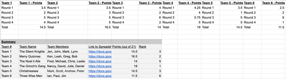
While it brought all the scores into one place, it wasn’t very easy for my participants to quickly pull out the key information (i.e., how well their team was doing).

I decided to apply some of the lessons I learned in the Dashboard Design course to make the sheet more accessible.

After: My Trivia Night Dashboard

First, I had to decide what type of dashboard I wanted to make.

In the course, Ann provided a handy Dashboard Cheat Sheet that helped me see different options.

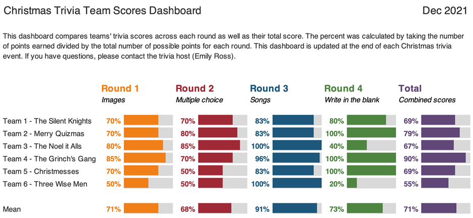
I decided because I had one time point and wanted to compare categories (i.e., teams) that bars would likely be best.

I also decided to convert the numerical scores into percentages because not all rounds had the same number of possible points. Percentages would be a more consistent indicator.

Now it was time to make the dashboard.

It was easy to follow along step by step with Ann’s stacked bar dashboard video tutorial.

I made the following dashboard using the Data Bars feature in Microsoft Excel:

This dashboard compares teams' trivia scores across each round as well as their total score.

What I Learned about Dashboards and Excel

Not only were the steps easy to follow, but I also learned about better dashboard and Excel practices.

These tips help make your life easier and your dashboards more editable and readable.

Some of my lessons learned include:

  • Always put a title, subtitle, and date on the dashboards.
  • If your text is in a colour, make it bold so it is easier to read.
  • Add a white border around cells to add white space.
  • Use cell styles and Theme Colours to make formatting more consistent and easier to edit (I somehow did not know about this in Excel even though I use it regularly in Word).
  • Give yourself a bit of time to do the final editing to make it sure fits on a page

With this dashboard, I found it much easier to see:

  • How well teams did in each round (e.g., team 6 struggled with Round 4, but excelled in Round 3).
  • How teams compared to each other.
  • How hard each round was (e.g., Round 2 was on average harder than Round 3).

Designing a Second Dashboard

Encouraged by my dashboard attempts, I decided to try one more dashboard.

I wanted to know within each round, which questions did teams get right and wrong.

This would help me identify which questions were too easy and which were too hard. It’s a fine balance to get when hosting trivia!

I thought about including it in the same dashboard above, but I then I watched one of Ann’s videos about the four types of dashboards.

This reminded me that it’s okay (and even better) to make different dashboards for different audiences.

I had to do a bit of data cleaning first. I ended up with a table that showed for each question in each round the percent of teams that got that question fully correct:

I made this dashboard to show the percent of teams that got a question correct, but I found it hard to identify any patterns or the take home message.

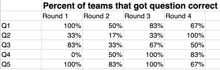
While it had the information that I needed, I found it hard to identify any patterns or the take home message.

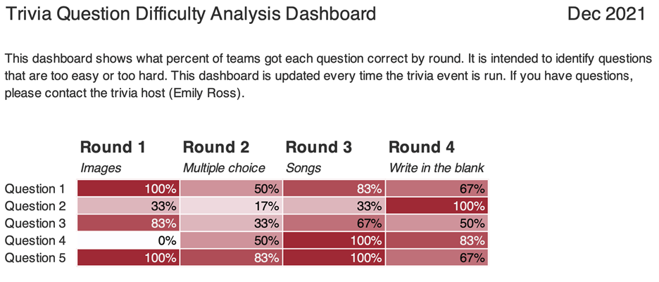
I remembered that in the Dashboard Design course Ann had a video on how to compare categories using heatmaps. (Here’s a blog post tutorial you can read.)

I used the steps to create this:

This dashboard shows what percent of teams got each question correct by round.

What I Learned from My Second Dashboard

As with the first dashboard, there were some great tricks.

Essentially, if you’re doing something manually (like changing the text colour to white on the darker cells or individually colouring cells) there is almost always a better way! You can use Excel’s conditional formatting to automatically color-code background fills and/or font colors.

I found it much easier to identify patterns both within round and across rounds.

For example, teams generally had a harder time with questions in Round 2 than they did with Round 3 (there are more lighter cells).

Using this dashboard, I could easily pick out questions which were too hard and too easy.

Questions That Were Too Hard

Round 1 – Question 4: What is the name of this dish and where is it eaten on January 6? (Answer: Rosca de Reyes; Mexico)

Image of food dish Rosca de Reyes, traditionally eaten in Mexico.
Image source: Elizabethcasasola, CC BY-SA 4.0, via Wikimedia Commons

Round 2 – Question 2: What is the highest grossing Christmas movie (according to Wikipedia)?

Options: a. The Grinch b. Krampus c. The Polar Express d. Elf

(Answer: The Grinch)

Questions That Were Too Easy

Round 4 – Question 2: What fruit is a traditional stocking stuffer?

(Answer: Citrus fruit like an orange, mandarin, clementine)

Round 3 – Question 4: What performance is this song played in? (Bonus: Who is the composer?)

(Answer: The Nutcracker; Tchaikovsky)

(Sound clip source: Dance of the Sugar Plum Fairy Kevin MacLeod (incompetech.com)

Licensed under Creative Commons: By Attribution 3.0 License, via Wikimedia Commons)

I really enjoyed how approachable and practical the videos in this course were.

I can’t wait to continue to apply the tips and techniques I learned both at work and for fun!

Maybe at next year’s trivia I’ll have to test some of the dashboard designs for comparing change over time.

Connect with Emily

LinkedIn: https://www.linkedin.com/in/emilysross/

Written by cplysy · Categorized: depictdatastudio

May 04 2022

Using Canvases

You might have noticed that the world seems to be awash in canvases these days. The canvas model owes much of its popularity to the work of Alex Osterwalder and Yves Pigneur and their Business Model Canvas.

A canvas is a form of system mapping that visualizes critical aspects of a system and organizes them. A canvas uses visual conventions like boxes and arrows to lay out key assumptions, resources, actors, and value claims.

Three examples of popular canvases include:

  1. Business Model Canvas
  2. Value Proposition Canvas
  3. Social Lean Canvas

Andi Roberts has pulled together a massive list of fifty different types of canvases that cover issues ranging from value chain analysis, ethics, and strategy, to project management and more.

Some popular canvases like the Business Model Canvas are even pre-loaded as templates in visual thinking tools like Miro and Mural.

There is even a tool called Canvasizer that can help you create your own personalized canvas.

But how do we use these in practice?

Canvas Application

Most of these canvases rely on a similar structure. The simple form of using 8-12 boxes organized in an essentially linear format. This is a strength and weakness of the approach. The reason? It reduces complexity and interdependence, favouring a simplified organizational approach.

The simplification makes it attractive to people and relatively easy to use. The difficulty is the risk of oversimplifying the situation and confusing the model with reality.

It is for both of these reasons that we use canvases with caution. Canvases can be helpful in the following circumstances:

  1. When a project team is unsure where to start. A canvas reduces complexity and can help people start getting things on the page. Just getting started can be an enormously powerful reason to use canvases. Too often, organizations pause because they do not know where to begin. This can nudge that process forward.
  2. When the research hasn’t been entirely done or organized while the need to move forward is high in its absence. Sometimes, there are holes in the research (what we know about a situation) and plotting key themes or issues on a canvas can help us to hypothesize more clearly what else we need, know, or ought to consider.
  3. In times when there isn’t a budget to support in-depth research and sense-making. Canvases can help us to anticipate what a situation has present and available. In the absence of data, we can imagine what might be needed. This isn’t faking data and should be used when research is used to guide, not to prove or validate.
  4. When the number of anticipated themes and key variables for consideration is relatively tiny. Massive systems with many variables don’t fit well, but in many situations, we are not dealing with large, massive, complicated systems — they are small and complex. There are a few key categories and for these, canvases can work well.
  5. When there’s coaching time available. Canvases shouldn’t be used for client work without sense-making and coaching. We see many people confuse the map and model with the landscape and reality.. Plotting out data on a canvas is relatively simple and can be done with little time. What takes time is making sense of what it means and how it can inform strategy. Designing a strategy from a canvas takes time, care, and attention. Doing this is where the value of a canvas comes in.

Canvases are useful. Find or create one, and you can focus your team on what’s most important, organize it, and help foster the kind of conversations needed to assess what to do and how we might do it in the future. Canvases are design tools, and if you consider their advantages and limitations, you can become a great organizational designer.

We use canvases and many other tools. If you want some help setting this up, applying it, or learning other tools and methods, let’s have a coffee and talk about your needs and how we can help.

The post Using Canvases appeared first on Cense Ltd. .

Written by cplysy · Categorized: cameronnorman

May 04 2022

Using Decision Canvases

You might have noticed that the world seems to be awash in canvases these days. The canvas model owes much of its popularity to the work of Alex Osterwalder and Yves Pigneur and their Business Model Canvas.

A canvas is a form of system mapping that visualizes critical aspects of a system and organizes them. A canvas uses visual conventions like boxes and arrows to lay out key assumptions, resources, actors, and value claims.

Three examples of popular canvases include:

  1. Business Model Canvas
  2. Value Proposition Canvas
  3. Social Lean Canvas

Andi Roberts has pulled together a massive list of fifty different types of canvases that cover issues ranging from value chain analysis, ethics, and strategy, to project management and more.

Some popular canvases like the Business Model Canvas are even pre-loaded as templates in visual thinking tools like Miro and Mural.

There is even a tool called Canvasizer that can help you create your own personalized canvas.

But how do we use these in practice?

Canvas Application

Most of these canvases rely on a similar structure. The simple form of using 8-12 boxes organized in an essentially linear format. This is a strength and weakness of the approach. The reason? It reduces complexity and interdependence, favouring a simplified organizational approach.

The simplification makes it attractive to people and relatively easy to use. The difficulty is the risk of oversimplifying the situation and confusing the model with reality.

It is for both of these reasons that we use canvases with caution. Canvases can be helpful in the following circumstances:

  1. When a project team is unsure where to start. A canvas reduces complexity and can help people start getting things on the page. Just getting started can be an enormously powerful reason to use canvases. Too often, organizations pause because they do not know where to begin. This can nudge that process forward.
  2. When the research hasn’t been entirely done or organized while the need to move forward is high in its absence. Sometimes, there are holes in the research (what we know about a situation) and plotting key themes or issues on a canvas can help us to hypothesize more clearly what else we need, know, or ought to consider.
  3. In times when there isn’t a budget to support in-depth research and sense-making. Canvases can help us to anticipate what a situation has present and available. In the absence of data, we can imagine what might be needed. This isn’t faking data and should be used when research is used to guide, not to prove or validate.
  4. When the number of anticipated themes and key variables for consideration is relatively tiny. Massive systems with many variables don’t fit well, but in many situations, we are not dealing with large, massive, complicated systems — they are small and complex. There are a few key categories and for these, canvases can work well.
  5. When there’s coaching time available. Canvases shouldn’t be used for client work without sense-making and coaching. We see many people confuse the map and model with the landscape and reality.. Plotting out data on a canvas is relatively simple and can be done with little time. What takes time is making sense of what it means and how it can inform strategy. Designing a strategy from a canvas takes time, care, and attention. Doing this is where the value of a canvas comes in.

Canvases are useful. Find or create one, and you can focus your team on what’s most important, organize it, and help foster the kind of conversations needed to assess what to do and how we might do it in the future. Canvases are design tools, and if you consider their advantages and limitations, you can become a great organizational designer.

We use canvases and many other tools. If you want some help setting this up, applying it, or learning other tools and methods, let’s have a coffee and talk about your needs and how we can help.

The post Using Decision Canvases appeared first on Cense Ltd. .

Written by cplysy · Categorized: cameronnorman

May 04 2022

How to Support Your Local Abortion Fund

Now is the time to raise your voice. Late Monday night, a leaked draft decision from the United States Supreme Court confirmed what many in the reproductive justice and abortion rights movement have known: Roe v Wade (1973) will be overturned, extremely restricted and in some cases, making abortion illegal throughout the U.S.  While this was anticipated, it doesn’t take […]

The post How to Support Your Local Abortion Fund appeared first on Nicole Clark Consulting.

Written by cplysy · Categorized: nicoleclark

Apr 27 2022

Falling In Love With Your Challenge

Humans are strongly motivated by two forces: love and money*.

When pursuing change and seeking to better things we often look at ways to gain more money as the solution, but what about love? What if we fell in love with our challenge?

(*Money can be a proxy for security, safety, and opportunity.)

Love as a Change Strategy

Author, broadcaster, finance and plant-medicine coach Geoff Wilson encourages people to try love as a means to growth and change. He recently spoke to this on Earth Day and encouraged his listeners and followers on social media to try falling in love with the earth. Instead of arguing about the reasons why we should care for the earth, falling in love is something that transcends reason. It breaks us out of the usual patterns of motivation and persuasion.

What if we took the same approach to falling in love with the earth that we do with humans?

Practically, this might mean buying and caring for a plant or more fully using our bodies and senses to embrace our connection to the earth. You might try walking barefoot on the grass to feel the earth, not just see it.

Increasing the sensory and emotional aspects of change reframes things for us. What if we fell in love with our organization or business? What if we cared for our neighbourhood or customers the same way?

If I want to change something why don’t I fall in love or why don’t I leverage love and power together?

This simple strategy has enormous power attached to it. This approach is much like Adam Kahane’s work on connecting Power and Love for social change. Geoff’s approach is also similar to Arthur Zajonc’s work on mindfulness as contemplative inquiry.

Be more mindful and open your heart, eyes, and senses and you might find change looks and feels differently.

Photo by Leon Wu on Unsplash

The post Falling In Love With Your Challenge appeared first on Cense Ltd. .

Written by cplysy · Categorized: cameronnorman

  • « Go to Previous Page
  • Go to page 1
  • Interim pages omitted …
  • Go to page 129
  • Go to page 130
  • Go to page 131
  • Go to page 132
  • Go to page 133
  • Interim pages omitted …
  • Go to page 310
  • Go to Next Page »

Footer

Follow our Work

The easiest way to stay connected to our work is to join our newsletter. You’ll get updates on projects, learn about new events, and hear stories from those evaluators whom the field continues to actively exclude and erase.

Get Updates

Want to take further action or join a pod? Click here to learn more.

Copyright © 2026 · The May 13 Group · Log in

en English
af Afrikaanssq Shqipam አማርኛar العربيةhy Հայերենaz Azərbaycan dilieu Euskarabe Беларуская моваbn বাংলাbs Bosanskibg Българскиca Catalàceb Cebuanony Chichewazh-CN 简体中文zh-TW 繁體中文co Corsuhr Hrvatskics Čeština‎da Dansknl Nederlandsen Englisheo Esperantoet Eestitl Filipinofi Suomifr Françaisfy Fryskgl Galegoka ქართულიde Deutschel Ελληνικάgu ગુજરાતીht Kreyol ayisyenha Harshen Hausahaw Ōlelo Hawaiʻiiw עִבְרִיתhi हिन्दीhmn Hmonghu Magyaris Íslenskaig Igboid Bahasa Indonesiaga Gaeilgeit Italianoja 日本語jw Basa Jawakn ಕನ್ನಡkk Қазақ тіліkm ភាសាខ្មែរko 한국어ku كوردی‎ky Кыргызчаlo ພາສາລາວla Latinlv Latviešu valodalt Lietuvių kalbalb Lëtzebuergeschmk Македонски јазикmg Malagasyms Bahasa Melayuml മലയാളംmt Maltesemi Te Reo Māorimr मराठीmn Монголmy ဗမာစာne नेपालीno Norsk bokmålps پښتوfa فارسیpl Polskipt Portuguêspa ਪੰਜਾਬੀro Românăru Русскийsm Samoangd Gàidhligsr Српски језикst Sesothosn Shonasd سنڌيsi සිංහලsk Slovenčinasl Slovenščinaso Afsoomaalies Españolsu Basa Sundasw Kiswahilisv Svenskatg Тоҷикӣta தமிழ்te తెలుగుth ไทยtr Türkçeuk Українськаur اردوuz O‘zbekchavi Tiếng Việtcy Cymraegxh isiXhosayi יידישyo Yorùbázu Zulu