• Skip to main content
  • Skip to footer
  • Home

The May 13 Group

the next day for evaluation

  • Get Involved
  • Our Work
  • About Us
You are here: Home / Archives for allblogs

allblogs

Mar 19 2022

Ungrading and the Logic of Evaluation

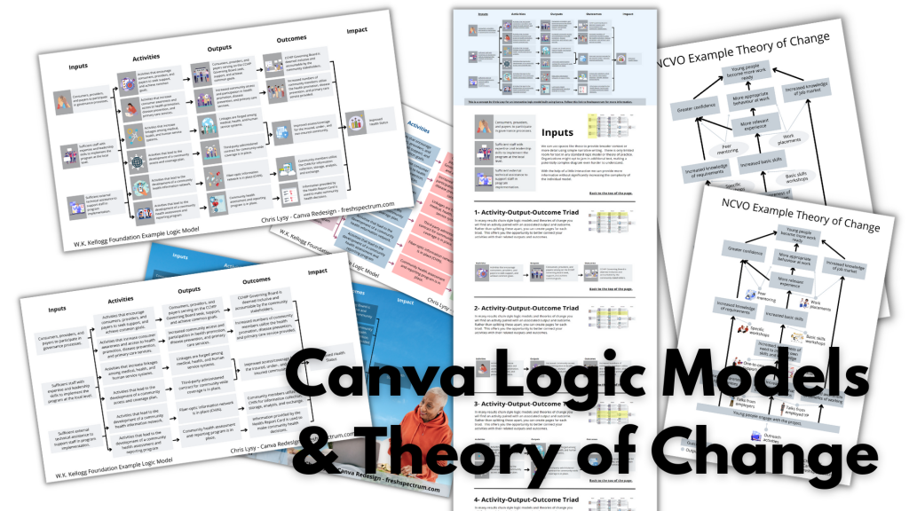
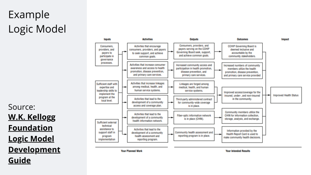
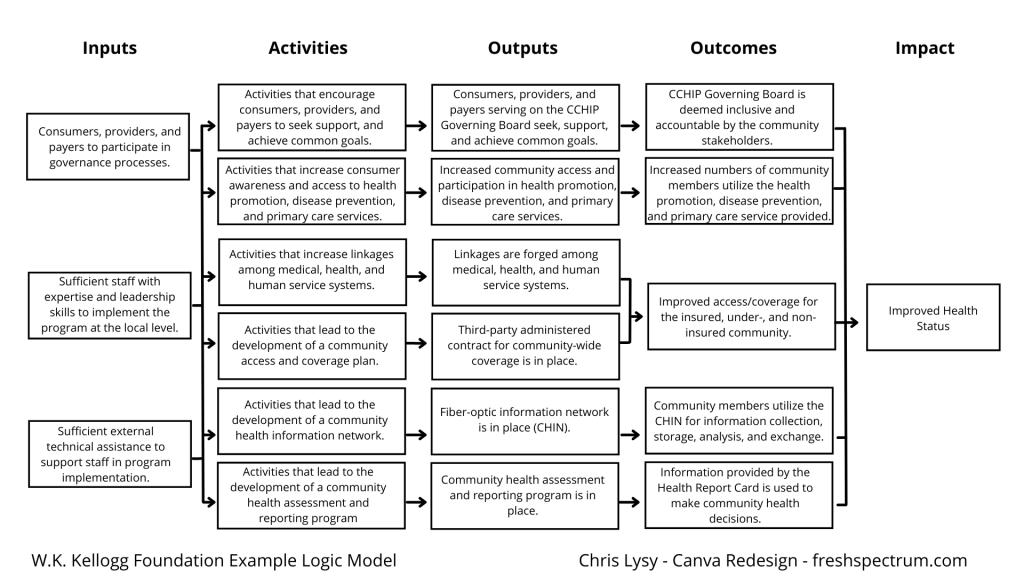
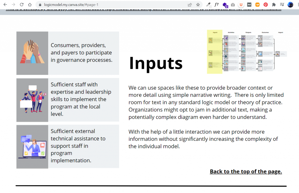
Many of us who teach evaluation are familiar with the chocolate chip cookie exercise by Drs. Preskill and Russ-Eft in their book Building Evaluation Capacity. It’s a great introductory activity to help students understand and work through the logic of evaluation. Dr. Montrosse-Moorhead also wrote up a blog post detailing an adaptation of the activity suitable for online environments during the pandemic.

The basic premise of the activity is you pick something to be evaluated (e.g., chocolate chip cookies) and then go through the basic four steps of the logic of evaluation:

  1. Develop the criteria for evaluating the objects
  2. Set standards for performance
  3. Rate the objects based on those criteria and standards
  4. Synthesize an overall evaluative judgment (e.g., which is best)

When I began shifting some of my courses to ungrading (e.g., my evaluation courses and my interpersonal effectiveness course), one issue I had is that students had a difficult time determining what final grade they should get and documenting evidence for that final grade. I had some students who graded themselves too harshly on factors I didn’t deem too relevant (e.g., lateness wasn’t a big deal to me but many students penalized themselves even if they turned in things a few days late) and I had some students who graded themselves too leniently (e.g., did not turn in any reading reflections or journals, two of the major sets of assignments in the discussion based course and felt they had earned an A).

This difficulty in students grading themselves seemed to stem from not understanding how they have been graded in the past and therefore not knowing how to grade themselves, particularly when the criteria may be more amorphous. Students have previously only really been involved in step 3 of the logic of evaluation process: receiving their individual grades on assignments. They are rarely involved in developing criteria or setting standards, and the overall grade judgment can often feel mysterious or even unfair to students since they are also rarely involved in that process, either.

To combat this difficulty, I decided to apply the chocolate chip cookie evaluation activity to their mid-semester grade reflection letters. My university requires students know where they’re at grade-wise at Week 6 in the semester, presumably so they know whether they should consider dropping the course. Regardless, in an ungraded course this means that students need to practice determining what grade they are currently at and supporting that grade with evidence. This formative exercise helps them practice what they will do summatively at the end of the semester and allow them to not only document and defend their current grade but also reflect on what they will do differently for the rest of the semester to improve their performance.

This activity can be done in two ways, which I’ll document below.

Class-wide activity

In my interpersonal effectiveness course, I have mostly undergraduate students (n = 25) plus some graduate students in our program who had gone through the chocolate chip cookie exercise in our evaluation courses (n = 6). Thus, most of the students were unfamiliar with the activity but I had some students with familiarity who could support the other students. I clumped students into small groups to brainstorm ideas to bring back to the full class.

First, I had students in their small groups brainstorm criteria. I explained to them what criteria are and gave one example criteria (attendance). I had them pull up the syllabus again so they knew what activities, learning objectives, etc. we were doing throughout the semester. We then came together as a class, each group reporting their criteria out and clumping them together if folks came up with the same criteria. As a class, they decided on the following criteria: attendance, participation and engagement, journals, reading reflections, group project, individual project, and growth throughout the semester.

Second, I explained to students what standards are and some examples of what standards can look like (e.g., pass/fail, rubric). We worked together on the attendance criteria for developing standards as a class so they could see what that looked like. Then I assigned the remaining criteria to the groups so they had 1-2 criteria to set standards for performance. They then reported out to the class and we deliberated and discussed as a class until there was group consensus.

The third and fourth steps were then done individually in a mid-semester grade reflection letter. For the third step, I presented them the grading rubric (each criteria with their relevant standards) and had students rate their performance and document evidence and support for their ratings for each criteria. The fourth step involved them determining what final grade they would give themselves at this moment in the course and provide evidence and support for their overall judgment.

I also met individually with each student in short (usually 2-5 minutes) meetings to discuss their letter. This was an opportunity for us to chat 1-on-1, for students to practice those interpersonal skills we’d been learning throughout the semester, and for me to adjust their grading reflections as necessary. Thankfully, this process only involved increasing a few students’ grades because they were too harsh on themselves; I no longer had any students who were too lenient on grading themselves.

Individual activity

Although I have not yet done this, the other option would be to have students individually determine their own criteria and standards for performance, rate themselves, and then synthesize their overall evaluative judgment. This allows more flexibility for students and provides them more autonomy in the grading process.

I plan on doing this with my graduate students in our evaluation concentration moving forward because they will already have had practice doing the class-wide activity as part of the evaluation program. This will be an extension of their learning.

Regardless of the course I would implement this in, I would have students first submit their criteria and standards, perhaps doing a round of peer review or presentation to classmates to get feedback and more ideas of how they want to shape their criteria and standards and get my approval before finalizing them. Then I would have students do the third and fourth step the same as in the class-wide activity; the only difference would be that their criteria and standards would vary from student to student and would need to be presented in their letter clearly.

Conclusion

Overall, I am very pleased with how this activity turned out. Like I documented in my other blog post, I was increasingly concerned with how my teaching practices did not align with how I practiced evaluation. This process gives more power and control in the grading students to students in a way that supports them better in that process.

Written by Dana Wanzer · Categorized: danawanzer

Mar 16 2022

How to create logic models and theory of change using Canva.

So by now, you might have guessed that I really like Canva.

Usually I consider myself to be software agnostic. I’m always on the lookout for the best tool for the job. But the thing is, now-a-days, I find that I’m just almost always in Canva. It’s just made my designer life that much easier that I find myself always using the tool.

  • Infographics > Canva
  • Social Media Images > Canva
  • Reports > Canva
  • Videos > Canva
  • What about Logic Models and Theory of Change? I’m pretty sure you can guess.
Canva Logic Models & Theory of Change

In today’s post.

  • A rundown of creating (and adapting) a basic results chain logic model using Canva.
  • A rundown of creating (and adapting) a basic theory of change using Canva.
  • A rundown of creating (and publishing) a web-based interactive logic model using Canva.
  • A couple of Canva templates so that you can start where I finished.
Zombie evaluators cartoon by chris lysy of freshspectrum. 

"Yes, I get it, you all want to eat brains.  But why do you want to eat brains? What is our intended outcome here?"

Guides for developing logic models and theory of change.

Just in case it wasn’t obvious, this is not a guide on how to fully develop a logic model or theory of change for your program or organization. There is a lot of hard thought work behind the scenes that goes into developing models beyond the finished diagram.

  • Here is a UNICEF Methodological Brief written by the amazing Patricia Rogers – Theory of Change
  • Here is a well-loved guide (created in 2004) from the W.K. Kellogg Foundation – Logic Model Development Guide
  • This one is for those who want the CDC Approach to Creating Logic Models
  • If you want an overly simplified approach, I created a guide – How to create a basic logic model [activity book]
  • Or perhaps you would like to create a Theory of Change using guidance from NCVO – How to Build a Theory of Change

Now that that’s out of the way, let’s jump to putting the metaphorical pen to paper.

A Simple Results Chain Logic Model – Example from the W.K. Kellogg Foundation

Kellogg Foundation Logic Model Example

Okay, so as a starting point I’m going to use this example logic model found in the Kellogg Foundation logic model guide.

Recreating the Logic Model using Canva

When it comes down to it, most basic logic models are really simple to design. It’s just a bunch of shapes, arrows, and lines. This is so many people just end up creating these things in Word or PowerPoint. Because it’s easy enough to do.

Kellogg Logic Model Created with Canva

So that’s where I started. I’ll just replicate a logic model from the guide using shapes and text boxes.

Logic Model created in Canva

It didn’t take too long to create something that looked really similar to the original. And because it’s now in Canva, I have a lot of download options. If I just want an image I’ll usually download as PNG. If I want something printable, then I’ll download as a PDF Standard.

Exporting the logic model to PDF

Adapting your Canva Logic Model

The nice thing about Canva is that it’s pretty easy to duplicate and adapt your logic model, trying out different styles. I find the outline boxes to be a little visually jarring. So instead I replaced the outline boxes with some solid color light gray boxes.

Alternative Canva Logic Model Style

The shapes exist separately from the text, so you just insert the rectangle and send it to the back to set behind the text blocks. If you spend a lot of time moving the boxes around it’s a good idea to group the individual text/shape pairs.

Grouping items in Canva

Color coding the logic model.

Once you have the base shape and text there are all sorts of alterations you can do to the design. I know there are a lot of evaluators who like to color code different elements. That’s certainly simple enough to do.

Canva Logic Model Alternative

Occasionally you’ll want a softer color, especially for background elements. One way to do that is just make the boxes slightly transparent.

Changing colors in Canva

Photo annotating the logic model.

If you find yourself creating a lot of different logic models annotating with some photographs and background elements can really help you to differentiate. Especially if the photographs pair well with the actual project. I created this corny version with just some Canva stock photos.

Canva logic model with photo annotations

I use a Canva a lot, so I’ve made the investment in a pro account (~$10/month at the time of this post). Given the amount of stock content I use and the bonus features, this is well the worth the subscription cost. One of the features I like to use is the background remover. It’s a nice way to make certain stock images fit almost anywhere.

Background Remover in Canva

Coding Logic Model Elements

If your logic model is still being developed and fine tuned it can be a good idea to code the individual blocks. This makes it a lot easier to talk about individual elements.

Logic Model element map

For this I just shrunk the text and offset it to the right of the gray boxes. Then I darkened the side to create a space for codes.

Changing font size in Canva

Icon Illustrating your Logic Model

My favorite way to adapt a logic model is to simply icon illustrate the individual elements.

Icon Illustrated Logic Model

Just move from element to element looking for icons that somewhat illustrate each block of text. There are all sorts of icon styles available within Canva.

Showing how to find icons in canva

A Simple Bottom Up Theory of Change – Example from NCVO

NCVO Theory of Change Example

Okay, so maybe you are less of a logic model person and more of a theory of change person. Let’s do the same thing we did for the logic model with this NCVO example theory of change.

Recreating the Theory of Change using Canva

This starts off just like the logic model. Just recreate (or create) your theory of change using Canva shapes and lines.

NCVO Theory of Change Example created with Canva

Adapting your Canva Theory of Change

For this one I am only going to icon illustrate. But I’m also only going to icon illustrate the outputs (not the outcomes). I find collections of different shapes to be just a bit dull, so I replaced the ovals with icons and little circles to anchor the arrows. It’s a really simple tweak but the whole theory of change feels more open to me now.

Illustrated Theory of Change

Turning our Results Chain Logic Model into an interactive web page using Canva

A few years ago I created a prototype of an interactive logic model in a prototyping tool called InVision. I then recreated the same prototype as a PDF. But recently Canva has rolled out a Beta version of a website builder. So since I already had a logic model created I thought I would try adapting it into an interactive.

So that’s what I did, and you can check it out by clicking this link.

Interactive Theory of Change created in Canva

A little bit of copy and paste and poof, now I have an interactive logic model. The goal of this tool is to create a way to walk a reader through the model, piece by piece. This creates ample space for additional context and conversation that just won’t fit in a traditional model.

Example from the Canva created web based logic model

Not only can you publish your design to a canva site domain for free, you can also purchase a fresh domain or publish to an existing domain you own.

Example of how to publish Canva web pages to the web.

Want to start where I finished? [Templates]

No need to start from scratch. Now that I’ve created some basic templates, you can start where I finished.

Here is a link for the Logic Model Starters template.

Canva Logic Model Template

Here is a link for the Theory of Change template.

Canva Theory of Change Template

And if you end up creating something using these templates, please do share it with me in the comments!

Written by cplysy · Categorized: freshspectrum

Mar 16 2022

Data Collection and Participation For Busy People

Among the greatest challenges of doing research and evaluation is ensuring you get participation from enough (and the right) people. Surveys are everywhere. It feels like everyone wants our feedback on just about everything. Yet, the more surveys out there the more we should be concerned about data quality, too.

On top of that, we are surrounded by media messages, distractions, and ‘noise’ that can make attention a very precious (and rare) commodity.

It can be daunting.

How do we get people to participate and get good quality data from that participation amongst the noise? We’re going to outline an approach to data collection that goes from methods to conversations.

From Methods to Conversations

There is a lot of research on improving existing methods like surveys or asking better questions. Tips like these can be useful, but they may also distract us from addressing other issues. For starters, consider the user case for doing research and evaluation.

Who benefits from the research? Is it those who are participating? If not, why would someone want to take time and spend energy answering your questions? We can no longer assume people will participate out of a sense of wanting to help. The deluge of research requests has made data gathering an imposition more than an opportunity for most people.

One of the ways that we deal with this is to shift the focus to creating conversations and learning opportunities. By thinking of data collection as part of a conversation we can change the way we gather data. This works for evaluation, design research, or any applied research context.

A great conversation is about creating exchange. That means some back and forth between the parties. What if you could do this with your data?

Data-Based Conversations

The concept of data-based conversations is all about using what you gather as the foundation for the exchange between people. This means gathering relevant information from people and then sharing what it is that you find. Individuals provide their thoughts, opinions, attitudes, and reflections and as researchers we provide the synthesis and opportunity to share what we’ve learned from others. It works because it creates exchange and value.

People choose to participate because they can both contribute and receive insights about their peers. Please keep in mind that this approach only works when people are interested in your topic.

We recommend that you design multiple, short engagements so you reduce response burden. Rather than use a single, large survey we suggest you break it into smaller batches of questions. In between each survey we provide rapid synthesis learning reports to share what we’ve learned from others.

Our rapid learning reports might be short summaries, infographics, or distilled tips gleaned from the data. Using visual media is particularly helpful because it’s simple and accessible. It says to our participants: “we heard you and here’s what others have said.”

Data collection can also include short interviews, social media exchanges, or panel feedback. The methods matter less than the way that we structure the engagement. This approach builds trust, familiarity and increases data quality.

Time to Talk?

People are busy and less invested in your product or service than you think. This approach to creating a conversation than just asking (and taking) from people changes the relationship. By enlisting people as partners and focusing on sharing what you learn in ways they can benefit, you serve others not use others.

As always, this must be done with transparency, ethics, respect, and commitment to delivering on your promises. We’ve found this approach works and it adds value to participants. People like to learn and know what’s going on with their peers. Gathering data this way is less intrusive, more natural, and less burdensome.

If you’ve got a big research question to ask, consider ways you can transform your data collection into a conversation. You might find that you get more participation, greater engagement, and better quality data.

Want to build this approach into your evaluations or research? We can help and share our experience using this approach to reach busy people. Contact us and let’s grab a coffee.

Image credits: Karen Lau on Unsplash, Jon Tyson on Unsplash, and Firmbee.com on Unsplash

The post Data Collection and Participation For Busy People appeared first on Cense Ltd. .

Written by cplysy · Categorized: cameronnorman

Mar 13 2022

The “mixing” in mixed methods

In evaluation, we use multiple types and sources of data, diverse methods of collection, or multiple evaluators to answer evaluation questions. Data integration is a way of merging these data from different sources through mixed methods. Data integration can enhance reliability in evaluation findings (e.g., by increasing the ability of findings to be replicated). It can also help to discover contradictions and inconsistencies that otherwise might not have been revealed between different sources and can clarify the results of an evaluation.  

The ability to synthesize large amounts of data to identify important information is an essential skill for evaluators. Depending on the scope of the evaluation, we often collect large amounts and different types of data, and we must triangulate them to get to the main evaluation findings. “Mixed methods” is intentionally using one data source with another, with the purpose of triangulating the results, whereas “multiple methods” is simply using different data collection strategies in the same program, but with no intention to “mix” or integrate them.  

To give you a simple analogy, “mixed methods” is like mixing coffee and milk together (e.g., latte), while “multiple methods” is having coffee and milk separately. They are both great but very different beverages.  

In this article, we discuss how qualitative and quantitative data can be integrated at the study design level, methods, or analysis level. 


Data integration at the design level

At the design level, data can be collected concurrently, or one approach can be used to inform the other.  

  • In exploratory sequential design, we can collect and analyze qualitative data and use the findings to inform upcoming quantitative data collection. A good example would be using interview or focus group results to design survey questions. This exploratory approach improves the survey as it helps to focus the questions on topics that are relevant or important to participants.  

  • Explanatory sequential design uses the findings of quantitative data to plan qualitative data collection. For example, a survey finding can be further explored using interviews to understand what, how, and why. This approach often leads to a much richer discussion as the evaluator already understands the underlying issues and can further explore those specific themes in interviews and/or focus groups.  

  • If we conduct the qualitative and quantitative data collection simultaneously in convergent design, the findings from one approach can still inform and drive change in an interactive approach. For example, using interviews and survey findings in multiple phases such that the data interact to inform subsequent versions and the final result. This approach is resource-intensive and requires many cycles of participation from respondents.  


Data integration at the methods level

Data integration at the methods level occurs when the qualitative data collection is linked to quantitative in the data collection or analysis.  

  • Data collection can be linked through the sampling frame (connecting) whereby participants for one method can be recruited/invited to participate in another method (e.g., recruiting focus group participants from survey respondents).  

I often use this approach in my evaluation practice where I recruit interview or focus group participants through surveys. It is often difficult to reach program participants thus, using one data collection effort to recruit for other methods reduces the burden on participants and minimizes evaluation cost. I use the app Calendly, which works like a dream to schedule interviews as the link to the app can be inserted at the end of the survey. Calendly will automatically show interested participants potential interview times and lets them schedule time that works for them.  

  • Other ways of integration at the methods level include embedding, which is linking data at multiple points (e.g., the use of the first round of qualitative data to understand and control for potential bias in an initial survey and using a second round of qualitative data to further explore survey results. In this example, there are two rounds of qualitative data collection and a survey between them. The evaluator uses the findings from each data collection effort to inform the next one) or bringing them together for analysis (merging). 


Data integration at the Interpretation and Reporting level

Data integration at the Interpretation and Reporting level often occurs in one of the following approaches:  

  • Narrative – describing the qualitative and quantitative findings in a report. The evaluator weaves the qualitative and quantitative findings together on a topic-by-topic basis or presents the findings in different sections.  

In my evaluation reports, I often do a combination of weaving and presenting in different sections. In the results section, I present the results of administrative data collection, surveys and interviews separately and bring them all together by general themes/topics in the discussion or key takeaway sections.  

  • Data transformation – one type of data is converted into the other type of data, then the transformed data is integrated with the other data and analyzed simultaneously. An example will be transforming the qualitative data into numeric counts and variables using content analysis to integrate with a quantitative database.  

  • Lastly, we can integrate data using joint displays, which incorporates the qualitative and quantitative data through visual means to present new considerations. The example below presents survey and focus group results side-by-side to provide comprehensive information. If you would like more information on joint displays, check out this article.  


Whichever approach you choose, integrating qualitative and quantitative data and triangulating the results often helps generate new insights and reliable evaluation results. Evaluators should consider which evaluations would benefit from mixed methods and carefully choose their data integration approach.  

Which data integration approach do you use often? Let us know in the comments.  


The data integration approaches listed here are a summary of the article “Achieving Integration in Mixed Methods Designs—Principles and Practices” by Michael D. Fetters, Leslie A. Curry, and John W. Creswell.  


Sign up for our newsletter

We’ll let you know about our new content, and curate the best new evaluation resources from around the web!


We respect your privacy.

Thank you!


Written by cplysy · Categorized: evalacademy

Mar 10 2022

Color Theory, Color Wheels, Color Themes, Color Pickers, and More.

Gone are the days when all your reports were just in black and white. Sure, black and white is still cheaper to print, but color printers do exist. And who even prints anything anymore when most of what we read sits on a screen.

It’s time to stop hiding from color. Luckily for us, there are a bunch of tools out there to help even the least color-savvy designers. For years, when anyone would ask, I used to send them to Adobe Color. But now-a-days Canva has come through with their own useful set of free tools.

This post highlights a bunch of the useful, mostly free, tools you can add to your own reporting toolkit.

freshspectrum cartoon by Chris Lysy
"Hey, look at us, we're all matchy matchy. I love it when our shirt colors are complementary."

"I think you mean analogous. I'm wearing a greener blue, not orange."

In this post.

  • The Basics of Color Theory
  • Color Wheels for Graphic Design
  • Color Palette Inspiration Tools
  • Color Extractors
  • Color Pickers
  • Color Contract Checkers
  • Personal Color Libraries

The Basics of Color Theory.

Do you know what it means if I say a color combination is monochromatic, complimentary, or analogous? Do you know the difference between hue, saturation, and value? If the answer isn’t a resounding YES, then I suggest you take a few minutes to watch this really solid intro video by GCF.

Color Wheels for Graphic Design

Color wheels are particularly useful tools when you already have at least one color in mind. For instance, you are trying to create a broader color palette for a project that already has a single color logo. You can use that color as your starting point when choosing supporting colors.

Adobe Color’s color wheel gives you 5 color options. Depending on the color harmony rule you choose, change one color and all the colors will change.

https://color.adobe.com/create/color-wheel

Canva’s color wheel runs similarly, although with less colors. For a lot of report palettes, this is probably not a bad thing. I often suggest you use two complementary colors and then monochromatic varieties of each color.

https://www.canva.com/colors/color-wheel/

Canva’s color wheel page also gives a really nice run-down on color theory.

Color Palette Inspiration Tools

If you don’t know where to start, or only have a general feeling on your desired look, a little inspiration might help. Both Canva and Adobe offer a bunch of tools that might get you the inspiration you need to build a palette (or to discover one that they showcase).

Canva’s color palette tool lets you search color palettes based on keywords. Looking for something blue? How about a nature theme? Like pastels or bright colors? Just search away and you’ll be given lots of options to choose from.

https://www.canva.com/colors/color-palettes/

Another thing I like about Canva’s color palette search is that when you click on a palette you like you are brought to a page that shows the palette alongside a photograph that includes the colors. It also gives you related combinations.

Sharing these pages with stakeholders as you mull color choices can really help you get better/faster input on their likes and dislikes.

https://www.canva.com/colors/color-palettes/rosettes-and-cream/

Another tool that Canva offers is a color meanings page. Certain colors have certain societal connotations. When you click on a specific color Canva will give you a run down of that color’s meaning, along with some potential supporting color combinations. You probably don’t need to do this with all of your colors, but it could certainly help you narrow down a list of your primary colors.

https://www.canva.com/colors/color-meanings/

Adobe Color also has some tools that let you search for themes based on color, moods, and other keywords.

https://color.adobe.com/explore

Adobe Color also features color trends drawn from their own designer social network (Behance) and Adobe Stock (Adobe’s stock photo library). These trends are categorized and the color schemes are shown alongside the images that inspired the theme.

https://color.adobe.com/trends

Color Extractors

Do you want to create your own color palettes based on photographs or other images? You can use a color extractor.

Canva’s color extractor (color palette generator) simply requires you to upload a picture. Then Canva will choose four colors drawn from that picture.

https://www.canva.com/colors/color-palette-generator/

Adobe Color’s extract theme feature works similarly but has more features. Instead of 4 colors, it will pull five. If you want a different mood pulled from the same picture, just select the appropriate mood on the left. Also, if you don’t like the colors it picked from the page, you can drag the little circles around to choose different ones.

https://color.adobe.com/create/image

Color Pickers

Just want to pick individual colors from pictures? You can do this using all sorts of tools.

Canva has a color picking eyedrop tool. Just click on the colors button, then on the + (add new document color) and select the eyedropper. Then you can drag the eyedropper around your image to pick a color you want to use.

Adobe has similar eyedropper tools in their pieces of design software. For example, here is the eyedropper tool in Adobe XD.

Even PowerPoint now has an eyedropper. You’ll find it when you click the little drop down menu button next your shape, outline, or text fill buttons.

Another super useful eyedropper tool is one that you can get as a we browser extension. I use the Chrome extension “ColorZilla” often to pick colors from web pages. This gives me the hex code I can then put into other design applications.

https://chrome.google.com/webstore/detail/colorzilla/

Color Contrast Checkers

Wondering how accessible your color palettes would be for different people? One really simple Contrast Checker can found on the WebAIM site. They also provide lots of other information on keeping you designs accessible.

https://webaim.org/resources/contrastchecker/

Adobe Color also recently added Accessibility Tools to their website.

https://color.adobe.com/create/color-contrast-analyzer

Personal Color Libraries

Tired of copying and pasting hex codes?

If you have Canva Pro, you can save multiple color palettes as part of your brand kit.

https://www.canva.com/pro/brand-kit/

If you are an Adobe user, you can also add your color themes to libraries that will be accessible across all of your Adobe software tools.

https://color.adobe.com/mythemes

You can even set up your custom color schemes within PowerPoint. Just click on the design tab, then the dropdown next to “Varients.”

Written by cplysy · Categorized: freshspectrum

  • « Go to Previous Page
  • Go to page 1
  • Interim pages omitted …
  • Go to page 135
  • Go to page 136
  • Go to page 137
  • Go to page 138
  • Go to page 139
  • Interim pages omitted …
  • Go to page 310
  • Go to Next Page »

Footer

Follow our Work

The easiest way to stay connected to our work is to join our newsletter. You’ll get updates on projects, learn about new events, and hear stories from those evaluators whom the field continues to actively exclude and erase.

Get Updates

Want to take further action or join a pod? Click here to learn more.

Copyright © 2026 · The May 13 Group · Log in

en English
af Afrikaanssq Shqipam አማርኛar العربيةhy Հայերենaz Azərbaycan dilieu Euskarabe Беларуская моваbn বাংলাbs Bosanskibg Българскиca Catalàceb Cebuanony Chichewazh-CN 简体中文zh-TW 繁體中文co Corsuhr Hrvatskics Čeština‎da Dansknl Nederlandsen Englisheo Esperantoet Eestitl Filipinofi Suomifr Françaisfy Fryskgl Galegoka ქართულიde Deutschel Ελληνικάgu ગુજરાતીht Kreyol ayisyenha Harshen Hausahaw Ōlelo Hawaiʻiiw עִבְרִיתhi हिन्दीhmn Hmonghu Magyaris Íslenskaig Igboid Bahasa Indonesiaga Gaeilgeit Italianoja 日本語jw Basa Jawakn ಕನ್ನಡkk Қазақ тіліkm ភាសាខ្មែរko 한국어ku كوردی‎ky Кыргызчаlo ພາສາລາວla Latinlv Latviešu valodalt Lietuvių kalbalb Lëtzebuergeschmk Македонски јазикmg Malagasyms Bahasa Melayuml മലയാളംmt Maltesemi Te Reo Māorimr मराठीmn Монголmy ဗမာစာne नेपालीno Norsk bokmålps پښتوfa فارسیpl Polskipt Portuguêspa ਪੰਜਾਬੀro Românăru Русскийsm Samoangd Gàidhligsr Српски језикst Sesothosn Shonasd سنڌيsi සිංහලsk Slovenčinasl Slovenščinaso Afsoomaalies Españolsu Basa Sundasw Kiswahilisv Svenskatg Тоҷикӣta தமிழ்te తెలుగుth ไทยtr Türkçeuk Українськаur اردوuz O‘zbekchavi Tiếng Việtcy Cymraegxh isiXhosayi יידישyo Yorùbázu Zulu