• Skip to main content
  • Skip to footer
  • Home

The May 13 Group

the next day for evaluation

  • Get Involved
  • Our Work
  • About Us
You are here: Home / Archives for allblogs

allblogs

Jan 26 2022

How to fall into evaluation – a cartoon post.

So what does it mean to “fall into evaluation?”

That’s today’s cartoon post inspiration from Ann Price via Twitter.

@clysy Hey Chris, have you created a cartoon for the often used phrase, “I just kind of fell into evaluation?”

— Ann Price (she, her, hers) (@annwprice) January 21, 2022

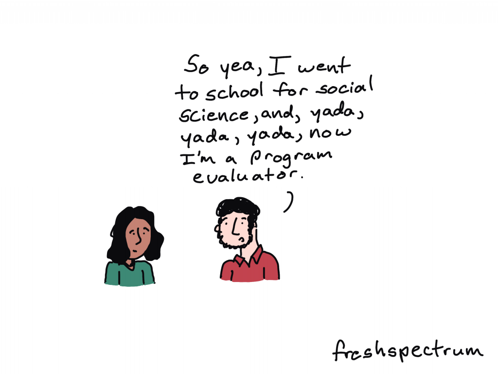
There are lots of social scientists working as evaluators.

Unless you’re in academia it’s hard to be something like a Sociologist professionally. Practical fields like program evaluation and contract research offer a good career path for social science grads.

Fresh Spectrum Cartoon by Chris Lysy. One person talking to another, "So yea, I went to school for social science, and, yada, yada, yada, now I'm a program evaluator."

Professional Sidetracker

If you ask the right question at the right time, you can totally sidetrack a meeting. But if it’s a critical question, maybe that’s not such a bad thing.

Fresh Spectrum Cartoon by Chris Lysy.
Three people at a table.
Person 1 says, "Amara, you keep sidetracking our meetings with important but hard to answer questions. Have you ever considered becoming an evaluator?"
Person 2 just stare at person 3.
Person 3 responds, "That's a job?"

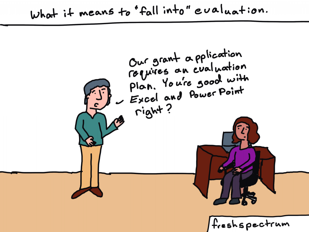
The tools make the evaluator.

I see a lot of people with certain skillsets get funneled into evaluation or quasi-evaluation roles. Especially those who fall into evaluation from specific roles in non-profits or government agencies.

Fresh Spectrum Cartoon by Chris Lysy.
Written across the top, "What it means to "fall into" evaluation."
Person standing but speaking to another person sitting at a desk, "Our grant application requires an evaluation plan. You're good with Excel and Power Point right?"

Sometimes it’s just about filling a need.

People who become evaluators are usually pretty self-aware and good at noticing things other people tend not to see. So sometimes becoming an evaluator is just a response to an existing societal need.

Fresh Spectrum Cartoon by Chris Lysy.
Two people talking. 
Person 1, "So you just fell into evaluation?"
Person 2, "I considered starting my own nonprofit. But then I thought, we don't need more nonprofits. We need the one's we have to be more effective."

Falling into evaluation is not without its risks.

Some pursuits and programs just don’t make a ton of rational sense. At least rational sense that we can see and measure.

Fresh Spectrum Cartoon by Chris Lysy.
One person stopping a second person from falling into a hole labeled "Evaluation."
Person 1 says, "Careful! You fall into that and you'll never see our program in the same light again."

Are you an evaluator? How did you fall into evaluation?

Seriously, I want to know. Do any of these cartoons strike a chord? Let me know in the comments.

Fresh Spectrum Cartoon by Chris Lysy,
Two people talking.
Person 1, "Oh, I just kind of fell into evaluation."
Person 2, "What does that mean? Did you trip on a logic model or something?"

Written by cplysy · Categorized: freshspectrum

Jan 25 2022

Dashboard Don’ts: My 10 Worst Mistakes from Past Projects

Are you working on a dashboard at your workplace?

Maybe you’re making a brand-new dashboard?

Maybe you’re revamping an existing dashboard to bring it up to speed?

Maybe you don’t have a dashboard yet, and you’re wondering if you need one?

In this article, you’ll see my 10 worst mistakes from past dashboards.

I’ve made all these mistakes (and more…) over the past 15 years. Let’s fast-forward your project and make sure you’re not doomed to run into the same issues I did.

Learn from my mistakes. Don’t let your dashboards suffer.

10 Worst Dashboard Mistakes

You can watch the video or read about the top 10 dashboard mistakes.

Mistake #1: Not Having a Dashboard  

Fifteen years ago, I assumed that a single technical report was enough.   

I started my career by working on university-based research centers. Peer-reviewed articles were the norm.  

When I transitioned into contracting for Federal government agencies, 100-page technical reports were the norm. 

Nowadays, I know better.  

Dashboards used to seem like extras.  

But they’re not extras. They’re essential.  

Mistake #1: not having a dashboard. Instead of a single technical report, aim for a dashboard.

Mistake #2: Not Having Multiple Dashboards  

After I realized that every project could benefit from a dashboard, I realized that every project needs multiple dashboards.  

In the past, I’d make a single dashboard. All the information was crammed in. I was trying to meet every audience’s needs. 

It was destined to fail.  

Now, I have multiple dashboards so that each audience gets their own individualized dashboard.  

Audience A gets the information they need. 

Audience B gets the information they need. 

Audience C gets the information they need. And so on. 

By providing each audience the exact information they need, the data is much more likely to be understood and used.

Mistake #2: not having multiple dashboards. Each audience should have their own dashboard.

Mistake #3: Copying and Pasting from Excel into Word or PowerPoint 

Here’s what I used to do.

I would make my graphs in Excel and then I would past them into Word or PowerPoint.

I found workarounds to make sure the formatting was identical in both Excel and Word/PowerPoint (e.g., by setting up Themes and a standard text hierarchy in advance).

I found workarounds to avoid copying and pasting (e.g., by writing VBA code).

But the transfer process was still time-consuming and prone to errors.

Nowadays, I just keep everything in the same software program.

I’m a big fan of everyday software so I usually just use Excel for everything. You could use PowerBI or Tableau. Whatever software program you like.

Less copying and pasting between programs is a major time saver.

Mistake #3: copying and pasting between programs. Save yourself time and just do everything in one program.

Mistake #4: Getting Distracted by Sparkly Interactivity 

It’s easy to get caught up in all the cool things interactive dashboards can do, like adding drop-down menus or checkboxes. Interactivity lets the user explore the data further.

In hindsight, I wish that some of my interactive dashboards were actually static dashboards.

Yes, I admit it–I wish some of my interactive dashboards were static instead.

I wish I would have used static dashboards for the high-level executives who don’t have extra time to explore data.

Or, for the non-technical audiences who just want the key takeaways.

Sometimes your audience would really just prefer a PDF’d one-pager.

Mistake #4: getting distracted by interactivity. Sometimes your audience really just wants a static dashboard.

Mistake #5: Placing Drop-Drops or Checkboxes Wherever There Was Space 

I used to just place drop-downs and checkboxes wherever there was space.

At the bottom of a page? Sure.

On the right-hand side of a page? Sure.

In this teeny tiny white space that’s leftover? Sure!

Now, I aim for consistency.

That means usually placing them in the upper left corner.

It’s the most valuable real estate on our screen because our eyes are naturally drawn there.

Intentional placement helps your audience know where to start.   

Mistake #5: placing drop-downs wherever they fit. Be intentional with placement.

Mistake #6: Shoving Everything onto a Single Screen 

I used to think that a dashboard had to fit onto a single screen or page.

That’s false.

People can easily click to the next window or flip to the next page.

There’s no reason to cram all the information into one page. Especially if you have to resort to using size 6 font with no white space left.

A good rule of thumb is literally a thumb: Make sure you have about a half inch to an inch of white space between your graphs and text boxes.

Give the dashboard some room to breathe so your audience doesn’t feel overwhelmed by the sheer density of the data.

Mistake #6: shoving everything onto a single screen. Leave some room to breathe.

Mistake #7: Only Showing the Latest Data 

Here’s the most common mistake I see: Only showing the latest data.

Let’s pretend there’s a big meeting in March. I used to just show March’s numbers.

But what about February? Or January? Or earlier dates? My poor audience would have to hunt down the previous month’s dashboard, flip back and forth between screens, and try to make comparisons. Our audience should never have to flip between screens or flip between pages to make comparisons!

By only showing the most current data, we’re not allowing our viewers to see the bigger picture.

Nowadays, I use lots more line graphs so that my viewers can see whether there are fluctuations over time.

Mistake #7: only showing the latest data. Show more information allows your audience to see fluctuations over time.

Mistake #8: Losing Time on Colors and Fonts 

Wasting time looking for color palettes or fancy fonts is so common.

I used to just use whatever colors and fonts I felt like. Or, I used the software defaults..

I would think, “Ooh, I heard this font is really popular right now!” or “I love this shade of blue!”

Being guided by personal preferences means your work isn’t as professional as it could be. Especially if you’re working in a group.

If everyone picks their favorite colors or fonts, nothing is cohesive or branded.

Instead, save yourself some time and boost the professionalism by using the recipient’s brand fonts and colors.

You don’t even have to think about it. It’ll just be done. Save your precious mental space for something else.

Mistake #8: losing time on colors and fonts. Just use brand guidelines from the start and save time.

Mistake #9: Wasting Money by Outsourcing Too Much 

There’s a time and place for outsourcing work.

But dashboard design is not one of them.

It shouldn’t cost tens of thousands of dollars to develop a dashboard.

Nor should it take weeks or months.

Don’t hire somebody else to make your dashboard.

Keep it in-house.

You’ll be able to maintain it more easily and will have full control whenever changes or updates need to be made.

Mistake #9: wasting money by outsourcing too much. Keep dashboard design in-house.

Mistake #10: Assuming It Was Finished 

Dashboards are never finished.

Ever.

They’re not supposed to be.

Dashboards should be updated over time.

Dashboards should evolve as the information needs evolve.

And not just once a year.

You should be making ongoing edits, adjustments, and improvements all the time.

As needs change, the dashboard changes.

Which is another reason why keeping it in-house is so much better.

Mistake #10: assuming it's finished. Dashboards should be updated indefinitely.

Your Turn 

Those were my top 10 worst mistakes from my past projects.

Now, it’s your turn.

What are your worst mistakes from your past dashboard projects? Share so we can learn from one another and avoid some of the headaches before they start.

Written by cplysy · Categorized: depictdatastudio

Jan 19 2022

Try This: Check In on Your Strategic Plan

Try this out and let me know how it goes for you. On the road to becoming more data driven, and making sense of stakeholder data, organizations use the data to inform their strategic planning process. A strategic plan, in short, is a written document that outlines an organization’s mission, vision, the context the plan […]

The post Try This: Check In on Your Strategic Plan appeared first on Nicole Clark Consulting.

Written by cplysy · Categorized: nicoleclark

Jan 19 2022

UX Evaluation and Creative Reporting Webinars [Free Replays]

In early December I was given the opportunity to join The Youth Research and Evaluation eXchange (YouthREX) for a couple of Zoom webinars.

And, if you’re interested, the replays for both are now live and free to watch.

freshspectrum cartoon by Chris Lysy.

Person talking while holding paper. "Not sure how they did it. It's only a 3 page executive summary but it reads like a 50 page report.
A screenshot of the YouthREX webinars page, showing two webinars.  User Experience Evaluation and Creative Reporting in Evaluation.
Both webinars are currently available on the YouthREX Webinars page.

User Experience (UX) Evaluation

I’ve embedded below, but you can also watch/download the slides for this webinar by following this link.

  • How can evaluations of youth programs be enhanced by User Experience Design?
  • What are emerging UX Design methods and tools for better understanding participants of youth programs?

An effective program evaluation ensures that the data collected, interpreted, and shared are relevant to program stakeholders.

We explored ways that UX strategies can improve the design of the process evaluation component of an evaluation of a youth program.

This webinar paid attention to recent innovations in online platforms and software tools that enhance youth participation in a program evaluation.

freshspectrum cartoon by Chris Lysy
Two people talking. Person one says,
"Why are we spending time on evaluation? We already know what's working and not working."
Person 2 replies, "Because if we want to succeed, we need to prove that to others."

Creative Reporting in Evaluation

I’ve embedded below, but you can also watch/download the slides for this webinar by following this link.

  • How can we share our evaluation findings in more creative, accessible, and engaging ways?
  • What tools can we start using today to enhance our reports and presentations?

Sharing evaluation insights can be fun and rewarding. This webinar challenged us to revisit the common ways we share evaluation findings and presented a number of creative solutions for keeping stakeholders engaged and informed.

Participants explored practical ways (infographic design, cartoon illustration, meme design, and social media reporting strategy) to mobilize knowledge and examined how Slidedoc Reporting can offer unique advantages to youth programs who are looking to create exciting and professional presentations through everyday software tools.

freshspectrum cartoon by Chris Lysy
Person presenting says, "We suggest using a modern 1:3:25 reporting strategy."
Power Point slide says, "1 Slidedoc, 3 Blog Posts, 25 Social Media Posts."

Written by cplysy · Categorized: freshspectrum

Jan 17 2022

What Makes a Useful Data Story? 5 Questions to Ask 

Ready to tell a story with data?  

Here’s my definition of data storytelling, in case you missed the previous blog post. 

Great!  

Let’s remove the guesswork from our graphs. 

The next step is to figure out which message we’ll highlight. 

We can’t visualization everything—that dilutes the power of our graph. 

What Makes a Useful Data Story? 5 Questions to Ask

Here are five thought-starter questions to help you uncover useful nuggets in your data.  

  1. What’s Going Well? What’s Not Going Well? 
  1. Did We Reach Our Goals? Why or Why Not? 
  1. What’s Surprising? What Unfolded as Expected? 
  1. Which Information Needs to be Shared with Others? Who Needs to See This Information? 
  1. What Increased Over Time? Decreased? Stayed the Same? 

If you analyze data for a living, then I bet you’re already asking yourself these questions. You were probably trained to approach data this way in grad school. Or, it’s become intuitive after years of on-the-job practice. 

Dabblers in data, this one’s for you.  

Newcomers to data, this one’s for you.  

What’s Going Well? And What’s Not?

Everyone loves a success story.  

Look through your dataset.  

Find the good news and highlight that finding with dark colors and takeaway text.  

I often start with positive findings so that my audience can celebrate a small victory right away. 

But, facilitating an honest conversation with data visualization is requires balance.  

After presenting positive news, I present the less-than-positive news.  

For example, the next graph in my report might use a darker color to draw attention to something that wasn’t going very well. 

Did We Reach Our Goals? Why or Why Not? 

I consult to dozens of grantmakers and grantees each year—Federal, state, and local government agencies, foundations, and nonprofit organizations.  

In the grantmaking world, it’s common for funders to ask their grantees to explain whether they are meeting their targets.  

For example, one goal of a parenting program for teenage mothers and fathers might be to avoid repeat pregnancies. The health centers and high schools that are running the program might have to report whether there was, in fact, a decrease compared to a control group.  

Graphing these goals is an obvious choice. 

What’s Surprising? What Unfolded as Expected? 

Take off your data nerd hat. 

Put on your human hat.  

Step outside the math for a bit.  

Trust your gut instinct.  

I look for numbers that are surprising and unexpected.  

What’s surprising to you, personally?  

Surprising new facts make for interesting reports.  

Nobody wants to read the same old stories over and over and over.

Which Information Needs to be Shared with Others? Who? 

This thought-starter question keeps your data actionable.  

Examine your numbers.  

Who, in particular, needs to see these numbers?  

Think about all the different people who are involved in your project.  

Are there certain takeaway findings that your boss should probably know about? Or the boss’ boss? Or someone outside the organization?  

Who might act differently or make a different decision based on this new information?

What Increased Over Time? Decreased? Stayed the Same? 

Most projects have numbers available at multiple points in time.  

Examine how your numbers are changing over time, if at all.  

Sometimes a number will increase over time. Other times, a number will decrease over time.  

And other times, you might not notice any difference whatsoever. Flat lines can be useful, too! 

Data Storytelling Example: Highlighting a Flat Line in a Workforce Development Project 

I changed around the details, but this example is based loosely on a past project.  

Let’s pretend that you’re leading a career coaching program for adults who recently immigrated to the country. I consulted on a project like this a couple years ago.  

The purpose of the career coaching program was to get those adults into higher-paying jobs.  

A few times a year, the career counselors collected data on the participants. For example, they asked the participants how much they were being paid. The career counselors might even verify their wages by looking at pay slops or tax forms.  

The person responsible for compiling all this data should see whether wages are improving, declining, or staying steady.  

Imagine that you uncovered that wages for most program participants were staying steady—despite hundreds of thousands of tax dollars being poured into this program. 

That flat line has to be shared and talked about! Something needs to be adjusted ASAP. 

Your things-stayed-steady-over-time graph might look like this. 

We applied several data storytelling techniques. I bet you recognized them right away: 

  1. We’ve got color contrast (all 30 participants’ individual lines are grayed out, and the average is highlighted in a darker brand color). 
  1. We’ve got a takeaway title (“Wages Did Not Increase”). 
  1. We’ve got numeric labels on a handful of key data points (the $18.27 average wage at the beginning, and the $18.30 average wage at the end). 
  1. We’ve got (light) narrative annotations (“Average hourly wages: $18.30”) 

Looking for Useful Stories throughout the Analytical Process 

When do you look for possible data stories? 

Not the day before your project’s due!!!!!!!!!!!!!!!!!! 

Revisit these questions at each stage of your project’s analytical process. 

Look for Useful Stories in the Raw Data 

I start with my spreadsheets of raw data.  

I ask myself, “What’s going well? Did we reach our goals? What increased over time? What’s surprising? Which information needs to be shared with others?”  

I keep a running list of interesting nuggets in a notebook. 

Look for Useful Stories as You’re Compiling Tables for Your Appendices 

Later, I compile my analyses in tables. The tables often go in the appendix of a technical report.  

This means that I write the last pages of my report first.  

As I’m designing the tables, I ask myself those five questions again, and I add to my running list. 

Look for Useful Stories as You’re Designing Your Full Reports or Slideshows 

Next, I write my report (or create my slideshow, or whatever the finished product will be).  

I look through the tabulated data as I’m designing the report: Which numbers deserve to go into the body of the report?  

Look for Useful Stories as You’re Designing Summaries (One-Pagers, Infographics, Briefs, etc.) 

Finally, when my full report/slidedeck is complete, I pull out graphs that are so interesting that they deserve to go in a summary.  

I’m using the word summary loosely here.

A summary could be a one-page handout, an infographic, a shorter brief, etc. 

Yes, this is the place for those stories to shine.

Yes, you should’ve found stories along to way to include in your summaries. Hopefully!!!

This stage gives you one more chance to think carefully about useful gems in your dataset.

Don’t wait until the end of a project to think about the “so what?”  

This should be an ongoing, intentional process.  

When we think deeply about the data, our audiences will benefit from the added clarity. 

Your Turn 

What’s your process for uncovering interesting stories in your data? 

Do you have more thought-starter questions to add to the list? 

Written by cplysy · Categorized: depictdatastudio

  • « Go to Previous Page
  • Go to page 1
  • Interim pages omitted …
  • Go to page 143
  • Go to page 144
  • Go to page 145
  • Go to page 146
  • Go to page 147
  • Interim pages omitted …
  • Go to page 310
  • Go to Next Page »

Footer

Follow our Work

The easiest way to stay connected to our work is to join our newsletter. You’ll get updates on projects, learn about new events, and hear stories from those evaluators whom the field continues to actively exclude and erase.

Get Updates

Want to take further action or join a pod? Click here to learn more.

Copyright © 2026 · The May 13 Group · Log in

en English
af Afrikaanssq Shqipam አማርኛar العربيةhy Հայերենaz Azərbaycan dilieu Euskarabe Беларуская моваbn বাংলাbs Bosanskibg Българскиca Catalàceb Cebuanony Chichewazh-CN 简体中文zh-TW 繁體中文co Corsuhr Hrvatskics Čeština‎da Dansknl Nederlandsen Englisheo Esperantoet Eestitl Filipinofi Suomifr Françaisfy Fryskgl Galegoka ქართულიde Deutschel Ελληνικάgu ગુજરાતીht Kreyol ayisyenha Harshen Hausahaw Ōlelo Hawaiʻiiw עִבְרִיתhi हिन्दीhmn Hmonghu Magyaris Íslenskaig Igboid Bahasa Indonesiaga Gaeilgeit Italianoja 日本語jw Basa Jawakn ಕನ್ನಡkk Қазақ тіліkm ភាសាខ្មែរko 한국어ku كوردی‎ky Кыргызчаlo ພາສາລາວla Latinlv Latviešu valodalt Lietuvių kalbalb Lëtzebuergeschmk Македонски јазикmg Malagasyms Bahasa Melayuml മലയാളംmt Maltesemi Te Reo Māorimr मराठीmn Монголmy ဗမာစာne नेपालीno Norsk bokmålps پښتوfa فارسیpl Polskipt Portuguêspa ਪੰਜਾਬੀro Românăru Русскийsm Samoangd Gàidhligsr Српски језикst Sesothosn Shonasd سنڌيsi සිංහලsk Slovenčinasl Slovenščinaso Afsoomaalies Españolsu Basa Sundasw Kiswahilisv Svenskatg Тоҷикӣta தமிழ்te తెలుగుth ไทยtr Türkçeuk Українськаur اردوuz O‘zbekchavi Tiếng Việtcy Cymraegxh isiXhosayi יידישyo Yorùbázu Zulu