• Skip to main content
  • Skip to footer
  • Home

The May 13 Group

the next day for evaluation

  • Get Involved
  • Our Work
  • About Us
You are here: Home / Archives for allblogs

allblogs

Feb 02 2022

Design Thinking Practice: Designing for What’s Next

What does it mean to take Design Thinking and actually apply it in the world?

This was the subject of a series of webinars hosted by the Tamarack Institute for Community Engagement. The webinars featured Co-CEO Liz Weaver speaking with Cense Ltd. President Cameron Norman.

In this first in a series of posts, we outline the key steps in applying design thinking in practice by looking back at this series and begin with the idea of designing for what’s next.

A Framework for Change

The series was set up by a look at designing for what’s next. In this discussion, Cameron Norman introduces the Design Helix – a multi-stage framework for putting design thinking into action.

The Design Helix (below) is based on our two decades of experience designing products, services, and systems at Cense and reflects the literature on design and design thinking. It’s a framework – a means of thinking about design — and not a prescription.

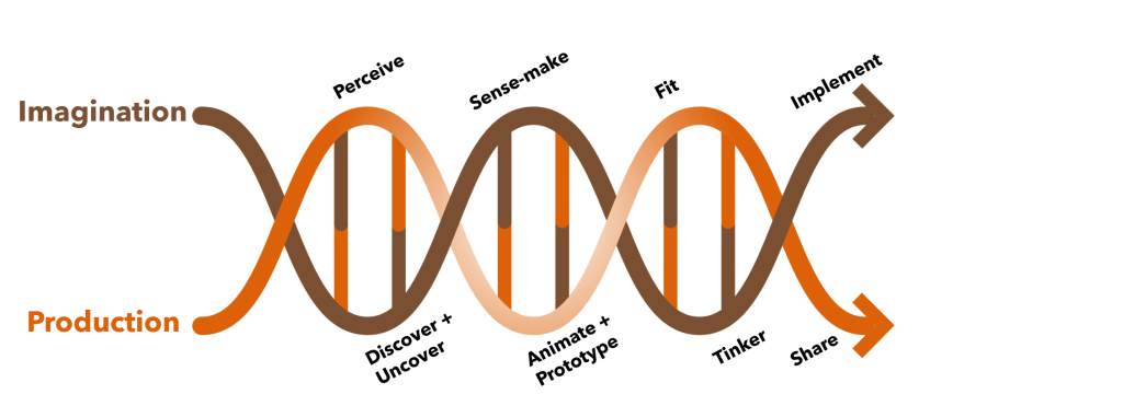
This multi-stage framework is designed like a helix partly to reflect the very fact that most of what humans engage with is created (designed). Design is at the DNA core of what we humans generate into the world — for good or otherwise.

The helix has two major strands that are tied together by activities that go in sequence but may have greater or lesser roles as one progresses through them. The framework is meant to guide design and provide a means to account for the key aspects of the design process. It is not prescriptive in the methods that articulate this design practice. Many different methods can be used to support this work.

Designs are rarely ‘one and done’ and are iterative, thus the helix actually winds its way around and connects multiple iterations together as illustrated in the image below.

Designing What’s Next introduced attendees to this design helix and what it means in practice. The helix will be further discussed and elaborated in a second series that we’ll cover in future posts. A recording of the conversation is below.

We will look at this process in greater detail in future posts as we walk through this series on applying design thinking and reviewing the Design Helix.

For more information on this approach and to apply it to your work, contact us. This is the approach we take with our clients and train those working alongside us.

The post Design Thinking Practice: Designing for What’s Next appeared first on Cense Ltd. .

Written by cplysy · Categorized: cameronnorman

Feb 02 2022

How to User Test a Report, Toolkit, or Dashboard (a.k.a. usability testing)

How do you know if a report, toolkit, or data dashboard works?

If you’re like most organizations, you probably copyedit your reports and have multiple people read them through. But how often do you actually put your reports into your users’ hands?

Today’s post is about usability testing, a.k.a. “how to assess if the thing you created is actually useful for the purpose for which it was created?” Oh, and also, “how to get the feedback you need to make the thing you created better?”

freshspectrum cartoon by Chris Lysy
Person 1 "I was told you find our new report really useful?"
Person 2 pointing at computer "Oh, I do. I needed to raise my monitor and it was just the right height."

What is User Testing/Usability Testing?

So as far as this article is concerned, we’ll use the two terms “User Testing” and “Usability Testing” interchangeably.

Basically, Usability Testing is a method for testing how something is used for the purpose of improving the product. But let me pull the definition from what I think is one of the best resources for this kind of thing on the web:

In a usability-testing session, a researcher (called a “facilitator” or a “moderator”) asks a participant to perform tasks, usually using one or more specific user interfaces. While the participant completes each task, the researcher observes the participant’s behavior and listens for feedback.

From the Nielsen Norman Group’s fantastic Guide to Usability Testing

If you’re really interested in usability testing from a user experience perspective, that guide is a really good rabbit hole to fall into. This post is specifically focused on usability testing reports, toolkits, and dashboards. The kind of stuff we create all the time as evaluators and researchers.

How is Usability Testing different from Cognitive Testing?

If you have spent a significant amount of time in social science research or program evaluation, usability testing might feel pretty similar to the cognitive testing methods you might use when developing surveys. And yes, the methods used are very similar and there is a lot of overlap.

Cognitive testing is built around the cognitive process respondents use when answering questions. Here is a nice short focused guide on cognitive testing from the Harvard University Program on Survey Research.

If you try to answer a question, you’re going to need to do four things.

  • First, you need to comprehend the question.
  • Second, you need to retrieve the information the answer the question from memory.
  • Third, you’ll need to summarize the information so that you can answer the question.
  • Fourth, you’ll need to actually answer the question.

Understanding where the process breaks down can help you better understand why a survey question may or may not work so that you can fix it and make it better. The methods are designed around this cognitive process, which may be close to what you are evaluating in a run-of-the-mill usability test, but also might not be super relevant.

freshspectrum cartoon by Chris Lysy
Person 1 "I thought we were doing user testing today but my calendar is clear?"
Person 2 "You said to only schedule with likely report readers. There are none."

What is the Purpose of a Report, Toolkit, or Dashboard?

It’s really easy to badmouth a report that’s too long or really ugly. But I think the biggest problem in reporting is when a report is just plain useless. I will take a long, ugly, useful report over a short, pretty, useless report any day.

Useless reports are just collections of information someone thought should be catalogued in a pdf. Not because that information has a purpose, but because the writer just felt like it should be included.

In order to properly usability test anything, you have understand how someone would use that thing.

For example…

  • a non-profit executive director might use an evaluation report to decide whether they should continue funding a particular project.
  • a school board might use a COVID-19 case report to decide whether schools in their system should go virtual.
  • a program director might use a needs assessment report to better tailor their programming to meet community needs.
  • project staff might use a step by step guidance document to enter information about their program into a data system.
  • a program officer might use a data dashboard to ensure project sites are following through on their commitments.

Try to write your own sentences.

A [insert type of person in your audience] will use [insert product] to [purpose of using the product]

freshspectrum cartoon by Chris Lysy
Someone speaking through computer, "As you complete the task, please think aloud so we can understand your thought process."
Person at the computer, "Sure, no problem. Right now I'm thinking I should have eaten lunch before this because all I can think about is food."

What are the Basic Steps in Usability Testing?

Let’s not overcomplicate this (which is always really easy to do) and just go with the basics.

You will need…

  • Someone to facilitate the usability test (usually filled by a good qualitative interviewer).
  • A participant to use the product (should ideally be someone from your target audience).
  • A set of tasks for the user to perform.

One of the easiest ways to go about usability testing is to ask your participant to perform a task while thinking out loud. The job of the facilitator is to observe, listen, and prompt the participant but mostly stay quiet.

Definition: In a thinking aloud test, you ask test participants to use the system while continuously thinking out loud — that is, simply verbalizing their thoughts as they move through the user interface.

Thinking Aloud: The #1 Usability Tool

For the prompts, ask questions like, “why did you go straight to that page?” or “what were you thinking when you clicked on that link?” Try to ask neutral questions and try not to influence their decisions.

For a lot of us, all of this now-a-days is likely to be performed over Zoom, or a similar tool. If that’s the case, ask your user to share their desktop screen and ideally their webcam. You want to see if they get confused and having the ability to see their face is helpful.

You don’t have to test a lot, usually you can get a good amount of information from just 5-10 users.

Depending on your needs, you can make usability testing a really formal process or keep it informal. To formalize the process, consider writing a testing protocol and training your interviewers. Also consider recording the session and/or having your project team present on the call (in listen mode) during the session.

freshspectrum cartoon by Chris Lysy

"How NOT to user test."

One person sitting next two and talking to another person sitting at a computer.
"What the heck. Why did you click that button? Are you some kind of idiot? Do you even know how to use a computer?

What NOT to do when Usability Testing?

Stuff you don’t want to do.

  • Talk too much (listen/watch);
  • Guide their actions (you are facilitating the usability test, not the use);
  • Answer all their questions (you want your tester to work through the problems as though you are not there as much as possible)
  • Have multiple team members asking questions (everyone other than the facilitator should be completely silent/in listen mode.”)

Listening to a user openly critique your work can be hard. Not all comments will be useful, but try not to close your mind.

Written by cplysy · Categorized: freshspectrum

Feb 02 2022

Ask Nicole: Be Honest About Your Organizational Culture

Have a question you’d like to be featured? Let me know. If there’s anything I’ve hated about a consulting project, it most likely stems from the organization I worked with, and less about the actual project. In some ways, the process of securing a new consultant or consulting team mirrors the process of recruiting and […]

The post Ask Nicole: Be Honest About Your Organizational Culture appeared first on Nicole Clark Consulting.

Written by cplysy · Categorized: nicoleclark

Jan 31 2022

How to Plan for Your Next Dashboard [Lea Pica’s Present Beyond Measure Podcast]

You’ve been asked to make a dashboard—now what?!

Dashboard is a tricky term; it means different things to different people.

In this article, you’ll learn how to:

  • choose between various dashboard types (static or interactive, single or series); and
  • deal with common dashboard challenges.

Lea Pica’s Present Beyond Measure Podcast

I recently had the chance to be on the Present Beyond Measure podcast, hosted by Lea Pica.

Lea is a seasoned digital analytics practitioner, social media marketer and blogger with over 11 years of experience building search marketing and digital analytics practices for companies.

You can listen to all of Lea’s podcast episodes here.

What’s Inside

Here are some of the topics we talked about:

  • All about my journey into data viz and how I leveraged my skills.
  • The poll that I use to start the conversation around data dashboards!
  • Different perceptions of dashboards and the first steps for client conversations.
  • The four types of dashboards and the steps in the planning process.
  • The necessary software for dashboard creation and thoughts on the nuances between different programs.
  • Tips and tricks for streamlining your data extraction process.
  • Challenges that I have seen most often in the dashboard creation process.
  • Unpacking the discussion around layout and chart types and my personal approach.
  • My recommendation of an impactful book dealing with the power of text placement.
  • Why I’m so excited about progress in the field of dashboard creation.

Defining the Term “Dashboard”

I asked Lea to give her definition of a dashboard (hint: there’s a million correct answers!).

Lea said,

“My definition of a dashboard is a single view suite of data chart modules, or data form modules, that are designed to alert a lay audience to the most critical business key performance indicators, business metrics, in a way that they can either make very basic decisions on their own or alert them to ask the proper teams to investigate those chains further.”

Whoa! That’s one of the most sophisticated answers I’ve ever heard.

Different Perceptions of Dashboards

Dashboard software programs are relatively new.

If you’ve entered the field recently, you might associate “dashboards” with specific software programs, like Tableau or PowerBI.

In the past, “dashboards” meant static one-pagers, like a printout or a PDF. For example, you might prepare a one-page handout of key metrics that would be printed and discussed at a board meeting.

How to Plan Your Next Dashboard Project

On the podcast, Lea and I talked about how to plan for your next dashboard project.

Step 1: Define the Term “Dashboard”

First, recognize that each team member has a different idea of the term “dashboard.”

Some people might want to dive in and build a dynamic dashboard.

Others might be envisioning a one-page PDF, or even some slides to discuss at a meeting.

Step 2: Static or Interactive?

Second, talk about whether you need a static or interactive dashboard.

Static means you need a meeting handout or a one-pager of key facts and figures. You could share the one-pager as an email attachment or post it on a website.

Busy leaders don’t have the privilege of time, so providing a one-pager is a gift. It’s like saying, “I’ve already dug through all the messy data, here’s what I think are the key findings for you in this neat, tiny, little package.”

Interactive dashboards (or dynamic dashboards) have drop-down menus, checkboxes, and buttons.  

We’ve all seen and used these dashboards, either on our computers or in our phone apps.

But, sometimes people don’t need or want that much information.

Technical audiences will probably appreciate an interactive dashboard, but non-technical audiences might appreciate a one-pager.

In the podcast, you’ll hear Lea and I discuss the mismatches we see.

Technical people like using interactive dashboards, so we make interactive dashboards. We have to pause and remember that our audiences might be non-technical, and they might prefer a static one-pager.

Step 3: Single or Series?

Third, figure out whether you a single dashboard or lots and lots of matching dashboards.

For example, leaders at a state education agency might need an overview of all the schools, aggregated together.

Principals would benefit from seeing their own school’s data.

Within a single project, you might need a single dashboard (the overview for the state education agency) and a series of matching dashboards (one per school for each of the principals).

Step 4: Choose Your Software Program

Finally, choose your software program.

Audience decisions should come before software decisions.

I’m a big fan of everyday software, so I tend to make most of my dashboards in Microsoft Excel.

Excel, PowerPoint, and Word are the common language among all the groups I work with, and I think people are pleasantly surprised to see how much Excel can do.

Common Dashboard Challenges

In the podcast, Lea and I discussed common dashboard challenges.

Designing Your First Dashboard

Getting your first dashboard set up is the hardest part.

If you’ve got a dashboard, I’d love to give you five gold stars, seriously.

You might have needed to hire new staff, attend training, or spend hours fiddling with that first dashboard. Celebrate your wins, vizard.

Making Sure Your Dashboard Isn’t Too Dense

Then, we talked about some specific design challenges.

The biggest challenge I see is volume, or how much we try to include in a dashboard.

I see a lot of dashboards that look very full. They’ve got so many charts. They’re bursting at the seams.

If that happens in your project, take a time-out. Try to remember which one audience this dashboard is for.

It can’t be for your boss, board members, the public, fellow staff, and your peers.

Each of those groups is going to need different charts, so if you try to fit everyone’s information requests inside a single dashboard, it starts to overflow.

Pick your one audience, and then prioritize the data points that your one audience needs.

Use Familiar Bar Charts, or Variety?

Another common dashboard challenge is choosing the right chart type.

I come from a research background, so my go-to chart type is bar charts.

I have way too many bar charts. My drafts are bar, bar, bar, bar. As I edit, I add more variety.

There’s a delicate trade-off between adding variety and sticking with everyday charts, though.

In the podcast, you’ll hear Lea say that she sees a benefit in using everyday charts.

“People immediately understand what they’re supposed to understand from seeing those [familiar] charts. There’s no learning curve, there’s no training gap,” Lea explained.

In the podcast, you’ll also hear me talk about a recent client. Their dataset has three nested levels (i.e.., categories, subcategories, and sub-subcategories).

We brainstormed several options for their dashboard: a tree diagram, sunburst diagram, and Sankey diagram. Together, we weighed the pros and cons of each approach: What does it highlight? How easy is it for someone else to understand? Is this the pattern we really want to emphasize—or not?

But another consideration is time and software options. Is it worth the staff time to develop those charts for the dashboard? Or do we stick with the usual bar charts?

Book Recommendation: I Am a Book

In the podcast, you’ll hear Lea ask me whether I’ve read any good data or design books recently.

I mentioned I Am a Book. I Am a Portal to the Universe by Stefanie Posavec and Miriam Quick.

This book has my favorite text placement of all time. The Nobel Prize for text placement! It gave me permission to use huge fonts, diagonal fonts, and even circular fonts. What a masterpiece.

The Future of Data Storytelling

Finally, Lea and I talked about the future of data storytelling.

“I can’t wait until I can stop talking about some of the topics I’m talking about,” I said.

“Let’s re-record this in 10 years and our dashboard conversation, I cannot wait for that to be a different conversation.”

I can’t wait to stop saying that some interactive dashboards should actually be static.

I can’t wait to stop saying that non-technical and technical audiences have different dashboard preferences.

I can’t wait to stop saying that the leaders and the doers have different information needs.

Your Turn

What does the term “dashboard” mean to you? Every workplace has a slightly different definition.

What type of dashboard do you need for your project? Static or interactive? Single or series?

What are some of the most common dashboard challenges you’ve seen?

Connect with Lea Pica

Website: leapica.com

The Present Beyond Measure Podcast: leapica.com/podcast

LinkedIn: linkedin.com/in/leapica

Written by cplysy · Categorized: depictdatastudio

Jan 27 2022

Third Position Strategy

When we are in a complex situation with much going on dividing our experience into halves is not often useful. How often have you encountered an either/or situation where neither option is particularly attractive?

Thinking in triads is far more useful for understanding complex situations. One of the simplest ways to do this is to adopt a Third Position. The third position is meant to create a simulated space for generating new insights and observations that are taken from a third-person perspective, that is not your own. Nor, is it of the competing party or those looking to take a contrary position.

The Third Position is not to be confused with the political movement of the same name, rather it is a means of framing negotiations and for scenario development.

How to take the Third Position

The strategy works in three steps.

  1. Recognize a context where you can observe something as a third party that you are / or were involved in. This could be some kind of interaction or a decision context. Create a vivid recollection or even write down what this scenario looks like and note what you are thinking, observing, and feeling. Also note what contrary or challenging positions there are to the one you are stepping away from.
  2. Next, try to step away from this position and shed any sensations you might have from the first scenario and bring in a curious attitude by asking questions about what you see, feel, sense, and experience from that first step. What does this look like and feel?
  3. The third step is to evaluate what you perceive from this ‘third position.’ Note where there are points of agreement, disagreement and where there are new insights that are not explored by either of the two sides. This allows you to see things from a dispassionate perspective and notice things that might influence how either of the two parties might be making a decision. This could include things like understanding the role of stress, situational factors like time pressures, or information and knowledge gaps that are previously unrecognized.

The Third Position is away of gaining alternative perspectives on a situation when there is no reliable third party to observe. It’s a means of doing checks on your thinking and actions as well as anticipating or hypothesizing what others might be doing. It’s useful for checking assumptions and recognizing where there are gaps in our understanding and knowledge.

By learning these and becoming aware of them we can better avoid the problems they create and take advantage of the benefits they offer.

Photo by Joshua Hanks on Unsplash

The post Third Position Strategy appeared first on Cense Ltd. .

Written by cplysy · Categorized: cameronnorman

  • « Go to Previous Page
  • Go to page 1
  • Interim pages omitted …
  • Go to page 142
  • Go to page 143
  • Go to page 144
  • Go to page 145
  • Go to page 146
  • Interim pages omitted …
  • Go to page 310
  • Go to Next Page »

Footer

Follow our Work

The easiest way to stay connected to our work is to join our newsletter. You’ll get updates on projects, learn about new events, and hear stories from those evaluators whom the field continues to actively exclude and erase.

Get Updates

Want to take further action or join a pod? Click here to learn more.

Copyright © 2026 · The May 13 Group · Log in

en English
af Afrikaanssq Shqipam አማርኛar العربيةhy Հայերենaz Azərbaycan dilieu Euskarabe Беларуская моваbn বাংলাbs Bosanskibg Българскиca Catalàceb Cebuanony Chichewazh-CN 简体中文zh-TW 繁體中文co Corsuhr Hrvatskics Čeština‎da Dansknl Nederlandsen Englisheo Esperantoet Eestitl Filipinofi Suomifr Françaisfy Fryskgl Galegoka ქართულიde Deutschel Ελληνικάgu ગુજરાતીht Kreyol ayisyenha Harshen Hausahaw Ōlelo Hawaiʻiiw עִבְרִיתhi हिन्दीhmn Hmonghu Magyaris Íslenskaig Igboid Bahasa Indonesiaga Gaeilgeit Italianoja 日本語jw Basa Jawakn ಕನ್ನಡkk Қазақ тіліkm ភាសាខ្មែរko 한국어ku كوردی‎ky Кыргызчаlo ພາສາລາວla Latinlv Latviešu valodalt Lietuvių kalbalb Lëtzebuergeschmk Македонски јазикmg Malagasyms Bahasa Melayuml മലയാളംmt Maltesemi Te Reo Māorimr मराठीmn Монголmy ဗမာစာne नेपालीno Norsk bokmålps پښتوfa فارسیpl Polskipt Portuguêspa ਪੰਜਾਬੀro Românăru Русскийsm Samoangd Gàidhligsr Српски језикst Sesothosn Shonasd سنڌيsi සිංහලsk Slovenčinasl Slovenščinaso Afsoomaalies Españolsu Basa Sundasw Kiswahilisv Svenskatg Тоҷикӣta தமிழ்te తెలుగుth ไทยtr Türkçeuk Українськаur اردوuz O‘zbekchavi Tiếng Việtcy Cymraegxh isiXhosayi יידישyo Yorùbázu Zulu