• Skip to main content
  • Skip to footer
  • Home

The May 13 Group

the next day for evaluation

  • Get Involved
  • Our Work
  • About Us
You are here: Home / Archives for allblogs

allblogs

Sep 16 2020

The Power of Cartoons

This week I decided to take a dive into the world of cartoonists.

Aside from my childhood love of the funny pages (especially Peanuts, Garfield, and The Far Side) I wouldn’t say I had ever been that much of a cartoon connoisseur. Cartooning in my past was more a diversion than anything else, and that continued, even as I started to become known as the evaluation cartoon guy and cartoons helped shape my professional life.

But lately I’ve been wondering about all those influential cartoonists that I don’t yet know. What lessons have I been missing by keeping my eyes solely on the road ahead?

Today’s batch of cartoons with one exception, is inspired by cartoonists of bygone days. Artists and activists who understood the stuff that’s still so new to me.

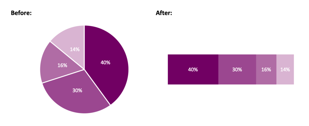
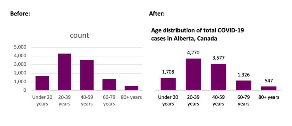
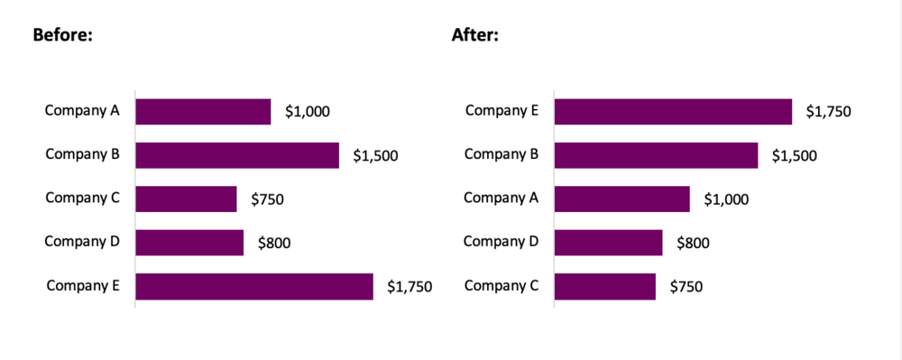
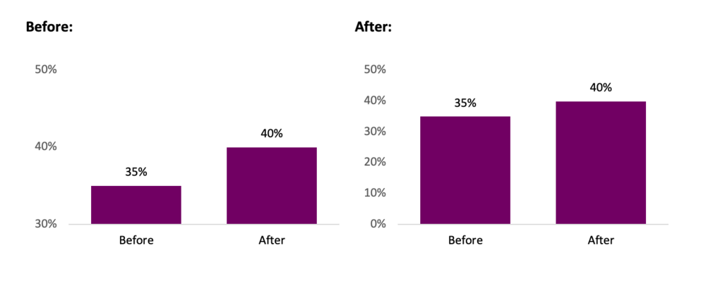
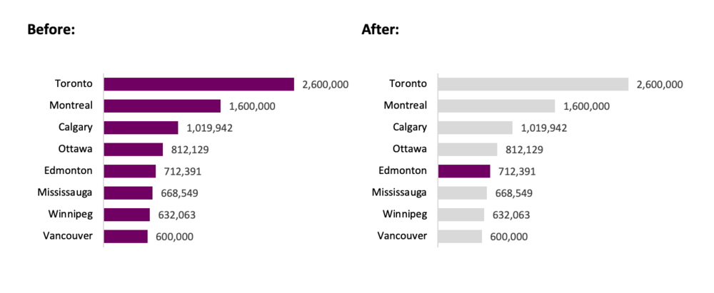
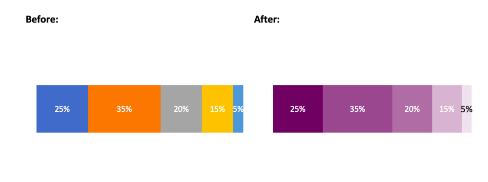
First the exception – why data visualization might just be too precise for its own good.

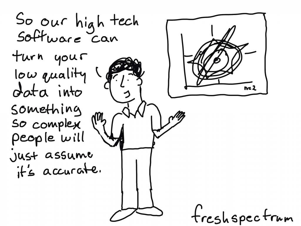
One day I’m going to do a study. I’m going to put a bunch of “best practice” data visualizations against a series of cartoons designed to illustrate a data set.

For a long time I’ve felt like the biggest advantage for data visualization is that it is an academically acceptable form of illustration. I don’t believe that most charts are more memorable or more effective at delivering key messages than any other form of illustration.

I recently stumbled into this article interviewing Mona Chalabi, I’m a super fan of her work and think her philosophy is spot on.

I was inspired by the fact that I was bored out of my tiny mind in a dead end job. My desk was in a little booth so it was easy to doodle discreetly. Slowly though, when people started to respond to my early work, I found it enormously encouraging that there was another way of doing data visualisation — one that would reach more people without compromising on precision. A big part of my philosophy is that computer-generated images overstate certainty, my hand-drawn graphics show the real margin of error in the numbers while reminding people that a human was responsible for the data gathering and analysis.

“If it’s about farts, draw a butt for god’s sakes”: Mona Chalabi tells us how to illustrate data

Cartooning and Women’s Suffrage

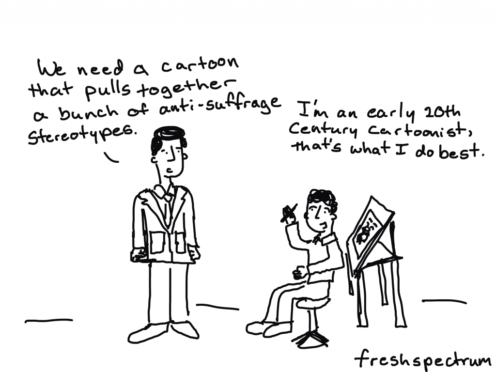
Regardless of nationality and which group the artists belonged to, they all recognized the importance of using visual imagery to reach larger audiences. So did the anti-suffrage campaigners who very quickly created their own visual propaganda and stereotypes. Stereotypes are implicitly negative (although positive stereotypes can also exist, they are usually used for negative reasons): they take an idea or object or person which in real life exists in various forms and they impose a single form which essentially denies those variations. The challenge for the suffragists was the challenge of subverting anti-suffrage stereotypes which already existed and creating equally compelling new stereotypes which would be recognizable but communicate an opposing message.

 Art Responds to Women’s Suffrage: Pro and Con

Exploring the Hilarious Chaos

Oliver Wendell Harrington’s work could be put into the papers today and be just as relevant. The more things change…

It was the first black comic strip to receive national recognition. Harrington later wrote about the birth of Bootsie: “I simply recorded the almost unbelievable but hilarious chaos around me and came up with a character. I was more surprised than anyone when Brother Bootsie became a Harlem celebrity.” Harrington became the first African American to establish an international reputation in cartooning.

Oliver Wendell Harrington: “America’s Greatest Black Cartoonist”

Hidden in the Funny Pages

If you draw cartoons, you have a lot of latitude to just draw ridiculous things.

And lots of racist cartoonists would take that opportunity to just create one-dimensional ridiculous stereotype-laden characters of color.

Jackie Ormes did the opposite, drawing characters with elegance and nuance and infusing her comics with so much wit and truth.

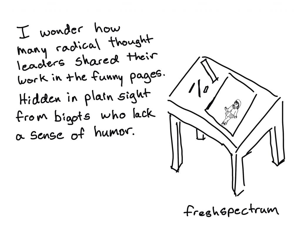
While editors and writers would often be threatened and intimidated into reining in their content, cartoonists were largely left alone. And with lack of oversight they could criticize unjust policies without consequence.

An Unstoppable Force: The Story of Cartoonist Jackie Ormes [Illustrated Video]

Twitter Book Selfies and Coloring the Cartoons

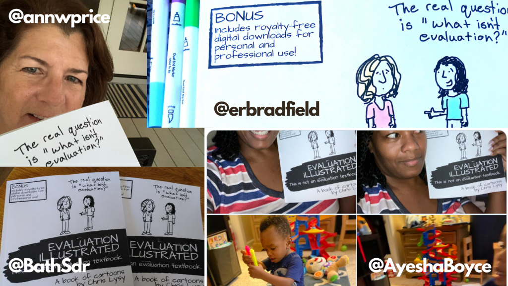
I was super humbled after sharing my newly published book last week.

And this week I had some new surprises. I didn’t actually expect that my amazing readers would sharing pictures and videos of themselves with my book in hand on Twitter.

Then after exchanges with @AyeshaBoyce and @erbradfield, came another surprise. Because my cartoons are mostly black ink with lots of white space, I inadvertently created a coloring book.

Just in case you don’t know me well enough, both of these things (Book Selfies and Coloring) are totally encouraged!

Oh, and in case you missed last week’s email. I published a book. Here is where you can buy it.

On Amazon – Softcover

  • United States – US
  • Canada – CA
  • United Kingdom – UK
  • Germany – DE
  • France – FR
  • Spain – ES
  • Italy – IT
  • Japan – JP

On Amazon – eBook

  • United States – US
  • Canada – CA
  • United Kingdom – UK
  • Germany – DE
  • France – FR
  • Spain – ES
  • Italy – IT
  • Netherlands – NL
  • Japan – JP
  • Brazil – BR
  • Mexico – MX
  • Australia – AU
  • India – IN

Other Retailers

  • Barnes and Noble
  • More to come…

Written by cplysy · Categorized: freshspectrum

Sep 16 2020

7 Tips for Better Data Visualizations


Data visualization is an effective approach for improved data comprehension. Seeing the data presented in a clear, concise fashion drives your overall message home much better than cluttered tables. In this article I outline seven simple tips that will help to improve your visuals.


1. Choose the correct chart

There are a multitude of charts that may adequately represent your data. However, before selecting a chart, you need to be clear on what you, and your data, are trying to communicate. Consider the message you want to convey to your audience and select your chart accordingly.

As a side note, 3D graphics are never the correct chart. They distort the data and reduce the comprehension of your chart.

Instead of a pie chart, try a stacked bar chart.

Instead of a pie chart, try a stacked bar chart.


2. Opt for simplicity

After you have selected the chart that tells the story of your data, it is time to visualize your data. In Excel, the default chart is accompanied by excess gridlines, uninformative titles, and poorly positioned legends. The goal: remove anything that does not support the message you are communicating to your audience.

Simplifying your chart will help your message shine through. You want your audience to focus on what is important. Therefore, remove what is not crucial for understanding your data. Excess gridlines and axis labels can be removed if you have labeled data points. Your chart title can be re-written to highlight the core message of the data. Legends can be deleted in favour of a custom-made legend that better aligns with the theme of your chart.

Simplify your chart to let the message shine through.  Source: https://www.alberta.ca/stats/covid-19-alberta-statistics.htm

Simplify your chart to let the message shine through.
Source: https://www.alberta.ca/stats/covid-19-alberta-statistics.htm


3. Order data

Ordering data improves the overall comprehension of your chart. By ordering data, random data points can be reorganized in such a way that is meaningful for your audience. This allows for the clear interpretation and understanding of the data.

Categories should be ordered both logically and consistently. Categories independent? Order by value. Categories sequential? Order sequentially. Ordering by value or sequentially does not quite work? Order alphabetically. Regardless, the ordering should improve the comprehension of your chart.

Order your data in a logical way.

Order your data in a logical way.


4. Include a zero baseline

Truncating axis baselines is an efficient method to lie with data. Truncated axes skew visual comparison, exaggerating differences within your chart. As a result, minor differences appear larger and more significant.

To avoid errors in interpretation, include a zero baseline in your charts. This allows for more accurate interpretation of results. This improves the overall comprehension of your chart and better communicates your overall message.

There are exceptions to the rule, although most often, it is suggested that you use a zero baseline. Line charts are used to compare between lines and a truncated y-axis may be opted for to emphasize differences between lines. If highlighting clear variations between your lines is the goal, truncating the axes may be an option. In this case, clearly identify to your audience that you are using a non-zero baseline.

Avoid misleading with your data by including a zero baseline.

Avoid misleading with your data by including a zero baseline.


5. Use colour to highlight the important information

Colour is a great way to highlight important data within your chart. While you should be mindful to use like colours for like data, it is often beneficial to use accent colours to emphasize a point. These accent colours will pull the reader’s attention and help them focus in on the core message of the chart.

Use an accent colour to highlight important information.  Source: https://www.geonames.org/CA/largest-cities-in-canada.html

Use an accent colour to highlight important information.
Source: https://www.geonames.org/CA/largest-cities-in-canada.html

6. Select an appropriate colour palette

Avoid using mixed colour palettes. While a mixed palette may provide ample contrast between your data, it also reduces the efficacy of your chart. Instead opt for different shades of the same colour. Use darker shades to emphasize important data (based on value, hierarchy, etc.) and lighter shades for less important data.

Choose a cohesive colour palette.

Choose a cohesive colour palette.


7. Experiment, revise and edit

Initially, all charts are limited in their ability to communicate the desired message. However, with simple tweaks, you can create charts that are clean and comprehensible. Plus, data visualization should be fun. Seek inspiration from the many great visualizations online and experiment with your own charts. Through experimentation, revision, and editing, your charts will be able to “wow” both colleagues and clients.


Conclusion

Simple changes to the default Excel chart can lead to significant improvements in your data visualizations. Following the tips outlined above will help you get started creating better charts that will both impress and inform.


Some Data Visualization resources

Chart Selection:

Data Viz Project: https://datavizproject.com/

The Data Visualization Catalogue: https://datavizcatalogue.com/


Inspiration:

Information is beautiful: https://informationisbeautiful.net/

Depict Data Studio: https://depictdatastudio.com/

Evergreen Data: https://stephanieevergreen.com/


Sign up for our newsletter

We’ll let you know about our new content, and curate the best new evaluation resources from around the web!


We respect your privacy.

Thank you!


Written by cplysy · Categorized: evalacademy

Sep 15 2020

How to Overcome your FEAR of Evaluation

What are you most afraid of?

For me, it definitely heights.

For my husband, its bees or anything that buzzes or remotely sounds like a bee.

For some nonprofit and community leaders, what they fear most is evaluation. Sometimes, there are good reasons for that fear. Some nonprofit leaders have told me about their bad experiences with evaluation (evaluation reports that were too long, didn’t answer their questions, made no sense to them, or were not actionable).

Here are some common objections I have heard from some community leaders about their reluctance to participate in evaluation.

  • I am not a “data person.”
  • I hate Logic Models.
  • I don’t “speak” evaluation.
  • I don’t want to have our program judged.
  • Evaluation takes money from programs.

A profound fear of evaluation is often at the core of these objections.

Let’s go through these together objections one by one.

Ready to face your fears? Click here.

Written by cplysy · Categorized: communityevaluationsolutions

Sep 15 2020

Solopreneurship on the EvaluLand Podcast

In 2016, I met evaluator extraordinaire Dana Wanzer at a national conference. We’d originally connected on Twitter and this was our first-time meeting in person.

Side note: If you’re on the fence about joining social media… Social media can be the first step towards forging long-lasting friendships with colleagues. Go for it!

In addition to her career as an evaluator, and her busy teaching schedule as a professor, Dana recently launched the EvaluLand podcast.

On her podcast, we talked about my unexpected shift from being an evaluator to a data visualization designer, along with my tips getting started working for yourself or teaching online.

Watch Our Conversation

Listen to the Episode

Or, listen to the episode here: https://evaluland.fireside.fm/8

Ann’s Trajectory into Evaluation

Here’s a recap of what we discussed.

Dana: I’m curious how you transitioned from evaluation and research work into what you do now?

Ten years ago, it was a really big deal to do anything besides a technical report.

That was the norm (and in some work places, still is).

At a conferene, we stood up and said, “What if we have a technical report but we also have a one-pager for each of the 30 schools in this project? That way, each school can view their own data? And what if, instead of tediously copying and pasting from Excel to Word, we just write some VBA code to automate the process and save days of time?”

These concepts were groundbreaking at the time.

Fast forward a few more jobs, to when I worked with foundations. I would help train their nonprofits on evaluation, data collection, data analysis, and data visualization.

I remember thinking, “This is my favorite thing in the world! I like teaching more than I like writing the actual reports myself.”

I got to work on technical assistance projects about one day a week and realized I wanted to do that five days a week.

At the time, I was working and earning my master’s degree at night. Friends, family, and colleagues kept asking me, “What’s next for you, once your graduate?” I had no idea. I hadn’t intended on switching jobs. But people kept asking, so I kept thinking about it.

I remember telling my husband, “Someday, when we’re 65 and I retire, I’m going to do data viz training full-time!”

And he said to me, “But that’s decades away! You’re 28. That’s a long time to wait. You’re really going to put off your dreams for decades?”

And I thought, “I guess I should do this now. Why would I put my life on hold?”

I lready had a good job. It was risky to leave something good in hopes that it would lead to something great. I pulled the trigger, and seven years later, the rest is history.

Ann’s Career Shift: From Evaluator to Entrepreneur

Dana: I want to talk a little bit about how your career has shifted. What’s been the difference for you between entrepreneurship and independent consulting? How has that transition been for you?

My identity has certainly shifted over the years.

Way back, I started as a researcher who was going to do a Ph.D. program.

Then, I was an evaluator in salaried positions for a while.

Then, in my one of my first projects as an independent consultant, I was a one-woman evaluation team. At the time, it was perfectly feasible to work on the project all by myself.

My specialty, though, is data visualization. And there’s a huge demand for that. It got to a point where it didn’t make sense to turn down the data viz jobs that I’m passionate about. There was a natural transition where I began training evaluators on how to do data viz.

Then, a few years later, I shifted to, “I’m a data visualization designer.”

It was truly only a year ago that I shifted my thinking to, “I’m actually this ‘entrepreneur’ people talk about.”

I was in a book club of fellow data analysts who are self-employed. We’d read a book together every quarter. One time, we read Company of One by Paul Jarvis together. Paul talks about the value of staying small and nimble.

The measure of success used to be how many employees your business has. Paul presented new metrics of success:

  • How much time do you have with your family?
  • How profitable are you?
  • How many hours a day do you have to work?
  • Are you able to scale?
  • Are you just being paid by the hour? So if you take an hour off, you don’t get paid? Or do you have passive income coming in?

I was so persuaded by the idea that small is great.

My setup now is very lean. It’s me plus a 5 hour/week assistant. I did at one point have up to 10 subcontractors, where one person designed the icons, one person created the report cover, etc. I was trying to coordinate all of it while I was traveling around the world teaching workshops. I’d be waiting in line to board a day-long flight to another continent, trying to clumsily thumb-type instructions to contractors to keep the projects moving. It was just too many details and wasn’t any fun. I focus on trainings now not only because I love it, but also to save my sanity.

I don’t consider myself moonlighting. I’m not a consultant or a freelancer. Depict Data Studio is definitely a company with a clear structure, processes, automations, and regular passive income. I have a workflow where I do this, and then my assistant does this. And we try to avoid as much manual work as possible, letting the tech do the tedious tasks for us.

How to Start Online Courses

Dana: I’d like to talk about your online courses and how you got into them. What’s your number one tip for somebody interested in doing this? I’m personally struggling with this because I teach and my university brings in income through the students who I bring into the program. So, I’m not sure how I should/could do this personally.

A decade ago, I started teaching about data very informally at brown bags for fellow staff members in my company.

Word spread that Ann knows this Excel shortcut, and Ann can take a spreadsheet and turn it into a dashboard fairly seamlessly.

It came pretty naturally to me and I just assumed it did for everyone else too. How lucky am I that it doesn’t, because I’ll be employed for a while that way! 🙂

People started asking me for help. I started blogging around the same time, and making very informal YouTube videos as well. I simply started YouTubing to answer the questions I was getting. I kept getting the same questions over and over, and realized there were thing everyone was struggling with. I didn’t have time to answer everyone individually as I was taking graduate classes myself and had a very demanding job.

I would go home at the end of a long day and I would record a little 2- to 5- minute answer to their question, and then post the video on YouTube. I loved doing that and found it so gratifying to teach. It feels really good as a service to the community to help other people.

A few years later, Chris Lysy from Fresh Spectrum said to me, “Wow, you actually enjoy being on camera. Most people hate it. Why don’t you make an online course?” I pushed back that I already had blog posts and YouTube videos. The software didn’t quite exist yet that would allow me to turn disparate YouTube tutorials into a planned course, and I’d never seen this done before. Chris planted the idea, and I thought about it on and off for the next few years.

I went for it in Spring of 2018. I made a complimentary mini course using my favorite pre-existing YouTube videos I already had.

Then, I started making full-length paid courses. I was translating what I’ve already been doing with clients in-person to a virtual setting Not everybody is going to fly me out to teach all 30 of their staff. Some people are self-employed, some people are based in other countries, some companies have staff located in multiple offices, etc. There are so many benefits to offering courses online. Participants can learn whenever it’s convenient for their own schedule.

From there, it just grew and grew, and I now have six full-length courses (which are each the equivalent of a two-day workshop). I offer Office Hours where students can ask me questions. We hold live sessions with guest speakers. We’ve built ebooks, handouts, and checklists. There are opportunities to submit work and get feedback. And, the early birds even get Swag Bags with t-shirts and stickers as a treat for signing up early. It’s grown very slowly, intentionally but slowly.

That being said, although I have six full courses now, that’s not a realistic starting point for anybody. I recommend people start exactly how I did: Make a very short courses that’s 30 to 60 minutes long on a topic you’ve already presented about (e.g., at a conference or staff meeting). Start with the audience’s favorite presentation that people love every time. Or, start with your favorite presentation that you’re really excited about.

Take that 30- to 60-minute talk and record it. Not all in one video, of course! Maybe there are four lessons inside your talk. Turn that into four shorter videos. You could give it away for free if you’re trying to build your email list. Or, sell it.

Recycling Content

Dana: I know you always talk about recycling your content and I’m realizing I don’t do that very well. I’ve got this perfect demonstration I did at a conference in 2018 on how to survey children. There’s really not much out there and it was based on my thesis. People ate it up! That would be a perfect one to maybe build up more but it could be pretty ready to go. That actually really excites me, so thank you!

I bet your slides are 90% done and you remember 90% of your speaking points.

I bet you have clear breaks in your presentation by topics where you can record this 10 minutes, this 10 minutes and so on.

You can make it interactive just like you do a regular presentation. Not just “Does anyone have any questions?” at the end, but you can say “Comment below the video” or “Try it out and come back and reflect on this here.”

I bet you could transform that talk into a recorded course in half a day. You’ve already recorded yourself online (through your professor position in virtual school this semester), and you already know how to do podcasts. It’s going to be really easy for you to do this.

Chris Lysy taught me about recycling content. At a past conference presentation, he was saying, what a shame that we all fly to conferences. We spend all this time prepping our presentation. We have amazing learning for a couple of days. We then go home. Learning doesn’t have to stop! What if we also wrote a blog post with key takeaways from our presentation? At a bare minimum, write a blog post. But you could make a video course based on that conference presentation.

Sharing Resources and Expertise

Dana: I wish more people would blog, create podcasts, and share their resources. The reason I blog is to share all of this. It makes me sad when people feel like they need to hoard their information and never share out of fear. I want to learn something and share it. Why should everybody do the same work over and over again? Instead, you can take what I’ve done and make something more of it.

There’s definitely a misconception in the consulting space where, if you share your perfect expertise and knowledge in a blog post, other consultants will steal it. Or, nobody will hire you.

I’ve had the complete opposite experience.

The more tips I share online, the more business I get.

One person from a group’s team will be on my newsletter list, have followed my blog, or maybe seen me speak. They want everyone else on their team to benefit and learn from me. So, when it’s time to bring in a speaker, they naturally reach out to me. Then everybody on their team gets to benefit, and I get to keep a roof over my head. I have never lost business over anything I’ve shared online.

I also think that sharing knowledge leads to so much life satisfaction.

One of my favorite books of all time is Your Money or Your Life by Vicki Robin.

It’s a financial book, kind of. But it’s really about life purpose and making sure that the limited days you’re alive are spent really well, and that you’re making the world a better place. That you’re not just consuming and giving yourself temporary happiness by buying a new purse or going on vacation. But, instead, you’re giving yourself lasting satisfaction by creating rather than consuming. Vicki Robin talks about how the tippy-top of ultimate happiness is achieved by giving to others and being of service to others.

And that’s why I love teaching, too. Because you clearly see the impact that you have on helping other people out. And, you get to stay in business while you do it. It’s such a natural path for me. I highly recommend teaching online. But just start small.

Shifting from a Scarcity Mindset to an Abundance Mindset

I used to have the scarcity mindset where, if I don’t accept this project, even though it’s not a good fit, maybe the client will never want to work with me again.

But then I transformed very slowly into an abundance mindset. My thinking is, “There’s plenty of work to go around, and plenty of people to help. It’s not like if you help somebody else, your career goes down the toilet. It’s not that. It’s just that you have this amazing network of really talented, hardworking people around you that you get to collaborate with.”

Merging Personal and Professional Ann

I used to have Professional Ann and Personal Ann.

Professional Ann wore suits and heels to work, and worked by the White House. Sure, I talked to my co-workers, but I wasn’t sharing my life with them.

Here’s Professional Ann:

Meanwhile, here’s Personal Ann, a Wild Child riding her Harley in the Salt Flats during her fourth cross-country trip:

It was a weird tension. I realized that at some point in my life I’d have to merge them and be myself all the time.

I finally got the courage to do that and share many things about my life. I share 90% of how I’m feeling on my InstaStories and don’t filter myself. Deven Wisner asked me, “How do you decide to share online? What’s your strategy?” My answer was, “I don’t think about it.”

The tipping point for me was that I started getting emails from other women in data. These emails basically said, “I was on the fence about starting blogging/speaking/etc, but I saw you doing it and thought, ‘I can do it too!’”

For about a year, I honestly hated those messages. I never wanted to be known. I just wanted to share data. It wasn’t a goal to grow an audience.

I felt really reluctantly placed on a pedestal.

I didn’t want to be this role model for women in data. I didn’t ask for that. But here I am. So, I thought, “Well, okay, I owe it to them to be a leader and be a role model. And to not just show the great parts of working for yourself, but also the not-so-great parts.”

Dana: I wonder if the sharing more of the personal side helps to humanize you more so that people don’t put you on a pedestal. I certainly don’t want to be on a pedestal. And every person I’ve put on a pedestal has toppled.

If you need somebody good to follow on Instagram who’s at the top of her career game but also is so real, I’d suggest Farnoosh Torabi. She’s a finance expert with a NY Times Bestselling book. On her InstaStories, she’ll share what her life is like as she’s getting ready to be interviewed on national television. Her makeup turned out weird, or her kids are throwing a fit and crying on the floor. Farnoosh is this amazing, professional woman who has so much expertise, but she’s also a real person. It just makes me love her more. I’m learning not just about finance, but what it’s like behind the scenes. The more she shares, the more I admire her for being herself online.

Teaching in the Virtual World

Dana: What kind of tips do you have for those of us teaching in this virtual world now?

I think there’s this misconception that every video has to be perfect if it’s recorded.

And that to be professional means you have perfect posture. Or you sit very stiffly and not move at all.

Early on, my speaking points were perfect. I wouldn’t use any casual language like um, so, or hmmm. I sounded like a robot! Nobody wants to listen to a boring robot. We want to connect with real human beings.

How to Be Natural On Camera

I’m a fan on planning in bullet point form, but I don’t recommend reading off a script.

I have tried multiple approaches including:

  • “The show must go on.” You have one take! Keep recording even if you make a mistake. That’s what you’d sound like in-person, after all.
  • Starting and stopping and starting and stopping, and then editing the recording afterwards to make it “perfect.” This takes five times longer!

I highly recommend recording everything in a single take. It’s more like teaching live. And, you’ll sound more like a real person. Embrace the hiccups and just deal with whatever happens.

Teaching Data Viz Around the World

Dana: I would love to talk a little bit about travel because I know you did travel a lot before COVID-19 hit. How did you get into it? How you did you do it? How did this process work for you? How can others with this dream of traveling either for or outside of work do this as well?

This could be a whole other podcast! Here’s the 30-second answer. I’m starting year seven of my business, but in year one we decided to have kids. (I started working for myself, and a week later my husband turned 30, and said, “I’m ready to be a dad now!” And I said, “No!” We were high school sweethearts, so we’ve been together forever, and kids were never in the plan. I came around, and we’ve never regretted it.)

I had all these great data viz trainings that I was traveling for, but I also just wanted to be home for bath time.

I felt like I had to pick, am I going to quit my job or be a stay-at-home mom?

We thought, what if my husband quits his job, and we sold our house and our belongings? It felt very logical to us. The family came along and we traveled for this perfect year until COVID flipped everything upside down.

What is Something in Evaluation that is Giving You Life Right Now?

Dana: What is something in evaluation that is giving you life right now?

I’ve got two.

The first one is evaluators who were never into cultural competence or racial equity are getting into it now and really taking the topic seriously due to the Black Lives Matter movement. That’s so exciting for me to see all of those ‘Aha!’ moments going on for people to recognize that white people have been really privileged for a long time and it’s our responsibility to do something about it.

And the second one is that, ten years ago, when I gave a dashboard presentation at a national conference, I had suggested also creating a one-pager to accompany a technical report. It was groundbreaking at the time. Luckily, that’s not the case anymore. I see evaluators making slideshows, one-pagers, infographics, and dashboards, and thinking so carefully about what stakeholders can actually use to inform decisions and make better programs. It makes me really hopeful to think of what’s next in evaluation.

Resources

Dana: Do you have any resources that you’d like to share?

My resource recommendation is my mini course, Soar Beyond the Dusty Shelf Report. It’s really a mindset course to get you thinking about what impact, if any, are your reports having now. And it’s not just reports, but infographics, dashboards, slideshows, etc. In the course, I give examples of what’s possible with reports, and share some tried-and-true tips like the 30-3-1 approach.

Your Turn

Comment below: What surprised you about our conversation? Do you have additional questions about careers in evaluation or data visualization?

Written by cplysy · Categorized: depictdatastudio

Sep 15 2020

Innovation Talent Inventories

Faced with a situation or opportunity that demands you try something new or change what your organization does, the type of knowledge, skills, and experience required is often different than what is used to maintain the status quo. One of the most overlooked places to look for this talent is right under our noses — or beaks — and that your birds of a feather might be closer together than you knew.

An innovation talent inventory is an exercise that organizations are advised to undertake every 6-12 months (depending on the level of dynamism within the organization and industry) to assess the talent within your organization.

Why an Inventory?

Talent acquisition and retention is a costly part of organizational development. Hiring staff often means looking at a variety of skills, yet may only enlist a few of them for a specific job. Over time it becomes easy to lose track of or forget that your team may have skills and experiences that can be brought to bear on your current project.

The process of undertaking an inventory is also a means of recognizing and reminding your team of who is on it. By looking at your staff through the lens of innovation, it’s also possible to identify attributes that were not germane at hiring or recruitment but have evolved into a need at the present day. Whether its a certification course, extra-mural activities like coaching sports, or experience working in a particular sector, these previously non-recognized experiences can now serve to support your team’s innovation project.

Undertaking an Inventory

There is no prescriptive means of undertaking an inventory and we recommend the following:

Informal interviews. Simple coffee-time conversations can make a big difference and have the added benefit of allowing your team to build trust and commitment to the innovation project in the process. Toronto-based software firm Freshbooks encourages their team to go on ‘blind dates’ (not real ones) over coffee with staff in other departments so that they can learn from each other. Informality allows for conversations to wander to different parts of a persons’ career that might have been previously unexplored.

Resume reviews. Whether it is looking over your team’s personnel files or LinkedIn pages (all with permission and consent of your team, of course), a review of the current set of listed skills, experiences and certifications can jog your memory about what talent your team already has. Being transparent about why you’re doing this and ensuring that any exploration is done solely for the purpose of the innovation talent inventory is essential. This can be a powerful means for team and trust-building if done right and harmful if done poorly.

Surveys. A simple exploratory survey asking individuals to identify skills and abilities (less about knowledge) can catalogue your teams’ ideas and suggestions. The one risk with this approach is that many staff might still see themselves in their current role and frame their responses according to that. Like with the interviews, focusing on a person’s journey rather than their current destination is key.

Visual Mapping. Another fun and informative strategy is to use visual maps where individuals either self-plot or are plotted on a map of the situation. Plotting out the needs, wants, and opportunities on a simple large-sheet of paper and then having individuals place themselves closest to where they fit related to those needs, wants, and opportunities can be highly participatory. This works by having the page posted on a wall in a common area for a few days (e.g., coffee room) or using an electronic tool such as Miro or Mural.

Together, you will find yourself and your team learning much from what you already have and putting underused or unknown talents to work to help take your idea forward. You’ll know so much more about what you already know (and didn’t realize).

Need help putting this together? Contact us and we can show you how to engage your team and learn more, together, to set yourself for innovation, by design.

Written by cplysy · Categorized: cameronnorman

  • « Go to Previous Page
  • Go to page 1
  • Interim pages omitted …
  • Go to page 235
  • Go to page 236
  • Go to page 237
  • Go to page 238
  • Go to page 239
  • Interim pages omitted …
  • Go to page 310
  • Go to Next Page »

Footer

Follow our Work

The easiest way to stay connected to our work is to join our newsletter. You’ll get updates on projects, learn about new events, and hear stories from those evaluators whom the field continues to actively exclude and erase.

Get Updates

Want to take further action or join a pod? Click here to learn more.

Copyright © 2026 · The May 13 Group · Log in

en English
af Afrikaanssq Shqipam አማርኛar العربيةhy Հայերենaz Azərbaycan dilieu Euskarabe Беларуская моваbn বাংলাbs Bosanskibg Българскиca Catalàceb Cebuanony Chichewazh-CN 简体中文zh-TW 繁體中文co Corsuhr Hrvatskics Čeština‎da Dansknl Nederlandsen Englisheo Esperantoet Eestitl Filipinofi Suomifr Françaisfy Fryskgl Galegoka ქართულიde Deutschel Ελληνικάgu ગુજરાતીht Kreyol ayisyenha Harshen Hausahaw Ōlelo Hawaiʻiiw עִבְרִיתhi हिन्दीhmn Hmonghu Magyaris Íslenskaig Igboid Bahasa Indonesiaga Gaeilgeit Italianoja 日本語jw Basa Jawakn ಕನ್ನಡkk Қазақ тіліkm ភាសាខ្មែរko 한국어ku كوردی‎ky Кыргызчаlo ພາສາລາວla Latinlv Latviešu valodalt Lietuvių kalbalb Lëtzebuergeschmk Македонски јазикmg Malagasyms Bahasa Melayuml മലയാളംmt Maltesemi Te Reo Māorimr मराठीmn Монголmy ဗမာစာne नेपालीno Norsk bokmålps پښتوfa فارسیpl Polskipt Portuguêspa ਪੰਜਾਬੀro Românăru Русскийsm Samoangd Gàidhligsr Српски језикst Sesothosn Shonasd سنڌيsi සිංහලsk Slovenčinasl Slovenščinaso Afsoomaalies Españolsu Basa Sundasw Kiswahilisv Svenskatg Тоҷикӣta தமிழ்te తెలుగుth ไทยtr Türkçeuk Українськаur اردوuz O‘zbekchavi Tiếng Việtcy Cymraegxh isiXhosayi יידישyo Yorùbázu Zulu