• Skip to main content
  • Skip to footer
  • Home

The May 13 Group

the next day for evaluation

  • Get Involved
  • Our Work
  • About Us
You are here: Home / Archives for allblogs

allblogs

Dec 20 2023

Optimizing Excel Charts by Right Justifying Y-Axis Labels

This article is rated as:


The placement of axis labels in our data visualizations plays an important role in enhancing the clarity and impact of our charts. While Excel is a powerful tool for creating impactful data visualizations, its default charts often leave much to be desired. In previous articles (see Data Visualization Best Practices and 7 Tips for Better Data Visualizations) we have discussed methods for improving the overall look our charts, but we have not discussed how to justify y-axis labels in our bar and stacked bar charts. In this article, we will discuss a quick approach for justifying our y-axis labels within the Microsoft suite of applications (e.g., Word and PowerPoint), as well as a workaround for justifying y-axis labels directly in Excel.


The Problem

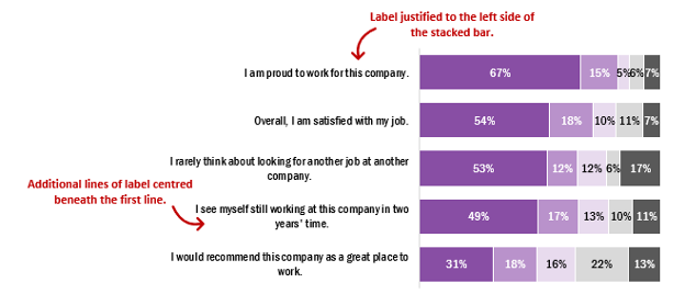
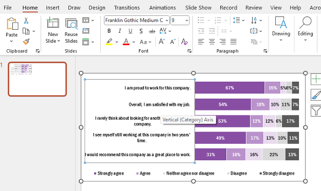
First, it is important to highlight the problem with the default y-axis labels in Excel. On creation of a new chart, whether a bar or stacked bar chart, the first row of text is justified to the left edge of our bars, but subsequent lines are centred below the first line of text. This leads to awkward looking labels that distract from the overall appeal of the chart. While this issue may not be immediately apparent if y-axis labels are short in length or if the chart is large enough to allow sufficient room for the full label to display in a single line, this becomes an issue when we are wanting to plot charts with lengthy y-axis labels. For example, a label may be a survey or evaluation question that is being addressed.

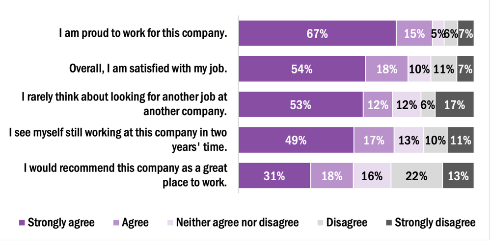
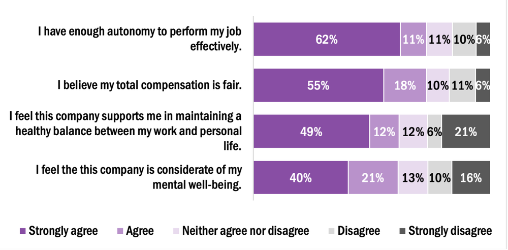
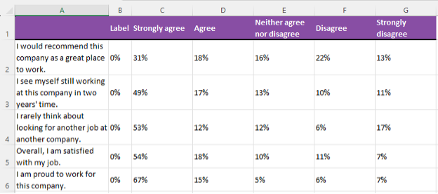
To illustrate this, the example below depicts the default y-axis labels of five staff engagement questions. Some labels will be justified as needed, but others will require editing to improve the overall look of the chart.


The Simple Solution

The simplest solution for justifying the y-axis labels is to leverage other Microsoft suite applications (e.g., Word or PowerPoint), as Excel does not have a simple approach for justifying these labels without additional data preparation.


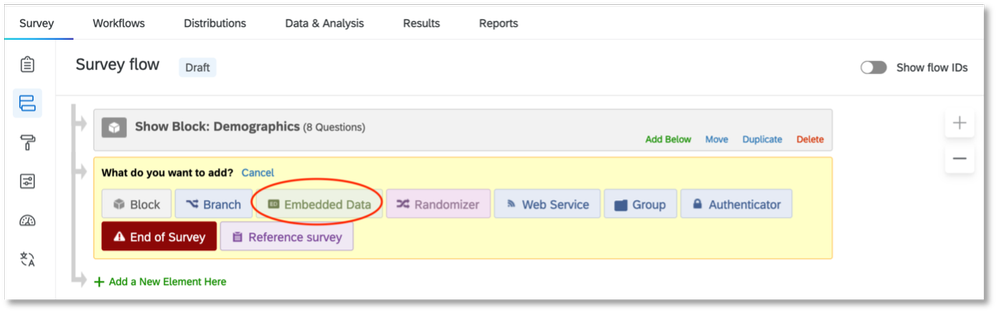
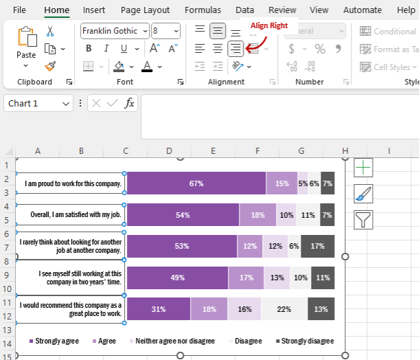
How to Justify Y-Axis Labels in PowerPoint or Word

  1. Copy & Paste (Ctrl +C, Ctrl + V) the Excel chart into PowerPoint or Word.

2. Left-click on the y-axis labels (Vertical (Category) Axis).

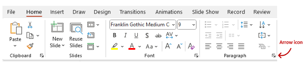
3. Within the Home tab, navigate to the Paragraph section of the top ribbon.

4. Left click on the arrow icon in the bottom right of the Paragraph section. This will open the Paragraph menu.

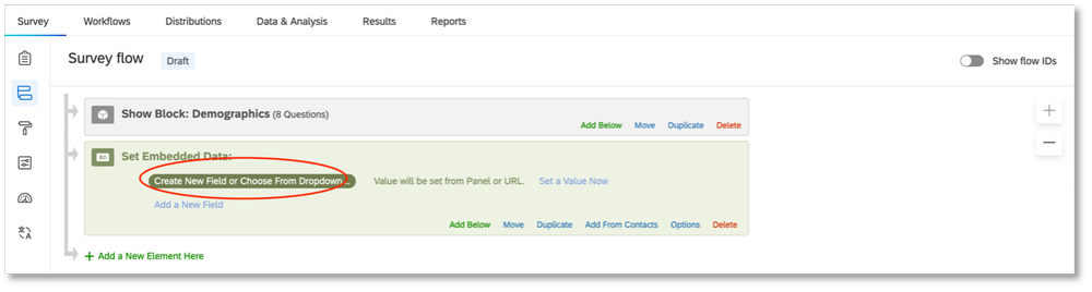
5. Under General > Alignment the default will be set to Centered.

6. Change the Alignment to Right.

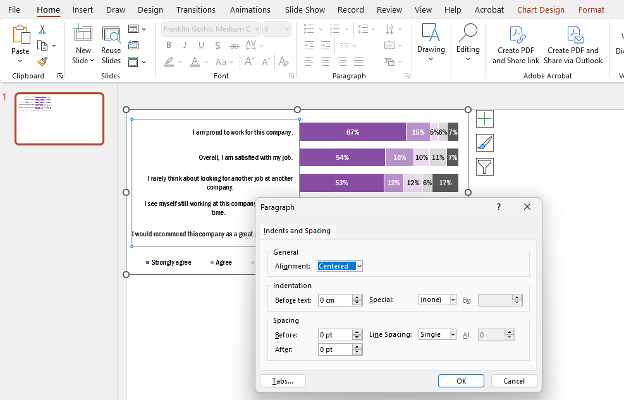
7. The resulting chart will have right justified y-axis labels.


Right-Justifying Labels in Excel using Chart Templates

While justifying labels in Word or PowerPoint accomplishes the goal of improving the overall look of our charts, this process typically needs to be completed manually for each chart. However, we can leverage chart templates in Excel to apply this formatting to all similar charts within our worksheets.


Creating a New Chart Template to Right-Justify Y-Axis Labels

1.     Copy & Paste (Ctrl +C, Ctrl + V) the updated chart back into Excel.

2.     Right click on the formatted chart and Save as Template…

a.     Name the template (e.g., Right justify labels)

3.     With the template saved, right click on any additional chart requiring formatting.

4.     Navigate to Change Chart Type…

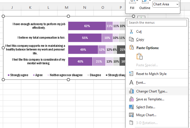
5. Go to your saved Templates at the top left of the All Charts tab.

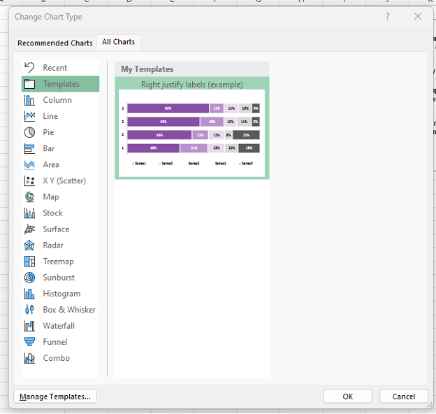
Note: When applying a chart template to another chart, both charts need to be identical in style. For example, a stacked bar chart with five levels of agreement would need to be identical between the template and the chart for which the template will be applied.

6. Select the template you want to apply and click OK.

7. The new template will be applied to the new chart.


The More Complicated Approach

The following approaches work well when working between Excel and PowerPoint (or Word). However, sometimes you may want to justify the labels entirely within Excel. The workaround requires some additional steps in setting up your data but will allow for complete formatting and control within Excel.


How to Justify Y-Axis Labels in Excel

1.     Prepare your data for charting.

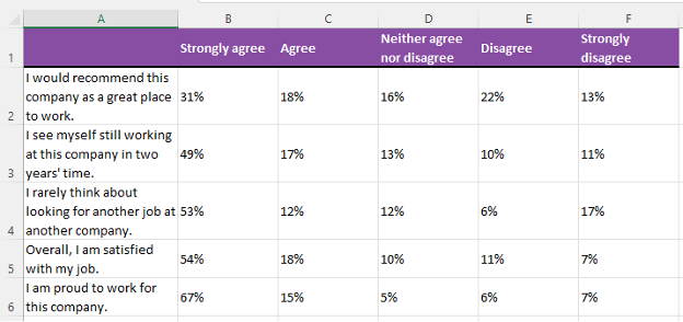
2. Insert a new column to the left of Column B.

a.     Right click on Column B and Insert.

3. Label this new column as ‘Label’ and insert 0% into all cells below.

4. Highlight the data from Cell B1 (‘Label’) to Cell G6 (7%).

5. Go to the Insert tab in the top ribbon and insert a 100% Stacked Bar Chart.

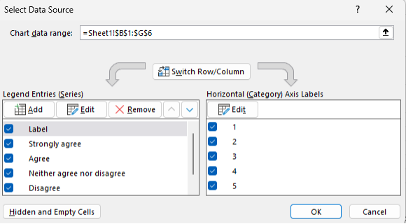
a.     Right click the new chart and go to Select data…

b.     Switch Row/ Column to get the data presented properly.

6. Add data labels and format the chart as necessary (see Data Visualization Best Practices).

7. The chart will have 0% labels on the left side of the stacked bars. Right click and Format Data Labels…

a.     Under Label Position select Inside End.

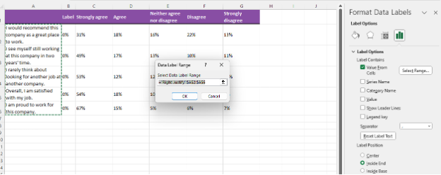
8. Also, within the Format Data Labels menu, navigate to the Label Options and select Values From Cells.

a.     Highlight cells A2:A6 (the axis labels) and click OK.

b.     Toggle off the Value and Show Leader Lines boxes under the Label Options.

9. Manually adjust the text boxes for each of the labels by dragging the text boxes (use the circles around the text box to resize) to the far left of the chart.

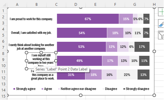
10. Select all the data labels and under the Home tab > Alignment click on the Align Right option.


Wrapping Up

While powerful, Excel has some limitations in its default charting options. However, with the flexibility of the Microsoft suite of applications, as well as additional Excel charting options, it is possible to format engaging charts with a little patience and know-how.

Written by cplysy · Categorized: evalacademy

Dec 19 2023

New Infographic: Types of Interview Guides

This article is rated as:


Eval Academy just released a new Infographic: “Types of Interview Guides”


Who’s it for?

This infographic is for anyone looking to learn more about the different types of interviewing or for those who are unsure which type of interview guide to use.


What’s the purpose?

This “Types of Interview Guides” infographic will help you to:

  • Learn about the key characteristics, advantages and potential use of the different types of interview guides.

  • Choose which type of interview guide to use in your qualitative data collection.


What’s included?

A one-page, downloadable infographic as a png file.


Download the “Types of Interview Guides” Infographic now!


Learn more: related articles and links:

You can learn more about collecting data with professional and ethical conduct in the following Eval Academy articles:

  • How to conduct interviews

  • 5 tips for ensuring interviewer safety

  • How to transcribe interviews like a pro

Other Eval Academy resources that you might be interested in checking out:

  • Standard Interview Guide Template

  • Standard Interview Information Letter Template

  • Standard Interview Consent Form Template

  • Tips for conducting interviews

  • Standard Interview Templates Bundle


What do you think of our new template? Let us know in the comments below!

Written by cplysy · Categorized: evalacademy

Dec 19 2023

How to Link Surveys in Qualtrics with a Participant ID

This article is rated as:

This is a step-by-step guide for linking your surveys in Qualtrics with a participant ID to assess change over time. There are ways to set up these surveys to automate the process to a greater degree than what will be covered in this article. Qualtrics has a support article that has more details for how to do those things such as automating Qualtrics to randomly generate participant IDs or setting up a way to automate the survey distribution to an email list.

The steps below outline ways to for link your surveys with a participant ID that is manually entered by participants, rather than automatically generated, and assigned. Please note that you can only link surveys using a paid version of Qualtrics.

What does it mean to link your surveys?

Linking surveys together means that you’re connecting the data from all your surveys in a way that lets you track an individual respondent. For example, if Kay fills out survey 1 about how they like dogs more than cats, and then changes their mind 6 months later when they take survey 2, you’ll be able to see that pattern in the data on an individual level if the surveys are linked.

Why would I want to link my surveys?

If you want to know how individuals are influenced and change their behaviours or views over time, linking surveys can help you see that in the data at a greater detail than if your data was only in an aggregated form. Linking surveys is a useful method for collecting longitudinal data.

For example, let’s say you were trying to measure the influence of an ad campaign that is trying to get people to like cats more than dogs. You can do a regular survey BEFORE the ad campaign runs and find the total percentage of people who like cats more than dogs. And then you can do another regular survey AFTER the ad campaign to see if that percentage has increased. However, your results won’t tell you if most of the people who changed their opinions were between the ages of 30-40. It also wouldn’t tell you if some people who liked cats more than dogs changed their minds too. Linking surveys can allow you to see more details in the pattern of your results.

Does linking surveys reveal a participant’s identity?

Linking surveys lets you track individual data confidentially. You can set up linked surveys so that any personally identifying information is not linked directly to an individual’s response. This means that when you are looking at the survey data, you’ll see the answers given by participant 1, but you won’t know their specific name or contact information. A confidential survey is different from an anonymous one. Linked surveys cannot be anonymous because they generate a list of everyone who has taken the survey. If you are using this method, it is important to help your participants understand that while their responses are confidential, they are not anonymous.

To learn more about the difference between confidentiality and anonymity in evaluation, check out, “Your information will be kept confidential: Confidentiality and Anonymity in Evaluation.”

Before we get to the details, I want to remind you that it is best practice to test the survey functionality and pilot it prior to sending it to participants.

How to manually link surveys in Qualtrics

Setting Up Survey #1

1.     Create your first survey in Qualtrics as if you are setting up a regular survey.

2.     Create a survey question that will determine the participant ID. This is the ID that a participant will need to remember and enter to access the second survey.

For this guide, we will use the participant’s email address as the ID. We chose to create a text entry question with an email address validation that asks, “What is your email address?”. You can choose a different identifier like a phone number or a name – something that the participant will remember easily. Make sure you make this question mandatory. It is recommended that you put this question near the beginning of your survey so that participants will fill it out even if they exit the survey early.

3.     Go to the “Survey flow” tab.

4.     Select “Add a New Element Here.”

5.     Select “Embedded Data.”

6.     Type in a label for your participant ID. Since we’re using email addresses, we just wrote, “Email Address.” Do NOT select an option from the drop-down list.

7.     Next, click on “Set a Value Now.”

8.     For “Set a Value Now,” you will need to choose the survey question that you had created for your participant ID. In the drop-down list, select “Insert Piped Text,” then “Survey Question.” Find the question you created for the participant ID. There will be one more panel that appears with options. Select the box that has the actual question. For us, it is “What is your email address?” Do NOT select “Question Text.”

9.     Select “Apply.”

10.     Next, go to the “Workflows” section.

11.     Select “Create a workflow” and choose the option “Started when an event is received.” Another page will pop up that will list different types of extensions.

12.     Choose the extension “Survey response” by Qualtrics. This means that you are now creating a workflow within Qualtrics that will be triggered when someone responds to your survey.

13.     In the next set of options that appear, make sure that “Newly created responses” is checked. You can make selections under “Additional response types” as you prefer. Select “Finish” when you are done.

14.     Next, select the plus sign (+) and then select “Add a task.” Another panel with an extension will appear.

15.     Select the extension “XM Directory” by Qualtrics.  

16.     Select “Add to XM directory.” A new panel with fields will appear. What you will be doing at this point is creating a contact list for participants that will be stored on Qualtrics. This contact list is how Qualtrics will recognise the participant IDs when they are entered to access the second survey.

17.     Select the drop-down box for “Contact List.” From there, you will select “My Library,” and then “New Contact List.”

18.     Create a name for your participant contact list. Then select “Save” to exit the window.

 19.     Next, select the drop-down box for “External reference ID.” From the list, select “Embedded Data Field” and then select the name of the label you created for your participant ID in step 6. For us, the name we chose was “Email Address.”

20.     Leave the other settings under “Contact update options” as the default settings. This means that “Save or update it as embedded data to your XM directory contacts” is selected and “Update recipient from survey response” is checked. Save to exit the window.

21.     Your first survey is now ready to be distributed. After publishing your survey, make sure you use the “Get a single reusable link” option from the “Distributions” tab. That will give you a single anonymous link that can be sent to all the participants. This survey shows as a regular survey. When the respondent submits their response, their information will get added to the contact list associated with your survey.

Congratulations! You have just set up your first survey! Try testing it out and if you encounter any problems, contact Qualtrics Support and someone will help you troubleshoot your issues.

In my experience, it takes Qualtrics a few minutes to update your survey with the changes you’ve made. If you don’t see your changes right away, wait and try again before contacting  Qualtrics Support.

Setting Up Survey #2

22.     Create your second survey like you would for a regular survey. This one doesn’t need a specific question for the participant ID. If you are asking the same questions as survey #1, I would recommend copying that survey and editing it to make sure your questions are worded in the same way.

23.     Go to the “Survey flow” tab and select “Add a New Element Here.”

24.     Select “Authenticator.”

25.     Select “Move” on any question blocks you have and move them underneath the Authenticator element. If you have multiple question blocks, be sure to move and arrange them in the correct order for your survey.

26.     “Authentication Type,” should be set to “Contact.” And under “Authenticate Using Contact,” select the same library you used in step 17 of survey #1. When you select the library, another drop-down list will appear for contact lists. Select the contact list you created in in step 17 of survey #1.

27.     After selecting your contact list, another section called “Authentication Fields” will appear. Under this section, select “External Data Reference” in the drop-down box, then type in the label you chose for the participant ID you selected in step 6 of survey #1. For us, we had chosen “Email Address” so that is what we wrote in this box. Leave the “Password” and “Pre-fill” boxes UNCHECKED. Apply your changes.

28.     After publishing your survey, it is now ready to be distributed. When you are sending it out, make sure you use the “Get a single reusable link” option from the “Distributions” tab. That will give you a single anonymous link that can be sent to all the participants. After receiving the link, they will be taken to a page where they will have to enter their participant ID before accessing survey #2. Requiring participants to enter their participant ID ensures that their survey #2 responses are linked to their survey #1 results.

Anyone who has not taken survey #1 will NOT be able to access survey #2, unless you add their contact info manually to the corresponding contact list in Qualtrics. This is the contact list you created in step 17 of survey #1.

And that’s it! You have just linked your second survey to your first! If you don’t get the result you want after testing it out, contact Qualtrics Support and someone will help you troubleshoot your issues. Sometimes it takes a few minutes for Qualtrics to update your changes. So, if you don’t see your changes right away, wait a few minutes to test again before contacting  Qualtrics Support.

Written by cplysy · Categorized: evalacademy

Dec 18 2023

Top 23 Dataviz Resources of 2023

9,200 total participants in my dataviz courses so far (and ~25,000 taught in-person and virtually over the past decade).

A dozen in-person workshops (with trips to Dubai & Tanzania) and several dozen virtual workshops.

32 new blog posts: 28 from me, and 4 from guest authors.

2 more YouTube videos (115 total).

2 more podcast interviews.

2 more babies.

6 months off.

What a year. 

Top 23 Dataviz Resources of 2023 

Want to do some year-end learning as 2023 winds down? 

Here are my favorite data visualization resources from the past year. 

  1. The Progression of Sue Griffey’s Year-End Infographic: Sue Griffey explained how she edited her infographic and we discussed it together during Office Hours. I love going behind the scenes like this!
  2. Watch Out for Mars! 6 Data Cleaning Steps to Save You Millions: Hudson Kelley teaches us how to check for duplicates; check for changes in the survey instrument; check for outliers; use counts; recode variables with IF statements; and combine datasets with lookups.
  3. How to Influence Others with Your Data: SuperDataScience Podcast Interview: I was invited to speak on the #1 podcast in the data field. Host Jon Krohn asked me to summarize some of my favorite tips for data storytelling, spreadsheets, reports, and presentations. This is a great listen for people who are new to my work.
  4. Embedded Legends Aren’t Enough: I see this accessibility mistake way too often. Take a peek and make sure you aren’t messing up your graph titles and legends.
  5. How to Visualize “Overall” Data or Averages in Bar Charts: Probably my most practical post of the year.
  6. 39+ Amazing Graphs You Can Make in Excel: Probably the community’s favorite post of the year. This isn’t an exhaustive list, and I’ll add to it someday. In all my spare time.
  7. 3 Simple Steps that Took My Graph from Good to Great: In this before-after makeover from a museum evaluation project, Maia Werner-Avidon teaches us how to use grouping, spacing, and icons.
  8. How to Make Great Graphs in Excel: 4 Levels of Excel Vizardry: Probably my personal favorite of the year. Everyone wants to jump into advanced graphs, and then they flail and drown. In this post, you’ll see which skills you should start with.
  9. How to Analyze Nonprofit Data with Excel’s Pivot Tables (No Formulas Required!): I shared the recording and materials from my how-to workshop at the Good Tech Fest conference.
  10. Building a Business that Fits Your Family: Disrupt Your Money Podcast: I was invited to speak on Meg Wheeler’s financial podcast. I shared a lot of personal and business details.
  11. From Formulaic to Meaningful: Constructing a Useful “Table of Contents” Page for an Evaluation Report: Barbara Klugman shared her before-after makeover on the discussion boards inside Report Redesign, and I invited her to write a blog post so others could learn from her, too. Thanks, Barbara!
  12. How to Visualize Multi-Year Patterns: Another super-practical post. It would’ve been a personal favorite if people on social media didn’t prefer the terrible, horrible, before version better than the redesigned options. Sigh.
  13. Two Types of Tables: Datasets vs. Tabulations: If everyone followed this advice, I could retire. Someday!!!
  14. Two Types of Datasets: Contiguous vs. Non-Contiguous: The most important time-saver I’ll teach you all year.
  15. Two Types of Tabulations: Formulas vs. Pivot Tables: To my knowledge, none of the Excel bloggers worldwide have written about the implications of formulas vs. pivot tables for data visualization. Maybe 5 people in the entire world will appreciate this advanced, niche post. Are you one of those 5 people?
  16. How to Make Your First Tableau Dashboard: It’ll take less than an hour, promise.
  17. How to Make a Series of Matching Dashboards in Excel: I gave away all the behind-the-scenes secrets in this one. Companies pay me $10,000 – $30,000 for these types of automations in consulting projects. Please, just follow these instructions and do it yourself. I’d love to retire someday.
  18. How to Make Interactive Dashboards in Excel: You’ll learn how to link Excel Tables, pivot tables, pivot charts, and slicers.
  19. Redesigning a Thesis Chapter: Farihah Malik does the very hard work of applying what she learned in Report Redesign to academia.
  20. Use Icons to Visualize Data (Not Just Decorate): An advanced, niche post that maybe 5 people worldwide will appreciate. Maybe you’re one of them?? It had to be written.
  21. How to Visualize Small n’s with Icon Arrays: A quick before-after table makeover. Please steal this idea.
  22. Bring Technical Tables to Life: A real (sort of) before-after makeover from when I keynoted the National Birth Defects Prevention Network Conference in Atlanta this summer.
  23. Don’t Start from Scratch! Make One of These Dashboards Instead: A few of my favorite dashboard case studies, all in one place, to make them easier for your to find.

Your Turn

What types of tutorials should I create in 2024?

Comment below with your requests!

Written by cplysy · Categorized: depictdatastudio

Dec 13 2023

Finding Our Stories through Digital Storytelling

The act of creating our stories and sharing them with others is a powerful way to better understand our experiences. I realized this in a training on digital storytelling with the Institute for Social Science Research at the University of Massachusetts Amherst.

I’ve long used the metaphor of storytelling in my work as an applied researcher and evaluator. The way that we ask questions, conduct our analyses, and represent our results all convey a message or story. As a qualitative and equity-focused evaluator, my aim is to tell the stories that participants in the study want to tell about their own experiences — what meaning they are making, what is important to them, what they want the audience to learn. But it occurred to me while taking this course that we don’t always fully know the message we want to share about our experiences. And the act of creating the story — in written narrative, in visual art, in film or comics or otherwise — actually helps us find our story.

Take, for example, my own digital story on the cocktail of emotions I felt when my mom was diagnosed with cancer. I began writing the story, intending to share a message about the incredible support I received from my community of people. However, through the process of creating my story, I was able to come to the meaning I needed to make about my experience — about the numerous, shifting, and often contradictory emotions I felt through my mom’s diagnosis, treatment, and ultimately recovery.

https://medium.com/media/415589ed81d66316310177aa0c76efae/href

So, what is digital storytelling? How might we use it in learning and evaluation? And what are important ethical issues we evaluators need to consider?

What is digital storytelling and why use it?

Digital storytelling is a method often used in learning and evaluation. It invites participants to identify, create, and produce a 3- to 5-minute video that shares a personal story through an artful combination of narration, images, and sound. The videos produced can then be used to collectively identify and analyze themes to answer learning questions.

Digital storytelling is a form of critical narrative research, which means that participants engage with their stories as a way to critique wider cultural, political, and economic phenomena. It’s easy to see how digital storytelling can also be used as an intervention, education, and advocacy in fields as wide as health/reproductive justice, education, work/labor rights, and more!

Digital storytelling can be used in learning and evaluation many ways. Using Cocktail as an example, the creation of my digital story was a form of data generation itself. As I was writing the narrative, reading it aloud to my peers, and getting feedback from the group, we shared insights about our experiences with the illness of a loved one. When the video was complete, and I showed it to the group, it became an elicitation device — a conversation starter for further discussion on the topic. Our collective of digital stories could even be shared publicly — for example, to advocate for supports to family members and caretakers or to educate health professionals!

How can I use digital storytelling?

Digital storytelling is a flexible method that can be adapted to meet the needs of the participants in the study. For example, if participants are based around the country, the process can be facilitated online or in a hybrid format. If participants have limited digital literacy or technology access, or a more professional appearing video is needed for advocacy purposes, a collaborative process of creating the stories can be used between the researcher and the participant (and maybe even a professional photographer and video editor). And digital storytelling can be used as one of multiple methods in a mixed-methods study.

Just be sure not to simply ‘add-on’ digital storytelling! It’s a time and resource intensive method that requires care to ensure respect and ethical treatment of participants and their stories, and to produce quality stories that generate dialogue and reflection.

In digital storytelling, there are at least three steps:

  1. Writing the story. Once a group topic or question is defined (connected to the evaluation and learning project), participants spend time drafting their storyline and narrative. This could be done within a single session or for homework. Some people may prefer to create an outline before writing — for me, I just began free-writing, and that is how I learned what my story would eventually become! The first story circle is held when participants have a first draft. Each participant takes a turn reading aloud their draft and receiving feedback from the group. Facilitators and the group can help participants strengthen their stories by identifying key messages, clarifying language, helping with tone/pacing, knowing where to cut or add content, etc.
  2. Producing the story. When stories are finalized, participants then produce their stories. This involves recording the voiceover, creating or finding images, and selecting sound effects. We used an app called WeVideo, which was pretty easy to learn. I recorded my voiceover (it took a few tries and involved hiding in a closet to reduce background noise) and took pictures with my iPhone. I’ve even seen digital stories with hand drawn or illustrated images, which I hope to try next!
  3. Sharing and reflecting. When all digital stories are complete, the group holds a second story circle to screen the videos. Each participant shows their story to the group. We provided feedback and reflection after each video, but it may be more timely to share 2–3 videos followed by a discussion, and then repeat until all videos are screened. Sharing the stories is the core purpose of digital storytelling, and it is what allows participants to engage critically with their ideas. In a learning and evaluation setting, facilitators could encourage participants to reflect on the conditions leading to the issues identified in the stories, what systemic issues need to change (or are changing), and what factors enable or constrain those changes. The stories could also be a powerful educational or advocacy tool for sharing with organizations, decision-makers, and the wider public.
Screenshot of WeVideo app.

Ethical issues and power in digital storytelling

Importance of choice. Creating my story, Cocktail, taught me one of the most important ethical considerations in visual and narrative methods — the importance of choice. I have really bad stage fright — even if it’s just reading my own story aloud to a group. Before I read my story during the story circle (which was held online), I told the group that I might turn my camera off if I start to clam up. In other situations, I’ve had to recuse myself from sharing my story personally and have found other ways to share, like asking someone else to read aloud for me. A major ethical consideration is that everyone is being vulnerable in sharing their stories — which may be quite painful. Participants need choices — to read their story aloud, to share it in writing, to ask someone to read it aloud for them, etc.

Telling a personal story that involves others. At the same time, the experience highlighted the important privacy issue of telling my own story, not someone else’s. Throughout the process of creating Cocktail, I had to continually ask myself — whose story am I telling? I made decisions about what I told in my story (and what I left out) because the cancer, the treatment, and all the emotions that went along with that wasn’t my story to tell — it was my mom’s. But I also recognized that as her primary caretaker for a time, I also had a story that needed to be told.

Confidentiality. Another essential ethical consideration in digital storytelling is the timing of obtaining permission to share stories outside of the group (e.g., as educational or advocacy materials). People may participate in the digital storytelling project with full intention to share their stories publicly. But that may change as they move through the process and realize their story is too difficult. Permission to use the stories should only be requested after the stories are finalized and screened within the group, when people have a greater sense of what it feels like to share their story and who they are comfortable with hearing it.

Fortunately for me, the course instructors were not only professionals, but were highly conscientious in ensuring we retained the power over our stories and how they were shared. Staying off camera as I screened my story, I choked up at the overwhelming support I received from my peers and the care and reciprocity they showed. Sharing it with my mom later opened up a conversation we had not had in nearly 10 years since her diagnosis. Creating Cocktail helped me to name and tell my story — of how I felt fear, sadness, and guilt, alongside love, inspiration, and community — a true cocktail of emotions.

How has digital storytelling helped you to find your story? I’d love to hear from you about how you’ve used it (or other participatory visual methods) to find and share your story, or help others do the same!


Finding Our Stories through Digital Storytelling was originally published in InnovationNetwork on Medium, where people are continuing the conversation by highlighting and responding to this story.

Written by cplysy · Categorized: innovationnet

  • « Go to Previous Page
  • Go to page 1
  • Interim pages omitted …
  • Go to page 64
  • Go to page 65
  • Go to page 66
  • Go to page 67
  • Go to page 68
  • Interim pages omitted …
  • Go to page 310
  • Go to Next Page »

Footer

Follow our Work

The easiest way to stay connected to our work is to join our newsletter. You’ll get updates on projects, learn about new events, and hear stories from those evaluators whom the field continues to actively exclude and erase.

Get Updates

Want to take further action or join a pod? Click here to learn more.

Copyright © 2026 · The May 13 Group · Log in

en English
af Afrikaanssq Shqipam አማርኛar العربيةhy Հայերենaz Azərbaycan dilieu Euskarabe Беларуская моваbn বাংলাbs Bosanskibg Българскиca Catalàceb Cebuanony Chichewazh-CN 简体中文zh-TW 繁體中文co Corsuhr Hrvatskics Čeština‎da Dansknl Nederlandsen Englisheo Esperantoet Eestitl Filipinofi Suomifr Françaisfy Fryskgl Galegoka ქართულიde Deutschel Ελληνικάgu ગુજરાતીht Kreyol ayisyenha Harshen Hausahaw Ōlelo Hawaiʻiiw עִבְרִיתhi हिन्दीhmn Hmonghu Magyaris Íslenskaig Igboid Bahasa Indonesiaga Gaeilgeit Italianoja 日本語jw Basa Jawakn ಕನ್ನಡkk Қазақ тіліkm ភាសាខ្មែរko 한국어ku كوردی‎ky Кыргызчаlo ພາສາລາວla Latinlv Latviešu valodalt Lietuvių kalbalb Lëtzebuergeschmk Македонски јазикmg Malagasyms Bahasa Melayuml മലയാളംmt Maltesemi Te Reo Māorimr मराठीmn Монголmy ဗမာစာne नेपालीno Norsk bokmålps پښتوfa فارسیpl Polskipt Portuguêspa ਪੰਜਾਬੀro Românăru Русскийsm Samoangd Gàidhligsr Српски језикst Sesothosn Shonasd سنڌيsi සිංහලsk Slovenčinasl Slovenščinaso Afsoomaalies Españolsu Basa Sundasw Kiswahilisv Svenskatg Тоҷикӣta தமிழ்te తెలుగుth ไทยtr Türkçeuk Українськаur اردوuz O‘zbekchavi Tiếng Việtcy Cymraegxh isiXhosayi יידישyo Yorùbázu Zulu