• Skip to main content
  • Skip to footer
  • Home

The May 13 Group

the next day for evaluation

  • Get Involved
  • Our Work
  • About Us
You are here: Home / Archives for allblogs

allblogs

Dec 05 2023

La rendición de cuentas interna en las organizaciones

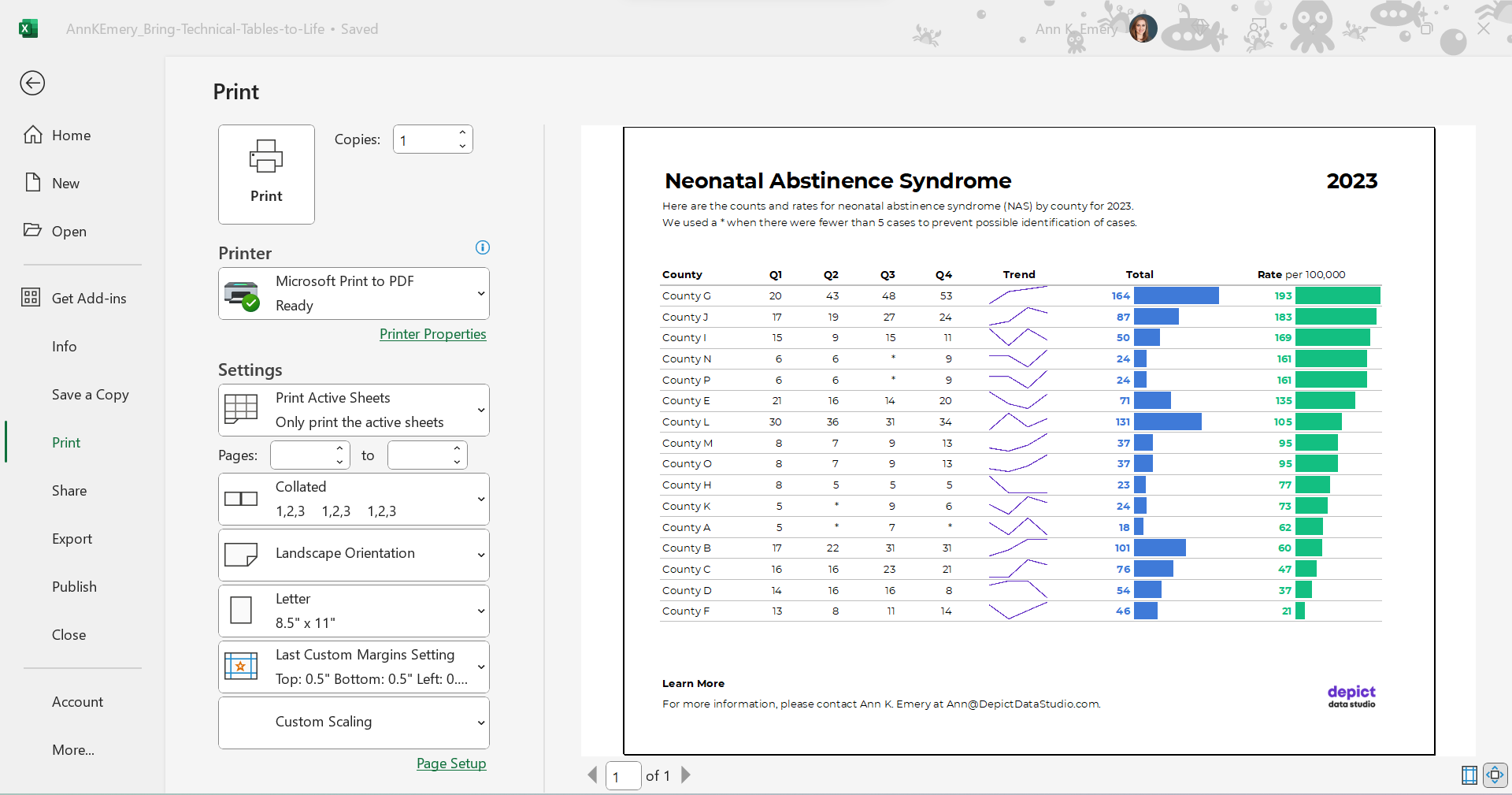
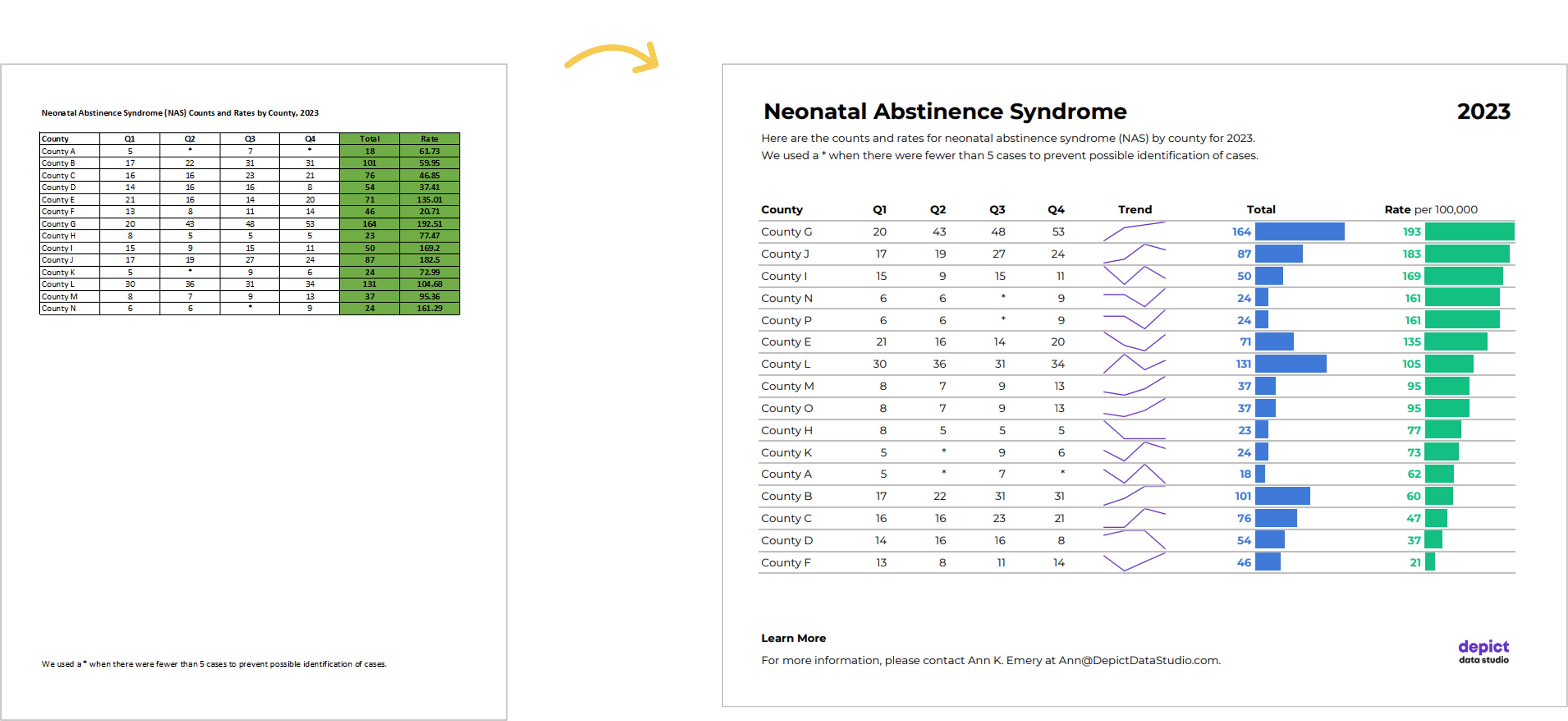
En un sentido amplio se entiende la rendición de cuentas en una organización como el conjunto de derechos y responsabilidades existentes entre los miembros de una organización y las estructuras que afectan a su trabajo, sus relaciones laborales y cultura organizacional.

La rendición de cuentas en las organizaciones incluiría entonces tres dimensiones:

(1) Obligatoriedad: derecho a obtener una respuesta por parte de los miembros de la organización y la obligación de darla por parte de las partes.

(2) Exigibilidad: capacidad para asegurar que una acción se lleva a cabo y sancionar si ello no ocurre.

(3) Evaluabilidad: valoración positiva o negativa de la organización y de los miembros de la organización.

Esto lleva a diferentes modelos de rendición de cuentas según su carácter:

(1) Control a la dirección y las estructuras de gestión de la organización: combina modelos obligatorios (control interno obligatorio de la organización) y voluntarios (por ejemplo, comparecencias ante todos los miembros de la organización);

(2) Carácter jurídico o legal, marcado por la obligatoriedad, exigibilidad y cumplimiento de las normas, incentivos y sanciones;

(3) Carácter de gestión de recursos (financieros, humanos, equipos de trabajo, relaciones laborales y cultura organizacional), marcado por la exigencia y obligatoriedad de auditoría, evaluación o valoración respecto a la norma.

Entiendo la transparencia en la organización es una amalgama de elementos que permiten el fortalecimiento de la cultura organizacional, la comunicación y la participación, al tiempo que se trata de una herramienta para el acceso a la información y la rendición de cuentas, permitiendo poner en marcha un proceso de interacción entre actores de la dirección de la organización y los miembros de la organización. La experiencia indica que la rendición de cuentas sin transparencia no funciona, ya que las políticas de transparencia permiten la apertura y disponibilidad de información para permitir la rendición de cuentas.

La rendición de cuentas es un círculo virtuoso en el que interactúan en un ciclo de vida los siguientes elementos:

(1) Establecimiento y claridad de las normas de las que estamos hablando (gestión y evaluación del desempeño, seguridad, comunicación, reconocimiento…).

(2) Transparencia (provisión de información basada en mecanismos para rendición de cuentas (ejemplo feedback 360).

(3) Evaluación (proceso de comparación de los compromisos adquiridos con el alcance de los objetivos propuestos).

(4) Consecuencias: Incentivos en caso de cumplir y Sanciones en caso de no cumplir con las normas (mecanismos con los que los actores/miembros aprueban o no el desempeño de la organización).

Por otra parte, podríamos señalar que, a la inversa, es difícil salir del círculo vicioso de una débil rendición de cuentas cuando no hay normas y la transparencia es de aplicación selectiva, no hay cultura de evaluación, ni mecanismos para incentivar el buen desempeño (o sancionar el mal desempeño).

Referencias

Rodríguez-Ariza, C. (2009). La gestión de la información en organizaciones de desarrollo. Serie CECOD. Número 11

Toledano, J. M., Guimaraes, J., Illán, C., & Farber, V. 2008, Buenas prácticas en la cooperación para el desarrollo. Rendición de cuentas y transparencia, La Catarata, Madrid.

Written by cplysy · Categorized: TripleAD

Dec 04 2023

How to Bring Your Technical Tables to Life

Just because I’m pro-graph, I’m not anti-table.

Technical tables have so much value, especially as visual appendices for reports.

In this blog post, you’ll get ideas for bringing your technical tables to life.

Before

Here’s what the “before” version of some technical tables looked like.

These are made-up numbers, but you get the idea.

The public health staff wanted to look at quarterly numbers, the total annual number, and the rate (the number of cases per 100,000 live births).

Even if you’re not measuring neonatal abstinence syndrome, I bet there are numbers that you track each quarter. You might even want to look at the total annual number, too. Get some inspiration from this blog post, and then adapt the ideas to your own workplace.

Re-Created in Excel

First, I re-made their table in good ol’ Excel.

The finished product will be a PDF, but the most efficient way to bring technical tables to life is to keep the numbers inside Excel the entire time. We’re not going to transfer anything to Word.

Declutter

Let’s tackle the easy edits, such as:

  • removing all the borders;
  • adding back just the gray horizontal borders;
  • removing the background fill; and
  • left-aligning the text and right-aligning the numbers.

Add Trendlines

We’ll bring the quarterly trends to life with sparklines.

Add Bars

We’ll bring the annual totals to life with data bars:

We’ll bring the rates to life with data bars, too:

Brand Colors & Brand Fonts

Time to format!

We’ll apply brand colors and brand fonts:

We’ll color-code the text to match the bars.

(Sometimes the table’s columns get so narrow that it’s tricky to tell which number corresponds to which bar. That’s where color-coding comes to the rescue.)

As a general rule of thumb, colored font should be bold so that it passes 508/ADA color contrast guidelines.

Text Hierarchy & Intro Sentences

A text hierarchy means the title should be largest, boldest, and darkest so that it’s easiest to spot. (Followed by H1s and H2s if we had them.) We’re developing a hierarchy of information so our readers can stay organized.

As a general rule of thumb, I make sure headings are twice as big as body font. The body font is size 11, so this title is size 22 and bold.

We’ll also add intro sentences, and move that footnote info about the asterisks to the top. (People need to read that sentence before the table, not after.)

PDF- and Printer-Friendly

We’ve kept everything in Excel — that’s the only way to add the spark lines and data bars, and pasting tables into Word is a waste of time — but the final version will be shared with others as a PDF.

In the real version of this project, the PDF was about 15 pages long. There were various tabulations on various topics, not just neonatal abstinence syndrome.

We’ll need to:

  • set the Print Area;
  • adjust the Page Layout (portrait to landscape for easier on-screen reading);
  • adjust the margins (0.5 to 1 inches is sufficient);
  • add contact info and a logo so people can get in touch with questions; and
  • adjust the column widths and row heights so everything fits juuust right.

Optional: Sort by Rates, Not Alphabetically

Finally, we might choose to sort the table by the most important column (rates, in this example) instead of alphabetically by county name.

I’m usually a fan of sorting. But I’m on the fence here. I also see the value in the leaving the counties alphabetized so readers can search for their own county. Hmm.

The Final Version

The visuals help us spot the patterns (thanks, Picture Superiority Effect).

The branding will help us look more professional to outside audiences (so we don’t look Frankensteined — when all our colleagues use different colors and fonts, and we put everything together in one doc, and it’s a hot mess).

The PDF’d appendices can be merged with the PDF’d report (thanks, Adobe Acrobat).

The Before-After Transformation

Once you’ve got intermediate/advanced Excel vizardry skills, the whole process will take less than an hour.

Really, this should take you less than 15 minutes!

If not, you’ll simply need to brush up on your Excel skills.

Dataviz is supposed to be fast and easy.

Bonus: Download the Materials

Want to explore my spreadsheet? Download my Excel file and adapt it for your own project.

Written by cplysy · Categorized: depictdatastudio

Nov 29 2023

Canva Jumpstart

Interested in learning how to use Canva but don’t know where to start? Start here.

My Canva Jumpstart Course is now FREE.

I had originally planned to sell this course for more than $200. But since Canva has become such an essential tool in how I approach and teach reporting here on this blog, I’ve decided to make the course free. With no strings attached.

My goal is to give you quick run through on everything you need to know to create professional graphics, infographics, presentations, reports, and videos using Canva.

You don’t need to spend hundreds of dollars on design software to create professional graphics and reports. Trust me, as an information designer I have subscriptions and licenses for A LOT of professional design tools. But project after project I still find myself using Canva more than any other piece of software.

Canva can…

  • help you create better designs, faster.
  • simplify your design workflow.
  • improve your design collaborations.
  • make you look like a design pro, even if you’re not.

This course will introduce the software features, provide you with practical walkthroughs, offer practice exercises, and a set of templates you can adapt and make your own.

Canva Jumpstart Course Curriculum

Module 1: Getting Started (~20 minutes)

In this module you’ll learn the basics. I’ll walk you through some of the basic features and we’ll end with a simple practical walk through by creating a social media graphic together.

  • Why Canva? (1:50)
  • The Canva Mindset (2:44)
  • Essential Features (7:24)
  • A Note about Canva Pro (0:55)
  • PRACTICAL: Creating a Social Media Graphic (8:24)

Module 2: Going Deeper (~40 minutes)

Now that you know the basics, we’ll go a little bit deeper. I’ll walk you through all the different elements and some of the secondary features that get a little hidden by the interface. This section also includes a few practical examples along with a couple of templates.

  • Going Deeper with Canva Design (0:46)
  • Search, Photos, Graphics, Text, Shapes, Colors, Lines, and Grids (11:18)
  • PRACTICAL: Creating a One-Pager from Scratch (5:23)
  • One-Pager Template
  • Frames, Backgrounds, Charts, Tables, Text Effects, Photo Filters (6:54)
  • PRACTICAL: Redesigning a Social Media Chart Post (6:31)
  • Social Media Chart Post Template
  • Animate, Transparency, Grouping, Uploads, Videos, Audio (6:26)
  • PRACTICAL: Designing a YouTube Video (6:19)

How to register?

Registration is easy, just visit the course page by following this link. Then click on “Enroll in Course for FREE” and follow the instructions.

Written by cplysy · Categorized: freshspectrum

Nov 28 2023

Eval Academy’s Top 10 Posts and Resources of 2023

To celebrate the end of the year, we’ve highlighted Eval Academy’s top ten posts and resources from 2023.

What posts or resources would you like to see in 2024? Comment below, tweet us @EvalAcademy or connect with us on LinkedIn!

Top posts of 2023

 10. What you need to know about member checking

While member checking is commonly used in qualitative research, it’s less commonly used in evaluation and we think that should change! In this article, we review what member checking is and why, when, and how you should use it.


9. But really, how do I use the RE-AIM Framework?

In this article, Bonnie shares her account of how to use the RE-AIM framework in your evaluation planning, implementation, and reporting.


8. Everything you need to know about Likert scales

The Likert scale is one of the more commonly used rating scales in surveys. As evaluators, we should know a thing or two about it, and how to navigate some of the decisions involved in using a Likert scale. This article introduces Likert scales and how to use them.


7. Differences between Theory of Change, Log Frames, Results Frameworks and Logic Models – what are they and when to use them

You might have noticed how there seem to be quite a few evaluation tools doing very similar things. It’s no surprise that these tools can sometimes be confused, and the lines can be blurred around when and how to use them. To help you on your way to deciding which tool is best suited to our evaluation, this article compare and contrasts few of our favourites.


6. Evaluation question examples by type of evaluation

This article takes a look at how using different evaluation strategies or frameworks can help you to craft perfect evaluation questions.

5. Evaluation question examples

A blank page can intimidate any writer. The same goes for evaluators – that “evaluation questions” column in your evaluation plan may be daunting. This article takes a look at examples of real-world evaluation questions that might just inspire your own.


4. How to write good evaluation questions

The article outlines essential considerations for writing effective evaluation questions, emphasizing the need for questions to align with the evaluation’s purpose and involve stakeholder collaboration. The article provides guidance on the optimal number of questions, suggests the use of thematic clusters, and underscores the importance of language precision in crafting questions, concluding with indicators of well-crafted questions and next steps in the evaluation process.


3. How to complete an environmental scan: avoiding the rabbit holes

This article is aimed at those who are new to environmental scanning and are looking for new ways to support program planning and improvement.


2. Finding the right sample size (the hard way)

For those interested in calculating sample sizes by hand, or getting a better understanding of the math behind many sample size calculators, this article outlines the formulae used to calculate sample sizes.


1. Interpreting themes from qualitative data: thematic analysis

This article supports evaluators who are new to qualitative data analysis. We start by defining thematic analysis, then give you a 5-step process to complete your own analysis. We end the article by highlighting some common challenges with thematic analysis.


Top resources of 2023

 10. Focus group moderation guide template

You have important questions to ask in your next focus group. Use this template to make sure you don’t miss a thing including logistical details, housekeeping, consent verification, and closing comments. This fully editable template will download as a Word document.


9. Interview tracking log – Excel template

An Interview Tracking Log is a tool to use when collecting qualitative data through interviews to keep track of participant recruitment. This customizable Tracking Log in Excel can be used by anyone completing interviews and should be modified to capture project-specific information such as relevant participant demographics.


8. Interview guide template – standard interview

Evaluators often use interviews to collect data. Strong interview data relies on a consistent interview process—that’s where this interview guide comes in. You’ll find yourself using this template over and over to structure your questions and provide prompts for interviewers to get deeper into interviewees’ perspectives. This template downloads as a fully editable Word document.


7. Evaluation kick-off meeting agenda template

This customizable resource provides an agenda template for an “Evaluation Kick-off Meeting” for a program or project. The meeting aims to initiate the evaluation process and includes various activities such as introductions, identification of team members and their roles, clarification of program goals, evaluation planning, and communication strategies. The template downloads as a Word document.


6. Developing a Logic Model (template)

This customizable template serves as a guide for creating a Logic Model for a program. The document includes sections explaining the purpose of a Logic Model, and the facilitating questions cover topics like needed resources, program activities and outputs, the intended reach of these outputs, short-term, medium-term, and long-term outcomes, impact, and external influences and assumptions. The template provides a structured format for users to input their answers to these questions, creating a comprehensive Logic Model that can be presented as a flowchart. This template downloads as a Word document.


5. Program evaluation scoping guide

This guide is intended for anyone conducting an evaluation of a program to understand the scope of the evaluation. The guide outlines questions evaluators can ask program managers or other stakeholders to better understand the scope of the program and its evaluation. The questions in the guide are intended to help evaluators begin formulating a quote and/or an evaluation plan; however, it can also be used identify disagreements or gaps in what is known about the program and/or the boundaries of the evaluation. This resource downloads as a Word document.


4. Theory of change template

This customizable template provides a structured framework for developing a Theory of Change for a program. The document guides the user through the process of defining the program’s purpose, its intended impact, and the activities required to achieve that impact. The goal is to create a comprehensive understanding of the program’s logic and context, aiding in the development of measurement and evaluation approaches. Downloads as a Word document.


3. Evaluation question checklist

This checklist acts as a tool to score your evaluation questions. This resource downloads as a Word document.


2. Evaluation plan template

This template includes all the sections needed in an evaluation plan including background, assumptions, evaluation purpose and scope, data collection methods, and reporting products, with prompts to help jump start your thought process. This file will download in fully editable Word format.


1. Canva design templates for creating your own Logic Model

Create your own logic model using our FREE pre-made Canva templates. This fully customizable template is available online on Canva through our download link.

Written by cplysy · Categorized: evalacademy

Nov 28 2023

Survey Question Types

We love a survey at Eval Academy! It’s one of the most commonly used data collection tools in an evaluator’s toolbox. There are lots of benefits to using a survey: you can collect lots of responses for a low cost, you can collect over time and space, you can be sure participants are asked the same question in the same way for comparisons, and more!

Have you ever stopped to think about how many question-type choices you have in creating your survey? I think most of us turn to the good ol’ Likert questions but there are so many more. Here’s a quick rundown of some options:

1. Multiple choice (or drop-down menus if online)

“Multiple choice” questions can be used when you have discrete option choices and when you want to limit write-in answers that are more resource-intensive to analyze. “Multiple choice” is also a great option when you want to force a choice, like understanding preferences.

In a “multiple choice” question, the key is that respondents choose one answer, not multiple (despite the name!). In creating a survey, if you think your choice list may not be exhaustive, you can always add an “other” category. Most online survey platforms have built-in features for this, and you can ask respondents to type in their “other” response.

In an academic world, “multiple choice” questions might be called “nominal” and probably include dichotomous questions, that is, questions that only include two answer options like “yes/no”.

Examples:

  • [forced choice] Which of the following activities is most important to achieving your program outcomes?

    • Offering the drop-in program

    • Operating 24/7

    • Doing community outreach

    • Partnering with schools


  • [other category] In which country do you reside?

    • Canada

    • Australia

    • United States

    • Other, please write in: ___________

  •  How many times did you access this program in the last 6 months?

    • 1 – 3 times

    • 4 – 6 times

    • 7+ times

    • I have not accessed the program in the last 6 months


2. Check all that apply

“Check all that apply” is similar to “multiple choice”. It has the same format, but respondents can select more than one answer. This is used when the answer options are not mutually exclusive.

It is important to be clear on your surveys which questions allow for multiple selections, often by adding “select all that apply” after your question.

Both “check all that apply” and “multiple choice” questions should still have response options that reflect all possibilities, which may include things like “None”, not “Not applicable”. The example below includes an exclusive answer option of indicating that services have not been used.

Example:

  • [with exclusive answer option] Which services have you used in the last months? (select all that apply)

    • Drop-in program

    • Lunch program

    • After school tutoring

    • I have not used any services in the last 12 months (exclusive)


3. Likert Scales

We’ve written about Likert scales before. Likert scales are used when you want to capture a spectrum of responses to assess how strongly a respondent feels about what you are measuring, like satisfaction, acceptability, etc. Likert scales can also be used to assess how frequently something happens.

The Likert scale may be viewed as an alternative to Yes/No questions by changing a dichotomous response into a spectrum, often with a middle or neutral point.

Examples:

  • [frequency] How often do you access the program?

    • Never

    • Rarely

    • Sometimes

    • Often

    • Always


  • [satisfaction] How satisfied are you with this program?

    • Very Satisfied

    • Somewhat Satisfied

    • Neither Satisfied nor Dissatisfied

    • Somewhat Dissatisfied

    • Very Dissatisfied


4. Rating scales

Ratings scales can be used in similar situations as a Likert scale, but often have more answer options (e.g., on a scale of 1 – 10 or even 0 – 100). Rating scales don’t have labels clearly attached to each marker. Without these labels it is impossible to say what the difference between a rating of 6/10 and a rating of 7/10 means but a rating scale (usually) creates more specificity and sensitivity than Likert scales because they offer more option choices. However, the interpretations of those differences are tricky. A rating scale also offers the respondent more freedom in responding without being tied to the anchors of a Likert scale.

When using a rating scale, make sure you are clear which end of the scale is positive! Respondents could circle a response, as in the first example below, or write in their rating, as in the second example.

In an academic world, this question type might be called an “ordinal” question.

Examples

  • [circle an option] On a scale of 1 to 10, indicate to what extent do you agree that the keynote speaker was engaging.


  • [write in your rating] On a scale of 0 to 100, how would you rate your health, where 0 is very ill and 100 is the best health?_______


5. Visual Analogue Scale (VAS)

Another way to get a distribution of responses is to use a VAS. In this question type you ask respondents to make a mark on a line (horizontal or vertical) that indicates how closely they feel to each end of the line, which is labelled by you. A VAS is similar to ranking, but removes the numeric labels (e.g., 1 – 10 or even 0 – 100). In this way, respondents aren’t limited to number options. The major limitation with a VAS is that it is difficult to analyze. In the past, I’ve had to find a ruler to literally measure from the end of the line to the mark, however some online platforms can do this for you. On online platforms this might be called a sliding scale, where the respondent slides the mark along a line.

A VAS is probably most frequently used in health care to measure mood, pain, health, or quality of life. They are highly sensitive to change, which means they’re great to use over multiple time points. They can be used in some populations that may have literacy difficulties, or when you are looking to minimize respondent burden because the respondent only needs to make one mark.

Again, be sure to label the ends clearly. Because a VAS is less common, many respondents won’t have encountered it before.  It might be smart to include a completed example at the top of the page.

Example

  • Place an X on the line about how likely you are to attend this program again:


6. Ranking

 Ranking questions can also be used to prioritize lists and help you to understand what has highest importance to your audience.


While potentially very informative for evaluation, I have had feedback from respondents that these are difficult questions. Ranking forces a respondent to really think about what matters most, and in some cases that can be a hard or even impossible ask. Be careful when using ranking questions that you aren’t forcing a choice that will make your respondents uncomfortable. It’s also best to keep the list as short as possible, a rule of thumb is six or fewer items. Imagine being ask to rank order 20 items!


Online platforms are fairly useful for ranking questions. Paper formats are trickier – you could ask respondents to assign a number value to each item (first example), or to draw a line between the item and a pre-ordered list (second example). If you are using this latter format, a completed example might be helpful.


Ranking is another example of an ordinal question type.

Examples

  • Please rank these services from most important to least important by assigning a number, where 1 is most important and 4 is least important:


  • Please rank these services from most important to least important, by connecting them to the list, where 1 is the most important and 4 is you’re the least important.


7. Allocation

Allocation questions are another way that you can evaluate preference or priority of items. In your question you tell your respondent that they have a resource (most commonly this would be points or virtual dollars) and you ask them to distribute, or allocate, that resource among the answer options. This mitigates the problem of the ranking question where respondents may have trouble assigning something the lowest rank if they still find it valuable or important. Using allocation, the respondent can allow for ties between items.

On online platforms you can ensure that totals add up to the allocated amount.

Examples

  • Imagine you have $100 distribute. How much you distribute it amongst the following charities:


  • You have 10 points. Distribute those points to the following school services to indicate how valuable they are to you:


8. Image choice

Image choice is when your response options aren’t words or numbers, but images. Image choice is a great option to give respondents a refreshing way to answer, or if there are literacy or cognition concerns. Images may also be good for youth and children (faces icons can also be used as part of a Likert scale). However, images can be more difficult to analyze and interpret. One way to mitigate this difficulty is by adding words with the images, but this of course negates the benefit of being word-free.

Example

  • [wordless] Select the image that best represents how you felt about the session today:


  •  [with labels] Select the image that best represents where you would like to live:


9. Open ended (long or short answer)

Open ended questions are when the respondent writes in their answer. Generally, these are described as “short answer”, which is just that: the respondent may answer in just one word or maybe one sentence.  “Long answer” is when you are asking for more information, perhaps an explanation of something or detailing an experience.

Technically, when you include an option in a “multiple choice” question that says “Other, please specify” that is a short answer question type. Short answer question types are good options when you don’t know how to create a list that is exhaustive, or when your exhaustive list might be too long.

Example (Short answer)

  • What other programs have you participated in in the last 12 months?  ____________________________________________________________________________________________________________________________________________________________


Long answers, as described above, ask for detail. I often use these when I want to probe deeper into a survey question. I’ll use branching in online survey platforms so that, depending on what option a respondent chose for a previous question, a long-answer question will appear asking “Why did you select “Strongly agree” to the previous question?”.

Survey respondents get tired of long answer questions quickly. They add considerable time to completing a survey and to analyzing it. It’s best to limit these to areas that you really want to probe, where an interview or focus group isn’t an option. I usually make long answer questions on my online surveys optional.

Example (Long answer)

  • Please describe your main takeaway from the session today.

______________________________________________________________________________________________________________________________________________________________________________________________________________________________________________________________________________________________________________________________________________________________________________________________________


10. Matrix questions

Ok, so matrix questions aren’t actually a distinct question type. Most often, they are a series of Likert questions with a distinct format. When you have a series of questions that all use the same response option you can format them into a table (see example below).

Matrix question tables definitely save room on your paper or digital page, and they indicate to the respondent that the next set of questions are all similar, thus reducing some cognitive load in responding. However, Matrix formatting can also be overwhelming if your question list is long. It’s a general rule of thumb to limit the number of matrix questions on a survey.

One of my pet peeves is when I see a matrix question on a survey but the survey creator hasn’t offered any instruction. Just because it may seem intuitive or easy to respond, it’s still important to offer your respondents some guidance.

Example

  • Please place a check or X next to each statement to indicate your level of agreement.


11. Form fields

Technically form fields probably aren’t used on surveys, but on forms. However, it is possible that if you need to collect identifying information from respondents that form fields will be used. I’m not sure these are their own question type per se, as they are more likely short answer questions, but the formatting of the field provides some guidance – things like First Name, Last Name, Address etc. Most online platforms offer assistance with form fields.


12. Others!

There are other options out there that I haven’t explored, particularly around the use of mapping. Sometimes it’s fun and informative to play around with online tools to see what options they give and consider how you can use them in your survey.


Some final considerations:

  • Survey question type choice should be based firstly on what format best suits the information you are seeking to gain. Where several options are available to you, consider selecting the one that makes your survey shorter and/or easier to complete. Aim for simplicity.

  • As I’ve mentioned a few times, it is important in any question type in your survey to offer clear instructions, and clear labels.

  • Question type is just one decision to make in creating your survey. The wording of your questions is also important! Take a look at this infographic for more help.

  • I’ve presented 10+ question types here, but that doesn’t mean you should use them all in one survey. Switching question types frequently can be stressful for the respondent. Try to limit yourself to three or fewer different question types.

Written by cplysy · Categorized: evalacademy

  • « Go to Previous Page
  • Go to page 1
  • Interim pages omitted …
  • Go to page 66
  • Go to page 67
  • Go to page 68
  • Go to page 69
  • Go to page 70
  • Interim pages omitted …
  • Go to page 310
  • Go to Next Page »

Footer

Follow our Work

The easiest way to stay connected to our work is to join our newsletter. You’ll get updates on projects, learn about new events, and hear stories from those evaluators whom the field continues to actively exclude and erase.

Get Updates

Want to take further action or join a pod? Click here to learn more.

Copyright © 2026 · The May 13 Group · Log in

en English
af Afrikaanssq Shqipam አማርኛar العربيةhy Հայերենaz Azərbaycan dilieu Euskarabe Беларуская моваbn বাংলাbs Bosanskibg Българскиca Catalàceb Cebuanony Chichewazh-CN 简体中文zh-TW 繁體中文co Corsuhr Hrvatskics Čeština‎da Dansknl Nederlandsen Englisheo Esperantoet Eestitl Filipinofi Suomifr Françaisfy Fryskgl Galegoka ქართულიde Deutschel Ελληνικάgu ગુજરાતીht Kreyol ayisyenha Harshen Hausahaw Ōlelo Hawaiʻiiw עִבְרִיתhi हिन्दीhmn Hmonghu Magyaris Íslenskaig Igboid Bahasa Indonesiaga Gaeilgeit Italianoja 日本語jw Basa Jawakn ಕನ್ನಡkk Қазақ тіліkm ភាសាខ្មែរko 한국어ku كوردی‎ky Кыргызчаlo ພາສາລາວla Latinlv Latviešu valodalt Lietuvių kalbalb Lëtzebuergeschmk Македонски јазикmg Malagasyms Bahasa Melayuml മലയാളംmt Maltesemi Te Reo Māorimr मराठीmn Монголmy ဗမာစာne नेपालीno Norsk bokmålps پښتوfa فارسیpl Polskipt Portuguêspa ਪੰਜਾਬੀro Românăru Русскийsm Samoangd Gàidhligsr Српски језикst Sesothosn Shonasd سنڌيsi සිංහලsk Slovenčinasl Slovenščinaso Afsoomaalies Españolsu Basa Sundasw Kiswahilisv Svenskatg Тоҷикӣta தமிழ்te తెలుగుth ไทยtr Türkçeuk Українськаur اردوuz O‘zbekchavi Tiếng Việtcy Cymraegxh isiXhosayi יידישyo Yorùbázu Zulu