• Skip to main content
  • Skip to footer
  • Home

The May 13 Group

the next day for evaluation

  • Get Involved
  • Our Work
  • About Us
You are here: Home / Archives for allblogs

allblogs

Oct 30 2023

How to Visualize Confidence Intervals in Presentation Slides

Do you need to share statistics in presentations?

Maybe you’re getting ready for a talk at a conference.

Or, maybe you’re sharing updates with coworkers in a staff meeting.

In this blog post, you’ll learn how to explain dense graphs one slide at a time, which makes it easier for our audience to follow along.

Before

Last summer, I was keynoting the National Birth Defects Prevention Network’s annual conference in Atlanta.

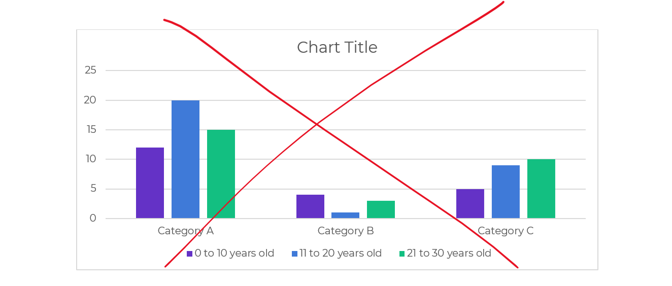
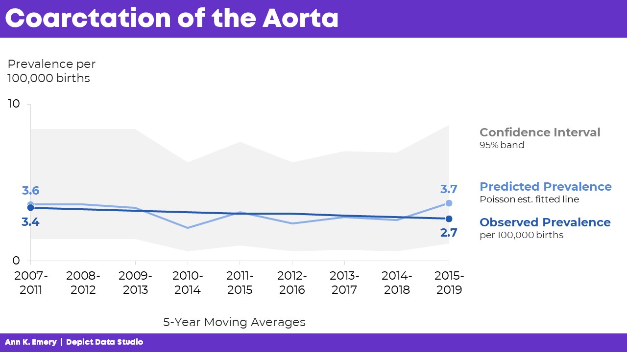
Here’s what one of the health department’s original graphs looked like.

We wanted to make a presentation-ready version.

If you work in public health, then you know that the tiny text and statistical terminology is pretty common in scientific graphs. (BUT IT DOESN’T HAVE TO BE!!!)
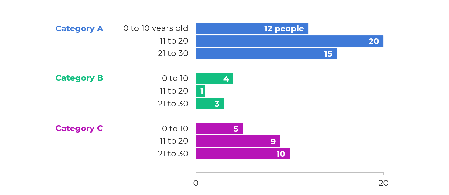
After

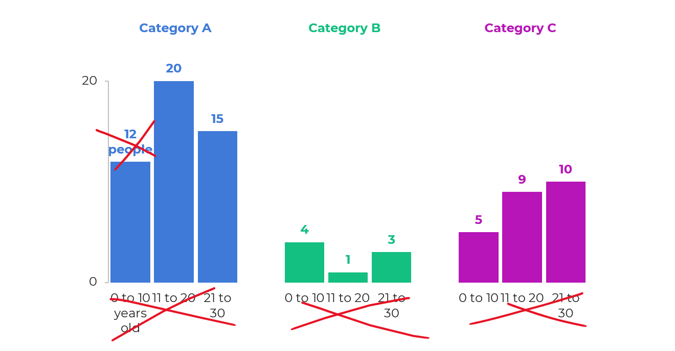
We don’t need a complete overhaul.

I made some very light edits to the existing graph:

  • Direct labels (instead of legends) ensure that the graph is “Big A” Accessible (a.k.a. 508/ADA compliant).
  • Horizontal text (instead of vertical text) is faster to read.
  • I removed the grid lines.
  • I enlarged the font (the body font is size 18, which is my bare-minimum font size for presentation slides).

Storyboarding for a Live Presentation

Now that we’ve tackled the quick edits, we’re ready to adjust the graph for a presentation.

We’ve already done the hardest part: Getting the “final” slide ready.

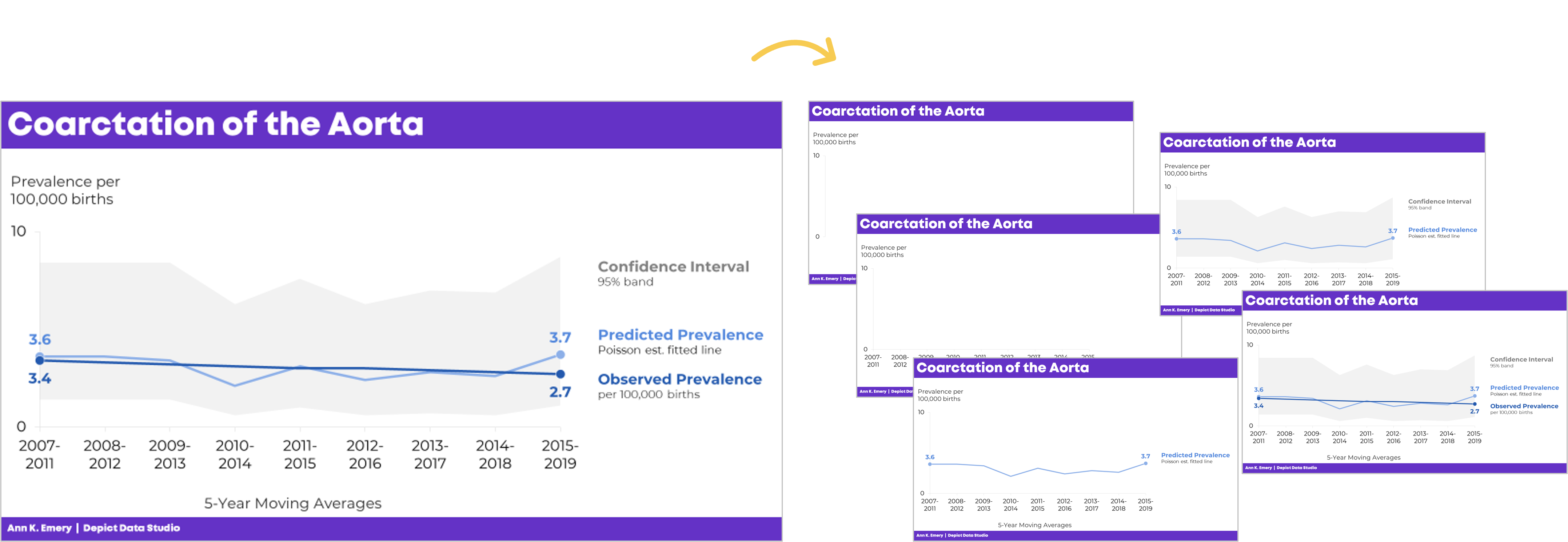
Now, with a few more minutes of planning time, we’ll create the “build-up” slides, like this:

What the Presentation Will Look & Sound Like

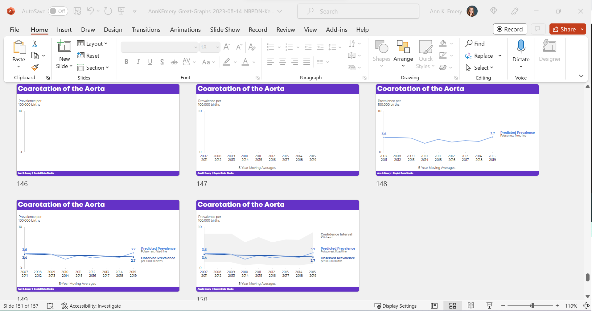
For statistical graphs, I often begin by explaining the axes.

I’d show the y-axis, and say, “Next, let’s talk about coarctation of the aorta. We’re going to look at the prevalence per 100,000 births.”

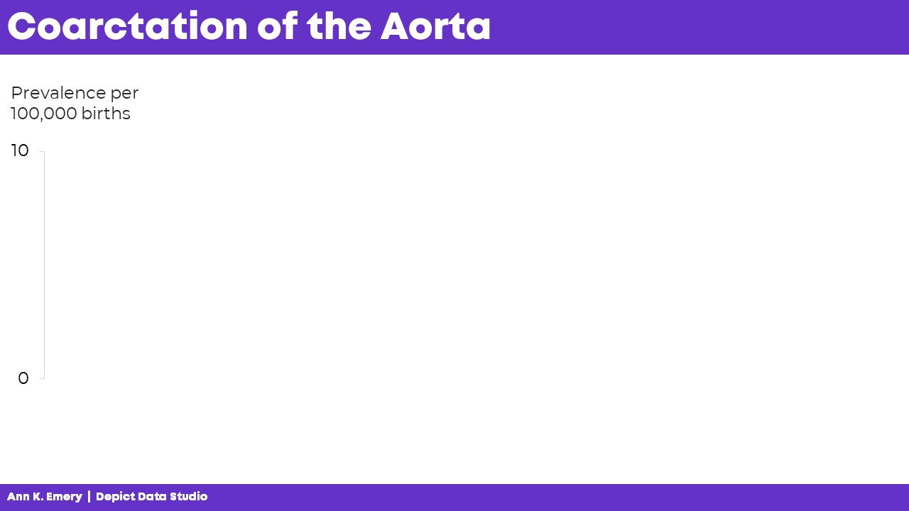
I’d click, move to the next slide, and say, “…and we’re looking at data from 2007 through 2019. The numbers vary a lot each year, so we’re looking at 5-year moving averages in this graph. The moving averages are going to help us focus on the bigger picture.”

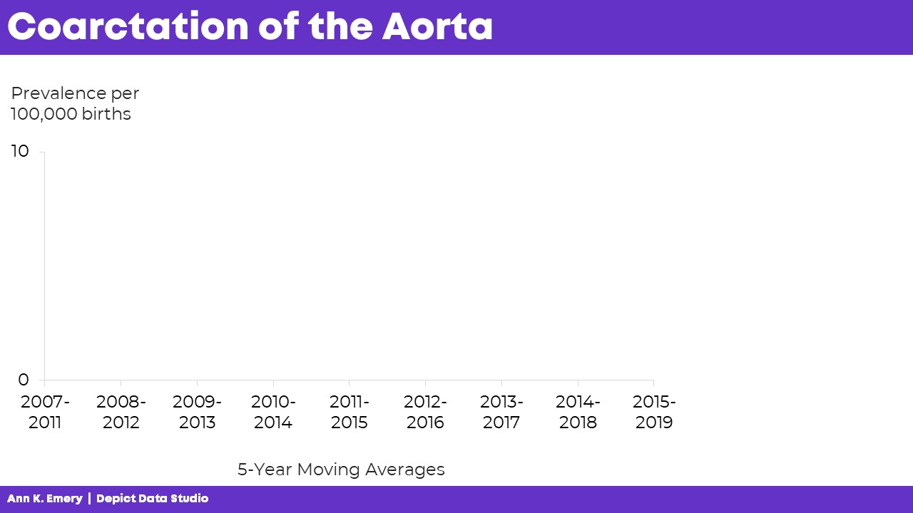
“Here’s what we predicted would happen. You can see some slight variations over time, but we generally estimated that there would be 3.6 to 3.7 cases of coarctation of the aorta per 100,000 births.”

“Here’s what actually happened. There were slightly fewer cases of coarctation of the aorta than what we predicted. And the numbers are actually going down slightly over time.”

Finally, I’d click, move to the next slide, and say, “Here’s the confidence interval with a 95% band.”

The graph is explained piecemeal, RATHER THAN SHOWING EVERYTHING ALL AT ONCE.

If we show everything all at once, then my audience would be looking at one thing while I’m talking about something completely different. That’s Death by PowerPoint.

The Bottom Line

We don’t have to delete or dumb-down our statistical graphs.

We just have to explain them piecemeal.

It’s counterintuitive, but sometimes we need more slides — one slide per sentence or two of speaking points.

We’re not talking for longer, or running over time.

We’re not talking faster, or slurring our speech.

We’re simply clicking through our slides one at a time to match our speaking points.

A few more minutes of planning time on our end… to make sure our audience can follow our dense graphs. A necessary trade-off.

Learn More

Browse more examples of storyboarding in these blog posts.

You’ll also practice this technique inside Powerful Presentations.

Written by cplysy · Categorized: depictdatastudio

Oct 30 2023

Cartoon Infographic: Inside Big Bird

Comics can really make great infographics. Today’s inspiration was found in the book, Imagination Illustrated: The Jim Henson Journal.

About the Infographic

This is a comic drawn by Caroll Spinney, the performer of Big Bird, as a holiday greeting to his friends. It’s well drawn but also provides a good deal of information.

Here are my favorite parts.

Mixing Fonts and Grid Construction

It’s a comic without frames, but there is definitely some order built in. There are two main columns that break into 4 as you go down the page. It’s not super precise, but as a cartoon it really doesn’t have to be precise.

The mixing of font sizes is purposeful, with narrative and caption based sizes being just a little different. The whole thing feels really well paced.

Inside Big Bird

So there it is, in a single sketch, how big bird was performed. I love how the cartoon doesn’t provide a lot of detail on the human inside, just a dashed outline to show the person with his arm in the air.

There are descriptive annotations, “the head is held as high over my head as I can manage.” But there are also commentary pieces, “Yes, my arm feels like it might ache right off, but that’s part of puppetry tiddletypom!”

There is more detail on the tiny TV monitor and microphone that aid the performance. This is how Big Bird can interact with others.

Under Oscar the Grouch

I love how he pairs the behind the scenes of Oscar right next to Big Bird. You can see how another TV is used behind the scenes, and how his performance of Oscar relates to Big Bird.

“Doing Oscar is fun because he’s just the opposite of Big Bird in personality. I get to let out lots of hostilities.”

As for the drawing itself, Caroll Spinney depicts himself performing Oscar but shows that he’s still wearing his Big Bird legs. All of the puppeteers behind muppets play multiple roles, and this just illustrates that well.

The Anything Muppets

“Here is a group of puppets that can become almost anything! The possibilities are endless.”

Do you ever wonder how they can make so many different types of muppets? Well, this certainly gives you a behind the scene view. In addition to the description we are shown the transformation.

It starts with three base puppet forms. Then we see these puppet forms dressed as characters. Finally, we see these same three puppet forms dressed as entirely different kinds of characters. The transformation quickly illustrates the description.

Bonus: Jim Henson’s design for Big Bird.

This is Jim Henson’s concept sketch.

It’s simple. But it gives enough detail to communicate how the costume should be created and how it would be performed.

Want to check out the book?

I love looking at behind the scenes journals, sketches, and other materials that show the work of creatives. If you do too, definitely find a copy of the book somewhere.

As with most things, you can find the book on Amazon.

Want to dive in deeper?

Here is a conversation with the author Karen Falk.

Written by cplysy · Categorized: freshspectrum

Oct 27 2023

Conflict in Israel & Gaza by the numbers

What happened in Israel on October 7, 2023 was an inexcusable terror attack, as is the current hostage situation. What is currently happening in Gaza is a humanitarian crisis, or rather, a continuation/escalation of a humanitarian crisis.

Both things can be true.

The numbers I share in today’s blog post were pulled from UNRWA situation reports.

How big is the Gaza Strip.

How many internally displaced persons?

What is the population density of the Gaza Strip?

How many people have died in Gaza and Israel since October 7?

The people of Gaza were in bad shape before all of this.

How many UNRWA staff members have been killed in the last couple of weeks?

Just so we are clear.

I am for the most part a pacifist.

The Hamas attack on October 7 was horrendous.

But I don’t see how Israel’s actions, supported by the U.S. government and U.S. tax dollars, will improve anything. I don’t see how any of this doesn’t just lead to more death, destruction, and increased poverty. I don’t see how any of this makes anyone safer, anywhere.

Written by cplysy · Categorized: freshspectrum

Oct 23 2023

How to Visualize Small n’s with Icon Arrays

I was recently working with an online course student to visualize data for her country’s government officials.

These aren’t her real categories or real numbers, but you get the idea.

Before: Reading Numbers

Her “before” version looked something like this:

She had small n’s — a unique situation!

My definition of a “small” number is less than 100 — an arbitrary cut-off point that I learned from a past supervisor, and I’ve stuck with for years.

Not only was the total under 100, but each of the cells was under 100, too.

After: Skimming Visuals

There are several ways to bring the table to life.

During a 1:1 consultation, we talked through a few ideas together.

Idea 1: Heat Table

This easy visual — made via Excel’s Conditional Formatting — would be a great addition to the appendix.

If you’re familiar with the 30-3-1 approach to reporting, then you know I put allllll the tables in the appendix.

In other words, I aim for zero or few tables within the body of the report. The report’s body should focus on key findings with graphs, not dilute the data with eeeeeeverything in a table.

Idea 2: Clustered Columns

This is Ann K. Emery’s least favorite chart of all time. I’ll never let any of my students use one of these bad graphs!!!!

It’s the default option — we simply highlight the summary table in Excel, and insert a chart — and we get this lazy chart.

There’s too much going on, so it doesn’t tell us anything.

The color-coding by category is off.

There’s a separate legend, which is an accessibility no-no.

Idea 3: Small Multiples Histograms

With a re-orientation and re-coloring, it’s easy to build small multiples histograms.

But, the vertical columns didn’t fit her portrait Word doc:

The the horizontal bars would be totally fine.

My only hesitation was that bar charts are… boring.

I’ll never let my students have only bar charts in their reports, slides, dashboards, or infographics. Our viewers deserve variety.

Plus, this was a unique small n situation. Let’s capitalize on that!

Idea 4: Icon Arrays

To bring the small n to life, we tried an icon array.

The student liked this option because:

  • It’s very, very, very fast to create — much faster than creating and formatting a chart.
  • It was similar to her original table — the same rows and columns.
  • Right away, she could see how much bigger Category A was than the other categories.

Yes, I realize the irony…

I just wrote a blog post asking you to humanize your data with realistic people icons, which would be a step above shapes like circles and squares.

We tried realistic people icons, too.

They look fine close-up.

But they simply didn’t fit. In other words, there would have to be fewer icons, and/or they’d have to be much larger, to even be legible.

They just look like chicken scratch, sigh.

Behind the Scenes

I’ve written and spoken about symbol fonts a million times.

Webdings, StateFace, and WeePeople are personal favorites.

Yep, these are simply Webdings n’s!

Never, ever add a bajillion individual circles to your Word doc or PowerPoint slide. What a waste of our own time. Just use symbol fonts.

Made Within Minutes

Can you type n’s into your table?

And change the font into Webdings?

Even if you’re the slowest typer in the world… I promise it won’t take long to type some n’s.

Then, simply adjust the font colors, so that you’re using one brand color per category.

Bonus: Download the Materials

Want to see the Excel file and Word doc used in the blog post? Download them here.

Written by cplysy · Categorized: depictdatastudio

Oct 11 2023

Halloween Evaluation Comics 2023

Time for yet another halloween evaluation comic post. Which is your favorite? Let me know in the comments.

Scope Creep

This one inspired by Kasey Valente.

Halloween comic idea- something to do with “scope creep”…. I was writing about scope creep this week and kept visualising creep as a halloween monster of sorts.

Whatever you do, don’t fall asleep.

You kind of need to know a little about Nightmare on Elm Street for this one to make sense. That guy totally gave me nightmares as a kid.

Evaluator Scary Stories.

I almost added a kid saying, “dad, that’s not scary,” to this one. Still not sure I made the right decision leaving it out, but just felt too busy with it in.

Ghosting Participants

Not sure I needed the whole haunted house study thing here. Also, am I giving you too much behind the scenes in my thought process?

Night of the Living Draft

This one inspired by Lisa O’Keeffe.

Re Halloween Cartoons, how about a cartoon highlighting neverending stakeholder feedback and ‘suggestions’ (especially when it is an evaluation report prepared for a government department) and or the head of department/stakeholders in the background steering the findings.

Engaging Stakeholders [From the Archive]

This one is super old from when I first started drawing comics with my first iPad.

Like these? Check out a couple of my old halloween posts.

Here is a post from 2017, it includes one of my all time favorites.

Data Halloween Cartoon Post

Here is my 2020 cartoon post…I was thinking about COVID a lot at the time, but it still has a couple of gems.

Halloween Cartoons 2020 Edition

Written by cplysy · Categorized: freshspectrum

  • « Go to Previous Page
  • Go to page 1
  • Interim pages omitted …
  • Go to page 69
  • Go to page 70
  • Go to page 71
  • Go to page 72
  • Go to page 73
  • Interim pages omitted …
  • Go to page 310
  • Go to Next Page »

Footer

Follow our Work

The easiest way to stay connected to our work is to join our newsletter. You’ll get updates on projects, learn about new events, and hear stories from those evaluators whom the field continues to actively exclude and erase.

Get Updates

Want to take further action or join a pod? Click here to learn more.

Copyright © 2026 · The May 13 Group · Log in

en English
af Afrikaanssq Shqipam አማርኛar العربيةhy Հայերենaz Azərbaycan dilieu Euskarabe Беларуская моваbn বাংলাbs Bosanskibg Българскиca Catalàceb Cebuanony Chichewazh-CN 简体中文zh-TW 繁體中文co Corsuhr Hrvatskics Čeština‎da Dansknl Nederlandsen Englisheo Esperantoet Eestitl Filipinofi Suomifr Françaisfy Fryskgl Galegoka ქართულიde Deutschel Ελληνικάgu ગુજરાતીht Kreyol ayisyenha Harshen Hausahaw Ōlelo Hawaiʻiiw עִבְרִיתhi हिन्दीhmn Hmonghu Magyaris Íslenskaig Igboid Bahasa Indonesiaga Gaeilgeit Italianoja 日本語jw Basa Jawakn ಕನ್ನಡkk Қазақ тіліkm ភាសាខ្មែរko 한국어ku كوردی‎ky Кыргызчаlo ພາສາລາວla Latinlv Latviešu valodalt Lietuvių kalbalb Lëtzebuergeschmk Македонски јазикmg Malagasyms Bahasa Melayuml മലയാളംmt Maltesemi Te Reo Māorimr मराठीmn Монголmy ဗမာစာne नेपालीno Norsk bokmålps پښتوfa فارسیpl Polskipt Portuguêspa ਪੰਜਾਬੀro Românăru Русскийsm Samoangd Gàidhligsr Српски језикst Sesothosn Shonasd سنڌيsi සිංහලsk Slovenčinasl Slovenščinaso Afsoomaalies Españolsu Basa Sundasw Kiswahilisv Svenskatg Тоҷикӣta தமிழ்te తెలుగుth ไทยtr Türkçeuk Українськаur اردوuz O‘zbekchavi Tiếng Việtcy Cymraegxh isiXhosayi יידישyo Yorùbázu Zulu