• Skip to main content
  • Skip to footer
  • Home

The May 13 Group

the next day for evaluation

  • Get Involved
  • Our Work
  • About Us
You are here: Home / Archives for allblogs

allblogs

Sep 29 2023

Data Visualization Design Principles

Written by cplysy · Categorized: connectingevidence

Sep 28 2023

New Template: Telephone Survey Introduction

This article is rated as:


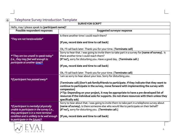
Eval Academy just released a new Template: “Telephone Survey Introduction Template”


 Who’s it for?

This template is for anyone who conducts phone interviews for their evaluation!

Once filled out, it can become a useful reference to guide you through any situation encountered over the phone while reaching out to participants.


What’s the purpose?

This Telephone Survey Introduction Template will help you to:

  • Feel prepared when addressing survey participants over the phone

  • Handle a variety of possible scenarios with professional and ethical conduct


What’s included?

A 6-page fully customizable document that includes:

  • A cover page

  • Table of contents

  • Template description and instructions for use

  • Telephone Survey Introduction Template with a sample script


Download the Telephone Survey Introduction Template now!


Learn more: related articles and links:

You can learn more about collecting data with professional and ethical conduct in the following Eval Academy articles:

  • How to conduct interviews

  • Consent Part 1: What is Informed Consent

  • Consent Part 2: Do I need to get consent? How do I do that?


Other Eval Academy resources that you might be interested in checking out:

  • Focus Group Information Letter and Consent Form Template

  • Standard Interview Guide Template

  • Standard Interview Information Letter Template

  • Standard Interview Consent Form Template

  • Tips for conducting interviews

  • Standard Interview Templates Bundle


What do you think of our new template? Let us know in the comments below!

Written by cplysy · Categorized: evalacademy

Sep 27 2023

Data Visualization Applications: Bar Charts

This article is rated as:


This will be the first installment in our Data Visualization Applications series. Here we will outline how to transform your data into effective data visualizations using our own tried and tested Data Visualization Best Practices. And what better place to start than the simplest, and most effective, data visualization: the bar chart.

For this tutorial, we will look at the all-time highest-scoring NBA players. Feel free to pull more NBA statistics or use your own data to practice the fundamentals behind creating an engaging bar chart.

The following tutorial assumes that your data are both reviewed and cleaned. However, this is rarely the case. If you need help getting your data to a workable state, here are some resources to help:

  • The Data Cleaning Toolbox

  • Let Excel do the Math: Easy tricks to clean and analyze data in Excel

  • A Beginner’s Guide to PivotTables


Initial Chart Selection

  1. Highlight the data will be included in the bar chart.

  2. Navigate to Insert along the top ribbon of Excel.

  3. Within Insert go to Charts > Clustered Bar.

Applying Data Visualization Best Practices

This section will outline the process to transform the initial bar chart into something much more engaging by applying data visualization best practices.


First Impressions

Before editing the bar chart, review the initial bar chart output and ask questions:

a) Are the data ordered properly?

b) Does the data require data labels?

c) Are gridlines beneficial to the overall interpretation of the data?


Simplify

  1. Remove unnecessary gridlines by left clicking on any gridline and hitting Delete.

  • Alternatively, hover over the chart with your mouse until a + (Chart Elements) icon appears in the top right.

  • Within Chart Elements toggle off the Gridlines option to remove the gridlines.

2. Remove the x-axis labels by left clicking on the axis labels and hitting Delete.

  • Again, you can use the Chart Elements menu to remove the x-axis.

  • Under the Axes option, toggle off the Primary Horizontal axes.


Reorder the Data

1.     Left click on the y-axis to highlight.

2.     Next right click on the y-axis and select the Format Axis option.

  • Alternatively, select the y-axis and use the keyboard shortcut Ctrl + 1 to open the Format Axis menu.

3.     The data are presented in ascending order. To switch to descending order, toggle on the Categories in reverse order option.


Add Data Labels

1.     Left click on any bar within the bar chart.

2.    Right click in the highlighted bar and Add Data Labels.

  • Or use the Chart Elements menu to toggle on Data Labels.


Improve the Appearance

Bar Thickness

1.     Left click on any bar within the bar chart.

2.    Right click in the highlighted bar and Format Data Series.

  • This menu can also be accessed using the Ctrl + 1 keyboard shortcut.

3.     Adjust the Gap Width to 35% (or your preferred bar width).

  • Note: A smaller Gap Width results in a wider bar, and vice versa.


Adjust Colours

1.     Apply your colour palette to the bar chart by right clicking on any bar and selecting the Fill option.

  • If all bars are highlighted, colour will be applied to all bars.

  • You can individually select single bars (ensure only one bar is highlighted) and follow the same step to apply colour to a single bar.

2.     Highlight the top three bars using your primary colour (check to see if you have a style guide).

3.     Mute the other bars with a secondary, muted colour.

Using a darker colour to highlight key information will direct the reader’s attention to important detail. By muting other bars, the focus is further drawn to the primary information.


Adjust Fonts

1.     Left click on the chart to highlight the entire bar chart.

2.     In the Home tab, select your Font of choice.

  • Ensure that your chart font is sans serif to the best results.

3.     Fonts can be selected by scrolling through the list of fonts or by typing in the name of the font if you already know the name of the font you will be using.

4.     With the chart still highlighted, adjust the Font Size to 9 pt.

5.     Next, change the Font Color to Black.

  • The default font colour is a dark grey that is not as sharp as crisp, black font. Change the colour for improved readability.


Improve the Chart Title

Excel will pull the column heading as the chart title for your bar chart. However, this title is often uninformative without more context. Instead of keeping a vague chart title, craft something much more informative that describes the data being presented.

1.     Left click on the Chart Title.

2.     Type in the improved title and hit Enter.

  • The chart title will be edited in the function bar above your spreadsheet.

  • Also, by right clicking on the title and selecting Edit Text you can edit the text directly within the chart.


Final Tweaks

1.     Emphasize the chart title by increasing the main point to 14 pt font.

  • The subtitle (if any) can be deemphasized using a slightly smaller font of 12 pt.

  • Note: When drafting the title within the chart itself, you will have to click and highlight the section to which you wish to apply changes.

2.     Further emphasize the title by using your primary colour in the text of the main title.


Final Thoughts

There are myriad ways to present your data. However, using simple, clean data visualizations will greatly improve the impact and effectiveness of your visualizations. The simple bar chart is among the most effective means of presenting data and should not be overlooked.

Written by cplysy · Categorized: evalacademy

Sep 27 2023

Data Visualization Best Practices: A Practical Guide for Getting the Most out of your Data Viz

This article is rated as: 

Data visualization is a powerful means of effectively telling stories with data. Too often the key messages of our data are lost to the confines of some burdensome table or cluttered chart attempting to present too much information. Here I will outline simple processes to transform your data and make your charts more engaging.


Understand Your Data

It is tempting to jump straight into data visualization, but it is important to take a step back and think about why you are visualizing the data. Specifically, you should be clear on the purpose and context for your data visualizations. This is the time to reflect on your evaluation questions and determine how you may best address these questions with your data visualizations. Understanding why you are visualizing the data and how the data reflect your clients’ goals will improve both the clarity and impact of your visualizations.

Much of the understanding of your data may fall within your initial data exploration and analysis. However, it is just as important to question the data and resulting analyses prior to data visualization. Revisiting the data and resulting analyses will refine what should or should not be visualized and hone your decisions on which visuals will best tell the story of the data. Here are a few prompts to get you thinking about your data:

  • Are there any gaps in the data (either missing data files or incomplete data files) that are otherwise critical for addressing the evaluation questions?

  • Do I understand the data received? For example, are column headings clear or do I need clarification (e.g., a data dictionary) to better understand the data?


Chart Selection

While Excel does provide some chart recommendations, these are often far from ideal. It is better to reflect on the data at hand to answer a few questions that will guide you toward an appropriate data visualization. Luckily, we have a data viz decisions tree to help you get started in selecting the correct chart.

However, broadly speaking, many chart decisions for most evaluations can be narrowed by reflecting on the type of data and deciding from a handful of chart types. Despite there being an endless myriad of charts to choose from, data are best presented simply. Stick to the fundamentals and your data visualizations will be more coherent and will better convey your client’s stories.


The above chart selections are but a handful of all the data visualization possibilities. However, each of these charts can be customized to suit your evaluation questions. For example, bar charts can be replaced with lollipop charts and line charts can be replaced with area charts. However, master the basics before adding variation and complexity into your data visualizations.


Building the Foundation for Better Data Visualizations

Just as there are nearly infinite different data visualizations to choose from, so too are there an infinite number of ways to format your data visualizations. That being said, if you focus on building a few foundational data visualizations, with presets that accentuate your data, then your starting point becomes much clearer.


Data Points

Bar Width

Bar and column charts are the bread and butter of data visualization. They are simple in their execution but are unparalleled in their ability to present data effectively. Personally, I find the default bar widths to be too narrow. Broadening the bar widths helps fill out the bar (or column) chart to better accentuate the data.

Adjusting bar widths:

  1. Left click on any bar within your chart.

  2. Right click (or use the keyboard shortcut Ctrl + 1) to Format Data Series.

  3. Adjust the bar width by changing the Gap Width.

  • A smaller percentage increases the bar width, while a larger percentage decreases the bar width.

  • 35% is my preferred bar width for most data visualizations. However, this may vary depending on the number of categories presented.


Line Thickness

A pencil thin line when presenting time series data can be hard to read. Thicken the line and trends will be much more apparent. While the Excel default is not bad (2.25 pt), often a slightly thicker line will be easier to read. This becomes even more useful when presenting multiple lines in a single chart. Thickening the line of interest will make it pop and better emphasize the most important information.

Adjusting line widths:

  1. Left click on the line within your chart.

  2. Select the Fill & Line heading.

  3. Adjust the line width by changing the Width.

  • Between 2.5 – 3.0 pt is my preferred sweet spot for emphasizing key data.


Marker Size (for Line Charts)

Depending on the data, you may opt to include or exclude markers in your line charts. With extensive time series data covering dozens of data points, data markers can become an eyesore. However, with a few select points, the use of markers can help to highlight your data points.

Adding Data Markers:

  1. Left click on the line within your chart.

  2. Select the Fill & Line heading.

  3. Go to the Marker tab at the top of the Format Data Series menu.

  4. Under Marker Options you can select a Built-in option with varying shapes. Although I recommend only using the filled circle if adding in data markers.

Data Marker Tips:

  1. If size permits, a larger data marker will allow for data labels to be centred nicely within the data marker itself. A marker size of 3-5 pts larger than your data label font is typically sufficient.

  2. With longer time series data, you can opt for smaller data marker (5 pt) to highlight each point within the time series.


Colours and Fonts

Colour Palettes

Sometimes we are constrained when it comes to selecting a colour palette. That is, our client may already have colours pre-selected based on their own company colour palette. However, there are items within our control that will make our data visualizations pop. For example, we can use a client’s main colour to emphasize important information. Or we can use a gradient of their main colour to present like information, as in a stacked bar chart.

Colour Palette Tips:

  1. Create your own palette to build a custom set of colours with primary and secondary colours for your data viz.

  2. Darker, more saturated colours draw attention first. Reserve these colours for highlighting the key information in your data visualizations.

  3. Gradients of the primary colour can be useful in presenting like data, such as in stacked bar charts.

  4. Avoid using green and red to exclusively mean good or bad results. It is better to use colour to emphasize the key message rather than focus on an arbitrary distinction of desirable and undesirable results. Undesirable results, if highlighted, can bring attention to areas for improvement.

Creating a Colour Palette:

  1. Left click on the Page Layout tab at the top of Excel.

  2. Under Colors you will be provided with some default Office colour palettes. To create your own custom colour palette, click on Customize Colors… at the bottom of the dropdown menu.

  3. Within Customize Colors… you will be given the option to modify text, accent, and hyperlink theme colors. Simply click on any colour you wish to change. Use More Colors… to get more options for updating your colour palette.

  4. Customizing your colours works well if you have the Hex codes.

  5. Save the colour palette after providing a suitable Name to reference the palette in the future.


A Few Resources for Picking a Colour Palette:

  • Coolors: Import an image or logo to extract colours and colour palettes

  • Microsoft PowerToys: The Color Picker tool within this Microsoft application will allow you to get colour codes from any image on your screen.

Sharing a Colour Palette:

  1. Left click on the Page Layout tab at the top of Excel.

  2. Under Themes located the Save Current Theme… option (ensure that your desired colour palette is already selected).

  3. Save your colour palette on your computer or within a shared team folder.

  4. Simply link or email the colour palette to any other team member that may require the use of the colour palette.


Fonts

Similarly, fonts may be pre-determined by your client or team. However, when it comes to data visualizations, always opt for a sans serif font. Serif fonts will clutter your charts and make smaller data labels more difficult to read, as these fonts use valuable space with your charts.

Font Tips:

  1. Always use sans serif fonts for data visualizations.

  2. Condensed fonts may help free up valuable space within your data visualizations (I have found some success with Franklin Gothic Medium Cond).

While the theme fonts for a project may be preselected, we usually have control over the size of said font. For data visualizations, consistency is the most important aspect when deciding on font sizes. Nothing is more distracting than identical looking charts with varying font sizes.

Font Size Tips:

  1. Titles and headings (should) emphasize the key findings of each data visualization and, thus, should be the largest. Reference your company or client’s style guide if available. If not, fonts of 14 pt size are good for main titles with a slightly smaller font (12 pt) being good for subtitles.

  2. Axis font size only needs to be large enough that they are easily readable. I usually default to a 9 pt font for axis labels.

  3. Similarly, data labels only need to be large enough to read. Like the axis font, I default to a 9 pt font. Although, you can use a large font or bolding to emphasize key values.


Miscellaneous

Gridlines

Often, data points will already be labelled. If so, gridlines are just visual clutter that offer little for the overall comprehension of your visualization; actually, they may even hinder the overall interpretation of a data visualization.

Gridline Tips:

  1. If data points are labelled, scrap the gridlines for a cleaner, more aesthetic looking visual.

  2. If you are presenting many data points, keep the gridlines. Sometimes labelling too many data points clutters the end visual. Drop data labels in favour of gridlines if this is the case.

  3. If including gridlines, adjust the Bounds of the axis to appropriate units. Too many major gridlines and the message will be lost.


Y-Axis Scaling

If possible, always start with a zero baseline on the y-axis. Keeping a consistent baseline will allow for more direct comparison between similar charts, while not overemphasizing otherwise minimal differences between data points.


Additional Tips and Recommendations

  • Remove the clutter. To get the most out of data visualizations, it is best to strip each chart to only what is necessary. Titles can be replaced with your own custom, engaging titles that actually explain what the data show. Gridlines can be dropped if your data bars are already labelled. Clutter is distracting, so focus each data visualization down to the critical pieces of information and highlight them. This will make your data visualizations appear more professional with the added benefit of being interpretable. For more tips on creating better data visualizations, check out our top seven tips.

  • Use chart templates to save time. Formatting charts from scratch is time intensive, so leverage the use of custom chart templates to quickly convert similar charts into the same style. This will maintain consistency across your visuals while saving you precious time.


Wrapping Up

There are many things to consider when building data visualizations. From chart selection to formatting, this guide is designed to narrow the scope of what makes a good data visualization by stripping away the need for overly complex and burdensome data visuals. By focusing on a few basic chart types and fundamental chart formatting tips, you will be able to craft custom and effective data visualizations no matter the data thrown your way.

Written by cplysy · Categorized: evalacademy

Sep 27 2023

Report Study – Map the Meal Gap 2023

In this series of blog posts I will share examples of professionally designed modern reports. For each report I’ll also write out a list of things to notice. My goal is not to critique but to show you real life examples of design concepts to help you become a better report designer.

Today let’s take a look at Feeding America’s Map the Meal Gap 2023.

This report is a good example of a modern layered approach. Meaning it’s more of a report bundle than a stand alone document. For this study let’s view the report holistically and not to spend too much time focusing on any one specific element.

To get the most out of this post I suggest opening the report in another browser tab so you can bounce and forth as your read this post.

1. The report is anchored by a dashboard style interactive map.

The interactive map is “deep” not “wide.” Meaning there are only a handful of variables (food insecurity rate, SNAP eligibility, average meal cost, population, money required to meet food needs) but you can filter the map to show different localities, demographic groups, and across different years. The presentation style won’t change, only the data. But there is a ton to explore.

2. Check out the four tab Q&A below the map.

“Everyone is Overwhelmed.” I say this a lot when teaching workshops and writing on this blog, but it’s true. As a report designer you need to find ways to layer information so it doesn’t overwhelm the reader. The initial landing page for this report doesn’t look too intimidating, outside of the interactive map there is only so much content showing and just a few links. But in order to pack in more information they used a simple tabbed box at the bottom of the page that features answers to four essential questions.

3. What else is included in the reporting bundle?

Let’s list out all of the elements that were created when sharing this report. Elements that then become part of the reporting process and contain additional information for interested readers.

  • The Interactive Map
  • The “Map the Meal Gap 2023” visual PDF report.
  • The “Map the Meal Gap 2023” PDF technical brief.
  • The landing page where the Interactive Map is shared.
  • The landing page you end up on when you click the “report” link. Where you will find the “Food Insecurity Report Briefs.”
  • The landing page you end up on when you click the “methodology” link.
  • The landing page you end up on when you click the “data” link.

This list just includes the primary pieces of content that make up the report. It does not include any associated social media, email communications, presentations, or featured images (which likely also exist but were not noticeably linked on these pages).

4. The main downloadable PDF report is visual and easy to read.

This report was clearly designed to reach a broad audience of stakeholders and politicians. Even the decisions to map the data by both county and congressional district hints at how this report was designed to have a policy influence. The pages are not overloaded and it reads more like a magazine or brochure than it does a technical report.

5. The technical brief is text heavy and only includes a few visuals.

The technical brief is not a work of art. It uses a smaller font and includes far fewer visuals. But it serves its purpose.

Not all reports need to be pretty. Spending extra time, effort, or money making a technical report designed for a very small technical audience is wasteful. Simple formatting and basic fonts are really all that is required.

What are your takeaways?

Did you check out the report? Anything interesting catch your eye? If yes, leave a comment and let me know what you noticed.

Written by cplysy · Categorized: freshspectrum

  • « Go to Previous Page
  • Go to page 1
  • Interim pages omitted …
  • Go to page 71
  • Go to page 72
  • Go to page 73
  • Go to page 74
  • Go to page 75
  • Interim pages omitted …
  • Go to page 310
  • Go to Next Page »

Footer

Follow our Work

The easiest way to stay connected to our work is to join our newsletter. You’ll get updates on projects, learn about new events, and hear stories from those evaluators whom the field continues to actively exclude and erase.

Get Updates

Want to take further action or join a pod? Click here to learn more.

Copyright © 2026 · The May 13 Group · Log in

en English
af Afrikaanssq Shqipam አማርኛar العربيةhy Հայերենaz Azərbaycan dilieu Euskarabe Беларуская моваbn বাংলাbs Bosanskibg Българскиca Catalàceb Cebuanony Chichewazh-CN 简体中文zh-TW 繁體中文co Corsuhr Hrvatskics Čeština‎da Dansknl Nederlandsen Englisheo Esperantoet Eestitl Filipinofi Suomifr Françaisfy Fryskgl Galegoka ქართულიde Deutschel Ελληνικάgu ગુજરાતીht Kreyol ayisyenha Harshen Hausahaw Ōlelo Hawaiʻiiw עִבְרִיתhi हिन्दीhmn Hmonghu Magyaris Íslenskaig Igboid Bahasa Indonesiaga Gaeilgeit Italianoja 日本語jw Basa Jawakn ಕನ್ನಡkk Қазақ тіліkm ភាសាខ្មែរko 한국어ku كوردی‎ky Кыргызчаlo ພາສາລາວla Latinlv Latviešu valodalt Lietuvių kalbalb Lëtzebuergeschmk Македонски јазикmg Malagasyms Bahasa Melayuml മലയാളംmt Maltesemi Te Reo Māorimr मराठीmn Монголmy ဗမာစာne नेपालीno Norsk bokmålps پښتوfa فارسیpl Polskipt Portuguêspa ਪੰਜਾਬੀro Românăru Русскийsm Samoangd Gàidhligsr Српски језикst Sesothosn Shonasd سنڌيsi සිංහලsk Slovenčinasl Slovenščinaso Afsoomaalies Españolsu Basa Sundasw Kiswahilisv Svenskatg Тоҷикӣta தமிழ்te తెలుగుth ไทยtr Türkçeuk Українськаur اردوuz O‘zbekchavi Tiếng Việtcy Cymraegxh isiXhosayi יידישyo Yorùbázu Zulu