• Skip to main content
  • Skip to footer
  • Home

The May 13 Group

the next day for evaluation

  • Get Involved
  • Our Work
  • About Us
You are here: Home / Archives for allblogs

allblogs

Nov 28 2023

The Power of Self-Reflection in Evaluation

This article is rated as:

As we approach the end of 2023, it’s more than likely that you’ll find yourself reflecting on the past year. As evaluators, our roles not only involve mastering methodologies and data analysis, but also a profound commitment to self-reflection, a core competency acknowledged by the Canadian Evaluation Society. In my recent presentation at the Canadian Evaluation Society, British Columbia Chapter (CESBC) annual conference, the transformative power of self-reflecting as an evaluator took center stage as I reflected on my journey of moving from an emerging evaluator to a more seasoned one.

This article explores the insights I shared during the CESBC presentation, emphasizing the pivotal role of reflection in the evaluation process.

Understanding Self-Reflection in Evaluation:

As evaluators, our main goal is to evaluate programs and projects, to uncover insights and evidence essential for informed decision-making. Yet, the transition from theoretical understanding (knowing what should be done) to practical implementation (actually doing it) in the field of evaluation frequently includes challenges. My personal experience aligns with this struggle, having embarked on my first-ever evaluation project 6 years ago without the benefit of formal education or training, or even knowing what evaluation is! In this journey (of which I know I’m not alone!) self-reflection emerges as a powerful tool, bridging the gap between theoretical knowledge and effective execution.

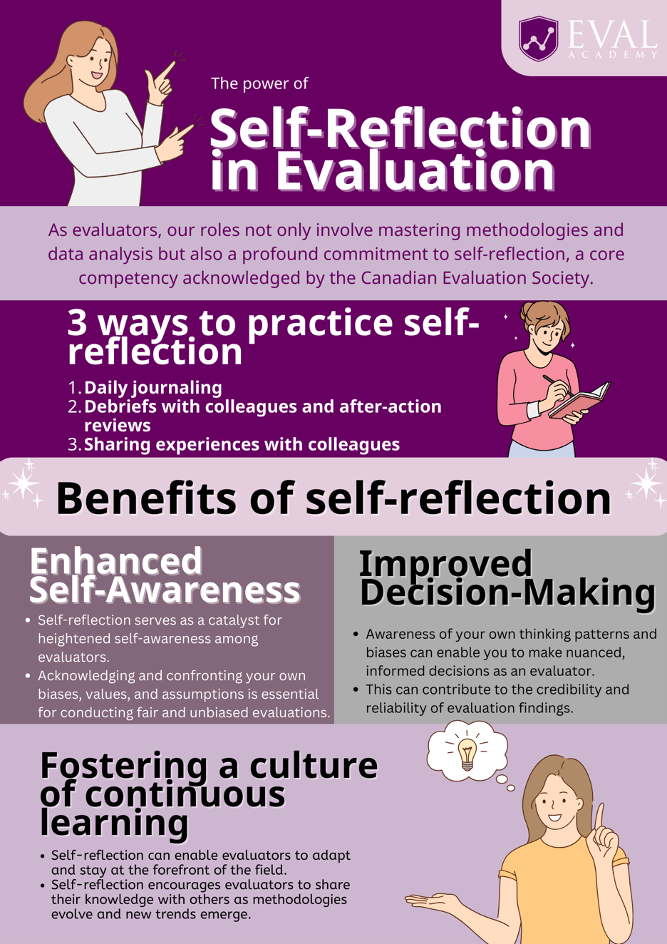
For me, I’ve found that self-reflection can occur in multiple forms in my role as an evaluator. Here are some of the ways that I’ve practiced reflection:


  • Daily journaling to write down what went well for the day, challenges, and ideas to improve my practice. This can provide a tangible record of growth, serving as a valuable resource for future projects.

  • Debriefs with colleagues and practicing after-action review processes at the end of an evaluation.

  • Contributing to Eval Academy by writing articles and creating content focused on lessons learnt from my own practice.

  • Reading the experiences of my colleagues through their contributions to Eval Academy.


Below, I’ve included some of the benefits I’ve witnessed by integrating self-reflection into my practice as an evaluator:

 1. Enhanced Self-Awareness: 

Self-reflection serves as a catalyst for heightened self-awareness among evaluators. Acknowledging and confronting your own biases, values, and assumptions becomes essential for conducting fair and unbiased evaluations. This foundational step lays the groundwork for excellence in evaluation.

 2. Improved Decision-Making:

I’ve found that making time for self-reflection has allowed me to be better equipped to make decisions. Evaluations can be complex processes with multiple partners and competing priorities. Awareness of my own thinking patterns and biases enables me as an evaluator to make nuanced, informed decisions. This, in turn, can contribute to the credibility and reliability of evaluation findings.

 3. Fostering a Culture of Continuous Learning:

As evaluation methodologies evolve and new trends emerge, self-reflection positions evaluators to adapt and stay at the forefront of the field and share their knowledge with others to foster a culture of continuous learning in the field.


My CESBC presentation on the power of self-reflecting as an evaluator is a call to action for evaluators at all career stages. By embracing self-reflection, evaluators can enhance self-awareness, improve decision-making, and contribute to a culture of continuous learning. The journey from theory to action becomes more seamless, ensuring that evaluations not only assess external programs but also turn the evaluative lens inward for a comprehensive and impactful professional journey.


As the field of evaluation continues to evolve, the lessons from my CESBC presentation and platforms like Eval Academy encourage evaluators to embrace self-reflection as an integral part of their professional toolkit, fostering a community that thrives on continuous learning and collective wisdom.

Written by cplysy · Categorized: evalacademy

Nov 27 2023

Qualtrics Automated Reporting – A How-To Guide

This article is rated as:


Regular in-depth analyses are important to provide accurate and meaningful insights and recommendations. However, it can also be useful for clients to be able to view summaries of their data between regular reporting intervals. I recently learned about Qualtrics’ automated reporting feature, and it has been a game changer! With some simple set-up, we’ve been able to create custom reports that automatically update with new responses for our clients to access at the click of a button.

My favourite features:

1. Real time updates: Although it’s always best to collect as many responses as possible to provide insights and recommendations from surveys, it can be useful to have a glimpse into the responses as they come in. Using custom reports in Qualtrics, we can provide clients with a visual summary of the data as it comes in, whether or not they are Qualtrics users themselves!

2. Easy-to-use customizations: The ability to customize reports for your clients is hugely important. Not only does this allow you to personalize the report to match their organization’s brand identity (which can go a long way in how that report is used and shared), it gives you the flexibility to tailor the report to the needs of the client. For example, we may collect data on the date the survey was completed so we can provide insights on how participant satisfaction changed over time in our final report, but this information isn’t relevant to the client who just wants to see the overall satisfaction at any given time. Using this tool, we can pick and choose which data is summarized in charts and tables to give our clients only the information they want, without burdening them with an entire data set.

3. Scheduled sharing: This feature is super useful for clients who want to see updated reports on a regular basis but prefer to receive them via email than by using the link to view the report online. Using Qualtrics, we can set up automated emails containing a report of the most recent survey responses to send to the client’s inbox at regularly scheduled intervals (weekly or monthly). This alleviates the burden of scheduling in time to check results from the client and saves you the trouble of manually emailing updates each week.


How to use Automated Reports:

1. Generating Test Data (recommended)

Once you have your survey developed (even before you’ve started to collect responses!), you can set up the layout and look of your report. While you can make the report without any data, I like to first generate dummy (fake) test responses using Qualtrics’ built in feature so that I can preview what the charts and tables will look like with real responses. To do this, click on the Tools drop-down menu in your survey view, and select ‘Generate Test Responses’:


In the new window, specify how many test responses you want to generate (here I went with 15) then click generate.


After a few seconds, Qualtrics will successfully generate test responses – if your summary looks something like the one below, you know this worked properly. Click ‘Close’.


Important! Don’t forget to delete your dummy data before launching the survey so that the test responses aren’t included in your report.


2. Building the Report

Once you have some test data to work with, navigate over to the ‘Reports’ tab at the top of your survey view.


If you haven’t used the reports tab before for the project you are working in, you will see the following screen – click ‘Create Report’ to start preparing your first report.


Give your report a name (you can always change this later!), choose the page size and orientation to your preferences, and click ‘Create’.


You will now have a blank report draft that is fully empty, with a button to insert a new section. Click ‘Insert’ to choose what you’d like to insert into your report. You’ll have some options to insert survey data, data from other projects, or design aspects like images and page dividers. In this article I will show you the basics of adding in data visualizations, but feel free to play around with these options as needed for your own report.  


3. Adding Visualizations for Survey Data to your Report

There are two ways to add visualizations to your report.

a. Click ‘Insert’, then ‘Questions’, and choose the question that you want to display data from. Qualtrics will automatically choose a graph style for your data, but you can change this to best fit your data type.


OR

b. Click ‘Insert’, then ‘Visualizations’, and choose the type of graph or table that you’d like to display in your report. In the pane that opens to the right, select the question that you want to pull data from by clicking ‘Add Metric’, then clicking ‘Select a field’ and choosing the question from the drop-down menu.  


Tip: check out our Data Visualization Decision Tree here if you’re not sure how to best display your data!

If the settings pane is not already open, click on the graph to open it up.  This pane contains options for your data viz, allowing you to change the metric you’d like to display, add filters, and change how the graph is displayed to suit your preferences.

You can also double-click into the chart title to rename it.


4. Breaking Out Responses (optional)

The last customization we’ll touch on in this article is the Breakout option: this allows you to split out the report data by some variable within your survey. In this case, I will split out satisfaction data by the program sessions respondents attended.

Click ‘Insert’ to insert another report aspect and follow the instructions in Step 3 to insert a graph. To breakout the bar chart based on participants’ responses to another survey question (in this case, which group of sessions they attended), click the drop-down menu under Breakout, and choose the question containing the data you want to group by.


This will visually separate out the responses in your graph.


Adjust the Settings and Style options in the right panel until your graph fits your preferences.


5. Customizing the Report using Images, Page Dividers, and Sections

To add visual interest and improve the flow of your report, you may choose to add images, text boxes, dividers, or page breaks by clicking ‘Insert’ and following the appropriate steps below.

a. Images

Select ‘Image’ from the ‘Insert’ menu. If you are using an image from the web, simply copy and paste the image URL into the ‘Image URL’ field in the settings pane. To add an image saved to your device, click the button just beside the Image URL field to open up your Qualtrics Graphics Libraries browser. In the Graphic Libraries browser, click ‘Upload Image’ and select the image from your files to upload it to Qualtrics.

You can then drag the corners of the blue box around your image to resize it or move the image to a different place in your report by clicking on the image itself and dragging it to where you’d like it.


b. Text Boxes

Choose ‘Text’, then ‘Text Area’ from the ‘Insert’ drop-down menu. Double click into the text box to change the contents, and to format the text to your preferences using the Text Formatting options at the top of your screen.


c. Dividers

Choose ‘Divider’ from the ‘Insert’ menu to insert a horizontal bar that helps to visually separate sections of your report. You can customize the colour, orientation, and width of the bar in the Settings pane to the right to match your needs and preferences.

d. Page Breaks

Choose ‘Page Break’ from the ‘Insert’ drop-down menu to jump to the next page of your report. This option will tell Qualtrics to place any new visualizations or report aspects onto a new page, which can be helpful in improving the flow of multi-page reports. To remove a page break, simply hover your mouse over the ‘Page Break’ indicator and click the ‘x’ that appears next to it.


Insert as many visualizations and customized aspects as you need for your report! If you’re having trouble getting started, check out our Qualtrics Report Template available for download as a .qrf file!

Preview the report template here, or download the template here.


6. Sharing Your Report

There are a few ways you can share your report with colleagues, clients, and the public.

a. PDF

To download and share your report as a static PDF (i.e., this PDF will not change as new data is received), in your report view select ‘Share’ and choose ‘Download PDF’ from the dropdown menu. Save this file to a location on your device, and share the PDF as you would any other file type (e.g., by email).


b. Live Link

Alternatively, you can share a live version of your report (meaning that this report will change to reflect newly received data), select ‘Share’ when viewing your report, then select ‘Manage Public Report…’.


Click the checkbox so that ‘Public Report Available’ is enabled, then click ‘Save’ to generate a unique link to your report. Next, click ‘Copy’ beside the field where the link appeared. You can now paste this link into your URL bar, or paste it in an accessible location for your audience (e.g., in an email to your colleagues and/or clients, on your website for the public, etc[BL4] .). I like to tell clients to save this link as a bookmark or in an easy-to-access document so they can view the report at any time.


Require a password to view the live link (optional): You may choose to password protect your live link by checking the box next to ‘Passcode Protection’ and choosing a passcode to share with your target audience members. Click ‘Save’ to enable changes.


c. By Email

To set up one-time or regularly occurring emails containing updated report versions as a PDF, select ‘Schedule Email…’ from the drop-down ‘Share’ menu when viewing your report.


Create a new email by clicking ‘New Email’. Fill out the ‘Your Name’, ‘Subject’, and ‘Message’ to send as a one-time email, or to schedule recurring emails with updated reports.

To send a one-time email: After filling out the fields noted in the previous step, click ‘Send Email Now’.


Enter the email address(es) of your intended recipient(s) into the field in the pop-up window, then click ‘Send’. You will receive a pop-up message letting you know that your email is being sent and should be received within a few minutes. Click ‘Close’ on the pop-up window, and ‘Close’ in the ‘Schedule Email’ window.


To schedule a recurring email: Specify your recipients’ email addresses in the ‘To’ field. Then use the drop-down ‘When’ menu to specify how frequently and on what date and time the emails should be sent, then click ‘Create’.


This will save your scheduled email draft and automatically send it to the recipient list specified in the ‘To’ field on the date and time specified in the ‘When’ fields. Click ‘Update’ to ensure your changes have saved, and then ‘Close’.


REMEMBER! Don’t forget to delete your dummy data before launching the survey so that the test responses aren’t included in your report.


There you have it! A report generated within Qualtrics that can automatically update based on newly received data that can be sent to clients, colleagues, or the public automatically from within the Qualtrics platform.

Written by cplysy · Categorized: evalacademy

Nov 15 2023

One Page Dissemination Plan

Dissemination should be easy.

It’s just sharing our findings and ideas with people who we think might be interested. If it’s hard, it’s because we make it hard.

Let’s make it easy instead.

The One Page Dissemination Plan

At the bottom of this post you’ll find both a link to a Canva template and fillable PDF. It’s landscape, 8.5 in by 11 in.

How to use the plan.

In short, you break your different audiences into three groups. Then for each audience group, you ask who is in the audience, decide what product you will create to reach them, and then jot down how you will share that product.

This is a content strategy plan.

What does that mean? It means that you adapt your work into different pieces of content with the intention of reaching different audiences or communicating through different channels.

You can think of it as report diversification. A printable executive summary might be great for the next board meeting. But it would not make sense to share that PDF executive summary on LinkedIn. It would make far more sense to adapt that summary into a social media carousel.

Adaptation creates more opportunities to share, without diluting or distorting original work designed to be more technical.

This should NOT include your technical report.

I suggest treating your technical report as the product of your evaluation. It documents your methods, defends your decisions, and delivers your analysis.

While a technical report is often a key source in support of your dissemination efforts, it is a mistake to treat the technical report as if it’s easy to share content. It’s probably not. And honestly, it’s also not worth the time it takes to make it easy to share content.

The three audience approach.

Perhaps you’ve gone through the step of thinking through your reporting audiences. And if you’re like many evaluators and researchers, you might even have a list of audiences.

The audiences might include your boss, your boss’ boss, a non-profit board, program managers, program staff, participants, clients, politicians, funders, etc.

It’s hard to design for a list. It’s also overwhelming and time-intensive to design reports for each audience individually. So I suggest splitting your audience into three.

Who is in your Core Audience?

These are the people who would feel compelled to read your report even if it were ugly, long, and boring.

It’s a small group. It likely includes your boss or your client. It might include a few other highly involved stakeholders or board members.

Designing for this group is about making the technical more approachable. Normal reporting content like executive summaries, one-pagers, and presentations usually work just fine.

How will you share the work? Probably through an email from your personal account. Or maybe through a Zoom meeting or an actual in-person get together.

Who is in your Primary Audience?

I like to think of your primary audience being the people who could get the most value from you sharing your work. This might include program managers, project staff, politicians, and funders. Compared to the core audience, they will not be compelled to read your report.

Designing for this group is about making the technical report more relevant and accessible. All audiences are overwhelmed right now so you need to make the reporting as easy to access as possible.

Some of the reporting content that works particularly well for this audience includes visual reports, case studies, slidedocs, blog posts, infographics, video, interactives, html reports, and webinars.

You may have direct emails (if you do, use them). If you don’t have their emails you’ll have to use social media, search-friendly content, and referrals. By referrals I mean gaining access to spaces where the target audience already has a relationship. For instance, a partner organization that already sends a newsletter to the people you want to reach.

Who is in your Secondary Audience?

I like to think of your secondary audience as being people who may have an interest in your work, but it’s not necessarily clear-cut. Or they may have an interest in just a very specific aspect of your work.

These are your “general public” audiences but could also include program participants, families, and academic colleagues.

You likely do NOT have a direct path to reach this audience. Reaching these audiences means leveraging social media, search-friendly content, and referrals. Small infographics, short videos, and targeted social media can help your work travel to these secondary audiences.

3 Audiences, 3 Questions, and 9 individual blocks.

You can access the Canva template below (just make sure to sign up for Canva/sign into your Canva account first). You can fill it in online or print it out. It’s also simple enough to just draw the grid on a whiteboard or piece of paper.

Or, if you prefer a fillable PDF, here you go!

One-Page-Dissemination-Plan-FillableDownload

Good luck. And if you use it or plan to use it, let me know.

Written by cplysy · Categorized: freshspectrum

Nov 07 2023

3 Common Report Mistakes that Waste Data

Have you ever heard of the last mile problem?

It’s a concept that gets talked about a lot in discussions about supply chains and transportation services. But I also believe it applies to evaluation.

The general idea is that the last leg of a journey is the most complex. For instance, in areas with good transportation networks, it could be pretty easy to get a person from a city center by subway to an area nearish their home. But getting them that last mile (from the station to their home) is the most complicated, and often the most expensive, part.

The biggest challenge I see in evaluation and research is that we do tons of work to get our evidence close to our audience. But instead of dealing with the complex last mile problem, we just give up and move on to the next problem.

It’s a waste of data.

And it’s that waste that has driven my career for more than the last decade.

But let’s break down the last mile problem a bit further. Here are three reporting mistakes that I see over and over and over again. They are mistakes that stop our data and evidence from reaching our intended audience. Each of these problems CAN be fixed.

Mistake #1 – The Single Report Problem.

Here is the mistake.

The evaluation team completes their evaluation and delivers a comprehensive technical report to their client. The assumption then is that the client will be able to process the findings and then further distribute these findings.

What happens is that the handful of people who feel obligated to read the report will do so. Whether they act on any findings or recommendations depends on their ability to process the information shared and their motivation to share it forward.

Sharing it forward is the last mile. It requires adapting the materials to meet the needs of various audiences and communication channels. It takes work and a person who has the ability to translate the knowledge from the technical report to meet the needs of these different audiences.

The people in the best position to do the translation are on the evaluation or research team. But by the time it comes to share these findings, many have already moved on.

My Solution: Every technical report should be adapted into a collection of digital assets that facilitate sharing data forward. This is a step that should take place after the technical report is complete (or while it is being written).

Mistake #2 – The Unintentional Gatekeeper

This happened to me pretty early in my career.

I had a high level of access to different data warehouses and datasets. But the folks working at program sites, who could potentially use this data, did not have the same level of access. And most did not have the same level of experience working with raw datasets.

This happens a lot. Potentially useful data is not shared with broader audiences. And not because there are unsolvable PII issues (Personally Identifiable Information for those not in the know). The reason is that it’s just in the wrong format and stored in the wrong place.

My Solution: Transform datasets and tables into simple dashboards. Not the kind that mimics car dashboards, but the type that sets up larger data sets for stakeholder exploration.

Mistake #3 – The PDF Problem

It’s time we move on from exclusively sharing our work through PDF.

Over half of web traffic is mobile these days. PDFs are not mobile responsive.

Google highly prefers HTML web pages to PDFs and will always prioritize non-PDFs in search results. In practice this means that a less useful resource could easily show up higher in search results merely because the alternative was only shared through PDF (the one you created).

PDFs are not auto-translatable. HTML web pages are, and will automatically be translated into over 100 languages just through the use of a modern web browser.

While PDFs have “accessibility features,” a simple HTML website is far easier to make accessible for a wide range of audiences with disabilities.

In other words, PDFs limit access.

My Solution: Adapt the PDF technical report or resource into HTML. I use WordPress.

Refer my services, PLEASE!

I’ll be honest. A big multi-year consulting project of mine ended in September.

So, I could really use some new clients to keep my business afloat.

The vast majority of my clients are either direct referrals from the researchers and evaluators who follow my work (I’m talking about people like YOU) or repeat customers.

The post above outlines the key problems I solve and the specific services I pitch. In shorthand, I create infographics, dashboards, and interactive reports for evaluators and researchers.

If you know anyone working on a report who might be able to use my services, could you send them my way?

https://freshspectrum.com/consulting

Written by cplysy · Categorized: freshspectrum

Nov 06 2023

Measure Collaboration: Woodland’s Framework

Written by cplysy · Categorized: connectingevidence

  • « Go to Previous Page
  • Go to page 1
  • Interim pages omitted …
  • Go to page 67
  • Go to page 68
  • Go to page 69
  • Go to page 70
  • Go to page 71
  • Interim pages omitted …
  • Go to page 310
  • Go to Next Page »

Footer

Follow our Work

The easiest way to stay connected to our work is to join our newsletter. You’ll get updates on projects, learn about new events, and hear stories from those evaluators whom the field continues to actively exclude and erase.

Get Updates

Want to take further action or join a pod? Click here to learn more.

Copyright © 2026 · The May 13 Group · Log in

en English
af Afrikaanssq Shqipam አማርኛar العربيةhy Հայերենaz Azərbaycan dilieu Euskarabe Беларуская моваbn বাংলাbs Bosanskibg Българскиca Catalàceb Cebuanony Chichewazh-CN 简体中文zh-TW 繁體中文co Corsuhr Hrvatskics Čeština‎da Dansknl Nederlandsen Englisheo Esperantoet Eestitl Filipinofi Suomifr Françaisfy Fryskgl Galegoka ქართულიde Deutschel Ελληνικάgu ગુજરાતીht Kreyol ayisyenha Harshen Hausahaw Ōlelo Hawaiʻiiw עִבְרִיתhi हिन्दीhmn Hmonghu Magyaris Íslenskaig Igboid Bahasa Indonesiaga Gaeilgeit Italianoja 日本語jw Basa Jawakn ಕನ್ನಡkk Қазақ тіліkm ភាសាខ្មែរko 한국어ku كوردی‎ky Кыргызчаlo ພາສາລາວla Latinlv Latviešu valodalt Lietuvių kalbalb Lëtzebuergeschmk Македонски јазикmg Malagasyms Bahasa Melayuml മലയാളംmt Maltesemi Te Reo Māorimr मराठीmn Монголmy ဗမာစာne नेपालीno Norsk bokmålps پښتوfa فارسیpl Polskipt Portuguêspa ਪੰਜਾਬੀro Românăru Русскийsm Samoangd Gàidhligsr Српски језикst Sesothosn Shonasd سنڌيsi සිංහලsk Slovenčinasl Slovenščinaso Afsoomaalies Españolsu Basa Sundasw Kiswahilisv Svenskatg Тоҷикӣta தமிழ்te తెలుగుth ไทยtr Türkçeuk Українськаur اردوuz O‘zbekchavi Tiếng Việtcy Cymraegxh isiXhosayi יידישyo Yorùbázu Zulu