• Skip to main content
  • Skip to footer
  • Home

The May 13 Group

the next day for evaluation

  • Get Involved
  • Our Work
  • About Us
You are here: Home / Archives for allblogs / rka

rka

May 17 2021

Improving Our Museum Labels Through A Harm Reduction Lens: Part 4

By: Rachel Nicholson

Having drafted new labels, we want to ensure our approach is actually meaningful to our audiences at the Nelson-Atkins before putting them on the walls. We’re currently in the process of evaluating our new labels to better understand their impact on visitors.

Our approach for label evaluations is usually to do random visitor interception. While the museum is open, Covid-19 makes this challenging because of socially distancing and wanting to ensure visitors feel safe and comfortable. We also wanted to focus on speaking to people from groups that may have experienced harm or could potentially experience harm in our galleries. This meant a more targeted approach to visitor evaluation.

Drawing from the strong partnerships that our Community and Public Programs and School and Educator Programs teams have developed, we reached out to community partners who have been involved with the museum in various ways including teachers involved with Race Project KC and artists involved with creating the Black Lives Matters murals throughout Kansas City. Each person we spoke to was a visitor to the Nelson-Atkins, meaning they had visited in the last year, and was over eighteen.

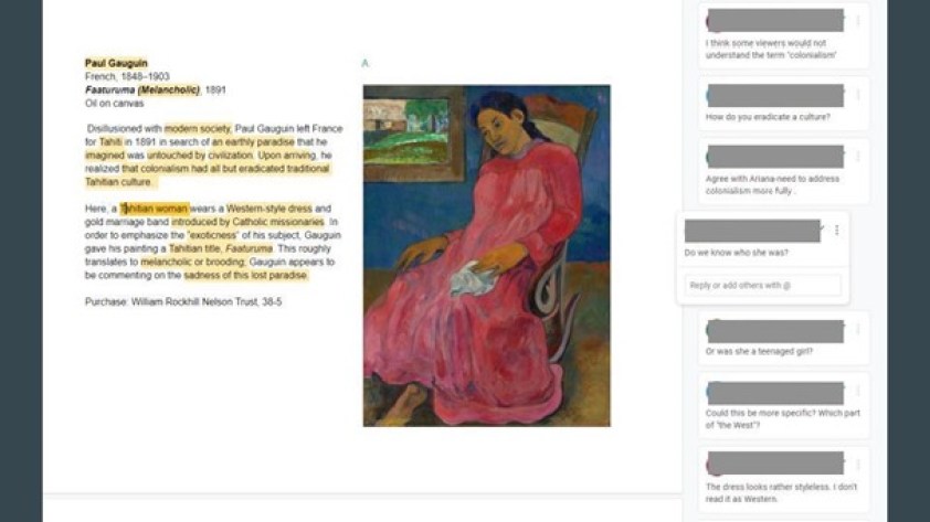
Alyssa Carr, our Evaluator on the team, and Jocelyn Edens developed the protocol for label evaluation. With the help of the museum’s graphic design department, they created new versions of the labels and placed them over the old labels, asking people to read and then reflect on the new version in the gallery. Questions included “What did the label make you think about? What are your reactions to the label? This can be about the objects or the gallery as a whole.” We began with the new label because we were most interested in people’s reactions to the stories shared and language used, apart from whether or not the new just felt like an improvement over the old. Of course, this comparison was important for us to understand if our approach was working to reduce harm and so after discussing the new label, Alyssa and Jocelyn removed the new version to reveal the old one. Here, questions were a bit more specific including “Did any specific words stand out to you in the labels? Do your feelings about the object change from reading one label versus the other?”

What are we learning so far?

For this first round of evaluation, we focused on six objects across the collection areas. Overwhelmingly, visitors reported that they preferred the newer labels (phew!).

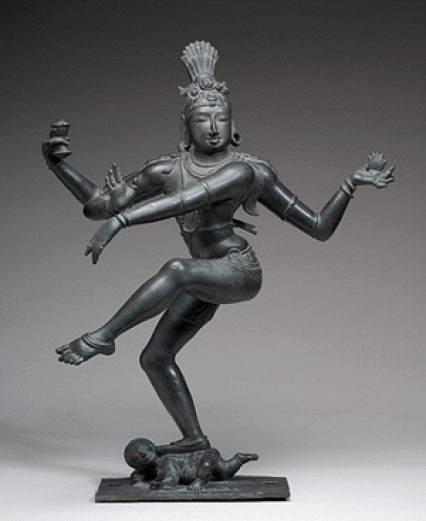
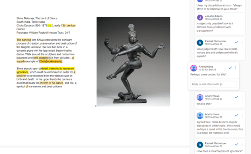
In our last post Ariana Chaivaranon shared how she and curatorial colleagues reimagined the label for Shiva Nataraja, The Lord of Dance. Below are the old and new versions:

Three images are side by side. On the left is a photo of a dark gray, bronze statue against a gray background. The god Shiva raises his right leg and extends his four arms in a dance. At the center and right, two black outlines boxes side by side contain black text on a white background. Box in the center contains the old label. Box on the right contains the new label.
Old label (center) vs. Rewritten label (right) for Shiva Nataraja, Lord of the Dance (left), Indian, early 13th century. Bronze; 34 ¼ x 27 ½ x 13 inches. Purchase: William Rockhill Nelson Trust, 34-7.

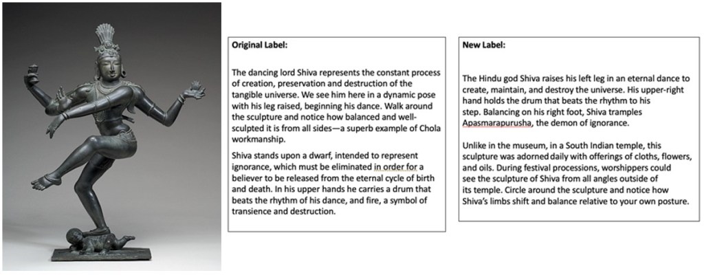
After reading the new version, visitors said the label drew them in to examine the object in new ways and that they paid close attention to the sculpture’s posture. The prompt to circle the object and the challenge to think about the object in its original context, in contrast to its display in the museum, both contributed to this reaction. After reading the old label, the majority of visitors also called out the use of the term “dwarf” and mentioned that they appreciated that the new label did not include this term.

A photo of a dark limestone, shallow carved relief sculpture with traces of color. A group of figures, men and women in ceremonial and royal dress, face right and process across the block of stone.
Offering Procession of the Empress as Donor with Her Court, Chinese, about 522 C.E. Fine, dark-gray limestone; 80 inches x 9 feet 1 ½ inches. Purchase: William Rockhill Nelson Trust. 40-38

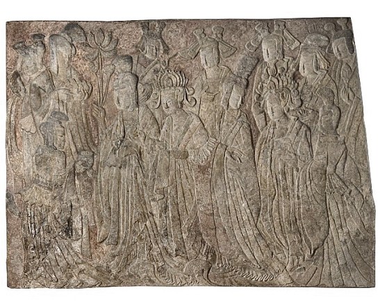
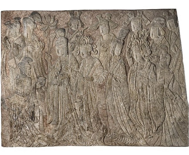
In the case of the Offering Procession of the Empress as Donor with Her Court, from our Chinese Art collection, Jocelyn Edens shared that she and curatorial colleagues wanted to not only shorten the label from over 300 words to 70-90 words but also be transparent about how the work was reconstructed from many fragments, a very different focus than the original label that instead focuses on style and composition.

Old label (on left) vs. Rewritten label (on right) for Offering Procession of the Empress as Donor with Her Court

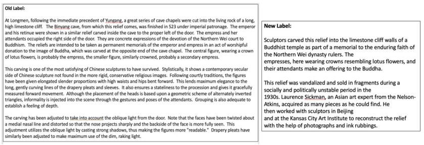
Once again, all those interviewed preferred the new version to the old, sharing that the old one contained a lot of information that was difficult to take in. One of our motivations with evaluating this particular label was to understand if the new approach would affect how people explored the other objects in the gallery. This, however, did not happen. Instead, people remarked on how the new label made them think about the Buddha as well as the connection to Kansas City Art Institute. While this particular label did not seem to have an effect on the interviewees’ overall experience with other objects, we’d like to continue exploring this question of how individual labels may influence visitors’ understanding of other objects.

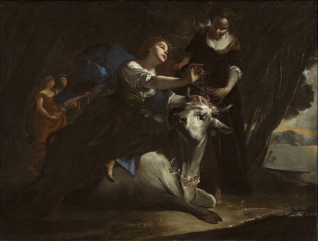
One last example was new interpretation for an object in our European Art collection, Cassone, or Chest, from 1500s Italy, which depicts the myth of Apollo and Daphne. Apollo chases Daphne romantically and, in an effort to help Daphne escape from Apollo’s unwanted pursuits, Daphne’s father, Peneus, turns her into a tree. Much like in the case of Europa and the Bull (a label we are working on but have not yet evaluated), in the original label this myth was described as a romantic story. In the rewrite (both versions below), we explicitly called out the violent nature of this myth as a story of attempted rape.

Image of Cassone (chest) next to its old and new labels. A photo of a large wooden chest shaped like a sarcophagus with a carved, hinged top. Front of the chest has detailed carvings of with stories figures. Two black outlines boxes side by side that contain black text on a white background. Box the on the left contains the old label. Box on the right contains the new label.
Old label (on left) vs. Rewritten label (on right) for Cassone (Chest), Italian, about 1565. Walnut with gilding and traces of paint or gesso. 25 ½ inches x 5 feet ½ inches x 21 ½ inches. Purchase: William Rockhill Nelson Trust. 33-459.

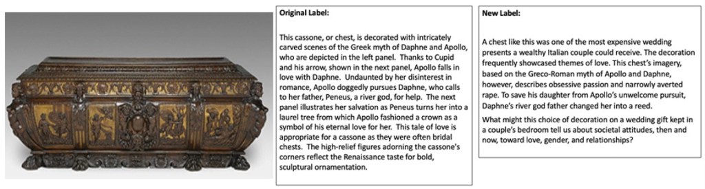
When presented with the new label, interviewees noticed this explicit language of rape as well as how it asked them to think about attitudes towards relationships and gender dynamics both historically and today.  When presented with the old label, interviewees also shared that they were unfamiliar with phrases like “high relief” and “sculpted ornamentation”, reinforcing that we need to avoid art historical jargon. Everyone interviewed preferred the shift away from a traditional art historical approach to the new label that was more explicitly tied to a 21st century understanding of the myth and gendered power dynamics. This one was particularly interesting (and exciting) for me, as it proves that people appreciate, and may actually want, culturally relevant discussions and transparent language in interpretation.

Where do we go from here?

Obviously, we still have a lot of work to do both in replacing current labels and in applying our agreed upon principles to all interpretive text. While this process started with the goal of harm reduction, it has pushed us to reimagine the content of all of our interpretation including the stories we do (and do not) tell and the language we use. Right now, the Interpretation and Curatorial departments are beginning to dig into specific parameters for inclusive language. Here, we are indebted to A Progressive’s Style Guide as a starting point for many conversations. We are gathering resources and sharing as much as possible, all in an effort to build a shared understanding and a common language.

Reflecting on the process, there are a few pieces I would say have been effective. First, this goal of developing a common understanding of harm/shared learning around what creates harm has made the work incredibly collaborative and fruitful. Rather than Interpretation dictating what we say and how we say it, this process has allowed us to build from the bottom up and create principles and values with our curatorial colleagues.

Second, throughout the process we have maintained that we are aiming for progress, not perfection. Those of us working in Interpretation know that once you start asking questions about labels, more questions appear. It’s easy to go down a rabbit hole or get so overwhelmed by the amount of work (don’t even get me started on credit lines and tombstone information!) that these projects die before they get off the ground. Committing to the principle that this is an ongoing process that will likely never be finished has helped us take it one step at a time. At the least, we’ve rewritten some outdated, harmful labels. At the most, we’ve developed new principles and values that will guide our work moving forward. While we still have a lot of work to do, we’ve made progress and tried to not let our perfectionist tendencies get in the way.

While this process has been effective in certain ways, there are, of course, still areas for improvement. I wonder, for instance, if starting with labels was the right place. In each conversation throughout this process, concerns and questions about other forms of interpretation have been raised, not to mention the need for small- and large-scale gallery reinstallations to reframe how we tell stories about objects. This is natural because labels support visitor experience and, as we all know, do not exist in a vacuum. While focusing on labels has enabled us to address some problematic interpretation and start amazing conversations with colleagues, I also worry it has overly focused us too much on one interpretive element. The question now becomes how do we open up the conversation to larger organizing principles that go beyond label text and get to the very root of planning and ideas in our projects. I don’t know the answer, but I think we’re on our way and I’d welcome any thoughts.

Thank you all for reading this series. It has been a pleasure to share our work and I hope it has been inspiring in a small way.

About the Author

Rachel Nicholson is the Director, Interpretation, Evaluation & Visitor Research at the Nelson-Atkins Museum of Art.  You can reach her at rnicholson@nelson-atkins.org. Every two weeks throughout April and May 2021, Rachel has shared her team’s efforts to rewrite the Nelson-Atkins’ permanent collection gallery labels through a harm reduction lens. Read her first three posts here.

Don’t want to miss a post? Subscribe to our mailing list (just fill out the form at the right)! 

The post Improving Our Museum Labels Through A Harm Reduction Lens: Part 4 appeared first on RK&A.

Written by cplysy · Categorized: rka

May 03 2021

Improving Our Museum Labels Through A Harm Reduction Lens: Part 3

By: Rachel Nicholson, Jocelyn Edens, and Ariana Chaivaranon

In our workshops with curatorial colleagues (which we wrote about in the last post), we continually heard certain ideas rise to the surface about shared principles for interpretive text at the Nelson-Atkins. These included:

  • Complexity: a label can be an invitation to explore the object and ideas further and does not need to offer a resolved story.
  • Specificity regarding the object and language.
  • Empathy especially for visitors, subjects, and makers who have been disempowered.
  • Making deliberate choices to share the most interesting and relevant stories of an object.
  • Thinking holistically about the experience of visiting a gallery and of visiting the museum.

Working off of these initial ideas, we as an Interpretation Team decided to divide and conquer, each taking on a different collection area and working with Curators to reimagine the labels they had identified. Each of us used “story jams” to explore new ideas for these objects. This model was shared with us by Antenna, an audio and multimedia production company with whom we work.

A screenshot of a PowerPoint Slide with a blue band at the left and a white background. Black text on a white background to the right outlines the story jam questions.
For story jams, we used the above questions to guide conversations, asking people to make observations first as a visitor or someone seeing the object for the first time, and then as an expert.

In each story jam, of which there were 3-4 for each collection area, we gathered colleagues and volunteers across the institution with different areas of expertise and experiences with art including visitor services officers, access staff, and membership and social media specialists.  Working collaboratively, we identified the most interesting and pressing stories that each object could tell. While our overall approaches were similar, there were also some differences since we worked with different colleagues and collections. Therefore, for this post, we’ll each share a bit about our process and our learnings.

Jocelyn Edens, Interpretive Planner, worked with objects in our Chinese Art collection, focusing in one case on how to tell complex stories about objects that may have been reconstructed and are therefore not “original.” Ariana Chaivaranon, Interpretive Planner, focused on our South and Southeast Asian Art collections, confronting questions of how to help visitors understand how an object’s context can change its reception. Lastly, Rachel Nicholson worked with objects in the European Art collection, tackling questions of violent subject matter and how to acknowledge 21st century experiences and understanding of topics such as sexual assault in the context of 17th century paintings.

Adding Complexity to our Chinese Art Collection

In one story jam for objects in the Chinese collection, we spent a lot of time discussing a limestone relief carving made in the Northern Wei Dynasty, around 522 C.E. Our curator identified the label for this object as needing a re-write for a few reasons: 1) it was physically worn and dirty, 2) it privileged stories about men that aren’t even visible rather than focusing on the women in the object, and 3) it was a slog for visitors to read at 346 words long (we aim for 70-90 words for object labels). Crucially, new research showed that a large portion of the panel had been reconstructed in the 1930s, so writing a new label would give us an opportunity to be transparent with visitors about the object’s the life.

Offering Procession of the Empress as Donor with Her Court, Chinese, about 522 C.E. Fine, dark-gray limestone; 80 inches x 9 feet 1 ½ inches. Purchase: William Rockhill Nelson Trust. 40-38

In discussion, we first raised questions about the object based on looking. Most of these questions focused on decoding the composition, the original context of the object, and its materials and techniques. When our curator introduced the story of its reconstruction, new questions and observations emerged: are objects in other museums from the same site in the same condition? Who were the artists who helped create this reconstruction? What can we glean about their mastery and skill, alongside that of the original carvers? What other objects in our collection can tell stories about copies and reconstructions?

As we develop a new label that incorporates this story and leans into complexity—that is, offers unresolved stories that invite more questions and further exploration—our big question is how it will affect the way visitors make meaning from this object, as well as others near it in the gallery. Will visitors feel empowered to ask new questions and explore these objects in all their complexity? Will they feel deceived or tricked or disappointed?

Specificity in the South and Southeast Asian Art Collection

The story jam participants for the South and Southeast Asian collection tackled some of the core tensions of the display of Hindu processional sculptures in U.S. encyclopedic art museums. An early 1200s sculpture of Shiva Nataraja is the centerpiece of one of the fictive “temple rooms” original to our 1932 building. Although non-Hindus often mistake the room for a temple reconstruction, the object display is far removed from its original religious context. Barring the opportunity for reinstallation, we set out to support both Hindu and non-Hindu visitors’ experiences through the label.

A photo of a dark gray, bronze statue against a gray background. The god Shiva raises his right leg and extends his four arms in a dance.
Shiva Nataraja, Lord of the Dance, Indian, early 13th century. Bronze; 34 ¼ x 27 ½ x 13 inches. Purchase: William Rockhill Nelson Trust, 34-7.

At first, story jam participants without a knowledge of Hinduism commented on the sculpture’s perfectly cast and precisely proportioned bronze body. Their interests shifted when Hindu story jam participants or those familiar with Hindu practices noted that to them, Shiva appeared undressed in the museum. In its original home in a South Indian temple, the sculpture would have been adorned daily with oils, cloth, and flowers. Our revised label invites visitors to reflect on the differing practices of seeing the sculpture in the museum context, in a temple, and in a religious festival procession.

The revised label also prompts visitors to consider the embodied experience of aspects of Hindu worship, such as dance, moving around the object, and darshan (mutual seeing between a worshiper and a sacred image). We replaced unspecific, harmful language that incorrectly described Apasmarapurusha, the figure crushed by Shiva’s dancing feet, as a “dwarf,” invited directed looking, and used non-ableist verbs to encourage visitors to “circle” the sculpture, taking it in from all angles. Ultimately, we hope to inspire visitors to reflect on their personal, spiritual, and bodily relationships to this sculpture of Shiva today.

Thinking Holistically about our European Art Collection

Our European art curators identified about 30 labels to be replaced. Rather than workshopping all of them, we broke them down into themes and chose objects that embodied each big idea. These themes included: violent subject matter, unacknowledged power dynamics, and harmful tropes.

For one specific label, we tackled a subject common in many European art collections: Europa and the Bull. In this story from the ancient Roman poet Ovid’s Metamorphosis, the god Jupiter transforms himself into a bull, seduces and abducts Europa. Our current label focused mostly on the artist and his style and did little to address the story. What arose from our story jam, however, were lots of questions about the scene itself: why is the bull the central figure? Who is the victim in this story? Why does the bull look “Disneyfied”?

Bernardo Cavallino and follower (Johann Heinrich Schönfeld? 1609-1683) (1616-ca. 1656). Europa and the Bull, about 1645. Oil on canvas; 24 x 31 13/16 inches. Purchase: William Rockhill Nelson Trust, 31-50.

First, we spent time looking closely at the painting and noticed that the bull is looking directly at viewers and almost winking. For many in the room, this felt like the way into the story. We could start with the specific object, move to the story of how Jupiter tricked Europa, and then touch upon broader ideas around gender and power dynamics in myths. Our curator shared that the title of the painting had also changed throughout time, from The Abduction of Europa to Europa and the Bull, opening a conversation about an object’s life and how our understanding of these myths and paintings can shift.

We also realized that the broader discussion of power dynamics would be better to include in a section panel in the gallery, near an entrance. This would allow us to address these ideas upfront, without having to then repeat ourselves on every specific object label in the gallery that dealt with a similar myth. In creating a broader theme panel, we could spend time in specific object labels focusing on the work of art itself. This push to think holistically about a whole gallery experience rather than just one label helped alleviate some pressure on all object labels, opening space to touch on big themes while also being specific in our interpretation of specific objects.

What’s next?

This process continues to evolve and right now we are in the midst of codifying label principles and evaluating these new labels. We hope to share more about where we’re headed in the next post.

About the Authors

Rachel Nicholson is the Director, Interpretation, Evaluation & Visitor Research at the Nelson-Atkins Museum of Art.  You can reach her at rnicholson@nelson-atkins.org. Every two weeks throughout April and May 2021, Rachel will share her team’s efforts to rewrite the Nelson-Atkins’ permanent collection gallery labels through a harm reduction lens. Read her first two posts here.

Jocelyn Edens, is an Interpretive Planner at the Nelson-Atkins Museum of Art.

Ariana Chaivaranon is an artist and an Interpretive Planner at the Nelson-Atkins Museum of Art. Born in Thailand, Chaivaranon studied Visual and Environmental Studies and the History of Art at Harvard. Chaivaranon is a board member of Plug, a curatorial collaboration and exhibition space supporting emerging artists in Kansas City.

Don’t want to miss a post? Subscribe to our mailing list (just fill out the form at the right)! 

The post Improving Our Museum Labels Through A Harm Reduction Lens: Part 3 appeared first on RK&A.

Written by cplysy · Categorized: rka

Apr 26 2021

Join us for the Saint Louis Art Museum’s Virtual Summit on Diversity

RK&A was honored to work with the Saint Louis Art Museum in 2019 to evaluate their longstanding Romare Bearden Graduate Museum Fellowship, which prepares outstanding museum professionals from historically underrepresented groups (particularly people of color) to become leaders in the field.  The Bearden Fellowship was one of the first diversity-focused fellowships in the museum world—established long before the recent wave of diversity, equity, access, and inclusion (DEAI) in museums—and ours was the first formal evaluation of the fellowship since it began in 1991. Our evaluation focused on learning from Bearden fellows’ and SLAM staffs’ experiences to not only measure the impact of the Bearden Fellowship, but also to develop a case study with insights and considerations for other museums interested in starting and sustaining a diversity-focused fellowship program.

On May 6, the Saint Louis Art Museum is hosting a free Virtual Summit on Diversity that will convene emerging and established arts professionals from across the country (including many past Bearden Fellows) to discuss ways to diversify the pipeline of museum professionals.  RK&A’s Director Stephanie Downey and SLAM’s Chief Diversity Officer and fellowship supervisor Renée Brummell Franklin will discuss the case study we developed with SLAM in the session “Change from Within: A Case Study of the Romare Bearden Graduate Museum Fellowship.”  Please register in advance if you would like to attend!

The case study—Advancing Change: A Case Study of the Romare Bearden Graduate Museum Fellowship—will be available free for download immediately following the summit. We are proud to contribute to ongoing dialogue, learning, and action toward creating a more diverse, equitable, and inclusive museum workforce.  

Stay tuned for a link to download Advancing Change: A Case Study of the Romare Bearden Graduate Museum Fellowship as soon as it is available!

The post Join us for the Saint Louis Art Museum’s Virtual Summit on Diversity appeared first on RK&A.

Written by cplysy · Categorized: rka

Apr 19 2021

Improving Our Museum Labels Through A Harm Reduction Lens: Part 2

By: Rachel Nicholson

“If you want to go fast, go alone; but if you want to go far, go together.”

– African Proverb

In my last post, I wrote about harm reduction as a philosophy and how it might be applied to rethinking museum labels. In this post, I’ll explain just how we started these conversations at the Nelson-Atkins and put our ideas in action.

This project is on-going, and we have certainly stumbled along the way, but central to our process has been a commitment to collaboration and shared learning across our institution. While the three of us working in Interpretation could have identified problematic labels, taken them down, and swapped them out for new ones relatively quickly, we saw this as an opportunity to build common language around harm across the museum and collectively imagine new guidelines and principles for our interpretative text.

To deepen our learning and ensure we included diverse voices and experiences in the process, we invited staff members who do not traditionally work on labels to our conversations and workshops. By asking for perspectives from colleagues in the Public Programs, School and Educator Programs, Visitor Services, and Design departments (to name a few) at different points in this process we broadened our understanding of how different people can experience a work of art and its accompanying label. Many of our colleagues outside of Curatorial and Interpretation are also personally members of groups that may have experienced harm in museums.

What do we mean by harm?

Step one, which took place from June to August 2020, was to identify what we at the Nelson-Atkins mean by harm in language and how we see it manifesting in our existing labels. To achieve this, we met with Curators, Interpretive Planners, and members of our Community and Access and School and Educator teams. Dividing into breakout rooms, we started with the question “How can art museum labels do harm?”

This broad question led to a specific list of ways labels can cause harm, including:

  • Assuming a generalized experience of the world, that the white male is the basic human experience, that whiteness is the norm
  • Subjective judgements or comments on physical appearance or value judgements on beauty without historical context
  • Passive voice sentence construction that generalizes or avoids naming an offender
  • Vocabulary and terminology that reinforces hegemonic power and exclusionary white narratives (e.g., Exotic, Discover, Westward expansion and progress)
  • Non-people first language; language that puts a social identity before the person

From this initial conversation, we asked our Curatorial colleagues to mine the permanent collection galleries and identify labels they’d like to replace, based on our agreed upon list of what can cause harm in labels. Not surprisingly, their critical examinations necessarily broadened our definition. The list below shows the additional types of harm they identified.

A list of 14 types of harm written in black text on a white background.
Our list of all types of harm identified by curators across collections.

Working off their notes, we in Interpretation mapped the types of harm cause by labels across different permanent collections. This reinforced the notion that strategies for improving our labels can be implemented across the museum, rather than department by department. As visitors tend to not think about collections separately but rather wander between galleries, we needed to think about our approach to labels and harm holistically.

A chart with the 14 types of harm in black text on a blue background in the first column. Our 5 collection areas on the top row in white text on blue background. X’s across the chart show how the types of harm appear in different and overlapping areas of the collection.
Our chart of the types of harm showing how they mapped across our collections.

In grouping types of harm, we also realized we could broadly place “harm done by label language” into two main categories: what we say and what we don’t say. In our next step, we chose to focus on these two arenas, acknowledging that accessible fonts and design were also necessary pieces for improving the gallery experience for all visitors. 

A large, light yellow circle with two smaller circles, one blue and one yellow, inside. Black text inside the large circle reads “delivery: damaged label, poor lighting, inaccessible font.” Black text inside the smaller blue circle reads “What we don’t say” and black text inside the smaller yellow circle reads “What we say.”

Our diagram showing the overlap between how language can cause harm, the major focus of our label workshops.

The Challenge of Collaborating While Working Remotely

To continue this conversation of harm cause by labels across our collections, our team organized cross-divisional label workshops. We paired Curatorial departments and chose a problematic label from each, one dealing with harm through omission and one dealing with harm through explicit language.

Working again in small groups of two Interpretive Planners (one facilitating and one taking notes) and with four to six Curators, we used Google Docs to collaboratively edit in real time and ask questions of the current labels, first identifying the harm together and then imagining how we might rewrite the labels. Our format was simple: identify harm individually through collaborative editing, then ask questions of the object and its label, first as a visitor and then as an “expert.” While working remotely has made it hard to have creative meetings like this, a tool like Google Docs helped us create a sense of shared work and brainstorming that is often missing from video meetings.

A screenshot of a Google Doc that we used in our label workshop. At the left is the text of the current label, in the middle is an image of a Southeast Asian bronze sculpture, and at the right are some of the comments from workshop participants.
We used Google Docs to collaboratively edit in real time with colleagues.

Grounding each workshop in specific example labels proved very useful. These conversations about how we improve labels can get abstract very quickly. Being able to all focus on a single label at a time, agree on how we saw harm in the label, and then imagine something new helped us focus. The collaborative editing also added an element of fun and experimentation by creating a shared activity even though we were not physically in the same room.

The workshops proved so effective that our Director, upon hearing about them, asked to be included. Organizing around a shared activity helped create horizontal communication. Our Director jumped in and was able to share his own thoughts on improving our labels as well as hear how colleagues were thinking through the process. 

Identifying Patterns and Principles

From these workshops, groups consistently came back to the question of “What can cause harm?” Across conversations, we began to recognize patterns including over-generalization, oversimplification, and simply trying to say too much could lead to, in the worst case, harmful labels or, in the best-case scenario, boring or unhelpful labels.

For instance, in the above example the sculpture, from our Southeast Asian collection, was referred to as a “superb example of Chola workmanship” and yet we never gave evidence for why it is a superb example or even what Chola workmanship is. Not only does the label assume knowledge from the visitor, it is general and does not really tell us anything about this particular Chola Dynasty Bronze, thus not doing justice to a legacy of art-making and cultural tradition.

The label was originally identified as harmful because it equates a “dwarf” with “ignorance.” Once we began discussing the object as a group, we realized we could go beyond correcting this harmful language and explore the most interesting pieces of this sculpture, information we were not providing in the current, over-generalized label.

A screenshot of a Google Doc that we used in our label workshop. At the left is the text of the current label, in the middle is an image of Gauguin’s painting of a Tahitian woman, and at the right are some of the comments from workshop participants.
Our workshop on our current Gauguin label helped us focus on the kinds of stories we might tell and how we could reorient the label to be about the subject rather than the artist.

In another case, as we discussed a label for Paul Gauguin’s Faaturama that referenced France’s colonization of Tahiti but did not explicitly mention Gauguin’s role in this power dynamic, we identified just how much space was wasted with general terms and passive voice. We realized that we could do much more in 90 words if we used direct and specific language to name violent and harmful histories.

Beyond using passive voice, the label also entirely focused on Gauguin, removing any discussion of the female subject of the painting. Through omitting her story, the label was reinforcing the power dynamic between Gauguin and his Tahitian subject. What if, we asked, we rewrote the label from the perspective of the woman, inviting visitors to reflect and consider why we know so little about her. While we often want to share the information we have (in this case information about Gauguin), this could be an opportunity to invite new, unresolved interpretations of the work, perhaps ones that create more questions than provide specific answers.

In the next post I’ll explore how these conversations helped us to develop Principles for Interpretative Text. What if, we asked, a label did not present a neat and simple story but rather opened space for further questioning and interpretation by visitors?

About the Author

Rachel Nicholson is the Director, Interpretation, Evaluation & Visitor Research at the Nelson-Atkins Museum of Art.  You can reach her at rnicholson@nelson-atkins.org. Every two weeks throughout April and May 2021, Rachel will share her team’s efforts to rewrite the Nelson-Atkins’ permanent collection gallery labels through a harm reduction lens. Read her first post here.

Don’t want to miss a post? Subscribe to our blog to get new posts delivered to your inbox (just fill out the form at the right)! 

The post Improving Our Museum Labels Through A Harm Reduction Lens: Part 2 appeared first on RK&A.

Written by cplysy · Categorized: rka

Apr 12 2021

Earth Day at 51: Why Museums Must Embrace the Anthropocene

Whether or not public programs are again canceled because of the COVID-19 pandemic, Earth Day each April 22 warrants the engagement of the museum sector. Emlyn Koster explains why.

“Earth Day 1970 gave a voice to an emerging public consciousness about the state of our planet — In the decades leading up to the first Earth Day, Americans were consuming vast amounts of leaded gas through massive and inefficient automobiles. Industry belched out smoke and sludge with little fear of the consequences from either the law or bad press. Air pollution was commonly accepted as the smell of prosperity. Until this point, mainstream America remained largely oblivious to environmental concerns and how a polluted environment threatens human health.”

–“The History of Earth Day,” from EARTHDAY.ORG

Black and white image of the New York Times issue from April 23, 1970.  The cover features an image of a huge crowd that stretches across the entire page and the headline "Millions Join Earth Day Observances Across the Nation."
Front cover of The New York Times the morning after the first Earth Day in 1970. Image via New York Times.

In 2005 the US National Academies determined that ‘climate change’ is preferable to ‘global warming’ because more than the atmosphere’s average temperature had been changing. News of governments tackling the ‘climate emergency’ is both pleasing and concerning. Pleasing that there is global communication although, as Greta Thunberg and her generation anxiously point out, today’s mitigating efforts run the perilous risk of being too little too late. In the 21st century, the world must grasp that climate and weather are interconnected with all other natural phenomena that encircle the Earth — oceans and rivers, ice sheets and glaciers, sea level, ecosystems, biodiversity, food chains, viruses, etc. — and that each has been, indeed continues to be, adversely impacted by human activities. Melting ice and rising sea level are, for example, more consequential than changing weather patterns. And while climates are being disrupted, oceans are being warmed and coral reefs are being bleached, the biosphere is being abruptly reduced by extinctions, plastic debris has become ubiquitous, and parts of the Earth’s crust have been impacted by waste disposal and hydraulic fracturing.

Society and the Anthropocene

A close-up shot of a man looking towards the camera. He is an older man, white, with gray hair and wearing glasses.
Paul Crutzen, PhD, coined the term “Anthropocene.”
Image via IASS Potsdam.

A scientific term joins mainstream conversation when it becomes helpful to communicate about a subject of rising interest and/or pressing importance. 2020 presented a compelling example: society quickly understood and used the terms pandemic and COVID-19. Although the natural history of the Earth is fascinating to many, Geologic Timescale terms have not become household words — with two exceptions. One is when Hollywood’s imagination of Jurassic Park became a blockbuster film (likely destined to remain unknown, though, is that it was field studies in the Jura Mountains along the France-Switzerland border by naturalist Alexandre Brongniart (1770-1847) that led to the term Jurassic for the period 200-146 million years ago). The second and much more consequential one is the Anthropocene (pronounced anthro-pocene like anthro-pology and of Greek origin with anthro referring to human and cene meaning a recent geological interval). For this one, we should know about Paul Crutzen (1933-2021), a Dutch meteorologist and atmospheric chemist who became a Nobel Laureate in 1995. In 2002, he contributed a seminal view to the journal Nature. Titled ‘Geology of Mankind’ it concluded: “A daunting task lies ahead for scientists and engineers to guide society towards environmentally sustainable management during the era of the Anthropocene”. Not only was it novel to imply that humanity is a geologic agent but his call to action for science and engineering to guide society was extraordinarily important.

No geologic timescale interval has previously been named in recognition of one species. This is certainly not an honor for us, Homo sapiens. Rather, it signals that humanity has, both carelessly and inadvertently, enabled a situation to rapidly develop that has imperiled all life, both human and non-human. Five years ago, science and environment journalist Andrew Revkin framed the Anthropocene as “common shorthand for this turbulent, momentous, unpredictable, hopeless, hopeful time — duration and scope unknown”. In 2017, environmental humanities scholar Christopher Schaberg wistfully asked: “Can the grand Anthropocene story, which highlights humanity as an exceptional actor in planetary morphology, help provoke a greater sense of human responsibility?”. Last year I defined the Anthropocene with a pragmatic recognition that humanity as the dominant species has extensively detached itself from the Earth System, endangering the future of both. A complicating matter is that the geological profession’s search for the best worldwide marker for the start of the Anthropocene — which currently looks likely to be the mid-20th century when atomic bomb testing left a distinctive chemical signature in lake deposits — is a different focus than the term’s relevance to the future state of the world.

Museums and the Anthropocene

Why has the museum sector hesitated to embrace this term? Is it because we must have a collection of related objects, or we lack fulsome knowledge, or we remain reticent to tackle contemporary subjects? The good news is that the tide has started to turn. Three Danish faculty have just documented 41 exhibitions since 2011 about the Anthropocene, almost 80% of which have been/are in art museums. And I have recently proposed in an upcoming Exhibition article how museums of all types have a more nimble and more immersive exhibition approach to consider.

Museums will hopefully find it feasible to emulate a reorientation described by historian David Christian: “Today’s scholarly world may be recovering the ancient balance between detailed and unifying knowledge. And doing that is increasingly urgent in a world that faces the colossal challenge of managing an entire planet, a challenge that cannot even be seen clearly through the narrow lenses of existing scholarly knowledge. The discipline-based scholarly world of the twentieth century generated much rich knowledge in so many fields that it should now be possible… to tackle the new problems of the Anthropocene with a rigor and richness, and a global scholarly reach, that was unthinkable before the twenty first century”.

To strive for unified knowledge about nature and culture, with equal respect for both, would be a profound goal of the museum sector. Biodiversity and diversity — respectively referring to the millions of animal and plant species and to just us — are each common terms yet they are unhelpfully disconnected in our conscience: it was only a geological nanosecond ago that human life evolved away from being an integral element of wildlife. Focused on the disconnects between nature and culture, the Alliance of World Scientists has nearly 26,000 signatories from almost 200 countries. Conversations about climate change in isolation oversimplify the whole Earth System scale of challenges facing us in the Anthropocene. The last annual report of Human Rights Watch highlights the link between climate change and pandemics. The choice of existential by dictionary.com as the word of the year in 2019 concluded: “It’s the threat of ceasing to exist that worries people now”. We can therefore see — surely we must see — that an ecological one-Earth perspective has become critical.


About the Author

Emlyn Koster, PhD (koster.emlyn@gmail.com) is a former CEO of Canada’s Royal Tyrrell Museum of Paleontology and Ontario Science Centre, New Jersey’s Liberty Science Center, and the NC Museum of Natural Sciences. Widely published, he has also been a board chair of the Geological Association of Canada. Currently, he is an ambassador for the International Coalition of Sites of Conscience and an adjunct professor in Marine, Earth and Atmospheric Sciences at NC State University. For Earth Day 2021, he is a panelist at a Johns Hopkins University forum titled ‘Environmentalism Today’; organized by Museum Studies, others include the lead senior scientist at the Environmental Defense Fund and project director at the Center for Scientific Evidence in Public Issues at the American Association for the Advancement of Science.

Emlyn is a guest blogger for RK&A in 2021. From his vantage point as a geoscientist, museologist, and humanist, Emlyn will explore difficult topics of our time through a monthly series of op-ed style blog posts called “Relevance Revisited,” imploring museums to be leaders in addressing these issues. Read Emlyn’s previous posts here.

The post Earth Day at 51: Why Museums Must Embrace the Anthropocene appeared first on RK&A.

Written by cplysy · Categorized: rka

  • « Go to Previous Page
  • Go to page 1
  • Interim pages omitted …
  • Go to page 5
  • Go to page 6
  • Go to page 7
  • Go to page 8
  • Go to page 9
  • Interim pages omitted …
  • Go to page 15
  • Go to Next Page »

Footer

Follow our Work

The easiest way to stay connected to our work is to join our newsletter. You’ll get updates on projects, learn about new events, and hear stories from those evaluators whom the field continues to actively exclude and erase.

Get Updates

Want to take further action or join a pod? Click here to learn more.

Copyright © 2026 · The May 13 Group · Log in

en English
af Afrikaanssq Shqipam አማርኛar العربيةhy Հայերենaz Azərbaycan dilieu Euskarabe Беларуская моваbn বাংলাbs Bosanskibg Българскиca Catalàceb Cebuanony Chichewazh-CN 简体中文zh-TW 繁體中文co Corsuhr Hrvatskics Čeština‎da Dansknl Nederlandsen Englisheo Esperantoet Eestitl Filipinofi Suomifr Françaisfy Fryskgl Galegoka ქართულიde Deutschel Ελληνικάgu ગુજરાતીht Kreyol ayisyenha Harshen Hausahaw Ōlelo Hawaiʻiiw עִבְרִיתhi हिन्दीhmn Hmonghu Magyaris Íslenskaig Igboid Bahasa Indonesiaga Gaeilgeit Italianoja 日本語jw Basa Jawakn ಕನ್ನಡkk Қазақ тіліkm ភាសាខ្មែរko 한국어ku كوردی‎ky Кыргызчаlo ພາສາລາວla Latinlv Latviešu valodalt Lietuvių kalbalb Lëtzebuergeschmk Македонски јазикmg Malagasyms Bahasa Melayuml മലയാളംmt Maltesemi Te Reo Māorimr मराठीmn Монголmy ဗမာစာne नेपालीno Norsk bokmålps پښتوfa فارسیpl Polskipt Portuguêspa ਪੰਜਾਬੀro Românăru Русскийsm Samoangd Gàidhligsr Српски језикst Sesothosn Shonasd سنڌيsi සිංහලsk Slovenčinasl Slovenščinaso Afsoomaalies Españolsu Basa Sundasw Kiswahilisv Svenskatg Тоҷикӣta தமிழ்te తెలుగుth ไทยtr Türkçeuk Українськаur اردوuz O‘zbekchavi Tiếng Việtcy Cymraegxh isiXhosayi יידישyo Yorùbázu Zulu