• Skip to main content
  • Skip to footer
  • Home

The May 13 Group

the next day for evaluation

  • Get Involved
  • Our Work
  • About Us
You are here: Home / Archives for cplysy

cplysy

Jul 04 2022

Designing Templates to Improve Workflow and Efficiency

I work as a program analyst for a government agency, and it is my job to find ways to improve the efficiency of day-to-day program operations.

An important part of my job is identifying and creating the appropriate communication products for each program, such as standard operating procedures, desk guides, fact sheets, and dashboards.

When I first joined the team, we had no style guide to dictate what fonts, colors, or design to use for our signature products. With multiple people regularly contributing to the same publications, how can we ensure consistency with design and writing? I remember one situation when I was contributing to three publications with three completely different styles. The fonts and colors were all over the place, and each person was manually editing headings and subheadings. Don’t even get me started on the Table of Contents!

I do not consider myself a tech-savvy person at all, but I knew there had to be a better way to create consistently designed reports and products. I made it my mission to learn branding and design tips and tricks to help my team enhance our communication materials.

Not knowing where to begin, I searched the internet and found the Depict Data Studio website. I wanted to sign up for several courses right away, and I tried unsuccessfully to get approval from my employer to cover professional development expenses for report and design courses. So for a long time, I sufficed with Ann’s free resources and blog posts. But I wanted to learn even more, and I registered from the Report Redesign course along with Dashboard Design.

Revamping Report Templates with Skills Learned in Depict Courses

Enrolling in Depict Data Studio courses is one of the best professional development decisions I have made.

I immediately was able to apply the tips and tricks Ann shared to improve my reporting quality and processes.

My greatest takeaway from Ann’s Report Redesign and Dashboard Design courses is that small and simple steps can make a tremendous impact.

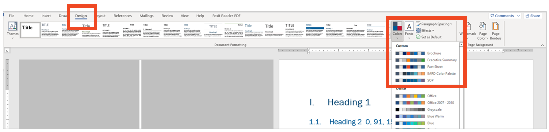
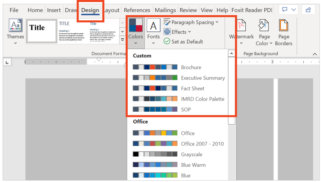
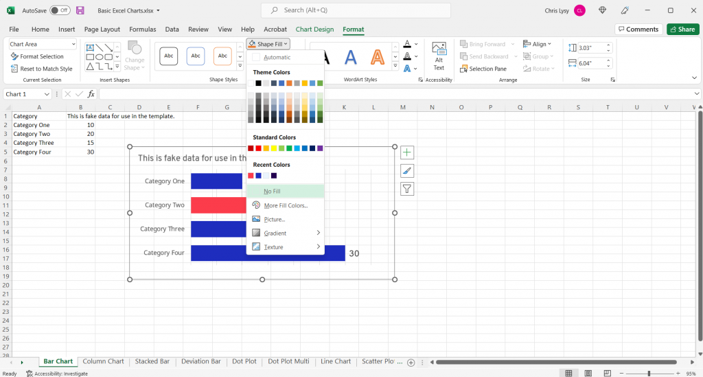
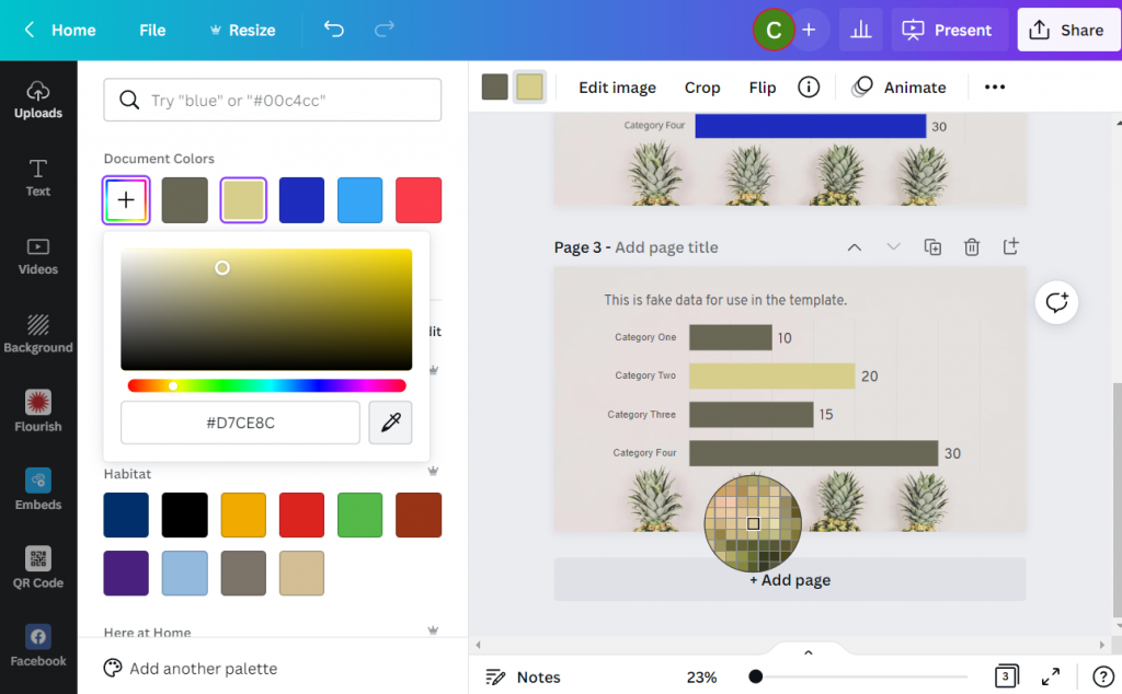
One of the most useful and time-saving tricks I was how to set up theme colors and theme fonts. I set up customized colors and fonts for each of the publication types that I regularly produce, so that I can quickly select the appropriate style for any new communication product.

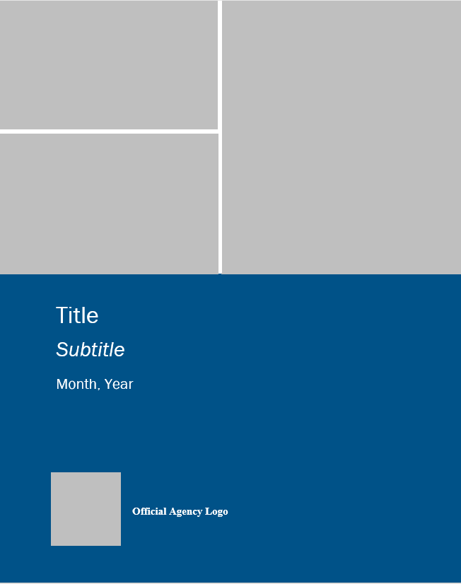
I went a step further and created a detailed template for each communication product. I personally like to start each new publications from a template that has more of the document architecture built into it. My templates usually include the following:

  • Title, Subtitle, and Date
  • Text Hierarchy
  • Table Format
  • Margins
  • Footer with Page Numbers
  • Icons and Symbols (when relevant)

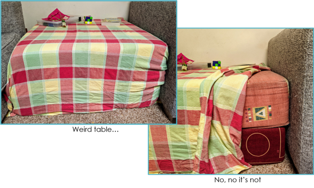
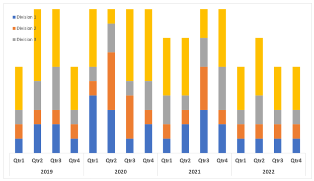
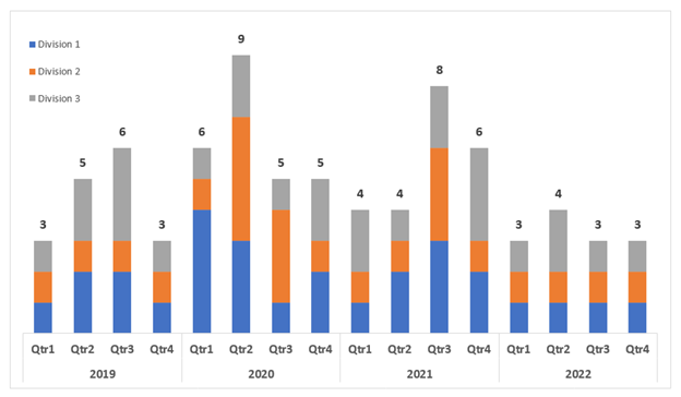
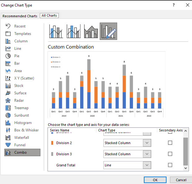
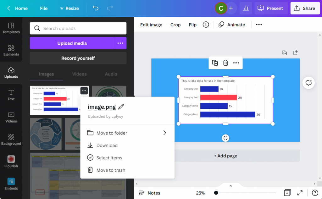
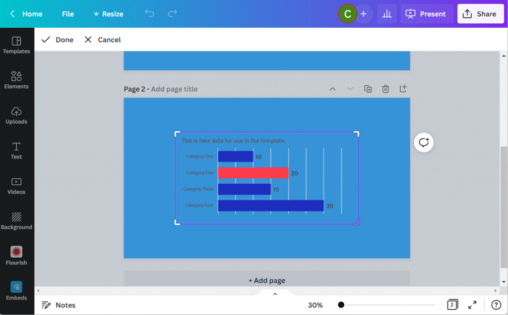
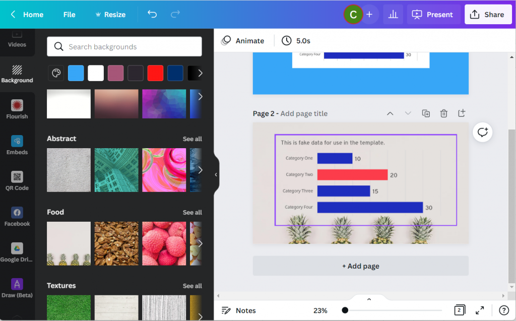
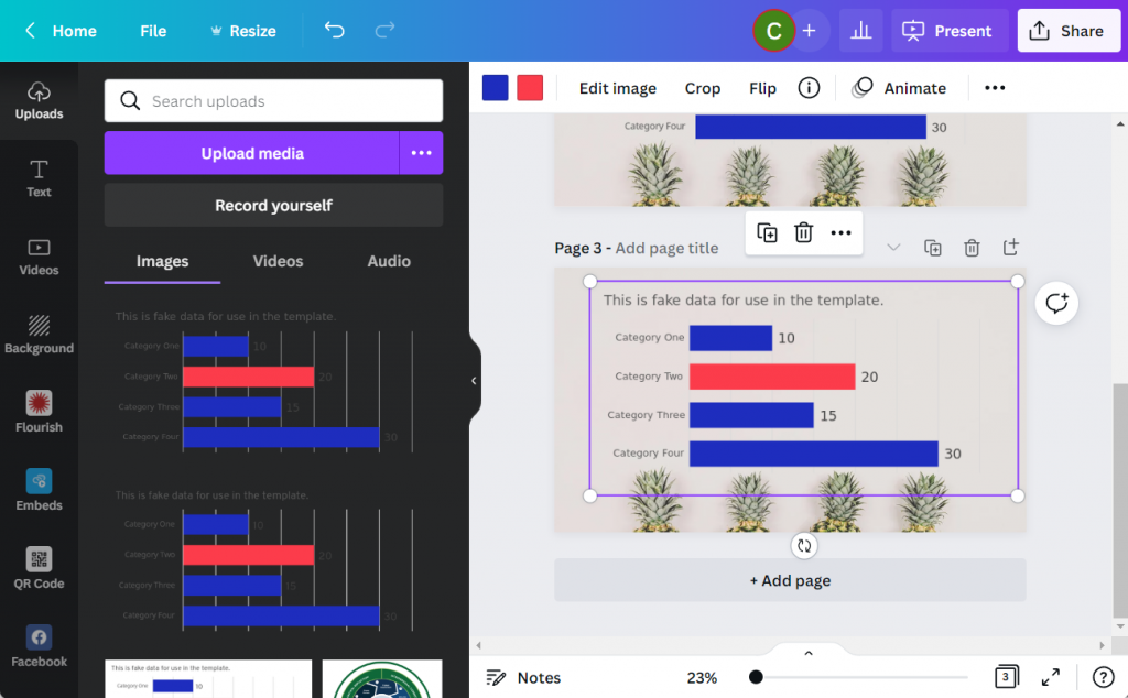
Of course, each template also applies the relevant theme color and font! Below is an example of a standard operating procedure template.

The Outcome: Save Time and Trouble with a Few Straightforward Steps

With just a few straightforward changes, I helped my team save hours of reporting time and formatting trouble.

As soon as I learned something new from Ann’s Report Redesign and Dashboard Design courses, I created templates and job aids to help myself master the process and have a reference tool that applied directly to my job.

I also shared tips and tricks with my colleagues so everyone could benefit.

As a result of implementing the knowledge I learned in Ann’s courses, my team’s report development time reduced by 50%!

Advance Your Professional Development, and Have Fun Too!

I incorporate so much of what I’ve learned from Ann’s courses into my day-to-day work.

Creating report and dashboard templates has made it so much easier for my team to start right away on new projects.

Our branding is consistent with the organization, and my team also created a unique identity for our signature reports.

Senior management loves that our products stand out from the crowd and have a consistent look and feel.

The concepts Ann teaches might seem intimidating at first, but each step is small and simple. A few tweaks and the right attitude can make a very big difference!

Connect with Stephanie Gentle

On LinkedIn: https://www.linkedin.com/in/stephaniegentle/

Written by cplysy · Categorized: depictdatastudio

Jun 30 2022

Comment on Can evaluators be the bridge in the research-practice gap? by Lamin Barrow

Thinking of evaluators as brokers or intermediaries between researchers and practitioners is one of the best scenarios to position the work of the evaluators. As an evaluation and also a research enthusiast, I have been providing that bridge for my organization that is involve in social service business. Sharing this blog post affirms my understanding of the role of evaluators.

Written by cplysy · Categorized: danawanzer

Jun 30 2022

How to create a scatterplot in Canva, and Flourish!

The scatterplot is one of my favorite chart types. So how do you create one in Canva?

In today’s post I’ll show you how you can create a scatterplot directly in Canva, even though you probably shouldn’t. Then I’ll walk through creating a scatterplot using Flourish. Finally I’ll talk a little about when you might want to use a scatterplot, along with an example of how you can make the chart easier to discuss by adding quadrants.

Scatterplots in Canva and Flourish Featured Image

Can you create a scatterplot directly in Canva?

Creating a scatterplot in Canva screenshot

Yes, you can certainly create a scatterplot directly in Canva.

Inside any Canva design just open up the elements menu and search for “Charts”. Then look for the scatterplot.

After you select the element, you’ll get a new Scatterplot dropped onto your page already filled with fake data.

Creating a scatterplot in Canva Screenshot

From here you can simply replace the data on the page with your own. Or you an connect directly to a Google sheet where your data lives.

Then you can tweak the style a bit with some of the options Canva makes available.

Where you might get annoyed.

Canva Scatterplot Fail Screenshot

I personally find the Canva data interface super annoying (the thing on the side that looks like a spreadsheet).

It looks like a spreadsheet, but it really doesn’t act like one. You can paste over the dummy data with your own data, but it’s not easy to move things around. You can’t even select multiple cells at once, which is usually required to move columns around.

Then ultimately, you’ll only have access to a few options you can use to tailor your graph.

Why go with Flourish instead?

Flourish Scatterplot Screenshot

Flourish, a free product that easily integrates directly with any Canva design, is my recommended go to for just about any chart or graph you want to create in Canva.

First off, you get tons of customization options. It can be a little overwhelming at first, but it doesn’t take too long to start figuring out how to tailor your design.

Flourish Data Scatterplot Screenshot

Next, the data entry part of this works really well. I also think the controls are intuitive and love how easy it is to choose columns, colors, names, and other aspects.

Creating a basic scatterplot using Flourish

Creating a Scatterplot in Flourish Screenshot

To create a scatter plot in Flourish, just click “New Visualization” and select one of the Scatter Plot starting points.

Just like Canva, Flourish will start you out with a chart using Dummy data.

Starter ScatterPlot

Then you just paste in or upload your data into the data tab.

Data behind a template scatterplot in Flourish Screenshot

If you need to change the selected columns, just put the letters in the appropriate spots for X values, Y values, and Name.

If you want to add in other variables (such as through color) you can do that here as well.

Scatterplot basics, where continuous data meets continuous data.

Scatterplots are visualizations of two continuous variables.

They are really good at showing correlations. Take for example the following scatterplot I created by matching the Firearm Mortality Rate with a Household Firearm Ownership Rate.

Believe it or not there is a pretty solid correlation between the percentage of households with guns and the total number of gun deaths. Also the highest firearm mortality rates are in mostly red states (shocking I know).

Mixing Two Data Sources (CDC’s Firearm Mortality by State & RAND’s State-Level Estimates of Household Firearm Ownership)

Turn your scatterplot into a “perceptual map style” 4 by 4 quadrant.

One of the downsides of a scatterplot is that it can be a bit tough to discuss.

Unlike a bar graph, where you have very specific tangible values, scatterplots are more about pattern recognition than individual data points. And while you can highlight and annotate individual points, sometimes you want to discuss the graph a little more broadly.

In these kinds of situations I like adding a 4 by 4 quadrant grid.

Screenshot of bringing a Flourish Graph into Canva
  1. To do this I start by connecting to my Flourish account from within Canva.
  2. Next I drop the chart into a design.
  3. After that I just add lines to make it a two by two.
  4. Then I label each of the four quadrants.

Now this chart is really simple to discuss. Here are a couple thoughts I had when looking at the final version.

  • I thought there would be a red state/blue state divide, but this is pretty extreme.
  • The High Ownership/Low Mortality quadrant is interesting. It also includes most of the high gun ownership blue states (like Vermont and New Hampshire). I’m curious as to why they don’t see the same kind of high mortality numbers as some of the red states with similar ownership rates.
Final Example Scatterplot created with Flourish and Canva
Click here for an Interactive Version
Mixing Two Data Sources (CDC’s Firearm Mortality by State & RAND’s State-Level Estimates of Household Firearm Ownership)

Written by cplysy · Categorized: freshspectrum

Jun 22 2022

How to Import Excel Charts into Canva, the Right Way

There are several ways to bring Excel Charts into Canva but which way is the right way? In this post I’ll walk you through the options and help you decide the best way for you.

So I had this question from an attendee of one of my data design webinars. “How do I bring Excel charts into Canva with a transparent background? I’ve tried copy and pasting but I end up with a white background.”

This is a pretty common problem, and it’s not just bringing charts into Canva but into other tools too. Luckily there is also a pretty common solution.

How to Import Excel Charts into Canva Featured Image

Why a simple Copy and Paste gives you an image with a white background.

So the easiest way to bring a chart from Excel into another program like Canva is to use Copy/Paste. Just select the chart and COPY (CTRL C), then open a Canva design and PASTE (CTRL V).

Excel Screenshot Bar Chart

This will work, but two things will likely happen.

  1. You’ll have a white box behind the chart (meaning you won’t be able to see the background through your chart.
  2. You’ll probably also have a border around the box.
Canva Screenshot with Copy Paste Bar Chart

The first thing you should know though is that this isn’t really a Canva problem. It’s an Excel problem.

When you copy from Excel and paste into Canva, you’ll find a new image file in your Uploads tab. You’ll also notice that the image is a PNG, which is good. Because a PNG “can” give you a transparent background (a JPG will not).

Canva Screenshot Uploads Menu

Giving Your Excel Chart a Transparent Background

Let’s go back to our chart in Excel.

We’ll select the chart and go into the format tab. Then select Shape Fill and then “No Fill.”

This will give us the transparent background. You can quickly see why this isn’t Excel’s default, because a transparent chart in front of the spreadsheet blends in a little too much with the sheet.

Excel Screenshot Shape Fill

Another step you should take while you are here is to make the shape outline transparent as well by clicking on “No Outline.” Now this default setting I don’t get, it’s just annoying.

Excel Screenshot Shape Outline

Now the Simple Copy Paste Works

Now that we’ve made the chart background go away it’s time to copy and paste again. The difference is that this time, the chart will have a transparent background and can be better placed within the Canva design.

Canva Screenshot Excel Chart Transparent Background

Did you know that Canva has a backgrounds menu? If you don’t see it on the left panel menu click on the “More” button at the bottom. You’ll find bunches of abstracts, textures, gradients, and photos ready to become backgrounds.

Like this super cool Pineapple background.

Canva Screenshot with Excel Chart and Background Image

Bonus: Saving your Excel Chart as an SVG

Okay, want to take the cool factor one step further?

Instead of copy and paste let’s save the chart as a picture in Excel.

Excel Chart Save as Picture

And not just any picture, let’s set the type to Scalable Vector Graphics.

Excel Chart Save as SVG Screenshot

Then we’ll drop the newly created SVG chart into Canva.

Canva Drop to Upload Picture

In the uploads tab you won’t notice much of a difference between the transparent PNG and the SVG. But something has definitely changed.

If you put the SVG in your Canva design, you’ll notice that you can actually change the colors!!! (I’ve tested this a bunch, and it has its limits. But for basic Excel charts you’ll be able to adjust most if not all of the colors).

Canva Screenshot Excel Chart SVG

You can even use the eyedropper tool in the colors panel (the first one with the plus sign gives you the option). Now I can match my chart to the awesome pineapple background.

Canva Screenshot Excel Chart SVG Color Dropper

Written by cplysy · Categorized: freshspectrum

Jun 20 2022

How to Hack Excel — and Add Totals to the Tops of Stacked Column Charts

“But you can’t do that in [Excel / Tableau / Numbers / Google Sheets / insert your own…]!”

Well, maybe you could.

When you work with data, you usually use the same tools over and over. You become familiar with them. You know the ins and outs, and you work faster because you remember the shortcuts and hidden menus.

Even with all your know-how, you can still come up against a roadblock, unable to do what you need.  How about taking what you know and use it…but differently. Hack it.

Hack? What? 

What hacking am I talking about? Not any of the Merriam-Webster definitions (think literally beating around the bush 😉). This hacking is more like the idea behind ikeahackers – taking a product and using it in a different way or for a different purpose than the original creator intended. Psst.. It doesn’t have to be ikea. You can take 2 giant foam cushions, and turn them into a side table.

What Do You Want?

Microsoft Excel added a map to its chart types. Great!

But what if you want to create a hex map?

A hex map is a map that represents an area (a US state for example) as a single hexagon, in the approximate position it should be. This eliminates problems that come up because of the different sizes of states. In the US it is especially helpful when including Alaska and Hawaii since they are both positioned far away from the contiguous US states.

A hex map would have equal representation for all the US states. No state would be too small (hello Rhode Island) or too big (looking at you, Alaska).

Get from Where You Are…

Ok, how to do that? Does Excel map include a hex map option? Nope.

Well, it looks like it’s organized in rows and columns.

Could we use the Excel cell structure for that? Maybe, but how will we get the data to the cells?

Well, a scatter plot could be the basis of that but you would need to build the whole map somehow.

How?

…to Where You Need to Go!

Other people (like David Napoli and John Schwabish) who understand Excel quite well sat down and wrote the process.

They did not use code. They did not use a special hidden feature.

They hacked Excel by using a standard feature such as the scatter plot.

It was done by understanding how scatter plots are built.

Scatter plots place your data in certain positions, based on the x,y coordinates provided.

You could use that to prepare the data for a scatter plot that looks like the US, then add the data, add hexagons, and so on. Since someone already did that, you can simply read up on their work.

Keep it Simple, S…Sweetheart

There are many more simple hacks you can use in Excel. 

A useful one I recently used is showing the total in a stacked bar or column chart.

A stacked bar chart has the option to display the data labels of each series but not the total.

Consider this example displaying the number of projects in different divisions.

Aside from the clutter, if users want to know the total per quarter, I don’t expect them to start adding up the numbers themselves.

But it’s not an option!

Wait, Excel displays the data labels of each series.

Why not create a series summing up quarterly projects and then just showing the data labels?

Did it. 

Then added it to the chart where it was displayed in all its glory.

Once I choose “No Fill” and “No Line” and add the data labels, things look different.

If you don’t like to think of all those stacked pieces jutting out of the chart, or you want the vertical axis to be determined automatically there’s another thing you can do.

Edit the chart type and choose the Grand Total series to be something other than a stacked column.

Same result, one more step, but a step that can keep the chart looking this way even if the data changes and your axis needs to change as well.

Gimme More…

I also have to mention one of Ann’s many hacks, because it is just so useful and so simple – using the Webdings font as a dynamic graphic component.

Read it and congratulate yourself on learning something small but powerful.

Now What?

Stop.

Stop and think. 

Stop and find time to invest in your professional development and think on the tools you are using. Break away from the “walls” of the examples you’ve learned from and truly think about features you know.  Try to imagine them as simple, skeletal definitions of input-output. “I have data and Excel places it on a grid.” “If there is space in the data, there is space in the table.” “My chart doesn’t have to show everything included in it, some of it can just be structure.”

Stop before you create a chart, table or report and think about what you want to do, without restricting yourself to whatever tool you need to use. Sketch it, describe it in words, use whatever helps you have it defined in your mind. Only after that think of your implementation, think of your own view of features in your tools and plan on how to use them. 

Now, go forth and be technically creative!

Connect with Anat Zohar

LinkedIn: https://www.linkedin.com/in/anatzohar/

Written by cplysy · Categorized: depictdatastudio

  • « Go to Previous Page
  • Go to page 1
  • Interim pages omitted …
  • Go to page 123
  • Go to page 124
  • Go to page 125
  • Go to page 126
  • Go to page 127
  • Interim pages omitted …
  • Go to page 304
  • Go to Next Page »

Footer

Follow our Work

The easiest way to stay connected to our work is to join our newsletter. You’ll get updates on projects, learn about new events, and hear stories from those evaluators whom the field continues to actively exclude and erase.

Get Updates

Want to take further action or join a pod? Click here to learn more.

Copyright © 2026 · The May 13 Group · Log in

en English
af Afrikaanssq Shqipam አማርኛar العربيةhy Հայերենaz Azərbaycan dilieu Euskarabe Беларуская моваbn বাংলাbs Bosanskibg Българскиca Catalàceb Cebuanony Chichewazh-CN 简体中文zh-TW 繁體中文co Corsuhr Hrvatskics Čeština‎da Dansknl Nederlandsen Englisheo Esperantoet Eestitl Filipinofi Suomifr Françaisfy Fryskgl Galegoka ქართულიde Deutschel Ελληνικάgu ગુજરાતીht Kreyol ayisyenha Harshen Hausahaw Ōlelo Hawaiʻiiw עִבְרִיתhi हिन्दीhmn Hmonghu Magyaris Íslenskaig Igboid Bahasa Indonesiaga Gaeilgeit Italianoja 日本語jw Basa Jawakn ಕನ್ನಡkk Қазақ тіліkm ភាសាខ្មែរko 한국어ku كوردی‎ky Кыргызчаlo ພາສາລາວla Latinlv Latviešu valodalt Lietuvių kalbalb Lëtzebuergeschmk Македонски јазикmg Malagasyms Bahasa Melayuml മലയാളംmt Maltesemi Te Reo Māorimr मराठीmn Монголmy ဗမာစာne नेपालीno Norsk bokmålps پښتوfa فارسیpl Polskipt Portuguêspa ਪੰਜਾਬੀro Românăru Русскийsm Samoangd Gàidhligsr Српски језикst Sesothosn Shonasd سنڌيsi සිංහලsk Slovenčinasl Slovenščinaso Afsoomaalies Españolsu Basa Sundasw Kiswahilisv Svenskatg Тоҷикӣta தமிழ்te తెలుగుth ไทยtr Türkçeuk Українськаur اردوuz O‘zbekchavi Tiếng Việtcy Cymraegxh isiXhosayi יידישyo Yorùbázu Zulu