• Skip to main content
  • Skip to footer
  • Home

The May 13 Group

the next day for evaluation

  • Get Involved
  • Our Work
  • About Us
You are here: Home / Archives for allblogs / depictdatastudio

depictdatastudio

Jul 31 2023

From Formulaic to Meaningful: Constructing a Useful “Table of Contents” Page for an Evaluation Report

Hello. I am Barbara Klugman, strategy and evaluation practitioner based in Cape Town, South Africa.

Under the guidance of the inestimable Ann Emery’s “Report Redesign” course, I had a go at making the contents page of a previous evaluation report meaningful.

Here are the steps I followed.

For anonymity, I have renamed the evaluand as (gender org) and the funder as (funder).
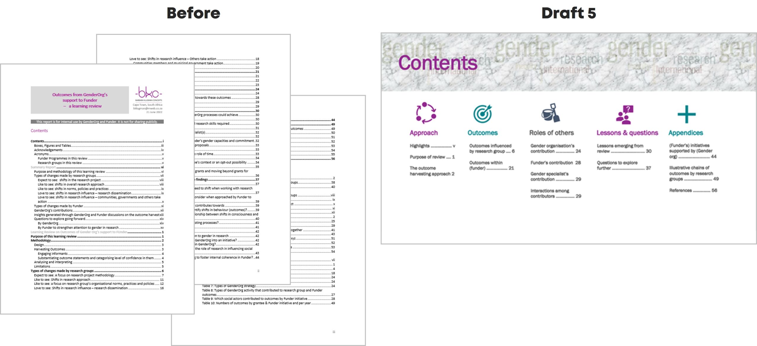
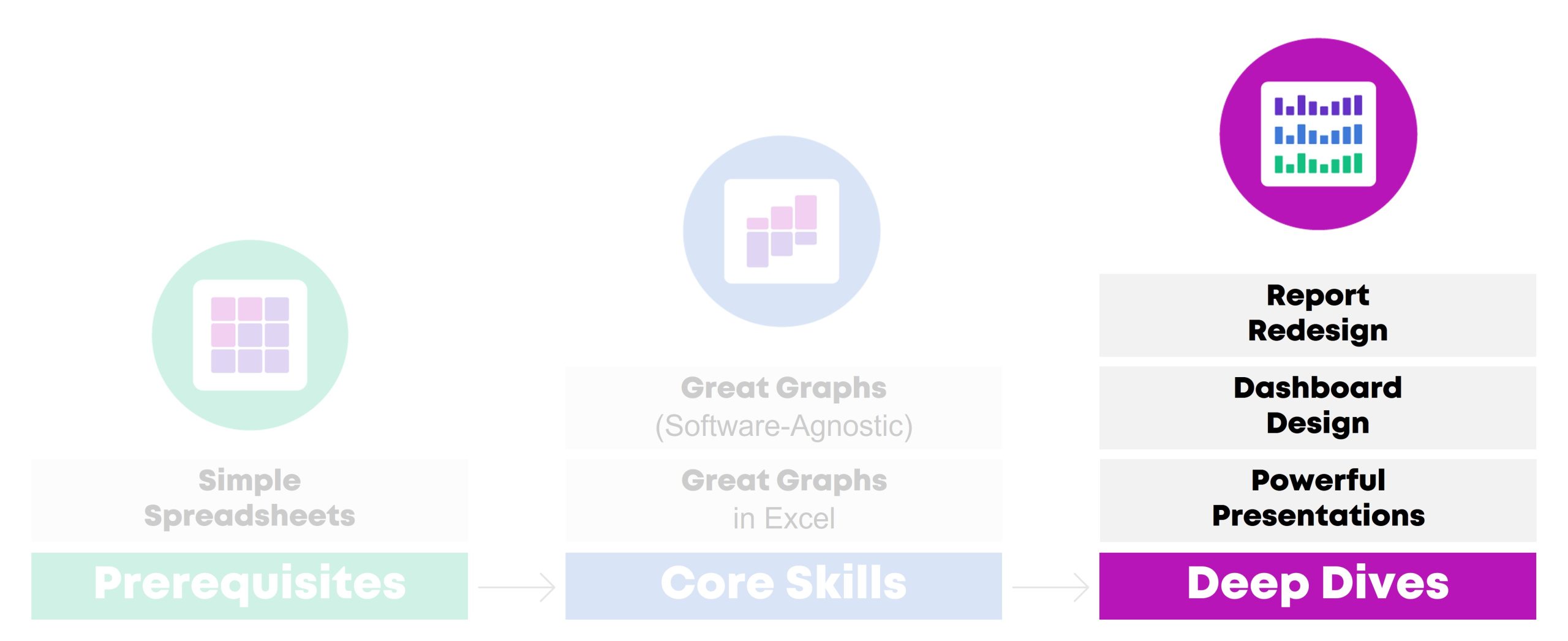
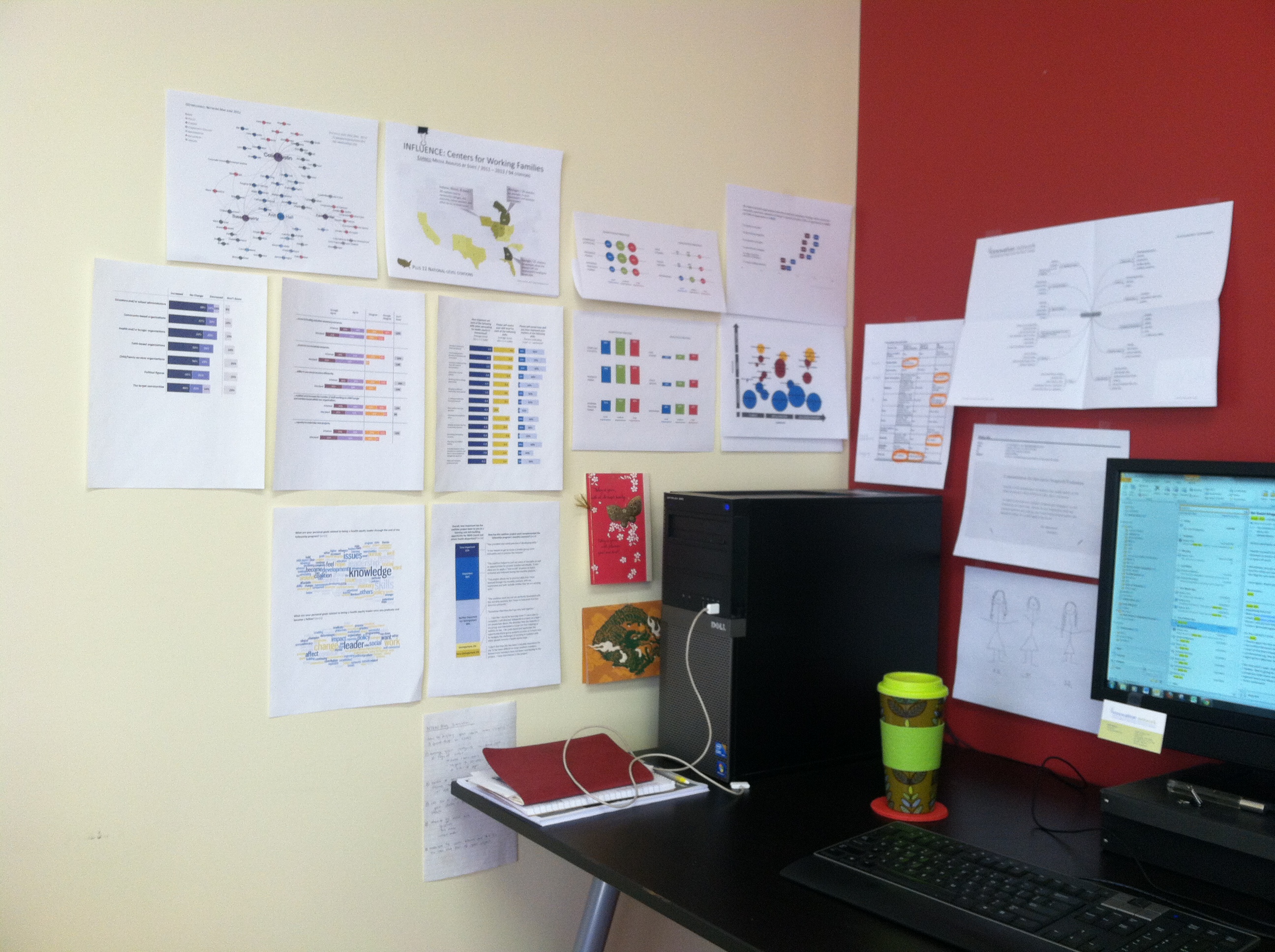
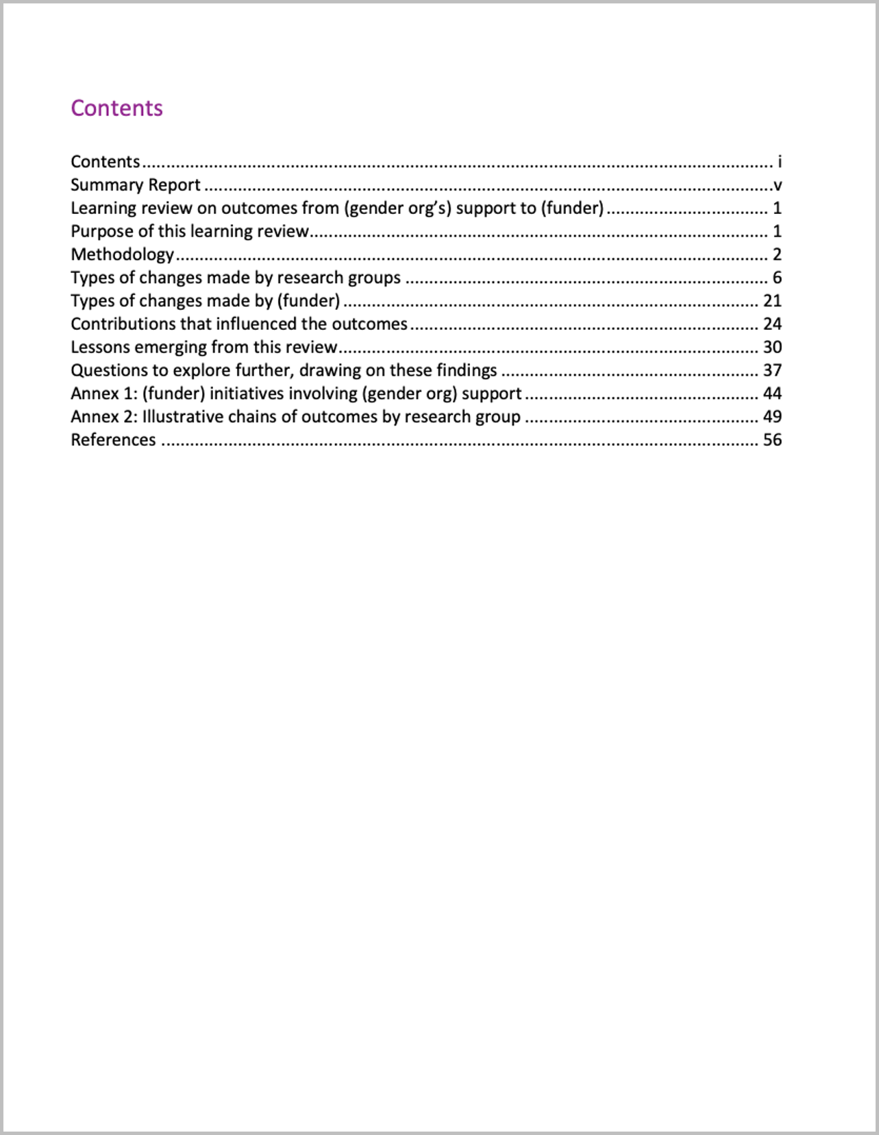
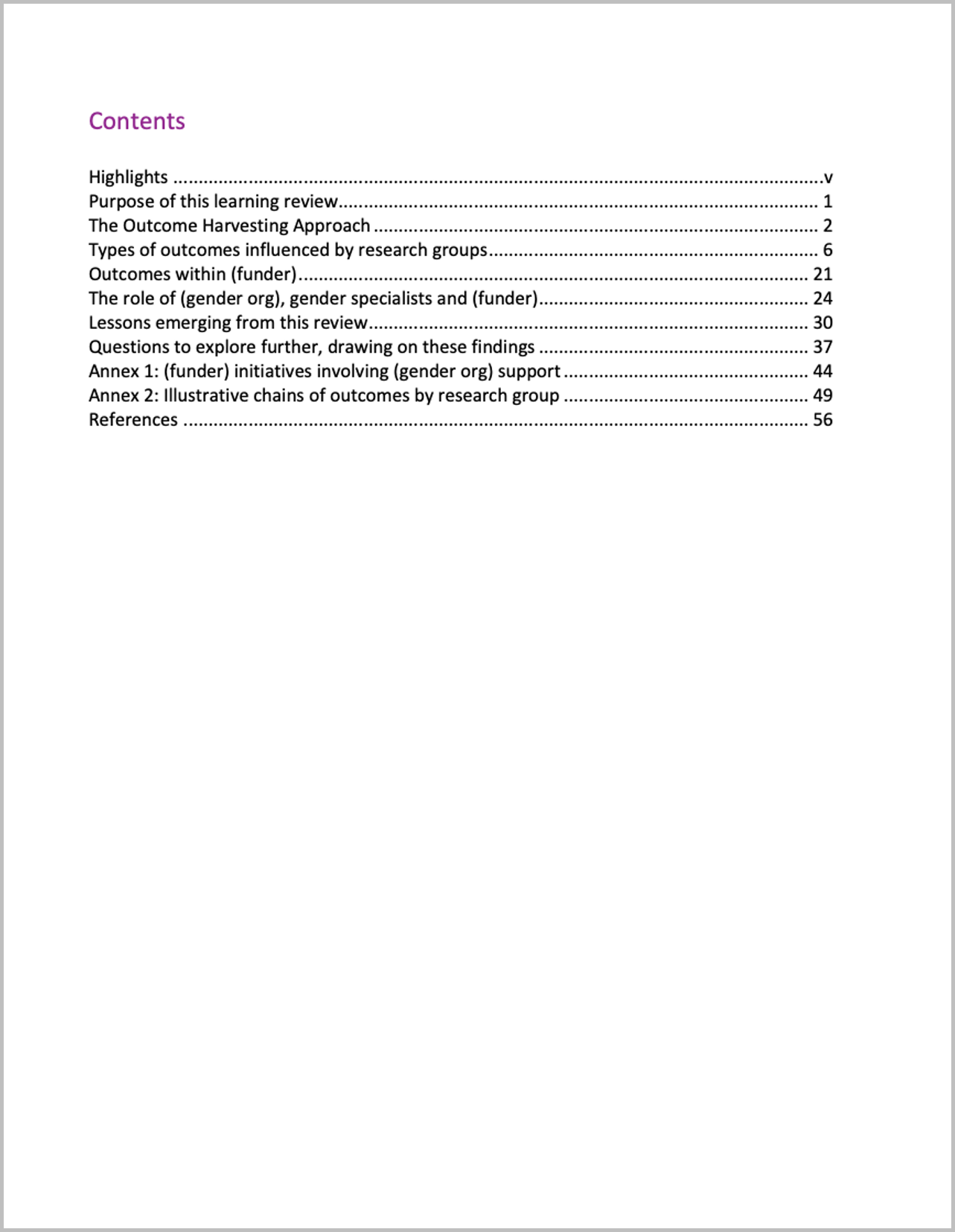
The Original

Here’s what the initial Table of Contents looked like:

Draft 1

I cut my multi-page contents page from three heading levels to only Heading 1s.

Draft 2

I changed some headings to be more meaningful.

For example,

  • from ‘Summary Report’ to ‘Highlights’
  • from ‘Methodology’ to ‘The Outcome Harvesting Approach’; and
  • from ‘Contributions that influenced the outcomes’ to ‘The role of (gender org), gender specialists and (funder)’.
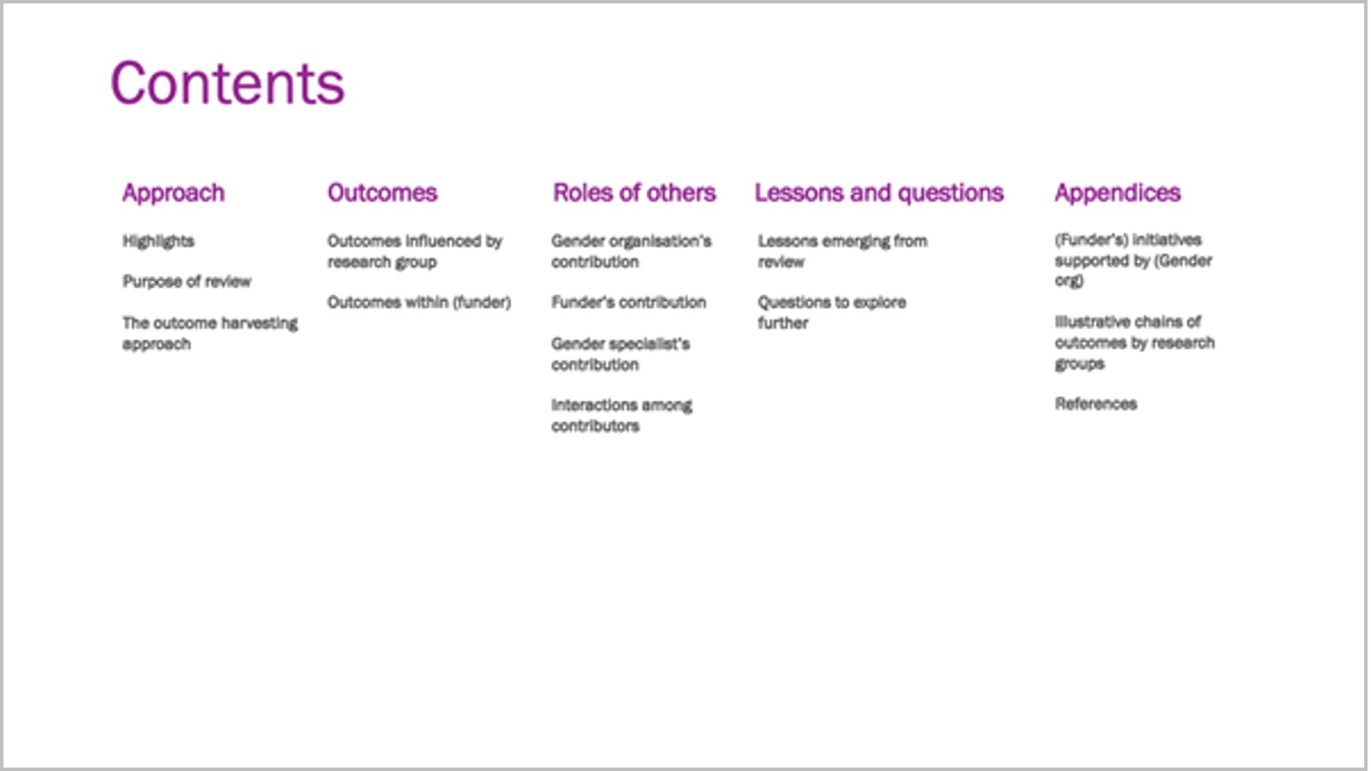
Draft 3

I grouped the headings, named the groups, and set it up in landscape.

I also enlarged ‘Contents,’ in response to one of Ann’s ongoing exhortations to “double the size of the headings from what you currently use.”

I moved from Word into PowerPoint.
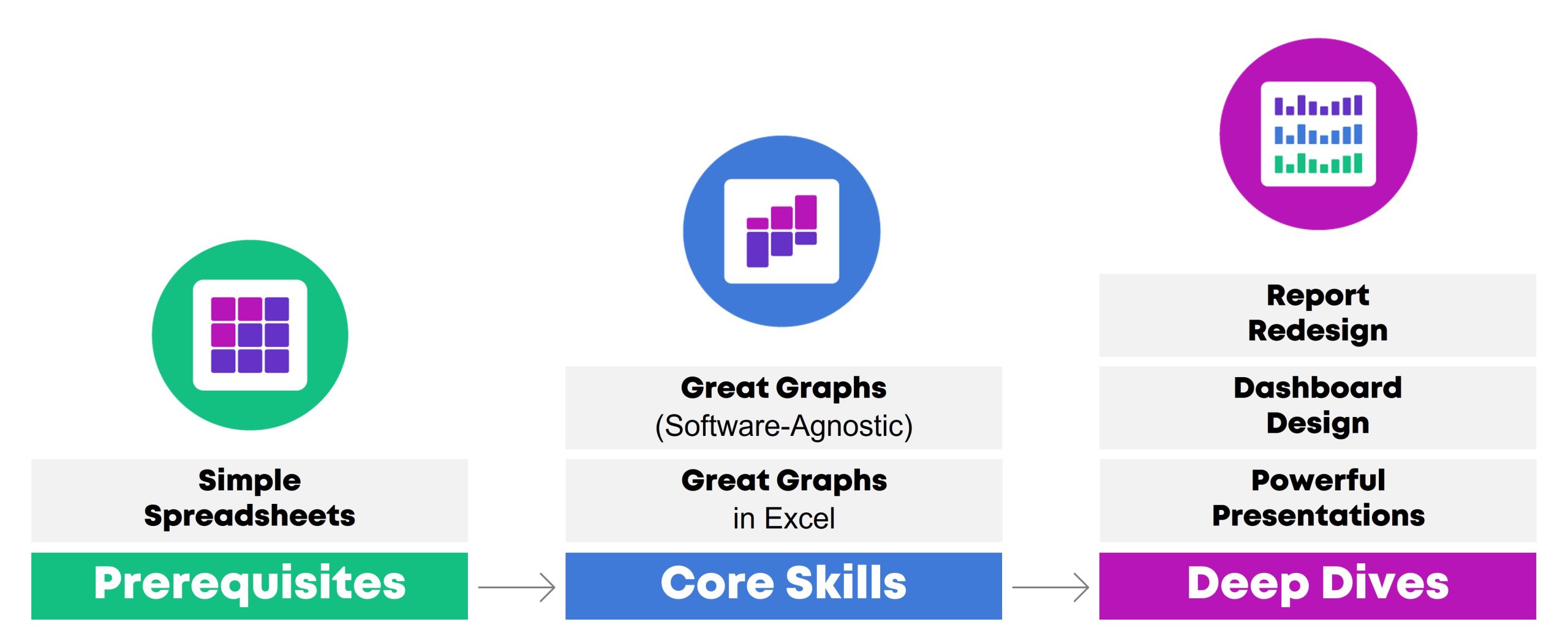
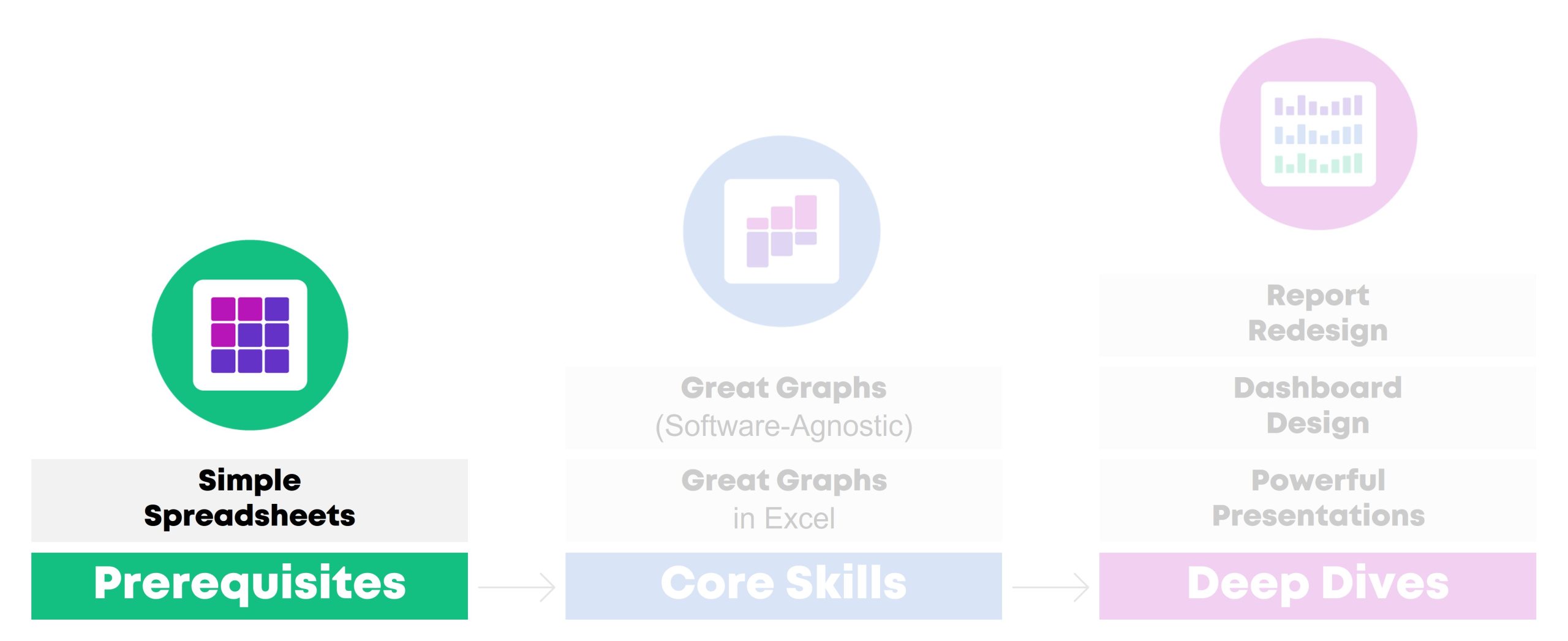
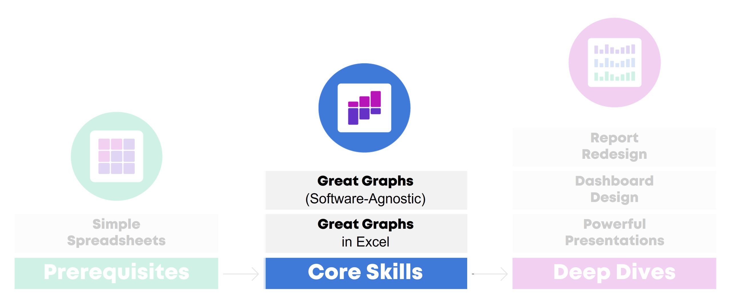
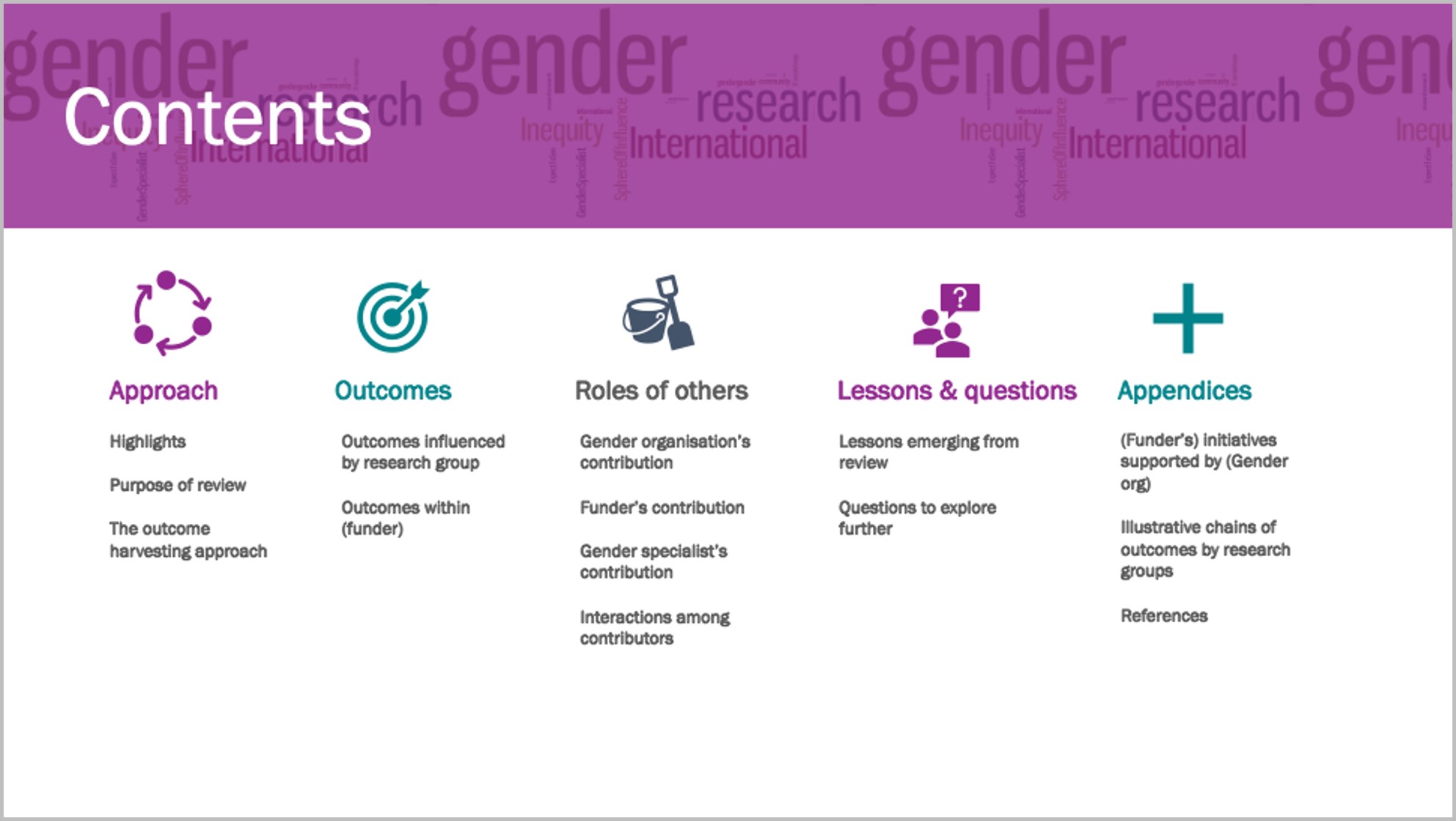
Draft 4

I created a section divider in my brand colours and added icons.

Ann proposes use of such dividers for short reports, with a different colour for each section – in long reports you’d use a whole page for each section.

I used her ’20-minute page cover’ method by layering a cylinder shape in my brand colour, somewhat transparent, over a Word Cloud, and ‘Contents’ on top.

I added an icon to each section and recoloured the sections to colours I will use for the divider page and headings of each section, taken from my brand colours.

Draft 5

I re-coloured the section divider and put in page numbers.

As ‘gender’ in the Word Cloud overwhelmed the heading, I used the ‘textures’ option in ‘format colours’ to create a grey textured layer over the Word Cloud, and changed the colour of ‘Contents.’

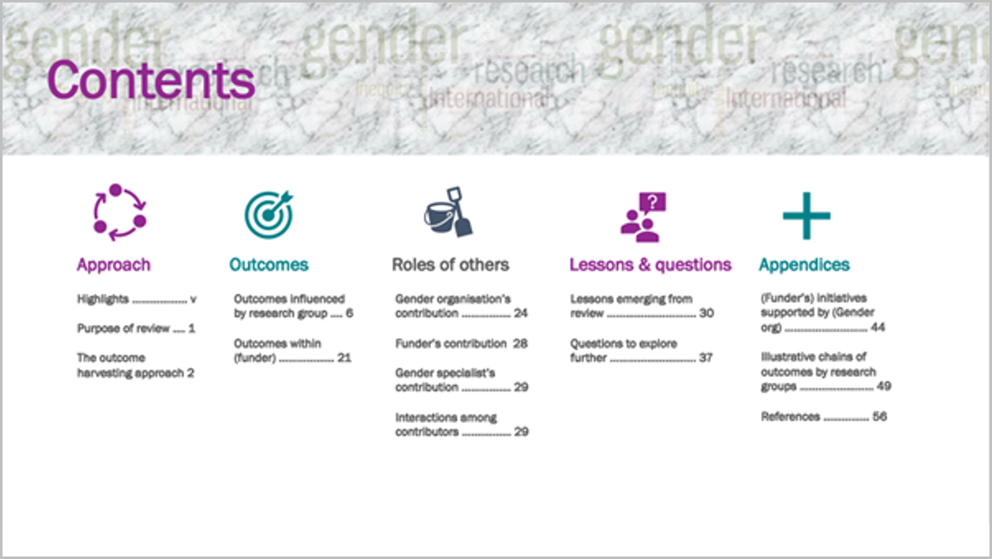
To me this shift from a pro-forma contents page to this version invites the reader to find what they’re looking for in the report.

Going forward, I would plan this out before writing the report, to help organise my own thinking about the contents and how to communicate it.

Thanks to Ann.

Written by cplysy · Categorized: depictdatastudio

Jun 19 2023

Building a Business that Fits Your Family: Disrupt Your Money Podcast

Wake up without an alarm… 

Exercise, eat breakfast with the family, work on energizing projects for a few hours… 

… and then call it a day. 

Take the kids to gymnastics. Volunteer at field day.

Take off the entire summer for bucket list adventures.

Months-long road trips around the United States. 

Cruises through Europe.

Passports full of stamps.

Meg K. Wheeler from The Equitable Money Project invited me to speak on her podcast about building a thriving business around your life — not building a life around your business.

Listen to the Podcast

Search for the “Disrupt Your Money” podcast on your favorite podcast app.

Or, listen on Spotify here:

Watch the Podcast

Or, you can watch our conversation:

Learn More

Meg asked me to write a blog post about my experiences, too. You can read that post here.

Inside, you’ll see how my business has evolved over the past decade. I also share behind-the-scenes revenue and expenses info. And, you’ll see five tips for transitioning from burnout to summers abroad.

Your Turn

What types of questions do you have about building a business that fits your family? Comment below!

Written by cplysy · Categorized: depictdatastudio

Jun 05 2023

How to Analyze Data with Excel’s Pivot Tables (No Formulas Required!)

In May 2023, I led a 45-minute session at Good Tech Fest about using pivot tables to analyze a dataset from start to finish.

The conference recording wasn’t perfect — I got kicked out of the conference session midway, and again towards the end. The audio sounds funky; it sounds… mechanical? Static-y? Unfortunately the conference platform was glitchy for many, many sessions. Lots of presenters got kicked out and had to re-load and re-join. Sigh.

I was hesitant to share the recording and materials at all. But, maybe you’re brand new to pivot tables and something is better than nothing? Fingers crossed that this blog post reaches the right people!

What are Pivot Tables?!

Pivot tables are a great option for our recurring analyses, like weekly, monthly, or quarterly updates to our boss; or for annual reports to our funders.

You’ll create the pivot tables you need just once, so you can save precious time and avoid having to re-do your analyses over and over again for each report deadline.

My Goal

Let’s move you up a half-step within just 45 minutes!

What’s your current familiarity with pivot tables?

  • Beginner: “I’ve never heard of pivot tables.” “I heard of pivot tables years ago, but never used them.” “Everything in spreadsheets takes forever.” “Using Excel is the least favorite part of my job.”
  • Intermediate: “I used pivot tables a couple times, but I don’t have the hang of them yet.” “I need a refresher.” “I get stuck sometimes.” “I’m not sure if I’m doing it right; sometimes I’m guessing.”
  • Advanced: “I use pivot tables daily.” “I could teach others to use pivot tables.”

Did you move up a half-step after participating in the session?

Comment below and let me know!

Download the Spreadsheet

This session was interactive; I demonstrated a skill, the attendees practiced, and so on.

Here’s the spreadsheet: https://depictdatastudio.gumroad.com/l/GoodTechFest

Watch the Conference Session

What You’ll Learn about Pivot Tables

Here’s what we covered during the conference session.

Step 0: Optional: Use An Excel Table

How familiar are you with Excel Tables? Comment below and let me know!

Excel Tables help to future-proof our analyses, making it easier to add new rows to the bottom of our spreadsheet (“append” the table).

Here’s how to add Excel Tables:

  • Go into your dataset and click on the upper left corner.
  • Go to the Insert tab.
  • Click on the Table button.
  • In the pop-up window, click OK.
  • That’s it! You’ve got an Excel Table.

You probably recognize the banded rows?

You’re probably familiar with filters?

My favorite part of Excel Tables is that they expand easily to handle new columns and rows; i.e., our new entries will feed easily into our Pivot Tables (as long as you “refresh” the pivot table).

Step 1: Make Sure Pivot Table Prerequisites Have Been Met

There are two prerequisites:

  • All columns must be labeled. If you add a new column, make sure to give the variable a name. Otherwise, you’ll get an error message later.
  • We need contiguous cells. We can’t have any completely empty columns or rows. A “Swiss cheese pattern” with a few empty cells here and there is normal and fine.

Luckily, having an Excel Table makes this step unnecessary!

In other words, if you add an Excel Table, then you’ll automatically have labeled columns and contiguous cells, phew!

In the video, you’ll see me demonstrate what type of errors can arise from non-contiguous cells that aren’t stored in Excel Tables. Knowing what not to do is just as important as knowing what to do.

Step 2: Add a New Pivot Table

Let’s insert a brand new pivot table from scratch!

In the video, you’ll see me go to the dataset… go to the Insert tab… and click on the Pivot Table button.

You’ll see a pop-up window, which can be confusing for newbies. It’s just (1) verifying that your correct columns and rows are selected and (2) asking where you’d like your pivot table.

You can put your new pivot table in:

  • a brand new sheet, or
  • an existing sheet (like if you’d want multiple tables, linked to multiple graphs, which is great for interactive dashboards).

(In this example, I simply added a pivot table to a brand new sheet.)

Then, you’ll re-name your sheet to stay organized. Don’t leave your sheets as Sheet1, Sheet2, or Sheet3! This is a red flag. It tells me your Excel file is a disorganized disaster.

On your new sheet, you’ll see a few boxes on the right side. Here’s an overview of what they mean:

  • Fields: The names of all the variables in your dataset. (The column headers.)
  • Filters, Columns, Rows, and Values: The boxes where you’ll drag-and-drop your variables into.

Step 3: Drag and Drop Variables!

You’ll drag-and-drop variables to build a summary table (so you don’t have to learn formulas like countifs and sumifs).

Here are some Rules of Thumb:

  • If your dataset has unique IDs, then you’ll drag those into the Values box, and you’ll change them to a Count. (You’ll see me demonstrate this in the video.) By default, Excel gives us Sums, which don’t make any sense for variables like ID numbers.
  • Start your analysis by dragging one variable at a time into Rows. (In the video, you’ll see me drag Q1 into Rows.) Then, we get a summary table, like how many people selected Strongly Agree or Agree on our fictional survey.
  • Pivot your table! Drag variables into Rows… and then into Columns! This is where the pivot table gets its name. You can rearrange your summary table as many times as you need. I encourage you to trust your gut instinct here!!! You’ll find summary tables that are naturally easier to read then others.
  • Then, try crosstabs — where you keep one variable in Values (the ID numbers) and drag two variables into Rows and/or Columns. For example, you might look at how people responded to Q1, by cohort. This is my personal max for pivot tables: one variable in Values, and two in Rows or Columns. Once you add three, four, or five variables into Rows or Columns… it gets impossible to read.

Optional: Re-order variables within the pivot table. For example, you can sort the variables from Strongly Agree to Agree to Disagree to Strongly Disagree (instead of the default setting, which is alphabetical).

Optional: Show percentages in addition to, or instead of, your counts. In the video, you’ll learn how to Show Values As a percentage. Finally, you’ll learn how to round the percentages with the Decrease Decimal button.

Behind the scenes, Excel is calculating countifs and/or sumifs for us. I personally love love love formulas… but I love that pivot tables can bypass these formulas entirely. In the video, you’ll see me create a countifs formula.

Optional: Add quick vizzes, like Color Scales, to your pivot table. Color Scales help the patterns jump off the screen and into our brains.

Step 4: Refresh Your Pivot Table

Anytime you update your dataset… you’ll need to refresh the linkage with your Pivot Table.

You might add new columns. Or new columns. Or make tiny adjustments within the body of your dataset.

You’ll simply click on your Pivot Table, right-click, and choose Refresh. That’s it!

Phew! Right as I was describing the Refresh button, the conference platform kicked me out for a second time. I was definitely crying inside because all my hard prep work was getting flushed down the drain. Sigh.

Written by cplysy · Categorized: depictdatastudio

May 08 2023

My 6 Data Communications Classes

Did you know… that I teach six different classes?

All of these classes fall under the broad data communications umbrella.

One class focuses on data analysis (cleaning and tabulating our raw datasets to get them ready for graphs).

Two classes focus on core data visualization skills (translating technical information for non-technical audiences; making sure we don’t just have bar charts; and using colors and fonts that are branded, accessible, and intuitive).

Three classes are advanced, sort of. I call them deep dives because they focus just on reports, or dashboards, or presentations. You’ll need to have your graphs created and edited first (skills taught in previous classes) so they can feed into those reports, dashboards, and presentations.

In this article, you’ll learn more about each of the classes.

Class 1: Simple Spreadsheets: How to Analyze Data from Start to Finish in Excel

Need to make sense of spreadsheets? Not sure where to start? Chances are, there’s a faster and easier way to get it done.

In this class, you’ll practice a step-by-step process for exploring, cleaning, analyzing, and tabulating your dataset. These spreadsheet skills will save your time, energy, and sanity.

You’ll learn how to:

  1. organize your brand new datasets by adding filters, freezing panes, and keeping raw data separate from clean data;
  2. merge disparate spreadsheets together with lookup formulas;
  3. clean and recode messy data (by checking for missing data and duplicates, and by transforming variables);
  4. run descriptive statistics and frequencies; and
  5. explore data more fully through pivot tables.

This workshop is highly interactive. Each section begins with a demonstration followed by a break for hands-on practice. For example, in the Analyze Data with Pivot Tables module, the instructor will show how to insert a pivot table and drag-and-drop variables. Then, you’ll practice right away, and you’ll be expected to ask questions whenever you get stuck.

Learning Objectives

After the two-day workshop, participants will be able to:

  • merge data from multiple sheets into a single master dataset;
  • organize spreadsheets by adding filters and freezing panes;
  • check for duplicates and missing data;
  • clean and recode messy data to get it ready for analysis;
  • run basic descriptive statistics and frequencies; and
  • explore data more fully through pivot tables.

Target Audience

Researchers, evaluators, scientists, graphic designers/communications staff, and admin staff who need to use Excel spreadsheets as part of their job–and it’s not your favorite part of your job.

If you already teach Excel at conferences or in seminars, you don’t need this class. It’s for those of us who didn’t take graduate courses specifically on Excel formulas.

If formulas and pivot tables have always been easy for you, you don’t need this course. It’s for those of us who feel like we’re missing something; that “I don’t know what I don’t know” feeling.

If you’re looking for a dataviz course, this isn’t it. Simple Spreadsheets is about: You’re opening a brand new dataset for the first time. Now what?! You’ll tabulate nominal, ordinal, interval, and ratio variables with the right formulas (you’ll need different formulas based on the type of variable/dataset). You’ll learn the in’s and out’s of pivot tables — and when to use formulas vs. pivot tables. These are the skills that precede graphs, dashboards, reports, and slideshows.

Level

Beginner/intermediate.

Prerequisites

None.

(But this course is a suggested prerequisite for all the other classes.)

Equipment Needed

A desktop or laptop computer (not a tablet or phone).

PCs preferred over Macs.

Software Programs Used

Excel is required.

Newest version preferred (called “Microsoft 365”).

Materials Included

  • 2 days of live instruction (two days on-site, or four half-days virtually).
  • For virtual trainings: Access to recordings for 1 year so you can re-watch anything you’d like.
  • ~6 different Excel files with step-by-step instructions typed out for you.

What Participants Are Saying

“As a 20+ year Excel user I can not BELIEVE the things I didn’t know, and that I learned to master in moments from Ann’s brilliant and engaging teaching. This course is by far the most well prepared and executed online course I have ever taken… The course materials are actual Excel files embedded with the skills, tricks and formulas… As far as who this course is best suited to, I think it could help Excel users of all levels, from beginners to advanced (which is what I would have called myself before taking this course and realizing my knowledge gaps!). For beginners it would be a one-stop shop of all you need to know to excel at Excel. For long-time users it will provide short-cuts, helpful formulas and other tricks you might not have known were hiding in this program. I truly can’t say enough about it, and have already recommended it to research colleagues, data/social indicator experts and policy folks.” – Lynn Davey, Ph.D, Davey Strategies

“I am a university researcher and have a lot of familiarity with data collection and statistical analysis programs/platforms (e.g. SPSS, SAS, etc.), but needed a low-cost, widely-used data collection and analysis tool I could recommend and teach to the community partners with whom I conduct research. I have known for a long time that Excel was likely the solution to my problem, but could never find time to learn to use it, except in the most basic ways (sort, sum). Last summer, I took Ann Emery’s Simple Spreadsheets course and dramatically improved my Excel acuity. *Plus* the course was fun, straightforward, and immediately useful… This course was more than worth the time and money I put into it, and I continue to learn and benefit from it (almost a year later). I highly recommend this course!” – Sarah V. Suiter, Vanderbilt University

Case Studies from Past Participants

You can view participants’ before-after transformations here:

  • 6 Data Cleaning Steps to Save You Millions by Hudson Kelley, HOPE International

Class 2: Great Graphs: A Software-Agnostic Introduction to Accessible Data Visualization

Are your takeaway findings getting lost? Busy graphs can slow down the viewer’s comprehension, increase cognitive load, and fail to inform decision-making processes. With intentional editing, we can design graphs that inform and inspire.

During this class, you’ll walk through a step-by-step process that you can apply to your own projects.

You’ll learn how to:

  1. customize your visualizations for each of your audiences (technical vs. non-technical, internal vs. external, etc.);
  2. choose the right chart type for your dataset (hex maps vs. choropleth maps, donuts vs. waffles, spaghetti lines vs. small multiples, etc.);
  3. select an appropriate software program for your needs;
  4. declutter your visuals so that viewers’ attention is focused on the data; and
  5. use colors and fonts that are branded, accessible, and intuitive.

Learning Objectives

After the two-day workshop, participants will be able to:

  • explain when they would use traditional graphs vs. storytelling graphs;
  • weigh the pros and cons of presenting data through various chart types (e.g., clustered bar charts vs. dot plots, and choropleth maps vs. hex maps);
  • explain how to declutter visuals to make sure the viewers’ attention is focused on the key patterns (e.g., by removing redundant text);
  • select graph colors that are branded, accessible, and intuitive; and
  • write graph text (titles, annotations, tooltips, etc.) that is branded, accessible, and intuitive).

Target Audience

Researchers, evaluators, scientists, graphic designers/communications staff, and admin staff who need to share data with others through accessible graphs.

Level

Beginner/intermediate.

Prerequisites

None.

(But this course is a suggested prerequisite for Great Graphs in Excel, Report Redesign, Dashboard Design, and Powerful Presentations.)

Equipment Needed

A desktop/laptop computer (not a tablet or phone).

PCs preferred over Macs.

Software Programs Used

None.

This course covers software-agnostic best practices that can be applied to any software program you might be using, from Excel to Tableau to R.

You don’t need to learn coding or graphic design to communicate data more effectively, and you’ll be encouraged throughout the class to continue using whichever software you’re already using.

Most of the examples shown throughout the course have been made with everyday software like Excel.

Materials Included

  • 2 days of live instruction (two days on-site, or four half-days virtually).
  • For virtual trainings: Access to recordings for 1 year so you can re-watch anything you’d like.
  • Handout
  • Ebook
  • PDF’d slides

What Participants Are Saying

“I would often see charts, graphs, and other data visuals in journal articles, and think to myself, ‘Wow, this is horrible; I have no idea what I am supposed to learn from this!” But I had no idea how to make it better or offer constructive suggestions.  After Great Graphs, I learned about how to select the best type of graph and how to make it visually appealing to the intended audience.  My own publications and posters have also benefitted—no more hard-to-read charts filled with clutter!” – John R. Heberger, Epidemiologist, Centers for Disease Control and Prevention

Case Studies from Past Participants​

You can view participants’ before-after transformations here:

  • A Before-After One-Pager Makeover by Lillian Haley, Haley Evaluation & Research Services

Class 3: Great Graphs in Excel: How to Make Beginner, Intermediate, and Advanced Graphs from Start to Finish

You’re familiar with all the research-based dataviz best practices. Now, let’s get down to business and make those graphs in Excel!

During this class, you’ll make beginner, intermediate, and advanced graphs in Excel.

You’ll walk through four levels of Excel vizardry:

  1. First, in Level 1, you’ll explore your dataset with sparklines, data bars, and heat tables.
  2. In Level 2, you’ll learns the in’s and out’s of overused native charts (bar charts, pie charts, line charts, and more).
  3. In Level 3, you’ll make underused native charts, like tree maps, b’arc charts, sunburst diagrams, and geographic maps.
  4. Finally, in Level 4, you’ll make non-native charts–charts that require sophisticated workarounds to produce in Excel, like dot plots, small multiples bar charts, population pyramids, waffle charts, and more.

Learning Objectives

After the two-day workshop, participants will be able to:

  • explore preliminary patterns by adding sparklines, data bars, and heat tables;
  • create and edit classic chart types (bars, lines, pies, etc.) to make sure they’re Big A Accessible (508-compliant) and little a accessible (intuitive);
  • practice creating newer chart types that are now available in Excel, like geographic maps and tree maps; and
  • transform Regular Tables into Magic Tables to fully harness Excel’s power and make dot plots, population pyramids, and more.

Target Audience

Researchers, evaluators, scientists, graphic designers/communications staff, and admin staff who need to share data with others through accessible graphs.

Level

Intermediate.

Prerequisites

You should complete a one- or two-day data visualization best practices class first (like Great Graphs).

You should already have strong spreadsheet skills (being able to transform your raw data into clean, tabulated data (skills covered in Simple Spreadsheets).

Equipment Needed

A desktop/laptop computer (not a tablet or phone).

PCs preferred over Macs.

Software Programs Used

Excel is required.

Newest version preferred (called “Microsoft 365”).

Materials Included

  • 2 days of live instruction (two days on-site, or four half-days virtually).
  • For virtual trainings: Access to recordings for 1 year so you can re-watch anything you’d like.
  • 28+ Excel files with step-by-step instructions and templates for making beginner, intermediate, and advanced graphs.
  • 2-page Chart Chooser.
  • 1-page cheat sheet on Transferring Graphs from Excel into Word or PowerPoint.
  • Instructions for setting up Theme Colors & Theme Fonts.

What Participants Are Saying

“Before the course, I presented numbers narrated by text…yawn. Now, I present numbers as a story with visuals, sometimes as simple as sparklines, which engages staff and invites their insights! The Great Graphs in Excel course helped me see and share what story our data is telling. This course is best for people who learn through interaction, not just watching videos and reading tutorials. Ann K Emery responds to students’ questions and specific data scenarios, has us try the solutions real-time, and engages and encourages her students (probably the most impactful part of the course…) I especially appreciate her walking us through her thought process as she demonstrates the procedures she’s developed. It’s like having an officemate who’s both a whiz and mentor, which helps make me a better analyst.” – Ellen Shepherd, Program analyst at a nonprofit

“This course helped me to see Excel as a flexible tool for a wide range of data management and analysis tasks… Much more than just tables and calculations!” – Bob Coulter, Missouri Botanical Garden

“My trend is definitely upward in this course. I’m learning EVERYTHING about graphs and #dataviz. Even the first couple lessons taught me so much useful formatting information about Excel that are already saving me so much time and ensuring my #professionalbranding consistency. And I’m looking forward to making graphs and charts that can convey complex information in an effective way!” – Sue Griffey, Founder, SueMentors

“Enrolling in courses at Depict Data Studio is one of the best professional developments I have ever made… After eight months with Ann, I was able to turn my blah capabilities statement into something I am happy to share! I could go on and on about the many design and data visualization lessons I’ve learned from Ann. Instead, I’ll end by saying that books and blogs are excellent resources. I have several books and subscribed to many blogs. However, they do not compare to live and on-demand instruction of Depict Data Studio.” – Lillian Haley Ph.D., MSW, ChFC®, President and Owner, Haley Evaluation & Research Services (HERS)

Case Studies from Past Participants​

You can view participants’ before-after transformations here:

  • 3 Simple Steps that Took My Graph from Good to Great by Maia Werner-Avidon, evaluator

Class 4: Report Redesign: How to Transform Text-Heavy Technical Reports into Visual, Skimmable Reports

Were you trained to write lengthy technical reports with methodological details? Technical reports are a great fit for technical audiences, like our peers working in public health. But what about our non-technical audiences, like policymakers or the general public?

In this class, you’ll learn how to translate technical data for non-technical audiences. You’ll walk through 3 layers of the Report Redesign pyramid.

Here’s what you’ll learn and practice:

  • In “Level 1: Go Beyond the Report,” you’ll learn how to add a variety of dissemination formats to your project (not just reports) in order to meet a variety of audiences’ needs. You’ll also learn about the 30-3-1 Approach to Reporting, visual appendices, and the 8 ingredients for designing one-pagers.
  • In “Level 2: Structure Your Report,” you’ll learn how to design a 20-minute cover. Then you’ll visually chunk your data with color-coded chapters. These are the big-picture, structural edits that make data-dense reports easier to skim and navigate.
  • Finally, in “Level 3: Design Each Page,” you’ll fine-tune the graphs and paragraphs included on each page. You’ll see a checklist of 15 Ideas for Visuals, and then practice adding more visuals to each page. You’ll also edit your writing to ensure that it’s accessible and inclusive.

Learning Objectives

After the two-day workshop, participants will be able to:

  • name a few dissemination formats (beyond technical reports) that would be ideal for non-technical audiences;
  • describe the 30-3-1 Approach to Reporting;
  • name 8 ingredients that should be included in one-pagers;
  • create a 20-minute report cover in Word;
  • create color-coded divider pages in Word; and
  • transform one text-heavy page into a visual, skimmable page.

Target Audience

Researchers, evaluators, and scientists who are preparing technical reports (peer-reviewed articles, etc.) and need to translate those scientific details for non-technical audiences.

Or, graphic designers/communications staff and admin staff who are helping scientists prepare those non-technical reports or infographics.

Level

Intermediate/advanced.

This training is ideal for staff who regularly work on reports of any type or length, and who might already be thinking about adding one-pagers or infographics to their project.

In other words, you’ll gain the most from this session if you can bring your own draft reports to work on. It’ll be harder to participate if you don’t have any documents to work on during the hands-on portions.

Suggested Prerequisites

This course is about designing reports and one-pagers for non-technical audiences. It’s not a data visualization course. We suggest that you complete a half-day or full-day data visualization class first. Then, those well-designed graphs and maps can go into the reports that you’ll fine-tune during this course.

Equipment Needed

A desktop/laptop computer (not a tablet or phone).

PCs preferred over Macs.

Software Programs Used

You’ll learn both reporting best practices and Word how-to’s.

Materials Included

  • 2 days of live instruction (two days on-site, or four half-days virtually).
  • For virtual trainings: Access to recordings for 1 year so you can re-watch anything you’d like.
  • Ebook
  • PDF’d slides

What Participants Are Saying

“Investing in the Report Redesign course from Depict Data Studio was one of the best decisions I have made in my career. Before the course, I was writing long, wordy reports that I thought were visually appealing because I included tables and bar charts; I had no idea the options I had within software I already had access to. Now, I create impactful one-pagers and reports that are visually appealing and even more importantly, get read by my colleagues. I know that there are more than 15 types of visuals to include in reports, how to utilize my company’s brand to my advantage, and more. I have been complimented on the new look of my reports by coworkers and external stakeholders, and continue to have “aha” moments of how I can continue to apply Ann’s advice as access to the course never expires. I cannot recommend this course enough. Thanks Ann and Depict Data Studio!” – Olivia Power, Data and Reporting Specialist, National FFA Organization

Case Studies from Past Participants

You can view participants’ before-after transformations here:​

  • Upping Your Reporting Game–with PowerPoint! by Ann Webb Price, Community Evaluation Services
  • Three Ways Intentional Data Viz Has Elevated My Work by Kathy Dowell, The Evaluation Group

Class 5: Dashboard Design: How to Design Static and Interactive Dashboards in Excel

Why wait until the end of the year to write a lengthy report when you can share data early and often with dashboards? Your organization’s leaders have more important things to do than read lengthy reports. Dashboards get to the point so that leaders can understand the numbers and take action.

During this class, you’ll make both static and interactive dashboards in Excel.

First, you’ll see sample dashboards from a dozen organizations like yours. You’ll hear share the story behind each dashboard so that you can learn about each dashboard’s audience and goals. For example, some of the dashboards were designed to track progress towards goals. Other dashboards were designed to help organizations compare their different program areas. You can decide which elements of each dashboard would be most applicable to your own work.

Then, you’ll design a few static dashboards in Excel. You’ll create sparklines and uncover some of Excel’s best kept secrets, like Conditional Formatting. These dashboards will live inside of Excel and get shared with stakeholders as PDFs through email or as printed handouts during meetings. Static dashboards are a great fit for non-technical audiences who only have time to skim a one-page email attachment.

Finally, you’ll design an interactive dashboard in Excel. You’ll turn your regular table into an Excel Table; you’ll tabulate your dataset with pivot tables; you’ll design pivot charts to showcase your key findings; and you’ll link everything together with slicers. Interactive dashboards are a great fit for technical audiences who have time to explore the data themselves.

Learning Objectives

After the two-day workshop, participants will be able to:

  • describe when static vs. interactive dashboards are most useful (e.g., for technical vs. non-technical audiences);
  • create sparklines, data bars, and heat tables;
  • adjust their dashboard to be printer- and PDF-ready to create static dashboards; and
  • insert Excel Tables, pivot tables, pivot charts, and slicers to create interactive dashboards.

Target Audience

Researchers, evaluators, and scientists who want to create monthly, quarterly, or annual dashboards inside no-code software you already have, like Excel.

Level

Intermediate/advanced.

You don’t need to have any prior dashboard experience.

You *do* need to have prior data visualization and Excel experience (skills covered in Simple Spreadsheets and Great Graphs).

Suggested Prerequisites

You’ll gain the most from this course if you’ve already taken two other courses from this instructor: (1) Simple Spreadsheets (to start practicing formulas and pivot tables) and (2) Great Graphs (to start practicing data visualization skills, like chart-choosing, branding, and accessibility).

Equipment Needed

A desktop/laptop computer (not a tablet or phone).

PCs preferred over Macs.

Software Programs Used

Excel is required.

Newest version preferred (called “Microsoft 365”).

Materials Included

  • 2 days of live instruction (two days on-site, or four half-days virtually).
  • For virtual trainings: Access to recordings for 1 year so you can re-watch anything you’d like.
  • Ebook
  • PDF’d slides
  • ~15 templates with step-by-step instructions for making static and interactive dashboards in Excel

What Participants Are Saying

“This course helped me to design a visually engaging and easy to interpret surveillance report for our State Health Department. This course offers so many great Excel tips and techniques in such an organized way. The skills I learned from this course were extremely easy to apply to an actual project. Furthermore, the course examples provided me with so many ideas and inspiration for future projects.” – Melissa Lurie, MPH, Epidemiologist/Research Scientist, New York State Department of Health

“When I started my position, I was tasked with developing a better way to track performance data across multiple programs. With this course, I was able to transform the old system into a dashboard that is efficient, makes good use of a single page, and looks great. We now get lots of compliments on our dashboard, thanks to this course.” – Shawna Rohrman, Associate Director, Cuyahoga County Office of Early Childhood

Case Studies from Past Participants

You can view participants’ before-after transformations here:

  • Creating Reports for Grant Deliverables Using Excel Dashboards by Josephine Engels, Mental Health America of Greater Houston
  • Better Storytelling with the Same Data: Upgrade that Board Packet! by Kristen Summers, Saint Luke’s Foundation

Class 6: Powerful Presentations: How to Design and Deliver Presentations for Maximum Impact

Do you need to give presentations, either in-person or online? You might need to design slides for public health conferences. Or, you might need to give updates at your staff meetings.

In this class, you’ll learn how to avoid Death by PowerPoint–those slides with Text Walls, grainy images, and run-on content. Our audiences are busier than ever, and they’re relying on us to communicate our data clearly and concisely.

You’ll gain presentation best practices and practical how-to’s in PowerPoint.

First, in the “Slidedecks vs. Slidedocs” module, you’ll learn the five graphic design features that make presentations stand out from reports. You’ll see examples of slidedecks and slidedocs from real CDC projects, and we’ll pause to make sure you know whether you need slidedecks and/or slidedocs for your own projects.

Second, in the “Message” module, you’ll design a Visual Framework to help organize your presentation into manageable chunks of information. You’ll also write the takeaway tweets for your presentation in advance to make sure it’s concise and actionable.

Third, in the “Design” module, you’ll swap out your bullet points and bar charts for a variety of visuals. You’ll receive our Chart Chooser and our checklist of 15 Ideas for Visuals, and we’ll practice adding visuals to some of your real slides.

Fourth, in the “Delivery” module, you’ll learn how to storyboard you slides, which is a technique for breaking up dense data over multiple slides and explaining it piecemeal to our non-technical audiences. You’ll also learn about public speaking skills, body language, and tech set-up for virtual presentations.

Learning Objectives

After the two-day workshop, participants will be able to:

  • name five characteristics that should differentiate slidedocs (handouts made in PowerPoint) from slidedecks (presentation slides made in PowerPoint);
  • narrow down a presentation’s content to just 3-5 “buckets” of information;
  • draft a Visual Framework (a diagram) that shows how those 3-5 buckets are related (e.g., a venn diagram, step-by-step process, or repeating cycle);
  • write a 1-2 sentence “takeaway tweet” that summarizes the main message from the presentation;
  • re-design one text-heavy slide so that it includes accessible, skimmable visuals; and
  • storyboard one graph (break up the graph over multiple slides to match your speaking points and keep the audience engaged).

Target Audience

Researchers, evaluators, and scientists who are preparing their own slides/handouts for upcoming presentations.

Or, graphic designers/communications staff and admin staff who are preparing slides/handouts that their supervisors will be presenting.

Level

Intermediate/advanced.

This class is designed for staff who are already giving presentations (informal staff meetings, or formal conference presentations) and want to take their slides and public speaking skills to the next level.

In other words, you’ll gain the most from this session if you can bring your own draft slides to work on. It’ll be harder to participate if you don’t have any slides or upcoming presentations to work on during the hands-on portions.

Suggested Prerequisites

This course is about presentations, slide design, and public speaking skills. It’s not a data visualization course.

We suggest that you complete a half-day or full-day data visualization class first (like Great Graphs). Then, those well-designed graphs and maps can go into the presentations you’ll design in this course.

Equipment Needed

A desktop/laptop computer (not a tablet or phone).

PCs preferred over Macs.

Software Programs Used

You’ll learn both presentation best practices and PowerPoint how-to’s.

Materials Included

  • 2 days of live instruction (two days on-site, or four half-days virtually).
  • For virtual trainings: Access to recordings for 1 year so you can re-watch anything you’d like.
  • Ebook
  • PDF’d slides

What Participants Are Saying

“Not only have my presentation skills and setup improved, but so have my slides. There are so many great tips and tricks I could highlight, but I will keep it to my three favorites: color coding, increasing readability, and storyboarding. The best part is, they don’t take that much extra time! These are simple changes that take your slidedecks to a new level and allow you to really impress your audience.” – Kelsey Waterson, Evaluator, Centerstone Research Institute

“A client asked me to report the results at their meeting and I used so many of your suggestions in the slidedeck, it was the most impressive PowerPoint I have ever made. But as the meeting progressed, they were running out of time, [but] luckily, I had also created a slidedoc and was able to share that document. I have never been so grateful that I had signed up for your class!” – Kristin Wright

Case Studies from Past Participants

You can view participants’ before-after transformations here:

  • A Tip, a Trick, and a Thing to Try in Your Next Presentation by Elizabeth Dove, University of Montana
  • Creating a Powerful Presentation: 3 Easy Changes to Revamp Your PowerPoint by Kelsey Watterson, Centerstone Research Institute

Learn More

If you’d like to explore private training options, you can learn more here.

Smaller teams may prefer group rates for online courses.

Written by cplysy · Categorized: depictdatastudio

Apr 10 2023

The Data Visualization Design Process: A Step-by-Step Guide for Beginners

Visualizing data in charts, graphs, dashboards, and infographics is one of the most powerful strategies for getting your numbers out of your spreadsheets and into real-world conversations.

But it can be overwhelming to get started with data visualization. Does data visualization leave you feeling like the numbers are about to topple over on you??

Bar charts falling onto stick people.

If so, this step-by-step data visualization guide is for you! I’ll walk you through the data visualization design process so you know what to do first, second, and third as you transform your spreadsheets into stories.

Step 1: Understand Your Audience

Wait! Don’t start making graphs on your computer! First, we have to do some planning. A little bit of up-front planning will save you hours of blood, sweat, and tears in the long run.

First, you need to analyze your audience. Who, exactly, is going to be using the data to make decisions?

Analyzing your audience is the least linear of all the thinking steps in the design process. Rather than relying on computer software or your programming skills, this step involves the most valuable computer of all—your brain.

Who is Your Audience?

Your audience should be your primary consideration. A chart designed for a group of foundation program officers will not be appropriate for a group of high school principals, and vice versa. List all your audience types on a piece of paper, or a whiteboard, or in a spreadsheet, or even on the back of a napkin. Share the list with your colleagues and make sure you’re on the same page. Have you reached consensus about who you’re targeting with your data?

What’s Your Audience’s Numeracy Level?

Do they enjoy or fear data? Unless you’re designing charts for a group of economists or statisticians, you can usually leave out details like the effect size, power analysis, and margin of error. Laypeople are often more interested in practical significance (the “so what?” and implications of findings) than in statistical significance.

What’s Your Audience’s Data Visualization Familiarity Level?

If they’re brand new to dataviz, stick with the traditional charts like pie charts, bar charts, and line charts—otherwise they’ll spend more timing ooh-ing and aah-ing over the chart’s novelty than paying attention to the information contained in the chart.

How Much Time Does Your Audience Have?

Little time or interest: Simple static chart. Lots of time and interest: Interactive charts.

What Types of Decisions Does Your Audience Make?

What information do they need? What information do they already have? What information are they expecting? How will your chart(s) add value for them? If you can’t think of how your chart will add value for the readers, don’t make one. Every chart needs a purpose and so what?

How Much Precision is Necessary?

As the data visualization designer, you have the freedom (and responsibility) to select how much precision is necessary. Your selection should be well thought-out and intentional. Your decision plays out in two ways: the chart type you select, and how you label the data points.

When selecting chart types, remember that some charts are better than others in displaying precision. For example, charts that rely on angles and area to show differences, like pie charts, are for communicating general patterns. Charts that rely on length to show differences, like bar charts, are for communicating specific details.

How Many Decimal Places Are Necessary?

A related decision is how exact your data labels will be. Will you include decimal places? How many?

In most scenarios, you can safely round your decimal places to the nearest whole number. Your audience is rarely using the tenths, hundredths, or thousandths place to make decisions.

Are My Viewers Expecting a Story?

Think about whether your audience is expecting you to tell a story with data–or not.

Step 2: Choose the Right Chart

It takes a while to understand all the different chart types and to pick the best one for your desired takeaway message. There are tons of great graphs to choose from!

Consult a Chart Chooser

My interactive Chart Chooser includes dozens of chart types, resources, tutorials, and templates.

My interactive Chart Chooser includes dozens of chart types, resources, tutorials, and templates.

New to Dataviz? Start with Classic Chart Types

If you’re not sure which chart to use, stick with classics like the bar chart to compare categories and the line chart to visualize how things change over time. These charts will be “right” most of the time, so they’re a safe bet.

Use Pie Charts Sparingly

Contrary to popular belief, pie charts are not evil and don’t have to be avoided altogether. I have seven guidelines for using pie charts and donuts. In this pie chart makeover, I show you how to transform a 3D pie chart with way too many slices into a storytelling bar chart with icons:

Getting Comfortable with Dataviz? Branch Out and Try Other Chart Types

Once you’ve mastered the classic chart types, you can play around with less-familiar chart types like bubble charts, bullet charts, dot plots, heat maps, scatter plots, slope graphs, social network maps, tree maps, waterfall charts, and more.

Surround Yourself with Positive Inspiration

Surround yourself with great graphs so you can expand your worldview of what’s possible with data visualization. I suggest following top-notch data journalism teams like @PostGraphics, @NYTgraphics, and @WSJgraphics.

You can even create a physical or digital library of great graphs. For example, you might print full-page, full-color charts and tape them near your desk. Surrounding myself with a variety of chart types, all of which have been used in different reports and for different groups of people, helps me create brand new charts easily. All I do is glance up at my gallery, and then I quickly figure out which chart is best for my new situation.

Work space with computer and papers taped to the wall for inspiration and reference.

Dive Into Your Dataset with Exploratory Data Visualization Techniques

I also use exploratory computer strategies, like Microsoft Excel’s spark lines, data bars, and conditional formatting, to help me narrow down the focus of my charts.

Spark Lines

Here’s a tutorial that shows you how to get started with spark lines:

Data Bars

And here’s a tutorial that shows you how to get started with data bars:

Conditional Formatting

You can set up rules in your spreadsheet that automatically change the color of certain cells based on their values. I regularly use heat tables to scan my dataset for patterns. You can follow my step-by-step tutorial to make heat tables for your data.

You can set up rules in your spreadsheet that automatically change the color of certain cells based on their values. I regularly use heat tables to scan my dataset for patterns. You can follow my step-by-step tutorial to make heat tables for your data.

Sketch Rough Drafts on Paper

Step back from your software program. This is especially crucial if you’re using Excel or R (versus Tableau) where you usually need a solid idea of your chart’s design before implementing that design on the computer.

I sketch, draw, and doodle plenty of drafts before I create anything on the computer.

Here’s how it works: First, sketch plenty of rough drafts on paper. Give yourself permission to doodle as many drafts as you need. Share drafts with colleagues early and often. Gather as much feedback as you can. Next, create one or two of those promising drafts on the computer. Finally, edit, edit, edit! Put your easiest-to-follow chart in your final presentation or report. You might sketch five or more drafts. Only the single best chart will survive the editing process.

Here's how it works: First, sketch plenty of rough drafts on paper. Give yourself permission to doodle as many drafts as you need. Share drafts with colleagues early and often. Gather as much feedback as you can. Next, create one or two of those promising drafts on the computer. Finally, edit, edit, edit! Put your easiest-to-follow chart in your final presentation or report. You might sketch five or more drafts. Only the single best chart will survive the editing process.

Step 3: Select a Software Program

Once you’ve got a rough mental idea of what your visualization might look like, sit down and build the first draft of your visualization on the computer.

There are dozens of software programs available for building data visualizations. Some are free. Others are low-cost. And others are quite costly, at least for smaller organizations.

Step 4: Declutter

After you’ve got the first draft of your data visualization created on the computer, it’s time to refine your visualization and make your message shine. No computer program is perfect. You’ll have to roll up your sleeves and make intentional edits no matter which software program you’re using. The very first edit I make is to declutter my visualization. Software programs come with way too many borders, lines, and unnecessary ink. Examine each and every speck of ink on the chart. Does it have a specific purpose? If you can’t articulate a reason for that ink, you don’t need it.

Apply the Squint Test

In these before scatter plot on the left, the cluttered appearance distracts us from the data. All these extra lines make the charts look overly scientific—and outdated. In the after version on the right, I removed the background shading and borders. I kept the x and y axes and some of the grid lines, but I intentionally changed the black ink to gray ink.

How do you know when you’re done decluttering? Apply the Squint Test. Here’s how it works: Squint your eyes so that you’re peering at the chart through your eyelashes. Everything should look a little blurry. Can you see the overall shape of the data? For example, you should be able to tell if a line chart is jutting upwards or downwards over time. If not, try removing more clutter.

In these before scatter plot on the left, the cluttered appearance distracts us from the data. All these extra lines make the charts look overly scientific—and outdated. In the after version on the right, I removed the background shading and borders. I kept the x and y axes and some of the grid lines, but I intentionally changed the black ink to gray ink.

Outline Shapes in White

Sometimes reducing clutter means outlining shapes in white, rather than black, so that they match the chart’s background color.

Sometimes reducing clutter means outlining shapes in white, rather than black, so that they match the chart's background color.

Delete Legends and Directly Label the Data

Although we’re used to seeing legends, we rarely need them. Legends can lead to unnecessary zig-zagging around the screen or page, and legends can also be difficult to interpret if your graph is printed in grayscale. Instead of using legends, directly label the data. Direct labels mean that you add labels as close as possible to the data. For example, in a line graph, you would delete the separate legend and place the category labels off to the right of each line. For bonus points, color-code the text in the labels to match the line.

Although we're used to seeing legends, we rarely need them. Legends can lead to unnecessary zig-zagging around the screen or page, and legends can also be difficult to interpret if your graph is printed in grayscale. Instead of using legends, directly label the data. Direct labels mean that you add labels as close as possible to the data. For example, in a line graph, you would delete the separate legend and place the category labels off to the right of each line. For bonus points, color-code the text in the labels to match the line.

Step 5: Clarify Your Message with Color

Colors are one of the most powerful elements of a chart, so choose wisely. There are a couple steps to choosing colors. First, select a color palette to match your client’s look and feel. Second, guide the reader’s eyes and attention with your action color.

Brand Your Visuals with Custom Colors

I’m begging you! Do not use the default colors from Excel, Tableau, or Google Charts. Nothing screams novice! or 2002! more than default color schemes. If you’re designing charts for a report, handout, or presentation for a client, use their color scheme. Consultants, this means the report will look like it came from the client. It will not have your firm’s look and feel.

In this example, Johanna Morariu and I were designing a slidedoc for the Working Families Success Network. We began by investigating the Working Families Success Network’s logo, website, and publications. Their logo has a distinctive blue, orange, and pink and their publications use dark gray text rather than black. Throughout their website they use color blocks with white text and white outlines. Next, we adapted that layout and color scheme for our slidedoc. The images on the right are separate slides (pages) of the report.

In this example, Johanna Morariu and I were designing a slidedoc for the Working Families Success Network. We began by investigating the Working Families Success Network's logo, website, and publications. Their logo has a distinctive blue, orange, and pink and their publications use dark gray text rather than black. Throughout their website they use color blocks with white text and white outlines. Next, we adapted that layout and color scheme for our slidedoc. The images on the right are separate slides (pages) of the report.

You can locate custom color codes in style guides, with a free eyedropper tool, or even with Microsoft Paint. Then, enter your custom color codes in Microsoft Excel or in Tableau.

Make Sure Your Colors Are Legible in Grayscale

On-screen reading is getting more common, but chances are, someone will still be printing your visualization. Color printing is expensive, so your visualization will probably be printed in grayscale instead of in full color. I like to test my drafts ahead of time to make sure they’ll still be legible even if they’re printed in grayscale. You can test your drafts a couple of different ways. First, you could simply print one draft in full color and another draft in grayscale and then compare then side-by-side. Or, you could simply preview your image file in grayscale so that you don’t have to print anything at all. In Microsoft PowerPoint, for example, you simply click on your image file to select it, and then go to the Picture Tools: Format tab along the top of your screen. Then, go to the Color icon and Recolor your image file in grayscale.

Make Sure Your Colors Are Legible for People with Color Vision Deficiencies

Upload your draft to www.color-blindness.com’s Color Vision Deficiency Simulator.

Emphasize the Takeaway Message with the Action Color

When you want to tell a story with data, you can guide your viewer’s attention to your desired takeaway finding by creating a dark/light contrast. This example comes from one of my graduate school projects a decade ago, so I used the exact shade of green from my university’s logo. Then, I used dark green to draw my audience’s attention to a couple key parts of the slide. This slide comes from the fourth section or chapter of the presentation, the Limitations section, so that tab was highlighted in dark green so that it contrasted with the other tabs, which are in gray. The topic of this particular slide was Brevity of open-ended survey responses, so that text is in green so that it stands out against the rest of the text. And the box-and-whisker plot itself also uses dark green.

Chart showing four steps organized by color.

Step 6: Clarify Your Message with Text

It’s hard to get wording just right, so I usually save my titles, subtitles, and annotations for the end.

Brand Visuals with Custom Fonts

Rather than using Microsoft’s plain ol’ Calibri, make sure your visualization’s fonts match the project’s branding.

Write the Takeaway Finding in the Graph’s Title

Need to tell a story with data? Rather than using a generic title (“Figure 1” or “Number of youth served”), state the takeaway message in the title.

I first learned about this technique through Cole Nussbaumer’s Storytelling with Data workshop back in 2012—but geez, was it tough to apply! This is one of the hardest practices for social scientists to learn because we’re so comfortable with APA formatting and its generic figure titles.

Think Twitter-like and aim for six- to eight-word titles. Look to newspaper articles for inspiration; journalists know how to include the “so what?” in their title. You may or may not read the full newspaper story for additional details. Same thing with charts: your audience may or may not read your full chart, so your title must give them the gist of your findings.

Annotate

Annotations are call-out boxes that provide important contextual details. In PowerPoint, Word, or Excel, you can easily create annotations by inserting a text box. No fancy software required!

Here’s a great example from Mother Jones. A generic title would’ve been “Number of children living in poverty” or “Relationship between poverty and geographic location.” This 6-word title, “In Climbing Income Ladder, Location Matters,” ensures that readers grasp the chart’s message instantly. A 2-line caption adds more details underneath the title, and a few cities are annotated. The tweet’s text also reinforces this message.

This is how likely poor kids are to grow up and move out of poverty based on where they live http://t.co/5A5VIZkLBN pic.twitter.com/7BBZQJ9bdg — Mother Jones (@MotherJones) January 31, 2014

Establish a Text Hierarchy

Size your fonts according to their importance. A text hierarchy tells your viewers which information is most important (headings) and which information is least important (the regular ol’ paragraphs). In this example, I transformed a university’s annual report simply by adding an intentional text hierarchy. I call this makeover a two-hour turnaround because these are changes that anyone can make in two hours or less. Before, all the font was the same size, so the headings didn’t stand out. The report looked like a sea of words. After, we made the headings stand out by with larger fonts and by overlaying the text on top of a photograph. We also used a different color for each section to break up the sea of words into manageable chunks.

Size your fonts according to their importance. A text hierarchy tells your viewers which information is most important (headings) and which information is least important (the regular ol' paragraphs).

Lower the Reading Level

The vast majority of reports, handouts, infographics, dashboards, and slideshows that I review with clients are written at a reading grade level that’s so high that reading the documents feels like homework. In this example, we assessed our draft’s reading grade level with a free tool called readable.io. Then, we re-worded the title so that it was a closer match for our intended audience.

The vast majority of reports, handouts, infographics, dashboards, and slideshows that I review with clients are written at a reading grade level that's so high that reading the documents feels like homework. In this example, we assessed our draft's reading grade level with a free tool called readable.io. Then, we re-worded the title so that it was a closer match for our intended audience.

Step 7: Are You Doing It Right?! Test Your Draft

Woohoo! You’re almost finished. Check your progress with these self-assessments.

The Significant Other Test

aka the Grandmother Test. Give a draft of your chart to a significant other or coworker. Ask, “What’s the central message in this chart?” If they hesitate more than a few seconds, or if their story doesn’t align with your intended story, try working on your title and caption.

Use the Data Visualization Checklist

Stephanie Evergreen and I designed the Data Visualization Checklist in 2014 and updated it in 2016. You can use the checklist to help you assess your drafts.

Stephanie Evergreen and I designed the Data Visualization Checklist in 2014 and updated it in 2016. You can use the checklist to help you assess your drafts.

Step 8: Share Your Completed Data Visualization

The final step in my Data Visualization Design Process is to adapt your visualization to fit different dissemination formats, like presentations, webinars, handouts, and social media.

Tips for Sharing Data Visualizations in Presentations

During conference presentations, presentations at staff meetings, or webinars, try breaking up your chart into several slides. Think storyboarding or animation. This takes a while to learn, but is well worth the learning curve.

Here’s a storyboarding example where I share key statistics about the American Evaluation Association’s Data Visualization and Reporting Topical Interest Group:

Tips for Sharing Data Visualizations in Webinars

I regularly share results from research studies during webinars. Webinars are a unique setting and require a unique skill set. One of the things that makes webinars unique is that you’ll want to pay careful attention to your physical set-up. Here’s what my desk looks like when I give webinars:

Here's what my desk looks like when I give webinars.

Tips for Sharing Data Visualizations in One-Page Handouts

We often print our full slideset for our audience. However, these “slideuments,” as Nancy Duarte calls them, are pretty much worthless. Our audience gets lost in pages and pages of details. One strategy is to produce a separate one-page handout with your most important chart. Now, the audience will walk away from your presentation with a crystal clear picture of the key message you wanted them to hear.

Image showing the old way of handing out printouts of every slide versus the new way of a separate handout that features one or two key charts.

Tips for Sharing Data Visualizations on Social Media

Planning to tweet a chart or two? Twitter images have a 2:1 aspect ratio. This means that when you’re scrolling through your Twitter feed, the images automatically display about twice as wide as they are tall. Make sure you adjust your charts to fit a 2:1 aspect ratio; otherwise your carefully crafted title will get cut off. Check out the Ultimate Guide to Social Media Image Dimensions for more tips on sizing charts for each channel.
Another consideration is that a chart might be completely wrong for your Twitter followers altogether. An alternative is to overlap findings on photographs, which adds valuable context for the audience.

Do you text your spouse/partner when you’re both home but in different rooms? You’re not alone http://t.co/545hmnXcQT pic.twitter.com/sGp5XqdqyF

— Pew Research Internet (@pewinternet) February 11, 2014

Tips for Sharing Data Visualizations in Dashboards

Now that you can create a single chart, combine several charts to create a dashboard or infographic. Sometimes people use dashboard and infographic interchangeably, but these visual modes are quite different.

Dashboards are for internal audiences (for example, to help directors make decisions about a program’s future). Dashboards provide key metrics about a program, department, or organization, usually at regular intervals over time (e.g., quarterly reports to your Board of Directors).

This is a one-page dashboard that shows the results from an annual survey of foster parents.

Tips for Sharing Data Visualizations in Infographics

Infographics are for external audiences (for example, to increase awareness about your issue).

They’re usually designed for large masses of the general public—not just a handful of key decision makers, like dashboards—so they include plenty of explanatory text.

Charts are often grouped together so that you can “read” the story from top to bottom.

Learn More

Sign up for my free online course called Soar Beyond the Dusty Shelf Report. There are several quick lessons that help you get started with data storytelling.

Or, contact me about online courses, private workshops, and conference keynotes.

Written by cplysy · Categorized: depictdatastudio

  • « Go to Previous Page
  • Go to page 1
  • Interim pages omitted …
  • Go to page 14
  • Go to page 15
  • Go to page 16
  • Go to page 17
  • Go to page 18
  • Interim pages omitted …
  • Go to page 37
  • Go to Next Page »

Footer

Follow our Work

The easiest way to stay connected to our work is to join our newsletter. You’ll get updates on projects, learn about new events, and hear stories from those evaluators whom the field continues to actively exclude and erase.

Get Updates

Want to take further action or join a pod? Click here to learn more.

Copyright © 2026 · The May 13 Group · Log in

en English
af Afrikaanssq Shqipam አማርኛar العربيةhy Հայերենaz Azərbaycan dilieu Euskarabe Беларуская моваbn বাংলাbs Bosanskibg Българскиca Catalàceb Cebuanony Chichewazh-CN 简体中文zh-TW 繁體中文co Corsuhr Hrvatskics Čeština‎da Dansknl Nederlandsen Englisheo Esperantoet Eestitl Filipinofi Suomifr Françaisfy Fryskgl Galegoka ქართულიde Deutschel Ελληνικάgu ગુજરાતીht Kreyol ayisyenha Harshen Hausahaw Ōlelo Hawaiʻiiw עִבְרִיתhi हिन्दीhmn Hmonghu Magyaris Íslenskaig Igboid Bahasa Indonesiaga Gaeilgeit Italianoja 日本語jw Basa Jawakn ಕನ್ನಡkk Қазақ тіліkm ភាសាខ្មែរko 한국어ku كوردی‎ky Кыргызчаlo ພາສາລາວla Latinlv Latviešu valodalt Lietuvių kalbalb Lëtzebuergeschmk Македонски јазикmg Malagasyms Bahasa Melayuml മലയാളംmt Maltesemi Te Reo Māorimr मराठीmn Монголmy ဗမာစာne नेपालीno Norsk bokmålps پښتوfa فارسیpl Polskipt Portuguêspa ਪੰਜਾਬੀro Românăru Русскийsm Samoangd Gàidhligsr Српски језикst Sesothosn Shonasd سنڌيsi සිංහලsk Slovenčinasl Slovenščinaso Afsoomaalies Españolsu Basa Sundasw Kiswahilisv Svenskatg Тоҷикӣta தமிழ்te తెలుగుth ไทยtr Türkçeuk Українськаur اردوuz O‘zbekchavi Tiếng Việtcy Cymraegxh isiXhosayi יידישyo Yorùbázu Zulu