• Skip to main content
  • Skip to footer
  • Home

The May 13 Group

the next day for evaluation

  • Get Involved
  • Our Work
  • About Us
You are here: Home / Archives for allblogs / depictdatastudio

depictdatastudio

Feb 13 2023

How to Visualize “Overall” Data or Averages in Bar Charts

I was working with a state’s public health agency to visualize their data.

We’ll call them the Statelandia Public Health Department.

Before

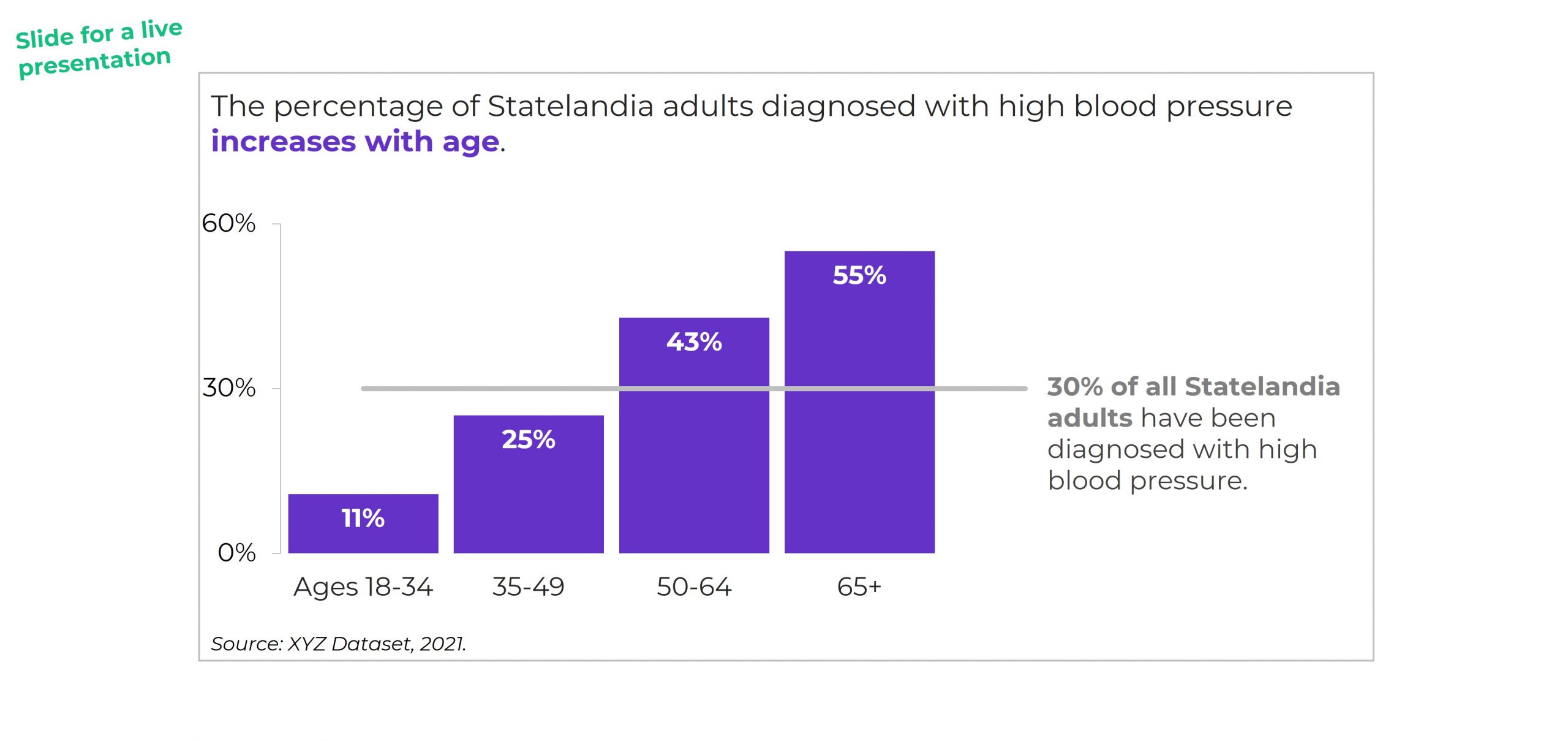
Here’s what their “before” version looked like.

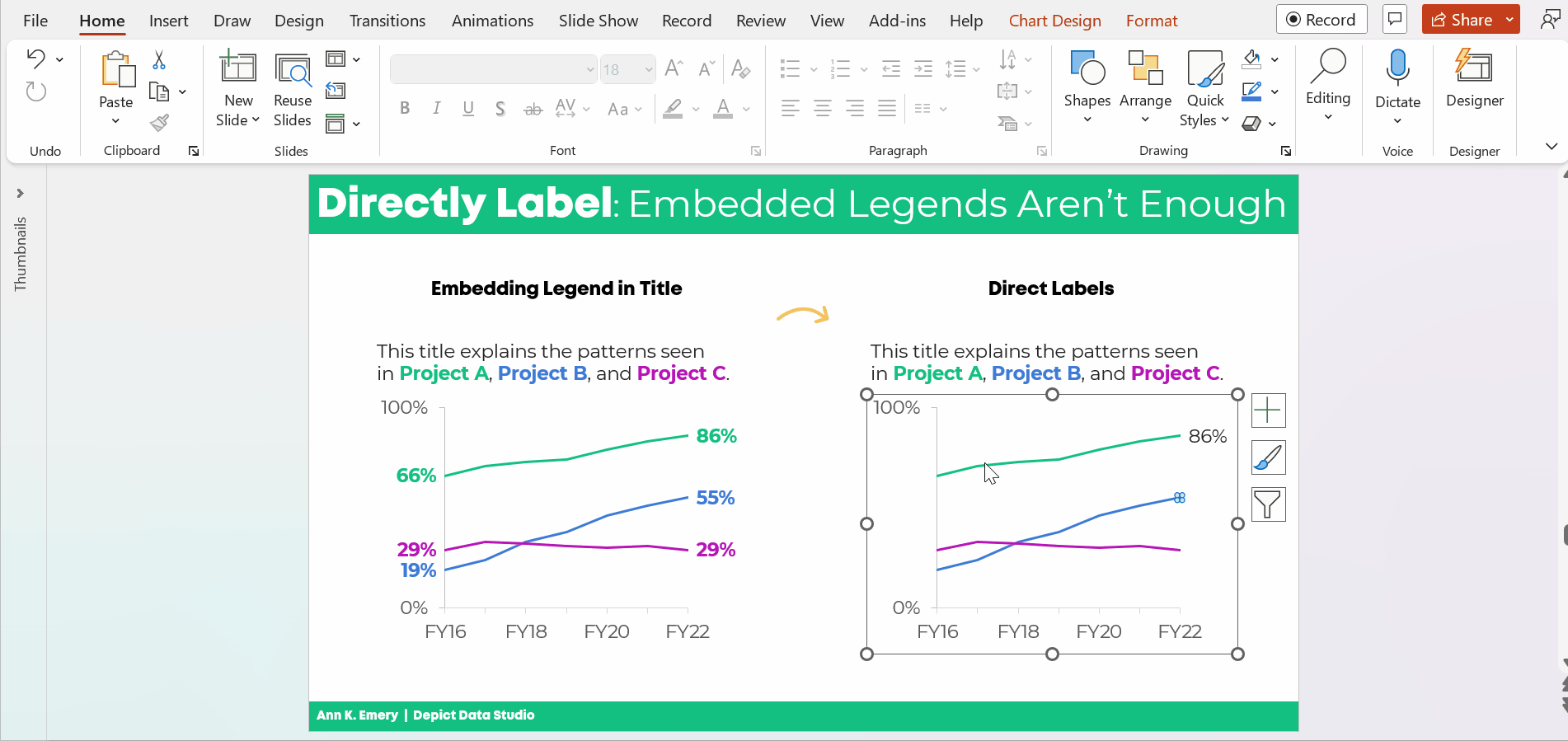
The information on how many adults overall had been diagnosed with high blood pressure was tucked inside the title, while the graph focused on the breakdown by age group.

All the important details are there, hooray! But we all wanted more cohesion between the title and the graph.

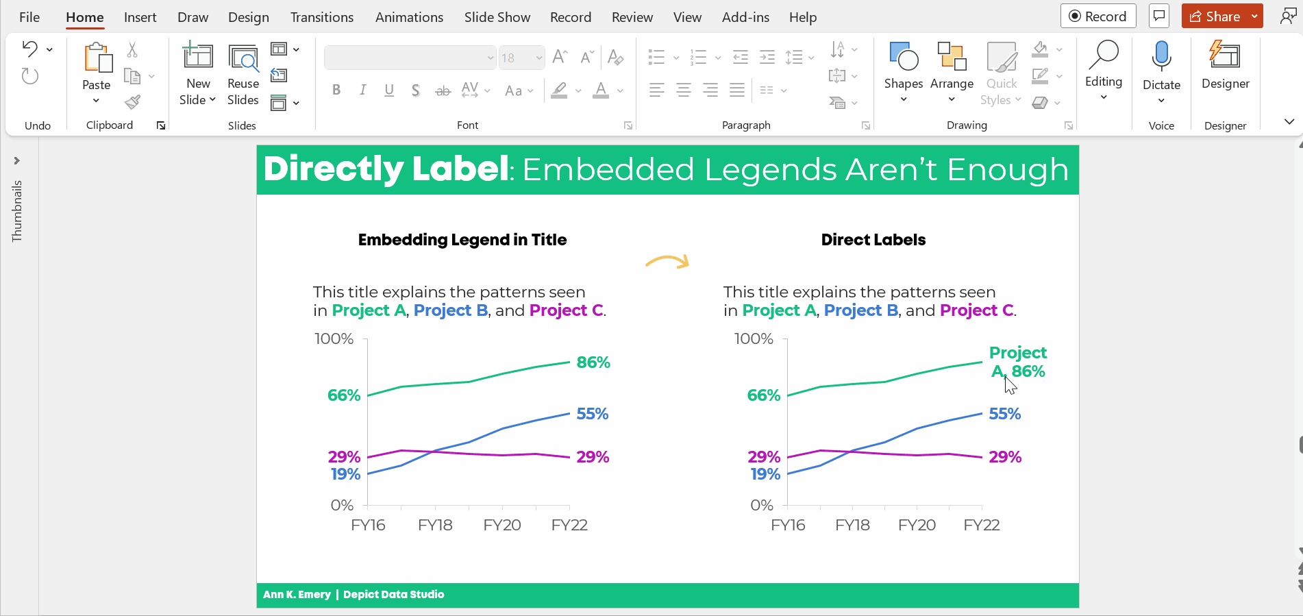
Two Options for Visualizing “Overall” Data or Averages on Bar Charts

There are two primary ways to visualize our “overall” data or averages when we’re making bar or column charts.

The two options include:

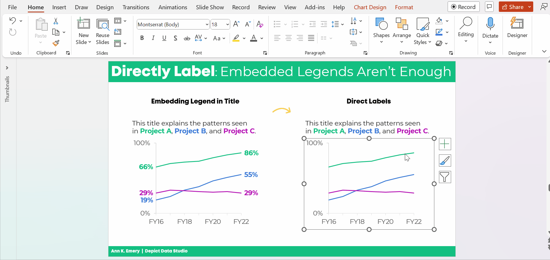
  1. Add a column. We can add intentional gaps between the “overall” data and the subgroups. In technical terms, the space is a preattentive attribute. Preattentive attributes help our audience recognize instantly that the overall vs. subgroups are a bit different.
  2. Add a line. Another option is adding a line on top of the bars or columns. I’ve seen people add literal lines in Excel (Insert – Shape – Line). That works, but the fancier option is to use a Combo Chart in Excel. (If you’re not familiar with Combo Charts, you can download my template below.)

Let’s apply these two options to the blood pressure example.

Option 1: Visualize “Overall” Data by Adding a Column

I *think* this is my preferred approach. I’m still on the fence. Hmm…

A Few Quick Wins

I always start with Quick Wins. These edits can be tackled within minutes.

Quick Wins give us momentum so that we have mental energy to tackle the Not-So-Quick Wins.

Here’s what we edited:

  • We changed the horizontal bar chart into a vertical column chart. Age groups are ordinal, and I generally try to arrange ordinal data from left to right. You can read more about my bar vs. column logic here, and you can learn how to make this quick rotation in Excel here.
  • We rounded the decimal places to the nearest whole number. You can learn more about lowering the numeracy level of our graphs here.
  • We moved the percentage labels inside the columns (so they don’t accidentally make the columns look taller than they really are).
  • We decluttered the graph (removing gridlines, showing fewer increments on the y-axis, tucking the labels inside the columns, etc.).

Add an “Overall” Column with an Intentional Gap

Next, we added the “overall” data to the graph as its own column.

We also spaced the overall column apart from the others. These are separate types of data (an overall number is qualitatively different from a breakout by subgroups). They need to be arranged separately on the slide.

If you’re using Excel, simply add an empty row to the table that feeds into your graph.

You can learn more about adding intentional gaps in this blog post.

Adjust the Text Placement

Next, we moved around the text boxes.

All the important text was there — but in a single full-width text box.

We simply placed “like with like” — the overall text with the overall column, and the subgroup text with the subgroup columns.

We also moved the “year” data to the source at the bottom of the slide.

Bold the Key Words & Color-Code by Category

For extra skimmability, we bolded a few key words.

Then, we adjusted the colors. Separate colors for separate categories of information.

Color-coding by category is one of my all-time favorite dataviz techniques! You can see color-coding applied to one-pagers, recurring monthly reports, technical reports, and slideshows in these linked examples.

The final version would look like this:

Option 2: Visualizing “Overall” Data by Adding a Line

I love adding lines to visualize targets and goals.

We can add lines to visualize “overall” or “average” data, too.

BUT make sure to gray out something. Otherwise, the line chart gets messy.

You might gray out the columns, like this:

Or, you might gray out the line, like this:

Visualizing “Overall” Data on Line Charts

It’s easy to apply these techniques to line charts.

Just add another line!

Your Turn

Which approach is your favorite?

Adding a column?

Or adding a line?

And why?

For this case study, I prefer adding a column because it was easier to arrange the takeaway text in the right places (the takeaway text is simply above the columns). For the line charts, the takeaway text didn’t feel as seamless.

Comment below and share your own insights.

Bonus: Download My Spreadsheet

Not familiar with the intentional spacing in the bar chart?

Not familiar with the combo chart design in the line chart?

Download my spreadsheet here.

Written by cplysy · Categorized: depictdatastudio

Feb 06 2023

Embedded Legends Aren’t Enough

I see these graphs a lot:

The graph title tells us which line is which.

In dataviz lingo, we call it “embedding the legend” in the graph title.

What a clever style!

But it’s not colorblind-friendly or grayscale-friendly.

Let’s compare embedded legends (on the left, YUCK) with direct labels (on the right, YAY).

Ann K. Emery shows two graphs. The graph on the left has color-coded words in the title (a.k.a. embedding the legend). The graph on the right also has direct labels.

Not Legible for Colorblind People

Although embedding the legend in the graph title is popular, it’s not colorblind-friendly.

Here’s a preview of what the two styles would look like for someone with red-green colorblindness. (I uploaded a screenshot to https://www.color-blindness.com/coblis-color-blindness-simulator/.)

Ann K. Emery shows how to test your draft to see if it's colorblind-friendly.

If you’re required to follow 508 compliance in your workplace (if your project is funded by the U.S. Federal government), then embedding the legend in the graph title isn’t 508 compliant, either.

One of the 508 guidelines goes something like this: Viewers shouldn’t have to rely on color alone to understand the graphic.

In the embedded legend version, we are asking our audience to rely on color alone. Oops! That’s where the direct labels save the day.

“But Ann, just choose colors that are colorblind-friendly!”

No no no no. I don’t think we should be choosing random colors for our graphs.

I want you to use your organization’s brand colors in your graphs. Brand colors remove guesswork. No more sitting down to think about which colors look like. Brand colors also help us avoid Frankensteined graphs. No more pages 1-5 of your document in colors that Bob likes, followed by pages 6-10 in colors that Joe likes.

Not Legible in Grayscale

Embedding the legend isn’t grayscale-printing friendly, either. We wouldn’t want our audience to guess which shade of gray is which.

(Again, I uploaded a screenshot to https://www.color-blindness.com/coblis-color-blindness-simulator/.)

Ann K. Emery shows how to test your draft to see if it's grayscale-friendly.

How to Directly Label Graphs in Excel, PowerPoint, or Word

“Ann, how do I directly label the graph in Excel??”

I don’t recommend using text boxes. They’re such a pain! It takes forever to add the text boxes, align them, and group them. When we re-size the graph—making it taller or smaller, for example—the text boxes have to be re-aligned. Ugh.

There’s a better way.

Add the Numeric Labels

In today’s example, I’m using PowerPoint. You can do this through Excel and Word, too.

And in today’s example, I’m labeling the endpoints. Sometimes labeling every. single. point. pulls our audience into the weeds when we need them to be thinking at a higher, strategic level.

Here’s how to add percentages to the endpoints.

Click on the line once. All the dots will be selected.

Click on the right-most point again. Only the right-most point will be selected.

Right-click on that right-most point. On the pop-up window, choose Add Data Label. It should be singular (Add Data Label) and not plural (Add Data Labels). If you see the plural version, it means you’ve still got all the points selected.

Ann K. Emery's GIF showing you how to directly label your line graphs in Microsoft Excel.

Then, do the same thing to the left-most point.

Don’t forget to move the label to the left of the point.

Here’s how: Once you’ve got the percentage label, click on it again, twice. Right-click and choose Format Data Label. In the sidebar, go to Label Position and choose Left.

Ann K. Emery's GIF showing you how to directly label your line graphs in Microsoft Excel.

Repeat the steps to add percentages to the other lines.

Color-Code the Labels to Match the Lines

This is an extra visual cue for our audience. We want them to know which label belongs with which line.

Click on the labels to activate them.

Go to the Home tab and change the font color just as you normally would.

Make sure that colored fonts are bold, not regular. A good rule of thumb for color contrast accessibility is that colored fonts should be bold.

(It’s harder to read colored font than black font, so the way we make the colored font easier to read is to make the letters thicker. You can learn more about color contrast rules at https://webaim.org/resources/contrastchecker/.)

Ann K. Emery's GIF showing you how to directly label your line graphs in Microsoft Excel.

Add the Category Label

Click on that right-most percentage, twice.

Right-click and choose Format Data Label.

Check the box for either Series Name or Category Name. (Series Name vs. Category Name depends on how your data table is organized. Just check and uncheck the boxes until you get the right label.)

Make sure to un-check the Leader Lines box, too. Otherwise you’ll get cluttered connecting lines later on.

Ann K. Emery's GIF showing you how to directly label your line graphs in Microsoft Excel.

Make Sure the Labels Fit

The wrapped text is awkward and hard to read.

We need to make the graph wider.

Sometimes I need to expand the interior of the chart, too. In Excel lingo, this inner border is called the Plot Area.

It looks like this:

Ann K. Emery's GIF showing you how to directly label your line graphs in Microsoft Excel.

Adjust the Separator

This step is optional.

The “separator” is the comma, period, space, or new line that separates the percentage from the words.

In this example, I’m going to use New Line. The percentage will be on one line, and the words will be on a second line. (I’m controlling the text wrapping.)

To adjust the separator: Click on the right-most label, twice. Right-click and choose Format Label. Go to the Separator drop-down menu.

You’ll see me widening the label, too.

Ann K. Emery's GIF showing you how to directly label your line graphs in Microsoft Excel.

Left-Align the Label

Left-aligned text is faster to read than centered text.

And, left alignment ensures that the label is right beside the line.

Simply select the label, go to the Home tab, and use the alignment button.

Ann K. Emery's GIF showing you how to directly label your line graphs in Microsoft Excel.

Change Which Comes First: The Percentage or the Words

This step is optional.

We can change which comes first (well, which one’s on top): the percentage or the words.

Kudos to Nick Visscher for teaching me this tip!

Here’s how: You double-click within the label until you see the gray fill around the percentages/words. Then, on the drop-down menu, select which element should come first or second.

Ann K. Emery's GIF showing you how to directly label your line graphs in Microsoft Excel.

That was a lot of steps, sheesh!

I covered them as thoroughly and slowly as possible. In real life, once you get the hang of it, this would take 60 seconds from start to finish.

The Bottom Line

Embedding the legend is fine.

But it’s not enough on its own.

We also need to directly label the data.

Ann K. Emery says that embedding the legend is fine. But it's not enough on its own.

Download the Spreadsheet

Want to explore the graph a bit more? You can download my Excel spreadsheet here: https://depictdatastudio.gumroad.com/l/EmbeddedLegendsArentEnough

Written by cplysy · Categorized: depictdatastudio

Jan 30 2023

How to Influence Others with Your Data: SuperDataScience Podcast Interview

What is data storytelling?

How do we overcome common pain points in data visualization and storytelling??

What’s the most important thing to keep in mind while editing our visualizations???

I recently discussed all these, and more, on the SuperDataScience podcast with the host, Jon Krohn.

With more than 600 episodes and hundreds of thousands of downloads each month, the SuperDataScience is the #1 podcast in the data field. What an honor!

What’s Inside

  • My definition of data storytelling
  • Common pain points and how to overcome them
  • Best practices for data visualization
  • Surprising spreadsheet tricks
  • When static dashboards are more effective than interactive dashboards
  • Top tips for presenting data in a slideshow

You can listen to or watch the episode here. Or, scroll down to read the highlights.

Listen to the Podcast

You can subscribe to the SuperDataScience podcast and search for episode #637.

Or, listen online here:

Watch the Conversation

The video version of the podcast is available on YouTube here:

Read the Transcript

Prefer to read the transcript? Download it here.

This was my favorite podcast conversation so far. I hope you enjoy listening to it!

Written by cplysy · Categorized: depictdatastudio

Jan 23 2023

Watch Out for Mars! 6 Data Cleaning Steps to Save You Millions

In 1998, NASA launched the unmanned Mars Climate Orbiter to study the atmosphere of Mars.

However, the spacecraft never finished its mission. In fact, upon reaching Mars the next year, the $125 million spacecraft promptly crash landed into Mars, disintegrating in the atmosphere.

What could have caused such a crash landing?

Was it a freak meteor strike?

Faulty equipment?

ALIENS, perhaps?!?

The answer, surprisingly, is that the crash was caused by a classic case of BAD DATA.

That’s right–this spacecraft, this wonder of science, was rendered useless by bad data being entered into its flawless system. The Mars Climate Orbiter was designed to work on metric units, but unfortunately commands for the spacecraft were being sent from Earth in English units.

The result was a $125 million conversion error.

Collecting Survey Data at HOPE International

So what exactly does this have to do with spreadsheets? I’m glad you asked. I work with the nonprofit HOPE International as a Listening, Monitoring, and Evaluation Analyst. The mission of HOPE is to invest in the dreams of families in the world’s underserved communities as we proclaim and live the Gospel.

My team contributes to that by facilitating listening to those we serve, primarily through administering surveys and analyzing the data. Our surveys focus on many things–impact, experience, satisfaction, etc.–but regardless of the focus area, I always can’t WAIT to dive into the results.

When you spend so long crafting a questionnaire, translating it just right, and training enumerators to administer the survey, it’s nearly impossible to resist jumping into analysis once the results are in.

However, I’ve found that this is precisely what I must do–resist the urge to jump straight into analysis.

This is because, just as in the case of the Mars Climate Orbiter, a perfectly designed analysis system with flawless pivot tables will amount to nothing (or worse, a $125 million error) without proper data flowing into the system.

That’s right–I’m talking about DATA CLEANING.

Why Data Cleaning?

Data cleaning is an essential part of our survey process.

There have been many real-world situations where the results would have been biased or even completely incorrect had we not first taken the time to clean the data.

Here are a few situations we’ve encountered in the past:

  1. Duplicate survey responses caused by system error, or a respondent accidentally taking a survey twice.
  2. Pretest/training responses being included with the actual data from survey administration.
  3. Surveys being completed in an extremely short amount of time, where most if not all of the answer choices were blank.
  4. Data entry errors, such as accidentally copying a response in Excel across multiple rows and erasing original responses.

As you can see, the issues above would cause drastic differences if not corrected through a data cleaning process.

As tempting as it is to jump straight into crafting pivot tables and analyzing the results of the survey, engaging in a thorough cleaning and recoding of the data is vital to ensuring accurate results.

6 Data Cleaning Steps to Save You Millions

I’d like to show you what we do for our data cleaning process, and how Simple Spreadsheets helped to make this process even stronger.

In this article, you’ll learn:

  1. How to check for duplicates (for example, if someone accidentally took the same survey twice);
  2. How to check the survey for changes (for example, if translation typos were found after going live);
  3. How to check for outliers in survey duration (how long it takes someone to complete a survey);
  4. How to Use COUNTA and COUNTBLANK;
  5. How to Recode Variables with IF Statements; and
  6. How to Combine Datasets Together with VLOOKUP.

Yes, all of these data cleaning steps can be completed in Microsoft Excel.

(1) How to Look for Duplicates

One of the most important steps in our data cleaning process is to look for “duplicates.”

Duplicates are two (or more) entries that are either exactly the same, or match on a critical piece of information (like ID number or name).

It’s crucial that we identify these duplicates and resolve them before starting analysis. Otherwise, our results will not be accurate, and will instead overrepresent the duplicated entries.

Which Variable(s) Should Be Unique?

To check for duplicates, first identify the key variables in your data set that should be unique for each respondent.

For instance, our clients have an identification number which is unique to them. This field should not be duplicated in a data set.

Highlight the Duplicates in a Different Color

Once you determine your key variables, there is a simple Excel process that you can follow in order to identify and sort through your duplicates:

  • Step 1- Highlight the column of interest.
  • Step 2- In the Excel ribbon, select “Home” > ”Conditional Formatting” > ”Highlight Cells Rules” >”Duplicate Values.”
  • Step 3- In the pop-up window, choose a highlight color of your choice and press “OK.” This will highlight all of the cells in the selected column that contain duplicate values.

Once these steps have been followed, any duplicates for the criteria you selected will be highlighted.

Manually Examine Each of the Duplicate Entries

I like to then filter the column where it only contains the duplicate values, sort in ascending order, and then manually go down the list to analyze each duplicate pair (or trio, etc).

Doing this manually really helps you to get a feel for the data, and understand whether the duplicates are truly duplicates, or whether there is some other systematic issue at play.

If the duplicates match exactly in all fields in the survey, then they are “true duplicates.” We usually keep the response that was entered first and remove the other response.

If they don’t match exactly in all of the fields, then we connect with our team that administered the survey and try to determine together how to handle the entries, whether removing them entirely, keeping some, or keeping all.

(2) How to Check the Survey for Version Changes

Another important step in the process is to check survey versions for any notable changes.

When we are administering a survey, we do everything we can to test the survey beforehand, in order to not make any changes during the administration.

However, unforeseen changes to translation, wording, or even whole questions sometimes need to be made during the administration process, and it’s important to check if any of these changes could impact how data is interpreted.

For instance, if the first 10 respondents to a survey saw this question:

“How satisfied are you with the training curriculum?”

  • Very satisfied
  • Satisfied
  • Neither satisfied nor unsatisfied
  • Very unsatisfied
  • Very unsatisfied

And the rest of the respondents saw this question:

“How satisfied are you with the training curriculum?”

  • Very satisfied
  • Satisfied
  • Neither satisfied nor unsatisfied
  • Unsatisfied
  • Very unsatisfied

Then the fourth answer would mean two different things, depending on when the survey was taken.

In a large survey that is being translated into multiple languages, it is quite possible that small details like this go unnoticed, even through quality checks and testing.

Compare Spreadsheets with the “Compare Files” Add-In for Excel

In order to avoid having to meticulously analyze each version of the survey row by row in Excel, we utilize the “Compare Files” function.

This is located in the “Inquire” tab as an add-in for Excel, but I highly recommend you download it.

It saves a considerable amount of time comparing two spreadsheets.

To use this function:

  • Simply open the spreadsheets you want to compare at the same time.
  • Click “Compare Files.”
  • Choose the files you would like to compare.
  • Press the “Compare” button.

Excel will then open a third document which lists all the differences (and their categories).

Our team then goes through this document to see if any critical changes were made to the survey during administration, and we account for these changes accordingly in the analysis.

(3) How to Check for Outliers in Survey Duration

Lastly, a simple but important step in our data cleaning process is to check the duration of a survey.

Usually, we determine the average time it took to complete the survey, and then manually investigate any responses that were much faster or much slower than that average length.

These could just be outliers, or they could be surveys that weren’t finished, system errors, data entry errors, etc.

We also look for “straightlining,” which is when a respondent answers the same response to each question (usually in order to just get the survey over with faster).

Removing any responses that are errors and accounting for straightlining is an important factor in our analysis.

(4) How to Use COUNTA and COUNTBLANK in Excel

The Simple Spreadsheets course both affirmed the current steps in our data cleaning process (particularly in the area of handling duplicates), and added new tools into our toolbox!

One simple tool that I’ve found helpful is the COUNTA and COUNTBLANK functions.

These functions are two sides of the same coin.

  • COUNTA returns the number of cells that are not empty in a specified range.
  • COUNTBLANK returns the number of cells that are blank in a specified range.

We’ve used these two functions to quickly assess whether our data passes the “sniff test.”

For instance, if there is a question that we designed as mandatory for everyone in the survey but only half of the cells are populated, there is something wrong with our dataset and we need to investigate further.

Some of the possible causes could be that the question was not marked as mandatory in the survey software, the data was entered incorrectly, there was an error in translation, etc.

Basically, by using these two functions for each column in our dataset, we can get a bird’s-eye-view of the pattern of responses to each question in the survey.

(5) How to Recode Variables with IF Statements in Excel

Recoding was a game-changer for me in the data cleaning process.

Before taking Simple Spreadsheets, I didn’t know how to make the data do what we needed it to do for our analyses.

For instance, maybe the geographical information in our database was captured in cities, but I needed to organize it into regions for our stratified random sample.

Or, maybe the data contained registration dates for clients, but I needed to organize them into different categories of tenure.

I didn’t know any method to do this besides manually going through the data and recategorizing by hand.

Needless to say–WOW did Simple Spreadsheets save me time!

The IF function allowed me to recategorize data by using a simple formula.

For a practical example, I had a list of bank branches that I needed to group together into different regions. Instead of doing this manually, I was able to use the IF formula to create different groupings for the regions all at once.

(6) How to Combine Datasets Together with VLOOKUP in Excel

VLOOKUP was also an extremely helpful formula for me to get the data sets to do what we needed them to do.

Often we will have multiple datasets that we need to merge together, because we have different sources of information.

Because most of our clients have Client ID numbers, I was able to use these numbers as the common source of information in the VLOOKUP function, thus merging together datasets in minutes with confidence.

Save Yourself $125 million

I honestly can’t count the amount of times that the data cleaning process has brought us helpful insights that both ensure we have accurate results, and helped us to improve our processes in the future so that we avoid/account for any potential errors.

Simple Spreadsheets was a great help in affirming and bolstering our data cleaning process, and I hope that this article gives you a jump start into creating a similar process that suits your needs.

It’s not always the most fun process (although I’ve grown to really love it and have earned the title of “Detective” on my team 😊), but it is CRUCIAL to ensuring a good result.

Just ask NASA…a million dollar data cleaning system would still have saved them $124 million in the long run.

Written by cplysy · Categorized: depictdatastudio

Jan 16 2023

The Progression of Sue Griffey’s Year-End Infographic

Are you working on a year-end infographic?

Maybe you’d like to showcase your company’s achievements over the past year.

Maybe you’d like to celebrate your own achievements.

Infographics are a great way to visualize key points (without boring our audiences, which can happen in lengthy reports).

Back in December 2022, Sue Griffey brought her draft infographics to our weekly Office Hours.

In this blog post, you’ll see Sue Griffey’s annual infographic for her global mentoring practice, SueMentors.

You’ll also see several of Sue’s drafts. I hope this behind-the-scenes view helps you develop your own infographic.

Watch the Progression

You can watch Sue’s progression here.

This is a 7-minute segment from an hour-long Office Hours session.

Here’s what’s inside.

Sue’s Previous Infographics

First, Sue shared three examples of past years’ infographics.

Draft 1: Six Tiles of Content

Then, we talked about orientation.

Should her infographic be square?

Rectangular??

Portrait???

Landscape????

A single image?????

Several standalone images??????

A decade ago, infographics were mostly portrait. I’ll never forget Chris Lysy’s cartoon from 2014, where he joked that 2:32 aspect ratio infographics could practically be used as belts.

Nowadays, infographics can be any orientation. Ideally, we’d customize the infographic to the platform where it’s being shared.

For example, Instagram used to require squares, although you can upload square or rectangular images nowadays. And now the algorithm prefers short video Reels over images. It’s tough to keep up!

What does LinkedIn’s algorithm prefer? That’s Sue’s primary platform for connecting with others. Should her infographic be square? Rectangular?? How about both???

We considered a modular, grid-like design.

Sue already had 6 buckets of information. What a nice round number!

That means she could organize her 6 existing topics in landscape…

…and/or portrait…

…and/or as 6 individual social media posts.

In the video, you’ll see Sue’s very first draft:

Draft 2: Adjusting Colors and Adding Visuals

Next, Sue “softened all the brand colors.”

She added icons.

She added white overlays to de-emphasize the icons.

Draft 3: Focusing on Brand Blue

Sue decided to go back to “one panel of blue” (her brand color).

She added a “road map” within the TV icon.

She created a bit.ly link so that readers could learn more.

She continued softening the icons.

 “I challenged myself to take out even more words,” Sue explained.

Final Version: Smaller Boxes with More “White” Space

On New Year’s Eve Day, Sue finished her “80% is good enough” final draft.

She made the boxes smaller, which added more “white” space between the buckets of information.

Next Steps

In all her “spare” time, Sue might write a long-form blog post to elaborate on each of these 6 topics.

(She did provide additional details in a document shared publicly on Dropbox, too.)

But, as we discussed in the video, “there are endless ways to recycle content.” At some point, we have to create deadlines for ourselves and move on to the next item on our to-do lists.

Software Used: Microsoft PowerPoint

During Office Hours, another participant asked Sue which software platform she used to create her year-end infographic.

It’s PowerPoint!

Sue said, “It’s the easiest way to move photos around and to keep graphics together.”

In a previous Office Hours, we opened Canva together and browsed their year-end infographic templates. I wasn’t impressed. There were just bullet points, icons, and photos—all of which can be handled inside PowerPoint, too. Plus, Sue’s already comfortable in PowerPoint. Every new software platform has a learning curve. We can’t spend time learning them all. PowerPoint worked perfectly fine and there was no reason to switch.

“I did feel like I was moving information around and conveying things much better than I did a year ago,” Sue said. I agree. Well done!!!

Connect with Sue Griffey

You can view Sue’s infographic on LinkedIn here.

And don’t forget to connect with Sue on LinkedIn.

Written by cplysy · Categorized: depictdatastudio

  • « Go to Previous Page
  • Go to page 1
  • Interim pages omitted …
  • Go to page 16
  • Go to page 17
  • Go to page 18
  • Go to page 19
  • Go to page 20
  • Interim pages omitted …
  • Go to page 37
  • Go to Next Page »

Footer

Follow our Work

The easiest way to stay connected to our work is to join our newsletter. You’ll get updates on projects, learn about new events, and hear stories from those evaluators whom the field continues to actively exclude and erase.

Get Updates

Want to take further action or join a pod? Click here to learn more.

Copyright © 2026 · The May 13 Group · Log in

en English
af Afrikaanssq Shqipam አማርኛar العربيةhy Հայերենaz Azərbaycan dilieu Euskarabe Беларуская моваbn বাংলাbs Bosanskibg Българскиca Catalàceb Cebuanony Chichewazh-CN 简体中文zh-TW 繁體中文co Corsuhr Hrvatskics Čeština‎da Dansknl Nederlandsen Englisheo Esperantoet Eestitl Filipinofi Suomifr Françaisfy Fryskgl Galegoka ქართულიde Deutschel Ελληνικάgu ગુજરાતીht Kreyol ayisyenha Harshen Hausahaw Ōlelo Hawaiʻiiw עִבְרִיתhi हिन्दीhmn Hmonghu Magyaris Íslenskaig Igboid Bahasa Indonesiaga Gaeilgeit Italianoja 日本語jw Basa Jawakn ಕನ್ನಡkk Қазақ тіліkm ភាសាខ្មែរko 한국어ku كوردی‎ky Кыргызчаlo ພາສາລາວla Latinlv Latviešu valodalt Lietuvių kalbalb Lëtzebuergeschmk Македонски јазикmg Malagasyms Bahasa Melayuml മലയാളംmt Maltesemi Te Reo Māorimr मराठीmn Монголmy ဗမာစာne नेपालीno Norsk bokmålps پښتوfa فارسیpl Polskipt Portuguêspa ਪੰਜਾਬੀro Românăru Русскийsm Samoangd Gàidhligsr Српски језикst Sesothosn Shonasd سنڌيsi සිංහලsk Slovenčinasl Slovenščinaso Afsoomaalies Españolsu Basa Sundasw Kiswahilisv Svenskatg Тоҷикӣta தமிழ்te తెలుగుth ไทยtr Türkçeuk Українськаur اردوuz O‘zbekchavi Tiếng Việtcy Cymraegxh isiXhosayi יידישyo Yorùbázu Zulu