• Skip to main content
  • Skip to footer
  • Home

The May 13 Group

the next day for evaluation

  • Get Involved
  • Our Work
  • About Us
You are here: Home / Archives for allblogs / depictdatastudio

depictdatastudio

Mar 27 2023

Review: Stefanie Posavec’s “Dataviz Drawing Class”

Last month, I participated in Stefanie Posavec’s Dataviz Drawing Class.

I LOVED the class!

Wondering whether the class is right for you?

What’s inside this review:

  • Class logistics
  • Why I signed up
  • About the instructor
  • What we learned
  • Who this class is best for
  • My favorite part
  • Learn more

Class Logistics

A dozen of us met for two half-day classes held over Zoom. This was the perfect length: a half-day of dataviz principles and quick drawing exercises, followed by a half-day focused on a bigger project.

Participants were mostly based in the U.S. and Europe, with most people using data for part/all of their job.

We used an online whiteboard tool, Miro, to introduce ourselves and share our drawings. There was a small learning curve, but then it was easy to snap photos of my hand-drawn images and upload them to the site.

Stefanie also sent us a supply list a couple weeks in advance. She said we needed a spreadsheet tool (Excel, Sheets, etc.) and some basic art supplies (e.g., plain paper, black crayon, colored pencils, etc.). There weren’t any specialty art supplies needed; these were all supplies that you’d have laying around your home somewhere.

Why I Signed Up

My own dataviz consulting and training is spreadsheety and linear—almost to a fault.

I don’t think it’s helpful for any of us to work within silos.

I wanted to think about dataviz from a different lens—drawing!

Sure, I could read one of Stefanie’s books.

Sure, she probably has public-facing talks on YouTube.

But nothing compares to quality online training where your brain is fully immersed in the topic alongside the instructor and peers.

About the Instructor: Stefanie Posavec

According to Stefanie’s website, she is “a designer, artist, and author exploring experimental approaches to communicating data and information to all ages and audiences.”

Her projects “might be wearable, danceable, or hoppable, be found in hospitals, museums, or on television, and will often use a human-scaled, hand-crafted design process.”

I first heard of Stefanie Posavec after she wrote Dear Data with Giorgia Lupi.

Then, I fell in love with I am a Book, I am a Portal to the Universe.

Day 1: Dataviz Basics + Data Drawing Challenges

Here’s what we learned and practiced each day.

Data Visualization Basics

The first hour was an intro to dataviz, including:

  • seven data visualization variables,
  • Gestalt principles, and
  • preattentive processing.

I took detailed notes, but won’t be sharing them here for obvious reasons. You’ll have to take her class to learn more. 😊

Stefanie had examples from a variety of artists (e.g., Sol LeWitt) and historical figures (e.g., William Playfair). Every dataviz person is familiar with Playfair, but the rest were new, and I loved learning about more artists.

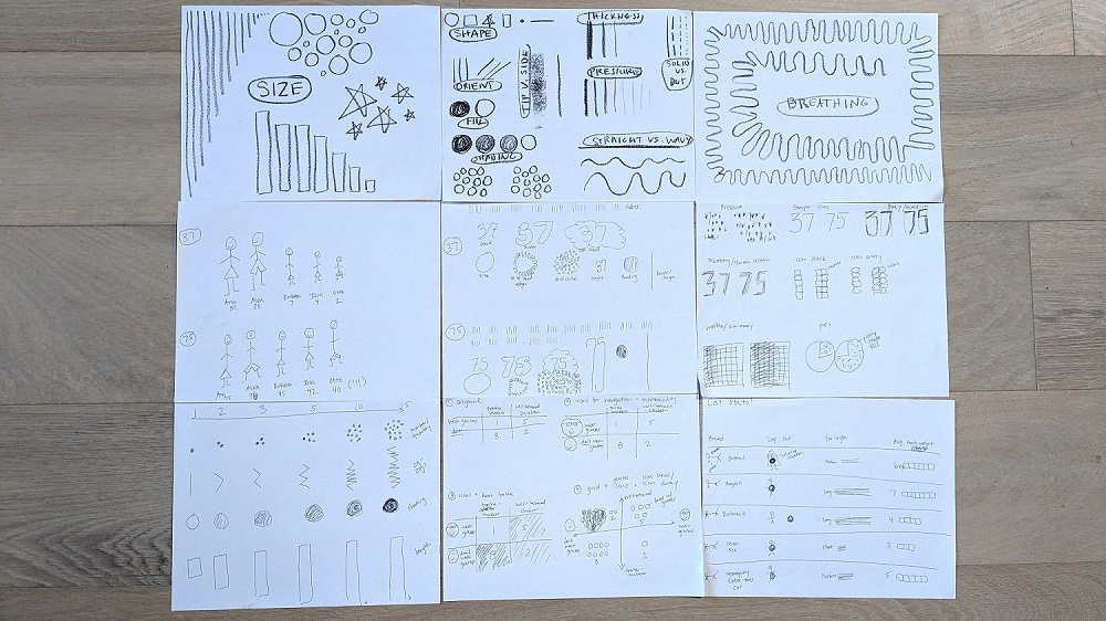
9 Dataviz Drawing Exercises

For the next few hours, Stefanie gave us drawing exercises.

Again, I won’t be describing the exercises in detail.

Here’s what I made:

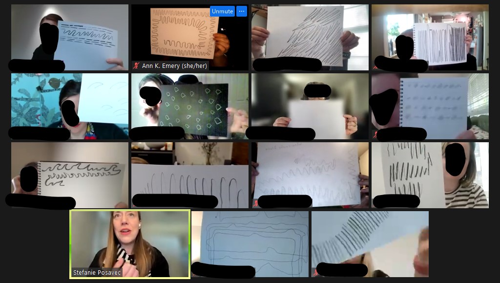
After each exercise, we shared our drawings on our webcams so we could learn from each other.

I was pleasantly surprised that everyone kept their webcams on!

Usually, I’m the only one with my webcam on. In Stefanie’s class, I was the only one with my webcam off (because I was walking on the treadmill while sketching). Then, I’d turn my webcam back on to share my drawings.

Day 2: Musician Challenge

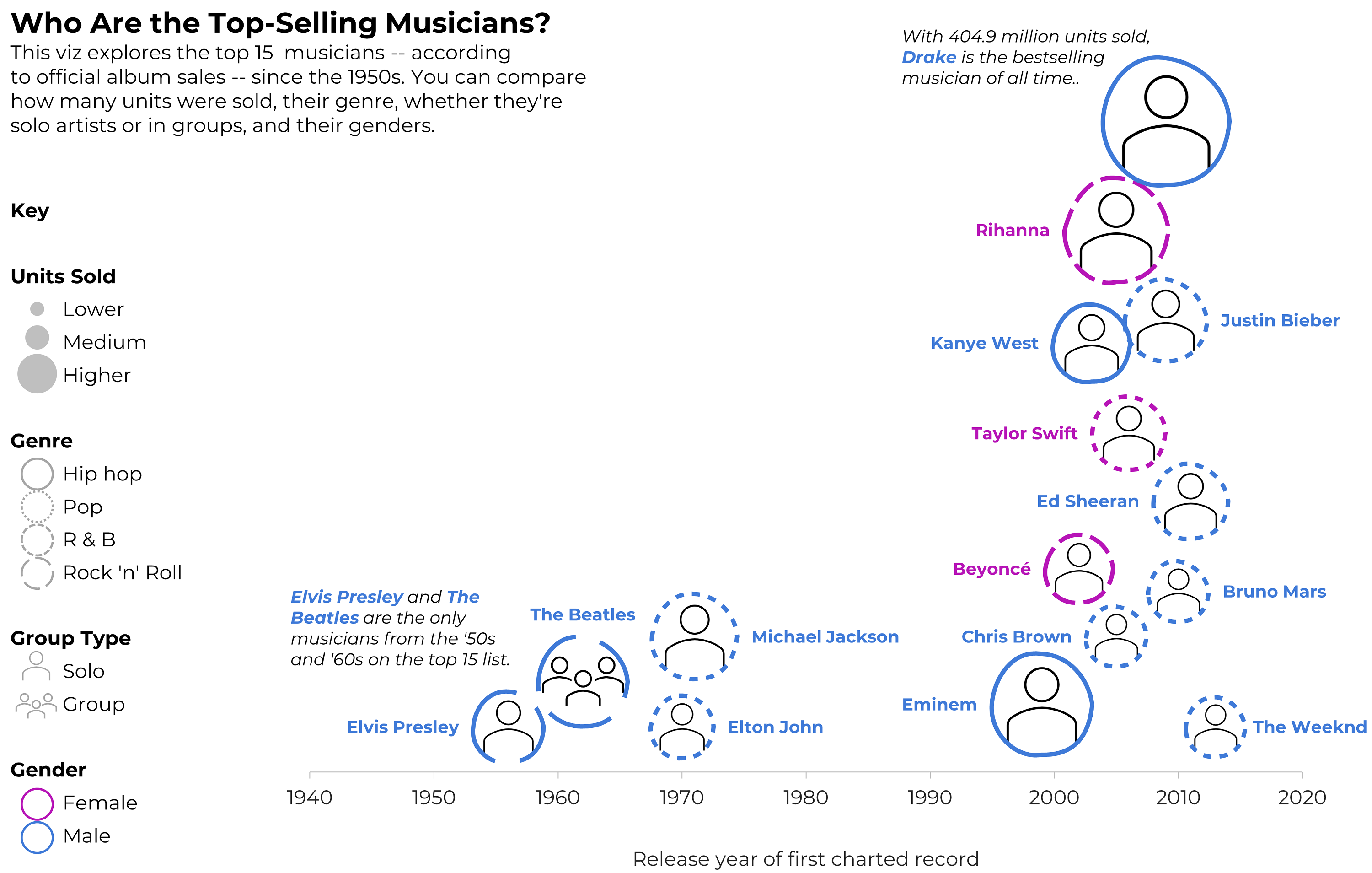
On the second day, Stefanie gave us a public dataset to work with.

She guided us through how to approach data as a designer, like understanding which type(s) of variables we’re working with (categories, rating scales, binary data, etc.).

Here are my glyphs (new terminology and new approach to dataviz design for me):

Then, we had ~50 minutes to arrange the glyphs with an underlying architecture (e.g., a circle, spiral, clusters, etc.).

The underlying architecture was a massive a-ha for me! The structure really differentiates linear, predictable dashboards from exploratory, artistic visualizations.

We posted in-progress drafts to the Miro board as we worked, and Stefanie provided helpful feedback.

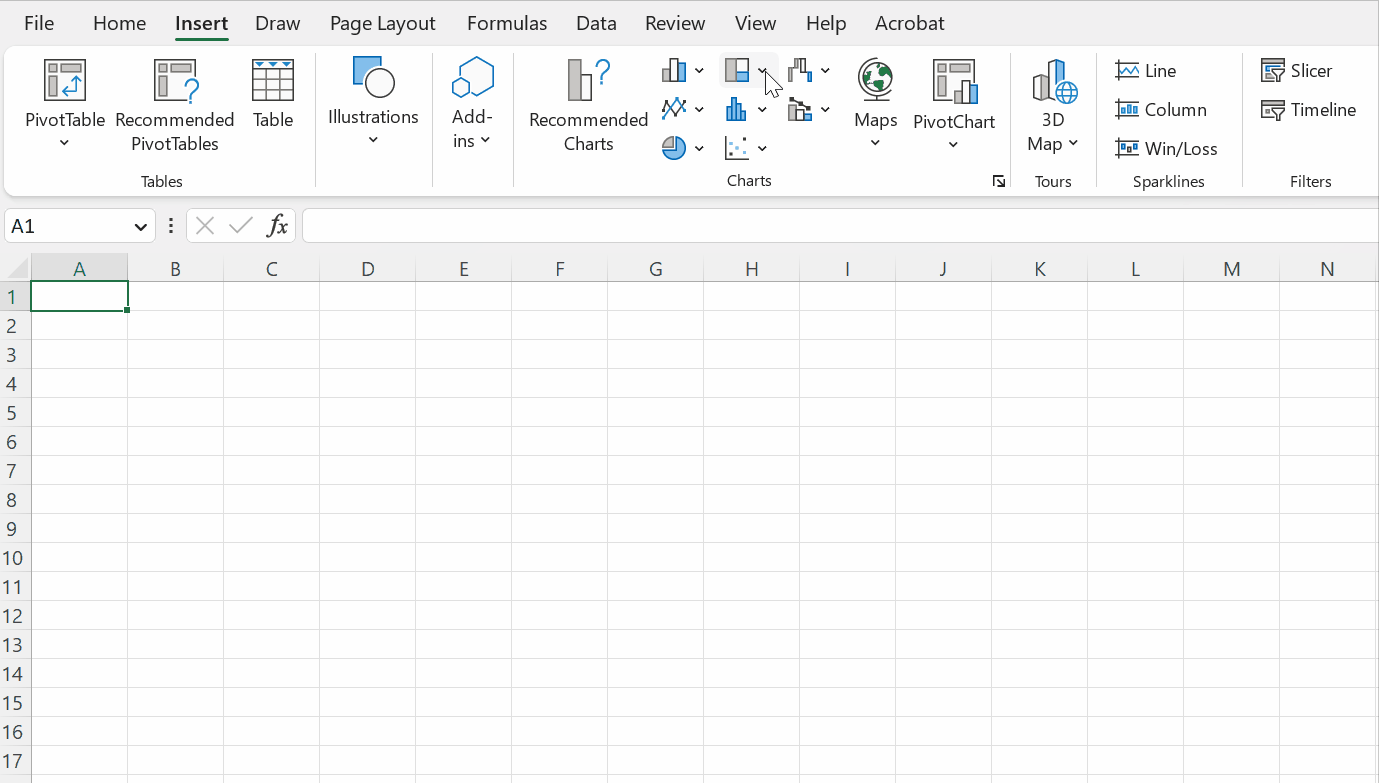
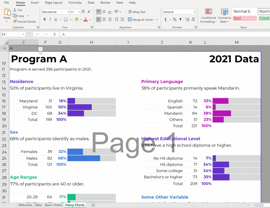
Since I’d been working with paper and pencil for a while, I was ready to switch to computer-drawn graphics. I was probably supposed to continue drawing, but… realistically, all of my client projects have to be done in everyday software like Excel, since that’s the common denominator for all my clients. I had to make sure I could actually implement my sketched ideas in Microsoft tools.

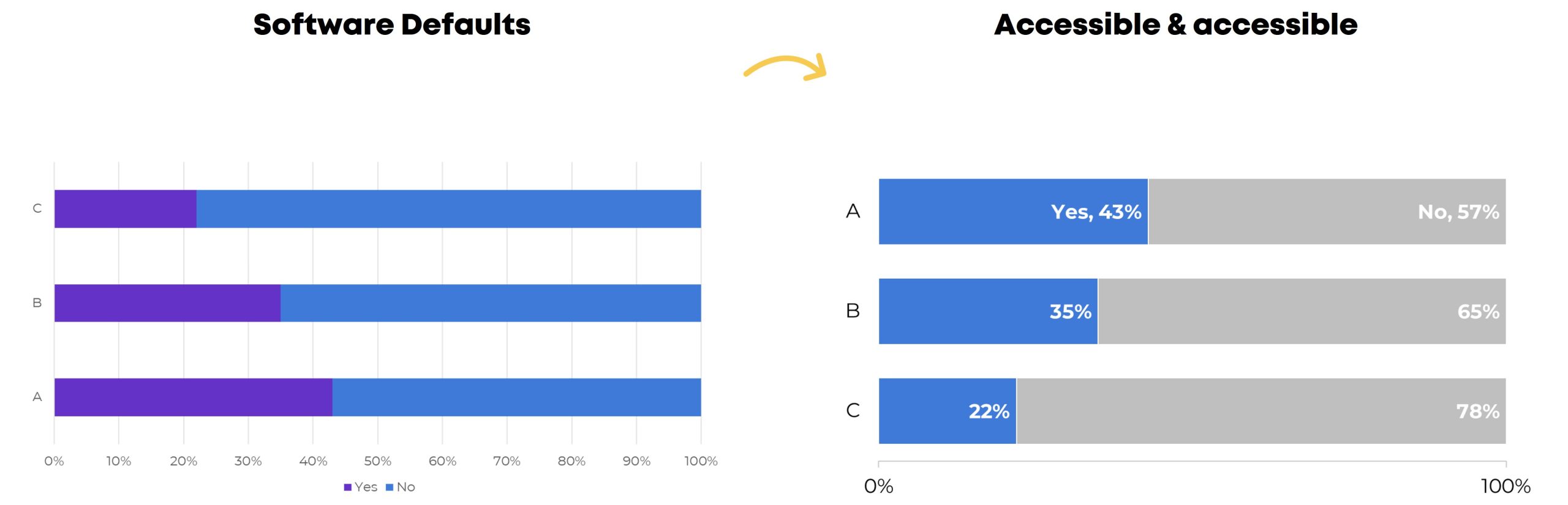
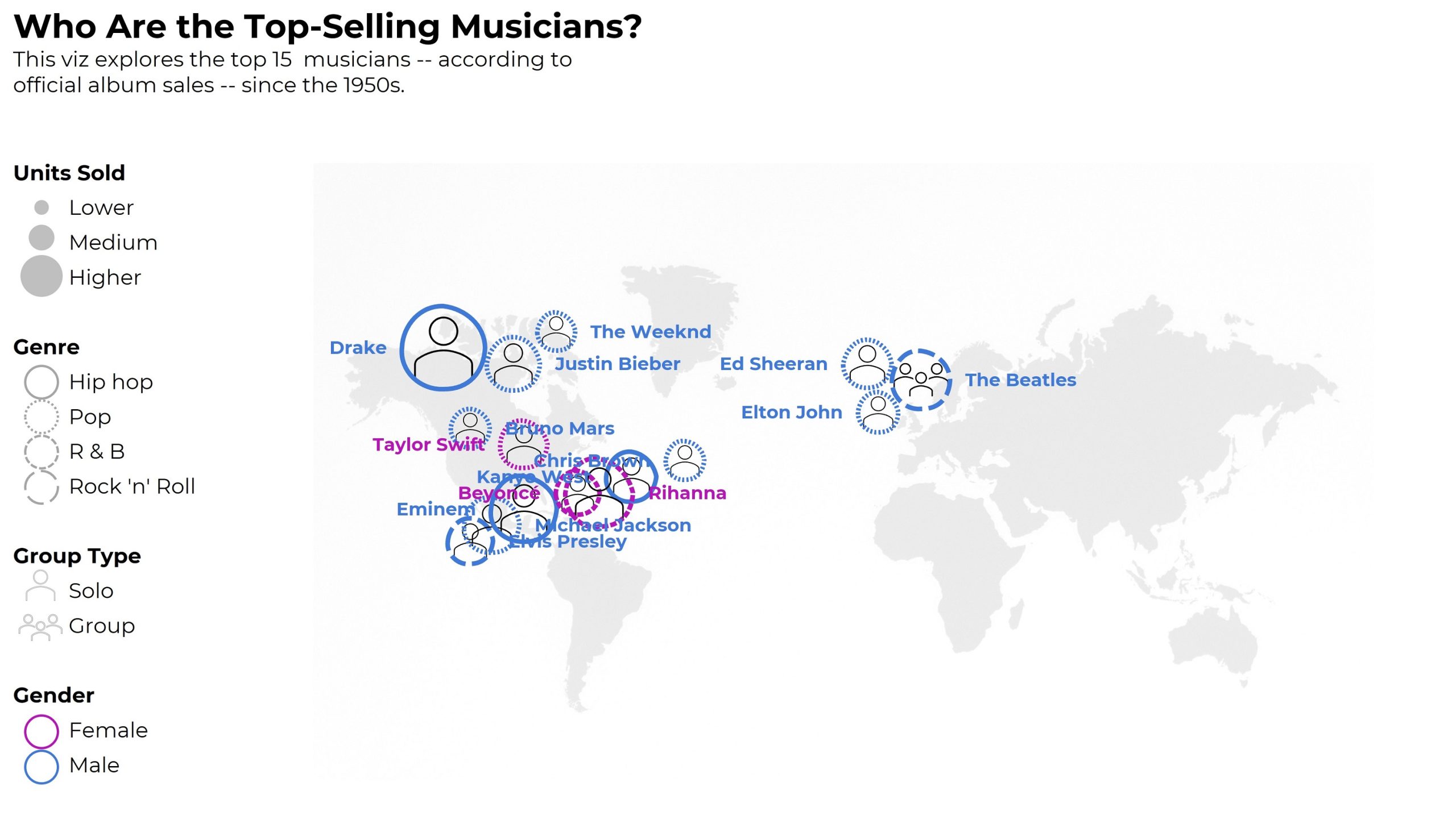
Here are some of my drafts, which were made in good ol’ Excel. (These are just bubble charts with icon fills, outline colors, and outline patterns.)

First, I tried arranging musicians by time and gender, and I started drawing the key. Don’t look too close – I had genre typos in this one, which I fixed later.

Then, I dropped the gender variable, and focused on the timeline (a.k.a. a column chart).

The timeline effectively showed how most of the top-selling artists are from the 2000s.

But, this one felt empty; I could’ve placed another variable on the y-axis.

That’s a lot within 50 minutes!

I was pleasantly surprised how much I could figure out, both design-wise and software-wise, in less than an hour. I can’t remember the last time I nearly-finished an entire non-traditional viz like this so quickly! I was on my treadmill, walking 10 miles during each of the classes, so my brain was definitely on Beast Mode.

After class, I spent another hour arranging the glyphs by the musicians’ birth country. I wanted to show how most of the top-selling artists are from the U.S. and Canada.

I didn’t spend time to make sure the glyphs didn’t overlap.

(Remember, this is an Excel bubble chart, so I’m manually assigning each artist an x and y value behind the scenes.)

At some point, you have to call it quits on just-for-fun dataviz.

Time permitting, I would’ve:

  • represented gender with shapes (circles vs. squares) instead of colors (to make it colorblind-friendly);
  • continued fiddling with the artists’ placements on the map so they didn’t overlap so much;
  • added a second outline/ring to the artists coming after 2000, and kept the single ring for the artists pre-2000;
  • added the artists’ photos (the icons are placeholders); and
  • shaded the background of each photo according to… something? (Imagine a light-dark shading as the background color behind their headshots.)

Who This Class is Best For

Stefanie described the focus as:

  • People who are creating or inventing data visualizations (me!)
  • People who want to move beyond the standard chart types (me!)

Well, it was for me, but not really.

I knew I’d be the only full-time dataviz instructor.

I think I was the only one who made datavizzes as the major focus of my job (?). Other students seemed to make graphs, dashboards, and infographics as a piece of their job, but not as the focus. One participant had just finished undergrad.

After listening to others’ questions—Which chart should I use? How exactly do I get started??—I think this class is best suited for people who already have prior data visualization training.

This isn’t the class to learn about data analysis, like how to merge datasets, clean data, recode variables, or calculate frequencies or descriptive statistics. The participants I chatted with in breakout rooms already had those skills from their data-focused jobs.

This isn’t the class to learn the difference between chart types, like a scatter plot vs. bubble chart, or a histogram vs. a population pyramid. Stefanie provided an overview of chart types, but chart types are so nuanced that they deserve an entire class of their own.

This isn’t the time to learn color nuances, like the difference between sequential, diverging, and categorical color palettes. Again, Stefanie provided an overview, but colors deserve an hour or two on their own.

This isn’t a class to learn about Big A Accessibility (like 508 compliance, colorblindness, etc.) or to learn about Small A Accessibility (making sure graphs are easy to understand). This was tricky for me—accessibility is woven into every aspect of my work, and I kicked myself as I drew non-colorblind-friendly graphics and made my own vizzes harder to decipher just for creativity’s sake.

This isn’t the class to learn any software how-to’s. You’ll be working with paper, crayons, colored pencils, and markers. I opted to work in Excel the last hour. Another student pulled up Illustrator.

Instead, this is a class to help you think past the common chart types that are available in our everyday software programs. (“I’m having trouble thinking outside PowerPoint’s charts!” mentioned a few fellow students.)

This is a class to help you think about individual data points (glyphs) within the underlying architecture. I don’t think I’ve ever approached a project from the lens! I’ll likely use this approach from now on.

This is a class to help you approach a brand new dataset and start graphing. These skills are essential for everyone working in data.

This is a class to practice conceptualizing your ideas on paper first, which is a critical planning step that’ll make all your visualizations stronger. There’s nothing worse than sitting down to your computer without hand-sketching first. Computer-first vizzes are never as good as sketched-first vizzes.

My Favorite Part

So much hands-on learning time!

About half the first day, and nearly the entire second day, were spent drawing and drafting visualizations.

For a busy consultant like me, it’s tough to devote time to learning and sketching for my own skill-building. I loved loved loved having dedicated time with others to practice my craft.

I like to lie to myself and pretend that I can set aside time for learning, but I can’t. That’s what dedicated classes like this are for.

Learn More

I asked Stefanie when she’s offering the class next. Possibly in June 2023! Follow Stefanie Posavec on LinkedIn to hear about the next class.

Written by cplysy · Categorized: depictdatastudio

Mar 03 2023

How to Make Great Graphs in Excel: 4 Levels of Excel Vizardry

Are you drowning in the deep end of Excel?

First, dip a toe in. And then another.

You’ll be swimming confidently before you know it.

4 Levels of Excel Vizardry

I’ve taught data visualization in Excel a dozen different ways over the years.

Nowadays, I teach Excel dataviz based on the degree of behind-the-scenes hacking needed to produce that chart.

We start easy. Then, we work up to harder battles.

Here are the 4 Levels of Excel Vizardry:

  • Level 1: Exploratory Viz
  • Level 2: Overused Native Charts
  • Level 3: Underused Native Charts
  • Level 4: Non-Native Charts

Level 0 would be Data Visualization Best Practices, like articulating which chart to use, when. I can’t get into the nitty-gritty details hacking Excel to make population pyramids… if someone’s never heard of a population pyramid before. That’s a separate course altogether.

Level 5 would be adapting those charts for specific contexts, like for interactive dashboards. That’s a separate course, too.

Let’s go through some of the Excel secrets in more detail.

Level 1: Exploratory Viz

We can make sparklines, data bars, and heat tables within seconds.

These miniature charts help us spot key patterns instantly.

Easy to make! And an instant payoff!

I love starting private workshops and online courses with exploratory viz.

I’ve blogged about these skills over and over and over because they’re the perfect launchpad. Here’s my latest tutorial.


Level 2: Overused Native Charts

These are the familiar faces:

  • Pies
  • Donuts
  • Bars and columns
  • Clustered bars and clustered columns
  • Stacked bars and stacked columns
  • Line graphs

What are Native Charts?

“Native” charts mean they’re available from our menu with just a few clicks:

What’s Wrong with Overused Charts?

There’s nothing wrong with a bar chart here or there… but any chart gets boring when we show it over and over and over and over and over and over.

There’s also the issue of analytical depth — or lack of depth.. If we’re only using bar charts… then we’re only showing totals and averages. There are dozens more statistical approaches!

Snooze. And no analytical depth.

Beware! Formatting Needed

Stacked bar charts, for example.

They’re easy to make.

But we still have to:

  • enlarge the font;
  • darken the font (to pass official Accessibility rules for color contrast);
  • directly label the data (so viewers aren’t relying on the colored legend alone — another Accessibility rule);
  • outline the touching shapes in white (which helps with colorblindness and grayscale printing);
  • show fewer increments in the scale (so it’s not so busy);
  • decide whether to apply a dark-light contrast — or not (learn about data storytelling here); and
  • adjust the gap width (if you want) to nudge the bars closer together.

Level 3: Underused Native Charts

This is where it starts getting fun!!

Excel can make:

  • Combo charts (e.g., a column chart with a target line, as shown below)
  • Overlapping Bars
  • Area charts (where you shade the area underneath the line for better oomph and high color contrast)
  • Slopes (a line chart with exactly 2 points in time, like pre and post)
  • Small Multiples Lines (to combat the spaghetti line graph)
  • Bumps (for rankings)
  • Scatter plots (x and y)
  • Bubble charts (x, y, and z)
  • Tree maps (for nested categories)
  • Heat Maps
  • Sunbursts (nesting)
  • Box and Whisker (to go beyond averages and show the min, quartile 1, median, quartile 3, and max)
  • Waterfall (how pieces add to a net number)
  • Radar (to compare several ordinal categories at once)
  • Icons & Symbols (to make our graphs easier to navigate — and more memorable!)

Yes, These are Native Charts 🙂

Well… if you’re using the latest version of Excel.

If you’re on outdated software, (most of) these charts are still possible. They just get harder to make, i.e., they’re in Level 4 territory.

Yes, Underused Native Charts Add Variety (and Analytical Depth)

We’re not just adding variety for variety’s sake.

(Although common sense — and hundreds of consulting projects — has shown me that dataviz novelty is one of the best ways to increase engagement.)

Most importantly, we’re adding analytical depth. For example, a regular ol’ bar chart just compares the average or total of several categories. What if we compare them by location, too? Now we’ve got a heat map! We can spot geographical patterns, which would’ve been impossible in a bar chart.

Beware! Formatting Needed

Scatter plots are easy to make.

But we still have to:

  • enlarge the font;
  • darken the font (to pass official Accessibility rules for color contrast);
  • add a key (that each dot represents one student);
  • label the scales (with everyday language, like More skills gains, because scatter plots are notoriously difficult to read for people who don’t stare at graphs all the time); and
  • decide whether to add a dark-light contrast.

Level 4: Non-Native Charts

Have you mastered Levels 1, 2, and 3? Are you already using a variety of charts? Have you actually analyzed your data (beyond averages, and beyond totals)? Can you adjust the gap width, annotate the data, and apply colors strategically in your sleep?

Then you’re ready for Level 4!

With behind-the-scenes elbow grease, you can make:

  • Stream graphs
  • Waffles
  • B’Arcs
  • Small Multiples Bars
  • Population Pyramids
  • Diverging Stacked Bars
  • Lollipops
  • Dots
  • Swarm
  • Tile Grid Maps
  • Sankey Diagrams

What are Non-Native Charts?

You won’t find any buttons that automatically make these charts.

Instead, we have to insert one chart type…

…and disguise it as something else.

For example, we have to insert a stacked bar chart… and disguise it as a waffle chart.

(You’ll need a Magic Table behind the scenes, too.)

A stacked bar chart gets disguised as a population pyramid.

Yes, you’ll need a Magic Table with placeholder values.

A scatter plot gets disguised as a dot plot, and so on.

Each value gets assigned a x-y placeholder location inside the Magic Table.

Do these maneuvers turn your brain inside out and upside down? You’re not alone.

Learn More

If you’re consistently making, editing, and applying graphs from Level 4, you’re already a vizard. Get in touch so I can send work your way!

If you’re in Level 1, 2, or 3, you’ll love Great Graphs in Excel. We’re meeting LIVE for 10 weeks this spring. In our very first class, you’ll make the Exploratory Viz from Level 1. Then, you’ll make graphs from Levels 2, 3, and 4. You’ll go slow and steady so you don’t feel overwhelmed. You’ll dip your toe in… and then you’ll be swimming in the deep end in no time.

Written by cplysy · Categorized: depictdatastudio

Mar 01 2023

Take of Tour of the “Excel How-To’s” Templates

Remember those “Excel for Dummies” books?

I’d go to the public library, grab a dog-eared book off the shelf, and flip through the grayscale images trying to match the author’s screenshots to my own computer.

They were always using a different version of Excel than me.

I couldn’t find the buttons from their blurry screenshots.

I had to zig-zag my eyes back and forth between the book and my screen.

That’s how I learned Excel. And it was terrible.

Introducing the Excel How-To’s Templates

That’s why I spent hours and days and weeks making the Excel How-To’s templates for you.

Rather than having a separate book open, you’ll learn directly from Excel.

All the instructions are typed directly into Excel for you – alongside the living, breathing graphs – so you can save precious time.

Or, if you’re not interested in learning all the how-to steps, you can use the completed templates for your own project. There are notes telling you exactly where to type your own numbers and percentages so that they’ll show up in the finalized charts. No need to reinvent the wheel.

What’s Inside: 28+ Templates

There are 28+ templates so far.

I make updates and additions a few times a year, and send the latest Zip folder to everyone to make sure they’ve always got the latest version.

Chart Chooser

In addition to the graphing instructions, you’ll see my 2-page Chart Chooser, which’ll help you narrow down which chart to try.

Theme Colors and Theme Fonts

You’ll also get step-by-step instructions for setting up your organization’s brand colors and brand fonts. Themes save time and help you look professional.

Available In

Inside each template, you’ll learn which version of Excel that chart’s available in.

Most charts can be made on most computers.

There are some exceptions here and there, which is why it’s explicitly spelled out for you.

Uses

You’ll learn what that chart type’s best for.

And, I’ve added notes about where that chart is most or least common. In practice, we don’t see every chart in every workplace. Some charts are pretty much only seen in peer-reviewed journal articles. Other charts are pretty much only used by accountants. And so on.

Real-Life Examples

Inside each of the templates, you’ll see links real-life examples. Then, you can see how that chart has been used in reports, slideshows, dashboards, infographics, and websites by other agencies like yours.

Before-After Editing Example

Then, you’ll get a preview of the before-after transformation that you’re about to create.

For example, in the bump chart tutorial, you’ll transform a regular ol’ line chart into a ranking chart.

Below, you’ll get ideas for how you’d adapt that busy bump chart for a presentation (by graying everything out and highlighting one category at a time).

Step 1: Set Up the Table

You’ll walk through step-by-step instructions to make and edit all the 28+ charts.

Step 1 is setting up your data table that’ll feed into the chart.

For native charts – bar charts, pie charts, line charts, etc. – the table set-up is extremely straightforward.

But for non-native charts, we have to get creative.

For example, in the population pyramid tutorial, you’ll see:

  • the original table, and
  • the magic table.

I’ve added notes to help you figure out what goes where.

The gray area gets pulled directly into the chart, so those are the values you’ll tweak when you’re making population pyramids for your own projects.

Step 2: Insert a ___ Chart

As we’re building non-native charts, we have to fool Excel.

We often insert one chart type… and disguise it to look like a different chart.

This took me nights and weekends, over several years, to figure out on my own. Let’s get you up to speed immediately! No need to waste your time fighting with Excel on your nights and weekends.

You’ll see explicit instructions about which chart type to add.

For example, to create a waffle chart (a.k.a. square pie), you’ll need to insert a 100% stacked bar chart first.

Step 3 (and onward): Format Format Format

This is where you’ll learn about Excel’s lesser-known features.

For example, you’ll learn how to adjust the primary and secondary axes’ Series Overlap and Gap Width, which makes our bars overlap.

I don’t find these edits to be intuitive at all. Quite the opposite! That’s why I’ve added screenshots for you – so you don’t have to memorize which buttons to click.

Variations

Finally, you’ll see variations of each chart.

For example, in the dot plot tutorial, you’ll see how to set up:

  • 2 sets of circles with a line connecting them
  • 2 sets of circles without a line connecting them
  • 1 set of circles (a lollipop)
  • Smaller dots with labels above or beside the dots
  • Arrows
  • Arrows, sorted (my personal fav)

Get the Excel How-To’s Templates

They’re included with your Great Graphs in Excel tuition.

Written by cplysy · Categorized: depictdatastudio

Feb 27 2023

3 Simple Steps that Took My Graph from Good to Great

After enrolling in Depict Data Studio’s Great Graphs in Excel course and watching many of the videos, I was excited to apply what I had learned.

My first chance came in the form of a front-end evaluation project for a children’s museum planning a new exhibition on dinosaurs.

Measuring What Kids Already Know about Dinosaurs

The museum wanted to understand what children and families already knew about dinosaurs – including whether they knew what other types of animals and plants existed at the same time.

I designed a fun card-sort activity, where parent-child pairs were asked to work together to sort 19 cards with images of different plants and animals into two piles:

  • one pile for those they thought lived at the same time as dinosaurs, and
  • one pile for those they thought didn’t live with dinosaurs.

Here’s a sample of a few of the cards we gave to families:

Cards with pictures of animals, humans, and trees that were used in the card sort activity.

Draft 1

For my first stab at a graph showing the results, I applied several of the best practices I learned about in Great Graphs:

  • I sorted my data from largest to smallest.
  • I applied color meaningfully – using the client’s brand orange to show the animals that did exist at the time of dinosaurs and gray to show those that didn’t.
  • I eliminated the unnecessary visual clutter from the Excel default graph and made some simple modifications (for example, increasing the width of the bars and the text font size).
  • I even added annotations highlighting interesting findings.

Here’s what my first version looked like:

Maia Werner-Avidon's first draft, which is a horizontal bar chart with about 20 categories. Some bars are orange and others are gray (to show whether the families got the answers right or wrong). There are call-out annotations describing a few of the bars, too.

Draft 2

I thought I was off to a pretty good start, but I wasn’t sure if my graph was clearly explaining that some of the answers were correct and some were incorrect, so I decided to bring my graph to Office Hours with Ann to see what else I could do.

Ann offered me three simple ideas that took this graph from good to great.

1. Group the bars to better show which responses were correct or incorrect.

Rather than order all the bars from largest to smallest, Ann suggested that I group all the correct answers together (ordered from largest to smallest) and similarly group all the incorrect answers together.

2. Add space between the groups to create a visual distinction.

Although the same effect could be achieved by creating two separate graphs, Ann showed me how to add a gap between two sets of bars in a single graph by simply inserting one (or more) blank rows in the source table. (Note from Ann: Learn more about adding blank rows in this tutorial, and view another example of intentional gaps here.)

To make the difference between the two groups even more obvious, we also added subtitles to indicate correct and incorrect responses.

3. Add icons for visual interest and whimsy.

This graph is for a children’s museum project about dinosaurs. This is the type of graph that is just calling for a touch a playfulness.

We found an adorable dinosaur icon in the free icons that are included with all Microsoft Office products.

We added an orange dinosaur icon to highlight the correct answers and a grey one with a slash through it to highlight the incorrect answers.

Here’s the final version of the graph that I included in my report:

Main Werner-Avidon's revised graph, which is still a horizontal bar chart with about 20 bars. In this version, the orange bars are grouped together at the top, and the gray bars are grouped together at the bottom. There are dinosaur icons showing whether families got the answers correct or incorrect, too.

A big improvement made in three simple steps and less than 30 minutes.

There’s a reason the course is called Great Graphs.

Connect with Maia Werner-Avidon

On LinkedIn: https://www.linkedin.com/in/maia-werner-avidon/

Learn more about Maia’s work at www.mwainsights.com.

Written by cplysy · Categorized: depictdatastudio

Feb 20 2023

39+ Great Graphs You Can Make in Microsoft Excel

Bored of the basics?

Want to take your graphs to the next level?

Wondering what’s possible in Microsoft Excel?

From A to Z, here are some of the amazing data visualizations that you can make inside of good ol’ Excel.

Area

Bars

Bar’c

Box and Whisker

Bubble Charts

Bump

To visualize rankings over time.

Clustered Bars

Clustered Columns

Columns

Combo Charts

Data Bars

Diverging Stacked Bars

Donuts

Dot Plots

Heat Maps

Heat Tables

Histograms

Interactive Dashboards

Lines

Lollipops

Network Maps

One-Pagers

Made entirely within Excel and saved as a PDF (not pasted into Word).

Overlapping Bars & Columns

Pie Charts

Population Pyramids

Scatter Plots

Series of Matching Dashboards

One per student, per school, per state, etc. Create one template and let Excel handle the rest.

Slopes

Small Multiples Bars

Small Multiples Lines

Sparklines

Stacked Bars

Stacked Columns

Static Dashboards

Sunburst Diagrams

Tile Grid Heat Maps

Tile Grid Trendline Maps

Tree Maps

Waffles

Written by cplysy · Categorized: depictdatastudio

  • « Go to Previous Page
  • Go to page 1
  • Interim pages omitted …
  • Go to page 15
  • Go to page 16
  • Go to page 17
  • Go to page 18
  • Go to page 19
  • Interim pages omitted …
  • Go to page 37
  • Go to Next Page »

Footer

Follow our Work

The easiest way to stay connected to our work is to join our newsletter. You’ll get updates on projects, learn about new events, and hear stories from those evaluators whom the field continues to actively exclude and erase.

Get Updates

Want to take further action or join a pod? Click here to learn more.

Copyright © 2026 · The May 13 Group · Log in

en English
af Afrikaanssq Shqipam አማርኛar العربيةhy Հայերենaz Azərbaycan dilieu Euskarabe Беларуская моваbn বাংলাbs Bosanskibg Българскиca Catalàceb Cebuanony Chichewazh-CN 简体中文zh-TW 繁體中文co Corsuhr Hrvatskics Čeština‎da Dansknl Nederlandsen Englisheo Esperantoet Eestitl Filipinofi Suomifr Françaisfy Fryskgl Galegoka ქართულიde Deutschel Ελληνικάgu ગુજરાતીht Kreyol ayisyenha Harshen Hausahaw Ōlelo Hawaiʻiiw עִבְרִיתhi हिन्दीhmn Hmonghu Magyaris Íslenskaig Igboid Bahasa Indonesiaga Gaeilgeit Italianoja 日本語jw Basa Jawakn ಕನ್ನಡkk Қазақ тіліkm ភាសាខ្មែរko 한국어ku كوردی‎ky Кыргызчаlo ພາສາລາວla Latinlv Latviešu valodalt Lietuvių kalbalb Lëtzebuergeschmk Македонски јазикmg Malagasyms Bahasa Melayuml മലയാളംmt Maltesemi Te Reo Māorimr मराठीmn Монголmy ဗမာစာne नेपालीno Norsk bokmålps پښتوfa فارسیpl Polskipt Portuguêspa ਪੰਜਾਬੀro Românăru Русскийsm Samoangd Gàidhligsr Српски језикst Sesothosn Shonasd سنڌيsi සිංහලsk Slovenčinasl Slovenščinaso Afsoomaalies Españolsu Basa Sundasw Kiswahilisv Svenskatg Тоҷикӣta தமிழ்te తెలుగుth ไทยtr Türkçeuk Українськаur اردوuz O‘zbekchavi Tiếng Việtcy Cymraegxh isiXhosayi יידישyo Yorùbázu Zulu