• Skip to main content
  • Skip to footer
  • Home

The May 13 Group

the next day for evaluation

  • Get Involved
  • Our Work
  • About Us
You are here: Home / Archives for allblogs / depictdatastudio

depictdatastudio

Sep 04 2023

How to Make Your First Tableau Dashboard

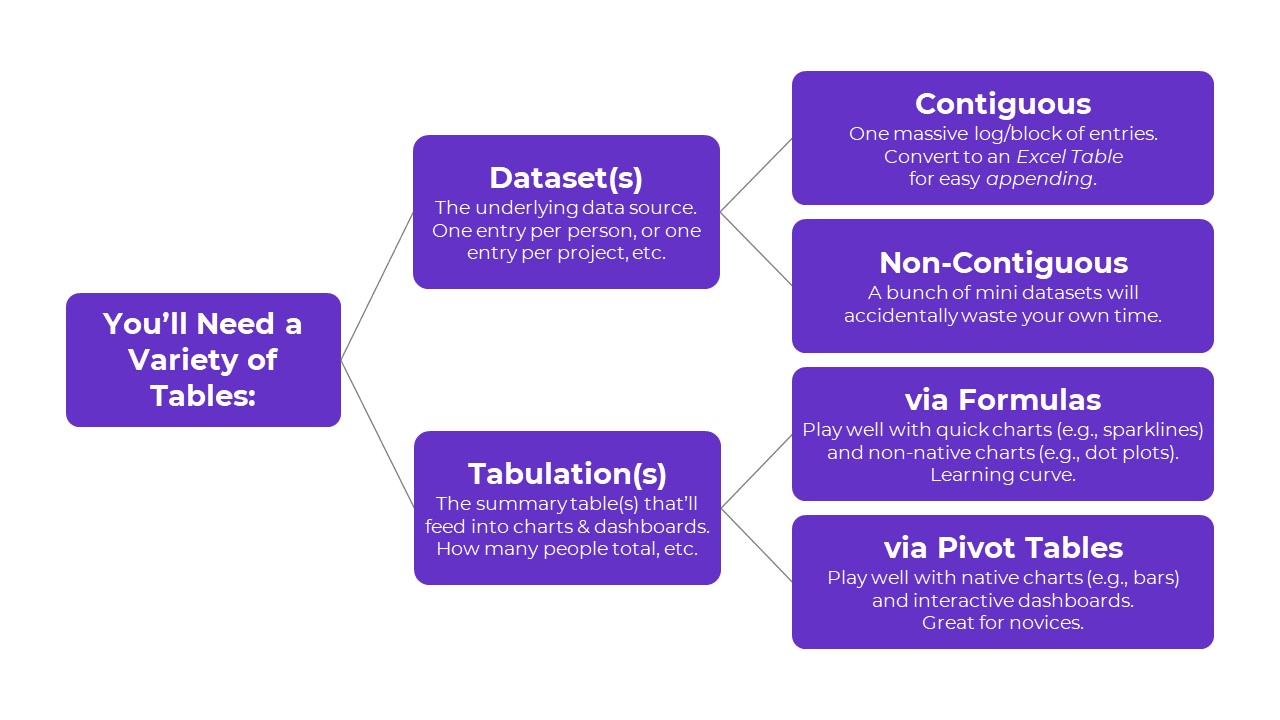
Want to get started with Tableau?

Here’s a step-by-step guide to making your very first Tableau dashboard.

In less than an hour, you’ll be able to install the free version of Tableau, add your dataset, create a few charts, and then combine then into a dashboard. You’ll still have time left for formatting, too.

Step 1: Figure Out Which Version of Tableau You Need

There are a few options:

  • Public: Free BUT your datasets and graphs will be publicly available.
  • Desktop: Paid; about USD $1,000/year per user.
  • Server: Paid.

This article compares the versions in more detail.

Step 2: Download Tableau Public

If this is your very first dashboard, I’d recommend starting with the free version, Tableau Public.

Here’s how you’ll install it:

  • Visit https://public.tableau.com/en-us/s/download
  • Enter your email address and click Download the App.
  • The download begins automatically.
  • It takes about 5 minutes.

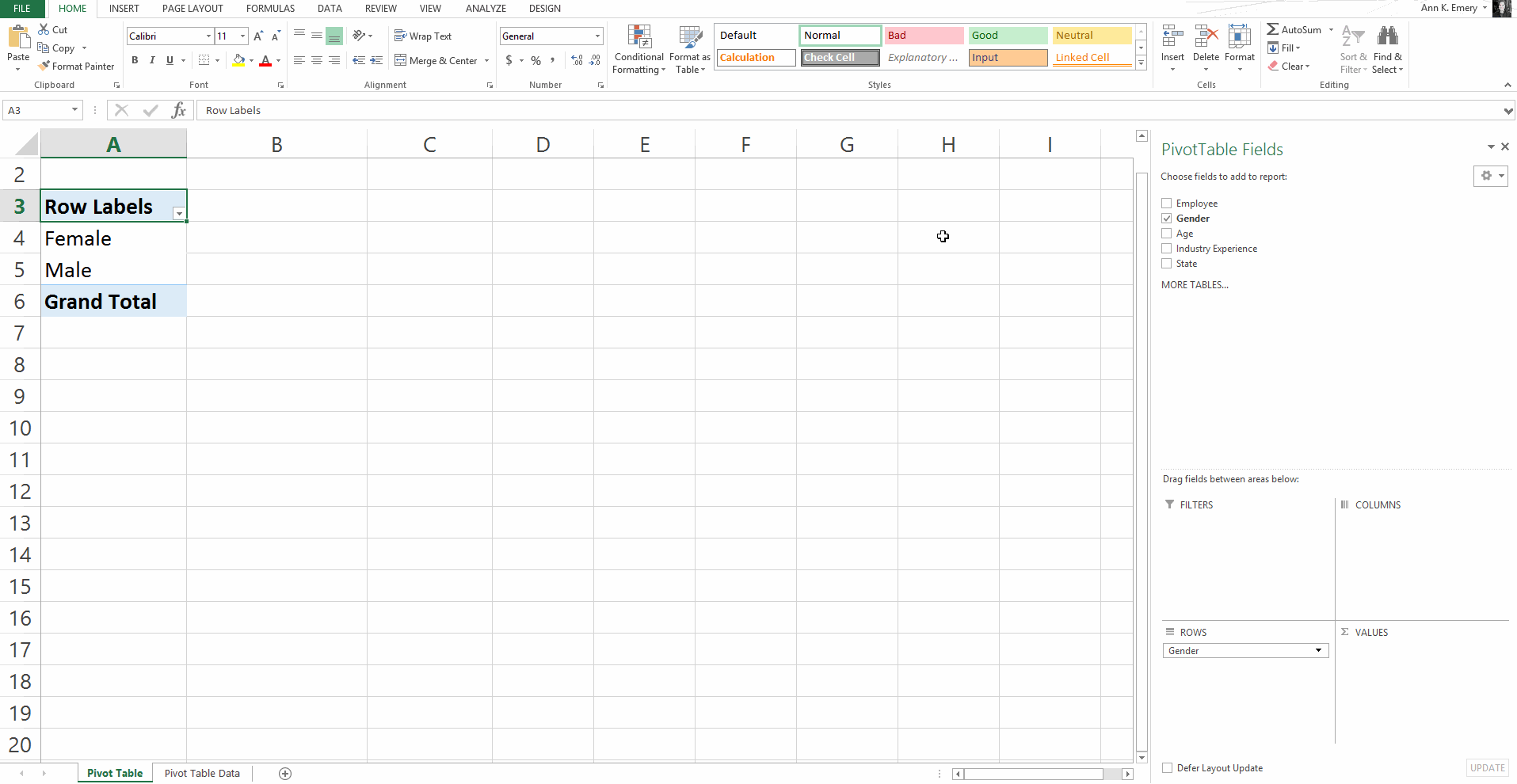
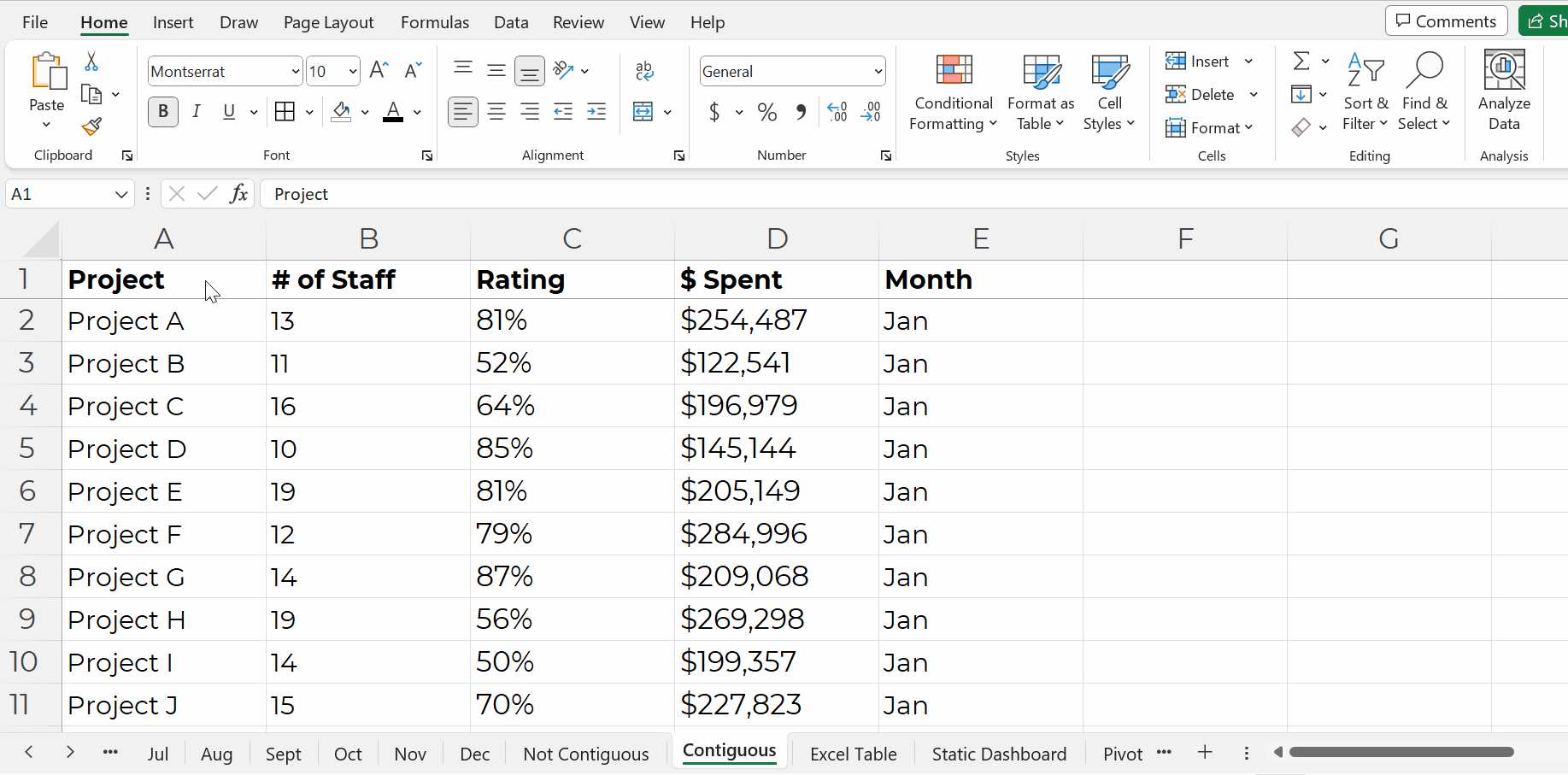
Step 3: Import or Connect Your Dataset

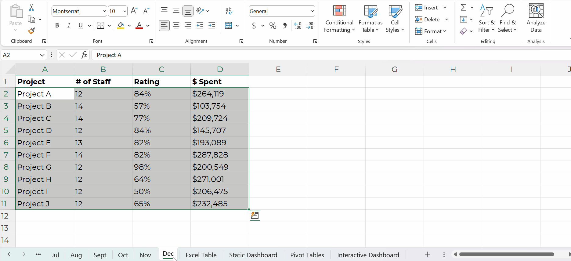
Now, you’ll need to connect your dataset to Tableau.

You can add datasets from Excel, Sheets, QuickBooks, etc.

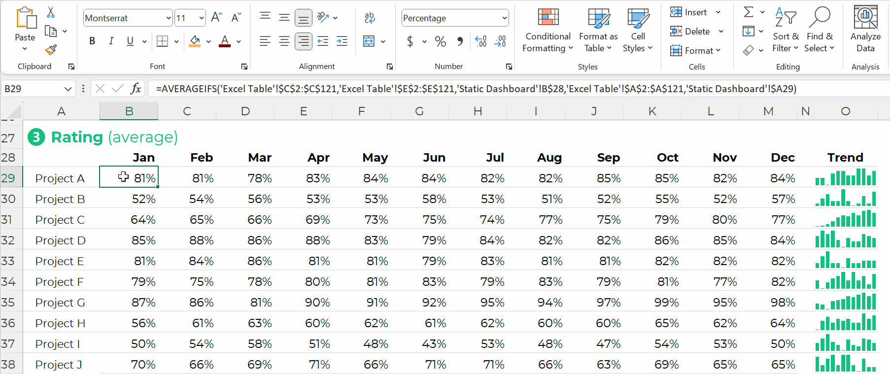
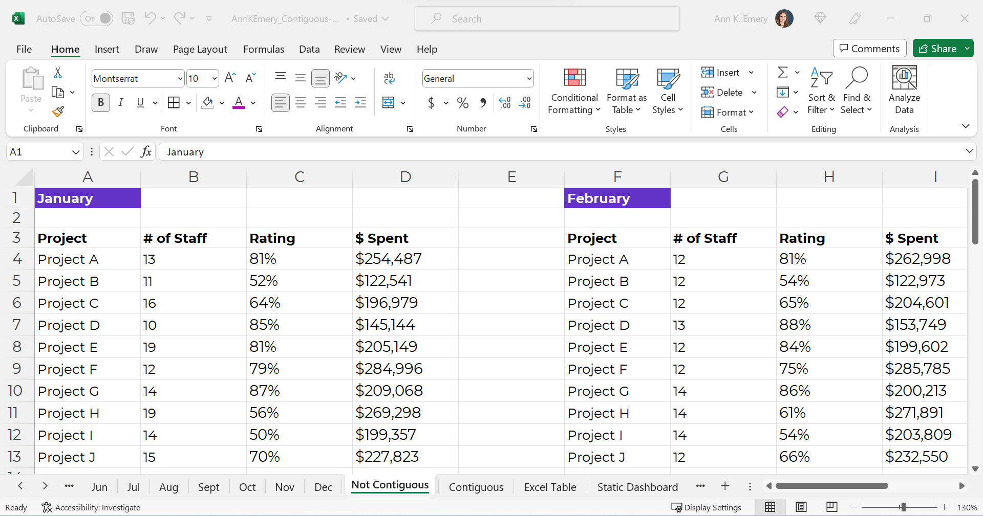
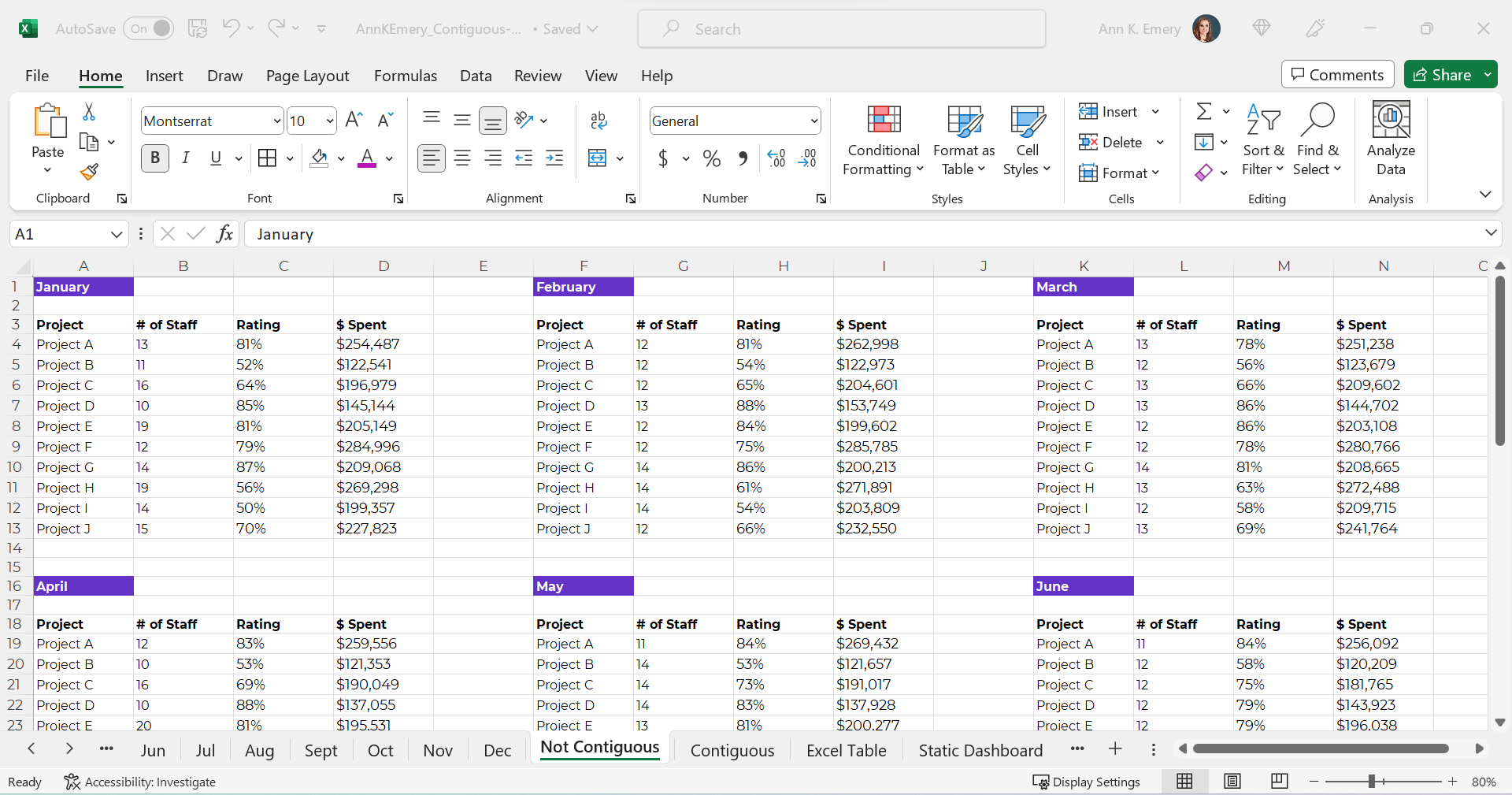
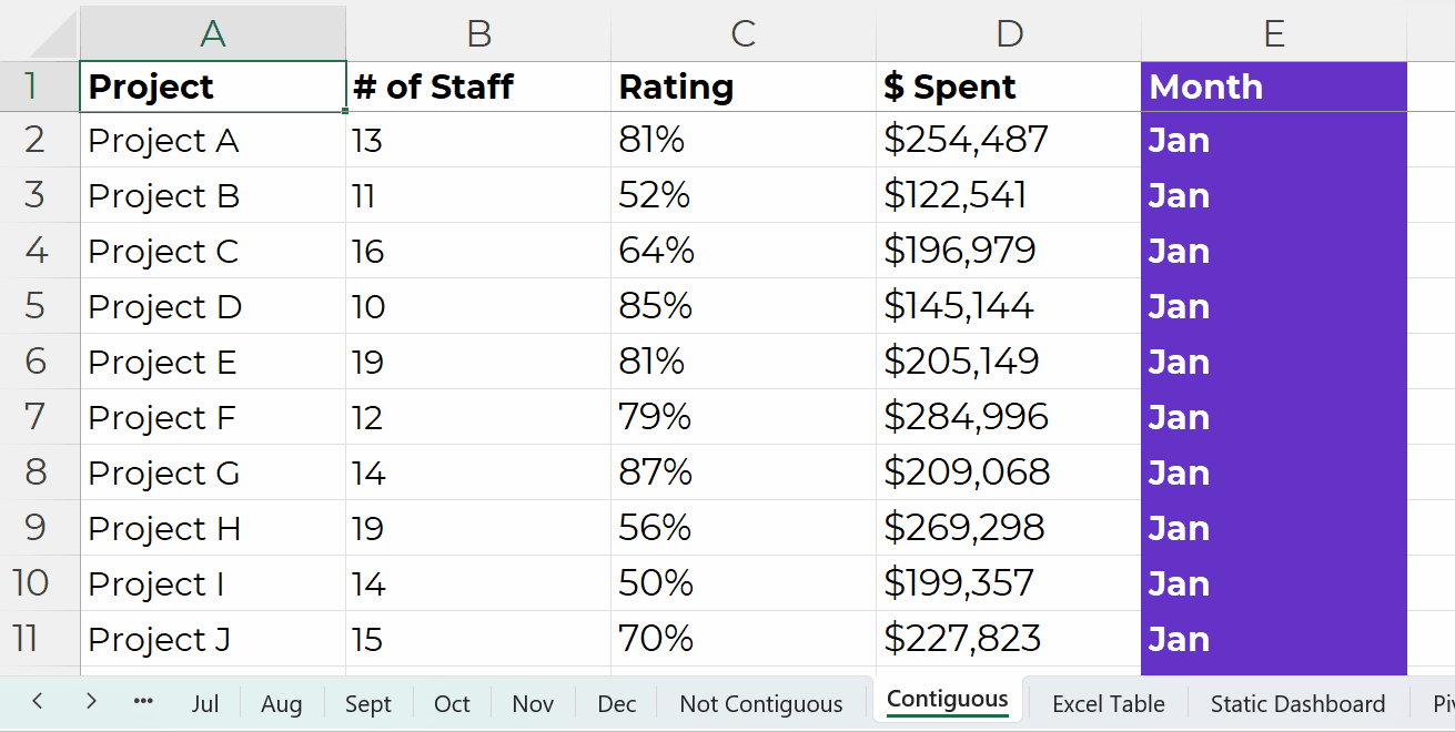
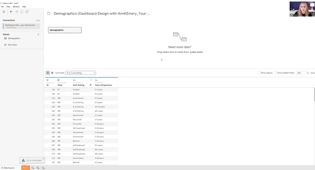
In this example, let’s pretend we’re visualizing demographic data from an Excel spreadsheet, like this:

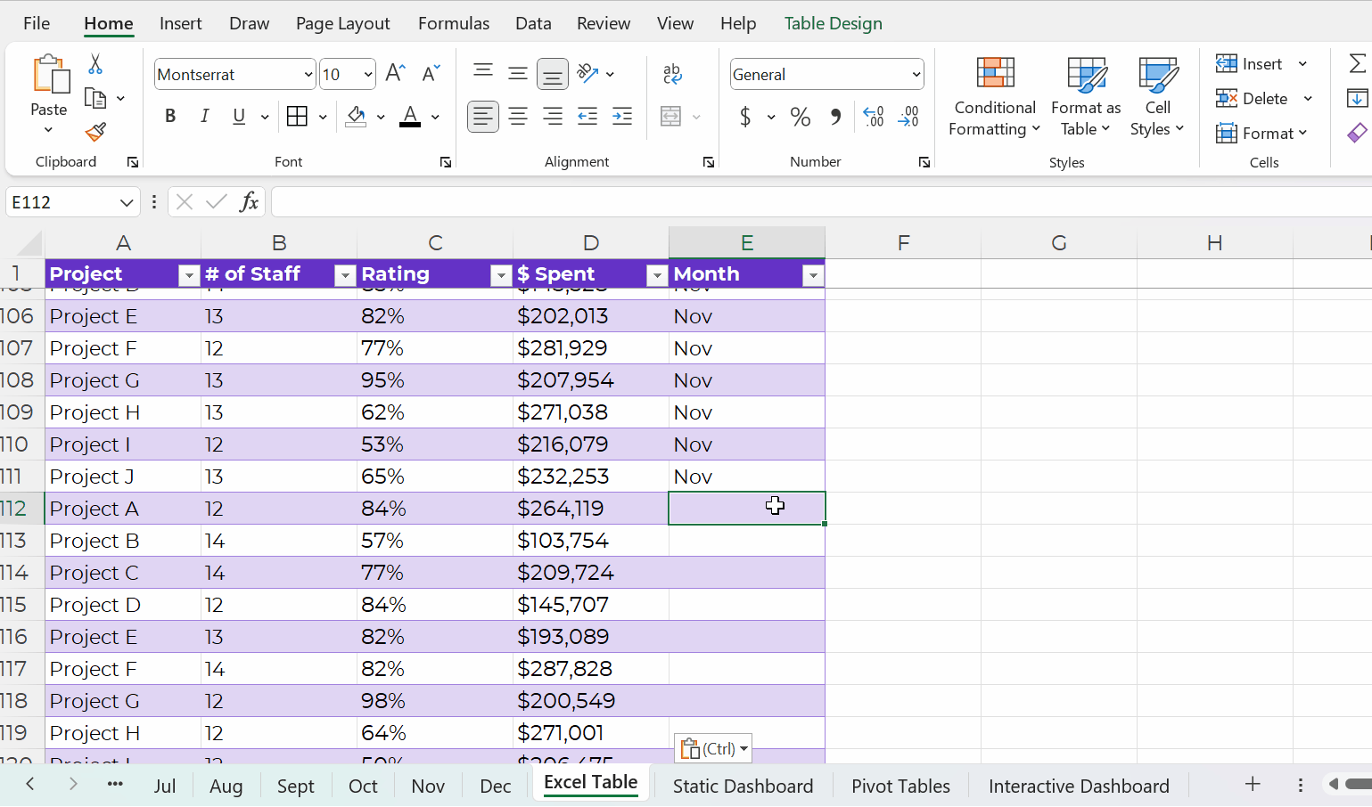
Here’s how you’ll add your dataset to Tableau:

  • Open Tableau Public.
  • Connect to a File: Microsoft Excel. Open your file.
  • You’ll see the names of the Excel Sheets on the left.
  • Drag in the sheet(s) you want to use for your Tableau dashboard.
  • Pre-filter if needed.
  • Connect multiple tables if needed. Joins combine the columns of two datasets, and unions combine the rows of two datasets. Joins are most similar to lookup functions in Excel. Unions are most often used when more data is coming in, and you need to add more rows to the bottom of the dataset.

The preview of your spreadsheet will look like this inside Tableau:

Step 4: Drag and Drop Variables to Create One Visual at a Time

We’ll build one chart at a time. Then, in a moment, we’ll combine them into a dashboard.

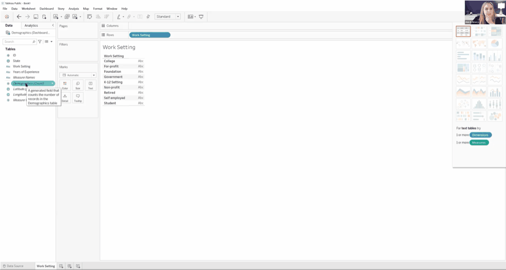
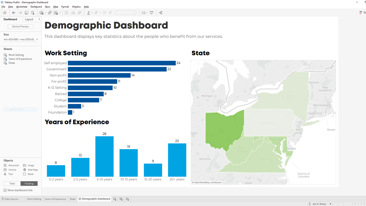
First, let’s visualize the Work Setting data in Sheet 1. We would drag Work Setting into Rows and Demographics (Count) into Columns. Congrats! You’ve got your first bar chart.

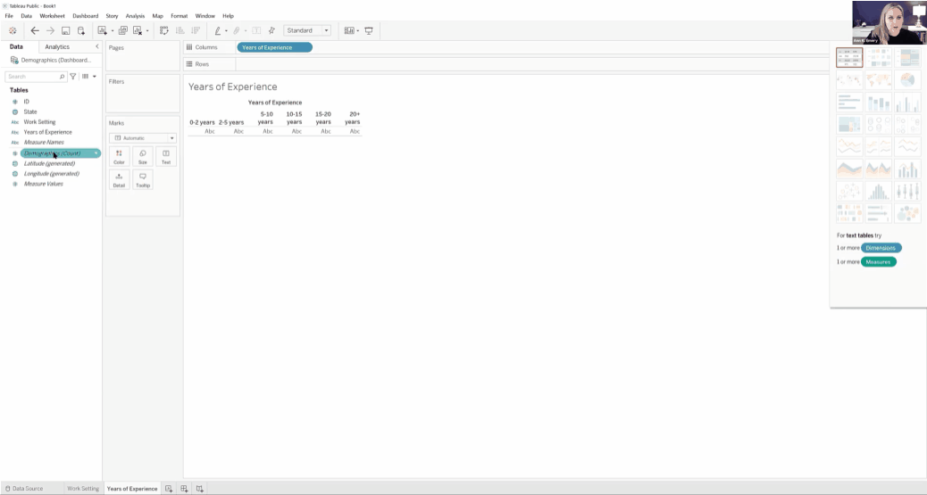
Next, we’ll drag and drop variables to create a Years of Experience histogram.

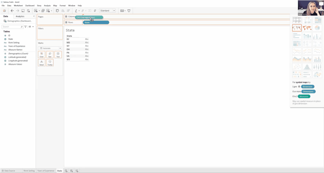
Finally, we’ll create a color-coded (“choropleth”) map by State.

We’ll create a bar or column chart first, and then simply change it into a map with the Show Me menu.

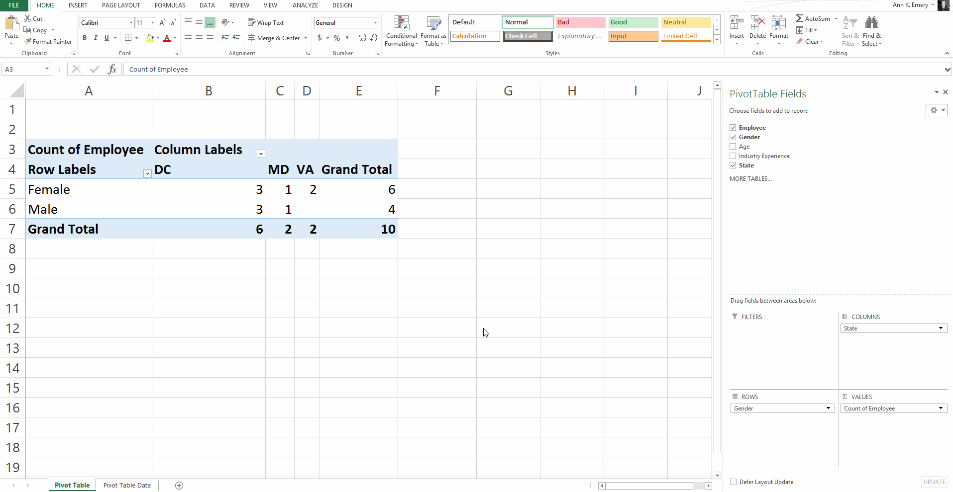
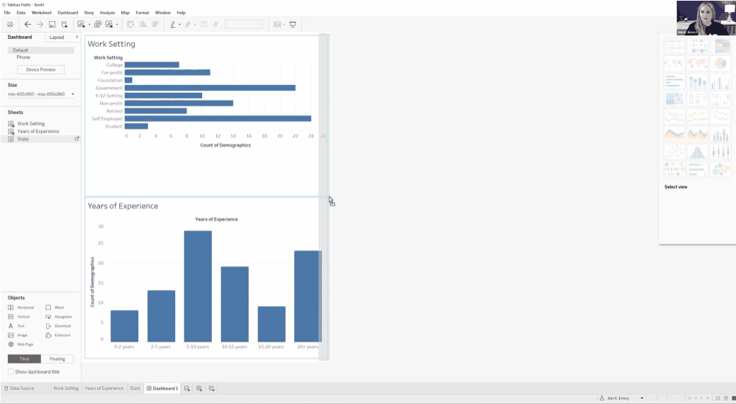
Step 5: Combine the Sheets into a Dashboard

Now, let’s combine our three individual graphs into a single dashboard.

Here’s how:

  • Along the bottom, click on the icon to create a New Dashboard.
  • Then, in the Dashboard tab on the left:
    • Choose the device (Desktop, Tablet, phone, etc.).
    • Adjust the size as needed.
    • Drag the Sheets into the main dashboard area.
    • Add Objects as needed (e.g., Blank to add some white space between visuals).
    • The individual graphs can be tiled or floating. I prefer tiled.
    • Check the box to Show dashboard title.

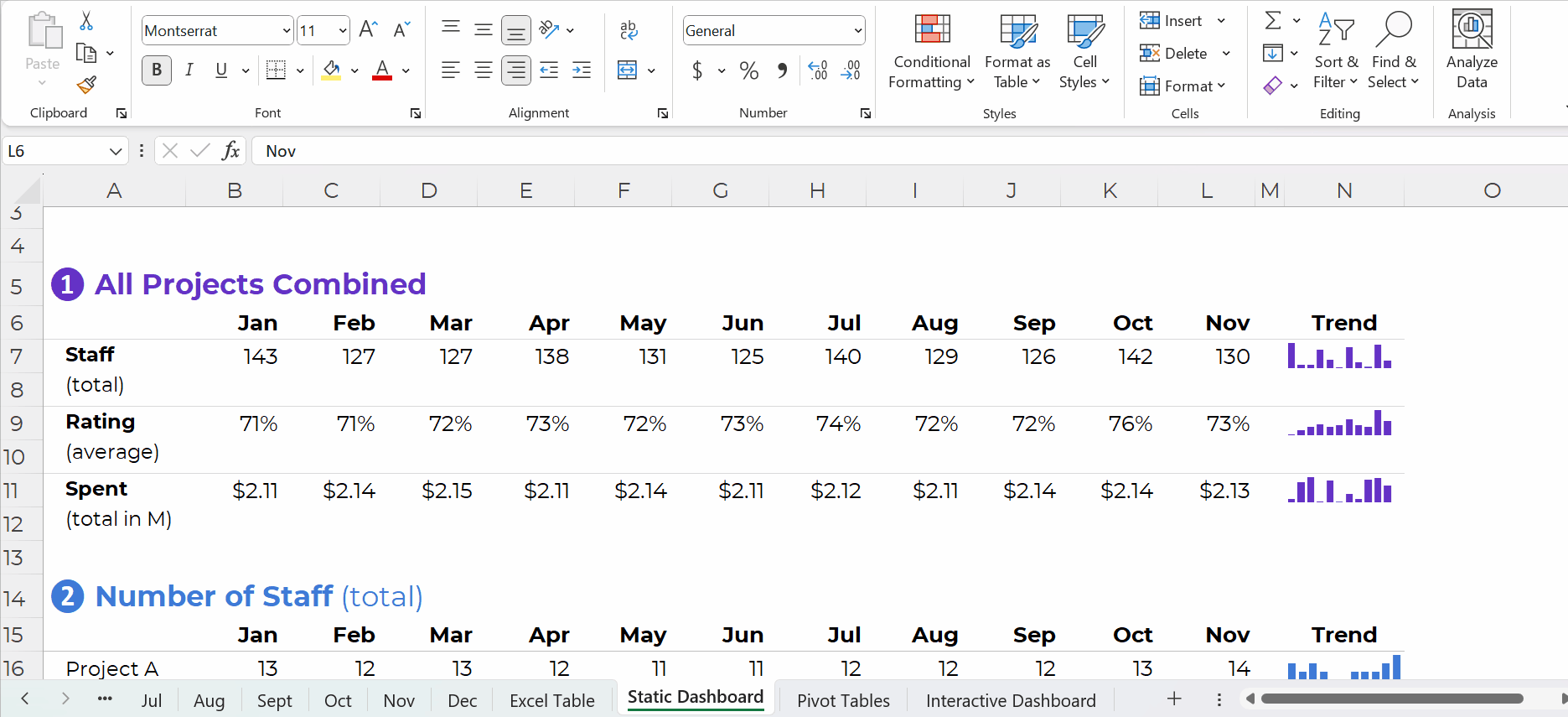
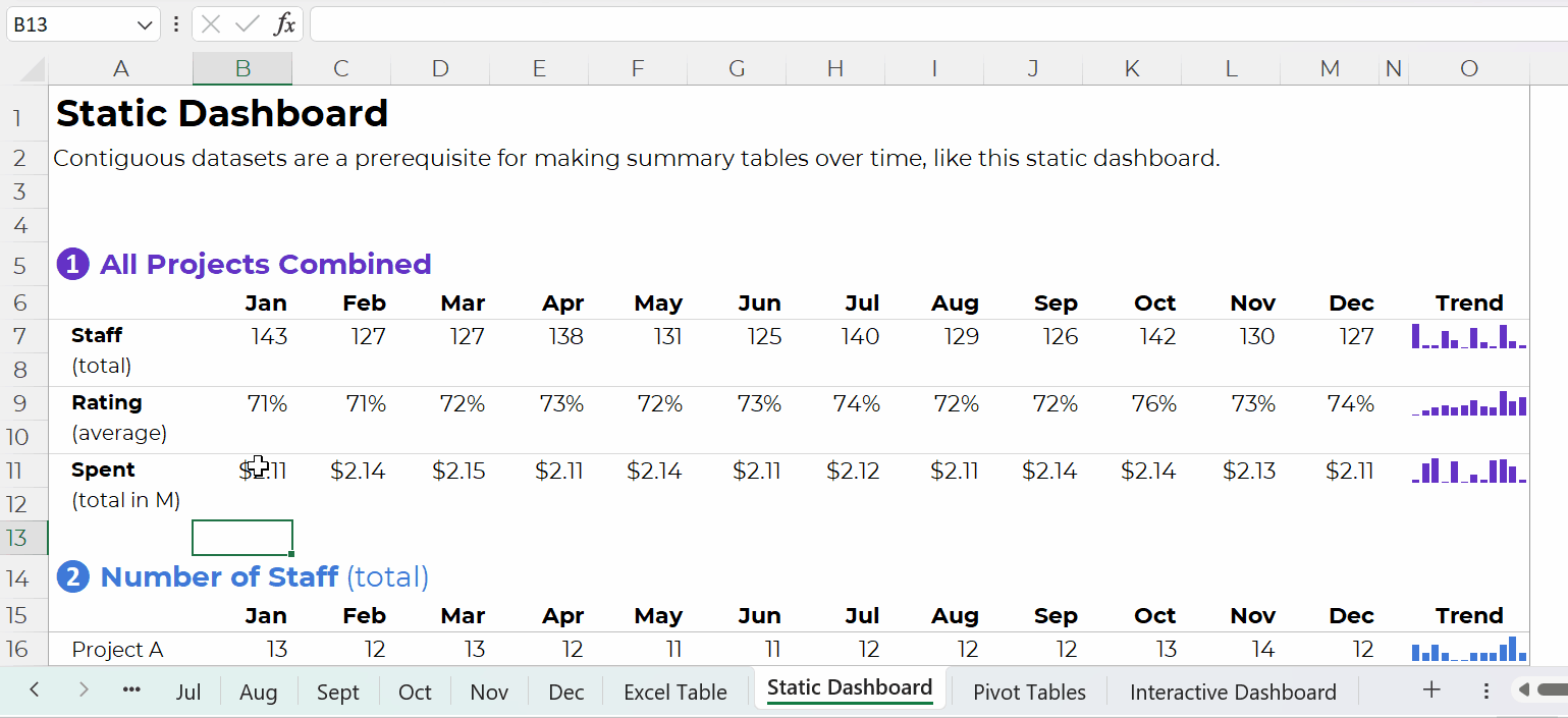
Step 6: Format, Format, Format!

It’s easy to create graphs in Tableau.

Like many software programs, it’s not so easy to format them to be Accessible (508/ADA compliant) and accessible (intuitive).

Here are some bare-minimum edits to get you started.

Apply brand fonts. Go to Format –> Workbook to change all the fonts in your file at the same time (rather than changing one visual at a time). Here’s an article with more info.

Apply brand colors. I personally just go to Marks –> Colors –> More Colors and enter the RGB or HEX codes. Or, here’s an article with a coding option.

I love color-coding by category (i.e., one brand color per graph). This is an easy way to make a dense dashboard feel not-so-dense.

Apply a text hierarchy. Make sure the dashboard title is largest, boldest, and darkest. You’ll also need Heading 1s, and you might need Heading 2s.

As usual, left-aligned text is faster to read then centered or justified text.

As usual, horizontal text is faster to read than diagonal or vertical text.

Don’t forget to turn bulleted tooltips into complete sentences for an extra boost of accessibility.

Your formatted dashboard might look something like this:

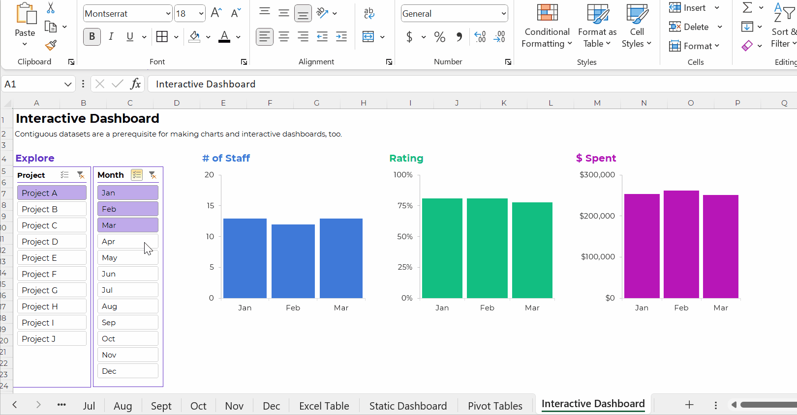
Step 7: Share the Dashboard

That’s it! Let’s share it with colleagues.

In the upper left corner, click on File. Choose Save to Tableau Public. Log in. Or, create a username.

Once the dashboard is saved to Tableau Public, you can save the dashboard as an image file, a PDF, a PowerPoint slide, etc.

Learn More

If you’d like to learn more about getting started with Tableau, check out Dashboard Design. This 4-course bundle includes a half-day course on Tableau.

Written by cplysy · Categorized: depictdatastudio

Aug 28 2023

Two Types of Tabulations: Formulas vs. Pivot Tables

You learned about two types of tables: datasets vs. tabulations.

Then, you learned about two types of datasets: contiguous vs. non-contiguous.

Now, let’s learn about two types of tabulations: formulas vs. pivot tables.

Tabulation Option 1: Formulas

Formulas and pivot tables are both correct… in different circumstances.

Here are the pros and cons of each approach so you can figure out which one you’ll need.

Formulas:

  • are necessary for tabulating numbers;
  • are faster for datasets with matching columns;
  • play well with quick vizzes;
  • give us full control over tabulations; and
  • give us full control over charts; but
  • involve a learning curve.

Formulas: Necessary for Tabulating Numbers

In Simple Spreadsheets, we talk about the calculations needed for different types of variables: nominal, ordinal, interval, and ratio.

When it comes to formulas, we can put these variables into two buckets: numbers and categories.

Numbers are test scores, ages, number of people, amount of money donated, etc.

For numbers, we need to tabulate them using descriptive statistics, which often aren’t possible with pivot tables.

Descriptive statistics for numbers might include:

  • Measures of central tendency (=average, =median, =mode)
  • Measures of dispersion (=stdev, =var, =min, =max, and range)
  • Characterizing the distribution (=skew, =kurt)
  • Quartiles (=quartile)
  • Percentiles (=percentile)
  • Outliers (There are multiple ways to define and deal with outliers; in many projects, we use +/- 3 standard deviations different from the mean)

Formulas: Faster for Datasets with “Matching” Columns

Years ago, I demonstrated how to tabulate satisfaction survey data with “matching” columns.

In the fictional-but-inspired-by-real-projects dataset, each survey question was in its own column.

Every survey question had the same options: strongly agree, agree, disagree, and strongly disagree.

In other words, this dataset had matching columns.

In this 5-minute video, you’ll see how we can write one formula, and then drag it down and across to quickly tabulate matching columns.

Formulas: Play Well with Quick Vizzes

Formulas feed seamlessly into at-a-glance visualizations, like spark lines, data bars, heat tables, and symbol fonts.

(Pivot tables don’t.)

Formulas: Give Us Full Control over Tabulations

Need to compare your numbers to a target?

Need to see how much the numbers have changed over time (e.g., percent change or percentage changes from month to month)?

These tabulations can be tedious or impossible with pivot tables.

Formulas: Give Us Full Control over Charts

We can make a billion different charts in Excel. Here’s an incomplete listing of the Excel vizardry that’s possible with good ol’ Excel.

Want to make a native chart? One of the common built-in charts, like bars, columns, pies, and lines? Pivot tables will feed into native charts just fine.

Want to make a non-native chart? Population pyramids, dots, lollipops, swarms, b’arcs, tile grid maps, diverging stacked bars, etc.? Advanced vizardry is only possible with magic tables, which have formulas underneath, not pivot tables.

For example, if you want to make a swarm plot (a.k.a. jittered dot plot), like this:

Swam plots are non-native charts, so we’ll need formulas behind the scenes to have full control over the chart’s creation and formatting, like this:

Formulas: Expect a Learning Curve

Sure, most people know the absolute basics, like sum and average.

But there are 450+ formulas and functions inside Excel.

Knowing which ones you need… at which point in the analytical process to use them… and how to use them… That takes training and practice.

Tabulation Option 2: Pivot Tables

Pivot tables are a drag-and-drop solution for tabulating our datasets.

In other words, we don’t have to write any formulas! No need to stress over jargon like “” or () or , or A1:A100.

Pivot tables are:

  • great for novices;
  • great for tabulating categories;
  • faster for cross-tabulations;
  • slightly faster for appended tables and recurring analyses;
  • way faster for mismatched columns; and
  • necessary for interactive dashboards.

Pivot Tables: Great for Novices

Let’s start with the biggest benefit of choosing pivot tables over formulas: there’s a minimal learning curve, so pivot tables are perfect for novices.

Here’s an older blog post that shows you how to get started with pivot tables within minutes. You’ll insert a brand new pivot table, and then drag and drop variables into the little boxes.

Sure, there are nuances:

  • switching the units from sums and counts;
  • double-clicking to explore mysterious entries and outliers;
  • placing two variables in the values box (e.g., counts and their percentages); and
  • refreshing the pivot table as new entries are added to the dataset.

But, anyone and everyone can learn the basics within minutes — supervisors who don’t have time to delve into the details of formulas, graphic designers who don’t need to conquer statistics, grantmakers who need to focus on the actual philanthropy and not statistical formulas, etc.

Pivot Tables: Great for Tabulating Categories

Formulas are great for numbers, because we’ll need to calculate descriptive statistics like mean, median, mode, standard deviation, variation, quartiles, percentiles, skewness, and kurtosis, among many others.

Pivot tables are great for categories, because we’ll need to calculate frequencies (like how many people).

Yes, we can also calculate frequencies with formulas (countifs, for example).

Pivot Tables: Faster for Cross-Tabulations

A regular ol’ tabulation might be the number of males and female employees.

A cross-tabulation adds another variable or two, like the number of male and female employees in each state.

Yes, we can do cross-tabulations with formulas, too (another perfect opportunity for countifs). But especially for novices, the drag-and-drop functionality is going to be faster than adding to an existing formula.

Pivot Tables: Slightly Faster for Appended Datasets with Recurring Analyses

Need to add to your dataset over time?

Maybe you collect daily outbreak data, like many public health agencies I work with.

Or, maybe you collect quarterly data from grantees, like many foundations I work with.

(Or some other time period — like weekly, or annually, or whatever.)

As you add to your dataset — your contiguous log — you can simply refresh your pivot table and it’ll incorporate the latest numbers. That means that the chart(s) linked to your pivot table will update with the latest numbers, too! Woohoo!

Yes, it’s easy to update formulas as we append datasets, too.

You simply create one anchor formula — the formula in the upper-left of your tabulation — and drag it across and/or downwards to fill all the cells, like this:

Pivot Tables: Way Faster for Mismatched Columns

Earlier, I said I prefer formulas for matching columns (e.g., all the columns contain agree-disagree response options).

I prefer pivot tables for mismatched columns (e.g., one column has agree-disagree options, another column has birthdates, another column has addresses, and so on).

It would be a huge pain to add so many different formulas along the bottom of my dataset! I might need countifs for one column, and sumifs for another column, and averageifs for another column… meh.

Pivot Tables: Necessary for Interactive Dashboards

To build interactive dashboards in Excel, you’ll need to create pivot tables, then pivot charts, then slicers.

To the best of my knowledge, interactive dashboards have to be built off pivot tables, not formulas.

Here’s an example of an interactive dashboard that’s linked to pivot tables:

The Bottom Line

There are two ways to tabulate your dataset: through formulas, or through pivot tables.

Formulas:

  • are necessary for tabulating numbers;
  • are faster for datasets with matching columns;
  • play well with quick vizzes;
  • give us full control over tabulations; and
  • give us full control over charts; but
  • involve a learning curve.

Pivot tables are:

  • great for novices;
  • great for tabulating categories;
  • faster for cross-tabulations;
  • slightly faster for appended tables and recurring analyses;
  • way faster for mismatched columns; and
  • necessary for interactive dashboards.

Neither option is terrible. Neither option is perfect.

As usual, there are pros and cons.

Your Turn

When do you tabulate your datasets with formulas vs. pivot tables?

This isn’t an exhaustive list of pros and cons. What am I missing??

Written by cplysy · Categorized: depictdatastudio

Aug 21 2023

Two Types of Tables: Datasets vs. Tabulations

Last week’s blog post about contiguous vs. non-contiguous datasets was immensely unpopular.

I had the most unsubscribes to my blog and newsletter of all time — in more than a decade of blogging, YouTubing, and newsletter-ing.

One person said something like this:

“I think the issue is you’re a visualization expert and visually the mini sets are easier. From a data prep perspective, one really long table is the correct way to store the underlying data. Dealing with dozens of tables that should just be a single set is a typical rookie mistake.”

Let’s chat more about that distinction: storing underlying data vs. tables that look nice visually.

Two Types of Tables

The term “table” is tricky.

At its core, a table is just a collection of rows and columns.

But you’ll need different types of tables at different phases in the data analysis and visualization process.

Here’s the major distinction you need to understand:

  1. Datasets are tables where your data is stored.
  2. Tabulations are tables where those datasets are summarized.

Let’s look at each type in more detail.

Type 1: Datasets

The first type of table is a dataset, which is where your data is stored.

Sort-of synonyms:

  • Raw data: This is a sort-of synonym. The term raw means the data hasn’t changed since you received it (i.e., a coworker emailed it to you); since you downloaded or exported it (i.e., from a public-facing website, or from your agency’s database); or since you or someone else manually-entered it.
  • Clean data: This is a sort-of synonym. The term clean means the data has changed since you received it. You checked for duplicates and missing data; you checked for and dealt with outliers; and/or you cleaned and recoded variables (e.g., by transforming a MM-DD-YYYY into Q1, Q2, Q3, or Q4, among hundreds of other recodings that are often necessary).
  • Master dataset: This is a direct synonym — and this is the term I learned in undergraduate and graduate statistics courses — but we don’t use slavery terms anymore. I’ve been hunting for a better term for a couple years. If you’re in Simple Spreadsheets then you’ve heard me talk about this a lot. I’ve experimented with the terms central headquarters or hub to replace master dataset, but none of them felt right. The term that currently feels most accurate is contiguous dataset.

Datasets: Contiguous vs. Non-Contiguous

Datasets should be contiguous, i.e., touching or sharing a border.

If you want to be efficient, that is.

Non-contiguous datasets — dozens of mini datasets located across different sheets or Excel files — lead to wasted time, wasted money, and wasted brainpower.

Datasets: Stored as Excel Tables for Easy Appending

Datasets should be stored as Excel Tables when you need to append them later, i.e., if you’ll be adding to them.

You can learn more about contiguous vs. non-contiguous datasets and tables vs. Excel Tables in this blog post. The Simple Spreadsheets course is all about data management and analysis, too.

Type 2: Tabulations

The second type of table is a tabulation. Tabulations are tables where the datasets are summarized.

For example, the dataset might have one entry per project. The tabulation might show the totals and/or averages across all the projects.

Datasets and tabulations have different purposes. They’re used at different points in the analytical process. They look different. They are different.

Synonyms:

  • Summary table
  • Summary statistics
  • Report
  • Key metrics

How to Tabulate the Dataset

You’ve got two options in Excel:

  1. Formulas (sumifs, countifs, averageifs, lookups, etc.) will play nicely with the quick vizzes (below). They require more skill and practice, though.
  2. Pivot tables will play nicely with the interactive dashboard (below). Anyone can learn pivot tables within minutes, so I often recommend them for the beginner/intermediate crowd.

This distinction deserves its own blog post, too. In all my “spare” time, ha! We also talk about the distinctions between formulas and pivot tables in detail inside Simple Spreadsheets.

Tabulations: Can Be the End Product (meh)

The tabulation might be the end product that you share with others.

I suppose you could email the summary table to colleagues. You could post it on a website, or share it on a slide.

Except… meh.

Why not bring those visuals to life?!

Tabulations: Can Feed into Mini-Graphs

Why not add quick vizzes to bring tabulations to life?!

Sparklines, data bars, heat tables, and symbol fonts are my go-to’s.

Visuals make it easier for our brains to spot patterns. It’s obviously faster to look at a viz than to read all the numbers.

Your quick vizzes might look like this:

If you format the sheet for easy printing and PDF’ing, then voila!, you’ve got a static dashboard.

Static dashboards like these are great for internal audiences that (1) need a quick turnaround time and (2) want lots of details from the actual tabulations.

Tabulations: Can Feed into Big Graphs and Dashboards

Tabulations can also feed into larger graphs (for documents and slides).

Or, tabulations can feed into larger graphs for interactive dashboards.

Your interactive dashboard in Excel might look something like this:

The Bottom Line

“Table” is a tricky term. It’s broad and generic. It means different things to different people.

There are two main types of tables:

  1. Datasets are the underlying data source. You might have one entry (one row) per person, or per organization, or per project. Datasets should be contiguous because.
  2. Tabulations are the summary tables. You might tally-up how many people, or how many organizations, or how many projects. Tabulations might be your end product (yawn!). Or, they might feed into graphs and dashboards (yay!).

We need both datasets and tabulations. But these are different types of tables.

Written by cplysy · Categorized: depictdatastudio

Aug 14 2023

Contiguous Datasets: A Critical Prerequisite for Useful Data Visualization

“Ann, I loved your training, but I’m having trouble applying what I learned. Something’s off with my datasets, and the graphs are taking forever!”

This past year, I’ve spent more time teaching about data management than data visualization.

When I look under the hood of companies’ spreadsheets, I’ve noticed way too many data management issues that could be avoided altogether.

In this article, you’ll learn about a critical prerequisite for useful data visualization: contiguous datasets.

Mini Datasets Spread Across One Sheet – NO!

Here’s what I often see:

Separate datasets for each time period.

NOOOOOOOOOOOOOOOOO!!!!!!!!!!!!!!!!!!!!!!!!!!!!!!!!

Sometimes there are dozens of mini tables, like this:

Mini Datasets Spread Over Multiple Sheets – NO!

Or, just as terrible for graphs and dashboards — one mini dataset per sheet, like this.

NOOOOOO!!!!!!!!!!!!!!!!!!!!!!

Or, separate mini datasets spread across different Excel files altogether.

NOOOOOOOOO!!!!!!!!!!!!!!!!!!!!!!!!!!!!!!!!!!!!!!!!!!!!!!!!!!!

Ann, What’s So Bad about Mini Datasets?!

Separate mini datasets (“non-contiguous” or “non-touching” datasets) mean that we can only look at one time period at a time.

We have to make a bunch of mini charts.

It takes forever to make these the first time, and they’re a huge pain to update over time.

It’s also tougher for our viewers to find patterns because the numbers are scattered across too many charts.

NOOOOOO!!!!!!!!!!!!!!!

Dataviz Prerequisite: A Single Contiguous Dataset

Instead, the numbers should be stored in a single dataset, with the timeframe as its own column, like this:

This running list of new entries — a log — is going to get very long.

In real-life projects, the logs might have hundreds of thousands of entries.

That’s okay!!!!!!!!!!!!!!!!! That’s preferred!!!!!!!!!!!!!!!!!!!!

It’s counterintuitive, but contiguous logs make dataviz faster, not slower.

Excel can handle millions of entries.

The length of a dataset won’t make your analysis or visualization take any longer. Repeat after me: Contiguous logs make dataviz faster, not slower.

However…

The width — the number of columns — can certainly take a while, because there are so many different variables to consider.

Bonus: Save Your table as an Excel Table for Easier Updating

A table is the generic term for a collection of rows and columns.

An Excel Table is a special feature that makes it faster and easier to update our log.

In other words, Excel Tables make it easier to append our contiguous logs as we get new data.

How to Turn tables into Excel Tables

You’ll simply click on your contiguous log — your generic table.

Then, go to the Insert tab.

Choose a Table.

Click OK.

You’ll recognize the banded rows.

Adding New Entries to Excel Tables

Adding new entries — or appending — is easy.

Let’s pretend you’re downloading data from your organization’s database. You might only be able to download one month at a time into its own sheet. That’s okay!

We’ll simply copy and paste those new entries into our running log.

Then, we’ll add the timeframe to that right-most column, too.

Excel is smart, and it’ll know that your new entries are part of your new dataset. In other words, your new entries will feed into pivot tables and formulas seamlessly.

Contiguous Datasets are Required for Static Dashboards

Want a short handout, PDF, or email attachment to share with others?

Maybe you’d want to see how all the projects combined are doing.

Or, maybe you’d want a breakdown of the different projects.

You could even add quick vizzes like sparklines to see trends, like this:

Contiguous datasets are required in order to make static dashboards.

Otherwise the sumifs, countifs, and averageifs behind the scenes will be impossible. Or, the formulas will be painfully slow to set up.

Static dashboards should take less than an hour to design from start to finish.

If it’s taking longer than that, it’s probably because (a) you don’t have a contiguous dataset or (b) you need more practice with formulas.

Contiguous Datasets are Required for Interactive Dashboards

Want to make interactive dashboards in Excel?

Your technical coworkers will love exploring the insights for themselves.

Interactive dashboards involve four pieces:

  1. A single contiguous dataset stored as a regular ol’ table or an Excel Table. You already know I prefer Excel Tables for datasets that are going to be added to or appended in the future.
  2. Pivot tables to tabulate the numbers (and bypass formulas, which can be tricky for novices).
  3. Pivot charts to, you know, visualize the numbers.
  4. Slicers (a fancy name for the filters).

Once again, contiguous datasets are the foundation of data visualization.

Have I sold you on contiguous datasets yet???

Contiguous datasets are required for:

  • Making a single graph to show comparisons over time (not January, February, and March in separate graphs that take three times as long to create and update);
  • Making static dashboards with formulas and trendlines that’ll update (nearly) automatically as you add new entries to your log; and
  • Making interactive dashboards with charts that’ll update (nearly) automatically as you add new entries to your log.

If your data visualization is taking too long… it’s usually a data management problem.

And it can be easily fixed!!!

Start storing your non-contiguous data as contiguous data.

Written by cplysy · Categorized: depictdatastudio

Aug 07 2023

How to Visualize Multi-Year Patterns

I recently worked with a healthcare system to visualize their multi-year patterns.

Are you lucky enough to have historical data at your fingertips?! Woohoo! What a treat.

Let’s weigh the pros and cons of a few different viz options.

The Table

Here’s what their tabulated data looked like, sort of.

Let’s pretend we’re looking at the number of doctor’s appointments that took place within their healthcare system.

That’s not the real variable, and these aren’t their real numbers, but you get the idea: They wanted to visualize patterns over the past four years.

Before: 1 Graph per Year

And here’s what their initial visualization looked like: a separate graph for each year.

Idea 1: Lonnng Column Chart with Bare-Minimum Edits

First, let’s tackle the Quick Wins, a.k.a. the Bare Minimum edits for branding and “Big A” Accessibility:

  • Brand colors and fonts
  • Darker font for better color contrast
  • Sized for a slide (size 18-point font, 13 inches wide, 5 inches tall)
  • Arranged left to right, rather than a grid
  • “Grouped” all the graphs together for easier copying and pasting into a slide
  • Horizontal text only
  • Consistent scales to make comparisons across graphs easier
  • Fewer demarcations on the y-axis (one label every 25,000 units)
  • Changed the y-axis to a “number” format so that a zero appears at the bottom, not just a dash
  • Then, only showing the left-most y-axis
  • Wider columns, a.k.a. a smaller gap width

It felt inefficient to keep four separate graphs — too much extra work to align everything and then group everything — so I turned this into a single column chart.

Yep, I had to rearrange the four tables into one table in order to transform the four graphs into one graph. At the bottom of this blog post, you’ll see a link to download my Excel file so you can explore the behind-the-scenes tables and graphs for yourself.

Idea 2: Lonnng Column Chart with Data Storytelling

I’ve written about spoken about traditional vs. storytelling graphs a lot over the past decade. If these terms are new, then you can watch the most recent public-facing conference talk here.

In this version, I intentionally used data storytelling. This data was intended for a busy upper-management office, and leaders often prefer when we cut to the chase, instead of burying them in graphs that don’t say anything.

The presentation slide might look something like this:

  • A takeaway slide title
  • The topical graph title underneath
  • Dark-light contrast
  • Labels only one the columns of interest – for September and October

And no, I don’t love how the September labels are right-aligned while the October labels are centered, but this probably isn’t the winning approach, so who cares.

Idea 3: Lonnng Line Chart with Data Storytelling

Another option is a line chart with gray shading for the peaks.

Yes, this is a combo chart in Excel.

The presentation slide would look like this:

Idea 4: Single Line Chart with Data Storytelling

A final option is a single line chart that stretches from January to December, with each year’s data “stacked.”

Comparing All 4 Ideas

My favorite is Idea 4 because we can easily see the seasonal peaks.

Which one is your favorite, and why? Comment below.

This isn’t an exhaustive list.

Can you think of additional options? Comment below.

Giving a Powerful Presentation

Idea 4 is a sort-of dense graph — and it’s definitely a spaghetti line graph, so we’ve gotta continue adjusting it.

We’ll want to present it piecemeal to match our speaking points.

Otherwise, our audience will die of boredom.

Our bosses will wonder why they hired us.

And nobody will be able to make data-driven decisions based on the data… because while we’re explaining one piece, they’re looking at something else (the very definition of Death by PowerPoint).

The meeting might sound something like this:

I hope you enjoy my kindergarten photoshopping skills. 🙂

PowerPoint’s animation works fine for bullet points.

But, to “animate” graphs to match our voice, it’s usually easiest to create a bunch of different slides.

Download My Excel File

Want to explore how I made each graph?

You can download my spreadsheet here.

Written by cplysy · Categorized: depictdatastudio

  • « Go to Previous Page
  • Go to page 1
  • Interim pages omitted …
  • Go to page 13
  • Go to page 14
  • Go to page 15
  • Go to page 16
  • Go to page 17
  • Interim pages omitted …
  • Go to page 37
  • Go to Next Page »

Footer

Follow our Work

The easiest way to stay connected to our work is to join our newsletter. You’ll get updates on projects, learn about new events, and hear stories from those evaluators whom the field continues to actively exclude and erase.

Get Updates

Want to take further action or join a pod? Click here to learn more.

Copyright © 2026 · The May 13 Group · Log in

en English
af Afrikaanssq Shqipam አማርኛar العربيةhy Հայերենaz Azərbaycan dilieu Euskarabe Беларуская моваbn বাংলাbs Bosanskibg Българскиca Catalàceb Cebuanony Chichewazh-CN 简体中文zh-TW 繁體中文co Corsuhr Hrvatskics Čeština‎da Dansknl Nederlandsen Englisheo Esperantoet Eestitl Filipinofi Suomifr Françaisfy Fryskgl Galegoka ქართულიde Deutschel Ελληνικάgu ગુજરાતીht Kreyol ayisyenha Harshen Hausahaw Ōlelo Hawaiʻiiw עִבְרִיתhi हिन्दीhmn Hmonghu Magyaris Íslenskaig Igboid Bahasa Indonesiaga Gaeilgeit Italianoja 日本語jw Basa Jawakn ಕನ್ನಡkk Қазақ тіліkm ភាសាខ្មែរko 한국어ku كوردی‎ky Кыргызчаlo ພາສາລາວla Latinlv Latviešu valodalt Lietuvių kalbalb Lëtzebuergeschmk Македонски јазикmg Malagasyms Bahasa Melayuml മലയാളംmt Maltesemi Te Reo Māorimr मराठीmn Монголmy ဗမာစာne नेपालीno Norsk bokmålps پښتوfa فارسیpl Polskipt Portuguêspa ਪੰਜਾਬੀro Românăru Русскийsm Samoangd Gàidhligsr Српски језикst Sesothosn Shonasd سنڌيsi සිංහලsk Slovenčinasl Slovenščinaso Afsoomaalies Españolsu Basa Sundasw Kiswahilisv Svenskatg Тоҷикӣta தமிழ்te తెలుగుth ไทยtr Türkçeuk Українськаur اردوuz O‘zbekchavi Tiếng Việtcy Cymraegxh isiXhosayi יידישyo Yorùbázu Zulu