• Skip to main content
  • Skip to footer
  • Home

The May 13 Group

the next day for evaluation

  • Get Involved
  • Our Work
  • About Us
You are here: Home / Archives for allblogs / depictdatastudio

depictdatastudio

Nov 14 2022

How to Use Repeating Diagrams to Visualize Qualitative Concepts

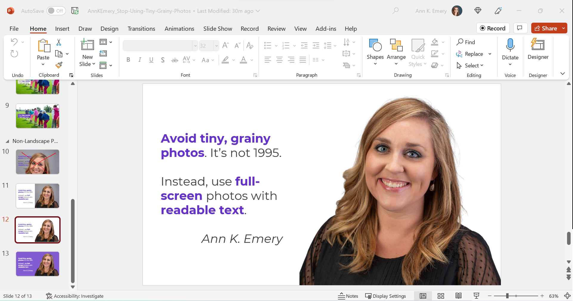
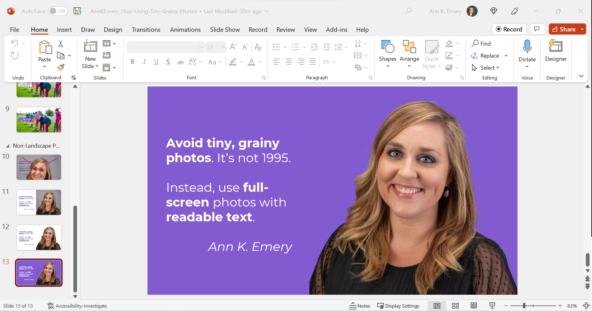
This is the status quo.

But it doesn’t have to be!!!

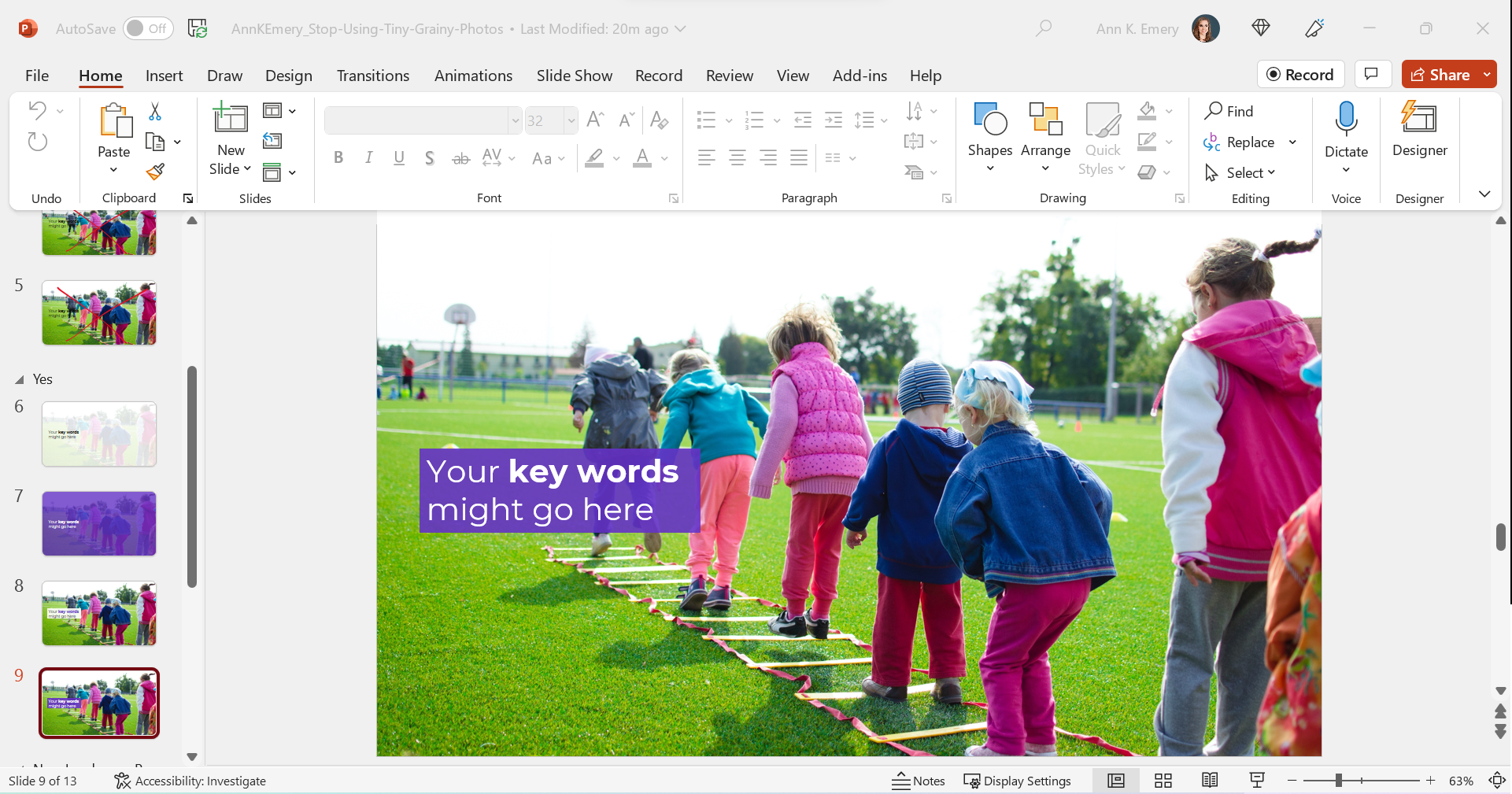
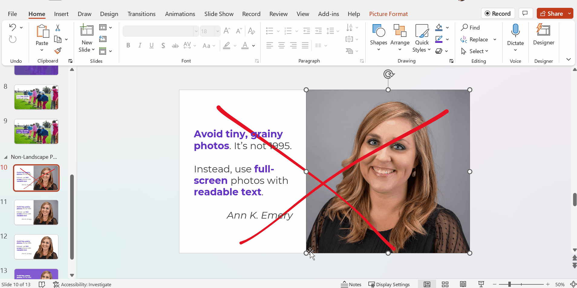
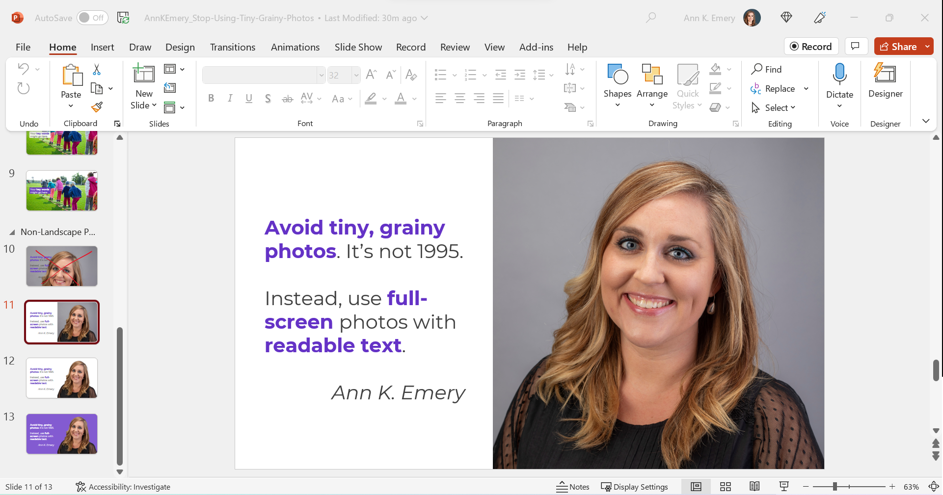
Let’s stop hiding important qualitative concepts inside Text Walls that no one reads.

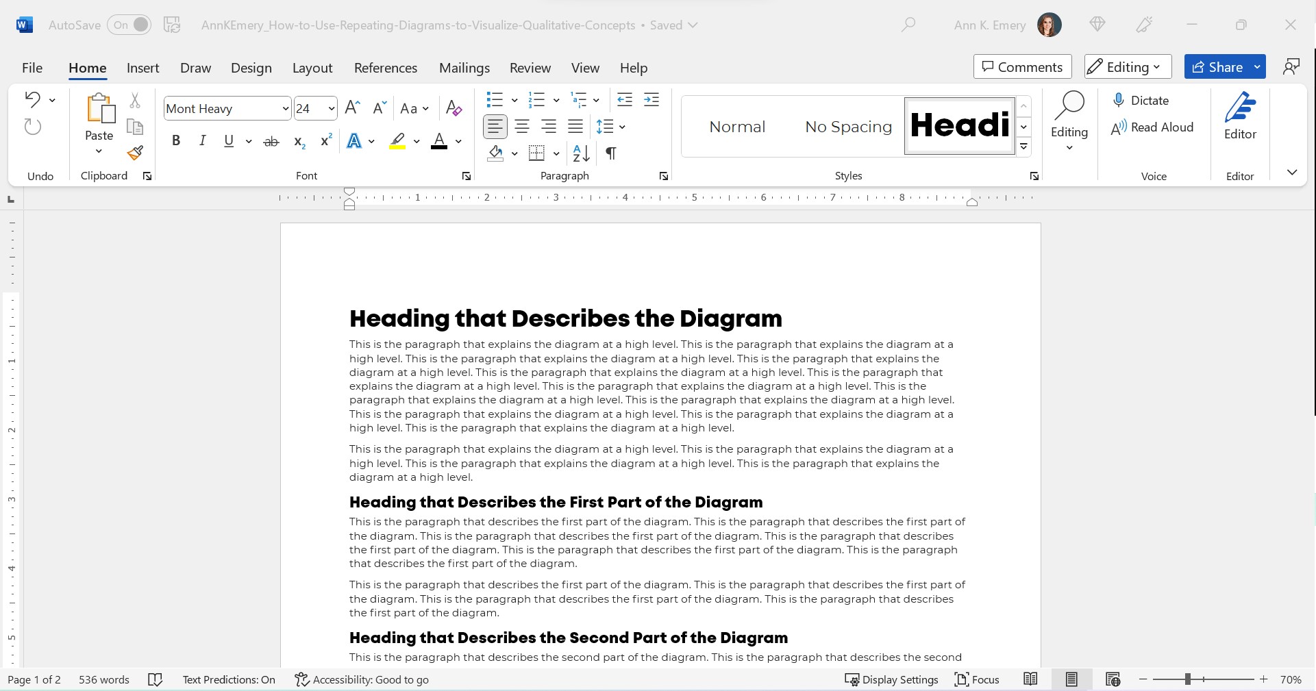
Step 0: Take Pride in Your Report’s Formatting

We’ll use landscape so that it’s easier to see on a landscape computer screen.

We’ll add the organization’s Theme Colors and Theme Fonts so that the document looks professional and enhances branding.

We’ll add a Text Hierarchy. Instead of a single Heading 1, we need to add several Heading 2s. We also need to enlarge all the font sizes. No more puny size 12 or 14 for headings!!

In this example:

  • the Heading 1 is size 24 bold in a brand color,
  • the Heading 2s are size 16 bold in a brand color, and
  • the body font is size 11 in dark gray. (Not black, which causes eye strain and makes people think of funerals, at least according to my graphic design friends.)

Step 1: Choose Your Diagram

I like to scroll through SmartArt for ideas.

You can also browse Diagrammer, which is SmartArt on steroids.

Here are the most common diagrams I’ve used to visualize qualitative concepts in research and evaluation projects:
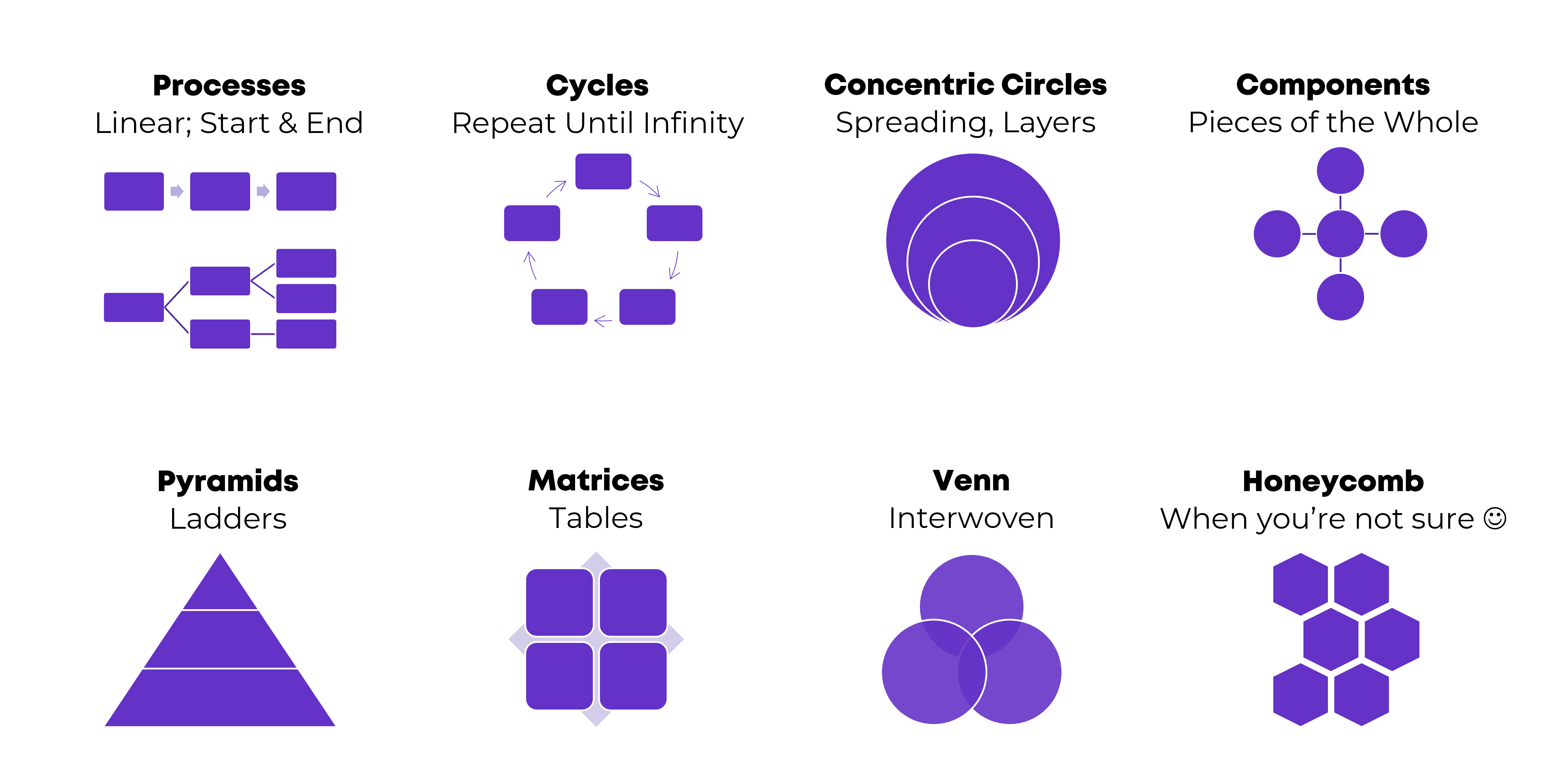
Processes

Processes are for linear, step-by-step concepts. There’s a defined start and end.

Examples:

  • A lot of my own training programs, where I teach how-to instructions for dataviz.
  • Logic models.
  • Research methods (e.g., we recruited participants, and then they did this, and then they did this).

Cycles

Cycles are for processes that loop around and around until infinity.

Example:

  • The program evaluation lifecycle, in which you plan for the evaluation, collect the data, analyze the results, use the data to inform decisions… and then start the process all over again.

Concentric Circles

Concentric circles are for spreading concepts and for inner, middle, and outer layers.

Example:

  • An agency made a plan to improve diversity, equity, and inclusion. They identified three layers of changes needed: at the individual level, at the departmental level, and at the agency level.

Components

Components are for pieces of the whole—when you want to show that all these random things aren’t so random; they’re connected. They’re just not connected as a linear process or as a cycle.

Examples:

  • In my master’s thesis, I researched how nonprofit organizations were using data to have a bigger impact on the community. In the literature review, I identified ~10 specific examples of data use, which were all related to the broader theme of data use.
  • The U.S. Surgeon General’s Framework for Workplace Mental Health & Wellness (scroll down a bit here).

Pyramids

Pyramids, or ladders, are for concepts that build upon one another. The base layer is the foundation, the middle layer builds upon it, and you’re aiming for the pinnacle at the very top.

Example:

  • In my Report Redesign classes, I organized the techniques into a pyramid. Participants learn the foundational skills, then the slightly narrower skills, then the nitty-gritty details that pull everything together.

Matrices

Matrices are fancy tables or plots.

Examples:

  • This blog post about four types of dashboards.
  • Lots of diagrams from McKinsey.

Venn Diagrams

Venn Diagrams are for interwoven, overlapping components.

Examples:

  • A project involving several groups of people, who all come together to advocate for their issue.
  • The U.S. Surgeon General’s Framework for Workplace Mental Health & Wellness (scroll down a bit here). It’s a venn diagram plus components.

Honeycomb

Honeycombs, meh. I don’t love these. They’re overused, along with the gears. If you’re not sure what else to use, this is still better than a Text Wall.

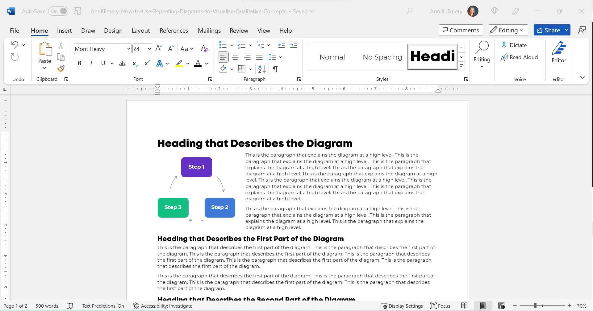
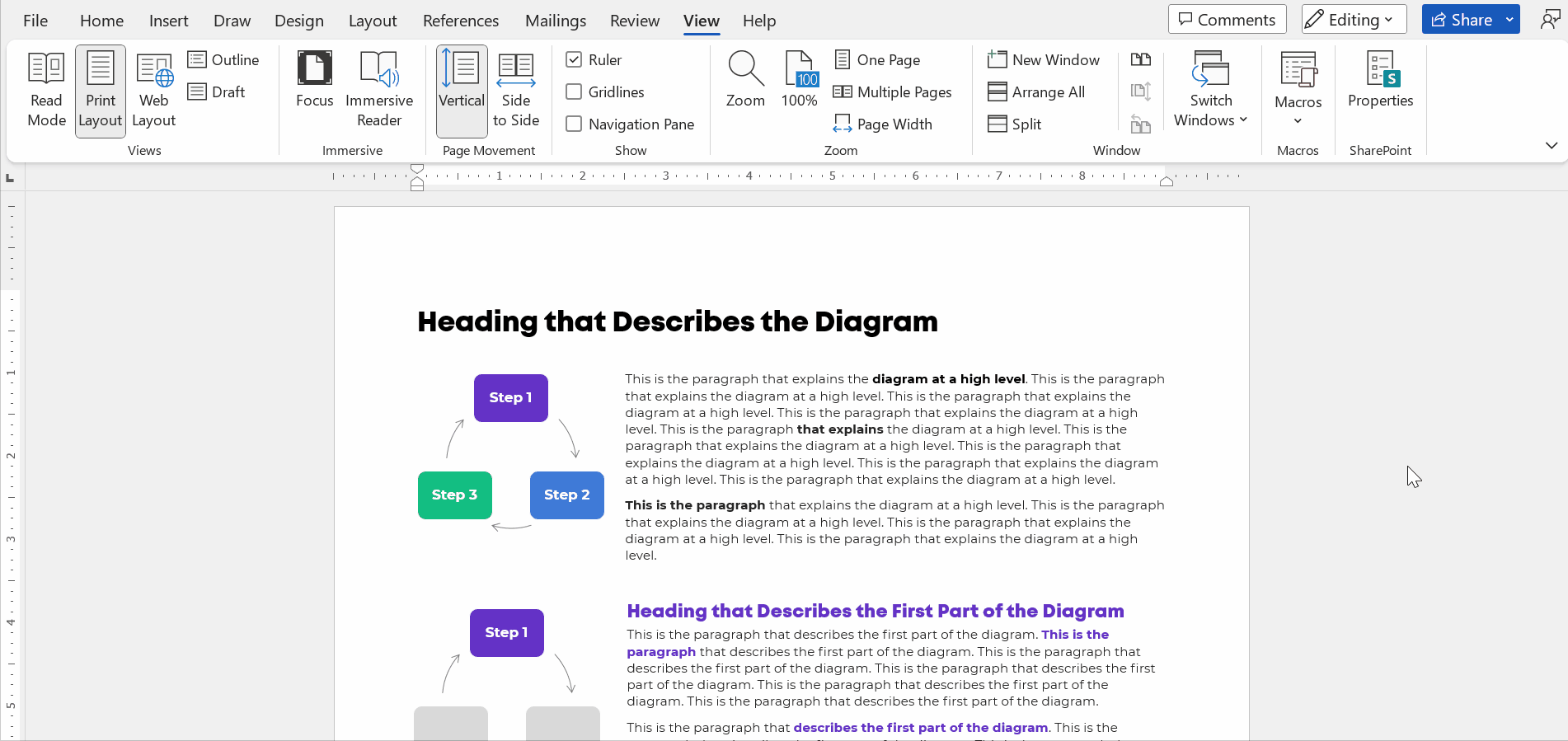
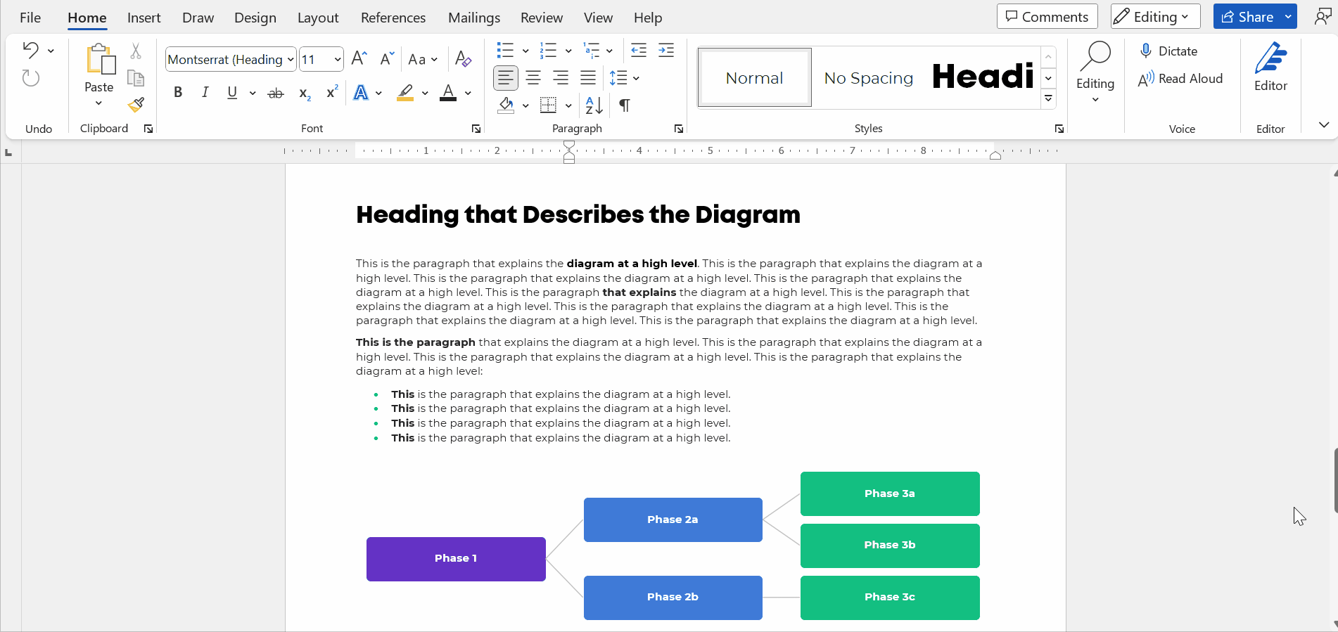
Step 2: Introduce Your Diagram

Show the fully-colored diagram.

Don’t cram too much text on the diagram itself. In this example, I’m pretending we’re describing three steps, which repeat over and over.

Add a paragraph or two to explain the diagram at a high level.

Make sure there’s plenty of color contrast by using bold white or bold black text against your brand colors. Use this color contrast checker to figure out which font color to use.

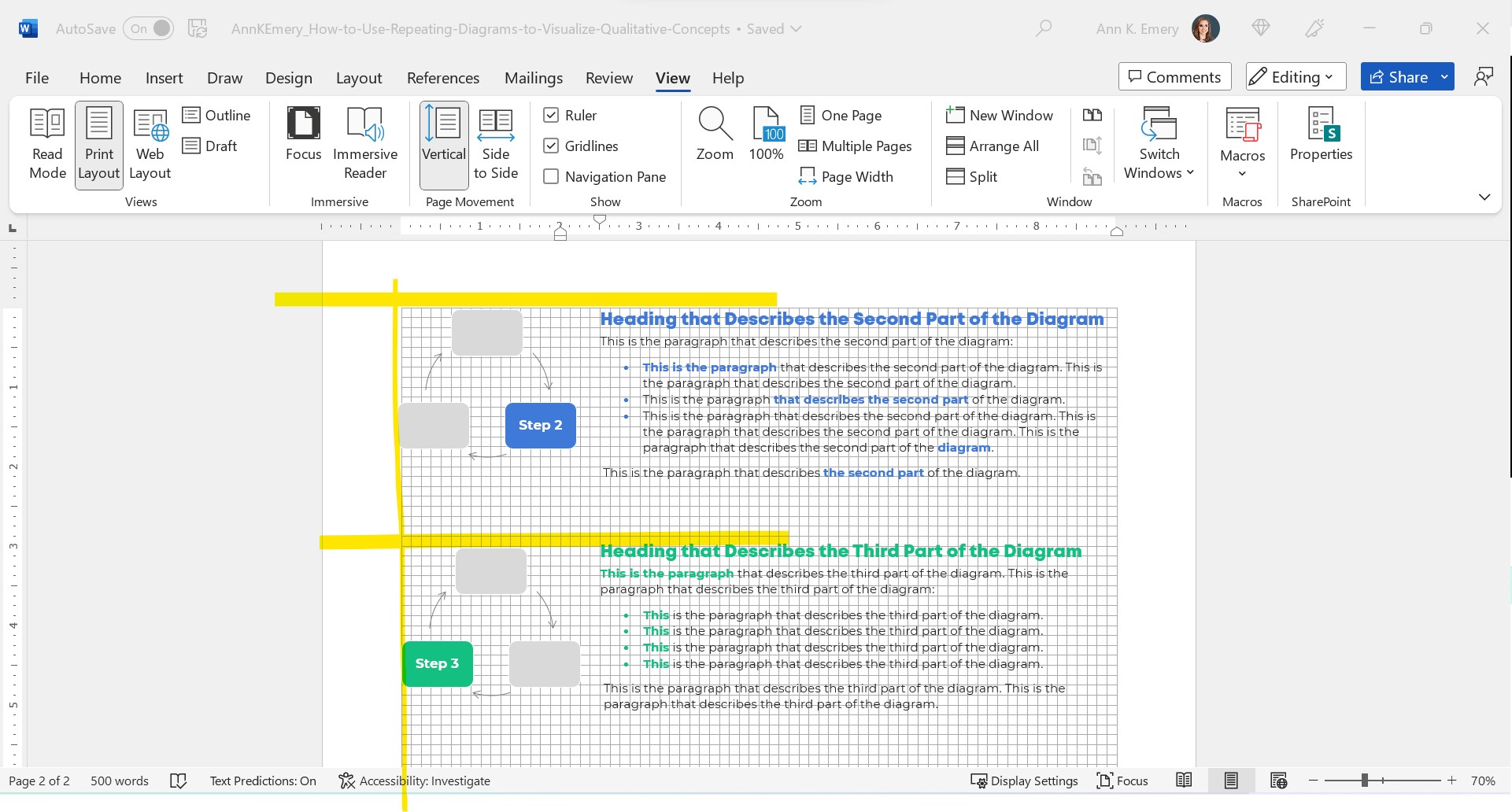
Step 3: Repeat Your Diagram

Here’s the important part: Repeat your diagram as you explain each segment in more detail.

Copy and paste the diagram.

Then, gray everything out, and just highlight the segment you’re explaining in a dark brand color.

For bonus points, you can color-code the Heading 2s to match the diagram.

Make sure your colors are consistent with what you introduced earlier!!! You wouldn’t want Step 1 to be purple, and then blue, and then green.

I usually delete the words from the diagram that I’m not currently explaining. For example, when explaining Step 1, I delete the words Step 2 and Step 3 from the diagram. I don’t want any issues with color contrast; the white font wouldn’t be legible against the light gray diagram, so I simply delete it.

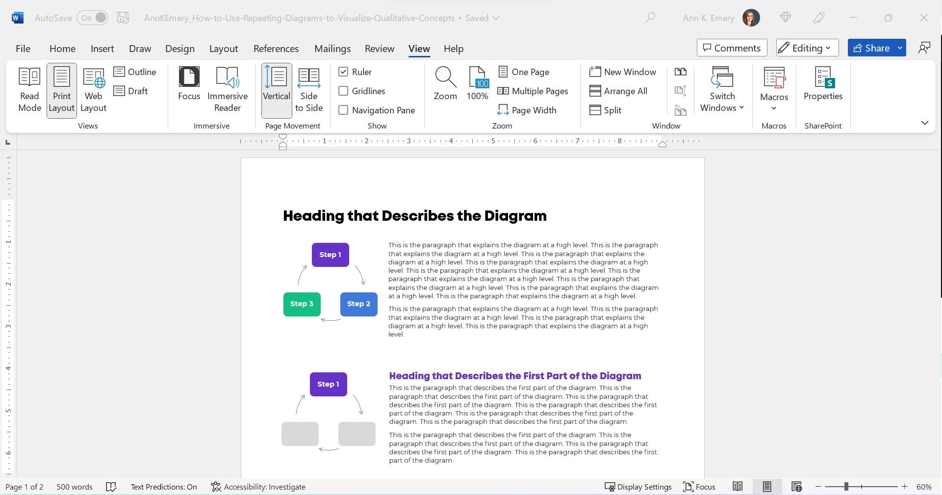
Make sure there’s plenty of white space between sections. I use at least 0.5 inches of white space (e.g., between the diagram and its paragraph, between the paragraphs).

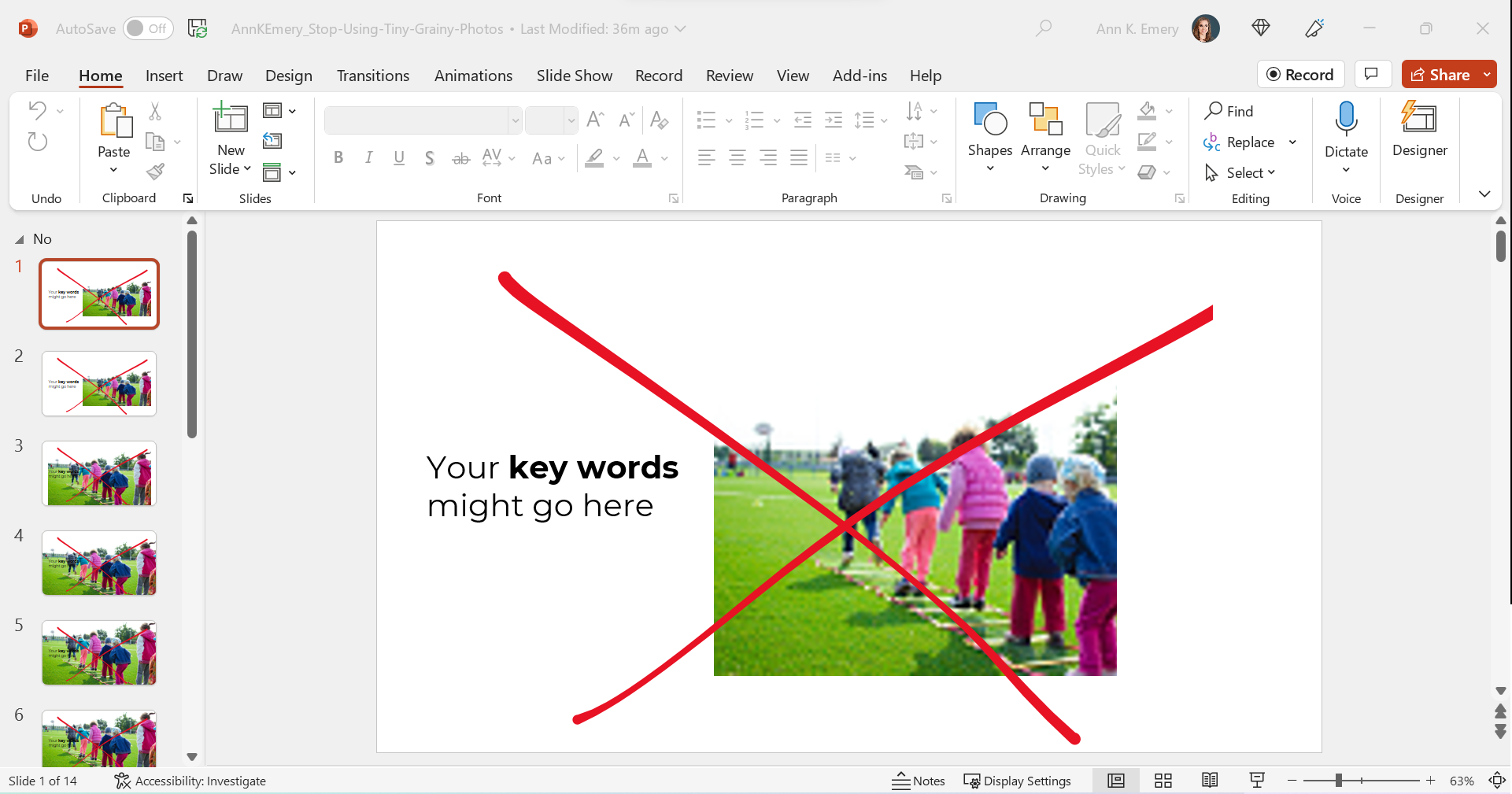
For bonus points, break up the paragraphs into points and bold a few key words. Long paragraphs are dated. Readers expect short, skimmable paragraphs these days.

Check out the paragraphs in this blog post, for example. They’re 1-4 sentences long. There are lots of headings. There’s bolding to increase skimmability.

This blog post is also written at a 7th grade reading level.

Peek at the document with the gridlines on. Make sure the diagrams are aligned with each other.

The Final Product: Repeating Diagrams

I don’t care that it takes up two pages instead of one.

Two great pages will beat one lousy page any day of the week.

Yes, your boss might give you a made-up page limit. “Make sure everything fits on a page!” Those limits were created because bosses got tired of Text Walls. And, because we used to print a lot.

Nowadays, people don’t print as much. I think the pandemic was a major turning point. With everyone working remotely, nobody had access to the office printer anymore. Any who wants to pay to print at home??

I’ve never, ever heard complaints about two accessible pages vs. one inaccessible page. The word count is the same. (Well, I added some headings.) But the information is richer because we’ve added a diagram and then explained it piecemeal.

Adapt as Needed

Use can use any diagram you need—a cycle, linear process, pyramid, or concentric circles.

You can do this in Word.

You can do this in PowerPoint.

You can do this in Canva.

You can do this in Publisher.

I’m software-agnostic. I don’t care which software program you use. When formatted well, you’ll get the same high-quality end result regardless of which program you’re using.

In this example:

  • The diagram was wide, so when I introduced it, it needed the full width of the page.
  • When I repeated the diagram, none of the words (“Phase 1”) fit, so I deleted them.

Adapt as needed!!!

Download My Word Document

Bonus!

Want to see how I arranged everything inside of Word?

You can download the document here: https://depictdatastudio.gumroad.com/l/UseRepeatingDiagrams

Written by cplysy · Categorized: depictdatastudio

Nov 07 2022

“Big A Accessibility” and “little a accessibility” Tips for Data Visualization

“Ann, how can I make my graphs more accessible??”

Accessibility means different things to different people.

I see two main types: Big A and little a.

  1. Big A Accessibility means that our graphs meet official accessibility guidelines so that they’re understandable for people with disabilities. In the United States, that means 508 Compliance.
  2. Little a accessibility means that our graphs are understandable for non-technical audiences; skimmable; and generally not a garbage heap of jargon.

Both Big A and little a are central in my work.

Here’s where you can learn more.

Ann K. Emery is holding a laptop. The words say, "Big A" Accessibility: Making sure graphs pass official 508 compliance guidelines.

Big A Accessibility

Here’s a (partial) list of everything you’d need to do to pass 508 compliance guidelines.

Directly Label

Remove legends and directly label the data.

Add White Outlines

Outline the touching, filled shapes with white borders (i.e., cells in a heat map, slices in a pie chart, locations in maps, rectangles in stacked bar charts).

Make Sure Graphs are Legible for People with Color Vision Deficiencies

Red-green colorblindness isn’t the only type, but it’s most common.

And, it’s the most problematic for data visualization. We love to use “stoplight coding,” especially in dashboards. We’ve all seen dashboards where green means “we met the target” and red means “we didn’t.”

For people with color vision deficiencies, those reds and greens just look like yellows all blended together.

Tips:

  • Avoid red-green color combos (try red-blue, orange-green, or orange-blue for stoplight coding instead).
  • Use direct labels.
  • Test your drafts.

Make Sure Graphs are Grayscale-Friendly

Printing is less common nowadays, especially with so many people working from home indefinitely. Who wants to pay for their own color ink?!

Your infographics, reports, slideshows, and reports might still be printed.

And they might be printed in grayscale.

Let’s plan for grayscale printing ahead of time to make sure the visuals will still be legible, just in case they’re printed.

Tips:

  • Use direct labels.
  • Add white outlines.
  • Test your draft.

Use Plenty of Color Contrast

The other night, as I was reading my 4-year-old a bedtime story, I was struggling to read the words on the page. The book used colored font against a colored background, and the words were kinda small. Those were all fixable problems!

Tips:

  • Don’t use colored text against a colored background. Here’s how to place text on top of photos so that it’s legible.
  • Make sure all your colored text (e.g., for headings) is bold.
  • Make sure your grays are dark enough. Software defaults are terrible at this. Enlarge and darken those defaults!!

Use Larger Fonts

Increase the font size (I recommend 11+ for documents and 18+ for slideshows, not Excel and Tableau’s puny size 9 defaults).

Again, the software defaults don’t help us here. Their defaults are usually way too small.

Add Alt Text

Add alt text to all images for standalone documents (reports, dashboards, infographics, etc.), including graphs.

Molly Burke’s Instagram is my favorite alt text inspo.

Ann K. Emery is holding a laptop. The words say, "little a" accessibility: Making sure graphs are easy to read, especially for non-technical audiences.

little a accessibility

These are techniques that won’t necessarily help you pass official accessibility guidelines… but are still a good idea if you want to make charts that people actually understand and use.

Actually Use Graphs

Use less text and more graphs!!!

Add graphs alongside those boring bullet points.

Choose the Right Chart

Go beyond the bar chart.

Use Data Storytelling

Use data storytelling, which I define as:

  • writing takeaway titles instead of topical titles and
  • highlighting one key finding at a time in a darker color.

Color-Code by Category

One of my favorite techniques of all time.

Color-coding by category helps us chunks the information into manageable pieces.

We can color-code in presentations, reports, dashboards, and one-pagers.

Lower the Reading Level

I’ve written about reading levels several times:

  • In this blog post, you’ll see a re-written chart title for a conference slide.
  • Here are some common data phrases, re-written.
  • Here are some common research methods phrases, re-written.

Lower the Numeracy Level

Here’s how.

Use a Consistency Text Hierarchy

Make sure all the Heading 1s match, all the Headings 2s match, and so on.

Use Horizontal Text

It’s faster to read than diagonal and vertical text.

Avoid Underlines

Only use underlines for hyperlinks (not for headings).

Avoid ALL CAPS

It feels like shouting and takes longer to read than mixed case letters.

Place Text Next to the Graph

Not on the next page so that it’s faster to read.

Add Symbols and Icons

They make graphs easier to navigate and they boost the memorability of our findings.

  • Here’s an example with state icons.
  • Here’s how to use the StateFace font.
  • Here’s an example with realistic human icons (instead of gingerbread people).
  • And the realistic human icons, in a GIF!

Presentation-Specific Techniques

Talk about one thing at a time so that what your audience is hearing and seeing match.

Use a microphone!!! In-person and online. I don’t care if you think your voice can fill the room. It can’t, especially for people who are hearing-impaired. For virtual presentations, purchase a microphone. Or, at the bare minimum, wear the earbuds that came with your phone (because they likely have a built-in microphone). Tinny, echo-y sounds are hard for all of us.

Report-Specific Techniques

Follow the 30-3-1 approach. Limit the body to 30 pages (or less!), and then create a separate 3-pager and 1-pager.

Use visual appendices instead of black and white appendices to make the patterns more obvious.

Dashboard-Specific Techniques

Don’t expect busy, non-technical audiences to interact with your dashboards.

Involve the End Users

Involve the end users in the sensemaking process, e.g., by using data placemats and by following the Choose Your Own Adventure method in presentations.

Listen to what users say they need… but give them what they actually need.

Remember the Humans Behind the Data

I love this example.

Your Turn

Which of these techniques are you already using?

Why techniques might you try in the future?

Written by cplysy · Categorized: depictdatastudio

Nov 04 2022

Celebrating 10 Years of Dataviz YouTubing!

I published my first video on November 4, 2012…

…and the rest was history!

YouTubing, blogging, and speaking at conferences just for fun quickly transformed into a fulfilling, creative business that’s taken me all over the world and enabled me to work with dream organizations. I never intended to start a business; it just kind of happened naturally thanks to YouTubing and blogging.

Here’s what the YouTubing portion of the journey looked like.

Why I Started YouTubing

A decade ago, I was working full-time as an evaluation consultant in Washington, DC.

I was also finishing my master’s degree at a nearby university, tackling one course at a time in the evenings after work.

And, I was starting to give data presentations at conferences as a regular part of my job. I also went to plenty of lunchtime brown bags around the city to meet people who worked in similar areas.

After the events, we’d stay in touch, and I started getting requests for data tutoring. “I loved your talk!” the emails would say. “Can I hire you to teach me how to do that?” Or, “I have a job interview coming up. Can I hire you to help me prep for the Excel tests that I’ll have to take as part of the hiring process?”

I’d been a formal statistics tutor and Spanish tutor in college through a small invite-only program. I got paid $25/hour back then, which felt like a million dollars for an 18-year-old college student.

So, in my mid-20s, I started tutoring colleagues after work in coffee shops around D.C. I started charging $25/hour and worked up to months-long projects at $125/hour.

Pretty soon, my schedule was way too busy. Again. Story of my life!!

“How can I help more of my colleagues with their datasets?!” I wondered. I decided to start YouTubing! My plan was to make one video that could help infinite colleagues. Then, I’d make another video that could help infinite colleagues. And so on. I’d help more people in less time.

The Earliest Videos

In between regular work and grad school assignments, I’d record short tutorials on common Excel formulas and post them to YouTube.

I didn’t have a webcam; I used my laptop’s built-in camera.

I didn’t have a microphone; you can hear my fingers clacking on the keyboard. Subscribers complained about the poor sound quality, so I bought a $15 microphone after a few videos.

I didn’t know how to edit videos; I’d record them in a single take with a “show must go on” approach.

I was awkward on camera; I rushed through my speaking points, afraid that I’d say “um” or “uhh” if I stopped to breathe between sentences. I didn’t want people to get bored while watching the videos, so I talked reallyreallyreally fast in an effort to hold their attention.

I didn’t know where to post videos – online courses hadn’t really been invented yet – so they were created out-of-order and posted in random places around my blog’s pages. At one point, I had a single webpage with ~50 videos embedded in it. As you’d imagine, it loaded really slow! I created an html Table of Contents to make the page easier to navigate. I added toggle buttons to hide the videos that you weren’t currently watching. I added buttons with links to download the supplemental materials. I was essentially creating a structured online course before that technology had been invented. I saw the need for organized videos and materials, and was thrilled when tech like Teachable, Thinkific, Kajabi, and all the others were released later on.

If you want a good laugh, you can watch my very first YouTube video here!

The Middle Years

By 2014, thanks to blogging and YouTubing, there was so much demand for my dataviz training that I left the corporate world and started my own company.

I started having kids, which left me without any “let me YouTube just for fun!” time.

I’d also finished grad school, so I didn’t need any “productive procrastination” away from my papers anymore. 😊

For a few years, I didn’t create any YouTube videos. (Although I did continue blogging 2-3 times each month.)

This Year

I don’t focus on revenue growth as a business goal. I’m not here to help you make a million dollars a year.

Instead, I’ve focused on mastery and quality: leading the best private workshops I can, creating the best online course experience I can, and producing the best public resources like blog posts and YouTube videos that I can. As you can imagine, revenue growth is a natural byproduct. When you master your craft and produce high-quality experiences, you grow your business.

Here’s how I’ve focused on mastery and quality on YouTube this year.

Upgrading My Equipment, Tech, and Skills

Here’s what I’m currently using:

  • Shure microphone, custom-ordered in brand purple (farewell Yeti mic).
  • Mic arm so the mic is an inch from my mouth and I stop slouching over.
  • Windscreen to cut down on background noise.
  • Circle light to make up for working in a one-window room.
  • Colored LEDs for fun.
  • Canon camera (farewell webcams) so that I’m in focus and the background is slightly blurred.

I upgrade my set-up every few months. The full, updated list of equipment is here.

Here’s what it currently looks like behind the scenes:

I invested in public speaking training so that I sound like myself on camera, don’t rush, and vary my tone and cadence.

I learned basic video editing so I can use a variety of imagery: full-screen direct-to-camera shots; the webcam embedded in the corner; B-roll; and so on. I currently use Camtasia to both record and edit videos.

I hired an animator to create intro and outro animations.

I add transcriptions with Descript instead of relying on YouTube’s auto-generated captions. Descript’s captions are more accurate than YouTube’s. And, uploading a transcription file helps with SEO. (When people are Google-searching for dataviz topics, then Google searches through my transcripts and figures out if my video is relevant to their question.)

Upgrading My Content Creation Approach

Most importantly, I’ve upgraded my entire content creation approach.

In January 2022, as I was setting my business goals for the year, I wanted to master what I call the Long-Form-Short-Form approach to content creation.

My approach involves:

  • Choosing a topic to share publicly (typically, anonymized case studies from past projects or Quick Wins for daraviz best practices and accessibility).
  • Creating new slides about that topic (so I’d have the option of turning that into a YouTube video, online course lesson, and/or conference presentation).
  • Writing a blog post about that topic with the images inside the post. The video gets embedded in the blog post, too.
  • Creating a downloadable resource to share, like a checklist, cheat sheet, or dataviz template. I share these free and low-cost resources via Gumroad.
  • Recording a YouTube video (which is easy once you’ve already got the slides created, the speaking points written out in your blog post, and a resource to share).
  • Making a thumbnail image. I have quarterly photoshoots with a brand photographer and make the thumbnails in good ol’ PowerPoint.
  • Transcribing the video on Descript.
  • Adding timestamps (chapters) to the video.
  • Writing a newsletter to my mailing list (ConvertKit) to let them know about the new resources.
  • Breaking up that long form video and blog post into several social media images (the “short form” version), which I make on Canva and schedule on Buffer.

Phew! That’s a lot of ways to repurpose and recycle content across multiple platforms.

I realize this is jargon for most of you. 🙂

But for the fellow bloggers, podcasters, YouTubers, and course creators reading this, I hope you can appreciate my mega transformation over the past decade. I’ve gone from “let me create this quick video just for fun” to “let me create conference slides AND write a blog post AND make a downloadable resource AND make a video AND add captions to help with accessibility and SEO AND add timestamps to break it up into chapters AND share it better than ever on social media.”

The Long-Form-Short-Form Approach in Action

Here’s an example of that workflow.

  • I was invited to speak at a conference.
  • I chose a topic (an anonymized version of a project I worked on a few years ago).
  • I made a downloadable resource (the graphs that I’d be talking about in the presentation).
  • I made slides and presented them at the conference.
  • An hour after the conference, I recorded the YouTube video (since the speaking points were already fresh in my mind). This was a free public event for a small audience, so it was the perfect opportunity to repurpose the content for my own larger audience.
  • I created a thumbnail image.
  • I added captions (Descript) and timestamps to make the longer video easier to navigate.
  • I wrote up my speaking points and turned them into a blog post. (I usually write the blog post before the conference presentation/YouTube video to help me organize my thoughts, but this time, I made the video before I did the writing.)
  • I made several images for social media (Canva), scheduled the blog post (WordPress), scheduled a newsletter to my email subscribers (ConvertKit), and scheduled the social media posts (Buffer).

It takes a full workday to complete that entire process, which is much longer than my “lemme make whatever video I feel like, whenever I feel like” approach from a decade ago. But, it’s more effective, so it’s worth the time investment.

My Latest YouTube Stats

Between 2012 and 2022:

  • 109 videos (and hundreds more inside my online courses)
  • 9,100 subscribers
  • 2,400,000 views
  • $13,000 made directly from video ads
  • $22,000 made directly from the downloadable resources that accompany the videos
  • Millions made indirectly from people who watch the videos and hire me for private workshops and/or join my online courses

I do wish I had more subscribers. If I was a full-time YouTuber–and gave up my private workshops and online courses entirely–I know I could grow my channel to millions of subscribers.

Being a full-time YouTuber is an entirely different business model from being a dataviz speaker and course creator. I’m not interested in switching careers at the moment.

Video Highlights

Here are some notable videos over the years.

Most Views

I made this one in the middle of the night, “thanks” to my never-ending battle with insomnia. And it’s made me thousands of dollars in ad money. A couple hours well spent!

Most Controversial

People either think the Excel test is way too hard or way too easy.

I didn’t create the test!! I just recorded myself taking it.

Video That’s Led to the Most Paid Jobs

What a nice surprise!

(Executives recognize these “dashboard don’ts” in their staff, and they hire me to come and train their staff to make simpler dashboards.)

Underdog Award

I’m surprised this one doesn’t have more views.

The downloadable resource–the templates to create all the one-pagers–is such a gem.

But, the video itself is too long, and it was posted on aea365, which doesn’t get as many views as my own blog.

Favorite Videos on Other Channels

So many!!! Some of my favorite videos have been collaborations for my friends’ YouTube channels.

I especially love this lesson on using colored phrases for qualitative data visualization, which I made for Jon Schwabish’s channel.

I also love this video on starter dashboards for the “Data Is Not Scary” theme for Kate Strachnyi’s channel.

What’s Next

For years, I’ve dreamed about focusing on YouTube, rather than treating my channel as an afterthought around my private workshops and online courses.

For years, I haven’t made the time. And I haven’t been interested in switching from a private workshop/online course business model to a YouTube business model.

I’m not sure whether I’ll ever choose to make the time or make the switch, though.

I love teaching dataviz through videos. Learning software how-to’s through screenshots is the worst. It’s so much better to watch someone’s mouse move on the screen!

But, I’ve done that. I’ve created 6 online courses that involve recorded tutorials, live Office Hours Q&As each week, 1:1 consultations, swag bags, downloadable resources, guest speakers, and more.

YouTubing is still a fun hobby, but with running a business… raising 3 kids… going to the gym… gardening in my backyard… planning fun outings with neighborhood families… I already have a life full of wonderful hobbies. As usual, there isn’t time for much more.

That being said, there are some specific tweaks I’m working towards in 2023:

  • Finally adding intro music to accompany the intro animation.
  • Upgrading my recording/editing software. Camtasia only lets you record full-screen, direct to camera videos in 720p resolution, which is grainy. I want to record in 1040p resolution. Sometimes YouTubers record their full-screen, direct to camera shots entirely on their camera’s memory card. Then, they record their software demos and screensharing from their laptop. Then, they have to merge the various files inside their editing software (Camtasia, etc.). That’s a lot of extra files to keep track of! I’d prefer to find a single software program that does everything. If you have suggestions, please comment on this blog post and let me know.
  • Keeping all videos to 10 minutes or less. People complain about short videos. People complain about long videos. I think the sweet spot for my topics is around 10 minutes.
  • Figuring out which topics can/should be shared on YouTube. Everyone wants Excel dataviz tips, but I’ve got a course on that. Everyone wants dataviz accessibility tips, but I’ve got a course on that. I’ve also got courses on dashboards, reports, presentations, and formulas/pivot tables. So what goes on YouTube?? This is the most challenging aspect of YouTube and blogging for me: finding one-off topics that aren’t already covered comprehensively inside my online courses.
  • Setting a realistic goal for videos. For 2022, I wanted to publish 20 blog posts, 10 of which would involve the long-form-short-form approach with the embedded YouTube videos and downloadable resources. I’ll finish the year with ~24 blog posts and just 6 videos. I’m not sure what’s realistic for 2023 given my other goals for online courses and private workshops, which take up the majority of my time. We’ll see! Stay tuned.

Your Turn

Have any YouTube questions for me? Post them here and I’ll respond ASAP.

It would mean the world to me if you’d subscribe to my YouTube channel here.

Written by cplysy · Categorized: depictdatastudio

Oct 31 2022

How to Write about Research Methods Like a Human (and Not a Textbook)

Did you devote years of your life trying to sound “smart” and “professional,” like a textbook?

I did.

I taught myself how to write in third-person language.

I called myself “The researcher…” instead of plain ol’ “I…”

I replaced my everyday words with “smart” synonyms. I literally paged through my GRE study guide. I tried to use as many GRE vocab words as possible.

Then, I started working in the real world.

My bosses rolled their eyes.

Another one from an academic background, they sighed. We’ll have to re-train her from scratch.

I panicked. But if I wasn’t supposed to sound like a textbook, what was I supposed to sound like???

A human!

It took me years to grasp that simple concept. I’m a person. It’s okay to sound like a person.

Nowadays, I make a living by teaching humans how to sound like humans again.

Before/After Makeovers for Common Methodology Sentences

Here are some before/after examples in case you’re still on the textbook-back-to-human journey like I was.

Please please please use these transformations in your technical reports.

I’m not so worried about peer-reviewed journal articles — that’s another battle for another day. Today, I’m focusing on your non-journal writing scenarios.

Who Designed the Survey?

  • Before: A survey instrument was designed by the ABC Research Company working under the supervision of the DEF Foundation staff, and key department heads of GHI Agencies.
  • After: The ABC Research Company, DEF Foundation, and GHI Agency teamed up to collect data.

Who Responded to the Survey?

  • Before: A series of survey instruments were developed to administer among students in the ABC programs.
  • After: We designed surveys to collect information from students in the ABC programs.

How Many Responses?

  • Before: A total of 14 programs participated in the survey.
  • After: Fourteen programs participated in the survey. (Remove redundancies like “a total of.”)

Or…

  • Before: A total of 144 programs participated in the survey.
  • After: We collected surveys from 144 programs. (Because writing out numbers at the beginning of a sentence is the worst.)

When Did You Collect Data?

  • Before: Initial surveys were launched on March 7, 2018 with fieldwork continuing to accommodate the schedules of participating institutions. Data collection was cut off on April 25 to begin data processing. A total of 789 surveys were attempted, with a total of 654 surveys completed sufficiently to include in the final tabulated results. A total of 123 individuals entered their contact information for a drawing.
  • After: We collected surveys in Spring 2018. We tried to collect data from 789 people, and 654 people participated, for a response rate of 83 percent—one of the highest response rates we’ve ever had on a survey.

Referencing the Just-in-Case Tables

  • Before: We are providing detailed data tables with this report that shows the responses by institution.
  • After: Want to view responses by institution? View the appendix on page 31.

Demographics on Respondents

  • Before: Overall, undergraduate students comprise 65% of total responses and graduate students comprise the remaining 35%.
  • After: Two out of three responses (65%) were from undergraduate students. The rest were from graduate students. (Getting rid of the word “comprise.)

Describing the Survey’s Topics

  • Before: One way the important resources and individuals specifically helped at least two-thirds of students were giving them a good sense for the kinds of careers they could pursue with a degree.
  • After: We asked students which resources were most useful. Two out of three students said that others had given them a sense of career options that they could pursue with their degree.

Summarizing the Survey’s Findings

  • Before: The largest mean share of the total cost are paid for by the student or their family, who account for 50% of the total cost. Student loans are used to cover a mean of 20% of the total cost, and scholarships or other financial aid pay for 30%.
  • After: For the typical student, 50% of their costs are covered by the student and their family, 30% are covered by scholarships or financial aid, and 20% are covered by student loans. (Getting rid of awkward language like “mean share” and “account for.”)

Objectively Scoring the Before/After Translations

In my gut, I know the translations are easier to read.

Let’s objectively test them.

Before: 12.1 Grade Level

The human-trying-to-sound-like-a-textbook wrote at a 12.1 grade level.

Okay, that’s not the worst I’ve seen.

The highest I’ve seen is a 36 (from a team of Ph.D. psychologists).

Can you beat a 36??? Let me know if you find any contenders. I’d love to (try to) read it.

(This screenshot is from Readable.com, which used to be a free reading level checker. It looks like they require payments nowadays, but there are plenty of free- and low-cost tools. Like good ol’ Microsoft Word! Comment below if you’ve got a favorite.)

A­fter: 9.3 Grade Level

I personally aim for grade level 6 to 8—throughout my blog posts, books, and even contracts.

I didn’t quite reach my goal. But a 9.3 isn’t horrible, either. The Readable site gives this an “A!”

Higher is not better. Lower is better.

You are a human who’s writing for humans. You are not a textbook. You are not a textbook. You are not a textbook. You are not a textbook.

How to Lower the Reading Grade Level

Try one (or more!) of these techniques:

  • Shorten the sentences. An easy fix is to look at your longest sentences. Replace your commas with periods (i.e., break one long sentence into two shorter sentences).
  • Shorten the paragraphs. Press the “enter” key lots and lots and lots.
  • Use first-person language. Adjust the sentence structure. Change “A survey was administered…” to “The agency administered a survey” or “We administered a survey.”
  • Find synonyms. This is the hardest one for me. What’s an accurate, understandable translation of calculations like standard deviation or confidence interval??? I used to pack those terms into the report’s body and hope for the best. What happened? Lots of Dusty Shelf Reports! Nowadays, I follow the 30-3-1 Approach to Reporting. I keep the methods section in the report’s body as short as possible, and I tell readers to check the appendix for more info. I don’t care if the appendix is packed with jargon. Only the technical readers are going to look there anyway, and they’ll understand the jargon.

Your Turn

Upload one of your own paragraphs into your favorite reading level checker.

How did you score?

And more importantly, how can you adjust the language to lower the reading level??

Written by cplysy · Categorized: depictdatastudio

Oct 24 2022

Stop Using Tiny, Grainy Photos in PowerPoint!!!

It’s not 1995.

Last week, I was leading a post-conference workshop with CQI professionals in California. You can learn more about their annual conferences here.

An attendee asked about best practices for adding photographs to our PowerPoint presentations.

Before

Let’s pretend that you’re giving a presentation about young children and physical fitness.

Avoid Tiny, Grainy Photos

Here’s what I often see: small, low-resolution photos.

It gets The Big Red X.

I want your presentations to look professional, but this one’s giving outdated, unprofessional vibes.

Avoid Small, High-Resolution Photos

Nowadays, it’s easier than ever to find high-resolution photos.

I’ve tried dozens of photo sites, and my favorite is still Pexels.com.

All of their photos are free for both commercial and educational use.

You don’t need to create an account to download their photos (one less username and password to remember!).

You don’t need to add citations to your photos (so your slides stay uncluttered).

Over the past couple years, they’ve added more photos from international photographers, so you’ll see beautiful skin tones and hairstyles showcased among the models.

Here’s the next draft with a high-resolution photo:

Avoid Awkwardly-Enlarged Photos

We’ve solved the grainy issue.

Next, let’s solve the size issue.

I often see slides like this, where the photo is placed awkwardly on the slide.

We can’t keep those white slivers along the sides.

Avoid Stretched Photos

Please please please don’t stretch photos.

Yes, we want full-screen photos. But we must keep the aspect ratio (the proportions) intact.

Be careful if you’re manually dragging the sides, top, or bottom of the photo, as shown below.

The stretching is hardly recognizable on this particular photo, since it shows the backs of young children. But if you stretched a photo of someone’s face, it would be immediately noticeable (and it would look unprofessional).

Avoid Full-Screen Photos with Unreadable Text

As you’re enlarging photos to fill the entire screen—so the audience feels like watching the action from the 50-yard line, not the nosebleeds—make sure you grab the corner.

Grabbing the corner will ensure that photo doesn’t get stretched awkwardly (i.e., it maintains the aspect ratio).

Full-screen photos often fall off the edges of the slide, like this. That feels weird at first! Don’t worry; the audience will only see the completed version, with the beautiful full-screen photo. They won’t know that, behind the scenes, an inch of the photo is falling off the edge of the screen.

After

We’ve got a full-screen photo, woohoo!

Next, let’s make sure the words are readable (i.e., that we have enough contrast to meet official accessibility guidelines).

Full-Screen Photos with a White Overlay

To make sure the words are readable, try adding a white overlay.

Go to Insert –> Shape and draw a large rectangle over the entire slide. Then, adjust the transparency. This one has 15% transparency.

Your audience will easily read the large, 32-point font. And they’ll see the photo peeking out from behind, too.

In this example, the words are the star, and the photo is the sidekick.

Full-Screen Photos with a Colored Overlay

You can use brand-colored overlays, too.

The words are still the star, and the photo is still the sidekick.

Full-Screen Photos with White Text Boxes

In this example, I kept the photo’s original colors.

The text box is filled with white (with a 10% transparency so you can slightly see the photo peeking through the text).

The photo is the star now, and the words are the sidekick.

Full-Screen Photos with Colored Text Boxes

I think you get the idea by now.

You could also fill the text box with one of your brand colors, like this:

Phew! In these redesigned slides, our full-screen photos put the audience in the middle of the action, and the text is readable.

What If My Photo Isn’t Landscape?

We can’t always find landscape photos to fit our landscape slides.

Maybe the photo we want is square, circular, or portrait-oriented, like this one.

We can’t expand those pictures to fill the slide, or they might get too big.

Enlarge the Photo to Fit the Height (or Width) of the Slide

I often enlarge those photos to fill the height of my slide, even if they don’t fill the width of the slide, like this:

Experiment with Removing the Background

When I’m adding headshots to slides, sometimes I remove the background.

(This rarely works with non-headshot photos, like the photo of the children playing. Computers get confused, and they often mix up the background and foreground.)

PowerPoint does have a Remove Background button (!). To use it, click on the picture to activate it, then go to Picture Format à Remove Background.

But PowerPoint’s Remove Background button is meh. It’s a newish feature and Microsoft still has some fine-tuning to work out.

Instead, I upload the photos to Canva, remove the background, download the edited version, and insert that into PowerPoint.

Canva gives me the correct results 90% of the time, whereas Microsoft gives me correct results 10% of the time.

Now, the photo and the words flow better, since they’re both against a white background.

Finally, you can try colored slide backgrounds, like this. You’d use your brand colors, not mine.

I think this final design might be my favorite of the batch.

All of these redesigns are better than the tiny, grainy original, don’t you agree?

Download My Slides

Want to explore these slides? Download them here.

Written by cplysy · Categorized: depictdatastudio

  • « Go to Previous Page
  • Go to page 1
  • Interim pages omitted …
  • Go to page 18
  • Go to page 19
  • Go to page 20
  • Go to page 21
  • Go to page 22
  • Interim pages omitted …
  • Go to page 37
  • Go to Next Page »

Footer

Follow our Work

The easiest way to stay connected to our work is to join our newsletter. You’ll get updates on projects, learn about new events, and hear stories from those evaluators whom the field continues to actively exclude and erase.

Get Updates

Want to take further action or join a pod? Click here to learn more.

Copyright © 2026 · The May 13 Group · Log in

en English
af Afrikaanssq Shqipam አማርኛar العربيةhy Հայերենaz Azərbaycan dilieu Euskarabe Беларуская моваbn বাংলাbs Bosanskibg Българскиca Catalàceb Cebuanony Chichewazh-CN 简体中文zh-TW 繁體中文co Corsuhr Hrvatskics Čeština‎da Dansknl Nederlandsen Englisheo Esperantoet Eestitl Filipinofi Suomifr Françaisfy Fryskgl Galegoka ქართულიde Deutschel Ελληνικάgu ગુજરાતીht Kreyol ayisyenha Harshen Hausahaw Ōlelo Hawaiʻiiw עִבְרִיתhi हिन्दीhmn Hmonghu Magyaris Íslenskaig Igboid Bahasa Indonesiaga Gaeilgeit Italianoja 日本語jw Basa Jawakn ಕನ್ನಡkk Қазақ тіліkm ភាសាខ្មែរko 한국어ku كوردی‎ky Кыргызчаlo ພາສາລາວla Latinlv Latviešu valodalt Lietuvių kalbalb Lëtzebuergeschmk Македонски јазикmg Malagasyms Bahasa Melayuml മലയാളംmt Maltesemi Te Reo Māorimr मराठीmn Монголmy ဗမာစာne नेपालीno Norsk bokmålps پښتوfa فارسیpl Polskipt Portuguêspa ਪੰਜਾਬੀro Românăru Русскийsm Samoangd Gàidhligsr Српски језикst Sesothosn Shonasd سنڌيsi සිංහලsk Slovenčinasl Slovenščinaso Afsoomaalies Españolsu Basa Sundasw Kiswahilisv Svenskatg Тоҷикӣta தமிழ்te తెలుగుth ไทยtr Türkçeuk Українськаur اردوuz O‘zbekchavi Tiếng Việtcy Cymraegxh isiXhosayi יידישyo Yorùbázu Zulu