• Skip to main content
  • Skip to footer
  • Home

The May 13 Group

the next day for evaluation

  • Get Involved
  • Our Work
  • About Us
You are here: Home / Archives for allblogs / depictdatastudio

depictdatastudio

Oct 17 2022

Do You Need a Single Map, or Several Maps?

Here’s a counterintuitive dataviz principle:

Sometimes, it’s easier to understand several small graphs than a single graph.

I was recently working with an organization to visualize which states were using their software programs.

States might use:

  • Software A
  • Software B
  • Or, both software A and B

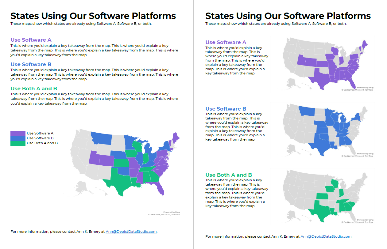
Before: A Single Multicolor Map

Here’s what their visualization looked like.

They had a single U.S. map with one color for each scenario:

  • one color for states using Software A
  • another color for states using Software B, and
  • another color for States using A and B.

Fairly straightforward, right?

It took us a while to spot patterns, though. Three colors is a lot to understand at once. It’s not impossible, but we had to think about it for a moment.

Multicolor (well, multi-hue) maps take a while to interpret.

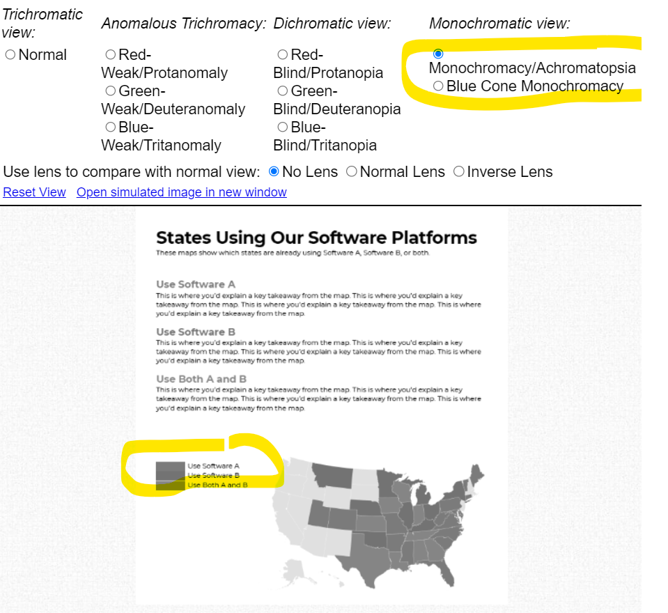
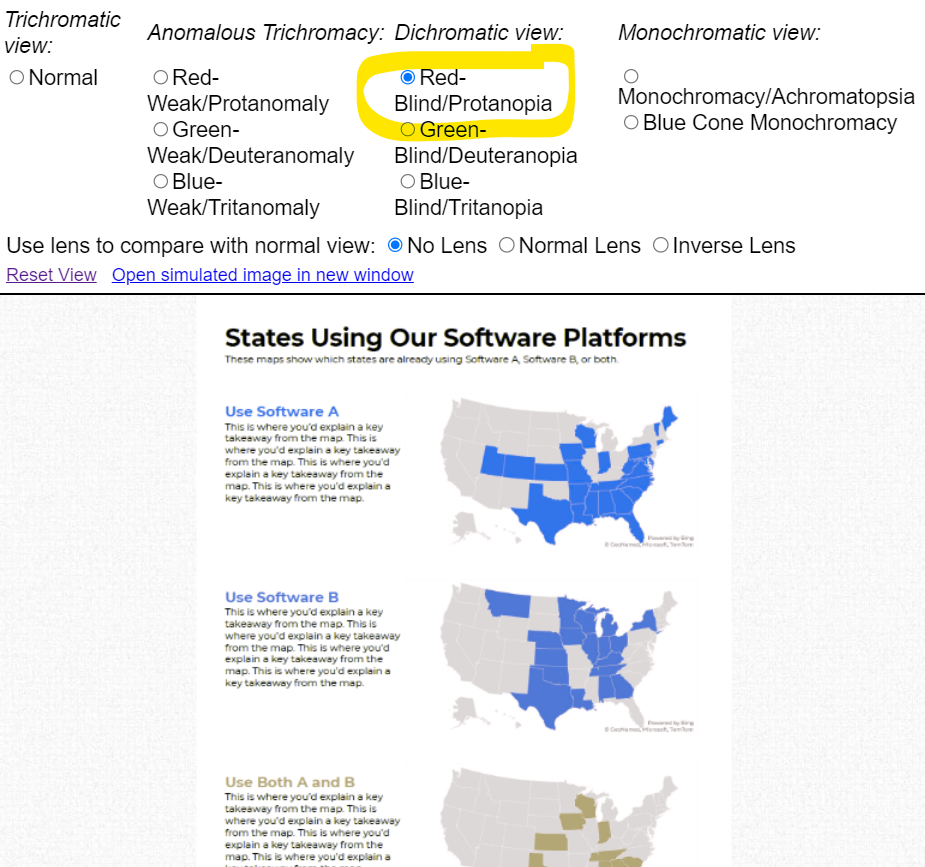
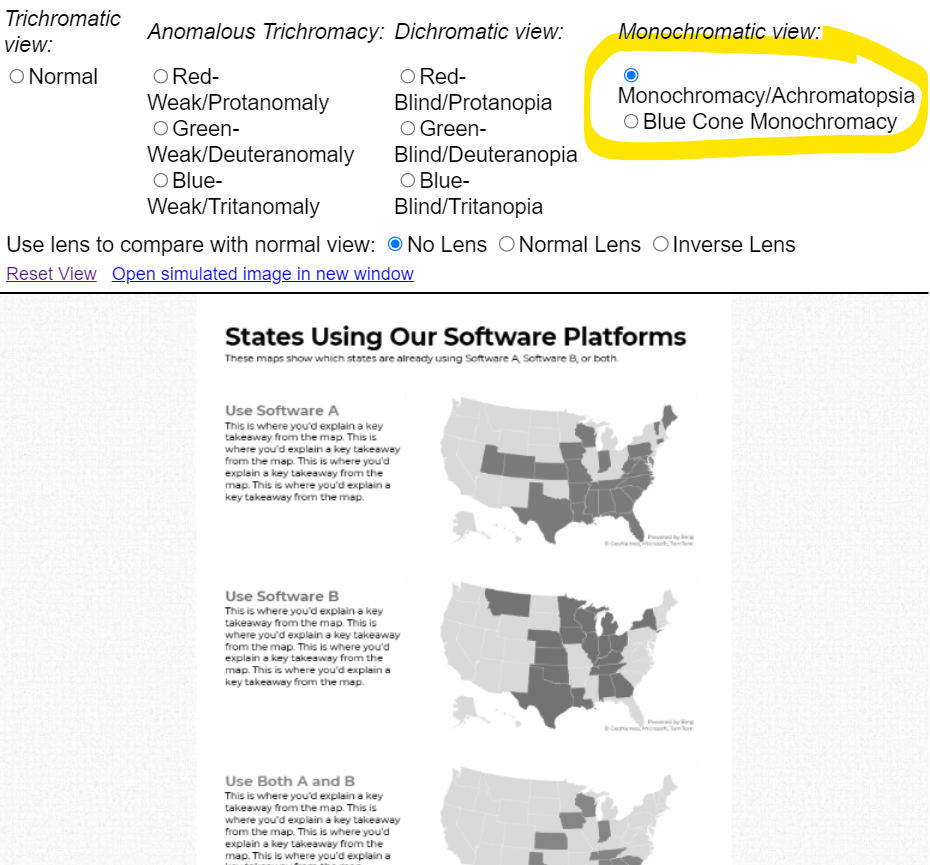
Multi-hue maps aren’t colorblind-friendly. Here’s a simulation of what the map would look thanks to https://www.color-blindness.com/coblis-color-blindness-simulator/.  

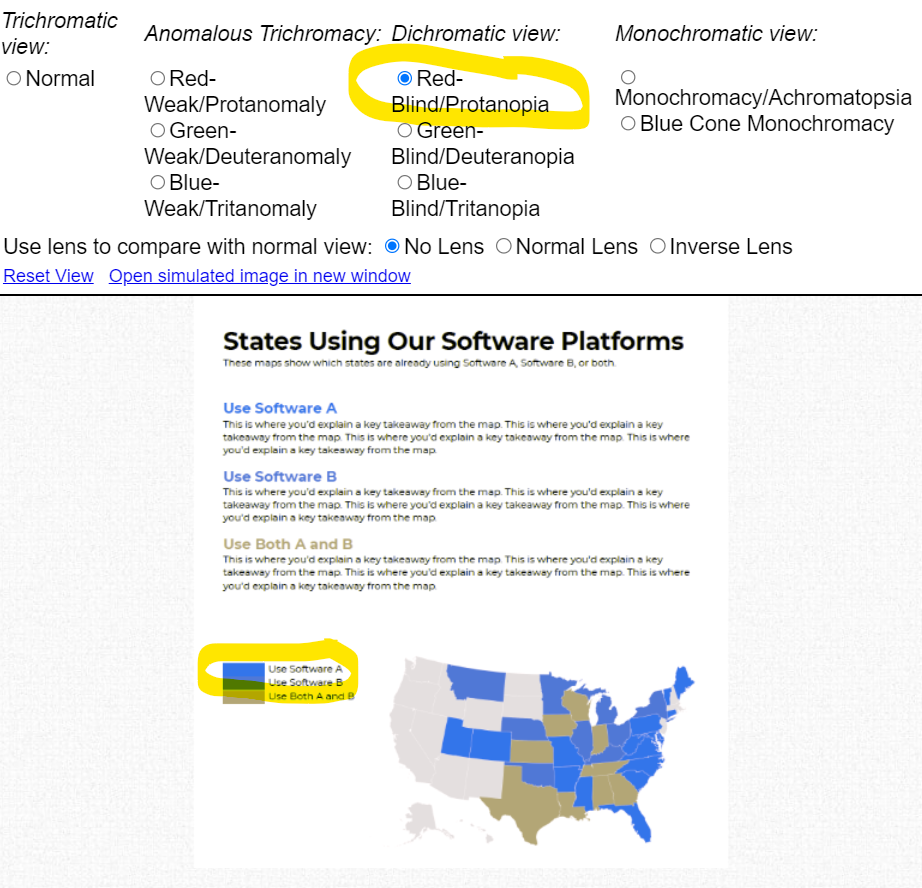
Multicolor maps aren’t grayscale-friendly, either.

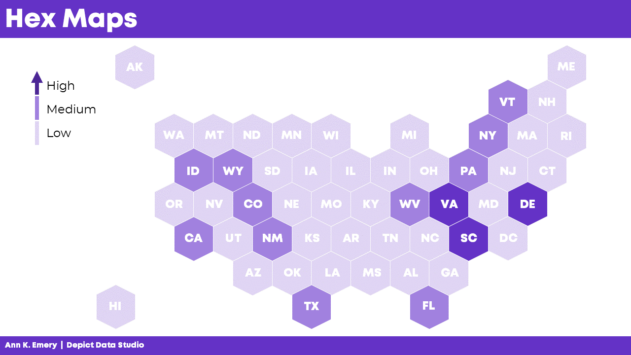
After: Small Multiples Maps with One Color Each

In lieu of a multicolor map, try small multiples!

In the redesign, we created three maps instead of one.

Now, we’re showing a single variable on each map, so the audience can understand it at a glance.

Small multiples binary maps (your dark brand color + light gray) are often faster to read than mutli-hue maps. It’s counterintuitive, I know. We’re asking people to read three maps instead of one. But, three fast maps will beat one slow map any day of the week.

Small multiples binary maps are colorblind-friendly. Everyone can spot the dark brand color vs. the light gray.

Finally, small multiples binary maps are grayscale-friendly. Everyone can distinguish the dark gray vs. light gray.

Side-by-Side Comparison

Both styles fit on a single page (a goal in their project).

Both styles have room for explanatory sentences (something I recommend in all one-pagers).

Only the small multiples version is colorblind-friendly and grayscale-friendly. I’d argue that the small multiples version is faster to read, too.

Download the Files

Want to explore my Excel file and Word doc?

You’ll see:

  • How I formatted the Excel table that feeds into the maps
  • How I arranged everything inside good ol’ Word

Download them here: https://depictdatastudio.gumroad.com/l/SmallMultiplesMapsInExcel

Your Turn

Have you split your multicolor map into small multiples?! Get in touch when you apply this technique to your own projects.

Written by cplysy · Categorized: depictdatastudio

Oct 04 2022

How to Make a Not-So-Scary Starter Dashboard in Excel

Dashboards aren’t scary!

In this video, let’s make a starter dashboard in Microsoft Excel.

You’ll learn how to make four quick visuals:

  1. Sparklines
  2. Data bars
  3. Symbol fonts
  4. Color scales

I use these visuals over and over in my real-life consulting projects.

Watch the Tutorial

Sparklines

Sparklines are helpful for visualizing patterns over time, like daily, weekly, monthly, quarterly, or annual data.

To create sparklines:

  1. Highlight the first row of your table.
  2. Go to the Insert tab.
  3. Go to the Sparklines section.
  4. Click on the first one (a Line sparkline).
  5. Choose where we want to put the sparklines (off to the right of the table).
  6. Click insert and enjoy the sparklines!

We can also edit our sparklines!

We might adjust the data source, type (from line to column), or color. I typically gray everything out and highlight a high point or low point in a dark brand color.

We can also group and ungroup our sparklines (e.g., if we want each category in our dashboard to have its own color).

And if we change our mind, we can clear them out.

Ann K. Emery teaches you how to make a starter dashboard in Excel with sparklines, data bars, symbol fonts, and heat tables.

Data Bars

Data Bars give us horizontal bars (as opposed to sparklines’ vertical columns).

They’re helpful for visualizing summary statistics like totals or averages.

To create data bars:

  1. Highlight the cells you want to visualize (e.g., the total column).
  2. Go to the Home tab.
  3. Click on the Conditional Formatting button.
  4. Select solid-filled data bars.
Ann K. Emery teaches you how to make a starter dashboard in Excel with sparklines, data bars, symbol fonts, and heat tables.

Symbol Fonts

I use checkboxes to visualize whether I met a goal or target.

We can get quick checkboxes through symbol fonts!

In the video, you’ll see me write an =if() statement to transform g’s and c’s into Webdings checkboxes.

Audiences love the checkboxes. They’re intuitive, colorblind-friendly, and grayscale printing-friendly.

Ann K. Emery teaches you how to make a starter dashboard in Excel with sparklines, data bars, symbol fonts, and heat tables.

Color Scales

a.k.a. heat maps or heat tables.

I love color scales for visualizing the interior of my table—when I want to compare lots of rows and columns to each other.

To create color scales:

  1. Highlight the cells you want to visualize (i.e., the interior of the table).
  2. Go to the Home tab.
  3. Click on the Conditional Formatting button.
  4. Select Color Scales. Most of the time, we’ll use a Green-White Color Scale. That’ll make the big numbers dark (and the small numbers will be light).
Ann K. Emery teaches you how to make a starter dashboard in Excel with sparklines, data bars, symbol fonts, and heat tables.

Combos

In real life, we might combine several of these techniques.

We might add color scales to the interior of the table…

We might compare the totals with data bars…

We might add Webdings checkboxes to see whether we met a goal…

And we might add more data bars to see how far we were over or under our goal.

Ann K. Emery teaches you how to make a starter dashboard in Excel with sparklines, data bars, symbol fonts, and heat tables.

Formatting

In real life, we’d edit these quick visuals.

I suggest:

  • Using brand colors and brand fonts.
  • Outlining the color scales in white (so the cells can be differentiated against each other).
  • Placing the data bars in a separate column than their numeric labels.
  • Coloring the checkboxes (rather than boring black).
  • Adjusting the colors in the over/under bars (to avoid scary red).
  • Moving the labels to the over/under bars to their own column (via an =if() statement to save time).
Ann K. Emery teaches you how to make a starter dashboard in Excel with sparklines, data bars, symbol fonts, and heat tables.

Download this Spreadsheet

Try it yourself!

Download this spreadsheet.

Explore the completed version with the =if() statements.

Use the empty version to practice alongside me as you replay the video.

Get in Touch

If you get stuck, reach out o­n LinkedIn.

Written by cplysy · Categorized: depictdatastudio

Aug 22 2022

When a Course is More Than a Course: 3 Ways “Great Graphs in Excel” Was Beyond Graphs

Last year, I finally enrolled in the Great Graphs in Excel course. After 2 years of thinking about it. And thinking I’m retired and I don’t really make graphs anymore. But I knew I had 10 years of mentoring data I wanted to analyze by the end of 2021.

Beyond Graphs 1: I made a Great Graph after just a Few Course Modules

Soon after the course started, I brought Ann data about who connected with me on LinkedIn after I was listed as one of Nick Martin’s 9 Amazing Humans to Follow. Nick has a HUGE network and I got over 69 connection requests in the first day. And requests continued for more than a week!

So I made a graph to go with a post on LinkedIn, applying all the learnings from the first few course modules.

Sue Griffey's horizontal bar chart showing the number of LinkedIn connection requests she received each day.

Beyond Graphs 2: 2 Things I Learned in 10 Minutes of Help in 1 Office Hour Session

I examined the few data variables on the LinkedIn connection requests. My impression was validated. Only 2 of 136 requests had a personalized message (despite LinkedIn experts emphasizing the need to personalize connection messages).

I tried different ways to display this finding (waffle chart, pie chart, and this one). Luckily, Office Hours were the next day. (Office Hours are a CAN’T MISS opportunity for immediate feedback!)

Sue Griffey's donut chart with miniature people icons in the center.

Ann took one look and exclaimed, “Ooh, let’s try the WeePeople font!” (Well, maybe not exactly like that!)

She then quickly used WeePeople to show the data.

Learning 1: More relevant and representative visuals with icons showing diverse silhouettes

Sue Griffey's icon array showing 136 tiny human-shaped icons.

(Hooray – No more using just the standard male icon.)

And then Ann taught us all how to make a gif which was even more effective at telling the “only 2 of 136 people” story.

Learning 2: Using a gif can give readers a quick result from your data

Sue Griffey's animated icon array showing that she received 136 connection requests on LinkedIn, but only 2 included a personalized message.

And, for those who follow LinkedIn stats to see how their posts engage, the post with the bar graph got 4,765 impressions and the 2nd post (the next day) with the gif got 8,778 impressions!

Beyond Graphs 3: Now I’m Applying a Mental Checklist to Graphs and Charts

No – not only to the few graphs I’m making.

The course taught me and heightened my awareness to look at all the visual elements in the many graphics we see each day. There was so much learning from the course modules. And then many great opportunities in Office Hours to learn from what others were working on.

Here are things I find I am automatically looking for in these graphics:

  • Color choice(s)
  • Is it a Traditional or Storytelling title?
  • The clarity of the data message
  • Is the graph or chart the best for that message and the data being used?
  • What elements could be removed for better clarity?

And a Beyond Graphs Bonus: Consistency and Efficiency

I consider myself a digital pioneer. But I didn’t know what I didn’t know, even being a longtime Word, PowerPoint, and Excel user.

I jumped into the course, and my efficiency increased in the first week! The course started – not with graphs – with ensuring basics including branding by setting my color and font defaults.

And then, a couple weeks later, I set up branding for a 3-part seminar series I did for Waey, the Association for Community Health in Saudi Arabia.

A screenshot of the Theme Colors that Sue Griffey set up in her Microsoft products.

And I now have the consistency across Excel, Word, and PowerPoint and across my different PCs. What a difference!

This is just the tip of the iceberg of everything I am doing differently after Great Graphs – Excel!

Ann’s wise counsel and breadth of experience shared unstintingly!  

Connect with Sue Griffey

LinkedIn: https://www.linkedin.com/in/suegriffey/

Twitter: @SueMentors

Youtube: https://www.youtube.com/channel/UC-rjWX4ZmTdo0S3ssKbut_A

SueMentors Resources: https://suegriffey.fyi.to/suementors-resources-for-your-professional-presence

A no-cost short course: Build and Update Your Professional Presence in 4 Steps at this page: https://www.linkedin.com/company/4-steps-to-build-update-your-professional-presence

Written by cplysy · Categorized: depictdatastudio

Jul 04 2022

Designing Templates to Improve Workflow and Efficiency

I work as a program analyst for a government agency, and it is my job to find ways to improve the efficiency of day-to-day program operations.

An important part of my job is identifying and creating the appropriate communication products for each program, such as standard operating procedures, desk guides, fact sheets, and dashboards.

When I first joined the team, we had no style guide to dictate what fonts, colors, or design to use for our signature products. With multiple people regularly contributing to the same publications, how can we ensure consistency with design and writing? I remember one situation when I was contributing to three publications with three completely different styles. The fonts and colors were all over the place, and each person was manually editing headings and subheadings. Don’t even get me started on the Table of Contents!

I do not consider myself a tech-savvy person at all, but I knew there had to be a better way to create consistently designed reports and products. I made it my mission to learn branding and design tips and tricks to help my team enhance our communication materials.

Not knowing where to begin, I searched the internet and found the Depict Data Studio website. I wanted to sign up for several courses right away, and I tried unsuccessfully to get approval from my employer to cover professional development expenses for report and design courses. So for a long time, I sufficed with Ann’s free resources and blog posts. But I wanted to learn even more, and I registered from the Report Redesign course along with Dashboard Design.

Revamping Report Templates with Skills Learned in Depict Courses

Enrolling in Depict Data Studio courses is one of the best professional development decisions I have made.

I immediately was able to apply the tips and tricks Ann shared to improve my reporting quality and processes.

My greatest takeaway from Ann’s Report Redesign and Dashboard Design courses is that small and simple steps can make a tremendous impact.

One of the most useful and time-saving tricks I was how to set up theme colors and theme fonts. I set up customized colors and fonts for each of the publication types that I regularly produce, so that I can quickly select the appropriate style for any new communication product.

I went a step further and created a detailed template for each communication product. I personally like to start each new publications from a template that has more of the document architecture built into it. My templates usually include the following:

  • Title, Subtitle, and Date
  • Text Hierarchy
  • Table Format
  • Margins
  • Footer with Page Numbers
  • Icons and Symbols (when relevant)

Of course, each template also applies the relevant theme color and font! Below is an example of a standard operating procedure template.

The Outcome: Save Time and Trouble with a Few Straightforward Steps

With just a few straightforward changes, I helped my team save hours of reporting time and formatting trouble.

As soon as I learned something new from Ann’s Report Redesign and Dashboard Design courses, I created templates and job aids to help myself master the process and have a reference tool that applied directly to my job.

I also shared tips and tricks with my colleagues so everyone could benefit.

As a result of implementing the knowledge I learned in Ann’s courses, my team’s report development time reduced by 50%!

Advance Your Professional Development, and Have Fun Too!

I incorporate so much of what I’ve learned from Ann’s courses into my day-to-day work.

Creating report and dashboard templates has made it so much easier for my team to start right away on new projects.

Our branding is consistent with the organization, and my team also created a unique identity for our signature reports.

Senior management loves that our products stand out from the crowd and have a consistent look and feel.

The concepts Ann teaches might seem intimidating at first, but each step is small and simple. A few tweaks and the right attitude can make a very big difference!

Connect with Stephanie Gentle

On LinkedIn: https://www.linkedin.com/in/stephaniegentle/

Written by cplysy · Categorized: depictdatastudio

Jun 20 2022

How to Hack Excel — and Add Totals to the Tops of Stacked Column Charts

“But you can’t do that in [Excel / Tableau / Numbers / Google Sheets / insert your own…]!”

Well, maybe you could.

When you work with data, you usually use the same tools over and over. You become familiar with them. You know the ins and outs, and you work faster because you remember the shortcuts and hidden menus.

Even with all your know-how, you can still come up against a roadblock, unable to do what you need.  How about taking what you know and use it…but differently. Hack it.

Hack? What? 

What hacking am I talking about? Not any of the Merriam-Webster definitions (think literally beating around the bush 😉). This hacking is more like the idea behind ikeahackers – taking a product and using it in a different way or for a different purpose than the original creator intended. Psst.. It doesn’t have to be ikea. You can take 2 giant foam cushions, and turn them into a side table.

What Do You Want?

Microsoft Excel added a map to its chart types. Great!

But what if you want to create a hex map?

A hex map is a map that represents an area (a US state for example) as a single hexagon, in the approximate position it should be. This eliminates problems that come up because of the different sizes of states. In the US it is especially helpful when including Alaska and Hawaii since they are both positioned far away from the contiguous US states.

A hex map would have equal representation for all the US states. No state would be too small (hello Rhode Island) or too big (looking at you, Alaska).

Get from Where You Are…

Ok, how to do that? Does Excel map include a hex map option? Nope.

Well, it looks like it’s organized in rows and columns.

Could we use the Excel cell structure for that? Maybe, but how will we get the data to the cells?

Well, a scatter plot could be the basis of that but you would need to build the whole map somehow.

How?

…to Where You Need to Go!

Other people (like David Napoli and John Schwabish) who understand Excel quite well sat down and wrote the process.

They did not use code. They did not use a special hidden feature.

They hacked Excel by using a standard feature such as the scatter plot.

It was done by understanding how scatter plots are built.

Scatter plots place your data in certain positions, based on the x,y coordinates provided.

You could use that to prepare the data for a scatter plot that looks like the US, then add the data, add hexagons, and so on. Since someone already did that, you can simply read up on their work.

Keep it Simple, S…Sweetheart

There are many more simple hacks you can use in Excel. 

A useful one I recently used is showing the total in a stacked bar or column chart.

A stacked bar chart has the option to display the data labels of each series but not the total.

Consider this example displaying the number of projects in different divisions.

Aside from the clutter, if users want to know the total per quarter, I don’t expect them to start adding up the numbers themselves.

But it’s not an option!

Wait, Excel displays the data labels of each series.

Why not create a series summing up quarterly projects and then just showing the data labels?

Did it. 

Then added it to the chart where it was displayed in all its glory.

Once I choose “No Fill” and “No Line” and add the data labels, things look different.

If you don’t like to think of all those stacked pieces jutting out of the chart, or you want the vertical axis to be determined automatically there’s another thing you can do.

Edit the chart type and choose the Grand Total series to be something other than a stacked column.

Same result, one more step, but a step that can keep the chart looking this way even if the data changes and your axis needs to change as well.

Gimme More…

I also have to mention one of Ann’s many hacks, because it is just so useful and so simple – using the Webdings font as a dynamic graphic component.

Read it and congratulate yourself on learning something small but powerful.

Now What?

Stop.

Stop and think. 

Stop and find time to invest in your professional development and think on the tools you are using. Break away from the “walls” of the examples you’ve learned from and truly think about features you know.  Try to imagine them as simple, skeletal definitions of input-output. “I have data and Excel places it on a grid.” “If there is space in the data, there is space in the table.” “My chart doesn’t have to show everything included in it, some of it can just be structure.”

Stop before you create a chart, table or report and think about what you want to do, without restricting yourself to whatever tool you need to use. Sketch it, describe it in words, use whatever helps you have it defined in your mind. Only after that think of your implementation, think of your own view of features in your tools and plan on how to use them. 

Now, go forth and be technically creative!

Connect with Anat Zohar

LinkedIn: https://www.linkedin.com/in/anatzohar/

Written by cplysy · Categorized: depictdatastudio

  • « Go to Previous Page
  • Go to page 1
  • Interim pages omitted …
  • Go to page 19
  • Go to page 20
  • Go to page 21
  • Go to page 22
  • Go to page 23
  • Interim pages omitted …
  • Go to page 37
  • Go to Next Page »

Footer

Follow our Work

The easiest way to stay connected to our work is to join our newsletter. You’ll get updates on projects, learn about new events, and hear stories from those evaluators whom the field continues to actively exclude and erase.

Get Updates

Want to take further action or join a pod? Click here to learn more.

Copyright © 2026 · The May 13 Group · Log in

en English
af Afrikaanssq Shqipam አማርኛar العربيةhy Հայերենaz Azərbaycan dilieu Euskarabe Беларуская моваbn বাংলাbs Bosanskibg Българскиca Catalàceb Cebuanony Chichewazh-CN 简体中文zh-TW 繁體中文co Corsuhr Hrvatskics Čeština‎da Dansknl Nederlandsen Englisheo Esperantoet Eestitl Filipinofi Suomifr Françaisfy Fryskgl Galegoka ქართულიde Deutschel Ελληνικάgu ગુજરાતીht Kreyol ayisyenha Harshen Hausahaw Ōlelo Hawaiʻiiw עִבְרִיתhi हिन्दीhmn Hmonghu Magyaris Íslenskaig Igboid Bahasa Indonesiaga Gaeilgeit Italianoja 日本語jw Basa Jawakn ಕನ್ನಡkk Қазақ тіліkm ភាសាខ្មែរko 한국어ku كوردی‎ky Кыргызчаlo ພາສາລາວla Latinlv Latviešu valodalt Lietuvių kalbalb Lëtzebuergeschmk Македонски јазикmg Malagasyms Bahasa Melayuml മലയാളംmt Maltesemi Te Reo Māorimr मराठीmn Монголmy ဗမာစာne नेपालीno Norsk bokmålps پښتوfa فارسیpl Polskipt Portuguêspa ਪੰਜਾਬੀro Românăru Русскийsm Samoangd Gàidhligsr Српски језикst Sesothosn Shonasd سنڌيsi සිංහලsk Slovenčinasl Slovenščinaso Afsoomaalies Españolsu Basa Sundasw Kiswahilisv Svenskatg Тоҷикӣta தமிழ்te తెలుగుth ไทยtr Türkçeuk Українськаur اردوuz O‘zbekchavi Tiếng Việtcy Cymraegxh isiXhosayi יידישyo Yorùbázu Zulu