• Skip to main content
  • Skip to footer
  • Home

The May 13 Group

the next day for evaluation

  • Get Involved
  • Our Work
  • About Us
You are here: Home / Archives for allblogs / depictdatastudio

depictdatastudio

Jan 25 2022

Dashboard Don’ts: My 10 Worst Mistakes from Past Projects

Are you working on a dashboard at your workplace?

Maybe you’re making a brand-new dashboard?

Maybe you’re revamping an existing dashboard to bring it up to speed?

Maybe you don’t have a dashboard yet, and you’re wondering if you need one?

In this article, you’ll see my 10 worst mistakes from past dashboards.

I’ve made all these mistakes (and more…) over the past 15 years. Let’s fast-forward your project and make sure you’re not doomed to run into the same issues I did.

Learn from my mistakes. Don’t let your dashboards suffer.

10 Worst Dashboard Mistakes

You can watch the video or read about the top 10 dashboard mistakes.

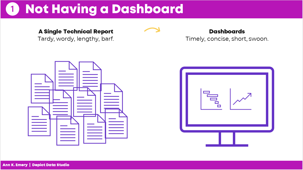
Mistake #1: Not Having a Dashboard  

Fifteen years ago, I assumed that a single technical report was enough.   

I started my career by working on university-based research centers. Peer-reviewed articles were the norm.  

When I transitioned into contracting for Federal government agencies, 100-page technical reports were the norm. 

Nowadays, I know better.  

Dashboards used to seem like extras.  

But they’re not extras. They’re essential.  

Mistake #1: not having a dashboard. Instead of a single technical report, aim for a dashboard.

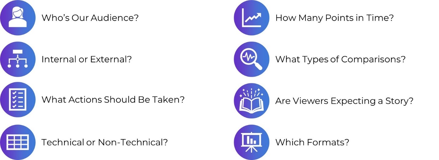
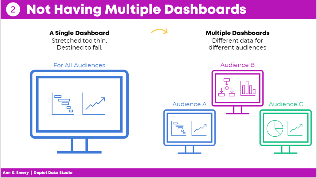
Mistake #2: Not Having Multiple Dashboards  

After I realized that every project could benefit from a dashboard, I realized that every project needs multiple dashboards.  

In the past, I’d make a single dashboard. All the information was crammed in. I was trying to meet every audience’s needs. 

It was destined to fail.  

Now, I have multiple dashboards so that each audience gets their own individualized dashboard.  

Audience A gets the information they need. 

Audience B gets the information they need. 

Audience C gets the information they need. And so on. 

By providing each audience the exact information they need, the data is much more likely to be understood and used.

Mistake #2: not having multiple dashboards. Each audience should have their own dashboard.

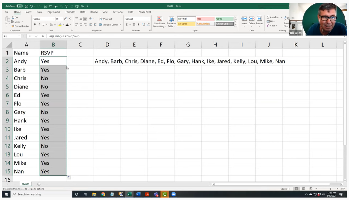
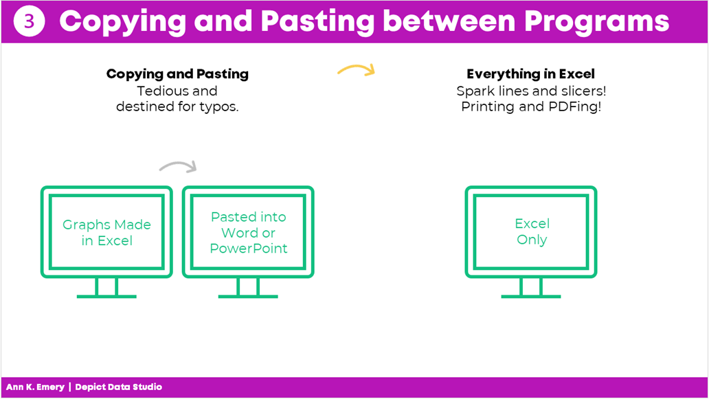
Mistake #3: Copying and Pasting from Excel into Word or PowerPoint 

Here’s what I used to do.

I would make my graphs in Excel and then I would past them into Word or PowerPoint.

I found workarounds to make sure the formatting was identical in both Excel and Word/PowerPoint (e.g., by setting up Themes and a standard text hierarchy in advance).

I found workarounds to avoid copying and pasting (e.g., by writing VBA code).

But the transfer process was still time-consuming and prone to errors.

Nowadays, I just keep everything in the same software program.

I’m a big fan of everyday software so I usually just use Excel for everything. You could use PowerBI or Tableau. Whatever software program you like.

Less copying and pasting between programs is a major time saver.

Mistake #3: copying and pasting between programs. Save yourself time and just do everything in one program.

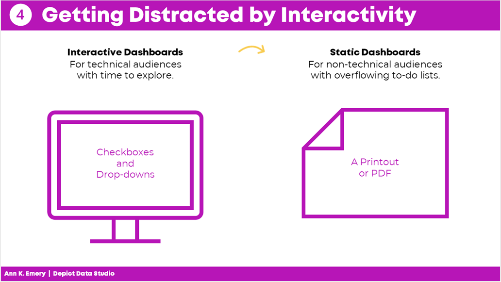
Mistake #4: Getting Distracted by Sparkly Interactivity 

It’s easy to get caught up in all the cool things interactive dashboards can do, like adding drop-down menus or checkboxes. Interactivity lets the user explore the data further.

In hindsight, I wish that some of my interactive dashboards were actually static dashboards.

Yes, I admit it–I wish some of my interactive dashboards were static instead.

I wish I would have used static dashboards for the high-level executives who don’t have extra time to explore data.

Or, for the non-technical audiences who just want the key takeaways.

Sometimes your audience would really just prefer a PDF’d one-pager.

Mistake #4: getting distracted by interactivity. Sometimes your audience really just wants a static dashboard.

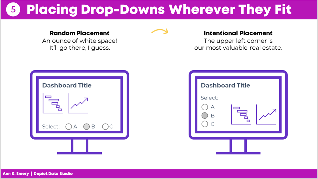
Mistake #5: Placing Drop-Drops or Checkboxes Wherever There Was Space 

I used to just place drop-downs and checkboxes wherever there was space.

At the bottom of a page? Sure.

On the right-hand side of a page? Sure.

In this teeny tiny white space that’s leftover? Sure!

Now, I aim for consistency.

That means usually placing them in the upper left corner.

It’s the most valuable real estate on our screen because our eyes are naturally drawn there.

Intentional placement helps your audience know where to start.   

Mistake #5: placing drop-downs wherever they fit. Be intentional with placement.

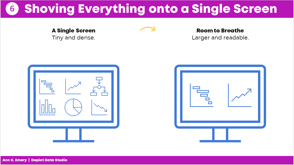
Mistake #6: Shoving Everything onto a Single Screen 

I used to think that a dashboard had to fit onto a single screen or page.

That’s false.

People can easily click to the next window or flip to the next page.

There’s no reason to cram all the information into one page. Especially if you have to resort to using size 6 font with no white space left.

A good rule of thumb is literally a thumb: Make sure you have about a half inch to an inch of white space between your graphs and text boxes.

Give the dashboard some room to breathe so your audience doesn’t feel overwhelmed by the sheer density of the data.

Mistake #6: shoving everything onto a single screen. Leave some room to breathe.

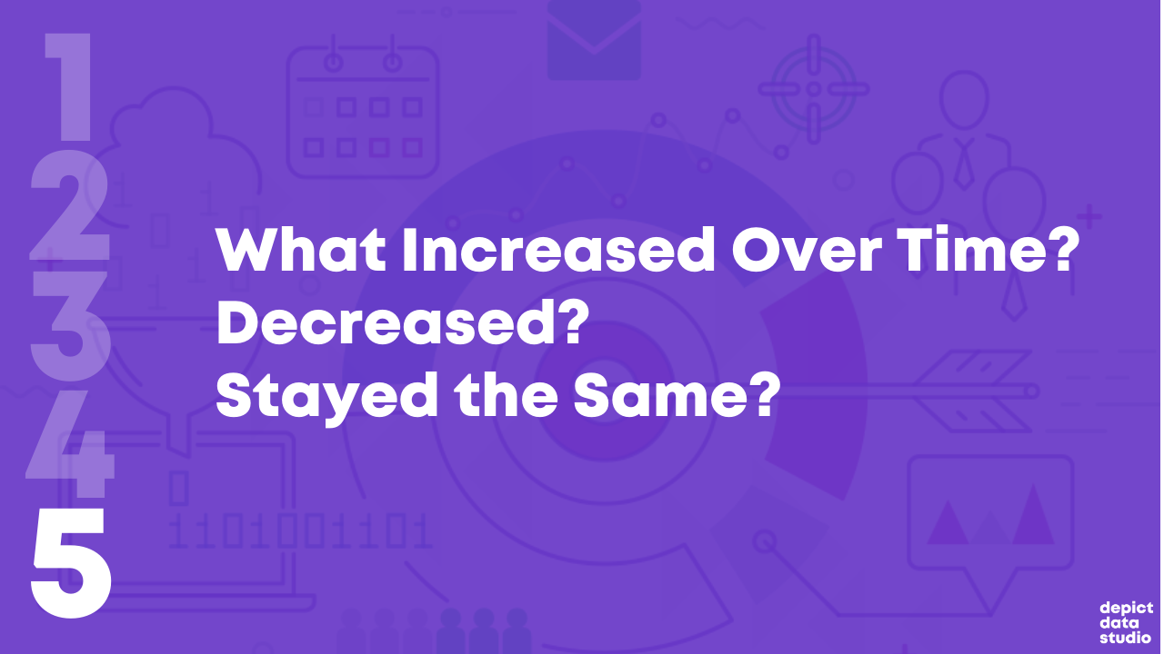
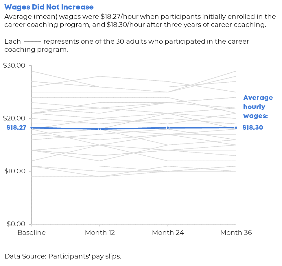
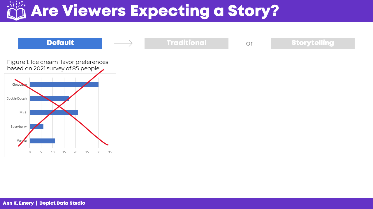
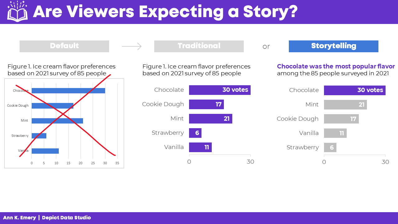
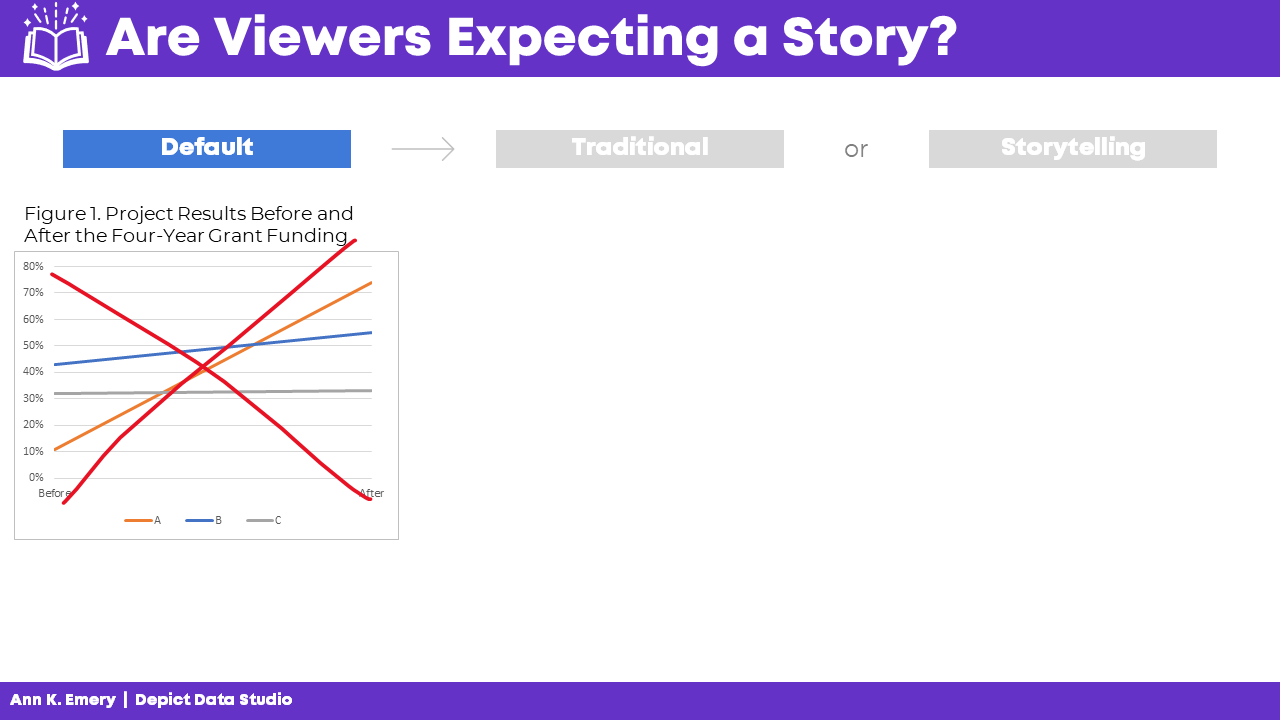
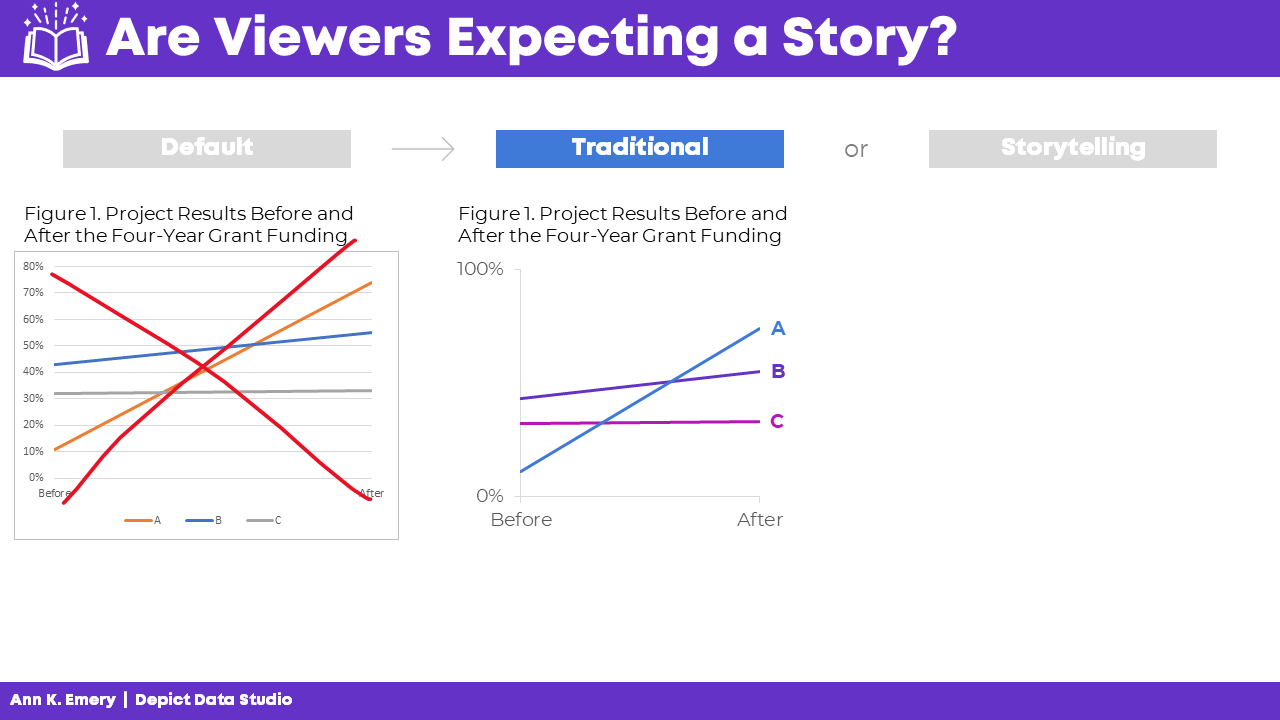
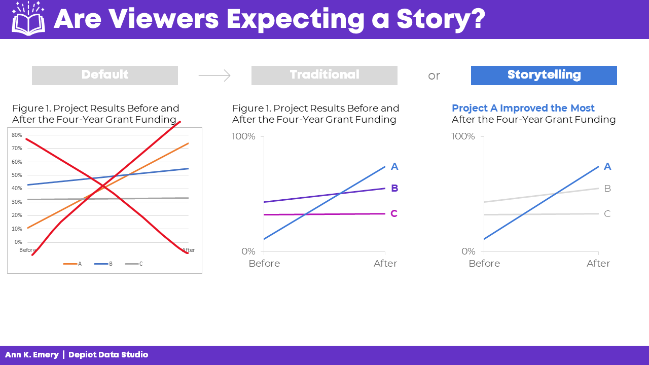
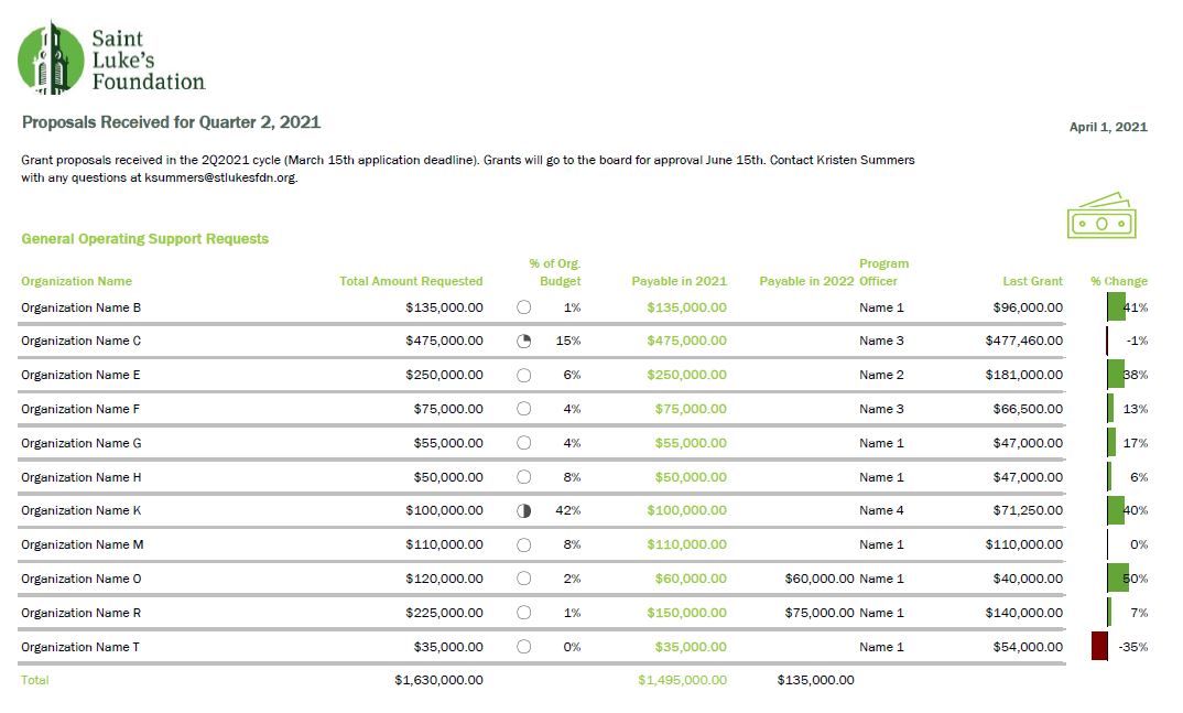
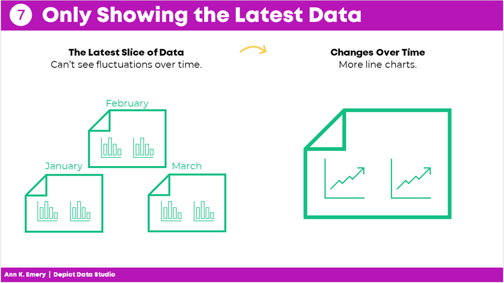
Mistake #7: Only Showing the Latest Data 

Here’s the most common mistake I see: Only showing the latest data.

Let’s pretend there’s a big meeting in March. I used to just show March’s numbers.

But what about February? Or January? Or earlier dates? My poor audience would have to hunt down the previous month’s dashboard, flip back and forth between screens, and try to make comparisons. Our audience should never have to flip between screens or flip between pages to make comparisons!

By only showing the most current data, we’re not allowing our viewers to see the bigger picture.

Nowadays, I use lots more line graphs so that my viewers can see whether there are fluctuations over time.

Mistake #7: only showing the latest data. Show more information allows your audience to see fluctuations over time.

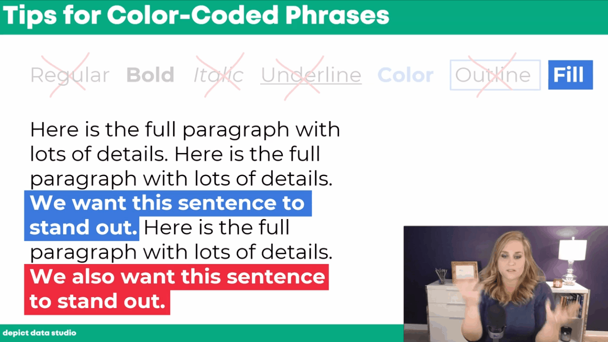
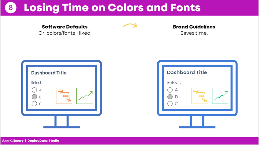
Mistake #8: Losing Time on Colors and Fonts 

Wasting time looking for color palettes or fancy fonts is so common.

I used to just use whatever colors and fonts I felt like. Or, I used the software defaults..

I would think, “Ooh, I heard this font is really popular right now!” or “I love this shade of blue!”

Being guided by personal preferences means your work isn’t as professional as it could be. Especially if you’re working in a group.

If everyone picks their favorite colors or fonts, nothing is cohesive or branded.

Instead, save yourself some time and boost the professionalism by using the recipient’s brand fonts and colors.

You don’t even have to think about it. It’ll just be done. Save your precious mental space for something else.

Mistake #8: losing time on colors and fonts. Just use brand guidelines from the start and save time.

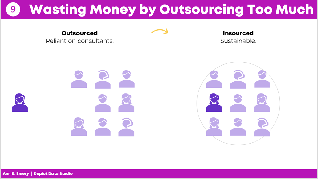
Mistake #9: Wasting Money by Outsourcing Too Much 

There’s a time and place for outsourcing work.

But dashboard design is not one of them.

It shouldn’t cost tens of thousands of dollars to develop a dashboard.

Nor should it take weeks or months.

Don’t hire somebody else to make your dashboard.

Keep it in-house.

You’ll be able to maintain it more easily and will have full control whenever changes or updates need to be made.

Mistake #9: wasting money by outsourcing too much. Keep dashboard design in-house.

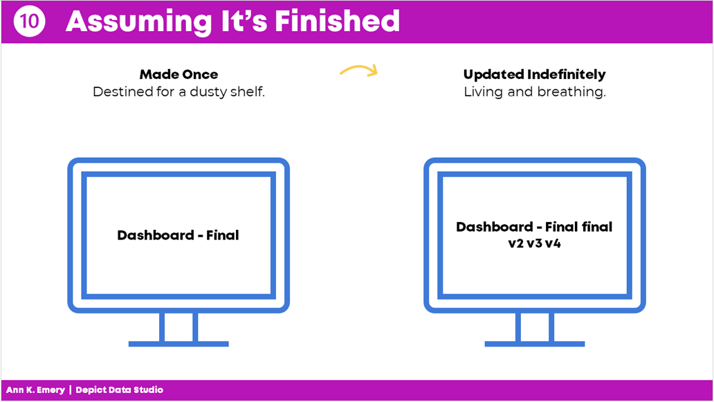
Mistake #10: Assuming It Was Finished 

Dashboards are never finished.

Ever.

They’re not supposed to be.

Dashboards should be updated over time.

Dashboards should evolve as the information needs evolve.

And not just once a year.

You should be making ongoing edits, adjustments, and improvements all the time.

As needs change, the dashboard changes.

Which is another reason why keeping it in-house is so much better.

Mistake #10: assuming it's finished. Dashboards should be updated indefinitely.

Your Turn 

Those were my top 10 worst mistakes from my past projects.

Now, it’s your turn.

What are your worst mistakes from your past dashboard projects? Share so we can learn from one another and avoid some of the headaches before they start.

Written by cplysy · Categorized: depictdatastudio

Jan 17 2022

What Makes a Useful Data Story? 5 Questions to Ask 

Ready to tell a story with data?  

Here’s my definition of data storytelling, in case you missed the previous blog post. 

Great!  

Let’s remove the guesswork from our graphs. 

The next step is to figure out which message we’ll highlight. 

We can’t visualization everything—that dilutes the power of our graph. 

What Makes a Useful Data Story? 5 Questions to Ask

Here are five thought-starter questions to help you uncover useful nuggets in your data.  

  1. What’s Going Well? What’s Not Going Well? 
  1. Did We Reach Our Goals? Why or Why Not? 
  1. What’s Surprising? What Unfolded as Expected? 
  1. Which Information Needs to be Shared with Others? Who Needs to See This Information? 
  1. What Increased Over Time? Decreased? Stayed the Same? 

If you analyze data for a living, then I bet you’re already asking yourself these questions. You were probably trained to approach data this way in grad school. Or, it’s become intuitive after years of on-the-job practice. 

Dabblers in data, this one’s for you.  

Newcomers to data, this one’s for you.  

What’s Going Well? And What’s Not?

Everyone loves a success story.  

Look through your dataset.  

Find the good news and highlight that finding with dark colors and takeaway text.  

I often start with positive findings so that my audience can celebrate a small victory right away. 

But, facilitating an honest conversation with data visualization is requires balance.  

After presenting positive news, I present the less-than-positive news.  

For example, the next graph in my report might use a darker color to draw attention to something that wasn’t going very well. 

Did We Reach Our Goals? Why or Why Not? 

I consult to dozens of grantmakers and grantees each year—Federal, state, and local government agencies, foundations, and nonprofit organizations.  

In the grantmaking world, it’s common for funders to ask their grantees to explain whether they are meeting their targets.  

For example, one goal of a parenting program for teenage mothers and fathers might be to avoid repeat pregnancies. The health centers and high schools that are running the program might have to report whether there was, in fact, a decrease compared to a control group.  

Graphing these goals is an obvious choice. 

What’s Surprising? What Unfolded as Expected? 

Take off your data nerd hat. 

Put on your human hat.  

Step outside the math for a bit.  

Trust your gut instinct.  

I look for numbers that are surprising and unexpected.  

What’s surprising to you, personally?  

Surprising new facts make for interesting reports.  

Nobody wants to read the same old stories over and over and over.

Which Information Needs to be Shared with Others? Who? 

This thought-starter question keeps your data actionable.  

Examine your numbers.  

Who, in particular, needs to see these numbers?  

Think about all the different people who are involved in your project.  

Are there certain takeaway findings that your boss should probably know about? Or the boss’ boss? Or someone outside the organization?  

Who might act differently or make a different decision based on this new information?

What Increased Over Time? Decreased? Stayed the Same? 

Most projects have numbers available at multiple points in time.  

Examine how your numbers are changing over time, if at all.  

Sometimes a number will increase over time. Other times, a number will decrease over time.  

And other times, you might not notice any difference whatsoever. Flat lines can be useful, too! 

Data Storytelling Example: Highlighting a Flat Line in a Workforce Development Project 

I changed around the details, but this example is based loosely on a past project.  

Let’s pretend that you’re leading a career coaching program for adults who recently immigrated to the country. I consulted on a project like this a couple years ago.  

The purpose of the career coaching program was to get those adults into higher-paying jobs.  

A few times a year, the career counselors collected data on the participants. For example, they asked the participants how much they were being paid. The career counselors might even verify their wages by looking at pay slops or tax forms.  

The person responsible for compiling all this data should see whether wages are improving, declining, or staying steady.  

Imagine that you uncovered that wages for most program participants were staying steady—despite hundreds of thousands of tax dollars being poured into this program. 

That flat line has to be shared and talked about! Something needs to be adjusted ASAP. 

Your things-stayed-steady-over-time graph might look like this. 

We applied several data storytelling techniques. I bet you recognized them right away: 

  1. We’ve got color contrast (all 30 participants’ individual lines are grayed out, and the average is highlighted in a darker brand color). 
  1. We’ve got a takeaway title (“Wages Did Not Increase”). 
  1. We’ve got numeric labels on a handful of key data points (the $18.27 average wage at the beginning, and the $18.30 average wage at the end). 
  1. We’ve got (light) narrative annotations (“Average hourly wages: $18.30”) 

Looking for Useful Stories throughout the Analytical Process 

When do you look for possible data stories? 

Not the day before your project’s due!!!!!!!!!!!!!!!!!! 

Revisit these questions at each stage of your project’s analytical process. 

Look for Useful Stories in the Raw Data 

I start with my spreadsheets of raw data.  

I ask myself, “What’s going well? Did we reach our goals? What increased over time? What’s surprising? Which information needs to be shared with others?”  

I keep a running list of interesting nuggets in a notebook. 

Look for Useful Stories as You’re Compiling Tables for Your Appendices 

Later, I compile my analyses in tables. The tables often go in the appendix of a technical report.  

This means that I write the last pages of my report first.  

As I’m designing the tables, I ask myself those five questions again, and I add to my running list. 

Look for Useful Stories as You’re Designing Your Full Reports or Slideshows 

Next, I write my report (or create my slideshow, or whatever the finished product will be).  

I look through the tabulated data as I’m designing the report: Which numbers deserve to go into the body of the report?  

Look for Useful Stories as You’re Designing Summaries (One-Pagers, Infographics, Briefs, etc.) 

Finally, when my full report/slidedeck is complete, I pull out graphs that are so interesting that they deserve to go in a summary.  

I’m using the word summary loosely here.

A summary could be a one-page handout, an infographic, a shorter brief, etc. 

Yes, this is the place for those stories to shine.

Yes, you should’ve found stories along to way to include in your summaries. Hopefully!!!

This stage gives you one more chance to think carefully about useful gems in your dataset.

Don’t wait until the end of a project to think about the “so what?”  

This should be an ongoing, intentional process.  

When we think deeply about the data, our audiences will benefit from the added clarity. 

Your Turn 

What’s your process for uncovering interesting stories in your data? 

Do you have more thought-starter questions to add to the list? 

Written by cplysy · Categorized: depictdatastudio

Jan 11 2022

Are Viewers Expecting a Story? Lightning Talk from the DATAcated Expo

Never, ever keep the default settings.

That was the overarching theme of my Lightning Talk at the DATAcated Expo, which was held virtually in October 2021.

You’re not going to keep the ugly, outdated defaults. Great!

But what should you do instead?

And how do you modify a graph so that it’s just right for your audience?

Surely a group of scientists will need something different from a group of policymakers.

Some audiences adore data. Others don’t.

Some audiences have plenty of time. Others don’t.

In this blog post, you’ll learn about:

  • the differences between default, traditional, and storytelling graphs;
  • which techniques can help you tell a story with data (e.g., dark colors); and
  • when to use each type of graph.

Watch the DATAcated Expo Lighting Talk

Missed the live event?

Watch the Lightning Talk here.

This is a 17-minute video. If you’re short on time, just watch a 10-minute segment — minutes 2 through 12 of the video.

Here’s a summary of what’s inside.

Defining the Term “Data Storytelling”

This is a tricky term with lots of definitions.

Some people love this term.

Others hate it.

In the recording, you’ll see me ask the attendees to share what “data storytelling” means to them.

You might define data storytelling as:

  • “What does data really mean, and what do you want it to tell.” — an Expo attendee
  • “Translating data for non-data centric users.” — an Expo attendee

And data storytelling is NOT:

  • Fiction
  • Making things up
  • Biasing our audience
  • Fudging the numbers

Data Storytelling in a Bar Chart

In the Lightning Talk, I showed attendees three versions of the same graph: default, traditional, and storytelling.

We’ll look at each of these side by side, so that you can see how they’re similar and how they’re different.

At the end, I’ll ask you to comment and share which style you think each of your audiences need.

The Default Bar Chart

We never, ever keep the default settings.

The Traditional Bar Chart

Instead, at a bare minimum, we need to design a traditional graph.

We would:

  • Enlarge the font
  • Enlarge the bars (by decreasing the gap width)
  • Remove the border
  • Add labels (optional—if we think our audiences would want specificity)
  • Adjust the scale
  • Use brand colors
  • Use brand fonts

It’s up to the viewers to read the chart and figure out the “so what?” for themselves.

The Storytelling Bar Chart

Sometimes, our audiences prefer storytelling graphs.

You already spent 60 seconds cleaning up the default settings.

In another 60 seconds of editing, we would:

  • Sort the bars (e.g., greatest to least)
  • Gray everything out
  • Highlight one takeaway finding with a dark color
  • Add the takeaway finding to the graph title
  • Bold a few key words to make the title even more skimmable

Data Storytelling in a Slope Chart

You can apply these principles to any and all chart types.

Here’s what the three different styles look like in a slope chart.

(A slope chart is just a fancy name for a line chart that has exactly two points in time.)

The Default Slope Chart

Defaults are for 2005.

We know better.

C’mon, Excel. And Tableau. And PowerBI. And and and.

The Traditional Slope Chart

At a bare minimum, we need to:

  • Enlarge the fonts
  • Adjust the scale
  • Remove the border
  • Add brand colors
  • Add brand fonts
  • Remove the legend and directly label the data

(Direct labels have three key advantages: They’re faster to read; they’re better for people who are colorblind; and they print better in grayscale.)

The Storytelling Slope Chart

Take the edited graph you just made, and keep going!

In a storytelling slope chart, we would:

  • Gray everything out
  • Highlight one thing at a time
  • Re-write the title and put the takeaway message in the title
  • Bonus points: Bold a few key words to make it even more skimmable

Which finding will you highlight in a darker color?

You might highlight:

  • The Success Story (Project A)
  • The Debbie Downer Story (Project C)

Be careful with red; in Western cultures, red means caution! warning! But colors are culturally-specific; in Eastern cultures, red doesn’t necessarily mean anything bad.

Data Storytelling in a Scatter Plot

We didn’t have time to discuss scatter plots at the DATAcated Expo, but I’d still like to share this example with you.

Here’s how data storytelling would be applied to a scatter plot.

Never keep the default settings!!!!!!!!!!

Traditional graphs are all one color and they have topical titles.

Storytelling graphs have a dark-light contrast and takeaway titles. For bonus points, you could label a few key points.

Data Storytelling in a Map

Finally, here’s how data storytelling would be applied to a choropleth map.

Never keep the default settings!!!!!!!!!!

In traditional maps, none of the colors stand out, and they have topical titles.

In storytelling maps, we’d add an intentional dark-light contrast and takeaway title. For bonus points, you could label a few key points.

When Should You Use Data Storytelling?

Comment below: When would you use each style?

Which of your audiences prefer traditional graphs?

Which of your audiences prefer storytelling graphs?

In the video, you’ll also hear the conference attendees share their perspectives, and you’ll hear from me, too.

Written by cplysy · Categorized: depictdatastudio

Jan 04 2022

Looking Ahead to 2022: What’s Coming to Depict Data Studio 

2021 was a rough year personally; our family of 5 experienced a million health issues and hospital stays, and the bills afterwards were crushing.

2022 can’t be that terrible. Right? Right??

I’m on a mission to make 2022 as healthy and positive as possible.

There’s lots to celebrate! This is my 10th year of blogging, 10th year of YouTubing, and 8th year of business.

Wondering what I’ve got planned this year? Here’s what’s in store for 2022 related to: 

  • Online Courses, 
  • Private Training, 
  • Data Visualization Consulting, and 
  • Personal and Professional Goals. 

Online Courses 

We’ll continue to offer online learning throughout 2022 (and likely for decades to come!). 

Here are the learning opportunities you can take advantage of this year. 

Soar Beyond the Dusty Shelf Report 

This is our complimentary mini course.  

It’s a why-to mindset course that prepares you for the how-to courses you’ll take later on. 

Have a colleague who’s still writing lengthy technical reports? Still using the software defaults in their charts? This is the course for them! 

It takes 45 minutes to watch the short video lessons and complete the discussion board activities. 

Register for no cost at https://depictdatastudio.teachable.com/.  

Dashboard Design 

Registration is officially going to be open February 14-18, 2022. 

This four-course bundle teaches you to design static and interactive dashboards in Excel and Tableau.  

Most of the resources are focused on static one-pagers in Excel—because those are the dashboards that’ll be most useful for our non-technical or busy audiences. 

Want to take advantage of the early bird bonuses, like the 1:1 consultations and Swag Bags? Shhh don’t tell anyone—early bird registration is available now at https://depictdatastudio.teachable.com/. 

Powerful Presentations 

Need to speak at a conference? Staff meeting? Board meeting? This is the advanced class for you! 

This is our deep dive on slideshows, public speaking skills, and behind-the-scenes tips for both virtual and in-person presentations. 

Registration will be open the week of May 16-20, 2022. 

Simple Spreadsheets 

Need to analyze a new dataset from start to finish? 

In this course, you’ll learn about cleaning and tabulating data (to get it ready for your graphs, dashboards, and more). 

Registration will be open the week of September 12-16, 2022. 

Great Graphs 

Which chart type should you use? How do you make visuals more accessible? 

This is our flagship dataviz course! 

Registration will be open the week of November 14-18, 2022. 

Office Hours 

For the third year in a row, all our Full Courses will include live Office Hours. 

Submit your draft dashboards, slideshows, reports, and more, and get my feedback in a small group setting.  

Office Hours last 30 minutes and are held almost every week. (No Office Hours in June or July—enjoy your summer break!) 

Just want to pick my brain during Office Hours, without joining a course? You can register for the entire years’ worth of Office Hours at https://depictdatastudio.teachable.com/.  

Registration Fees 

Registration will continue to be $997/participant for 2022, which includes lifetime access to the recorded lessons; all the Office Hours taking place in 2022; and additional support like ebooks, digital downloads, our Data Vizards community, and more. 

We also have group rates available. 

Registration fees will increase in 2023. 

Private Training 

Want to bring me in to speak to your team? 

Each year, I lead ~200 private sessions for foundations, nonprofits, universities, and government agencies who work on social good issues. 

Here’s more info about our workshops, which can be held virtually or in-person. 

Virtual Workshops 

I don’t offer full-day Zooms—those are miserable.  

Instead, we provide a series of 2-hour sessions that are spaced a week apart (e.g., four Tuesday afternoons in a row). 

I’ll review your sample materials. You’ll tell me more about your staff. We’ll put our heads together and craft a custom agenda that’s just right for your organization. 

Learn more at https://depictdatastudio.com/virtual-workshops/.  

Ann K. Emery working at the Depict Data Studio world headquarters.

In-Person Workshops 

I’m vaxxed, boosted, and happy to wear a mask for the entire time that I’m in your office.

Availability is limited, and my schedule tends to fill months in advance.  

Learn more at https://depictdatastudio.com/workshops/.  

Data Visualization Consulting 

Want our team to create your report, slideshow, dashboard, or infographic? 

We can refer you to our team of hand-picked experts. 

Personal and Professional Goals 

This year, I’m attempting my most lofty goal yet: To take the entire summer off to be with my 3 kids. A European summer, if you will.

Communicating data more effectively through data visualization–while using everyday software–is absolutely my professional purpose. But I don’t have to teach dataviz 365 days a year to make a positive impact on the community.

Taking the summer off is easier said than done when your schedule stays as full as mine.  

It requires a year of planning in advance—to make sure you schedule your conference keynotes, private trainings, and online courses with the K12 school calendar in mind. 

It requires automation (a multi-year goal, which is mostly finished at this point). Everything that can be automated has been automated. For example, when we hold private client trainings, the staff RSVP to a Zoom registration page… they automatically get enrolled in our Teachable learning platform… they get access to our Excel How-To files and ebooks via Gumroad… they get welcome messages via ConvertKit… and Zapier holds all the pieces together like glue behind the scenes. If done manually, these tasks would require an extra 10-20 hours of a staff member’s time per client workshop. Now that I’ve solved all the technical riddles, they happen almost instantly. 

It requires careful staffing and careful contractors. It requires payroll automation, and ongoing training, and having instructions and checklists for all the manual tasks. 

It requires letting go. I’m capable of having one of the highest-read blogs in the world. I’m capable of having millions of YouTube subscribers. I’m capable of building a podcast, or writing books, or even of becoming TikTok famous. I know exactly what’s required to do all those things, but I’m choosing not to do them—or do them more slowly. That’s the hardest part for a high-achiever like me. 

Novice Ann would’ve argued, “But you can do both! You can be a mom and a YouTuber!” 

Experienced Ann knows what’s involved. You can have anything, but you can’t have everything, and not all at the same time. And you can’t do everything simultaneously at elite levels. It’s impossible to be the best blogger ever and the best mom ever at the same time; both require more than a full-time workload and 24/7 mental energy. 

I’ll remain committed to the core aspects of Depict Data Studio—our online courses, private trainings, and dataviz consulting. 

But the “hobby” aspects of business—the optional blog posts, YouTube videos, podcasts, books, and social media posts—will take a backseat so I can move kid time to the front seat. A worthwhile tradeoff.  

Your Turn 

What are you focused on in 2022?  

Are you hoping to learn a new software program? Automate part of your process? Achieve a personal goal?  

Comment anytime and let me know! 

Written by cplysy · Categorized: depictdatastudio

Dec 21 2021

Top 21 Dataviz Resources of 2021

6,000 total participants in our dataviz training academy so far (with 5 cohorts going through our Full Courses in 2021 alone). 

28 blog posts. 

14 YouTube videos. 

6 podcast interviews. 

1 new baby. 

What a year. 

Top 21 Dataviz Resources of 2021 

Want to do some year-end learning as 2021 winds down? 

Here are our favorite 21 data visualization resources from the past year. 

Why “Know Your Audience” is Terrible Dataviz Advice—and What to Do Instead 

Every time I scroll through social media, someone’s post is telling me: “Want to know the secret to great dataviz?! Know your audience!” I mean… duh. “Knowing your audience” is terrible data visualization advice. What’s the alternative? Not know my audience? Of course not.  

In this blog post, you’ll learn 8 specific, nuanced, advanced ways of “knowing our audience.”

In this blog post, you’ll learn 8 specific, nuanced, advanced ways of “knowing our audience.”


The Inside Scoop on Excel with Bill Jelen (Mr. Excel) 

This year I had the honor of speaking with Bill Jelen, a.k.a. Mr. Excel. He was a guest speaker inside our data analysis course, Simple Spreadsheets, and is a big, big deal in the Excel community! I’ve internet-stalked him for years on his website and his popular YouTube channel. Frankly, I’m still shocked he agreed to come speak with us. 

This year I had the honor of speaking with Bill Jelen, a.k.a. Mr. Excel, who is a big, big deal in the Excel community!

Better Storytelling with the Same Data: Upgrade that Board Packet! 

“A lot of information and a bit overwhelming to take in.” That’s how Kristen Summers described her old grants docket. She emailed me an example of how she’s revamped her organization’s grants docket and I knew I had to showcase her hard work (keep it up, Kristen!).  

In this guest blog post, Kristen walks us through the steps she took to remake her organization’s grants docket and budget visualizations. 

In this guest blog post, Kristen Summers walks us through the steps she took to remake her organization's grants docket and budget visualizations. 

How to Visualize Qualitative Data with Colored Phrases 

When my friend Jon Schwabish asked me to partner on his One Chart at a Time project, it was an easy “yes.” For the project, I created a tutorial on using colored phrases to visualize qualitative data.  

You’ll learn about the first time I ever used colored phrases to visualize qualitative data, my favorite examples of colored phrases, and practical tips for using colored phrases in your project. 

In this blog post I share practical tips for using colored phrases in your project. 

Applying Data Visualization Principles to Your Business: A Before/After One-Pager Makeover 

Talk about a before/after makeover! Lillian Haley, Ph.D., MSW, ChFC® said, “Enrolling in courses at Depict Data Studio is one of the best professional developments I have ever made.”  

In this guest blog post she shared how she originally based her capability statement on an example she found on the U.S. Department of Health and Human Services website and then transformed it using skills she learned in our courses.  

In this guest blog post she shares how she transformed her capability statement using skills she learned in our courses.  

Escaping the Bar Chart 

Ready to escape the bar chart? Bar charts aren’t evil. But they’re overused.  

In this blog post and video tutorial, you’ll learn about my 3 favorite exploratory vizzes (sparklines, data bars, and heat tables) and the pros and cons of choropleth maps, square tile grid maps, and hex maps. 

Dashboard Design and “The Big Picture” in Dataviz: A Conversation with Steve Wexler  

Are you familiar with The Big Book of Dashboards?? It’s THE reference book with dozens of real-life case studies. The author, Steve Wexler, joined our Dashboard Design course as a guest speaker where we talked about his career, his books, the goal of data visualization, why he loves collaboration and a lot more.  

How to Pass the Excel Certification Exam  

Want to pass the Excel certification exam? Maybe you want proof that you can rock Excel for your resume? For your boss? In this blog post, I’ll share behind-the-scenes tips for registering for and pacing the MOS-200 exam. 

In this blog post, I’ll share behind-the-scenes tips for registering for and pacing the MOS-200 exam. 

Designing a Prettier and More Effective Dashboard with Excel 

Has using a dashboard has been central to your work? In this blog post, you’ll see Shawna Rohrman’s before/after dashboard makeover.

Shawna wrote, “Even with just these few changes (and using a program nearly everyone can access!), our new performance monitoring dashboard has made it so much easier for our team to review quarterly progress in one place and visualize how our system of early childhood programs are working for children and families in the county.” 

How to Engage Your Audience with “Choose Your Own Adventure” Presentations 

Ready for an advanced presentation technique? Want to make sure your audience is engaged?

In this blog post, you’ll learn about the “Choose Your Own Adventure” method for engaging our audiences during presentations. This style puts our audience in the driver’s seat. We prepare lots of topics in advance, but they vote on which topics they want to cover.  

Dashboards for 10-Year-Olds: Connecting Data to Students’ Lived Experience 

Who are your datavizzes for? For your Board members? Other staff members? The general public? But what about for kids?

Bob Coulter has been “developing dashboards to support students’ understanding of local ecology and equip them to use that local understanding as a baseline to explore the rest of the world.” In this blog post, you’ll learn how Bob Coulter designed visualizations that personalize the experience for kids, too. 

 In this blog post, you'll learn how Bob Coulter designed visualizations that personalize the experience for kids, too. 

Creating a Powerful Presentation: 3 Easy Changes to Revamp your PowerPoint 

“Over the past few years, I have given a number of presentations across the country. I’ve learned the importance of presenting a creative topic rather than just ‘Hey, here’s my program. Let me throw some stats at you…’ I realized my slides needed some quick but major changes,” said Kelsey Watterson.

In this guest blog post she shared how she transformed her text-heavy presentations with her three favorite tips: color coding, increasing readability, and storyboarding. 

3 Common Reporting Hurdles—and How to Overcome Them 

I was a guest on Alli Torban’s podcast, Data Viz Today.

In this episode, you’ll learn how to overcome common reporting challenges like: 

  1. Figuring out how to incorporate a variety of formats. Not just slideshows, not just reports, not just dashboards, and not just infographics. A different format for each of our different audiences. 
  1. Trying to pack a lot of dense, technical information into each format — without overwhelming our readers. This is a tough one, even for me. And 3)  
  1. Incorporating a variety of visuals. Not just graphs. Not just tables. Not just photographs. 

Communicating with Your Audience More Effectively: Using One-Pagers Internally  

Need a skimmable one-pager?

Guest blogger Juan DeJesus needed a one-pager that his team of 100+ people could read in 2 minutes or less.

“Instead of dense and text-heavy presentations, I minimize the text to include only the main points and actions I need from my team,” he wrote. 

Need a skimmable one-pager? Guest blogger Juan DeJesus needed a one-pager that his team of 100+ people could read in 2 minutes or less

How to Use Vlookup in Microsoft Excel: Two Step-by-Step Examples for Beginners 

Have you conquered the lookup functions yet? (vlookup, hlookup, index-match, and xlookup?)

In this blog post, you’ll learn:

  • what vlookup is used for,
  • why vlookup can be tricky, and
  • how to fill in the four pieces of the formula. 

Navigating Tableau’s Resources with Zach Bowders 

Curious about Tableau? Want to get started for the first time? Maybe you’re already using Tableau… but want to use it even better?

Zach Bowders, Tableau Zen Master and Tableau Ambassador, was a guest speaker during a Dashboard Design live session and he helped us navigate the Tableau community’s resources.  

A Trick, a Tip and a Thing to Try in Your Next Presentation  

Are you using visual frameworks to explain your data?

This is an advanced technique, and it definitely requires more up-front planning time than usual. (But, it’s time well spent! More planning = better comprehension for our audience.)

“The effort to pick the right visual metaphor transformed the way I understood my own content,” explained Elizabeth Dove, guest blogger who shared her tips and tricks for presentations.  

Guest blogger Elizabeth Dove shared tips and tricks to take your presentation to the next level.

Creating a Community through Graphs  

Do I selfishly hold Office Hours every week just so I can talk with you about data? Maybe. Wink.

Guest blogger Maddison Staszkiewicz shared how she transformed her data visualizations after getting feedback from our community during Office Hours.  

Getting Started with Sketchnoting: A Conversation with Emily Mills  

Most of us were trained to write formal, academic reports.

Transitioning into infographics, dashboards, slidedocs… or even landscape orientation… yikes! It’s a big difference from what we’re used to.

To ease that transition, I invited professional illustrator Emily Mills to lead a sketchnoting session for our Report Redesign Full Course. 

If we can get comfortable drawing graphics by hand, I thought, then adding a few more graphs to our reports won’t feel so daunting. Grab a pencil and paper to follow along.  

Professional illustrator Emily Mills to lead a sketchnoting session for our Report Redesign Full Course.

Why Nonprofits Shouldn’t Use Statistics  

Overwhelmed by fancy statistics? Does that make you feel like a wimp?? What if statistics weren’t necessary for some organizations???

Drs. Maryfrances Porter & Alison Nagel were guest speakers in our Simple Spreadsheets course, and they explained why nonprofits shouldn’t use statistics.

Don’t miss this one if you work at a nonprofit!  

Speeding Up Your Data Viz (& Preventing Future Injuries) Using Custom Commands in Dragon 

Ever feel like Microsoft Office wasn’t designed with data viz in mind? Do you have actions that need to be repeated over and over and over again?

In this blog post, Andrew Forsman is sharing how “a voice command and dictation software called Dragon can help overcome some of Office’s limitations.”

While I’m a big believer in everyday software, I love learning how new software can save us time and effort so we can focus on creating great data viz.  

Here’s to 2022! 

Written by cplysy · Categorized: depictdatastudio

  • « Go to Previous Page
  • Go to page 1
  • Interim pages omitted …
  • Go to page 22
  • Go to page 23
  • Go to page 24
  • Go to page 25
  • Go to page 26
  • Interim pages omitted …
  • Go to page 37
  • Go to Next Page »

Footer

Follow our Work

The easiest way to stay connected to our work is to join our newsletter. You’ll get updates on projects, learn about new events, and hear stories from those evaluators whom the field continues to actively exclude and erase.

Get Updates

Want to take further action or join a pod? Click here to learn more.

Copyright © 2026 · The May 13 Group · Log in

en English
af Afrikaanssq Shqipam አማርኛar العربيةhy Հայերենaz Azərbaycan dilieu Euskarabe Беларуская моваbn বাংলাbs Bosanskibg Българскиca Catalàceb Cebuanony Chichewazh-CN 简体中文zh-TW 繁體中文co Corsuhr Hrvatskics Čeština‎da Dansknl Nederlandsen Englisheo Esperantoet Eestitl Filipinofi Suomifr Françaisfy Fryskgl Galegoka ქართულიde Deutschel Ελληνικάgu ગુજરાતીht Kreyol ayisyenha Harshen Hausahaw Ōlelo Hawaiʻiiw עִבְרִיתhi हिन्दीhmn Hmonghu Magyaris Íslenskaig Igboid Bahasa Indonesiaga Gaeilgeit Italianoja 日本語jw Basa Jawakn ಕನ್ನಡkk Қазақ тіліkm ភាសាខ្មែរko 한국어ku كوردی‎ky Кыргызчаlo ພາສາລາວla Latinlv Latviešu valodalt Lietuvių kalbalb Lëtzebuergeschmk Македонски јазикmg Malagasyms Bahasa Melayuml മലയാളംmt Maltesemi Te Reo Māorimr मराठीmn Монголmy ဗမာစာne नेपालीno Norsk bokmålps پښتوfa فارسیpl Polskipt Portuguêspa ਪੰਜਾਬੀro Românăru Русскийsm Samoangd Gàidhligsr Српски језикst Sesothosn Shonasd سنڌيsi සිංහලsk Slovenčinasl Slovenščinaso Afsoomaalies Españolsu Basa Sundasw Kiswahilisv Svenskatg Тоҷикӣta தமிழ்te తెలుగుth ไทยtr Türkçeuk Українськаur اردوuz O‘zbekchavi Tiếng Việtcy Cymraegxh isiXhosayi יידישyo Yorùbázu Zulu