How do we make our graphs more accessible?
There’s a misconception that accessibility takes all day, that’s it’s costly, or that it’s complicated. Those are all false.
Accessibility is woven into all my trainings, but since this is a topic I get asked about a lot, I decided to make a new talk that’s focused just on accessibility for dataviz.
In Spring 2021 I gave a talk at the Good Tech Fest conference about dataviz accessibility quick wins.
The talk was a “Choose Your Own Adventure” style where the audience chose what we discussed from a list of options. They chose:
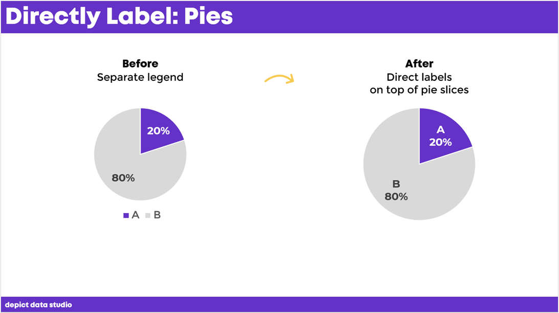
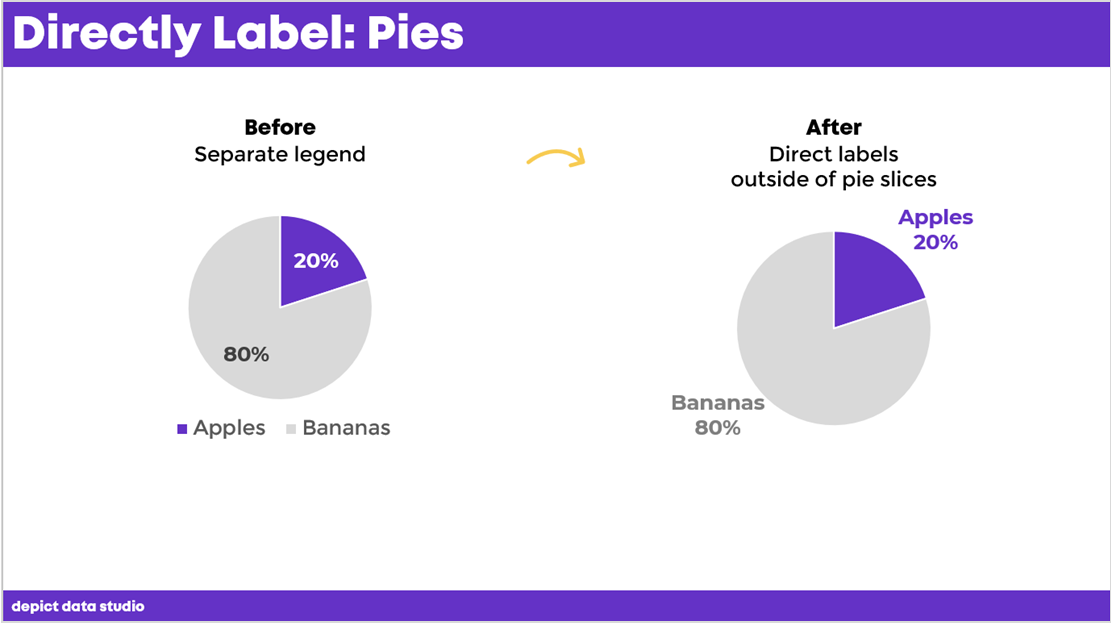
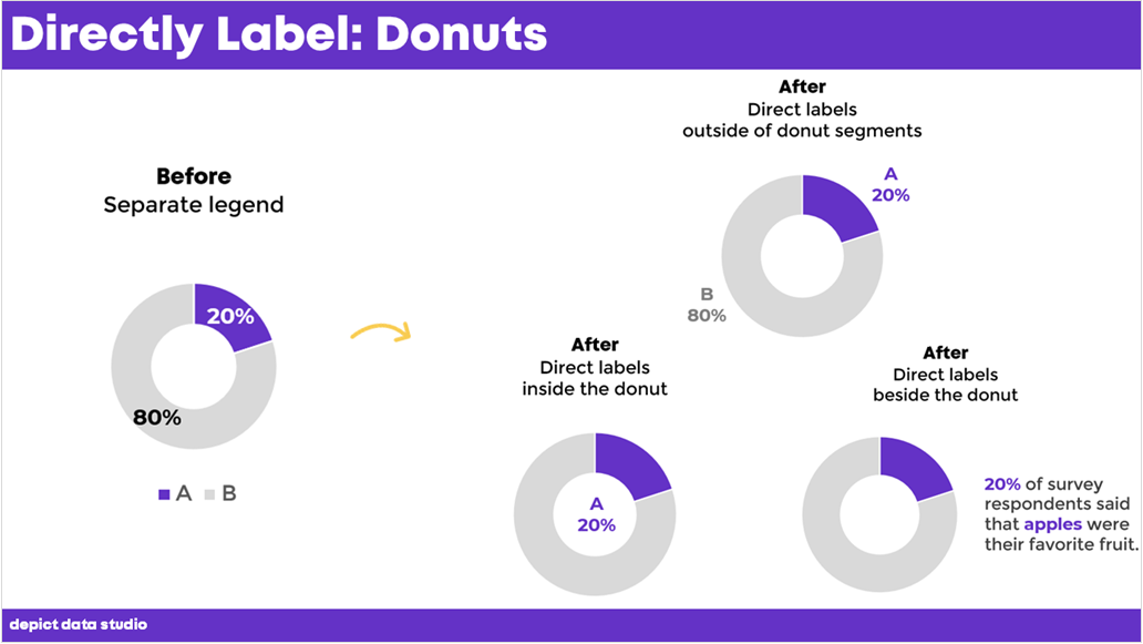
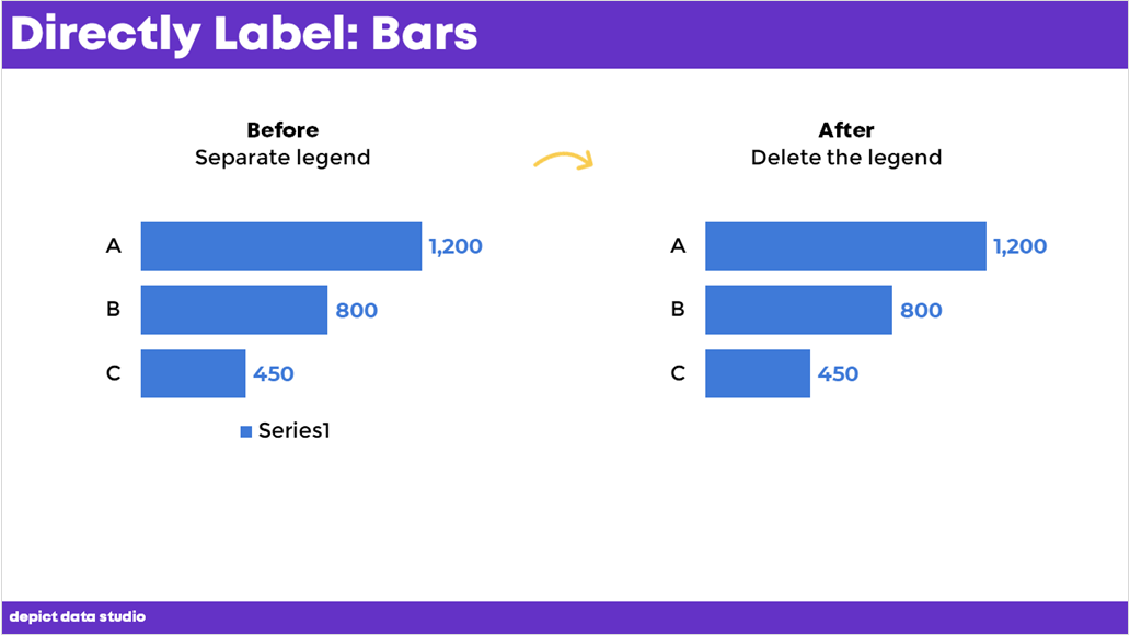
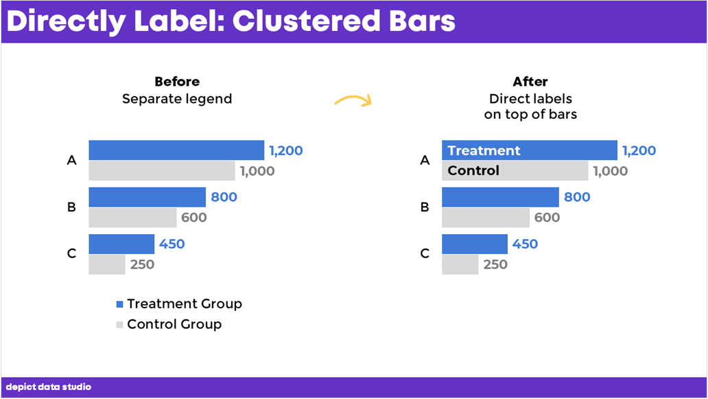
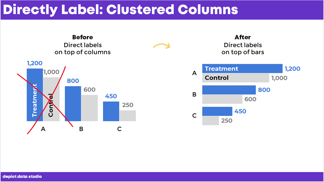
- direct labels,
- lower the reading level, and
- lower the numeracy level.
You can watch the recording or read the highlights. Enjoy!
—–
Watch the Conversation
You’ll learn about lowering the numeracy level. Then, you’ll see a case study that combines several accessibility quick wins.
How to Lower the Numeracy Level
We’ve discussed how to lower the reading level, but how do we lower the numeracy level?
Lowering the numeracy level just means making sure the numbers are easy to understand.
There are a couple of stages to this, so even if you only move one step, that’s a win.
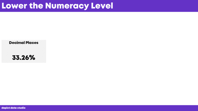
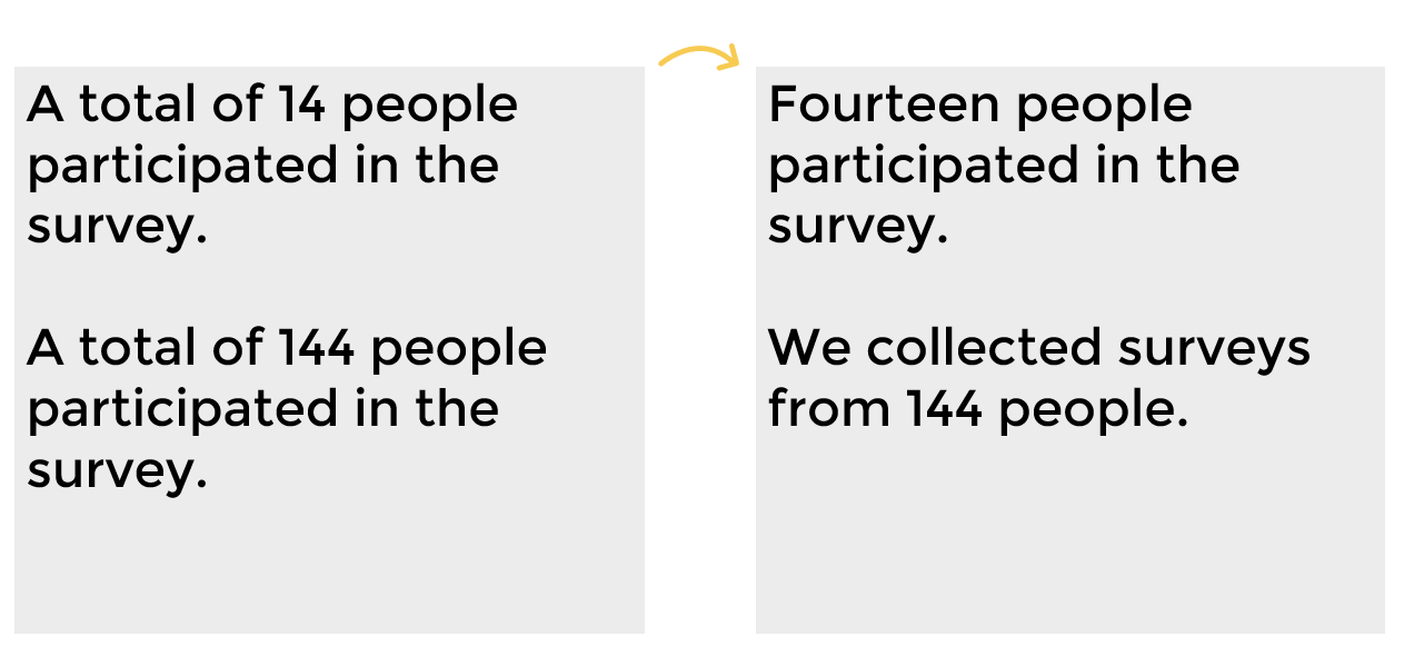
For example, let’s say you’re starting with 33.26%.
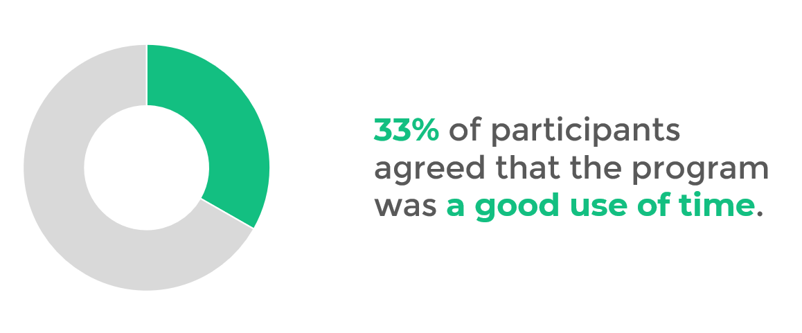
To lower the numeracy level, the first stage would be to round it to 33%. That’s a win!
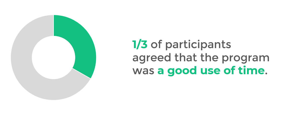
The next stage would be to go from rounded percentages to fractions. So, we could turn that 33% into 1/3. Another win!
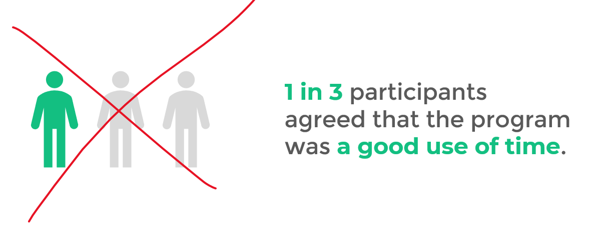
The final stage would be taking that 1/3 fraction and changing it to 1 in 3 in a sentence.
This is a general goal to aim for. It won’t work every single time for every single project. In other words, you can’t move from 33.26% to 1 in 3 for every project. Just try to move one step in every project.
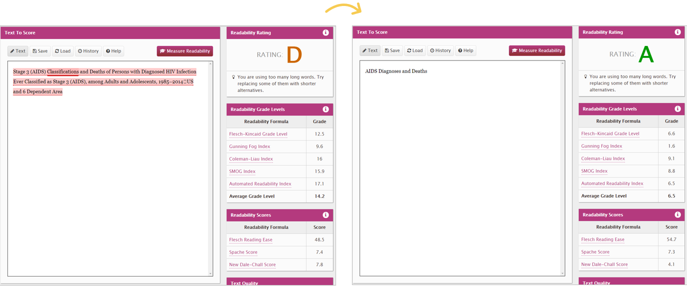
Before: Percentages with Two Decimal Places
Let’s practice lowering the numeracy level.

Let’s talk about what’s already going well:
- It’s a donut chart with only two slices – check.
- It’s got dark-light contrast – check.
- And the sentence, “33.26% of participants agreed that the program was a good use of time” is readable. (It scored a 5.8 on the Flesch-Kincaid scale.)
After: Round to the Nearest Whole Number
Let’s make it even better!
I know you understand percentages. Of course you do. You’re reading a data blog. 
But percentages are tricky for people who don’t work in data careers.
Percentages.
Percent changes.
Percentage point changes.
Percentiles.
Those are similar-sounding terms with completely different math and meanings.
No wonder others get confused by percentages.
Let’s be proactive and stop confusion at the source—by avoiding percentages whenever possible.
One improvement would be to round the decimal places to the nearest whole number.
After: Use Fractions Instead of Percentages
Another quick win would be to turn the 33% into a fraction (1/3).
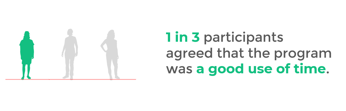
After: Put the Fraction into a Sentence
And the best practice would be to turn the 1/3 into one in three.
You could also adjust the chart, transforming the donut chart into an icon array.
That way, there’s cohesion between the chart and the text (i.e., they both talk about one in three).
I don’t recommend using gingerbread people.
- Men don’t have to wear pants and women don’t have to wear dresses.
- Some people don’t identify as men or women.
- You may not know if the data collected represents men or women.
So, what to do instead?
Use icons of real people.
This example is about people, so let’s show the people.
This is symbol font called WeePeople. You can download this for free and use it to visualize people as the real human beings they are.
Accessibility Case Study
By now, you’ve learned about direct labeling, lowering the reading level, and lowering the numeracy level.
Let’s look at a case study and put it all together.
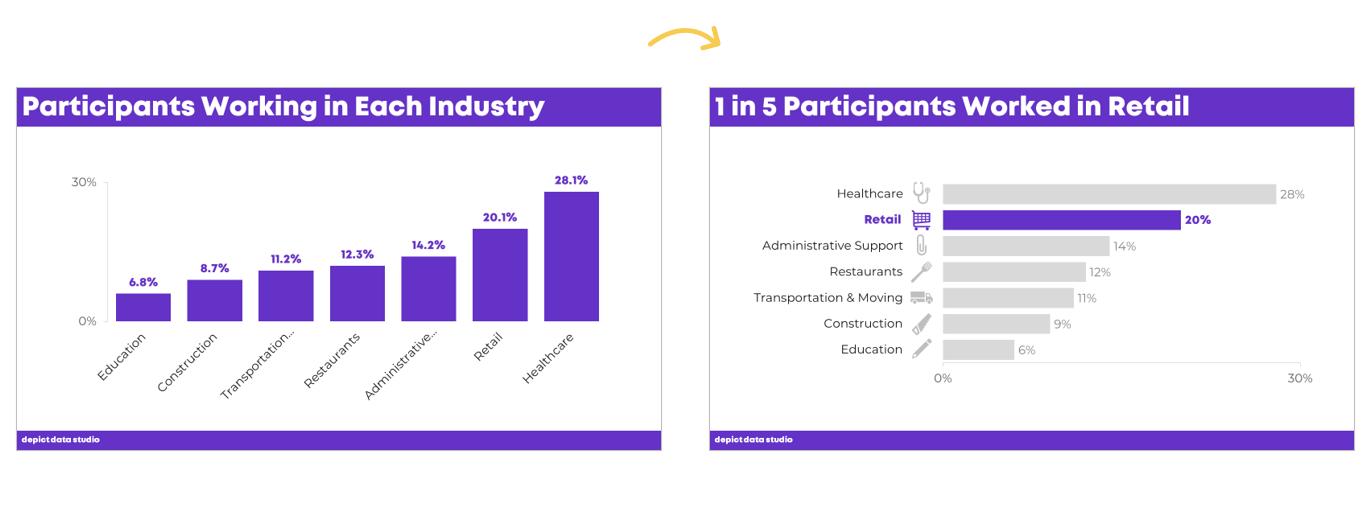
Here’s a before graph based on a real-life project. This organization was running a workforce development program.
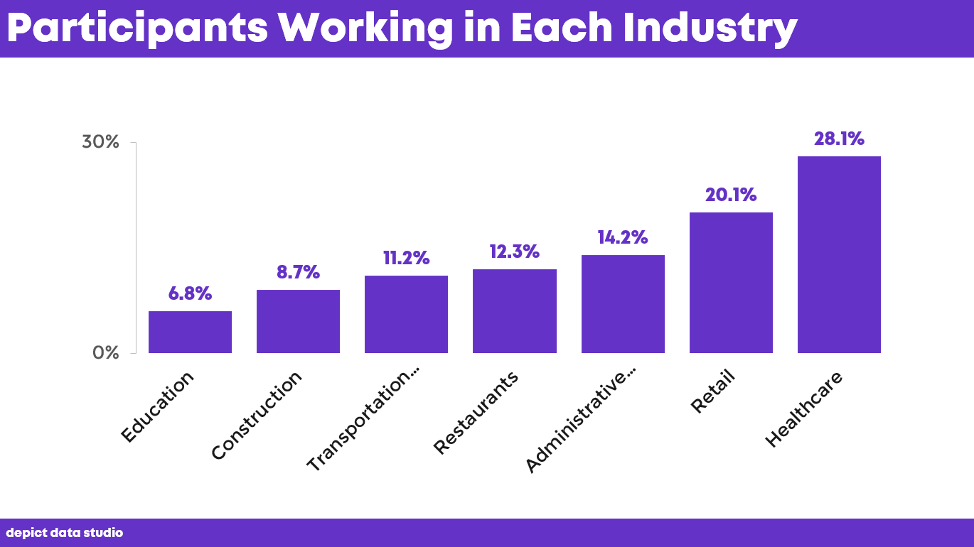
In the Good Tech Fest session, I asked the audience to describe what they saw going wrong.
Here’s what they came up with:
- Diagonal text
- Decimals
- Change from a column chart into a bar chart
- Add a takeaway title
- Reverse the order
- Color coding
Within three minutes, we made quick edits that made a big difference.
Rotate the Chart
The first thing we did was rotate it from a column chart to a bar chart.
(We wanted all the text to be horizontal.)
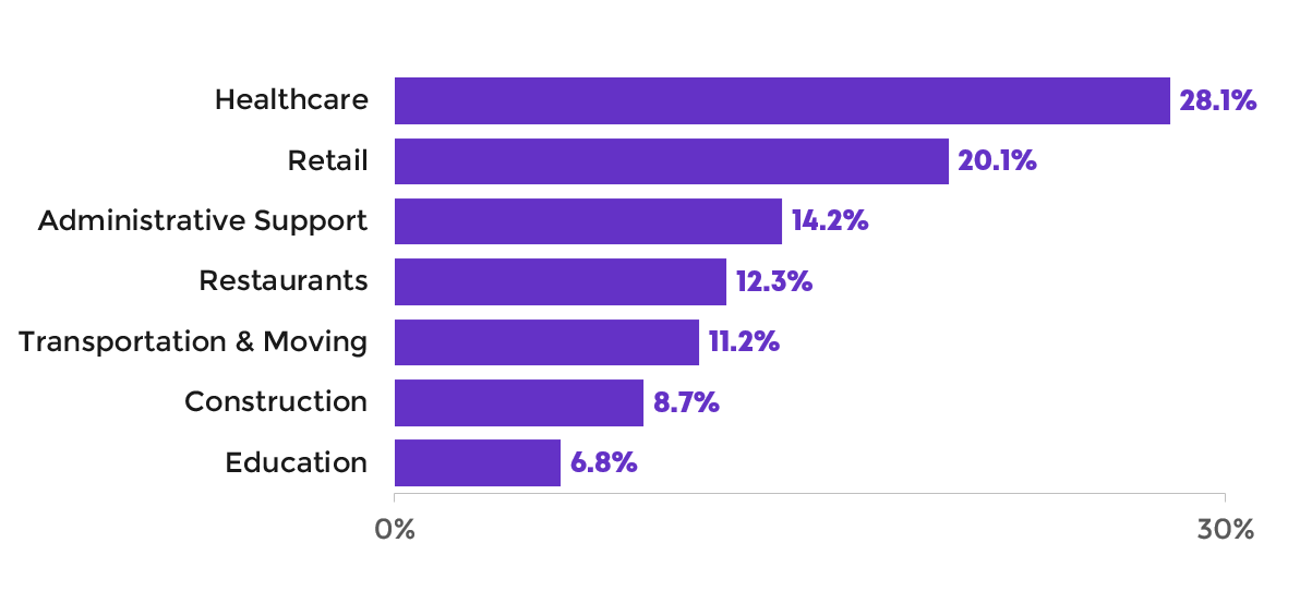
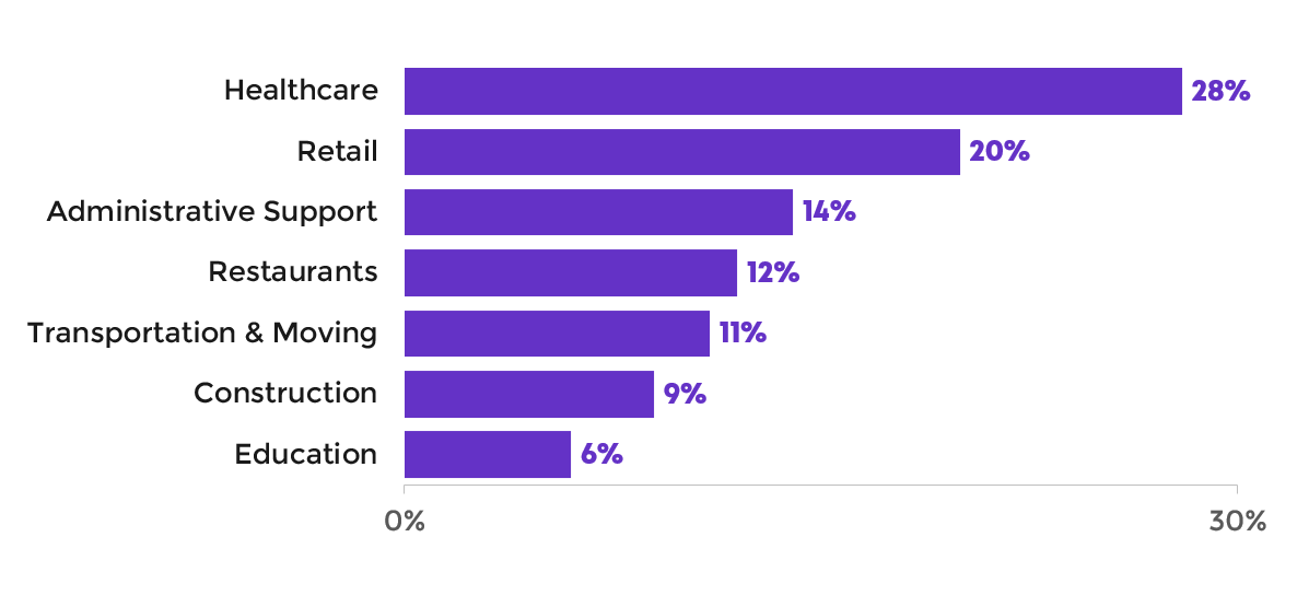
Round Decimals to Whole Numbers
Our next edit was to round the decimals to the nearest whole numbers.
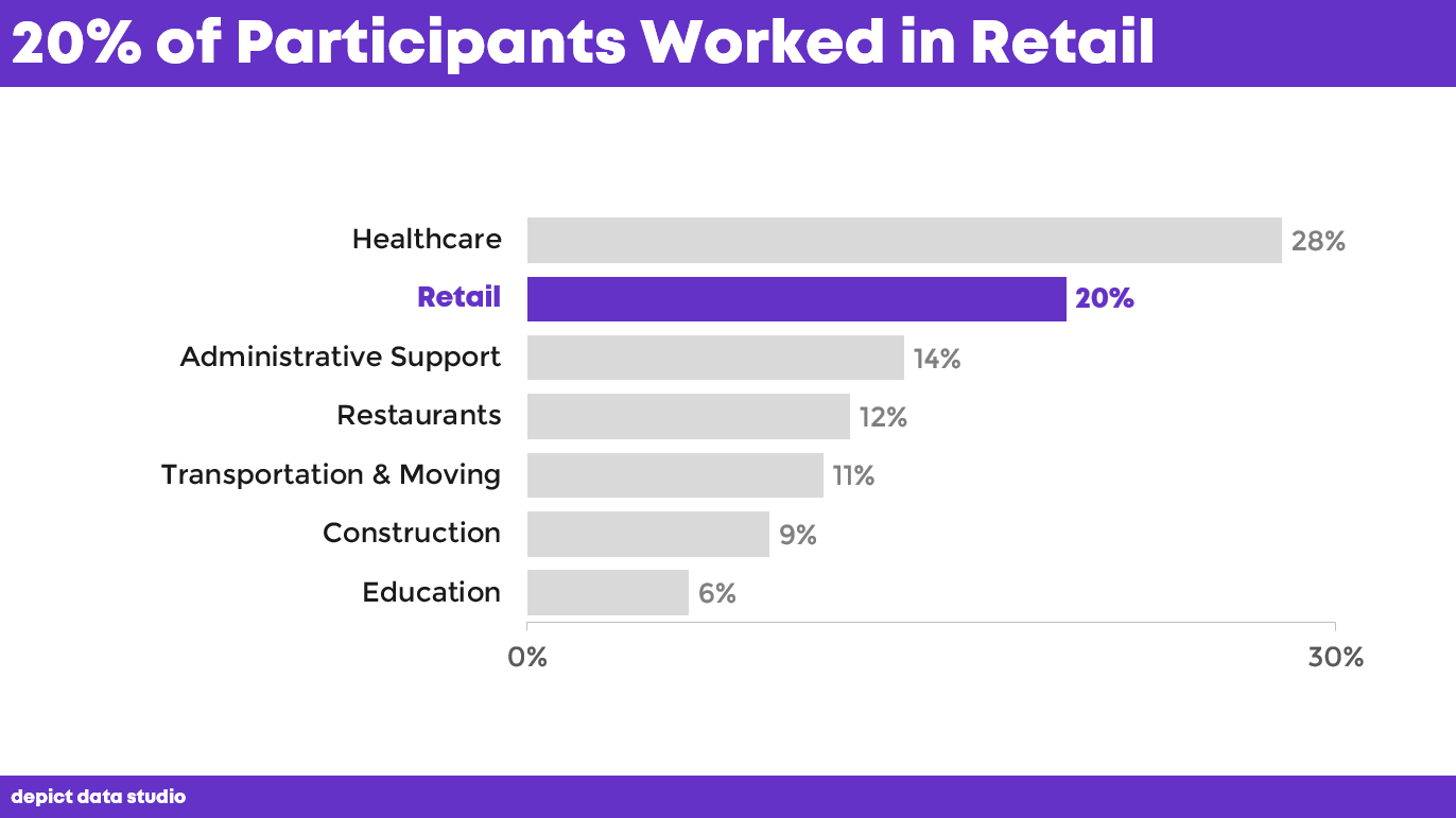
Add a Takeaway Title and Dark-Light Contrast
Next, we added a takeaway title.
Instead of “Participants Working in Each Industry,” we now have “20% of Participants Worked in Retail.”
Then, we highlighted the retail data. We changed that bar to a darker color and grayed out everything else. Dark-light contrast is an easy and effective data storytelling technique.
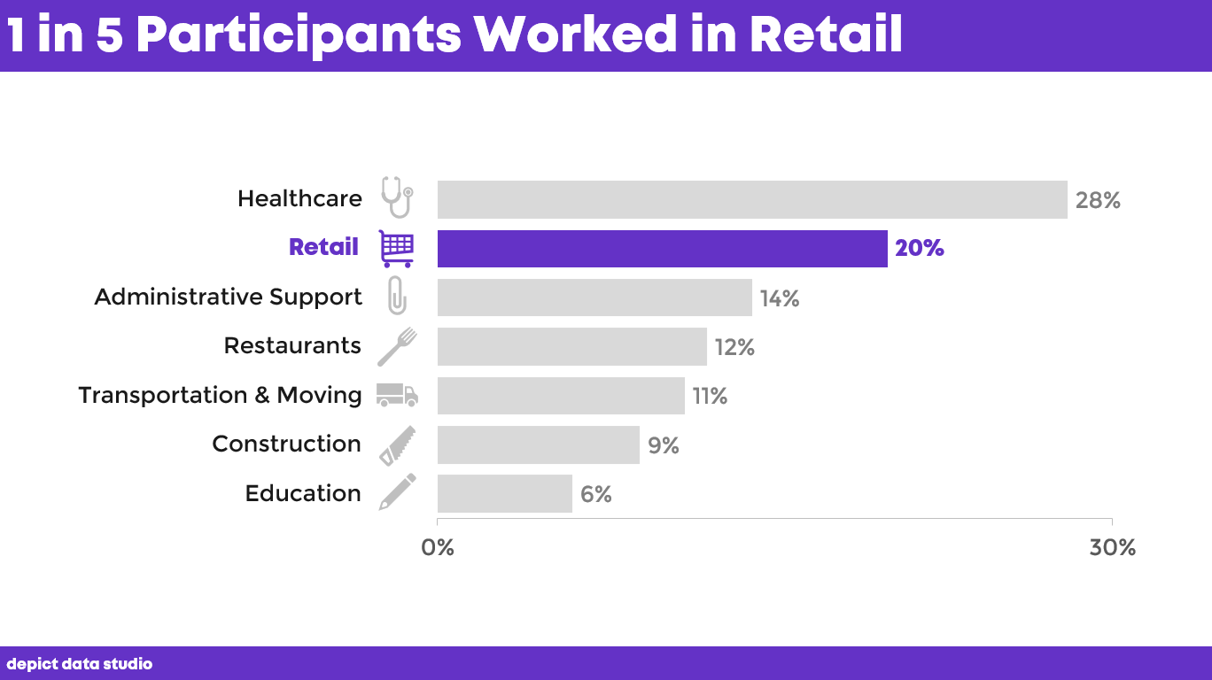
Add Fractions within a Sentence and Icons
We changed the percentage to a fraction in a sentence.
Then, we added icons, which makes our data more memorable.
Accessibility doesn’t have to take all day.
Accessibility doesn’t have to cost anything.
Accessibility doesn’t have to be complicated.
With a few quick edits, we’ve made this chart faster to read; we lowered the numeracy; we lowered the reading levels; and we made it more memorable.
Download the eBook
Want to learn more about accessible data visualization?
In this ebook, you’ll learn 10 quick wins for designing accessible data visualizations. These small edits can have a big impact for our coworkers, board members, and funders who have color vision deficiencies, hearing loss, or learning disabilities–and for all of us who are pressed for time.
For your complimentary copy, use code: goodtechfest