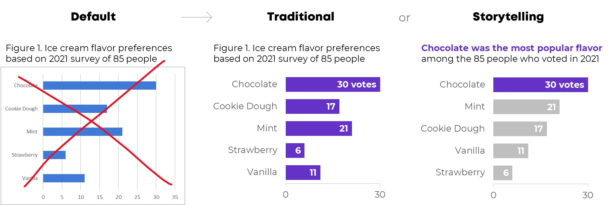
Bar charts aren’t evil. But they’re overused.
Ready to escape the bar chart? I talked about Designs to Start Using Instead at the DataScienceGO conference in April 2021.
Watch the Conference Session
Choose Your Own Adventure
This was a Choose Your Own Adventure presentation, where I gave the conference attendees a chance to vote for the chart families they wanted to learn about.
These non-linear presentations aren’t for everyone. You need to be extremely comfortable with the topic area and with presenting. You can learn more about Choose Your Own Adventure presentations here.
Exploratory Data Visualization
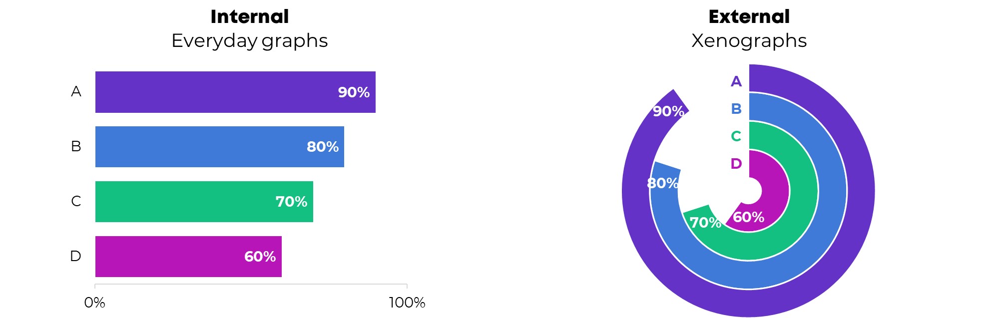
First, we talked about my three favorite techniques for exploratory data visualization:
- Spark lines
- Data Bars
- Heat Tables
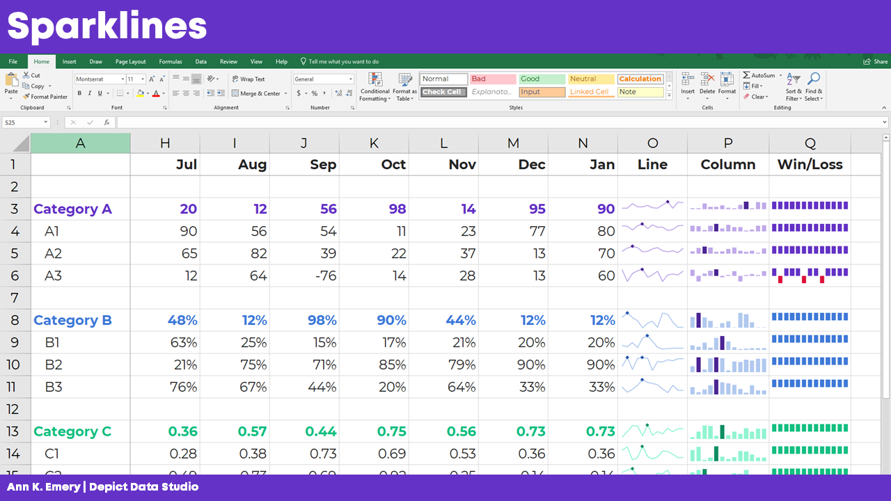
Spark Lines
Want to add miniature trend lines to your spreadsheet? Here’s how:
- Highlight the top row of your dataset (the numbers that you want to visualize).
- Go to the Insert tab.
- Click on the Sparklines button.
- Follow the instructions: Choose where you want the sparklines to be placed. I usually position them off to the right side of my dataset.
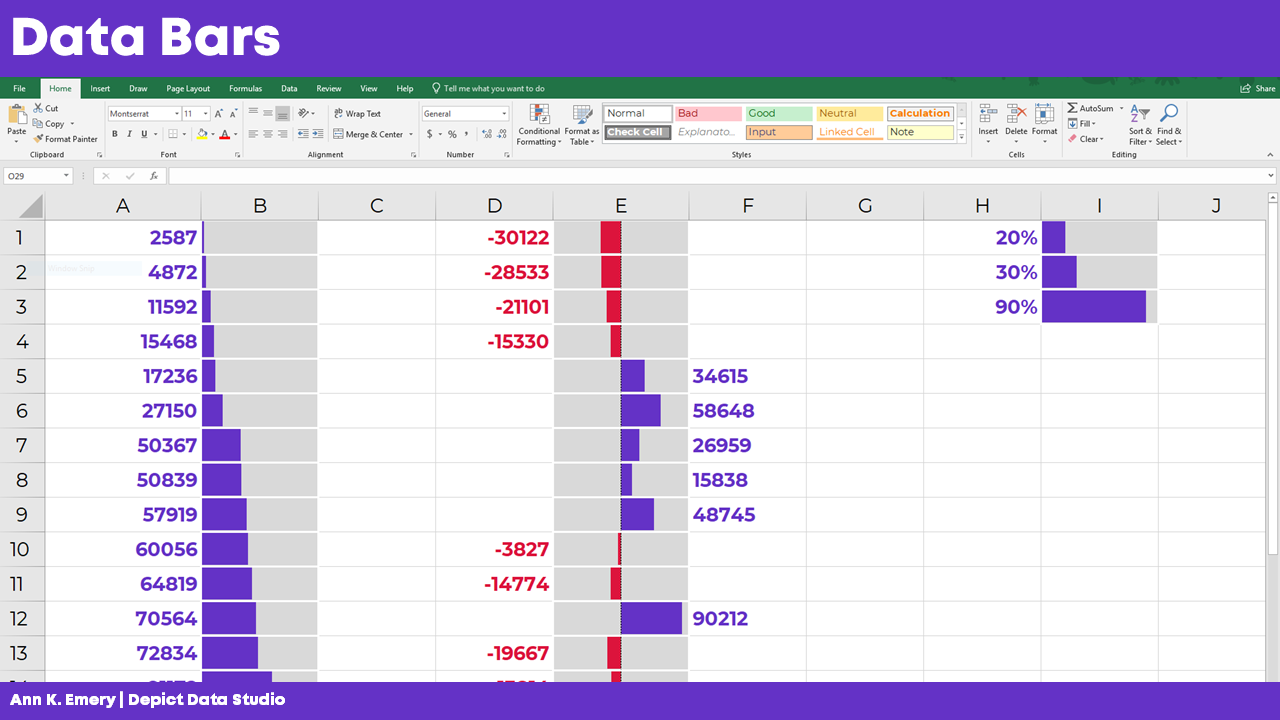
Data Bars
Want to explore your dataset with miniature horizontal bars? Here’s how:
- Highlight the data you want to visualize.
- Stay on the Home tab.
- Click on the Conditional Formatting button.
- Choose a solid-filled Data Bar.
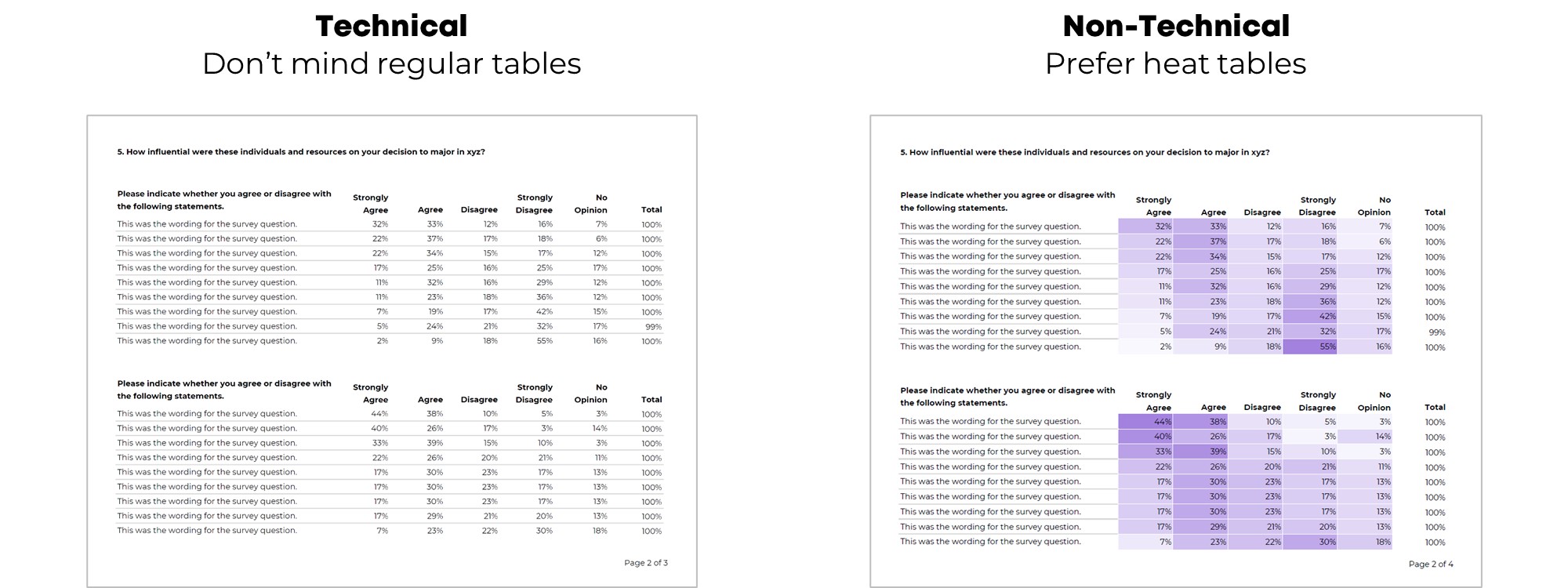
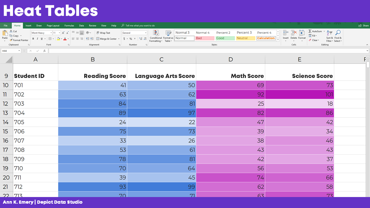
Heat Tables
We can also explore our dataset with instant color-coding. Here’s how to add a heat map or heat table to your spreadsheet:
- Highlight the data you want to visualize.
- Stay on the Home tab.
- Click on the Conditional Formatting button.
- Choose a Color Scale.
PLEASE avoid the inaccessible options—anything with red and green. Most of the Conditional Formatting options are absolute garbage, to be honest. Here’s a blog post that lists which Conditional Formatting options to avoid altogether—and what to use instead.
Want more info? In the video, you’ll see me open Excel and provide how-to tutorials.
Maps
Next, we discussed a few options for maps.
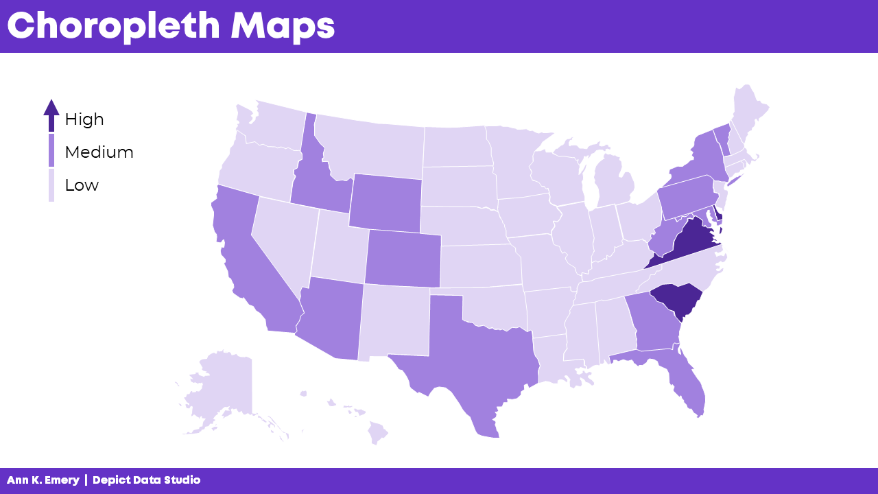
Choropleth Maps
You’ve seen this one: The regular ol’ color-coded map, or choropleth. Big numbers are dark. These maps are familiar and intuitive.
But, there’s a problem with regular maps: The large places can dwarf the small places. No matter how dark we color-in tiny Delaware, for example, the larger places like Texas and Alaska will always steal the show.
Cartographers have a name for this misleading issue with regular maps. It’s called The Alaska Effect.
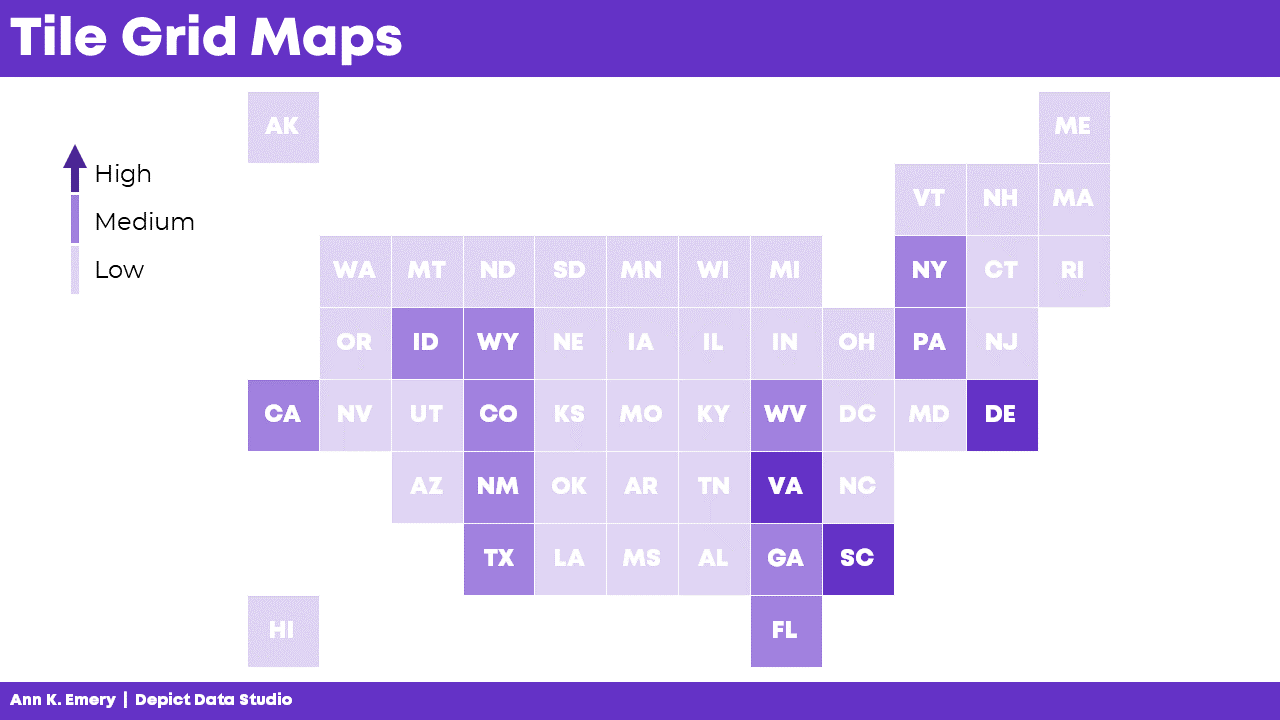
Tile Grid Maps
Don’t worry, we’re not doomed by The Alaska Effect! There are a couple alternatives worth mentioning.
Square tile grid maps can help us overcome The Alaska Effect. Every location is the same shape and size, so now our audience only has to look at color. In other words, since Delaware and Texas are the same shape and size, we’re free to focus entirely on color.
BUT.
There’s a learning curve with tile grid maps. They’re almost too novel. Sometimes we spend more time focusing on why our home state isn’t in the right spot than on actually finding patterns in the data.
Tile grid maps have become more and more common over the years. In the video, I show you some real-life examples from the Urban Institute, the Washington Post, Child Trends, CNN, and National Geographic.
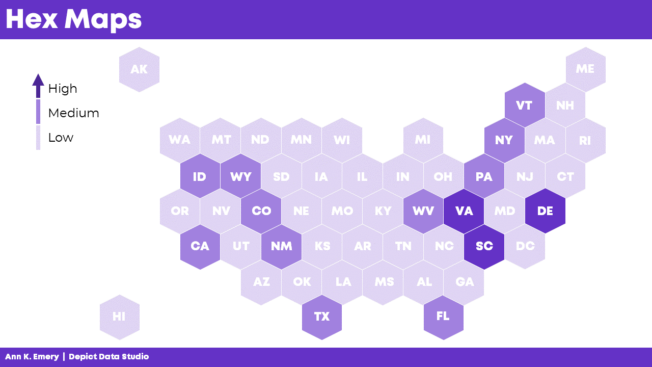
Hex Maps
Rather than using squares…. What if we try hexagons?
With six edges, hex maps give us more flexibility in arranging the shapes. That way, the maps can look closer to real-life maps.
In the video, I discuss some additional advantage of hex maps:
- Hex maps combat the Alaska Effect.
- Hex maps include more of the correct neighboring states compared to square maps.
- Hex maps include the correct southern tips.
- Hex maps include more notches for the Great Lakes.
- Hex maps visualize the correct four corners of the U.S.
And of course, hex maps aren’t just for the United States. You can create maps for zip codes, Census tracts, states, provinces, countries, etc. In the video, I show you a waffle map of African countries.
Learn More
You can download the 2-page Chart Chooser at https://depictdatastudio.com/chartchooser/. Use code DataScienceGO for a complimentary download.