• Skip to main content
  • Skip to footer
  • Home

The May 13 Group

the next day for evaluation

  • Get Involved
  • Our Work
  • About Us
You are here: Home / Archives for allblogs / depictdatastudio

depictdatastudio

Apr 13 2021

How to Visualize Qualitative Data with Colored Phrases

Wondering how to visualize your qualitative data? Maybe you’ve got open-ended survey responses, focus group notes, or speech transcripts. Qualitative data visualization can bring our words and phrases to life.

My friend Jon Schwabish from PolicyViz asked me to partner on his One Chart at a Time project, in which we’re helping you get better-acquainted with common and not-so-common chart types.

I created a tutorial on using colored phrases to visualize qualitative data. In this tutorial, you’ll learn:

  • The first time I ever used colored phrases to visualize qualitative data;
  • My favorite examples of colored phrases; and
  • Practical tips for using colored phrases in your project.

Watch the Tutorial

The First Time I Used Colored Phrases in Data Visualization

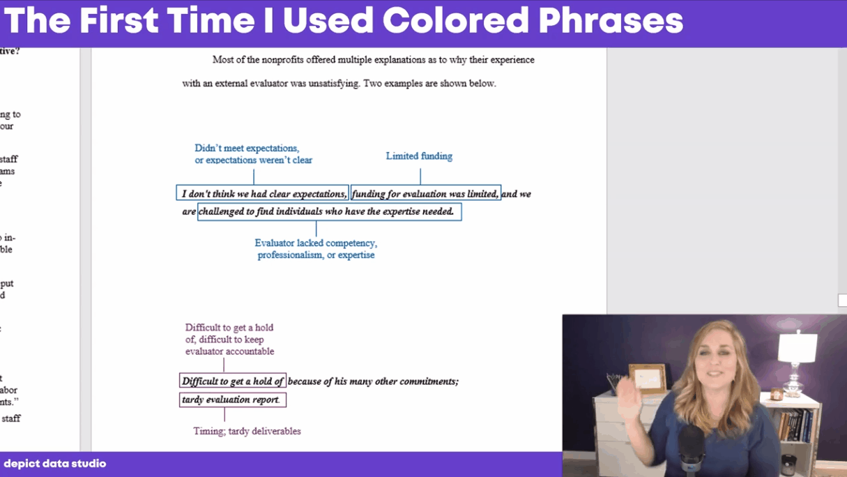
In the first part of the video, you’ll see the first time I used colored phrases.

I was coding open-ended survey data during my Master’s thesis, and needed to visualize different themes that I was finding in the data.

Inside good ol’ Word, I added colored rectangles around key phrases.

The outcome wasn’t perfect, but it was better than regular text.

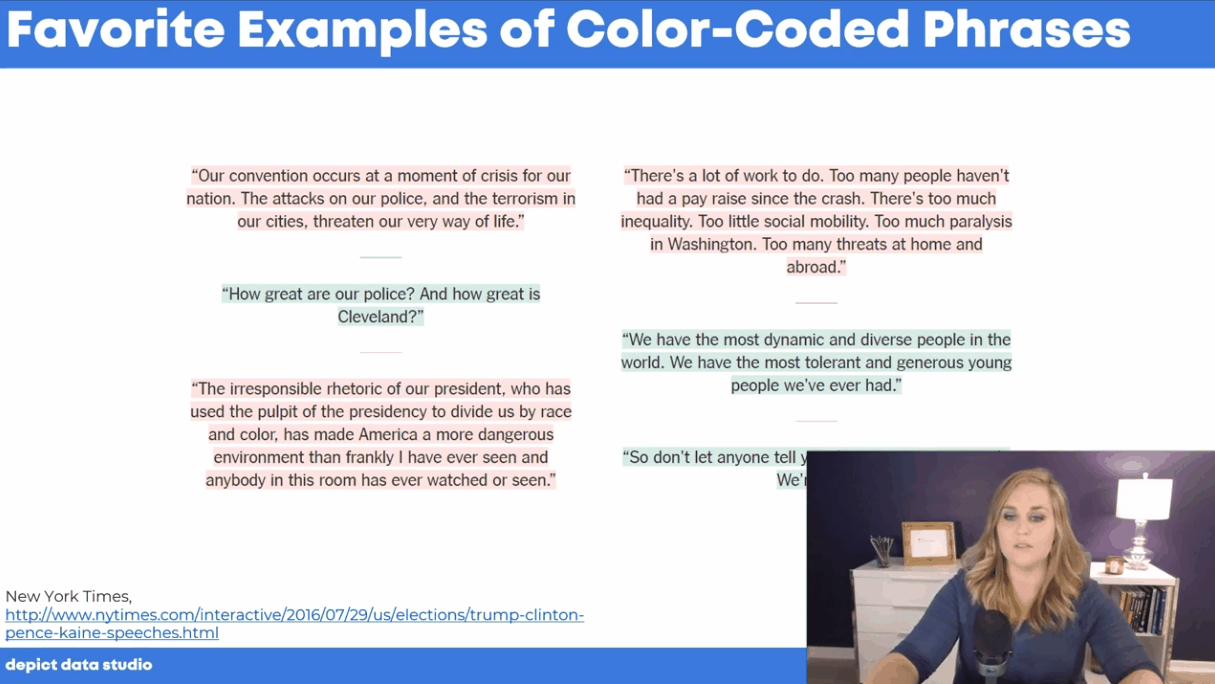
My Favorite Examples of Colored Phrases

In the second part of the video, you’ll see my favorite examples of colored phrases:

  • ‘Stronger Together’ and ‘I Am Your Voice’—How the Nominees’ Convention Speeches Compare by the New York Times
  • Did Michael Brown Charge? Eyewitnesses Paint a Muddled Picture by the Washington Post
In the second part of the video, you’ll see my favorite examples of colored phrases.

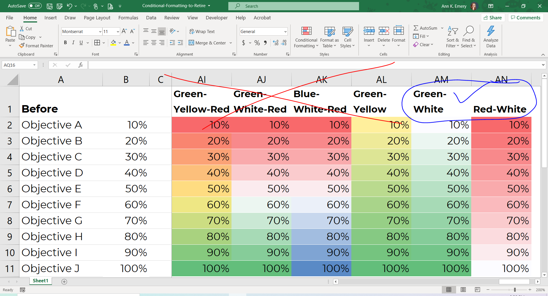
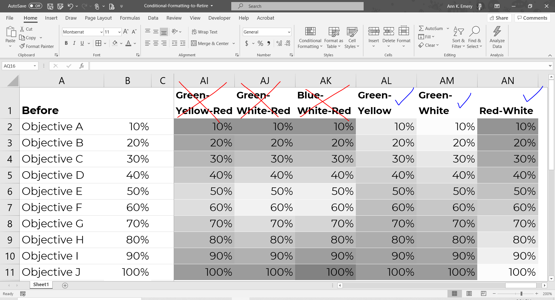
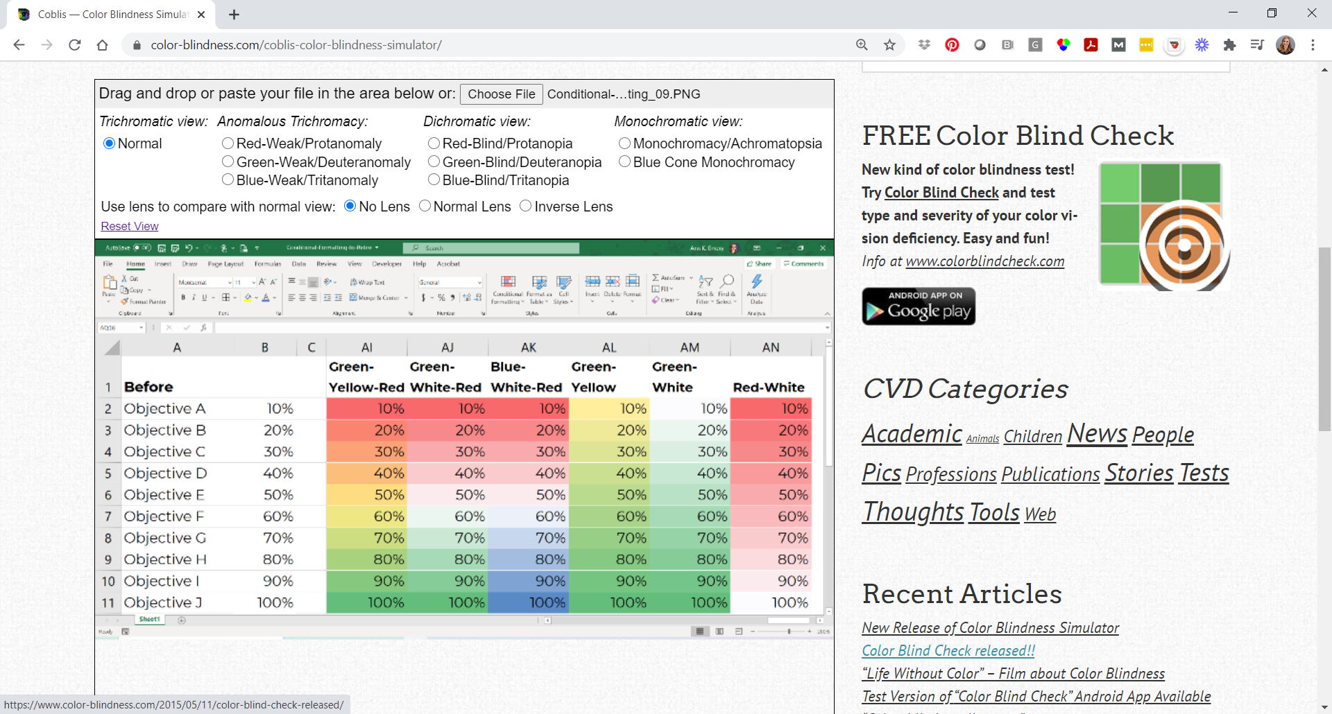
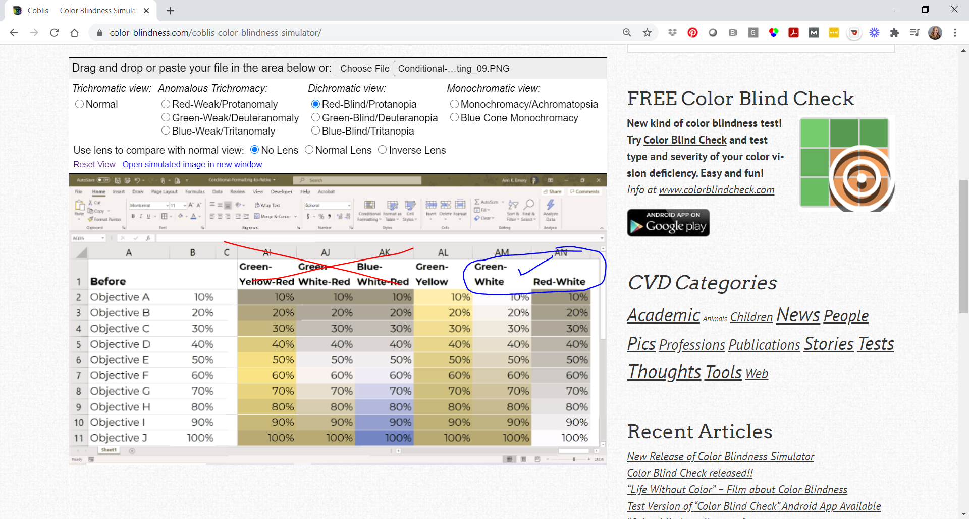
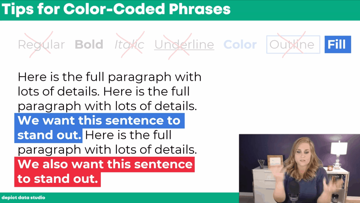
Practical Tips for Using Colored Phrases

In the final section of the video, you’ll learn practical tips for using colored phrases to visualize qualitative data.

We’ll go through seven options:

  1. Regular text
  2. Bold
  3. Italic
  4. Underline
  5. Color
  6. Outline
  7. Fill

You’ll learn the pros and cons of each approach, and see why I suggest using bold, colored, or filled text instead of the other options.

In the final section of the video, you’ll learn practical tips for using colored phrases to visualize qualitative data. You’ll learn the pros and cons of each approach, and see why I suggest using bold, colored, or filled text instead of the other options.

Your Turn

Let me know when you’ve applied colored phrases to your own project!

Written by cplysy · Categorized: depictdatastudio

Apr 06 2021

How to Pass the Excel Certification Exam

Want to pass the Excel certification exam?

Maybe you want proof that you can rock Excel for your resume? For your LinkedIn profile?

Do you want a confidence boost that, yes, you know Excel?

Do you want your boss to feel confidence that, yes, you know Excel?

Back in January, I’d just gotten home from my third hospital stay. Pneumonia while pregnant. 0 of 5 stars. Do not recommend.

My lungs were still on fire… but my brain was fired up and ready to go. I’d been laying in bed for weeks, and I was itching to get back to regular life.

On a whim, I registered for the Excel certification exam. I’d always been curious to see whether I could pass.

Spoiler alert: I passed!

In this blog post, I’ll share behind-the-scenes tips for registering for and pacing the MOS-200 exam.

How to Pass the Excel Certification Exam

Here are 10 steps for passing the Excel certification exam.

1. Choose the Exam You Want to Take

Head over to Microsoft’s website.

There are DOZENS of Microsoft exams available. Some focus on Word, Excel, PowerPoint, etc.

Levels

There are also different levels of exams. For example, some cover intermediate skills while others are labeled as “expert.”

I took MO-200, which is described as an intermediate-level exam.

Next, I might take the expert-level Excel exam. But, it covers formulas that I’ve never needed to use in real-life, so might not be relevant enough to be worth my time? I might also try the PowerPoint and Word exams later this year (?).

Certifications

You can also take several exams that add up to a certification. For example, if you pass the MO-100 (Word), MO-200 (Excel), MO-300 (PowerPoint) and MO-400 (Outlook), then you’ll be a certified Microsoft Office Specialist. I have zero use for Outlook skills so I doubt that I’ll bother with this particular certification.

2. See Which Skills are Covered

You can see which skills are covered. We’ll discuss these skills more in a moment.

3. Choose a Test Site

Choose a test site at https://www.certiport.com/locator.

I looked for test sites around Orlando, and when I contacted them, they said all the exams were now online (due to COVID).

4. Schedule the Exam

Schedule the exam for a particular day and time with an administrator from that test center.

Heads up: The online registration process kept glitching, so I had to call the test site over the phone.

5. Receive a Confirmation Email

Next, you’ll receive a confirmation email from the test center with your login link.

I registered over the phone and didn’t receive any confirmation emails at all, which was really stressful.

I had to follow-up with the test center twice and finally received an email confirmation at 5pm the day before my exam…

6. Create a Username and Password through Certiport

Before the exam, you’ll have to create a username and password at Certiport.com.

I was pleasantly surprised to learn that I still had a username and password from a decade ago, when I worked as a certification instructor.

I highly recommend setting up your username and password several days ahead of time in case you run into Certiport glitches.  

7. Purchase an Exam Voucher from Certiport

My MO-200 test was USD $100 as of January 2021.

You’ll also have the option to pay $120 in case you need to re-take the exam, and you can also purchase test manuals.

I didn’t purchase the $120 package to re-take the exam. Go big or go home is one of my life mottos. I know myself. If I have a safety net (the option to re-take the exam), I won’t give it my all the first time around. But, if paying $20 more for the option to re-take the exam gives you peace of mind, then go for it.

You receive two emails from Certiport:

  1. A receipt showing that you paid $100.
  2. A 16-digital voucher number. It took about 30 minutes to receive the second email with the voucher number, and I had to contact customer service to receive it. I *highly* recommend purchasing the voucher the day before in case there’s a delay.

8. Log In at Your Scheduled Exam Time

Log in at the correct day/time. Or, better yet, log in 10-20 minutes early.

My login link was in the confirmation email from the test center that I finally received the day beforehand.

A “proctor” from Pearson can see your screen. She helped me log in and start the exam.

There was also a “chat” feature available—through a “notepad,” actually—where she could help me log in.

9. Take the Exam

You’ll see two windows on your screen: a fictional Excel dataset at the top, with the instructions for the particular task underneath.

Time Limit: 50 Minutes

You’re given 50 minutes to complete the exam. I finished in 30 minutes, and spent literally half that time scribbling down notes about the registration process for this blog post.

You can probably finish even faster than me. I don’t anticipate that you’ll feel pressed for time.

Finish the 6 Projects

My test had 6 “projects.”

Each project is a fictional workbook with ~5 sheets. You’re given brief instructions for each fictional scenario, e.g., “You work for the ABC Company. You’re getting information ready for a meeting.”

Each of the ~5 sheets contains something different: an Excel Table, a chart, etc.

The data tables are relatively small, maybe 5 columns and 20 rows. You won’t see any intimidating datasets with thousands upon thousands of entries, phew!

Some of the columns were already filled in with data or formulas. Other columns were blank and you had to create new formulas to fill them in.

The topics are extremely generic and straightforward. You don’t need experience working with any of these topic areas, so don’t let the terminology intimidate you! For example, you might see questions about banking, but you don’t need to know anything at all about banking in order to understand the questions.

Finish the Tasks within Each Project

Each of the “projects” had ~7 tasks. Think of the tasks as exam questions. There were approximately 50 tasks, or questions, in total.

Skills Covered

Here are some blog posts about the skills that are covered on the exam:

  • Icon Sets (Yes, you’ll have to know how to add not-colorblind-friendly icons to your spreadsheet. Sigh.)
  • Auto-fill, adjusting column/row sizes, freezing
  • Sorting
  • Sparklines
  • If
  • Common formulas like average and sum
  • Number formatting

Skills I haven’t blogged about, but are covered extensively in my online courses:

  • Charts. On the exam, you’ll be asked to create and edit any and all aspects of charts.
  • Tables
  • Printing
  • Conditional Formatting

Skills not covered on my exam:

  • Pivot tables
  • Lookup formulas

Come Back to Tasks You Skipped

As you’re working through each task, you have three options:

  1. Mark the task as complete.
  2. Mark for review. What an excellent feature!!! This way, you don’t have to spend too much time on any particular question.You can come back and review these tasks later, time permitting. I needed to review 3 of the ~50 tasks.
  3. Leave a note for the test company (e.g., If you notice any errors in the exam). I didn’t leave any notes.

10. Receive Your Results

You can see your results immediately! I honestly expected to have to wait a while, and I was pleasantly surprised to receive instant results. So cool.

You need 700/1000 to pass. I scored 892/1000.

The scores are broken down by topic. I honestly have no idea which questions I missed; I assumed I got everything 100% correct as I was taking the exam. Apparently I don’t know much about tables, ha!

You can also login to Certiport.com and download a PDF’d certificate. The PDF is available within minutes of completing the exam.

Written by cplysy · Categorized: depictdatastudio

Mar 30 2021

How to Use Vlookup in Microsoft Excel: Two Step-by-Step Examples for Beginners

Vlookup is my all-time favorite function in Excel!

(Well, the entire lookup family—vlookup, hlookup, index-match, and xlookup.)

In this blog post, you’ll learn:

  • What vlookup is used for;
  • Why vlookup can be tricky; and
  • How to fill in the four pieces of the formula.

What Vlookup Is Used for in Excel

Vlookup helps us merge data from various tables, sheets, and files into a single table that we can use for our analyses.

Why Vlookup is Tricky for Novices

Sometimes Excel novices are hesitant to try vlookup because it requires that you fill in four different pieces of information.

Learning the Excel lingo here is truly like learning a new language. Stick with it and keep practicing, and you’ll be a fluent vlookup user in no time!

Here’s the information that we’ll need to complete: =vlookup(lookup_value,table_array,col_index_num,[range_lookup])

Let’s walk through each of the four segments of the vlookup function.

Our Fictional Scenario

I’ve got five people: Ann, Isaac, Tony, Keely, and Dan. I’ve also got two different tables of data: Favorite Color and Favorite Food.

Let’s pretend I want to create a single dataset that contains both the colors and the foods together.

In a perfect world, I’d be able to copy and paste the colors and foods together.

But in the real world, we’ve typically got different numbers of people in each of the original tables. For example, we’ve got information about Ann, Isaac, Tony, and Dan in our Favorite Color table, but we’ve only got information about Ann, Keely, and Isaac in our Favorite Food table, so a simple copy and paste isn’t possible.

Sure, with just five people, we could fill in this information by hand. But what if our dataset contains information about 50 people? Or 50,000 people? Copying and pasting could take all day, and we’d probably make a million mistakes along the way. Vlookup to the rescue!

How to Use =Vlookup() in Microsoft Excel

Here’s how to fill in each of the four pieces of the vlookup formula.

Step 1: Fill in the lookup_value

First, let’s fill in the lookup_value, which is the first piece of the vlookup function.

The lookup_value is the cell that contains the person’s name or ID number that we’re interested in. These names or ID numbers are the links that connect all the tables together.

The names or ID numbers must be located in the first column of each table–in the first column of your new combined dataset and in the first column of every single table from which you’re pulling data.

In this example, watch as I type =vlookup( into cell B8. Next, click on the cell that contains the name or ID number that you want to look up in one of your other tables. Then, insert a comma, which moves us on to the second section of the function.

So far, my function reads: =vlookup(A8,

In this example, watch as I type =vlookup( into cell B8. Next, click on the cell that contains the name or ID number that you want to look up in one of your other tables. Then, insert a comma, which moves us on to the second section of the function.

Step 2: Fill in the table_array

Second, we have to indicate the table_array.

The table array is the table or dataset from which we’re pulling data.

In this example, we want to get information from the Favorite Color table into our master table down below. The table_array for the Favorite Color table is A1:B5. In other words, that table begins in cell A1 and ends in cell B5.

My function reads: =vlookup(A8,A1:B5,

In this example, we want to get information from the Favorite Color table into our master table down below. The table_array for the Favorite Color table is A1:B5. In other words, that table begins in cell A1 and ends in cell B5.

Step 3: Fill in the col_index_num

Third, we have to indicate the col_index_num.

This column index number is the number of the column we care about. Just type in the number of the column you’re interested in.

For example, we want to know favorite colors, which are located in the second column of our Favorite Color table, so we type a 2 into the vlookup function. As usual, conclude with a comma to move on to the fourth and final segment of our function.

My function reads: =vlookup(A8,A1:B5,2,

For example, we want to know favorite colors, which are located in the second column of our Favorite Color table, so we type a 2 into the vlookup function. As usual, conclude with a comma to move on to the fourth and final segment of our function.

Step 4: Fill in the range_lookup

Fourth, we need to indicate the range_lookup..

We have to type the word true or false into the fourth and final section of our vlookup function.

A true will give us an approximate match and a false will give us the exact information we’re looking for. We obviously want precise information, so type false into the function and end with a closing parenthesis.

My completed function reads: =vlookup(A8,A1:B5,2,false)

We can see that Ann’s favorite color is blue.

Fourth, we need to indicate the range_lookup. We have to type the word true or false into the fourth and final section of our vlookup function.

A Second Vlookup Example

Let’s go through a second vlookup example to make sure the four pieces of the function make sense.

We’ll continue creating a master table that combines content from both the Favorite Color and Favorite Food tables into a single table.

First, in cell C8, type =vlookup(A8, to set the lookup_value as Ann.

First, in cell C8, type =vlookup(A8, to set the lookup_value as Ann.

Second, indicate the boundaries of the Favorite Food table that we want to pay attention to. My function now reads =vlookup(A8,D1:E4

Second, indicate the boundaries of the Favorite Food table that we want to pay attention to. My function now reads =vlookup(A8,D1:E4

Third, tell Excel which column of the Favorite Food table to focus on. The foods are listed in the second column of that mini-table, so enter a 2 into the vlookup function. My function says =vlookup(A8,D1:E4,2

Third, tell Excel which column of the Favorite Food table to focus on. The foods are listed in the second column of that mini-table, so enter a 2 into the vlookup function. My function says =vlookup(A8,D1:E4,2

Finally, type false into the function and close your parentheses. The completed function says =vlookup(A8,D1:E4,2,false) and tells us that Ann’s favorite food is pizza. 

Finally, type false into the function and close your parentheses. The completed function says =vlookup(A8,D1:E4,2,false) and tells us that Ann’s favorite food is pizza.

Vlookup takes time to sink in, so go easy on yourself if you don’t “get it” right away. I promise that the time-savings from vlookup are worth the learning curve.

Written by cplysy · Categorized: depictdatastudio

Mar 23 2021

10 Must-Have Analytical Skills

That beautiful chart is one of the last steps in the analytical process.

For most projects, it goes something like this:

  1. Planning. Figure out what data you need. You might get data requests from your boss. You might hold a months-long strategic planning process. You might participate in a program evaluation where the evaluator helps you brainstorm what your questions are and how to collect data to answer those questions.
  2. Collect the data. Design and administer surveys. Organize focus groups. Review public data sources (e.g., Census data).
  3. Analyze the data. Take raw, messy data from tons of different data sources and get it neat and tidy so it can feed into charts.
  4. Visualize the data and share the reports, one-pagers, dashboards, and slideshows with stakeholders.

Data analysis and data cleaning alone can take hours. Days. Weeks.

We’ve all got horror stories about data cleaning that took forever and ever and ever and ever. I often spend 10x more time cleaning data than creating charts.

Data analysis still takes time, but it doesn’t have to take forever.

Data analysis might not be your favorite part of the process. But it doesn’t have to be a headache, either.

In this blog post, we’ll cover 10 skills that can make your next data project easier, faster, and error-free.

10 Must-Have Analytical Skills

No matter the topic area. No matter the software program. Here are 10 must-have skills for cleaning and analyzing data.

Which skills are you already strong in? Which ones need to be developed? You can follow the links to additional tutorials.

Outliers

I recommend (1) checking every dataset for outliers, and then (2) deciding how you’re going to deal with them.

Humor me: Comment and let me know how you define the term “outlier.”

To some people, it generally means a really small or really large value.

To other people, it has a specific numeric meaning.

A million years ago, I worked on a longitudinal study in a university research lab. Here’s how the principal investigator of that study defined “outlier:”

An outlier is any value that falls more than three standard deviations outside the mean.

He taught us to calculate each variable’s mean and standard deviation. Then, we’d see which values were smaller than three standard deviations below the mean, and which values were larger than three standard deviations above the mean. Those were the outliers.

Next, we had to deal with outliers.

I’ve heard novices suggest that you should just delete outliers. NOOOOOOO. Deleting outliers will skew and affect the distribution of our dataset.

Here’s what the principal investigator taught us:

We should trim outliers—setting their value to be exactly three standard deviations above or below the mean.

For example, if three standard deviations above the mean is 150, and you’ve got an outlier of 160, you treat that 160 as 150 rather than deleting it.

This is a little jargony for a blog post, so if you’d like to learn more, let me know. I’ve got video resources in everyday language inside our Simple Spreadsheets course.

Duplicates

I’ve seen people identify duplicate ID numbers by scrolling through their dataset, squinting at the ID column, and hoping to spot the same ID number in there twice.

Eye-balling is fine with tiny datasets. But it’s impossible to scroll through hundreds, thousands, or tens of thousands of entries. It would take ALL DAY. And, we’d miss something.

Here’s how I like to identify duplicates:

  1. I use Microsoft Excel’s Conditional Formatting to make duplicate ID numbers pop out in bright red.
  2. Then, I re-sort my dataset so that the bright red numbers appear at the top. I go through the duplicate entries one at a time and try to figure out why those entries have appeared multiple times.

Or, I use the Remove Duplicates feature in Excel.

Or, you can even use pivot tables for data cleaning, like identifying duplicates. This blog post by Oz Du Soleil will get you started.

Missing Data

We need to check our dataset for missing data every single time.

This isn’t a once-in-a-while luxury.

This isn’t a if-I-remember-it optional step.

Checking for missing data is mandatory.

You might find patterns in your dataset: An entire row is empty. An entire column is empty. Find out why.

Let’s pretend you collected electronic surveys. You might see a mostly-empty column if your survey had a skip pattern, for example. Or, you might see a mostly-empty row if someone started the survey but didn’t finish answering all the questions. These patterns are normal and expected. The most important part is to understand all the nuances of why you might see missing data before you move on to any tabulations.

Or, you might not see a pattern in the dataset (like the image above).

This Swiss cheese pattern might mean that people skipped survey questions here and there, for example. That’s probably normal in your project. Again, the goal is to spot missing data and understand why it’s missing as early as possible in the project.

Measurement Scales

Nominal, ordinal, interval, and ratio. These are called measurement scales.

We need to understand whether each variable in our project is nominal, ordinal, interval, or ratio because that affects how we summarize that variable.

Let’s pretend you’re organizing a virtual conference, and you give attendees a survey when the event is over.

You might have a check-all-that-apply question where you ask people which part(s) of the conference they liked: the breakout sessions, and/or the keynote speaker, and/or the networking events. These categories are nominal data, which means we should be paying attention to frequencies—how many people checked the box for the breakout sessions, the keynote speaker, and the networking events.

This blog post gets you started with beginner-level formulas for numbers,like calculating the mean, median, mode, and standard deviation.

This blog post gets you started with pivot tables, which I find most helpful for categories.

Distributions

Being able to describe a dataset as left-skewed, right-skewed, or symmetrical is a must-have analytical skill.

We also need to understand how those distributions affect real-world decision making.

If academic test scores are left-skewed—now what?

If mental health assessments are right-skewed—now what?

Distributions also affect chart-choosing. For example:

  • We can use a traditional histogram to show the distribution.
  • We can use a unit chart or wheat plot to emphasize individual dots in the histogram.
  • We can use a population pyramid to compare two groups’ distributions, side by side.
  • We can use a swarm plot when the dots are overlapping and need to be jittered.

Recategorizing/Recoding Variables

You might need to recategorize or recode values if:

  • You have a list of zip codes but you really just care about the states.
  • You have a list of states but you really just care about the regions where those states are located.
  • You have a list of countries but you really just care about regions of the world.
  • You have a list of ages (0, 1, 2, 3, 4, 5, etc.) but you really just care about age ranges (0-9, 10-19, 20-29, etc.).
  • You have a list of schools but you really just care about which district the school is located within.
  • You have a list of test scores (40%, 55%, 70%) but you really just want to focus on students who passed or didn’t pass the exam.
  • You have a list of body mass indices (19, 24, 29, 32, etc.) but you want to categorize the raw numbers into underweight, normal weight, overweight, and obese.
  • You have a list of languages spoken but you really want to divide people into those who speak Mandarin and those who don’t.
  • You have a list of countries where people were born but you really just want to divide people into born in U.S. and not born in U.S.
  • … and so on.

This blog post gets you started with beginner-level categorizing using =if() and =vlookup().

Merging Datasets Together

Is your student demographic data living in one spreadsheet?

And your test scores are living in another spreadsheet?

But you want to see how demographic characteristics might be related to test scores? For example, do students living in one zip code score higher than students in another zip code?

We’ll need to combine those two spreadsheets together.

In Excel, you’ll need fluency in vlookup, hlookup, index-match, and xlookup.

This blog post gets you started with =vlookup().

Merging Variables Together

Sometimes, we need to merge entire datasets, tables, or spreadsheets together.

Other times, we need to merge individual variables together.

For example, if you have first names in one column, last names in another column, but you really want to see everything displayed in Last, First format.

Manual merging is a pain, and it’s destined for typos.

Instead, we can use use Excel’s =concatenate() formula or the & operator to merge variables.

Pulling Variables Apart

Sometimes we also need to pull variables apart, like when you’ve got Last, First but you really just want First. Or just Last.

In Excel, we can use formulas like left, right, or mid.

Excel’s text-to-columns is another game-changer.

This blog post gets you started with one of those techniques, =()left.

Exploratory Visualization

Why wait until we’re hours, days, or weeks into the analytical process before we see any charts??

Quick visuals help us scan the dataset for patterns early and often.

My favorite exploratory visualization techniques in Excel are:

  1. heat tables,
  2. data bars, and
  3. spark lines.

(NOT most of the Conditional Formatting options, ha! Here’s what not to do when it comes to exploratory visualization.)

Which Software Program Should I Use??

We can apply these analytical skills in any software program.

In college, I learned to use SPSS in my statistics and research methods courses.

After college, I worked in a university research lab, and we all used SAS.

After that, I worked in a consulting firm, and we all used Excel. I’ve linked to some Excel-specific resources throughout this blog post in case that’s your organization’s tool of choice, too.

Your Turn

Which must-have analytical skills would you add to this list? What types of techniques for transforming raw data into clean, tabulated data have been crucial in your own job?

I’ve linked to a few blog posts with how-to tips. Do you have additional how-to resources to share, like books, blog posts, or YouTube videos?

Written by cplysy · Categorized: depictdatastudio

Mar 04 2021

24 Conditional Formatting Visuals in Microsoft Excel that Should Be Retired

“You should go work at Microsoft and fix Excel’s terrible formatting.”

I can’t tell you how many times I’ve heard this from workshop participants.

Bill Gates, are you reading this??

Microsoft Excel is lonnnnng overdue for some updates.

Don’t get me wrong—it’s still my favorite program. With 750 million users worldwide, I won’t be switching to anything else. It’s used by every business professional I know for at least part of their workflow.

Earlier this week, I was invited to guest lecture at Baruch College. Thanks to Professor Mahmoud Kamal Ahmadi for inviting me!

I’m normally very zen about data visualization. I expected to bring that peace of mind to Professor Ahmadi’s students.

Here’s my calm before the storm selfie:

Ann K. Emery inside the Depict Data Studio world headquarters, before guest lecturing for Baruch College.
Inside the Depict Data Studio World Headquarters. Next to 5-year-old’s preschool classroom. 🙂

“Sure, some of Excel’s default formatting is hard to decipher. And isn’t accessible for people with disabilities,” I’ve said a million times. “But with some behind-the-scenes editing, we can still make powerful visualizations inside Excel.”

I’m getting tired of making excuses for Microsoft.

Shouldn’t they know better by now??

I started to teach the Baruch College students about exploratory data visualization with conditional formatting. I couldn’t help but rant about the bad formatting as I went. It was 8pm at night. My filter had disappeared; I couldn’t help it. Sorry not sorry, Microsoft.

Wait, What’s Conditional Formatting??

Conditional Formatting is a fancy way of saying “if-then visuals.”

If the number is above 50, then fill the cell with red.

If the number is below average, make the font bold.

On and on.

Conditional Formatting is Ann K. Emery’s favorite button in Excel (along with the pivot tables button). It’s hiding in plain sight on our Home tab.

How to Use Conditional Formatting in Microsoft Excel

Conditional Formatting lets us create near-instant visuals.

These visuals are helpful for both exploratory and explanatory purposes. Exploratory data visualization is for us, the spreadsheet users and graph-makers. These near-instant visuals help us uncover patterns. Explanatory data visualization is typically for others, like our supervisor, Board of Directors, or other stakeholder groups. These near-instant visuals can be shared with others inside of dashboards, scorecards, and one-pagers to explain key findings to our audiences.

Here’s how to use Conditional Formatting in Microsoft Excel:

  1. Highlight or select some of the values in your spreadsheet. You can use Conditional Formatting on numbers, percentages, currency, and even words.
  2. Go to the Home tab.
  3. Click on the Conditional Formatting button.
  4. Choose one of the options, like Highlight Cells Rules, Top/Bottom Rules, or Data Bars.
  5. Enjoy your near-instant visual!
  6. Edit edit edit. With the cells still selected, go back to the Conditional Formatting button. On the very bottom of the list, you’ll see an option for Manage Rules. This is a fancy way of saying edit. You can adjust most aspects of your visual: the colors, the cutoff values, more.

Conditional Formatting in Microsoft Excel that Should Be Retired ASAP

Conditional Formatting is mostly excellent.

I love the speed. I love the instant understanding I get by seeing my numbers come to life.

But I hate hate hate the ableism.

Some of the Conditional Formatting options are terrible for people with color vision deficiencies.

Others are terrible for grayscale printing. (When was the last time you got excited about paying for colored ink cartridges?)

Others are just terribly busy-looking and could easily be improved with Graphic Design 101 skills.

Here are 24 of Excel’s conditional formatting techniques that should be retired ASAP.

These visuals are:

  • too time-consuming to read,
  • not accessible, or
  • look like they’re from 1995.

3 Arrows (Colored)

Nice try, but so busy. I’ll show you something better in a moment.

3 Triangles

A bit easier to skim, but we can do better.

4 Arrows (Colored)

Why do the yellow arrows point in two different directions?

3 Arrows (Gray)

4 Arrows (Gray)

5 Arrows (Gray)

There’s nothing useful here. Don’t make me write three different sentences about why these three options are worthless.

3 Traffic Lights (Unrimmed)

I’m about to become really unpopular with 99% of people who make business dashboards, but….

We should really stop using traffic light color-coding altogether.

Green-red color combos aren’t accessible for people with color vision deficiencies (more on this later).

Sure, red-green combos are intuitive. For those of us who can see them. But they’re useless for everyone else.

3 Traffic Lights (Rimmed)

Let’s make the colors even smaller and harder to see.

Red to Black

These tones are confusing to me. Don’t we associate both red and black as “bad” colors? Why is red = high percentages? And black = low percentages? Sure, Excel lets us flip-flop these colors, but the question remains—aren’t red and black both “bad?”

4 Traffic Lights

Now, Excel is saying that black is even worse than red?? These inconsistencies kill me. And since when do traffic lights have 4 different colors? I’ve never seen a black lightbulb in a traffic light. So more for intuitive traffic light coding.

3 Signs

I want to love these. Although the 3 Signs design would technically pass 508 compliance accessibility guidelines (because our viewers aren’t relying on color alone—they can also see the different shapes) it’s still so busy.

There’s also the issue of combining both categorical coding (a diamond vs. triangle vs. circle) with diverging coding (red is worst, yellow is medium, green is best). Forgive the jargon, but as a research methods geek, this bothers me.

3 Symbols (Circled)

These tiny symbols would be impossible to skim at a glance in a tiny spreadsheet.

3 Flags

GAH. Probably the hardest to read from this bunch.

3 Symbols (Uncircled)

Maybe the easiest to skim from this bunch? But still a bit busy.

3 Stars

This design gets creativity points.

5 Quarters

These aren’t so bad to skim right now—because I’ve already organized the spreadsheet from lowest to highest. Imagine a mismatched list (e.g., 20%, then 80%, then 10%, then 50%….). It would get messy.

5 Boxes

There could be more contrast between the gray and blue, i.e., it would be easier to read if the gray was a bit lighter, or the blue a bit darker.

4 Ratings

I actually love bar and column charts for at-a-glance findings.

But, these would be easier to read if they were horizontal bar charts, not vertical column charts.

I’ll show you an example with horizontal bars in a moment.

5 Ratings

Same shortcomings here.

Data Bars (Gradient)

Speaking of bar and column charts… Do you see how much easier it is to compare bars than columns?

BUT, not these gradient bars. We need to retire these. The most important part of the bar chart is the right-most endpoint. So why does Microsoft fade these out to lighter colors… therefore making the most important thing harder to see???

Data Bars (Solid)

Winner winner chicken dinner! More of these, please.

Green-Yellow Red Color Scales

Yes, I know what you’re thinking. This stoplight coding is intuitive.

But only for those of us who can see red and green as distinct colors. For people with color vision deficiencies, this color scheme is worthless.

Let’s retire this ableist color scale from Excel.

Green-White-Red Color Scales

Not accessible. Ableist.

Blue-White-Red Color Scales

Better than the red-green color coding, since at least it’s legible for people with color vision deficiencies.

But, this wouldn’t print well in grayscale. More on this in a moment.

Green-Yellow Color Scale

Not horrible… but not as clear as it could be.

Green-White Color Scale

Winner winner chicken dinner! More of these, please.

Look at the green-yellow and green-white options next to each other.

Do you see how the green-white color scale is easier to read? The white is, well, whiter than the yellow. Therefore, there’s even more contrast when compared to the green.

This scale is colorblind-friendly and grayscale-friendly.

Red-White Color Scale

Winner winner chicken dinner! More of these, please.

This is the opposite tone of the green-white color scale.

In other words, use this color scale to emphasize that low = bad.

How about Grayscale Printing?

We should always assume that someone will print our visuals. That printing may happen in grayscale, not full color, to save money.

I did a quick grayscale test on these color scales to show you what they’d look like.

Do you see how the first three are worthless? The fourth one, green-yellow, is okay. The last two are the easiest to read.

(In Dataviz Jargon: Transform that diverging scale into a sequential scale. It’s harder to notice differences between two different hues, like red and blue, than to notice differences between gradations, like light green vs. dark green. And it’s impossible to read diverging scales in grayscale.)

How about Color Vision Deficiencies?

I also did a color-blindness check.

First, I uploaded a screenshot to the Color Vision Deficiency Simulator website.

Next, I investigated what the color scales would look like for someone with protanopia. Eek.

The first four are worthless.

Green-yellow is okay.

Green-white and red-white are best.

Well-Formatted Conditional Formatting in Microsoft Excel Worth Keeping

Keeping score? Here are the conditional formatting visuals we can keep using:

  • Green-White Color Scale
  • Red-White Color Scale
  • Data Bars

I’ll add another keeper to the list: Squares and circles made with the Webdings symbol font.

For example, we can use Webdings g’s and the rept() function to create an icon array, as shown above.

Or, we can use Webdings g’s and c’s to create a series of filled-unfilled squares.

Or, we can use Webdings n’s to create a series of light-dark circles.

It’s faster to skim a list of filled-unfilled squares, or light-dark circles, than to skim the stars, flags, or mini column charts shown earlier.

How to Add Conditional Formatting to Your Microsoft Excel Spreadsheet

Want to create conditional formatting to explore initial patterns in your spreadsheet? Here are links to detailed tutorials:

  • How to Create Data Bars in Microsoft Excel
  • How to Make a Heat Table in Microsoft Excel
  • More examples of easy-to-skim symbols and icons made with symbol fonts (Webdings and Wingdings)
  • Webdings example: Re-envisioning a University’s Monthly Report: Two Reports with Two Different Purposes      
  • Webdings example: Visualizing Your Annual Survey Results: Four Makeovers That Didn’t Work, and the Fifth That Did

Your Turn

What are some additional features of Excel that should be retired? Or added?

Written by cplysy · Categorized: depictdatastudio

  • « Go to Previous Page
  • Go to page 1
  • Interim pages omitted …
  • Go to page 28
  • Go to page 29
  • Go to page 30
  • Go to page 31
  • Go to page 32
  • Interim pages omitted …
  • Go to page 37
  • Go to Next Page »

Footer

Follow our Work

The easiest way to stay connected to our work is to join our newsletter. You’ll get updates on projects, learn about new events, and hear stories from those evaluators whom the field continues to actively exclude and erase.

Get Updates

Want to take further action or join a pod? Click here to learn more.

Copyright © 2026 · The May 13 Group · Log in

en English
af Afrikaanssq Shqipam አማርኛar العربيةhy Հայերենaz Azərbaycan dilieu Euskarabe Беларуская моваbn বাংলাbs Bosanskibg Българскиca Catalàceb Cebuanony Chichewazh-CN 简体中文zh-TW 繁體中文co Corsuhr Hrvatskics Čeština‎da Dansknl Nederlandsen Englisheo Esperantoet Eestitl Filipinofi Suomifr Françaisfy Fryskgl Galegoka ქართულიde Deutschel Ελληνικάgu ગુજરાતીht Kreyol ayisyenha Harshen Hausahaw Ōlelo Hawaiʻiiw עִבְרִיתhi हिन्दीhmn Hmonghu Magyaris Íslenskaig Igboid Bahasa Indonesiaga Gaeilgeit Italianoja 日本語jw Basa Jawakn ಕನ್ನಡkk Қазақ тіліkm ភាសាខ្មែរko 한국어ku كوردی‎ky Кыргызчаlo ພາສາລາວla Latinlv Latviešu valodalt Lietuvių kalbalb Lëtzebuergeschmk Македонски јазикmg Malagasyms Bahasa Melayuml മലയാളംmt Maltesemi Te Reo Māorimr मराठीmn Монголmy ဗမာစာne नेपालीno Norsk bokmålps پښتوfa فارسیpl Polskipt Portuguêspa ਪੰਜਾਬੀro Românăru Русскийsm Samoangd Gàidhligsr Српски језикst Sesothosn Shonasd سنڌيsi සිංහලsk Slovenčinasl Slovenščinaso Afsoomaalies Españolsu Basa Sundasw Kiswahilisv Svenskatg Тоҷикӣta தமிழ்te తెలుగుth ไทยtr Türkçeuk Українськаur اردوuz O‘zbekchavi Tiếng Việtcy Cymraegxh isiXhosayi יידישyo Yorùbázu Zulu