• Skip to main content
  • Skip to footer
  • Home

The May 13 Group

the next day for evaluation

  • Get Involved
  • Our Work
  • About Us
You are here: Home / Archives for allblogs / depictdatastudio

depictdatastudio

Sep 28 2021

Navigating Tableau’s Resources with Zach Bowders

Zach Bowders was a guest speaker during a Dashboard Design live session, which is an opportunity for Depict Data Studio students to come together to learn from experts, get extra training, and ask questions.  

Zach is a Tableau Zen Master and Tableau Ambassador and shared his expertise with us on all things Tableau.  

Watch the Conversation 

About Zach Bowders 

Zach works at JLL, where he’s an external facing consultant who works with countries around the world. Zach is also the creator of the Data + Love podcast and is a Tableau Zen Master and Tableau Ambassador.  

According to Zach, a Tableau Ambassador is a person handpicked by Tableau who’s a super fan that helps promote the brand along with other people’s work while a Tableau Zen Master is a person who showcases the best of Tableau software. Zach has an extensive Tableau portfolio and is one of only 43 in the world (!).  

In his previous career, Zach worked for 13 years at St. Jude Children’s Research Hospital working on the fundraising/giving side. He started in the IT department but then moved into the analytics department where he got his start with Tableau.  

Zach’s Tips on Using Tableau 

First, we talked about Zach’s tips for using Tableau, like sharing visualizations on Tableau Public, his favorite features, features he thinks should be retired, and features he thinks should be added. He also shared some favorite resources and took audience questions.  

Sharing Visualizations in the Tableau Public Gallery 

Zach has over 165 visualizations on the Tableau Public Gallery that he’s created in the past three and a half years.  

Zach Bowders has over 165 visualizations on the Tableau Public Gallery that he’s created in the past three and a half years.  

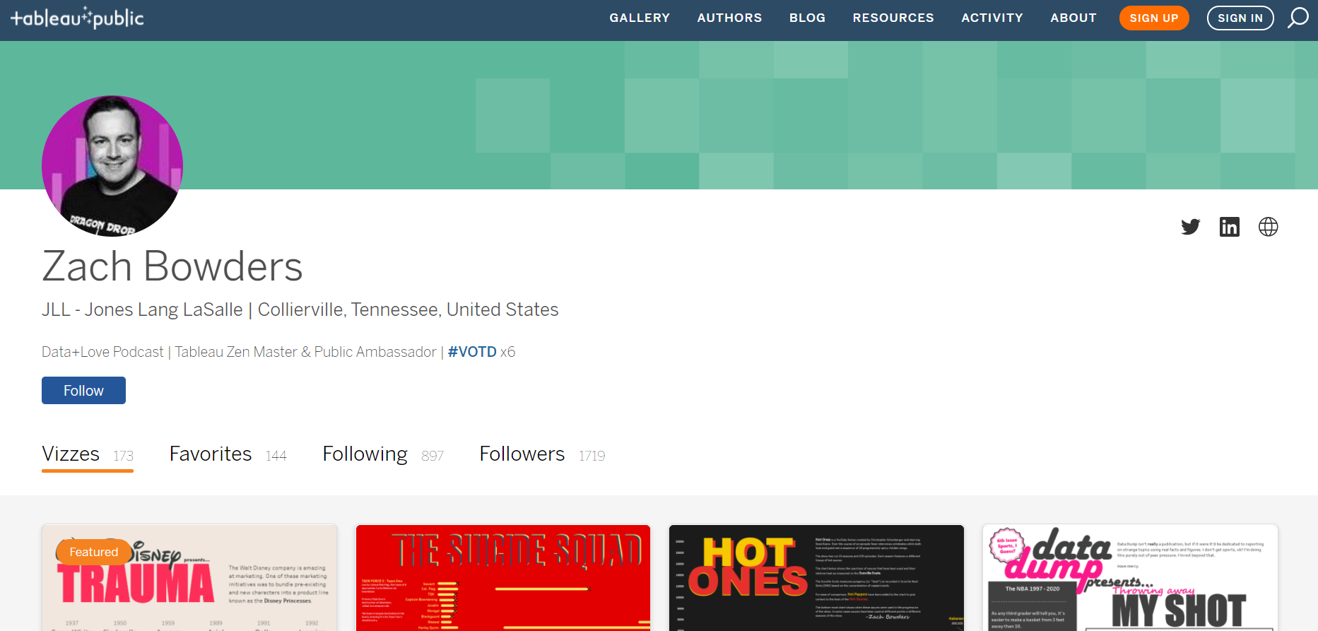
Tableau Public is free and Zach says it’s a fun way to share passion projects as well as to get ideas for other projects (personal or business). He said that since so many share projects and make them downloadable, it’s very easy to figure out how they made it and replicate it for another use.  

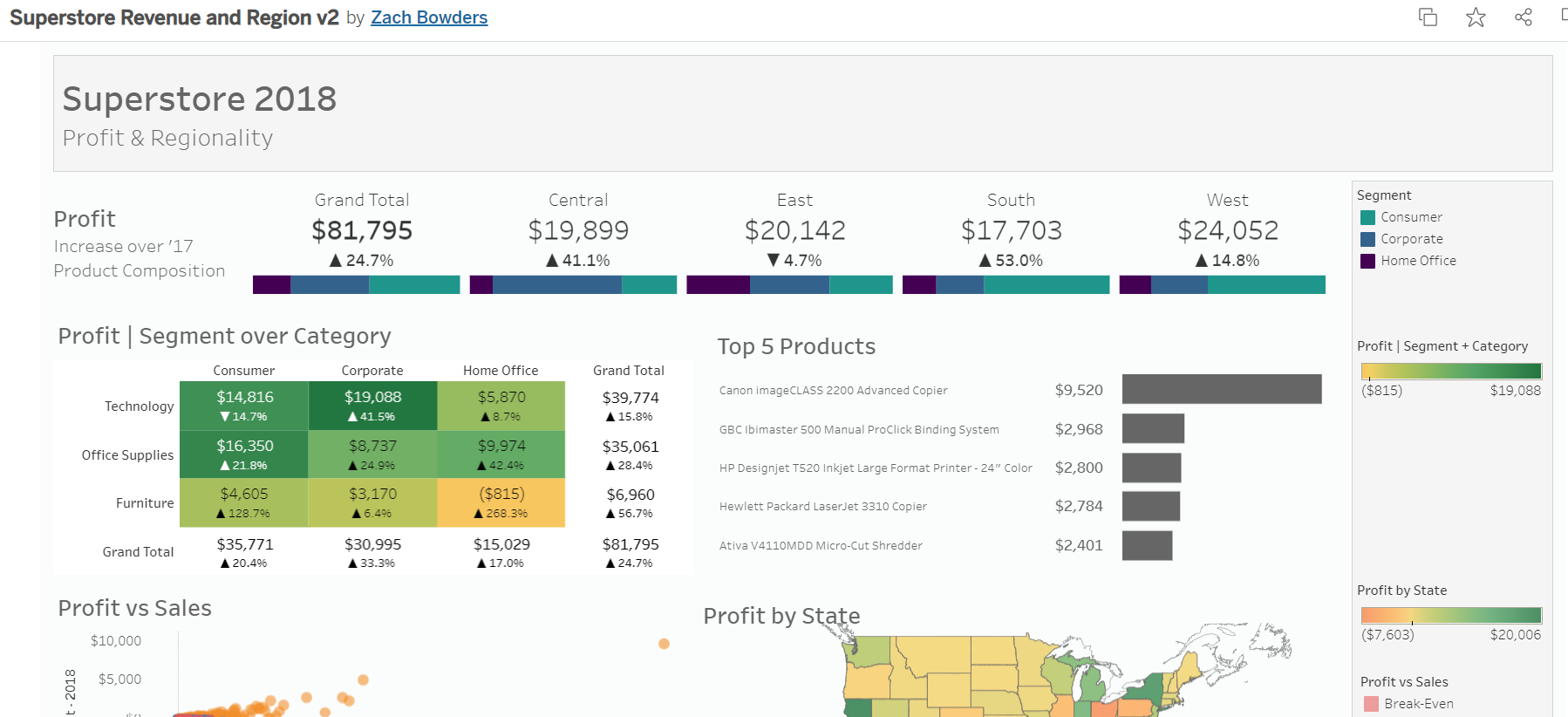
Zach’s favorite visualization he’s made is about the movie Inception because it doesn’t look like it came from a data software.  

Zach Bowders' favorite visualization he’s made is about the movie Inception because it doesn’t look like it came from a data software.  

Another favorite is one he created while applying for his job with JLL where he needed to prove how well he knew Tableau. He said, “Having a public portfolio… is very useful for sort of moving ahead in your career.”  

Zach Bowders also created a Tableau visualization while applying for his job with JLL where he needed to prove how well he knew Tableau.

He also noted that none of his visualizations in his public profile were work related, meaning he wasn’t accidentally sharing confidential data or work. He also said that having older stuff in your portfolio that “didn’t age well” shows your growth.  

Favorite Features of Tableau 

Zach said his favorite feature is the drag and drop interface of Tableau. He said that there are a lot of predefined charts that you can quickly create, even if you don’t know all of the rules.  

“I use it as a data exploration tool,” he said. “Sometimes you have a big dataset and you want to know more about it before you make something out of it. It’s very easy to rapidly create exploratory charts to better understand it so then you can make the charts that matter most.” 

Features That Could Be Retired 

Zach said that some of the spacing features in Tableau can take some getting used and that the fields that control where lines and axes can appear on different charts are difficult.  

He said that, “when you’re a newer user, understanding where to find those controls and which ones do what can feel kind of arduous.  So, it’s something you kind of pick up from a little bit of practice or alternatively by popping open someone else’s example and seeing which sort of controls they applied to make things look a certain way.”  

Features That Should Be Added 

“I have lot of things that I’d like,” Zach said. “Copy and paste- it’s not easy to copy and paste a text box or something that you make. If you copy and paste a chart, sometimes if you do it incorrectly, you’ll also apply the same filters from the thing you made. So, the filters now effect both charts instead of each version of it.” 

He also said text options in Tableau are limited to whatever is available on your server, instead of really having all the options that are listed out. He also hopes for some more design features in the future that are more modern.  

Getting Involved with the Tableau Community 

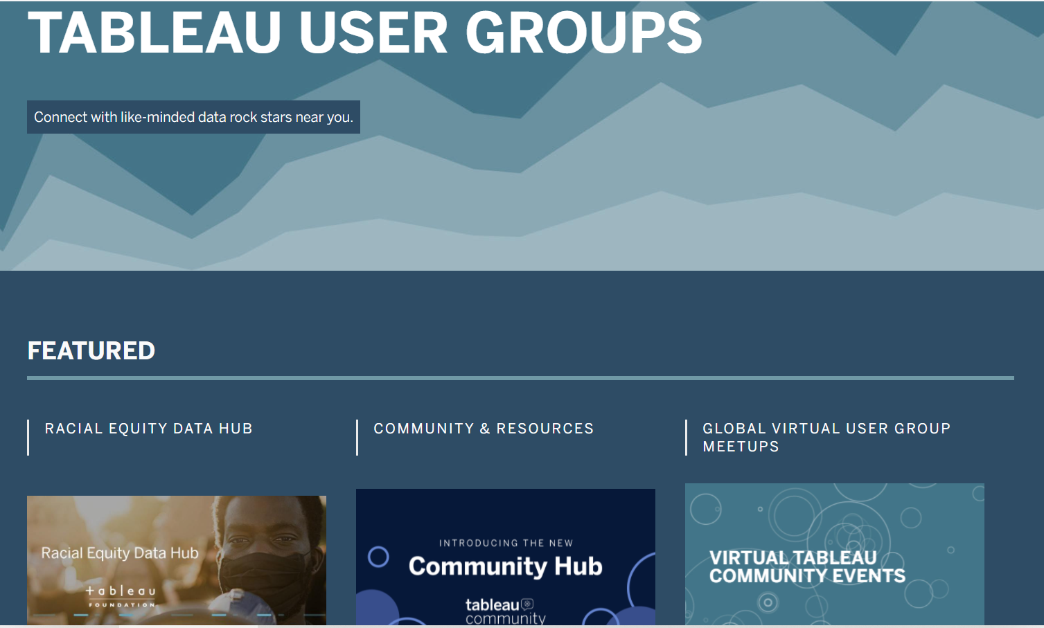
Tableau User Groups (TUGs) 

TUGs are Tableau User Groups and are located throughout the United States. They typically meet monthly or quarterly, have speakers and provide a sense of community to ask questions, learn from others and build a network.  

Zach noted that TUGs are not Tableau run but are rather mostly formed by “impassioned professionals that are trying to help themselves be better or are trying to help other people out.”   

TUGs are Tableau User Groups and are located throughout the United States. They typically meet monthly or quarterly, have speakers and provide a sense of community to ask questions, learn from others and build a network.  

Friendly Competitions, like Makeover Monday, Workout Wednesday, and Sports Viz Sunday 

Makeover Monday is a community exercise where Tableau users get the chance to take a dataset that’s already been visualized but maybe not in the best way and make it over. People then put it on Tableau Public and share it to Twitter or LinkedIn.  

Makeover Monday is a community exercise where Tableau users get the chance to take a dataset that’s already been visualized but maybe not in the best way and make it over. People then put it on Tableau Public and share it to Twitter or LinkedIn.  

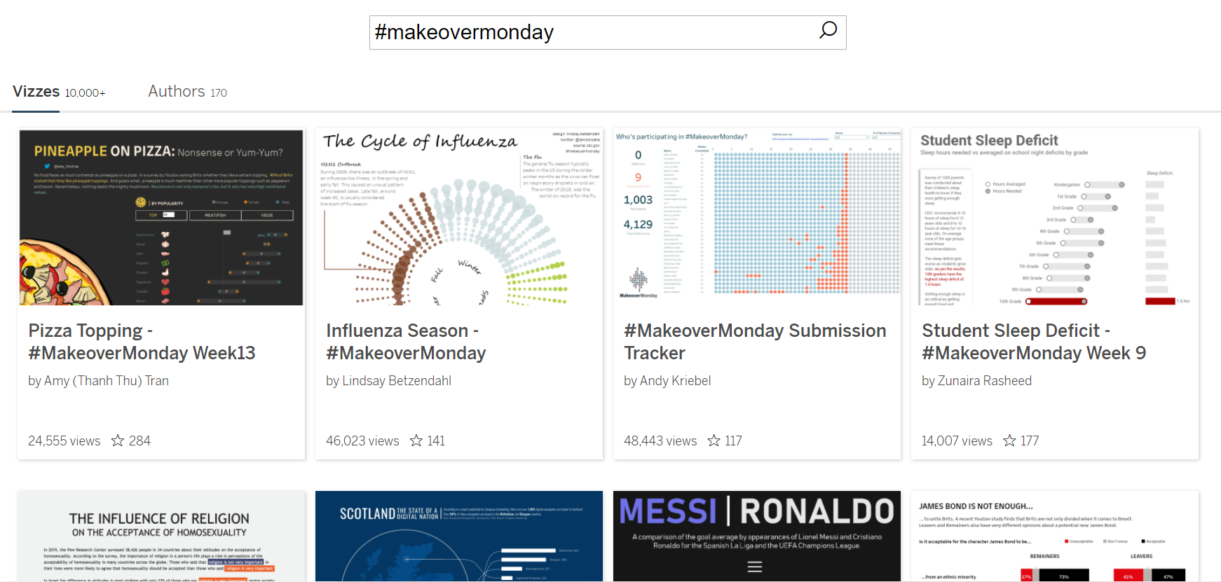
“It’s a great opportunity to on one hand get some practice and also see what other people would do,” said Zach. “If you have the same tool and, in this case, the same dataset, and you see someone else do something that’s better than yours, which you probably will at first, you’re probably going to see like, ‘Wow! Somebody made that?’ Then that’s definitely something that you can make also.”  

Workout Wednesday is a competition where the dataset has already been used to make something technical out of it and you have to figure out how to make the same thing.  

Zach said this comes in handy in work situations where you’re asked to make something out of a dataset and you think, “I don’t know how to do that…” Zach said Makeover Monday is for speed and agility and helps you produce dashboards more quickly. Workout Wednesday is to help you solve more complex problems better.  

Sports Viz Sunday is more sports related dataset and they make lots of interesting stuff Zach said.  

The Datafam 

Zach said datafam is mostly used as a hashtag to gain more attention for Tableau related things online. “But also, it’s the people,” said Zach. “There are a lot of very passionate people out there and typically if you see people using the #datafam, [they’re] sort of the super users that are out there creating the public visualizations, participating in the exercises and a lot of them end up becoming Ambassadors and Zen Masters eventually.”  

Datafam News is a part of Zach’s podcast channel and is hosted by Mark Bradbourne. It is a news update on upcoming TUG meetings, events, and more but Zach said that Tableau is now moving to promote this more officially themselves.  

Tableau Events, like the Conference and Tableau Live 

“Tableau’s conference is a huge deal,” said Zach. It’s attended by over 20,000 and is usually held in Las Vegas, NV due to its size. Tableau Live is the virtual alternative to their in-person conference and offers training and inspiration.  

Podcasts 

Data + Love: https://datapluslove.buzzsprout.com/  

The Tableau Wannabe Podcast (a.k.a. Tableau World Podcast): https://tableauwannabepodcast.libsyn.com/  

“They are the oldest Tableau specific podcast, I believe,” said Zach.  

YouTube 

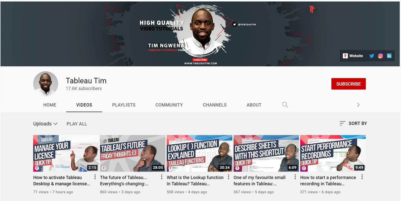
Tableau Tim: https://www.youtube.com/channel/UC7HYxRWmaNlJux-X7rNLZyw  

“He might be one of the best I’ve seen in terms of tutorials,” said Zach.  

Tableau Tim is a Youtuber who has a popular Youtube channel that covers all things Tableau.

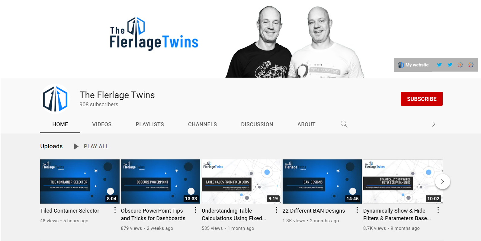
The Flerlage Twins: https://www.youtube.com/channel/UCDyr5VgVvkmfhHpeMUB8ZDA  

“They are twins and both Tableau Zen Masters,” said Zach. “They’re characters as well as very brilliant in what they do.”  

The Flerlage Twins are Tableau Zen Masters and Youtubers who have a popular Youtube channel that covers all things Tableau.

Books 

The Big Picture: How to Use Data Visualization to Make Better Decisions―Faster by Steve Wexler 

“Chapter four is about 80 pages long and it’s a huge, crazy chapter,” said Zach. “It is really like data visualization in a nutshell.” He also said it’s not just for the data professional who’s creating things, but also for the “consumer of data. Because we all have some times [where] we’re the consumers and some times [where] we’re the creators.”  

Steve Wexler is an author who has two books about data visualization that are highly recommended by Zach Bowders.

The Big Book of Dashboards: Visualizing Your Data Using Real-World Business Scenarios by Steve Wexler 

Zach said this book is “super influential in terms of the industry.”  

Information Lab – Thursday Trainings @ 3:00  

Information Lab offers free two-hour Tableau trainings that are geared toward beginner, intermediate or advanced users with a Q&A session at the end.  

Zach’s #1 Tip for Beginners Who Are Getting Started in Tableau 

“Just start doing stuff,” Zach encouraged us. “Everyone has probably one hour a week that they can dedicate. So, during that time, I would say, find a blog that you like, watch some YouTube videos or realistically pick one of these exercises. Makeover Monday is an excellent starting place.”  

His final piece of advice was to “make something and share it. Because if you make it yourself and you just sort of hold it back, you’re going to miss out on some of the feedback you’re going to get, which is mostly going to be encouraging. People like to see other people succeed.”  

Connect with Zach Bowders 

LinkedIn: https://www.linkedin.com/in/zachbowders/  

Twitter: @ZachBowders 

Tableau Public Profile: https://public.tableau.com/app/profile/zach.bowders  

Written by cplysy · Categorized: depictdatastudio

Sep 14 2021

Creating a Community through Graphs

Maddison Staszkiewicz is a Depict Data Studio student and evaluator. She was part of the 2020 Great Graphs: Excel How-To’s cohort and is sharing her experiences with us. Thanks Maddison! –Ann

—–

I was ecstatic to register for the Great Graphs: Excel How-To’s course and transform my graphs using Excel instead of online data visualization software. I already had Excel, my data was there, and it did not make sense to use another platform to make the graphs I needed.

I had tried other options before, and it was always clunky because instead of focusing on the data and the message I was trying to show, I was inevitably focusing on the different software programs and how they would interact.

Tips, Tricks and Community

Through the Great Graphs: Excel How-To’s course, I learned more tips and tricks than I ever expected. But the most impactful, yet unexpected, outcome was joining a community and making connections with others that were also along their own journey of improving their graphs as a way of sharing messages and insights through data.

Throughout the course, I was exposed to new ways of thinking about graphs, Excel, and how data visualization can be used in the workplace to guide more data-informed decisions.

Now, I look at data visualization differently.

When I see data visualization in the newspaper or on social media, I think about what it was trying to show and whether it was successful. This critical eye helped me be a better peer and colleague when seeking to get the message across from my own data and in collaborating with others.

As we started the course, I got to know my peers also in the course.

When I was working on producing graphs for a blog based on my graduate work in evaluation surrounding the perceived effects of medication access from COVID-19, we reviewed and workshopped them together with live feedback in an office hour session.

Because of the varied backgrounds of those in the course, I was thinking about my work in a completely new and improved way. I started experimenting with graph types I had not used before, with some having greater success than others.

Before: Audience Left with Questions

My original graph applied many of the lessons we had covered – I used my color palette, I had storytelling titles, but there was room for improvement.

There was much left up for the audience to discern when reviewing the graph – was the 85% or 70% most important? Why were different values mentioned in the heading?

The before graph had a branded color palette and storytelling titles but still left the intended audience with questions.

Live Editing During Office Hours

During the office hours, we mocked up what the graphs could look like and ultimately edited them to produce higher quality, easier to understand visuals. We took the original column charts and turned them into 100% stacked bar charts.

During a live Office Hours sessions, students work with Ann K. Emery to mock up what graphs could look like trying out different styles and techniques.

After: Clear Focus

Focusing on the major effects (both positive and negative) also provided a stronger narrative instead of hoping the audience would understand the message.

 Highlighting the ends of the bars gave not only visual focus, but a clear visual.

The after graph was a stacked bar chart that gave visual focus for the intended audience.

The final product was influenced by the feedback I received throughout the course. Getting feedback from the group changed the style of the graphs, colors, way I utilized text, and I was even encouraged to turn the graphs into a GIF for better online engagement.

Shared Learning is the Best Learning

As much as I looked forward to continuing the lessons, I was excited for the live office hour sessions when I would get to hear from someone else in the field and learn how they might use a graph style as well as how they did it.

Questions and discussions sparked thinking and problem solving about my data visualization in new ways, past the technical work in Excel.

As the course continued, my skills improved, and so did my connections with my peers. We connected on LinkedIn and offline to get to know more about each other’s work – similarities and differences abounded.

I found a great benefit in this as there was so much knowledge to be shared, wherever we were along our data visualization or professional journey. As a new evaluator, learning what others found to be successful also helped me in thinking about what I could apply to my own work.

The supportive community that was built goes beyond the technical skills we learned throughout the course, as I know I have a wider network to connect with for questions, feedback, and advice long after the course ended.

Connect with Maddison

LinkedIn: @maddison-staszkiewicz

Website: www.maddisonstasz.com

Written by cplysy · Categorized: depictdatastudio

Aug 31 2021

Applying Data Visualization Principles to Your Business: A Before/After One-Pager Makeover

Lillian Haley, Ph.D., MSW, ChFC® is the president and owner of Haley Evaluation & Research Services (HERS). She’s a Depict Data Studio student and when she shared her before/after makeover during our graduation ceremony, I knew I wanted to showcase her work. Keep up the great work, Lillian! – Ann

—–

I discovered Ann’s data visualization work at the 2016 American Evaluation Association (AEA)’s annual conference held in Atlanta, Georgia.

I was making the transition from academia to commercial research and was struggling mightily with telling a visual story. When your training is entirely writing journal articles in APA style, it can be challenging to transition to producing beautiful, easily consumable content.

I remember Ann and Stephanie Evergreen presenting and sharing their data visualization checklist. They poked fun at common reporting shortcomings in a relatable, engaging manner.

What they shared just made sense. They were speaking about content that applied to my job. I was sold!

I needed to be better at data visuals and storytelling. I tried unsuccessfully to get approval from my employer to cover professional development expenses for data visualization training.

So, I sufficed with Ann’s free Soar Beyond the Dusty Shelf Report course and blog posts.

Fast forward four years later, I found myself launching my research firm, Haley Evaluation & Research Services (HERS). Now, I had total control over my professional development.

Ann’s Dashboard Design was one of the first courses I wanted to sign up for. I stalked the website waiting for registration to open. I registered for the Dashboard Design course along with Simple Spreadsheets, Great Graphs: Design Principles, and Great Graphs: Excel How-To’s.

Developing a Capabilities Statement

Enrolling in courses at Depict Data Studio is one of the best professional developments I have ever made. I used what I learned to give my company’s capabilities statement a makeover.

What is a capabilities statement? Great question!

A capability statement is a concise, one-page document of your business competencies. Think of it as your business’ resume. Its purpose is to provide specific information that will convince potential customers to do business with you. When written well, it will differentiate your business from the competition!

Before taking Dashboard Design, my template was based upon an example provided on the U.S. Department of Health and Human Services website.

I reasoned I’d like to do business with the government, so I might as well follow their lead. Unfortunately, what I produced was text-heavy and lacking any visuals, minus a logo or color scheme that would help my business be an appealing option.  Would you trust this company to write your report or design your dashboard?

Lillian Haley based her company's capability statement off of an example provided on the U.S. Department of Health and Human Services website.

Revamping the Capability Statement with Skills Learned in Depict Courses

After eight months with Ann, I was able to turn my blah capabilities statement into something I am happy to share! It is painfully apparent I grew in my knowledge about leveraging:

  • White Space
  • Decluttering
  • Branding
  • Font size
  • Bolding
  • Color
  • Icons

I could go on and on about the many design and data visualization lessons I’ve learned from Ann.

Instead, I’ll end by saying that books and blogs are excellent resources. I have several books and subscribed to many blogs. However, they do not compare to live and on-demand instruction of Depict Data Studio.

Just look at my After one-pager!

Using skills learned in Depict Data Studio courses, Lillian Haley transformed her company's capability statement.

Connect with Lillian Haley

Website: https://www.haleyresearch.com/

Written by cplysy · Categorized: depictdatastudio

Aug 24 2021

3 Tips for Visualizing Social Change Data

I recently had the chance to be on the Community Possibilities® podcast with Ann Price. Ann owns Community Evaluation Solutions and helps community leaders plan and evaluate strategies to create lasting change. She started the podcast as a way to connect with community leaders to talk about root causes, dig deeper into understanding social and health inequities and to connect by talking with each other instead of at each other.  

We connected through our mutual speaking coach, Heather Sager’s Speak Up to Level Up class. We’ve since followed each other’s careers and were excited to talk together. 

Listen to the Podcast 

Watch the Conversation

3 Tips for Visualizing Social Change Data 

In the podcast, we discussed three tips for coalitions, foundations, and nonprofits that are visualizing social change data. 

Involve Others in the Data Process Early and Often 

First, get the staff, partners, and community members involved in the data sense-making process early and often.  

My favorite technique for involving others is the data placemat process, which I learned from my previous supervisor, Veena Pankaj. 

It goes like this: 

  1. First, we compile preliminary findings into a few handouts, or data placemats. Lots of ugly graphs. Lots of unformatted graphs. 
  1. Second, we share those data placemats with stakeholders during a data interpretation meeting. We ask the attendees whether they were surprised by any graphs, what additional information they need, etc. We get them to talk about the graphs in their own words. 
  1. Finally, we go back and write the final report (or design the final slideshow, or the final infographic) with the stakeholders’ interpretations of the graphs included. 

You can read more about data placemats in this article that Veena and I wrote for the American Evaluation Association. 

Share Aggregated or Disaggregated Data as Appropriate 

Next, figure out whether audiences need aggregated or disaggregated data. 

Let’s pretend that a nonprofit is running a GRE test prep program for high schoolers. As part of the program, the students take lots of practice tests to see when they’re ready to go take the actual GRE test.  

The students in the program need disaggregated data. They need to see their own individual data to determine how they’re doing and if they’re ready individually.  

A lot of times, the staff who are running the programs also care most about disaggregated data. That means they want to see data specific to each student so that they can individualize their instruction.  

There are also some aggregated summary statistics that might be helpful for those staff. For example, the staff might need to see averages.  

Current funders, prospective funders, and other collaborators will also benefit from aggregated data like averages. For example, they might want to see people in this year’s class compared to last year’s class, or this location’s class compared to a different location’s class. 

Problems can arise when there’s a mismatch.  

For example, if you only show the students the aggregated data, it feels too distant. Finding out the group’s average scores is helpful… but not as helpful as knowing your own scores. Or, if you only show the funders the disaggregated data, they’ll miss the big-picture patterns. 

Remember that Data Visualization Isn’t Supposed to be Hard 

You can use everyday software, like Excel. Just tweak the default settings to make the graphs easier to understand. 

You don’t have to learn coding or programming, unless you want to. 

You don’t need to go to school for graphic design, unless you want to. 

Stay in Touch with Ann Price 

LinkedIn: https://www.linkedin.com/in/awpriceces/ 

Twitter: https://twitter.com/annwprice  

Podcast: https://communitypossibilities.buzzsprout.com/ 

Website: https://www.communityevaluationsolutions.com/ 

Written by cplysy · Categorized: depictdatastudio

Aug 10 2021

Better Storytelling with the Same Data: Upgrade that Board Packet!

Kristen Summers is the Senior Grants Manager at Saint Luke’s Foundation and a Depict Data Studio student. She emailed me an example of how she’s revamped her organizations grants docket and I knew I had to showcase her hard work. Keep up the great work Kristen! – Ann

_________________

I work at a grantmaking organization and it is my job to update the board three times a year on the grant applications we are considering for awards, the grantmaking budget and other information.

You will see below an example of the grants docket (slate of grant proposals under consideration) as well as a grantmaking budget summary. I am almost too embarrassed to show these!

Fortunately, after completing about 70% of the Dashboard Design course, I was able to revitalize a tired spreadsheet into an information powerhouse and a colorful budget visualization into a professional presentation.

It’s the same information, just presented differently!

The Docket

Before: Gridlines Galore and No Visualizations

This docket was printed on 11×17 paper for easier readability and called a “placemat”.

Gridlines, some highlighted cells in yellow to draw the eye.

A lot of information and a bit overwhelming to take in.

Applications were presented alphabetical by organization and not grouped in any way.

The grants docket before was gridlines galore and no visualizations.

After: Fewer Columns, Bigger Impact

When I started the Dashboard Design course with Ann, my intention was to revamp our organizational dashboard and not even this document (once I get that done, I will have to write another blog!).

But the course showed me what little changes I could make to have a big impact.

Although we do not compare numbers over time in this document as it is just a list of our applications, I was still able to use some helpful visualizations, icons, colors, and conditional formatting to tell a story.

The after example number one had fewer columns and a bigger impact.
The after example number two had fewer columns and a bigger impact.

A summary of the changes made:

  • Added logo and subtitle
  • Used brand colors in headings and their corresponding icon
  • Minimized the use of gridlines
  • Removed highlighting of a column but used font colors for key info
  • Grouped applicants together by type of grant (general operating vs. project)
  • Hid the column with the organization budget, but added an icon set of pie charts via conditional formatting
  • Correct alignment for numbers vs. text
  • Deviation bar visualization to show the percent change of the current request from their previous award instead of just expecting the reader to do the math
  • Added a budget summary chart at the bottom

This resulted in a much more well-received document with lots of compliments from board members!

I have begun creating a cohesive aesthetic for all the documents I produce for the board to give them the information they need but in the most streamlined way possible.

The Budget

In 2019 I developed the below budget visualization to up my game a bit from a spreadsheet that board members had a hard time understanding.

This was an improvement over the previous version, but Ann’s course challenged me to turn it up a few notches.

Before:

The old budget was hard for board members to understand.

After:

The revamped budget has less text and more icons to illustrate where the organization is in the budget, which the board members appreciated.

There were not many “big” changes to this in terms of conditional formatting or visualizations, but it has definitely been toned down.

The biggest change was that I replaced the text explanations with icons to illustrate where we are in the budget, which the board members appreciated.

As you can see, there is that cohesive title, subtitle, font, and color choice to keep the branding in line.

Take the Time to Take the Course!

I am pleased with what I am able to do now that I have completed Dashboard Design. The lessons were fun and I was able to put my skills to the test in a matter of weeks!

Now I am enrolled in Simple Spreadsheets which will really provide me a good base as my role stretches me to do more community engagement data evaluation and learning. Thank you, Ann!

Connect with Kristen

LinkedIn: @summerskristen

Lift every Voice 216: https://www.facebook.com/216lift

Saint Luke’s Foundation: https://www.facebook.com/saintlukesfoundationcleveland

Written by cplysy · Categorized: depictdatastudio

  • « Go to Previous Page
  • Go to page 1
  • Interim pages omitted …
  • Go to page 25
  • Go to page 26
  • Go to page 27
  • Go to page 28
  • Go to page 29
  • Interim pages omitted …
  • Go to page 37
  • Go to Next Page »

Footer

Follow our Work

The easiest way to stay connected to our work is to join our newsletter. You’ll get updates on projects, learn about new events, and hear stories from those evaluators whom the field continues to actively exclude and erase.

Get Updates

Want to take further action or join a pod? Click here to learn more.

Copyright © 2026 · The May 13 Group · Log in

en English
af Afrikaanssq Shqipam አማርኛar العربيةhy Հայերենaz Azərbaycan dilieu Euskarabe Беларуская моваbn বাংলাbs Bosanskibg Българскиca Catalàceb Cebuanony Chichewazh-CN 简体中文zh-TW 繁體中文co Corsuhr Hrvatskics Čeština‎da Dansknl Nederlandsen Englisheo Esperantoet Eestitl Filipinofi Suomifr Françaisfy Fryskgl Galegoka ქართულიde Deutschel Ελληνικάgu ગુજરાતીht Kreyol ayisyenha Harshen Hausahaw Ōlelo Hawaiʻiiw עִבְרִיתhi हिन्दीhmn Hmonghu Magyaris Íslenskaig Igboid Bahasa Indonesiaga Gaeilgeit Italianoja 日本語jw Basa Jawakn ಕನ್ನಡkk Қазақ тіліkm ភាសាខ្មែរko 한국어ku كوردی‎ky Кыргызчаlo ພາສາລາວla Latinlv Latviešu valodalt Lietuvių kalbalb Lëtzebuergeschmk Македонски јазикmg Malagasyms Bahasa Melayuml മലയാളംmt Maltesemi Te Reo Māorimr मराठीmn Монголmy ဗမာစာne नेपालीno Norsk bokmålps پښتوfa فارسیpl Polskipt Portuguêspa ਪੰਜਾਬੀro Românăru Русскийsm Samoangd Gàidhligsr Српски језикst Sesothosn Shonasd سنڌيsi සිංහලsk Slovenčinasl Slovenščinaso Afsoomaalies Españolsu Basa Sundasw Kiswahilisv Svenskatg Тоҷикӣta தமிழ்te తెలుగుth ไทยtr Türkçeuk Українськаur اردوuz O‘zbekchavi Tiếng Việtcy Cymraegxh isiXhosayi יידישyo Yorùbázu Zulu