• Skip to main content
  • Skip to footer
  • Home

The May 13 Group

the next day for evaluation

  • Get Involved
  • Our Work
  • About Us
You are here: Home / Archives for allblogs / depictdatastudio

depictdatastudio

Feb 23 2021

How Drawing Makes Us Better at Data Visualization

“Which software program is best for data visualization???” This is one of the most common questions about getting started with graphs, charts, and diagrams.

There are plenty of great software programs, like Excel and Tableau—and even PowerPoint!

There’s also a lesser-known secret to creating strong data visualizations: hand-drawn sketches!

Watch Our Episode of Sketchnote Chats

Want to learn more about how hand-drawn sketches are essential for data visualization?

I was recently interviewed by Emily Mills for an episode of the Sketchnote Chats series.

Emily is a professional illustrator and expert in sketchnoting. She is also the founder of the Sketchnote Academy and author of The Art of Visual Notetaking. 

Recognize Emily’s name? She was a guest speaker in our Report Redesign course and I was happy to return the favor.

You can watch our episode here:

How Drawing Can Improve Our Data Visualizations

I use drawing in two ways:

  1. To brainstorm which chart type I need, and
  2. To piece together multiple charts on a page or screen (e.g., when designing dashboards that are composed of multiple smaller charts).

Drawing Helps Us Brainstorm Which Chart Type to Use

Here’s how I use hand-sketching to develop better visualizations.

First, I open my spreadsheet with my tabulated data. I might have a table with several columns and several rows of already-analyzed data.

Second, I set a timer on my phone for 10-15 minutes.

Third, I draw as many ideas as possible on paper. I think about whether this dataset can be represented through a donut chart, stacked column chart, hex map, Sankey diagram, and so on.

When I started doing this—back in 2012—I was only able to generate a handful of chart types during each brainstorming session. Now, I can generate a dozen ideas each time.

My audience benefits because they don’t have to suffer through the same ol’ bar charts over and over and over.

My audience also benefits because I’ve thought through the dataset at a much more sophisticated level. I explore whether the dataset has interesting chronological patterns that might be visualized in a line chart; whether there are interesting geographic patterns that might be visualized in a map, etc.

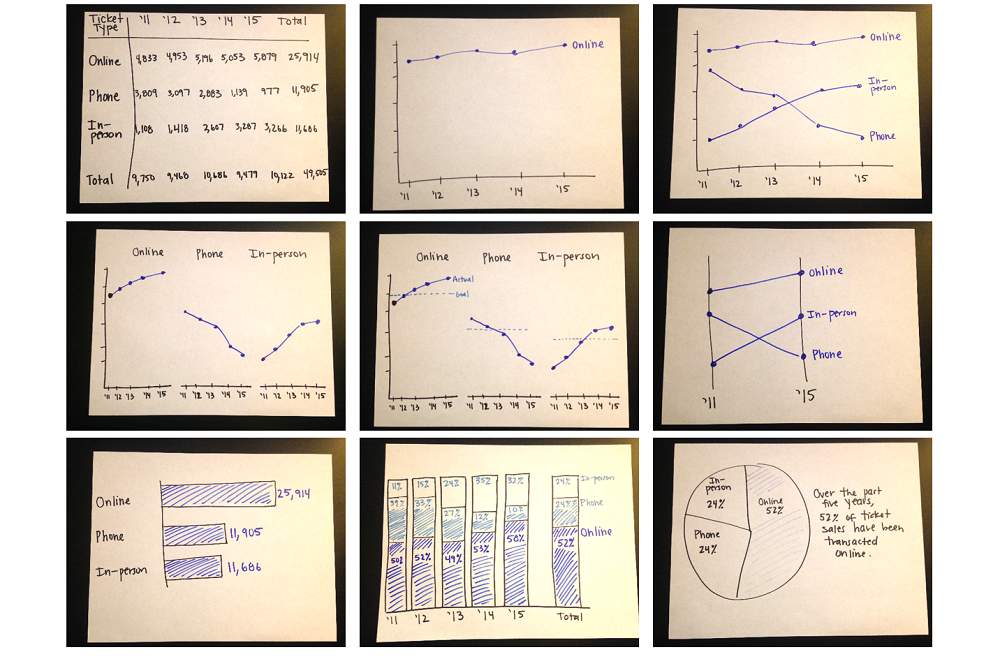
Here’s an example from the Harris Theater in Chicago, where I set my timer for 10-15 minutes, and was able to generate nine ideas for visualizing their (fictional) ticket sales data over time:

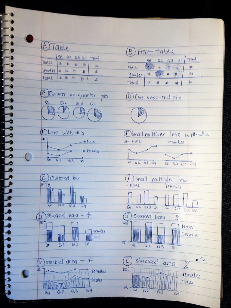
Here’s another example from a juvenile justice project, where I set my timer for 10-15 minutes and brainstormed 12 ideas for updating their pie charts:

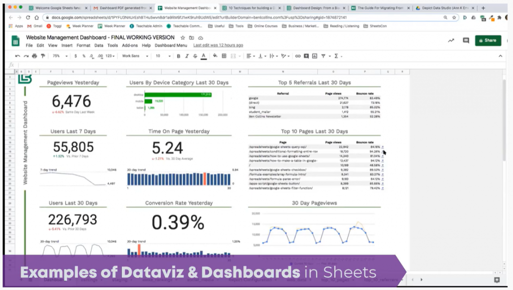
Drawing Helps Us Arrange Multiple Charts on a Page or Screen

Once I’ve selected lots of individual graphs to use, I often need to arrange them together on a page or screen.

For example, if I’m designing an infographic, the one-page summary might involve three, four, or five individual graphs.

Or, if I’m designing a dashboard, the screen might involve three, four, or five individual graphs.

I need to decide which graph should be displayed first, second, or third. Is there a natural sequence?

I also need to decide which graphs “go together.” Is there a natural grouping? A categorization? Similar graphs should be next to each other on the infographic or dashboard.

I use a pen and paper to sketch what that page could look like.

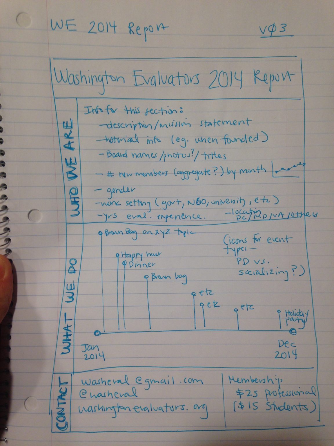
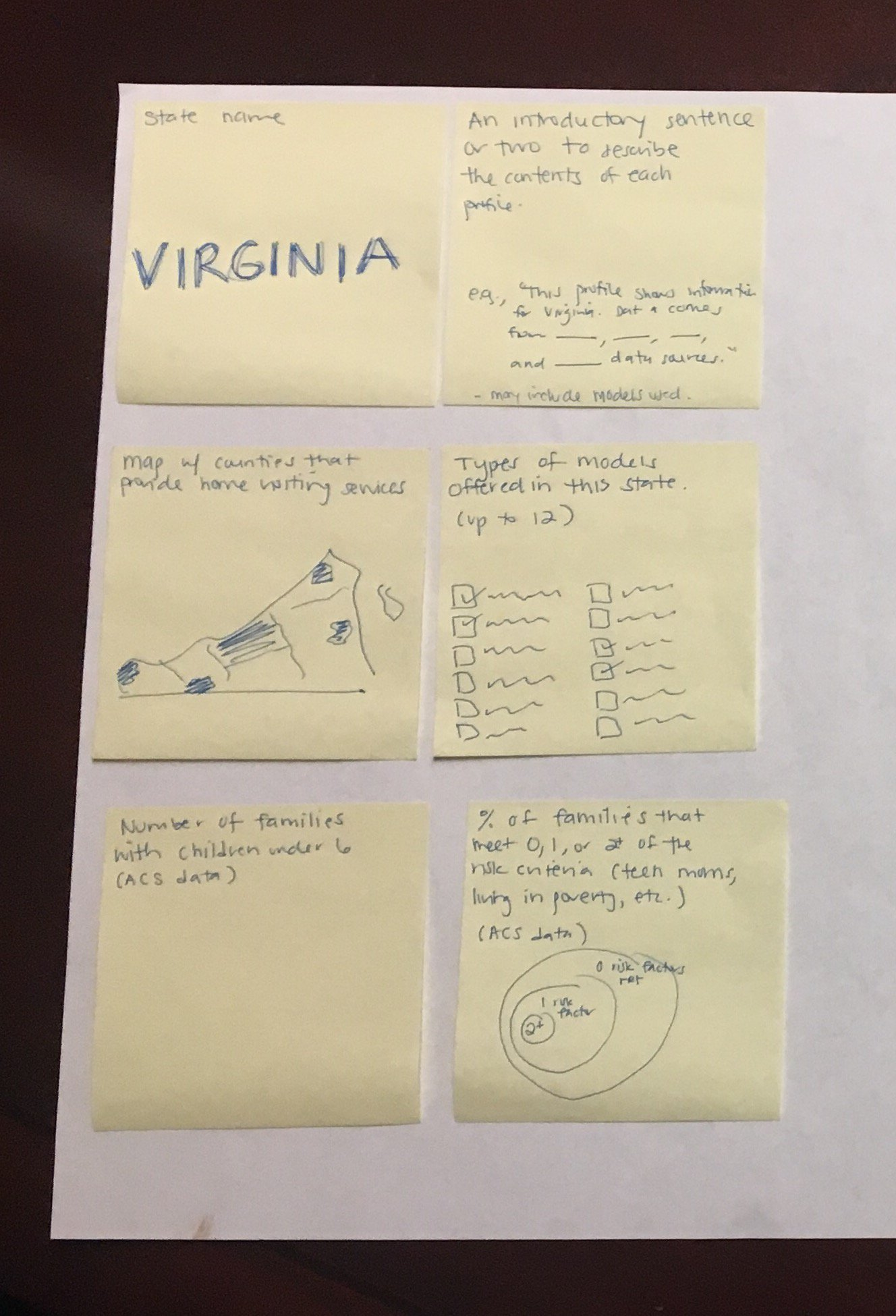
Here’s an example from the National Home Visiting Resource Center, where we used sticky notes to decide how to arrange multiple visualizations on the page:

Get Started with Sketching for Data Visualization

Want to incorporate sketching into your own dataviz design process? In this article, I share my step-by-step process.

Your Turn

Have you used hand-drawn sketches to develop better data visualizations? Comment below!

Written by cplysy · Categorized: depictdatastudio

Jan 12 2021

The Data Strategy Show with Samir Sharma

How can we design the best possible dashboards for business leaders? I addressed this question on the Data Strategy Show with Samir Sharma.

Samir Sharma is a data strategy and analytics leader, CEO and Founder of datazuum. He has a history of helping data executives and leaders craft and execute their data strategies. His passion for data strategy led him to launch the Data Accelerator Workshop and host the Data Strategy Show.

Watch the Podcast

Listen to the Podcast

You can also listen to the podcast here:

  • Stitcher
  • Apple Podcasts

What’s Inside 

Here are some of the topics we talked about.

Challenges Faced by Companies Trying to Visualize Their Data

Samir asked what are typical data visualization challenges that come up again and again. Ann said, “I think a big challenge I see with organizations is the people with data backgrounds, I think it’s so easy for us to forget that not everybody is a data person. I have to constantly remind myself, ‘Most people hate spreadsheets. They see it as a chore, and a burden, it’s just overly detailed and they can’t find what they need.”

While Samir serves as the bridge between business leaders and more data focused people, Ann noted that “if you’re trained in the weeds and details like I was, you’re never exposed to those business leaders. You have no training on how to work with those people necessarily.

Ann said she sees, “Organizations that will spend weeks or months creating the perfect dashboard or the perfect such and such tool. But they’ve never really tested it along the way. And they’ll get user feedback like, “I don’t like the colors.” Something really irrelevant but it just show the user is not really thinking deeply about the data because they weren’t engaged in the process.”

What We Should be Thinking About When Creating or Re-Designing Dashboards

“I see people assuming that developing a dashboard is going to take forever and cost a ton of money. That it’s going to be this months long process where they have to buy this new software program, they have to send their staff to training on this software program, they have to link all these data sources…”, Ann said. “They think it’s going to be this huge process so they think as long as this dashboard is taking forever, it better serve all of our needs. It better be this audience and this audience and this audience.”

Ann shared that during the planning process of each new project, she asks, “Who is this dashboard for?”

How to Learn More about Data Visualization

Samir asked what Ann’s advice would be for someone who wants was starting out in data visualization. Ann said, “I think a lot of us get wrapped up in tools, but there are so many tools available, more being invented. I think it’s really stressful, daunting, overwhelming for someone entering the field [to think], do I learn coding? Do I do the spreadsheet route? Do I do a drag-and-drop-dashboard route like Tableau or Power BI? There’s also the more graphic design route like do you specialize in Illustrator? Publisher? I think we feel like we have to master all of them and that’s just not possible. You’d spend your whole career just learning tools.

She advises to earn what’s out there and then specialize in just one tool. “I had this big crossroads maybe five years ago where I felt this pressure to go learn R. I just felt so much pressure and I just had to kind of let that go,” Ann said.

“The first step to getting started is letting go of this ridiculous, ambitious goal that we have that, ‘I’m going to learn every single tool, get certifications in it. I’m going to put all these skills in my resume.’ Just learn a tool and very, very comfortable and confident with that.”

Connect with Samir Sharma

LinkedIn: @samirsharma1

Website: www.datazuum.com

Written by cplysy · Categorized: depictdatastudio

Jan 05 2021

Getting Started with Sketchnoting: A Conversation with Emily Mills

I recently had the chance to talk with Emily Mills, who is a professional illustrator and expert in sketchnoting. She is also the founder of the Sketchnote Academy and author of The Art of Visual Notetaking. 

Emily was a guest speaker in our Report Redesign course. She walked us through the basics of sketchnoting, her career, why hand drawn images stop the scroll, the cool brain science behind sketchnoting, and then led us through some drawing exercises. We wanted to share Emily’s tips with you, too!

Watch Our Conversation

What is Sketchnoting?

Emily explained that sketchnoting is when you’re writing and drawing at the same time. “The whole purpose to remember information, and it’s just more engaging and interesting to look at,” she said. 

Sketchnoting is also called:

  • Visual notetaking
  • Graphic recording
  • Visual facilitation
  • Graphic facilitation

What is Sketchnote Academy?

Emily founded Sketchnote Academy in 2018. She offers online courses to help you learn how to sketchnote and then level up your skills. 

Emily Mills founded Sketchnote Academy in 2018. She offers online courses to help you learn how to sketchnote and then level up your skills.

Emily’s Previous Career Experience 

Emily Mills’ background is in graphic design. She was an in-house designer in education, nonprofit, and a healthcare start-up.  “I just get bored doing the same thing year after year like an annual report… again. While the data, pictures and information might change, it was still the same project… year after year,” she said. 

How Emily Got Started with Sketchnotes

Emily fell into sketchnoting from a weekly cartoon that she would draw on a whiteboard outside her office. 

She said that a former co-worker remembered those cartoons. When he went to work at a video studio, he contacted her, saying “We just booked a video client for something called a whiteboard video. We don’t really know what it is, but we need somebody to draw for it. Will you come to Houston and draw for our video?” Emily agreed and created a whiteboard video with them. 

“I was really proud of it and I put it online. Someone found it through keywords and hashtags and they said, “This is so cool! Have you heard of sketchnoting?” I hadn’t but [realized] it was pretty much the same thing,” she said. After that, she attended a sketchnote-specific workshop, and then challenged herself to sketchnote every day for a month. 

Hand-Drawn Images Stop the Scroll

Emily once shared with Ann that hand-drawn art/graphics get more view time than stock photos or computer generated graphics. Ann asked her to tell us more as we’re all trying to create reports that people *actually* want to read. 

Emily explained how hand-drawn images can stop the scroll. 

If you think about your average Instagram feed, she explained, you’re probably seeing mostly pictures, some stock photos,, an inspirational photo with a quote on it. She said that we’re used to those images now, and our brains are automatically thinking, “I’ve seen this before; show me something new.” 

Emily said when you see something different like a hand-drawn cartoon or someone’s artwork, you really stop because of human curiosity. “We keep asking questions,” she said. “Hand-drawn images invoke a lot of our human curiosity and take longer to engage with because you’re asking those questions.”

The Cool Brain Science Behind Sketchnoting

“Drawing is what I call the human language,” Emily said. 

Drawing was around before written language. We’ve been communicating in pictures for thousands of years. 

Studies also show that pairing an image with words also allows for better brain retention than just images or words alone.

Drawing Data Can Help Simplify Data

She gave an example of being at a conference where the speaker has a PowerPoint slide with a huge pie chart with 10 different slides and lots of labels. 

If you’re trying to take visual notes, there’s no way you can capture that entire pie chart, all the data points, and what all the colors mean. 

“But there’s usually one story that you’re trying to communicate with your data,” she said. Focus on just that main point rather than try and capture every single detail. 

Drawing Can Help You Sketch Drafts Quickly

Emily said she was taught in design school that you don’t even touch the design software until you have 50 designs drawn on paper first. 

“The reason is, it’s tracking your progress. I’m forced to go slow because I’m limited by how fast I can draw,” she said. 

She suggested giving yourself 30 seconds to draw what you’re trying to communicate. Then give yourself 10 seconds and then 5 seconds. This will allow you to see what you’re naturally drawn to and what can get cut. 

“See what you’re cutting and what you’re keeping, and that’s your data story. That’s the main point,” she said. 

Sketchnoting with Emily

Materials needed: Pen and paper (preferred) but an iPad is fine too. 

Emily gave us an introduction to drawing that you can follow along with. She said that every single drawing can be condensed into three things:

  1. A dot (a point)
  2. A line (a dot that went on a trip)
  3. A shape (a dot that went on a trip and came back home)
Emily Mills gave us an introduction to drawing and said that every single drawing can be condensed into three things:  a dot, a line and a shape.

She then shared the seven building blocks of all drawings:

  1. Dot
  2. Straight line
  3. Curvy line
  4. Crooked line
  5. Circle
  6. Square/Rectangle
  7. Triangle
Emily Mills shared the seven building blocks of all drawings:  a dot, a straight line, a curvy line, a crooked line, a circle, a square/rectangle and a triangle.

Her final tip: Go for recognizable rather than realistic. 

Grab your pen and paper and join in! 

Connect with Emily Mills

Instagram: emily_a_mills

SketchnoteAcademy.com 

Free Course: Beginner Sketchnote Drawing

Your Turn

Comment with your favorite part of learning with Emily. 

Written by cplysy · Categorized: depictdatastudio

Dec 08 2020

Getting Started with Google Sheets: Conversation with Ben L. Collins

Getting Started with Google Sheets: Conversation with Ben L. Collins

I recently had the chance to talk with my longtime friend, Ben L. Collins, who is THE Google Sheets instructor.  

Ben joined as a special guest at Office Hours (special live sessions for full course students where we share ideas and give feedback on each other’s projects). Ben shared about his consulting and training work with Sheets, and his personal take on Sheets – favorite features, surprising features, and so on. The personal insights and reflections you can’t learn just by googling something.  

Watch Our Conversation 

Ben’s Career Trajectory 

Ben is originally from England and came to the US about 8 years ago. He started his own business 5 years ago teaching online courses using Google software. Prior to that he was an accountant which is how he got his start with spreadsheets.  

He and Ann met on Twitter about a year after Ben moved here. They met in person for lunch in Washington, D.C. when they were both living there and have been friends since.  

He initially wanted to be a web developer and spent a lot of time transforming his Excel knowledge into coding knowledge. At the end of his first year working for himself, he didn’t have the coding job he was hoping for. But he did have a blog which led to freelance client work including teaching classes.  

Ben’s Intentional Shift to Google Sheets 

Ben shared that when he first started his business, he was given the advice to start a blog and begin writing about a variety of topics which for him included Excel, Sequel, how to do unit testing, etc.  

“I had a dashboard post in Excel that showed the political orientation of the US over 100 years. I thought it was a great project, but nobody ever looked at it,” he said.  

“Then I did a fairly simple dashboard in Google Sheets that got pretty popular on Google search. That post actually led to quite a few client requests to build dashboards for them in Google Sheets. What I then realized was that Excel has this industry of professionals who create courses and tutorials, teach and do consulting work. There’s a pretty big industry on the back of Excel to help businesses be better at Excel and provide solutions.” Ben decided to create something similar for the Google Sheets community.

Screenshot of Ben L. Collins blog.

What’s your favorite thing about Sheets?  

I also asked Ben what his favorite thing was about Sheets, but he didn’t have just one answer but several. Ben’s favorite things about Sheets are: 

  • First off that it’s so easy and accessible (TIP: just type sheet.new into your browser to start a new Google Sheet). It’s quick to get started and to use. 
  • The other is that you can take a Google Form link it to a Google Sheet, collect the data and do your analysis. Then you create a chart and embed that into a slide. What I love is that the pipeline is all linked so if someone fills out the form again, that data flows all the way through to the slide and it updates. It’s a great way to collect data.  
  • I remember when I was an accountant and as deadlines loomed and changes came through quicker and quicker and quicker. You’d have to take your slide, delete your chart, copy and paste your new chart in, send it to your for review and then wait for the new round of changes. And you’d repeat this up until the deadline when you were forced to stop.  
  • There’s a function called the Query function that you do not have in Excel. It’s very powerful for data analysis and uses a data-based language to analyze your data. I think of it as a pivot table in a function. It’s challenging to learn at first but is definitely one of my favorite things about Sheets.  
  • The last thing is that because it’s a web based, cloud-based product it really integrates well with other software online. Also, the sharing and collaboration where you can see all the changes right there and you can see the version history if you do need to go back in time for a mistake.  
Example of how to create charts using Google Sheets instead of Microsoft Excel.

Ben’s Biggest Surprise about Using Google Sheets 

Ben’s biggest surprise about switching from Excel to Google Sheets is how similar they were. He said he had this misconception that it was a toy spreadsheet program at best.  

He was also surprised that when you need to vlookup between two Google Sheets, you can’t click across like you do in Excel.  

When you have to desktop Excel files and you click one into the other, your computer can find the file path between the two and do the connection for you. In Google Sheets that’s two cloud files, they don’t know the connection path so you have to use a special formula to bring data from one Google Sheet file into another.  

Differences Between Sheets and Excel 

Ben walked us through three big differences where Excel has an advantage over Sheets: 

Data Size  

Excel has a million rows and tens of thousands of columns where you can have pretty big datasets. Sheets is 5 million cells total for your workbook. They keep increasing that limit, ten million is rumored at some point. Sheets is catching up there but it still lags behind Excel. TIP: If you’re bumping up against having slow Excel or Sheets files, that’s probably a good indication that your dataset is too big for the spreadsheet format and you should move to a database. Spreadsheets aren’t meant to be stores for gigantic dataset. They’re meant for working with smaller datasets and giving you flexibility to do your analysis. 

Data Analysis Tools 

Excel has an impressive data analysis tool feature called Analysis Toolpak. Google Sheets has data analysis add-on’s but they’re not as comprehensive as their Excel counterparts yet.

Charts 

The third is charts. You can pretty much customize anything in an Excel chart and Sheets doesn’t have that level of granular control. But Google Sheets is always improving and is catching up.  

You can do pretty incredible visualizations with Excel if you’re willing to put the time effort in.  

Ben’s Favorite New Google Sheets Feature 

Ben loves the new feature called Connected Sheets which allows you to work from datasets that have billions of rows of data and still write formulas in Google Sheets. Your information sits in a database and you use Sheets to interact with that dataset.  

He said that the charts and pivot tables have dramatically improved and thinks we’ll continue to see them improve and improve.  

“I think another thing that we’ll see is the integration of AI,” he shared. “It already has an explore feature that allows you to take the hands of the wheel per se and see what it gives you. If you’re learning how to use pivot tables or aren’t sure what your data will show, it’s helpful.” 

Hidden Gems of Google Sheets 

Ben said that people would be surprised at what you can do and how proficient Sheets is as a product. He sees a resistance from people who aren’t sure they’ll be able to do the analysis they need to do. Sometimes that is true, but for the vast majority of spreadsheet work, Sheets works as well.  

One feature he loves is the query function. He said it’s hard for him to use Excel and not have it available. He said, “Anytime you’re doing data manipulation, it replaces about 10 of the functions which is pretty fantastic.” 

Q&A from audience members 

Would you have some data viz examples you’ve created in Sheets to show us? Or dashboard examples?  

Ben shared an example of a Google Sheet he uses to track his business metrics. It connects with a script he’s written that takes that data and turns them into a dashboard that’s automatically sent to him each morning.  

Ben shared an example of a Google Sheet he uses to track his business metrics. It connects with a script he’s written that takes that data and turns them into a dashboard that’s automatically sent to him each morning.

Would be curious about the security/privacy of content in Google Sheets? Does Google read or capture content for its own purposes if content is stored in Google Cloud? 

The data is obviously on Google servers. GSuite falls under the Google Cloud company and they do not read any of your data in Google Cloud. If you’re comfortable using Gmail, then I wouldn’t feel uncomfortable using Google Cloud services. The other thing that always gives me comfort is that Google is very unlikely to get hacked because their security is so good.  

Have you used Sheets in other languages? How does Sheets fare in other countries, specifically Latin American ones?  

I can’t speak to using Sheets in Latin America. It is there and available though. The syntax for formulas is a little different for certain locales and locations, so what you can do is change the location of your Google Sheets. In Europe, they use a comma for a decimal instead of a period like in the US. So, the formulas will be different.  

What is the best way to learn about new features in Sheets?  

Every Monday, I sent out a weekly tip for Google Sheets. It’s not brand-new stuff, but it’s to try and improve everyone’s abilities with Sheets. Occasionally there’s a formula challenge to try and answer. They’re almost like mini blog posts in an email.  

Connect with Ben L. Collins 

Website: https://www.benlcollins.com/  

LinkedIn: @benlcollins 

Twitter: @benlcollins 

Email list: https://www.benlcollins.com/google-sheets-tips/  

Courses: https://courses.benlcollins.com/  

Blog: https://www.benlcollins.com/blog/  

Exceltosheets.com – Specifically to help people as a guide to moving from Excel to sheets. It’s a good place to start.  

Sheets Con – A two-day, online conference on Google Sheets in March or April each year.  

Your Turn 

Comment with your favorite thing you learned today. What tip or trick did you not know?  

Written by cplysy · Categorized: depictdatastudio

Dec 01 2020

Women in Data

In September, I was invited to speak at a Women in Data panel alongside Rebeca Pop. Thanks to Kanchan Malhotra for inviting me and for organizing the event! 

Women in Data is an international non-profit organization started in 2015 whose mission is to bring women together for career advancement and an opportunity to uplift one another. They have chapters throughout the world and each hold quarterly symposiums that include enlightening talks, expert panels and networking opportunities. 

Co-presenter Rebecca Pop is the founder of Vizlogue, a data visualization and storytelling lab that offers training and consulting services. 

Watch the Recorded Panel 

What’s Inside 

Here are some of the topics addressed during the panel. 

  • Can you share your personal journey and how you got started with data visualization? 
  • How do you approach data visualization problems? When you are working on a dataset, do you have standard steps/best practices that you follow every time? Are there any key focus areas one should be mindful of? Ann said, “Something so important to know in advance, is whether your audience is technical or non-technical. Technical audiences are people who like data, who love opening a spreadsheet, and are in a data career on purpose. Non-technical audiences are the opposite. They’d rather hire a consultant or let another staff member handle it. It’s probably the last thing on their to do that they want to tackle (and they probably procrastinate!)” 
  • Important aspects to keep in mind while working with data are data integrity and data ethics. What is your take on data integrity and data ethics?  
  • For someone just getting started in data visualization, it can be overwhelming with the number of tools and courses available these days, what is your advice for beginners? Can you also share some resources? Ann said, “At first, learn the one-hour version of about 10 different tools, but then take a 10-hour training on just one tool and go deeper and specialize. There’s a lot of great courses out there.”  
  • What is the future of data visualization? How do you anticipate data visualization to differ in the coming years? 
  • Data visualization is a very competitive field, how can one stand out from the crowd and make an impression? Ann said, “Don’t worry too much about having to be the best at everything, I don’t think it’s even possible. Just pick one and play on the strength that you already have and make that public in some way… For example, if you like Tableau post a lot of visualizations on your Tableau public profile. If you like R, post to your code on Github and connect with other people.” 
  • What are the key skills required to be successful in data viz? How important is the tool? Ann said, “Chart choosing [is so important]. Are you going to use a pie chart, bar chart or something else altogether? It’s very difficult to take a table, rows and columns of summary statistics and figure out what chart that is going to be. I think a lot of people go to the standards like pie charts or bar charts.” She added, “One activity that you can try for yourself is find a table of data, set a timer for 10-15 minutes and see how many ideas you can come up with in that time period. When I started doing this, I could only come up with a couple of ideas in a 15-minute brainstorming session. Now I come up with 15 ideas in that same time period.” 

Learn More 

Here are some of the resources we mentioned during the panel: 

  • The 3-step process for sharing data with users through data placemats: https://onlinelibrary.wiley.com/doi/full/10.1002/ev.20181  
  • Ann’s favorite dataviz podcasts, which were mentioned in the Q&A after the recording ended: Explore Explain with Andy Kirk, Data Stories with Enrico Bertini and Moritz Stefaner, Data + Love with Zach Bowders, Data Viz Today with Alli Torban and Storytelling with Data with Cole Knaflic.

Written by cplysy · Categorized: depictdatastudio

  • « Go to Previous Page
  • Go to page 1
  • Interim pages omitted …
  • Go to page 29
  • Go to page 30
  • Go to page 31
  • Go to page 32
  • Go to page 33
  • Interim pages omitted …
  • Go to page 37
  • Go to Next Page »

Footer

Follow our Work

The easiest way to stay connected to our work is to join our newsletter. You’ll get updates on projects, learn about new events, and hear stories from those evaluators whom the field continues to actively exclude and erase.

Get Updates

Want to take further action or join a pod? Click here to learn more.

Copyright © 2026 · The May 13 Group · Log in

en English
af Afrikaanssq Shqipam አማርኛar العربيةhy Հայերենaz Azərbaycan dilieu Euskarabe Беларуская моваbn বাংলাbs Bosanskibg Българскиca Catalàceb Cebuanony Chichewazh-CN 简体中文zh-TW 繁體中文co Corsuhr Hrvatskics Čeština‎da Dansknl Nederlandsen Englisheo Esperantoet Eestitl Filipinofi Suomifr Françaisfy Fryskgl Galegoka ქართულიde Deutschel Ελληνικάgu ગુજરાતીht Kreyol ayisyenha Harshen Hausahaw Ōlelo Hawaiʻiiw עִבְרִיתhi हिन्दीhmn Hmonghu Magyaris Íslenskaig Igboid Bahasa Indonesiaga Gaeilgeit Italianoja 日本語jw Basa Jawakn ಕನ್ನಡkk Қазақ тіліkm ភាសាខ្មែរko 한국어ku كوردی‎ky Кыргызчаlo ພາສາລາວla Latinlv Latviešu valodalt Lietuvių kalbalb Lëtzebuergeschmk Македонски јазикmg Malagasyms Bahasa Melayuml മലയാളംmt Maltesemi Te Reo Māorimr मराठीmn Монголmy ဗမာစာne नेपालीno Norsk bokmålps پښتوfa فارسیpl Polskipt Portuguêspa ਪੰਜਾਬੀro Românăru Русскийsm Samoangd Gàidhligsr Српски језикst Sesothosn Shonasd سنڌيsi සිංහලsk Slovenčinasl Slovenščinaso Afsoomaalies Españolsu Basa Sundasw Kiswahilisv Svenskatg Тоҷикӣta தமிழ்te తెలుగుth ไทยtr Türkçeuk Українськаur اردوuz O‘zbekchavi Tiếng Việtcy Cymraegxh isiXhosayi יידישyo Yorùbázu Zulu