• Skip to main content
  • Skip to footer
  • Home

The May 13 Group

the next day for evaluation

  • Get Involved
  • Our Work
  • About Us
You are here: Home / Archives for allblogs / freshspectrum

freshspectrum

Dec 15 2022

No More Writing for Google

In today’s post I talk about an upcoming change to how I blog and why writing for Google works, but for me, shouldn’t be the point.

Cartoon - 
Person 1 - I didn't know you were a writer. Where can I find your work?
Person 2 - Oh, mostly Google.

It works. But that’s the problem.

There is pretty simple logic behind writing for Google.

People use Google to find information, often in pursuit of answers to their questions. If you can do an adequate job of answering those specific questions, you will likely start showing up as results in the search engine.

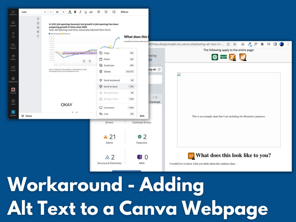
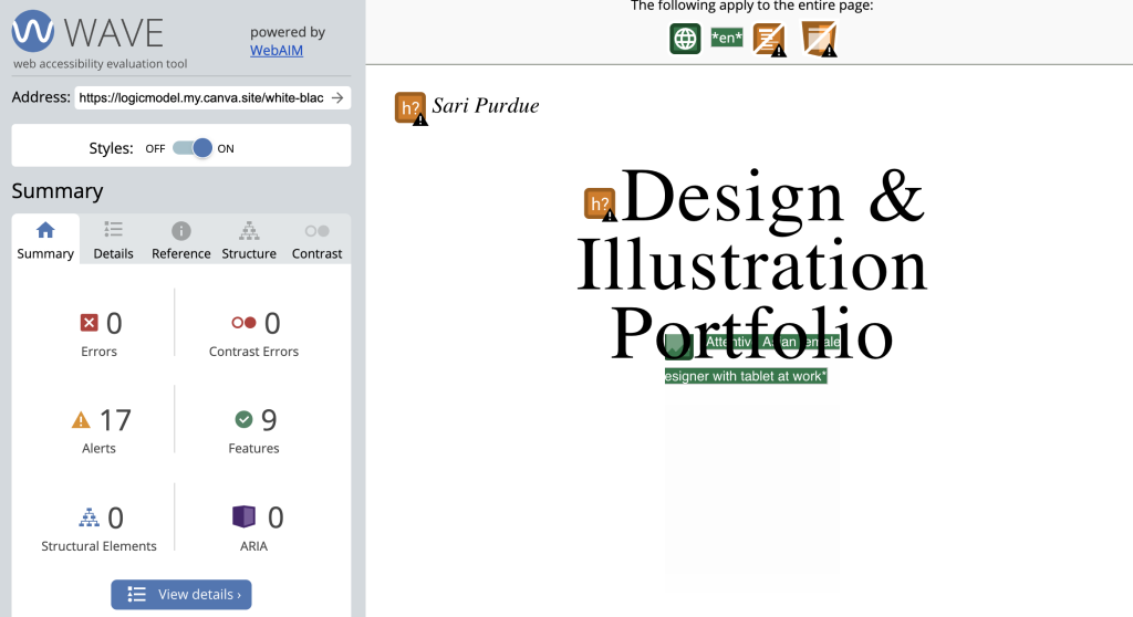
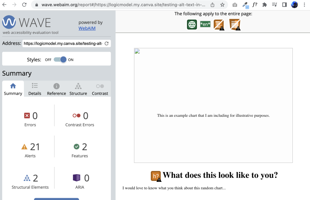
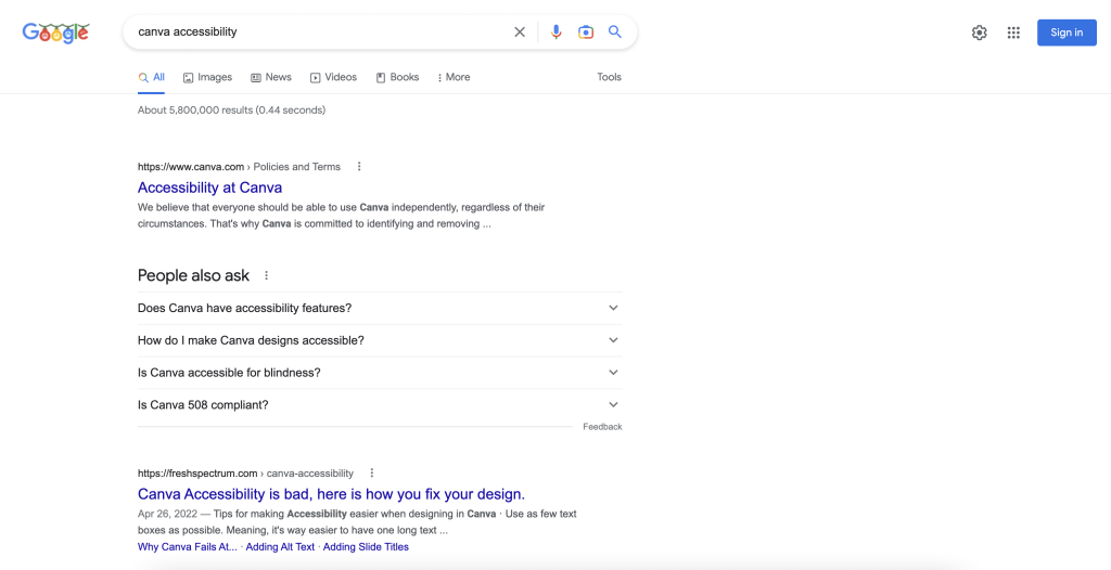
For instance, if you search for Canva Accessibility, you’re likely going to find a blog post by me ranked fairly high on the Google search page.

Screenshot of Google search for Canva Accessibility

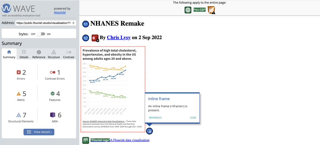
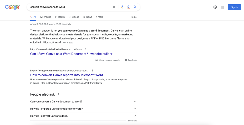
Same thing happens if you search for how to convert Canva Reports to Word.

Screenshot of Google search for Convert canva reports to word

Now I’ve been doing this strategically over the past year (answering questions people have so that they rank high on Google). As such, I’ve had a big increase in my website traffic. My website has become a resource for people looking to improve their design skills.

As an independent consultant I had convinced myself that this was a good thing. If I could be a design resource it would lead more people to my workshop or towards hiring me for gigs as a web, graphic, and data designer.

But the more I reflect, the more I think it’s flawed logic.

I have fallen into a trap.

When you write for Google, you write for discoverability. You write to offer out resources into the world that can help people in need of those resources.

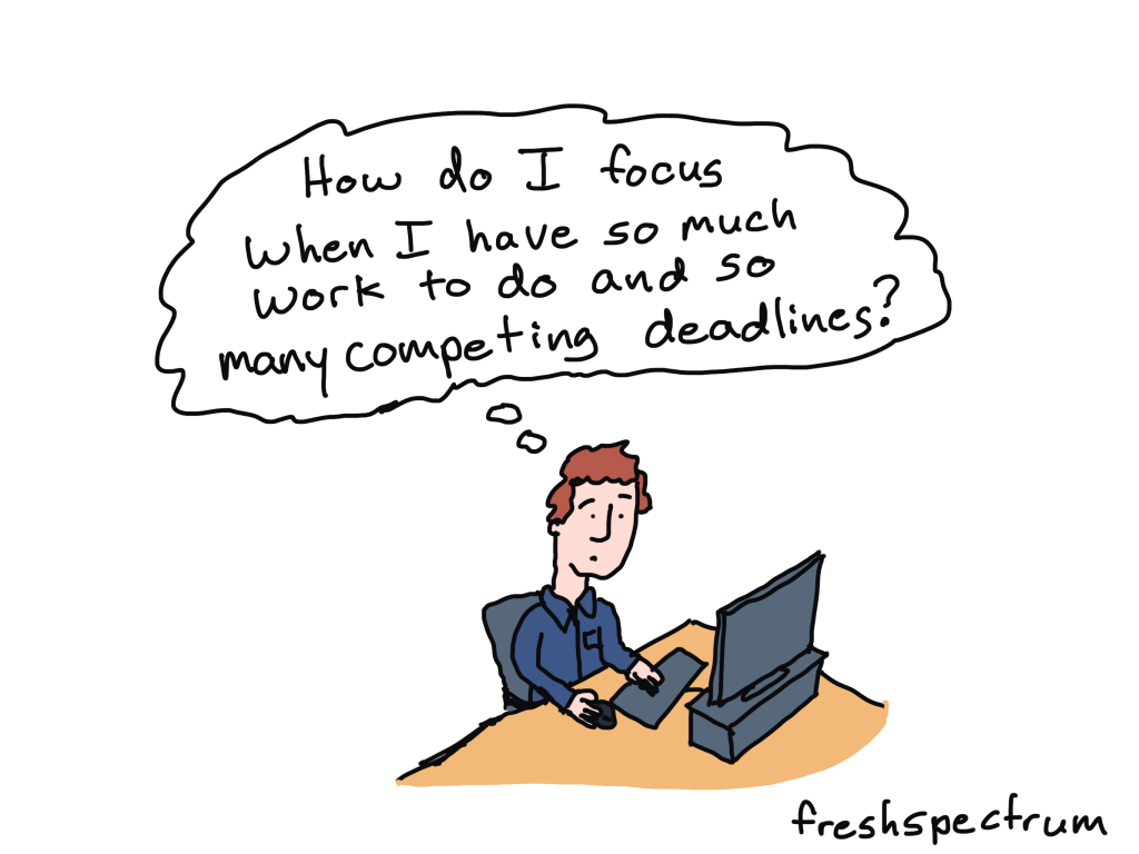
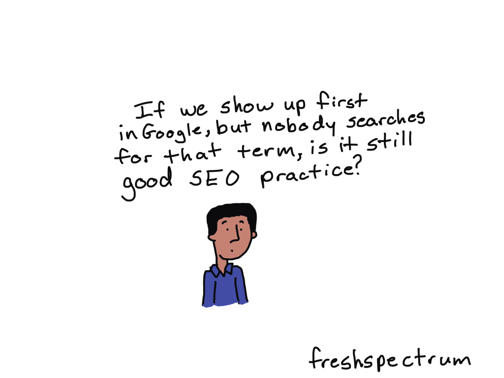
But here is the problem. Resource articles that do well on Google might be useful to the people with those questions, but they’re often pretty boring. They serve mostly an audience of strangers. But for the people who don’t care about the specific question, they offer nothing.

I’ve been playing the Google game successfully, and my Google score has been going up. But I’m not sure that makes sense for me and for this particular site.

Cartoon
If we show up first in Google, but nobody searches for that term, is it still good SEO practice?

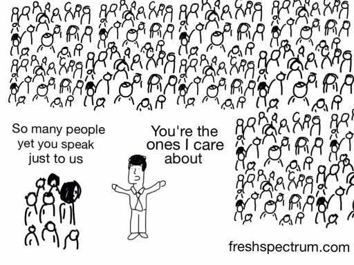
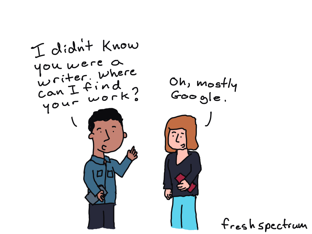
Why not write for the people who already know I exist?

Most of the people who become my workshop participants or clients knew me first as a cartoonist. Or they saw a presentation I delivered at a conference or on a webinar. They didn’t discover me through Google.

And by THEY I also mean YOU. There are plenty of exceptions, but YOU likely “met” me first as an evaluation cartoonist.

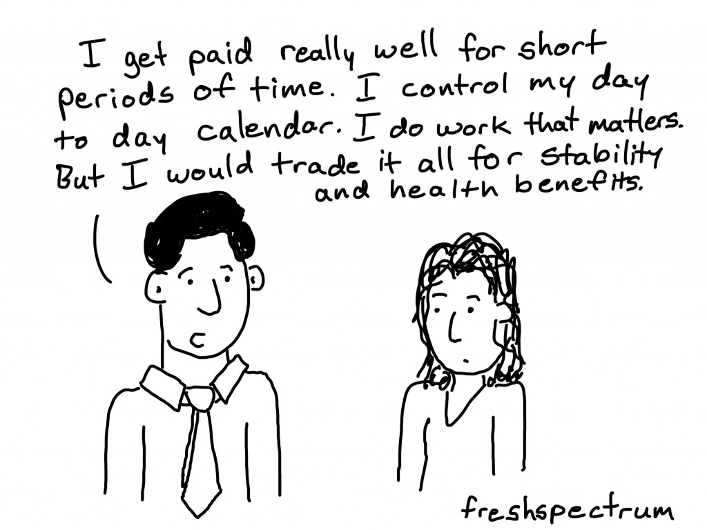
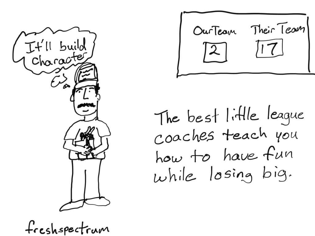
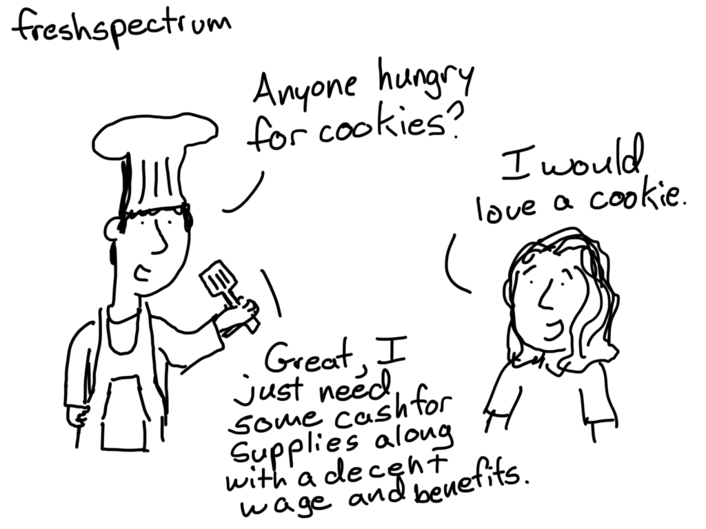
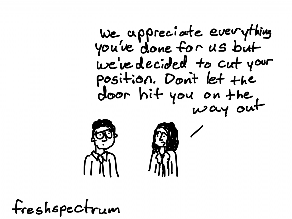
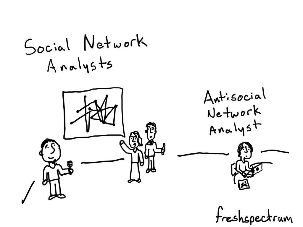
Now that doesn’t mean you are only interested in the cartoons. The comics are really just reflections of the important but sometimes absolutely ridiculous things that we see in our field. The blog posts that do best for my existing audience are the ones that dig deeper into my life and reflections as an evaluator and designer in the 21st century. And then go deeper into what you yourself might be able to draw from these lessons.

But these posts don’t do well on Google. Because nobody is actively searching on Google for my cartoon illustrated reflections on the modern data world.

Cartoon
Person at computer thinking - "I want to read something that will help me reflect on my profession and think about our role in our modern digital society.  Now who do I put into Google."

More like a columnist, less like tech support.

So what does this all mean?

Well, I made a decision. I’m going to stop writing for Google and focus more on writing for you (and me). This space is going to be a blog again.

In other words less tutorials, more essays.

I’ll still teach design, but intentionally through my workshop not here on the blog.

Have any thoughts?

I am curious about what you think. This will likely be the way I move forward for the next few months regardless of feedback, but any feedback I’m given is always appreciated and considered.

Thanks for hanging out with me, -Chris.

Written by cplysy · Categorized: freshspectrum

Dec 07 2022

Alt Text in Canva – finding a workaround

How do you add alt text in Canva? Short answer, you don’t (Canva doesn’t have that feature). Long answer, read on for a workaround.

Featured Image - Workaround - Adding Alt Text to a Canva Webpage

As much as I love Canva for creating infographics and micrographics, as a website publishing tool (and a PDF creator) it is a failure. It’s missing some key features required to share accessible interactive digital designs.

I decided to see if I could find a workaround to the Canva alt text issue. I think I found one and while it’s not perfect, it is a whole lot better than the nothing Canva gives us now. So that’s what you’ll find in today’s post, 4 potential workarounds I tested and the 1 workaround that actually seemed to work.

Quick PSA – Hey Canva, Stick an Alt Text Feature Here!

So I get that reading order might be a bit harder to implement, but at the very least alt text should be easy. You can already isolate images and edit them with filters why not add in a button for alt text?

Screenshot of a Canva web page being built from scratch.

Four potential workarounds

Until such time that Canva gets their accessibility act together, let’s test a few possible work arounds.

  1. Hiding text behind an image in a spot that only a screen reader could see.
  2. Embedding an imaged hosted elsewhere that already has associated alt text.
  3. Using a native integration with a tool that allows for alt text.
  4. Just incorporating images from Canva’s own stock image library.

How I tested the workarounds

To start, I created a couple of very basic sample Canva webpages for testing purposes. For the first I just published a Canva website template and tested it as is. For the second I created a basic website from scratch adding the elements I wanted to test.

  • I used a couple of screen readers for my test. A chrome browser based screen reader and my Macbook’s VoiceOver (built in screen reader).
  • I also used WAVE (Website Accessibility Evaluation Tool) by WebAIM.

What did NOT work.

I uploaded an image to my own personal website, gave the image alternative text, and then used the Embed tool inside Canva to insert the image. I thought this would work…but it definitely did not.

At its best I could get a screenreader to read the filename (but it never read the alt text).

Screenshot of an image being embedded into Canva

My guess is that if I played with enough embed tools there probably would be a successful workaround, but it’s just a guess.

What kind of worked.

The Flourish embed sort of worked. It was not straightforward, but I could technically get a screenreader to read the alternative text I put in to describe the chart.

Screenshot of the Flourish tool inside of Canva.

What I found interesting, is that even the chart shared on Flourish’s public site comes through inside an <iframe> which basically means that even on the share page for your Flourish visual, the image is embedded onto the page. This probably doesn’t mean much to most of you.

Screenshot of a WAVE assessment of a Flourish chart page.

In simpler terms, I was having the same screenreader quirky challenges on the published Flourish page that I was having inside the Canva embed.

Screenshot of a Flourish public chart page.

The stock photos used in Canva’s templates DO include standard alt text. There is no way to change the text, but it technically exists.

This does not include images you upload to Canva.

Canva design portfolio web template.

According to the Canva system, the photo above is “Asian Female Designer with tablet at work.”

Screenshot of WAVE assessment of a Canva webpage.

So while both of these options technically did give me alt text, you don’t really have enough control for this to be a great workaround.

What worked.

Okay, so here it is. The workaround to use if you have no other choice than to create a website using Canva (which I’m skeptical about but I don’t know your situation).

Step 1. Put a text box over the top of the image you inserted into your Canva design. Use this text box to describe the image. Then once you are done, click “send to back” to hide it behind the visual.

Screenshot of text box being sent to back of a Canva webpage.

Here is what it looks like on a website. If the image does not load, the descriptive text box will show. This was also successfully read by both my screen readers in the proper order on the page.

Screenshot showing how a canvasite looks to a WebAIM's WAVE tool.

My final conclusion: don’t use Canva for websites until they fix their accessibility issues.

Okay, so technically I found a workaround for one of Canva’s accessibility issues. But that doesn’t solve everything.

Canva should really fix the following if it wants to seriously pitch itself as a web design tool (not just for image production).

  • Alt text (what we’ve been addressing in this post)
  • Document tagging (being able to tag individual text boxes as headings or paragraphs is essential)
  • Reading order (you should be able to guide a screenreader through a page in the proper order)

Want to read more about Canva accessibility? Check out my other post:
Canva Accessibility is bad, here is how you fix your design.

Written by cplysy · Categorized: freshspectrum

Nov 30 2022

Agile for One

How do you manage all the stuff you need to do each day? In today’s post I’m going to walk through my indie consultant project management process, which I call Agile for One.

I am a creative with an ADHD brain.

If you have followed me for awhile that sentence will not be a surprise. My mind likes to jump around to different topics and I like doing all sorts of different things. And while it would be fantastic to just be able to lean into that craziness, running a business requires a bit more consistency.

Person 1 holding a duck carving - "I didn't know you were a wood carver."
Person 2 sitting in a chair carving wood, "Oh, I'm not. I had a lot to do this week but then I saw this YouTube Video of a guy carving ducks and thought, "I could do that."

For instance. Here is stuff I do every week.

  • Write a blog post.
  • Draw a set of cartoons.
  • Host a live design workshop.
  • Write an email for my blog followers.
  • Write a special email for my workshop participants.
  • Share stuff on social media.
  • Serve my clients.
  • Take care of business admin stuff.
  • Family support stuff.

That doesn’t even include the stuff I do on an every once and awhile or the random projects I seem to fall into on a whim. So how do I get everything done consistently when there is only so much time in the day?

What is Agile?

If you want a complete answer to this question I would suggest you Google it. There are people who make careers out of implementing Agile and lots of software companies who serve organizations that are committed to the project management philosophy. So you’ll find a lot of articles.

Guy at desk thinking, "How do I focus when I have so much work to do and so many competing deadlines."

But basically, in layman terms, it’s just a different way to approach getting stuff done. An approach used by lots of software development teams who are developing new things quickly and need to get a lot of tasks done together as a team.

I don’t use it that way. For one, I don’t have a team, just myself. But as an indie, an Agile approach really helps me keep track of tasks so I don’t forget anything.

My basic Scrum board.

Okay, so if you do google Agile, you’ll hear people talking about Scrum. It’s basically just a more specific method of Agile. But that doesn’t really matter, because all I care about is the board.

Photo of my Scrum Board wall with masking tape, to do, doing, and done sticky notes.
This is what my wall looks like. Nothing fancy, just masking tape and post it notes.

On my office wall I used masking tape to create three columns.

  • Column 1. To Do (This Week)
  • Column 2. Doing (Today)
  • Column 3. Done (For Now)

I put tasks that need to get done on Sticky notes. Then I put each one in its proper column. As I complete tasks I move them to the Done column.

Photo showing my archive column.
My Archive lives outside the columns of my Agile for One Scrum Board

I also have two more columns that are just spaces to hold tasks not currently on the list this week.

  • Archive. In (Left Side)
  • Archive. Out (Right Side)

In the Archive in space I put tasks that will likely need to be done again in the coming weeks. In the Archive out space, I put tasks that are fully complete and not likely to be completed again.

Your Weekly Plan

Photo showing my wall scrum board with post it notes.
Scrum board with Post its.

Your weekly plan is simple.

  • On Monday morning (or Friday afternoon) reset your board.
  • Each morning move tasks that need to be done that day to the doing column.
  • As you complete tasks move them to the Done column. then add more from your To Do (this week) column to the Doing (today) column.

Your goal each week is to move all the tasks from the left column of your board to the right column.

Go Digital with Trello

I like the tangible feeling of a Post-It note. I like being able to physically move the notes from column to column. But it’s not necessary to have a physical board. I’ve only been able to do this since I moved into my new office this fall.

If you don’t have physical wall space, or if you live your life as a digital nomad, a tool like Trello makes creating boards like this one easy. There are also bunches of other tools out there if you don’t want to use Trello (ex. Monday, Asana, and Microsoft Planner all have similar features).

Trello board example.
An example simple Scrum Board setup in Trello

How about you?

So that’s how I do it. What tricks have you developed to keep track of all the things you need to get done?

Written by cplysy · Categorized: freshspectrum

Nov 27 2022

The people who saved evaluation comics.

Since 2011 I have drawn thousands of comics. But over the last 11 years there were a few times when I almost quit. What saved the cartoons? Scratch that, who saved them? Read on to find out.

You’ll find my comics scattered across the web, on office bulletin boards, in university lecture slides, at conference presentations, and even within a handful of prominent textbooks. While I make most of my income as a graphic, web, and data designer these days, most evaluators know me first and foremost as “the evaluation cartoonist.”

But even with all the positive feedback there were quite a few times when I almost quit cartooning entirely.

Times when I almost quit cartooning.

1. When I started teaching data visualization design.

Back in the middle part of the 2010s I was a full time employee, a father to a preschooler, a blogger, and a cartoonist. Then I decided to start teaching an online data visualization design workshop. Something was going to have to give.

From my post, “What is diydatadeisgn?”

2. When I started my indie business.

It was 2016 when I started this business the first time. Were the cartoons essential to starting my consulting practice?

Drew this one as part of The Gig Economy Business Plan

3. During my family’s hell year.

At the beginning of 2017 we lost my healthy father-in-law out of the blue to a rare condition called CJD. At the end of 2017 we lost my not-nearly-as-healthy father to a sudden heart attack. Both events took a heavy toll on myself and my family. Honestly, I’m still recovering.

A cartoon I drew as part of my cartoon obituary for my father.

4. When my business collapsed.

In early 2018 I “closed” my blog. I came back months later. And then in late 2018, I took a new full time job.

From the post, “A few lessons learned as I close down my business.“

5. When I lost my job.

I was laid off in the middle of 2019. I saw it coming but it still felt like a punch in the gut. This was the moment that I lost all faith in the idea that a traditional full time position offered the stability I didn’t have when I was indie.

From the I lost my job blog post I wrote.

6. All those times in between, when I was just too overwhelmed.

I am an introvert with ADHD who faces regular bouts of depression and anxiety. Consistency is my struggle as my brain often pulls me in different directions or simply decides to shut down.

So why do I still cartoon?

I love that people read this blog. I enjoy when people like or comment on my social media posts. I like hearing from fans of my work or seeing the cartoons in prominent places.

But that wouldn’t be enough to keep me going.

In fact, I am almost certain that if not for this one thing the comics would have stopped years ago.

My Patrons Saved My Evaluation Comics

If you like my comics and have used any over the years in your presentations, lectures, or social media posts you have my patrons to thank.

The Patreon part of my business is not a huge money maker. It’s really just a small part of my income. But there is something behind the idea that people have been contributing real money towards my comics that makes it feel so much larger.

Their support over the years has taken me through every one of those times when everything seemed to be falling apart. All in all, 133 people have supported my comics at one point or another since I joined Patreon in 2014. My current count is 53.

Knowing they are there, supporting my work, brings me back even when times are hard. This post isn’t just a plug for you to join us on Patreon. It’s a time tested truth.

Re-inspired to Create

Back in the early summer I was really trying to post comics continuously, my goal was every single day. But then I burnt out and needed a break.

Over the last few weeks I’ve been cartooning again, although I haven’t shared much. This time I’m setting a personal goal to post 3 new cartoons a week for at least the next 6 months (Mondays, Wednesdays, and Thursdays).

Spinning off my comics to their own site.

Comics will still very much be a part of how I illustrate my blog here at freshspectrum. But I also wanted to create a comics-only place for when you just want to scroll through the cartoons. So that’s where evaluationcomics.com comes in.

All new cartoons I post will end up on the new site.

  • The current year’s cartoons will be freely available for everyone to read.
  • The complete archives will only be available to Patrons.
  • It only takes the minimum Patreon level ($2 a month) to unlock the archives.

So, Join Us!

The freshspectrum patreon community is filled with the kind of people who enjoy evaluation comics. Are you one of us?

If yes, becoming a freshspectrum Patron is the best way for you to support evaluation comics and keep me creating on a regular basis.

Join us on Patreon!

Written by cplysy · Categorized: freshspectrum

Nov 16 2022

Reader-Focused Report Assessment

How do you tell a good report from a bad report? That’s what I hope you’ll be able to do with my new quick 2 page assessment.

So a little while ago I created a resource, it was a short 18 page eBook that walked through a 6 step process. If you’re interested you can grab it here: UX Evaluation: How to Evaluate Dashboards, Reports, and Data Visualization.

But truthfully, whether or not they should, most people are not going to go through that much effort. And you really don’t have to go through that much effort to learn a lot about the effectiveness of your report. So I decided to make something a little easier.

Reader-Focused Report Assessment Featured Image
You can download the assessment by clicking this link.

There are three basic steps.

Step 1. What is your goal?

You would think it would be obvious, but a lot of people don’t take the time to put this into words. But why you are sharing your report or presentation is really fundamental to your design approach.

So I start by asking you to write a sentence or two on the goal.

Step 2. Describe 3 audience members?

Breaking your audience down into 3 groups is a really nice way to help you imagine “the who” in your audience. The 3 audience approach is central to my client design work, which is why I talk about it early in my book.

While all audiences are different, interest level plays a huge role in choosing the right type of report. Because if you try to serve everyone with the same style of report you are going to fail. Shorter visual reports work better for casual audiences. High interest audiences often want far more substance. And your executives (and probably your boss), they usually land somewhere in the middle.

Taking a little time to identify a person who can represent each group can really improve how you see your own reporting. It’s also fundamental to what I’ll ask you to do on page 2.

The people you choose here can be fictitious, but you should be able to validate your assumptions by talking to real people who match your descriptions.

Step 3. Rating on Relevance, Usefulness, Interest, and Confusion.

The second page gives you a chance to role play each one of your 3 identified audience members and rate your report accordingly. What might be highly relevant to one audience member might not be relevant for another. A report could be interesting but not all that useful. It could also be potentially useful but really confusing.

There is no getting all As on this assessment. If you find yourself saying everything is highly relevant, useful, and interesting while also not being confusing for everyone…you might be a little delusional.

Cartoon person 1, "This report reads like it was written just for me."
Cartoon person 2, "That's because it was."

How to use.

This is the kind of assessment you have several people run through. Then you meet together in a conference room (or Zoom room) and talk about your findings.

If there are disagreements, or your reports are really important, find real people who match your audience descriptions. Have them read the report. Then ask the questions on page 2 (over Zoom or a cup of coffee).

Do your assumptions on how your audience would see your report align with real world user experience?

Download the Assessment.

Click on the following link to download the assessment.

Download the assessment button.

Written by cplysy · Categorized: freshspectrum

  • « Go to Previous Page
  • Go to page 1
  • Interim pages omitted …
  • Go to page 23
  • Go to page 24
  • Go to page 25
  • Go to page 26
  • Go to page 27
  • Interim pages omitted …
  • Go to page 54
  • Go to Next Page »

Footer

Follow our Work

The easiest way to stay connected to our work is to join our newsletter. You’ll get updates on projects, learn about new events, and hear stories from those evaluators whom the field continues to actively exclude and erase.

Get Updates

Want to take further action or join a pod? Click here to learn more.

Copyright © 2026 · The May 13 Group · Log in

en English
af Afrikaanssq Shqipam አማርኛar العربيةhy Հայերենaz Azərbaycan dilieu Euskarabe Беларуская моваbn বাংলাbs Bosanskibg Българскиca Catalàceb Cebuanony Chichewazh-CN 简体中文zh-TW 繁體中文co Corsuhr Hrvatskics Čeština‎da Dansknl Nederlandsen Englisheo Esperantoet Eestitl Filipinofi Suomifr Françaisfy Fryskgl Galegoka ქართულიde Deutschel Ελληνικάgu ગુજરાતીht Kreyol ayisyenha Harshen Hausahaw Ōlelo Hawaiʻiiw עִבְרִיתhi हिन्दीhmn Hmonghu Magyaris Íslenskaig Igboid Bahasa Indonesiaga Gaeilgeit Italianoja 日本語jw Basa Jawakn ಕನ್ನಡkk Қазақ тіліkm ភាសាខ្មែរko 한국어ku كوردی‎ky Кыргызчаlo ພາສາລາວla Latinlv Latviešu valodalt Lietuvių kalbalb Lëtzebuergeschmk Македонски јазикmg Malagasyms Bahasa Melayuml മലയാളംmt Maltesemi Te Reo Māorimr मराठीmn Монголmy ဗမာစာne नेपालीno Norsk bokmålps پښتوfa فارسیpl Polskipt Portuguêspa ਪੰਜਾਬੀro Românăru Русскийsm Samoangd Gàidhligsr Српски језикst Sesothosn Shonasd سنڌيsi සිංහලsk Slovenčinasl Slovenščinaso Afsoomaalies Españolsu Basa Sundasw Kiswahilisv Svenskatg Тоҷикӣta தமிழ்te తెలుగుth ไทยtr Türkçeuk Українськаur اردوuz O‘zbekchavi Tiếng Việtcy Cymraegxh isiXhosayi יידישyo Yorùbázu Zulu