• Skip to main content
  • Skip to footer
  • Home

The May 13 Group

the next day for evaluation

  • Get Involved
  • Our Work
  • About Us
You are here: Home / Archives for allblogs / freshspectrum

freshspectrum

Oct 05 2022

New Free Course on Micrographics

I’m trying out a new style of course, and for the moment, it’s free.

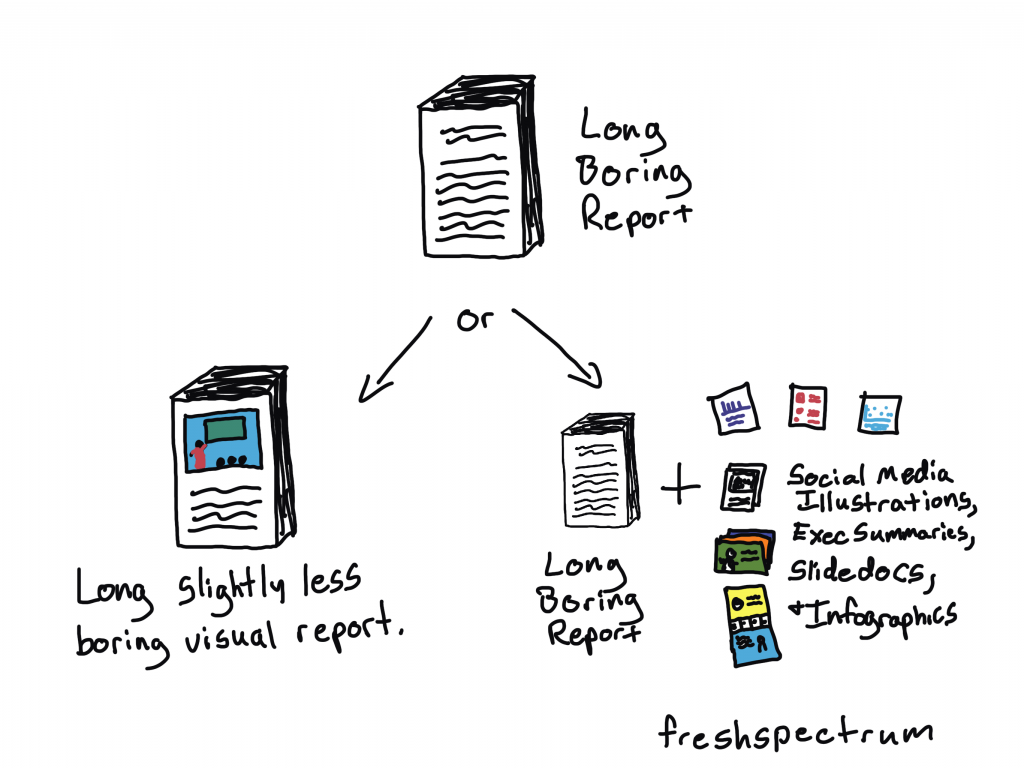
Even the best designed full reports are only read by so many people. It might be the marquee deliverable you pass on to your client. The thing that addresses everything you learned and documents everything you did. But ultimately long reports have limited audience.

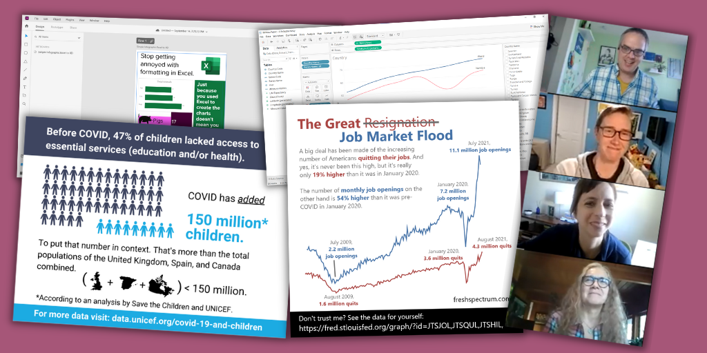
But then there is that one really nice illustration or chart. You know the one, it’s the visual you end up using in all your presentation slide decks. It’s the only image that gets shared in the email newsletter. It’s the image that goes along with all your social media posts.

That one little graphic will get seen by way more people than your full report.

That is, at least, if you have that one little graphic.

Quick Wins Micrographics Course image.

Our biggest reporting problem.

Our biggest reporting problem is not:

  • long boring reports,
  • bad charts,
  • or a lack of audience interest.

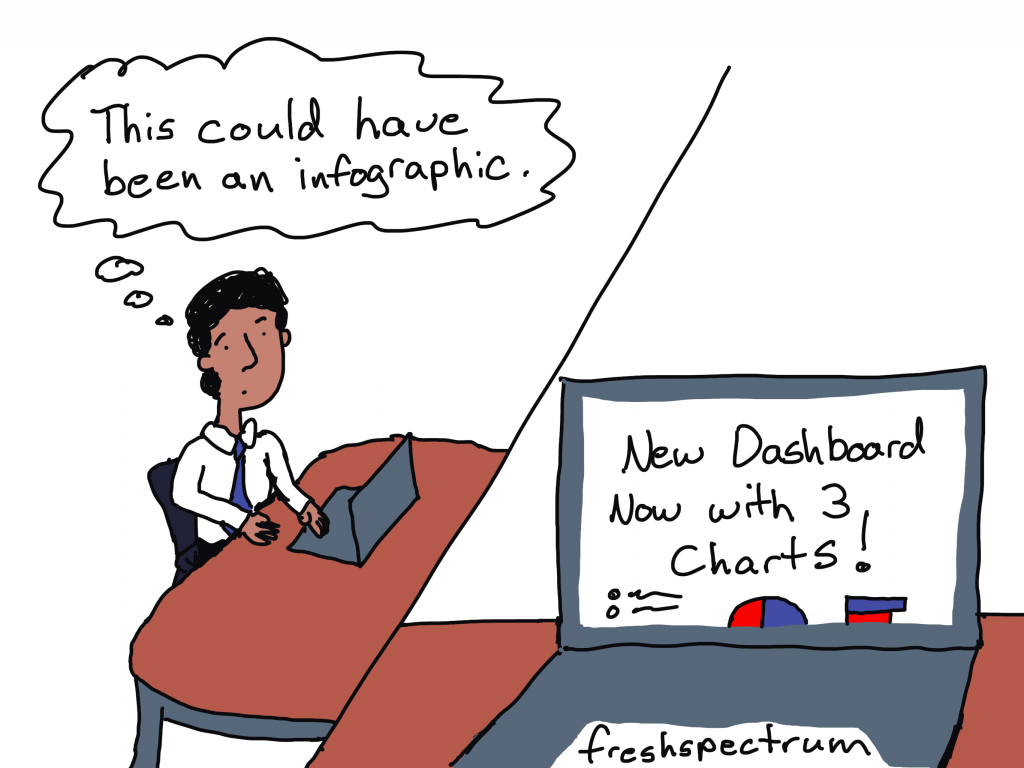
Our biggest reporting problem is that our reports are under illustrated.

We do not create enough quality visuals to satisfy the functional needs of our modern image-hungry digital society.

Micrographic...it's like an infographic...but smaller.

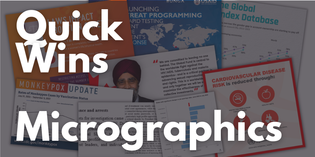
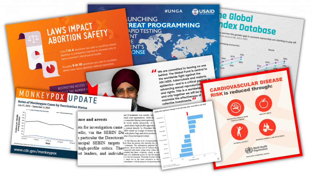
What are Micrographics?

I use the term to describe a bunch of different types of visuals.

But in a nutshell, micrographics are visuals that can exist and even thrive in their own right outside of a report. They have a wide range of uses…

  • as power point slides,
  • as blog post featured images,
  • as report illustrations,
  • as social media images,
  • as centerpieces in longer infographics,
  • as marquee visuals in executive summaries,
  • as newsletter illustrations,
  • and more!

Communications’ teams have been picking up the slack.

Since most of our reports are under illustrated and lack the kinds of images that can be stood up on their own, social media teams have had to pick up the slack. This means taking our work and adapting it into a visual format.

We see this the most with large organizations that have their own dedicated comms teams. Their social media accounts share tons of visuals, most of which have been adapted from reports, newsletters, and fact sheets that contain few, if any.

But not all of us work in large organizations. And even if you do, there is no guarantee the social media team is going to pay special attention to your work. Not unless you make it easy for them to do so.

A selection of 8 micrographics.

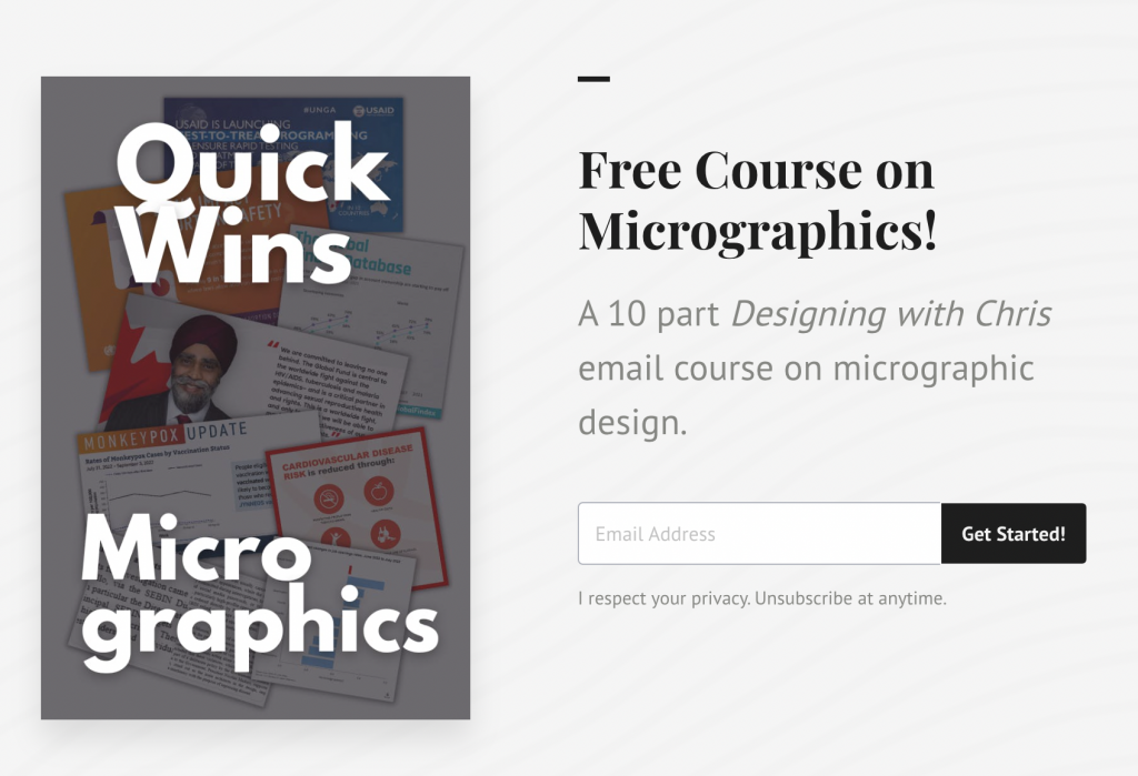
My email course on Micrographics.

The course is made up of 10 emails sent over 10 days.

With the exception of the introduction and the wrap-up, the emails are all structured using the same pattern.

  • First we will look at an example of a micrographic shared by a large NGO, non-profit, or government organization on Twitter.
  • Second we will look behind the tweet and find the information source behind the graphic.
  • Third we will break down the micrographic into its component parts.
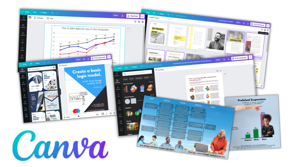
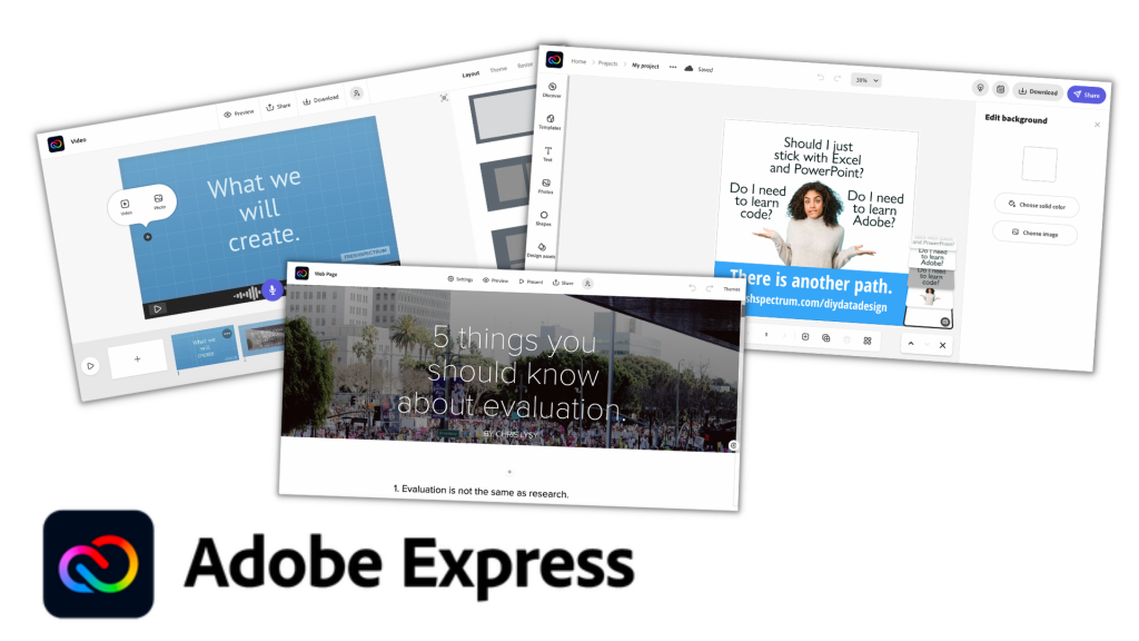
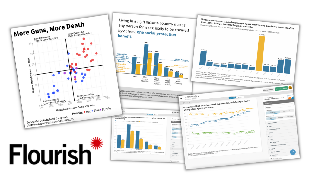
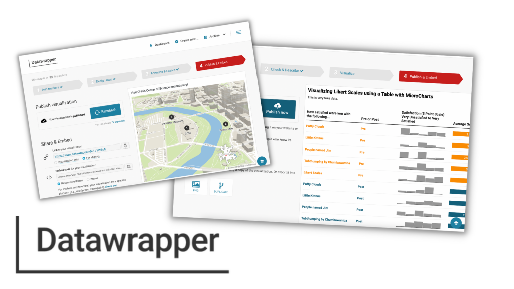
  • And lastly we will recreate the image using free online tools (mostly Canva but also Flourish and DataWrapper). I have done this for each one of the 8 examples and shared my version as a Canva template. It’s up to you to follow my lead (but you can look to my example if you get stuck).

The goal isn’t to teach you how to copy the work of others, but to give you a better perspective on the process of data illustration.

My hope is that by showing you how other large organizations go about creating visuals for social, you’ll be able to apply that same process to your own work. You’ll also get some experience using a few new tools.

Why that doesn't look so hard.

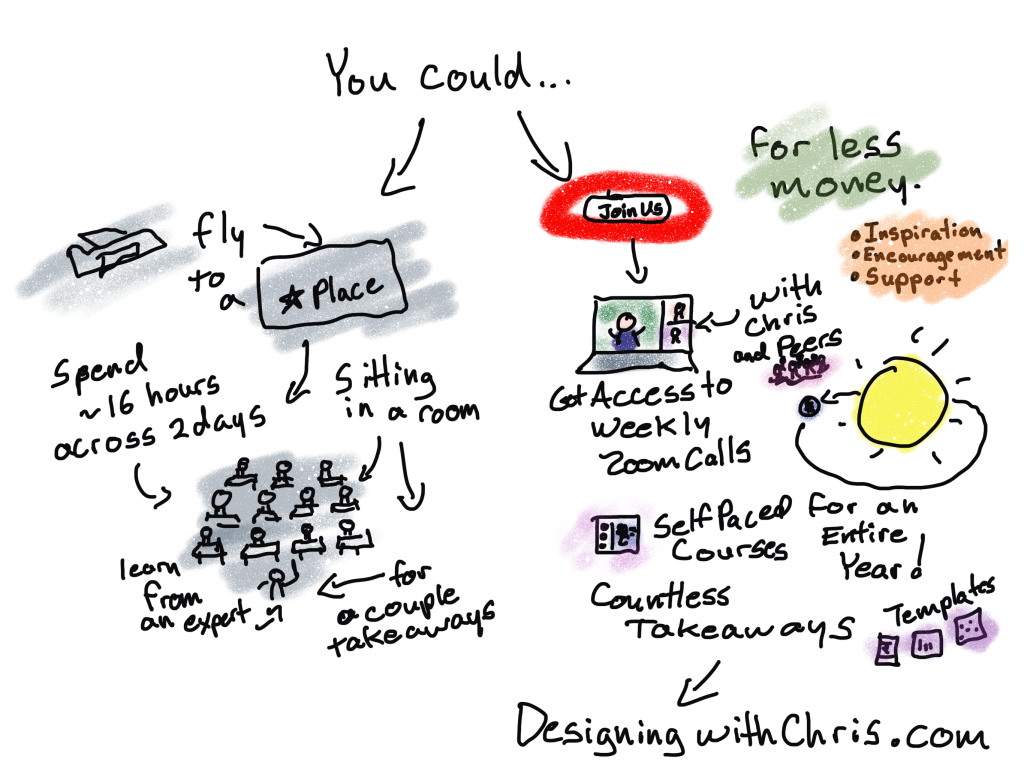
Want to binge the course instead?

The course binge option is only available to Designing with Chris – All Access participants. But you are more than welcome to join us anytime!

Ready to start the email course?

Just click the link, put in your email address, and click to get started. Your first email should come pretty quickly! Then you can expect an email everyday for the next 9 days.

Free course on micrographics.

Written by cplysy · Categorized: freshspectrum

Sep 28 2022

14 tips to make reporting easier.

Looking for ways to make reporting easier? In this blog post I share a collection of tips.

When talking about my book with folks I get a lot of head nods. But then the obvious question comes next… “Okay, but what do I do about it?”

The truth is, as important as you think it is to effectively communicate our research and evaluation work to a wide variety of audiences, it doesn’t mean you instantly have more time or money to do that. And I don’t think you should expect to have more time put into dissemination.

Right now, if you want to increase the power of your reporting you don’t just need to make it better, it also needs to be easier. Here are 14 small things I would suggest you do to make your reporting process easier.

Cartoon "Why create a style guide when you can just stick with Microsoft defaults?"

1. Create a basic style guide.

A basic style guide saves time when it matters the most. The last thing you should be doing when facing a fast approaching deadline is having a debate about your report’s color scheme and font choices.

Now I’m not talking about a full branding kit. You don’t need pages of information covering all the many ways it’s possible to screw up the use of a logo. Just a basic style guide.

Your basic style guide should include:

  • Logos (SVG or high quality PNG/JPG)
  • Colors (a primary set and a secondary set for use in charts)
  • Fonts with pt size (Header, Sub-header, Body)

Want help coming up with a data visualization color palette?

2. Leave your long boring report, long and boring.

Last week I wrote a post about how reporting is different from documenting. Those super long boring comprehensive reports usually fall well into the documenting category.

Lots of organizations will spend hours upon hours formatting and styling long reports that are not really meant for any specific individual audience. My advice, save your time and keep that long report boring. Then invest that saved time creating reports people will actually want to read.

Don't make your long boring report slightly less boring.  
Just keep it boring, and add other small reports.

3. Create short, simple, focused, visual reports.

There is nothing wrong with having a long boring report, as long you don’t stop with the long boring report. Your reporting focus should be on creating short, simple, focused, visual reports. These could be as simple as square social media infographics, one pagers, executive summaries, or short slide docs.

Pretend you’re at a cocktail party and somebody asks about your work, do you tell them everything? If you do, you probably don’t get invited to many cocktail parties. Reporting is easier when you are focused more on the needs of your audience than on sharing everything about your work, and it’s also more effective.

4. Build a template library.

Having a good template is like a getting a head start. Just like with the style guide, templates reduce the number of design decisions you have to make when you are most pressed for time.

I suggest creating templates in sets. For example, create a matching set of one-pager, 3-pager, and 25 pager templates. Use lorem ipsum text that mirrors content length. Also remember to create your templates using your basic style guide.

Cartoon. "I prefer to create all my reports from scratch. Templates make it all too easy."

5. Create template content worksheets.

Most report writers tend to write first, design second. And since our brains don’t multi-task well, separating the two tasks is usually a good idea. But a problem occurs when we write without the end in mind.

By creating worksheets to pair with your design templates you can make it much easier to write for specific types of content. The worksheet should include sections for each block of written content in a design. It should also include target word counts whenever possible.

6. Build an asset library.

Your asset library should include a collection of icons, illustrations, photographs, and charts. A lot of time gets put into finding the right visual, but often that visual would likely work across a wider range of projects.

While you can find an increasing number of premium stock asset libraries, it’s also a good idea to just have a folder on your computer or your team’s network drive.

Cartoon. "No need showing me any examples. I'll just wait till you put in all the work.  Then if I don't like it, you can just start over."

7. Collect inspiration.

Have you ever watched one of those reality TV shows about interior design? At some point early in the show the designer will share what they have in mind for a space using a mood board. The mood board is a collection of examples, colors, and other pieces of inspiration.

The easiest way to get a team on board with your vision is to show them a picture. You do not have to be the one who created that picture. And if your team does not share your vision, it’s better to find that out before putting in all the work. So when you find examples of report styles you think are effective, save them for later.

8. Start using Canva instead of PowerPoint.

So pretty much everything you can create in Canva you could already create in PowerPoint. So why use Canva instead?

PowerPoint is a design tool. Canva is a template and asset library that also happens to be a design tool. The tool makes creating visual reports easier and faster. It’s also easier to collect and share assets for future use.

Cartoon. "I'll stick with Excel, thank you very much. All those other programs don't let you create the snazzy 3D pie charts everyone loves."

9. Start creating charts in Flourish instead of Excel.

Over the past year I’ve noticed myself creating fewer and fewer charts in Excel. And it’s not because I’ve adopted an expensive or complicated tool.

I use Flourish for charts for many of the same reasons I use Canva for infographics. It’s easier to create higher quality visuals, faster. It’s also easier to share my created works as templates that can be used at a later date.

10. Start writing your reports in Google Docs instead of Word.

If you’re like most researchers and evaluators, you’ve probably spent a large amount of time writing and formatting reports in Microsoft Word. But it’s also likely you’ve developed some pretty bad design habits due in part to the way Microsoft Word is designed.

Switching to a simple Google Doc can help you to focus on just putting down words. That way you don’t get tempted into formatting tables or editing page layouts before the report is ready for that step. The more plain text you keep your writing, the easier it is to transfer into a visual design template.

Cartoon. "Shakespearean Trello Board. To Do. Not to Do."

11. Go Agile with your design process.

You don’t have to become a certified scrum master (or even know what that means) to adopt a simple agile design process. Agile has worked tremendously well for speeding up the software design process, but it can also work well in speeding up a modern design process. I suggest creating a very basic Trello board to keep track of all the tasks that need to be done when producing your report.

Set up your initial Trello board with just a few columns. One column (backlog) should contain all the tasks that need to be done (aka a To Do column). The second column should be in progress (this is the one you move a task to as you’re working on it). The third column should be a a completed column. Based on your team needs you can also add some additional columns including a stuck column, waiting review column, or next up column.

12. Get your HiPPOs involved early and often.

As I mention in my book, The Reporting Revolution, The HiPPO is the Highest Paid Person’s Opinion. That opinion is a report design wild card. In just about every organization there is a person, or people, who can completely disrupt a report design process with a simple suggestion. Why don’t you use green instead of blue? Who decided on using illustration instead of photographs? Shouldn’t we devote more pages to sharing our findings?

As a report designer it’s your job to find the people who can slow down the process or trigger your team to do double the work. You should have a list of all these people whose opinions could stymy your report design, then get them involved in the early parts of the design process. Because this is where you make a lot of little design decisions that would be hard to change later in the process.

Cartoon. "Why spend time talking to potential report readers when we can sit around a board room table asking what if questions and pretending we already know the answers."

13. Less speculation, more user testing.

We like to think we know what others want out of our reports, but do we really? I have spent far too much time across my data career sitting in rooms having conversations about what should and should not be included in a report. Often times these conversations are guided by speculation, not actual audience insight.

A few short, informal conversations with potential audience members seeing your report design for the first time can produce a ton of insight. Maybe they find that super nifty slopegraph you learned how to create super confusing and would just prefer a boring old clustered bar chart. Perhaps they missed that conclusion you thought was presented in a crystal clear fashion. The more you user test, the faster you can eliminate the stuff nobody needs or wants.

Designing with Chris gives you a whole year of takeaways for the same price as a two day workshop.

14. Join my virtual workshop > Designing with Chris.

Designing with Chris (formerly DiY Data Design) is my always open virtual design workshop for busy researchers and evaluators.

You can get a full year of my virtual workshop for less than the cost of a two day live workshop (ex. a two day live workshop with The Evaluators Institute costs well over a thousand dollars, even before factoring in travel costs!).

I first launched my workshop in 2015. Over that time technology has changed considerably. It’s now far easier to create better designs, faster. And that’s what I teach.

My goal is to give all my workshop participants the inspiration, encouragement, and support they need to grow professionally. Whether you want to become a professional information designer or just improve the quality of your reports, I am here for you.

Written by cplysy · Categorized: freshspectrum

Sep 23 2022

Are you reporting or documenting?

Do you know why so many research and evaluation reports are super long and boring? I have a theory.

Freshspectrum Cartoon.
"Wow, that's a lot of words."
"Can you believe I was able to fit my entire masters' thesis on a single research poster?"

One nice thing about putting all of your ideas into a book is that it makes it easier to chat about those ideas with others. And I’ve had the opportunity to participate in a bunch of chats about The Reporting Revolution.

A point that I make in the book is that it’s probably better to have 10 pretty good reports that reach 10 unique audience needs than to have 1 amazing report. I also talk a lot about different types of micro-reports (i.e. social media featured images, infographics, slidedocs, etc.).

This gets a little pushback, but not because I’m suggesting creating lots of little reports. Instead, it’s the idea that we shouldn’t create one big report. Because we need that report to do other things.

For example, we need the report as a historical record of the work that we’ve completed. Something that walks systematically through the methods we’ve used, talks about how we approached our analysis, and goes over any complications or considerations. Not because there is someone who specifically needs that information right now, but because somebody might need that information at some point in the future.

Freshspectrum cartoon - 
"Of course I "read" your report."
"Why the air quotes?"

Reporting versus Documentation

My love of little reports does not mean that I am against long reports. I have even written in defense of long 200 page reports.

Not only do long reports provide a historical record of our work, but they also help us to think through our work and let us write non-comprehensive short reports without the fear of missing something.

But merited or not, are these long brain dumps really reports?

Yes, we call them reports. But we don’t really create these things for people. We create these things to document our work.

We report for audiences.

Freshspectrum cartoon -
"Do you think I created too many types of reports?"
"Well, personally, I would have stopped at 25"

What would happen if you started calling your longer reports documentation?

If you give up the idea that you’re actually writing for an audience, the whole “formerly known as long report” thing gets easier to write. Because you’re just capturing your work.

And if you stop treating that documentation as the only way you report your work, you can start creating real reports. The ones designed to serve your audiences.

Written by cplysy · Categorized: freshspectrum

Sep 14 2022

5 Tools that Make Reporting Easier AND Better

In today’s post I’ll share my five favorite reporting tools. And no, my list doesn’t include Excel, PowerPoint, Word, R, Illustrator, D3, Tableau, or PowerBI.

My Quest.

I think I’ve been on a quest. Now I didn’t know I was on a quest.

It was more like something was missing but I didn’t know it. And it occurred the other day as I was re-opening my workshop, just what that missing thing was.

The four pathways.

Over the last decade I came to believe that most data people interested in better data design tend to follow one of four paths.

  • You could take a coder’s path. Learning things like R, Python, SQL, and Javascript. Maybe you start calling yourself a data scientist or data engineer.
  • You could take a graphic designer’s path. Learning tools like Adobe Illustrator, Photoshop, and InDesign. Perhaps you take a position in a small boutique design agency.
  • You could take a BI dashboard developer’s path. Learning tools like Tableau and PowerBI. Here you can get a job in finance or healthcare and join Tableau’s data fam.
  • OR…you could take the most common path and just stick with trying to create better charts and reports using Excel and PowerPoint. There is nothing wrong with this path, as modeled by Stephanie Evergreen and Ann K Emery, you can do amazing things with these mainstream tools.

As a jack of all trades, I personally tried to take all the paths…

And yes, I learned a lot. Now I can do a little bit of just about everything.

I have worked as a programmer, developing websites and applications, and know a little bit of code. I have designed and illustrated reports for NGOs and nonprofits. I’ve created data dashboards for state agencies and universities. And I’ve also created a lot of Excel charts and PowerPoint presentations for all sorts of clients.

And I thought…well maybe that’s just the kind of data designer I am. The kind that knows a bit about everything. From that vantage point I can help steer others down the right path for them. So I started a workshop all about data design where I could do just that.

I accepted that I didn’t have a straightforward path. But then by accident, I discovered a fifth pathway.

The fifth pathway.

The fifth pathway is a data communications path.

You don’t need code. You don’t need to learn complicated design software. You are hardly ever communicating large enough datasets to need data dashboards.

What you need, is to be able to create professional visual reports and infographics fast. That way you can communicate with a large range of audiences, fill up a social media posting calendar, or just spend less time creating better reports.

The fifth pathway is a mix of UX design, human centered design, agile project management, and template-based design. It requires learning a set of tools developed for social media teams, data journalists, and UX/UI designers.

It’s not a mix of the other pathways. It’s something different.

And long story short, that brings us to…

My five favorite reporting tools.

All five of these tools are nimble and web-based. They all offer free plans that can be used to create viable pro designs.

With these tools you can design professional social media illustrations, one pagers, infographics, slide docs, executive summaries, print reports, presentations, GIFs, videos, interactive web reports, and simple interactive data dashboards. Even on the free plans none of the five tools expose your designs to the public, unless you intentionally decide to share the designs publicly.

These five are increasingly becoming the tools where I spend almost all of my time as an information designer.

Number 1. Canva

Canva for me is most everyone else’s Microsoft Office. I design almost everything in Canva. It’s where I design social media images, infographics, slide decks, and print reports. I even use Canva to develop online course videos. Oh, and I also used Canva to fully design my both of my print books.

Canva isn’t a design tool with some supporting digital assets (icons, photos, and videos). It is a full asset collection that just so happens to also be a design tool. It’s templates and asset libraries that make design faster.

You can do a ton with Canva free, but for the cost and what you get I think Canva Pro is will worth the money (I’m a partner because I love the tool, so that’s an affiliate link). If you’ve been following this blog, you’ll know I don’t do that often.

Number 2. Adobe Express

Adobe Express used to be called Adobe Spark. And spark was an old favorite of mine as tool to create videos, interactive digital reports, and the occasional illustration. But for years Adobe kind of just let Spark just exist without many updates or new features.

I think Canva’s success has pushed Adobe into reinvesting more into Adobe Express. Because lately the tool seems to be getting better. There are now a few things that you can do for free in Adobe Express that are only part of the paid plan in Canva, like a background remover. Adobe can also draw upon its huge collection of stock images and other assets.

While Adobe Express isn’t taking much of my time away from Canva, it is a viable tool that hopefully should be getting better and more competitive with time. Also, if you already have a licensed Creative Cloud account, you already have a pro Adobe Express account.

Number 3. Flourish

Canva has a native chart builder. But…it leaves a lot to be desired. I think that is one of the reasons Canva acquired Flourish.

Flourish is a chart building tool designed for data journalists but totally useful for any of us. With the tool you can create the kind of simple interactive charts you see attached to major news articles. Unlike Excel, which often feels like you have to break in order to create a good chart, Flourish helps you create better charts faster.

The pro version of Flourish is expensive, it really is set up for use by newsrooms and larger organizations. But luckily the free version allows you to do almost everything and is completely viable even without a pro account.

Number 4. Datawrapper

Datawrapper is in the same class as Flourish regarding target market and general use. I think in some ways it’s a little easier to use but without as many features. It’s free plan is also slightly less good with no SVG export 🙁

That said, Datawrapper can easily do some things that Flourish cannot. Datawrapper is a pretty awesome map making tool. It’s also really nice for tables with microcharts. And since there is still a ton you can do with the free plan (SVG downloads aside), it’s also worth your time trying it out.

Number 5. Figma

When I started writing this post I almost left Figma off the list. It is an amazing tool, but it’s not a template based tool like the other four.

Figma is a UX/UI design tool similar to tools Adobe XD and Sketch. But Sketch is Mac-only (and costs money) and Adobe XD requires a download (it has also been increasingly hiding its free version). I’ve used all three tools, and each has its positives. But I put Figma here because it is entirely web-based and the free plan is full-featured.

Figma is not a tool that will necessarily make your workflow faster. But what it CAN do, is allow you to tweak the things that are hard to tweak using the other tools. For instance, if you save a Flourish chart as an SVG, you can drop that chart into Figma and pick the image apart. Meaning you can get rid of elements, change colors of individual elements, and add annotations.

It gives you the kind of freedom you miss when using template-based tools, which makes it an ideal finishing tool.

Want to learn more about Data Communications?

My workshop is open again for new registrations!

It includes…

  • Weekly Sessions (every Wednesday)
  • Session Recordings (50+ hours and growing)
  • Self-Paced Courses (in the process of recording more, all will be included)
  • Private DiY Data Design Newsletter (once a week with tips and inspiration)
  • Data Design Template Library (also will be growing soon)

And if you can’t afford the $99/month ($999/year), I have three no ask necessary scholarships for 25% off, 50% off, and even 75% off.

Click here to learn more about the workshop, the scholarships, and to register.

Written by cplysy · Categorized: freshspectrum

Sep 07 2022

Stop it with the Interactive Dashboards

So your organization gave you a Tableau license. Or perhaps you attended a half-day PowerBI workshop. Now you’re ready to use your new tools and make some of your data interactive.

But should you?

Cartoon person looking at data dashboard thinking, "this could have been an infographic"

Not everything should be interactive!

Tools like Tableau and PowerBI give you the ability to pack a lot of data into a small space. This can be incredibly useful when you have a lot of data that you want to open up for exploration.

Good interactive visualization can reduce the overwhelm felt by the data user. It does this by layering the data and presenting just little bits at a time. Because when you have thousands upon thousands of rows of data you need to simplify the experience.

But when you only have a little bit of data, creating an interactive dashboard does more harm than good. Instead of opening up a large dataset, you end up hiding data from your dashboard user. In order to find all the data that could easily fit on a single page, they need to click, and click, and click.

Example: The National Health and Nutrition Examination Survey (NHANES) Interactive Visualizations

NHANES is a big multi-year multi-million dollar CDC study that has collected lots of data over the years. And according to their website, they have some new interactive visualizations.

Screenshot of NHANES Data Products Page
NHANES data products page.

Their visualizations are some basic Tableau dashboards showing the prevalence of high total cholesterol, hypertension, and obesity in the US across ten points in time. The data is also filterable by Sex, Age Group, and Race and Hispanic Origin.

The initial visual we are given is a line graph showing high total cholesterol representing all adults 20 and over.

Screenshot of NHANES Data Dashboard
NHANES Interactive Visualization

For all its options and buttons, this is a small set of data for a dashboard. You find that out quickly if you download the CSV file.

The data for all three topics, sex, and age groups fits within 6 columns and 360 rows of data.

Screenshot of CSV file download

The race and hispanic origin data was not found inside the CSV, but it really doesn’t add a ton of data to the overall dashboard. Especially since the data is not broken down for every age group and there are some missing values due to low sample sizes for those groups.

Screenshot of Race and Hispanic Origin table.

All in all, the data represents hundreds of rows not thousands.

An alternative: create a series of charts.

The alternative I would pitch would be pretty simple. Instead of creating an interactive dashboard this data could be presented in a simple series of charts. Then you add narrative around each giving additional explanation and context.

For instance here are the charts for all adults 20 and over for each of the three topics (high cholesterol, hypertension, and obesity).

Screenshot of NHANES dashboard obesity line chart
You can see the full dashboard using this link.
Screenshot of NHANES dashboard hypertension line chart
screenshot of NHANES dashboard cholesterol line chart

These same three charts could easily be visualized in a single chart. We can even use some subtle interactivity through a tool like Flourish. Here is an example of the same data represented in the above three dashboard views but in a single chart.

I embedded the chart here, if it’s not loading you can find the original using this link.

One chart will not replace the full dashboard.

That would just be the initial chart.

I would then split up the three topics. And for each topic, I would show the data split by sex, age, and race.

In total, it would be ten charts with supporting narrative. None of the data would be hidden, and you wouldn’t need an explanation about how to explore the data. The page would feel more like reading a news article.

The Takeaway.

If your interactive dashboard would need 100s of charts to show the same amount of data, then a dashboard is the right call. But if your interactive visualization could be replaced using a handful of charts, you should just use the handful of charts.

Written by cplysy · Categorized: freshspectrum

  • « Go to Previous Page
  • Go to page 1
  • Interim pages omitted …
  • Go to page 25
  • Go to page 26
  • Go to page 27
  • Go to page 28
  • Go to page 29
  • Interim pages omitted …
  • Go to page 54
  • Go to Next Page »

Footer

Follow our Work

The easiest way to stay connected to our work is to join our newsletter. You’ll get updates on projects, learn about new events, and hear stories from those evaluators whom the field continues to actively exclude and erase.

Get Updates

Want to take further action or join a pod? Click here to learn more.

Copyright © 2026 · The May 13 Group · Log in

en English
af Afrikaanssq Shqipam አማርኛar العربيةhy Հայերենaz Azərbaycan dilieu Euskarabe Беларуская моваbn বাংলাbs Bosanskibg Българскиca Catalàceb Cebuanony Chichewazh-CN 简体中文zh-TW 繁體中文co Corsuhr Hrvatskics Čeština‎da Dansknl Nederlandsen Englisheo Esperantoet Eestitl Filipinofi Suomifr Françaisfy Fryskgl Galegoka ქართულიde Deutschel Ελληνικάgu ગુજરાતીht Kreyol ayisyenha Harshen Hausahaw Ōlelo Hawaiʻiiw עִבְרִיתhi हिन्दीhmn Hmonghu Magyaris Íslenskaig Igboid Bahasa Indonesiaga Gaeilgeit Italianoja 日本語jw Basa Jawakn ಕನ್ನಡkk Қазақ тіліkm ភាសាខ្មែរko 한국어ku كوردی‎ky Кыргызчаlo ພາສາລາວla Latinlv Latviešu valodalt Lietuvių kalbalb Lëtzebuergeschmk Македонски јазикmg Malagasyms Bahasa Melayuml മലയാളംmt Maltesemi Te Reo Māorimr मराठीmn Монголmy ဗမာစာne नेपालीno Norsk bokmålps پښتوfa فارسیpl Polskipt Portuguêspa ਪੰਜਾਬੀro Românăru Русскийsm Samoangd Gàidhligsr Српски језикst Sesothosn Shonasd سنڌيsi සිංහලsk Slovenčinasl Slovenščinaso Afsoomaalies Españolsu Basa Sundasw Kiswahilisv Svenskatg Тоҷикӣta தமிழ்te తెలుగుth ไทยtr Türkçeuk Українськаur اردوuz O‘zbekchavi Tiếng Việtcy Cymraegxh isiXhosayi יידישyo Yorùbázu Zulu