• Skip to main content
  • Skip to footer
  • Home

The May 13 Group

the next day for evaluation

  • Get Involved
  • Our Work
  • About Us
You are here: Home / Archives for allblogs / freshspectrum

freshspectrum

Jul 28 2022

How to create a two step infographic with Excel and Canva

In today’s blog post I’ll walk you through the creation of a specific type of infographic I call a Two-Step. At the end of the post you’ll also find a link to the underlying Canva template.

Excel and Canva Featured Image

First off, what is a two step infographic?

So I’m not sure if this kind of infographic has a different name, but I call it a two step.

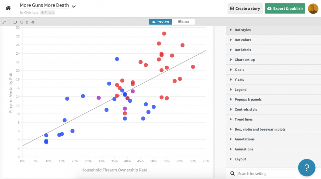
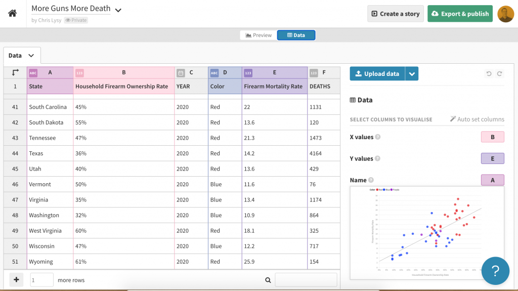
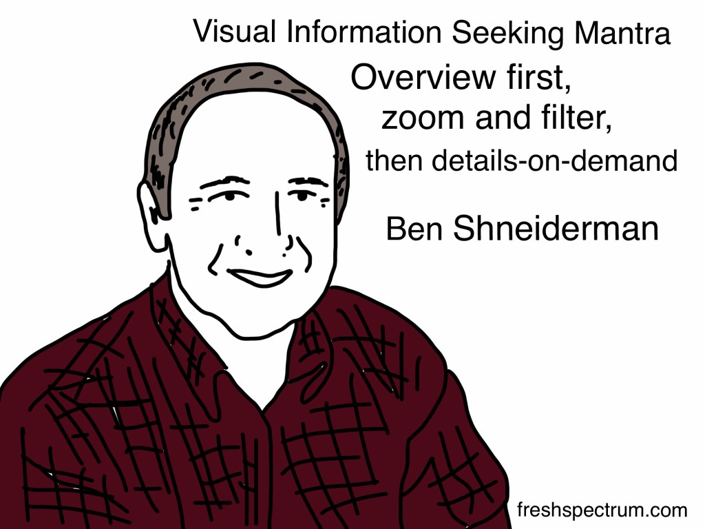
The static infographic mimics what you would expect to find in a data dashboard. When designing dashboards I like to remember Ben Shneiderman’s visual information-seeking mantra; overview first, zoom and filter, then details on demand.

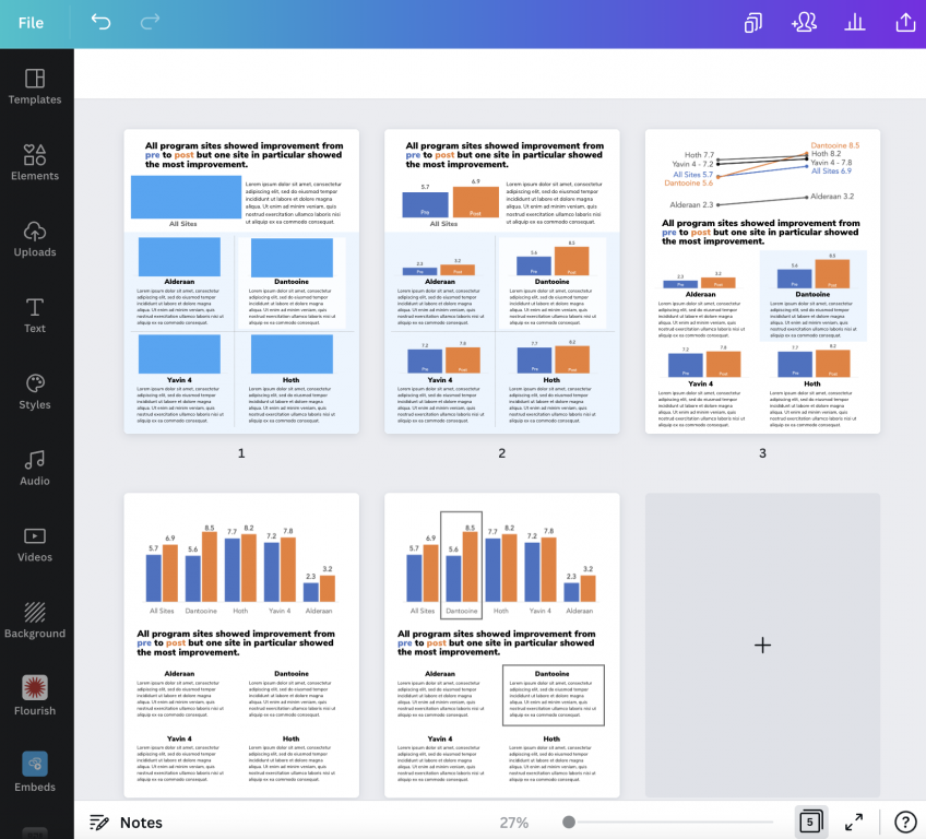
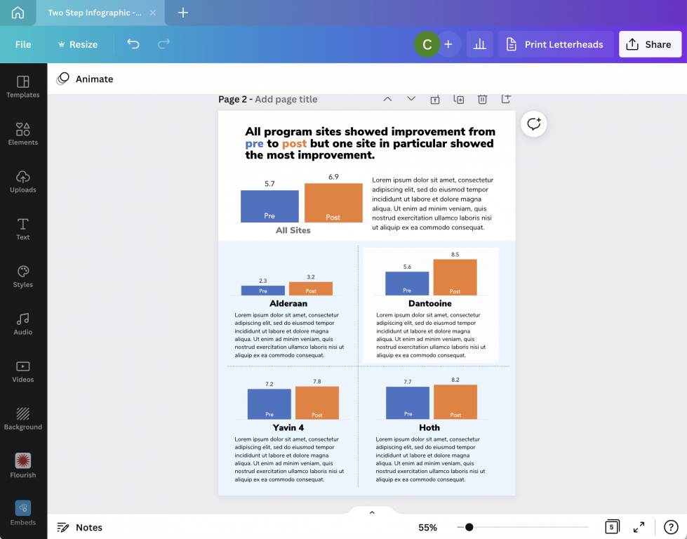
The overview chart is step 1. Step 2 is a small multiple that provides a zoomed in view based on a filter variable. So for instance, the overview might be all program sites and the filter variable might be individual program sites. But that’s just an example, you could break it down using all sorts of variables such as gender, race, location, or anything else you might use to filter your dataset.

The on-demand details part is the annotations you use alongside each individual chart. Usually a takeaway, description, or some other associated sound byte.

Visual Information Seeking Mantra. Overview first, zoom and filter, then details-on-demand. Ben Schneiderman.

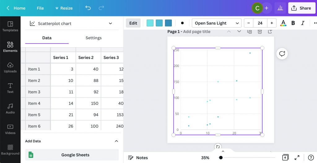
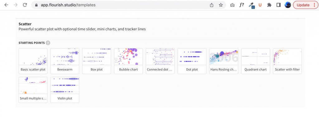
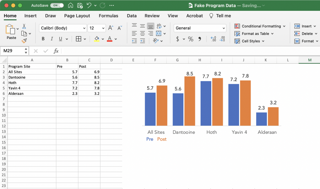
Starting with a Clustered Bar Chart.

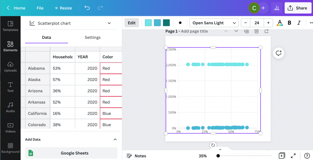
So I’ll use a little fake pre post program data for this example. Here I have pre post scores for four sites and a top level average score from all sites.

One way we might visualize this data is to just use a simple clustered bar chart. This approach is fine, but sometimes based on our audiences, isolating and discussing the individual sites is far more important than comparing the results across sites.

A screenshot of a clustered bar chart created using Excel.

Breaking up your chart into Small Multiples.

The most straightforward way to create small multiples is to just create a separate bar chart for each site. You just basically copy the chart over and over again, for each one only selecting the data for an individual program site.

A screenshot of small multiples charts being created using Excel.

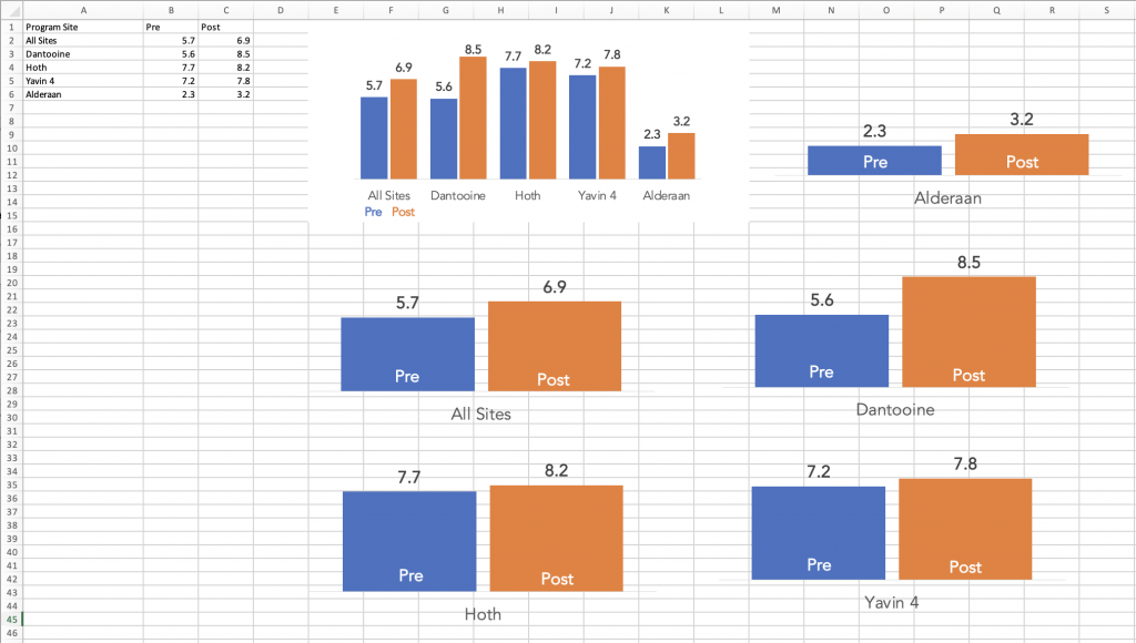
Tip: Make sure to keep your bar charts on the same scale.

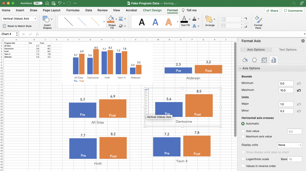
One thing to keep an eye on is that Excel’s defaults are set to change the vertical axis based on the data. It’s a setting you can turn off before you copy and paste your charts.

But if you’ve already recreated your charts and you just want to standardize the axes, you can do that. I prefer to go without axes, opting for on the bar data labels. But in order to change the minimum and maximum bounds I need to add it back in.

A screenshot of adding a primary vertical axis to a chart in Excel

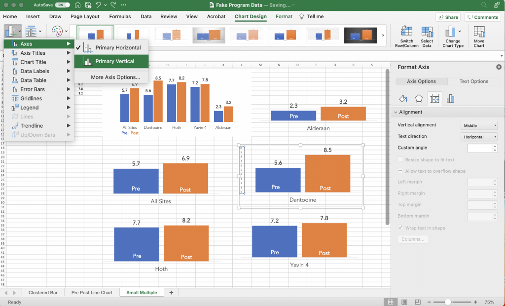
Once you have the vertical axis back you can select the axis and change the minimum/maximum bounds in the Format Pane. Do that for all your charts so that they are all on the same scale. Also make sure each of the charts is the same height and width.

A screenshot showing the vertical axis format pane for a chart in Excel.

Laying out your infographic.

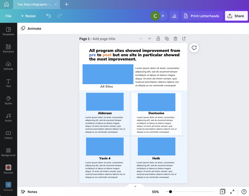
To layout my infographic in Canva, I start with a blank one page report.

At the top of the page I put my title, followed by a space for the overall chart and some descriptive text. Then I create a similar space for each of the step 2 charts.

As one of my diydatadesign community members brought up during a recent session, creating a clear distinction between the overall and secondary charts is a good idea. In other words, make your top chart a bit bigger.

A screenshot of a basic one-pager infographic template.

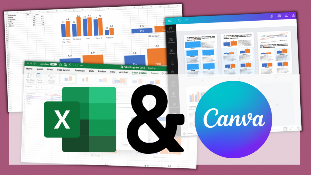
Bringing over your Excel Charts

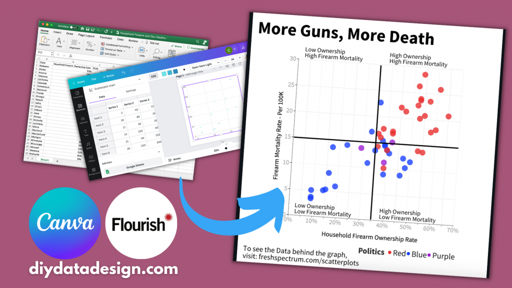
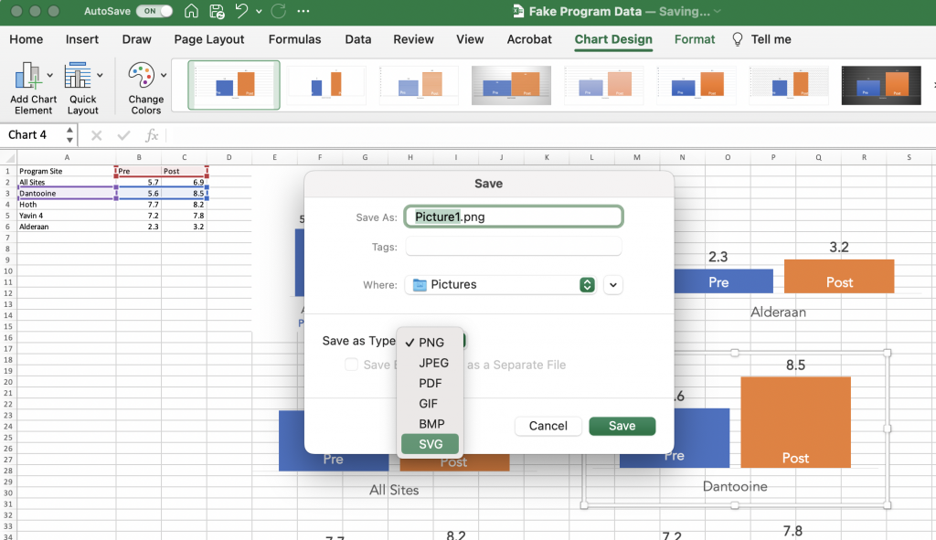
I wrote a whole blog post about the different ways to bring Excel charts into Canva. If you’re interested you can find it here: How to Import Excel Charts into Canva, the Right Way

The short version is this. You can either save your individual charts as images (saving as an SVG will prevent it from getting pixelated) or just Copy and Paste. Before I copy and paste thought I first get rid of the

A screenshot of a chart being saved as a picture in Excel.

Bringing it all together.

Once I have all the charts, I can bring it all together. You can use color and shapes to highlight certain key findings but it’s not a requirement.

This type of infographic is particularly good when you want to share all results with a group of smaller subgroups. But you want each of the subgroups to have equal billing. They’ll still get the context of where they stand versus other subgroups, but that’s only secondary.

A screenshot of a Canva one page infographic design.

Want access to the final template?

Do you want access to the final infographic Canva template, along with a few other alternative layouts. You can grab the template using this link.

A screenshot of a canva one page report infographic template.
Click on the image to get access to the Canva template.

Written by cplysy · Categorized: freshspectrum

Jul 20 2022

The Reporting Revolution – Finding Your Audience

Two weeks ago I shared the first 20 pages of the book I’m writing. Now it’s time to share Chapter 2.

In case you missed the last post, the book I’m writing is called The Reporting Revolution: A little book for researchers and evaluators who give a sh*t.

Chapter 2 was an accident.

Originally I thought I was writing what will eventually be Chapter 3 (re: modern reporting strategy). But the more I wrote, the more I felt as though finding an audience really deserved it’s own space.

The download below will give you both Chapter 1 & Chapter 2.

I’m offering the ebook for free as a I write it because I want it to be really good. But in order for that to happen, I need feedback. So if you download it it, please read it and let me know what you think.

Here is what’s inside currently as of July 20:

  • Chapter 1. The Big Why
    • Why are we still reporting like it’s 1999?
    • Our reports tell everyone else a story about our profession.
    • Seeing our work through our audience’s eyes.
    • Unintentional gatekeepers.
    • Mindset change – Noun report to verb report.
    • Not just better, faster too.
    • Make it easy.
  • Chapter 2. Finding Your Audience
    • Who is in your audience?
    • Activity: Naming your Audience
    • Your Big 3 Audiences
    • Activity: Three Bucket Audience
    • The Audience Growth Saturation Point
    • Audience Reach Splash Model
    • Measuring your Audience
    • Audience Building or Serving?
The Reporting Revolution: A little book for researchers and evaluators who give a sh*t.  
Screenshot of the eBook landing page.
Click here to go to the download page.

Written by cplysy · Categorized: freshspectrum

Jul 14 2022

8 Simple Tools for Video Creation

In today’s post I walk you through 8 different tools you can use for easy video creation.

Video used to be the realm of camera lovers, animators, and production studios. But in our modern digital world, anyone can produce a video with the phone in their pocket. The number of tools can be a bit overwhelming so I created this post to ease you into a decision.

This post starts with 4 tools you likely already have in your pocket or on your computer. Then we’ll talk about 4 more web-based tools that you can try out for free.

8 Simple Video Tools

1. Pick up your phone, hit record.

Phones have come a long way over the last decade years. We all know how easy it is to just pick up your phone and hit the record button. Even if you are the kind of person who runs away from any cameras turned in your direction, your phone is probably the easiest tool you can use to capture video.

And while holding your phone selfie style while you’re out for a walk might not give you the best video or audio quality in the world, it does create a video. With these types of videos you are not pretending that the recording has a high production value, and in that way they can feel a bit more authentic, conversational, and human.

One thing to keep in mind. Watch your audio. People are pretty forgiving when it comes to poor video quality but nothing will make them stop watching faster than poor quality audio.

Screenshot, picking up phone to record.

2. Use Zoom to record a video.

Do you have a Zoom account? Probably, over the last few years it’s really become an office standard. But have you considered just using Zoom for the sake of creating videos?

Think about it.

  • Zoom already connects to your webcam.
  • It will let you screenshare.
  • You can interview other people 1 on 1.
  • You can present a slide deck and deliver a presentation.
  • Video on, video off, it’s your choice.
  • Nothing stops you from starting a meeting with no other participants and hitting record.

Just a tip. Zoom will give you the option to record to the cloud or record on your computer. I suggest recording on your computer as it’s likely to give you a better quality video.

Zoom call recording screenshot.

3. Screen Record on your PC or Mac with the click of a button.

Just want to do a quick screen recording?

Did you know that you have software already existing on your computer that let’s you do that?

  • To record your screen on a PC, press the Windows Key + G on your keyboard.
  • To record your screen on a Mac, press the Command + Shift + 5 keys on your keyboard. 

Microsoft added this feature particularly for gamers who wanted to screenshare their game playing. But you could share anything, from Excel tutorials to survey tool instructions.

Windows PC screen recording tool

4. Create a Slideshow Video using PowerPoint

There are actually a few ways to create a video using PowerPoint.

You can record your presentation, which will open up another window and let you present as you flip through your slides. This is an easy option if you are already pretty comfortable presenting and the recording doesn’t throw you off.

Another way to create a video is to embed videos, screen recordings, and other audio onto individual slides. Then export to Video. In this way you can use the slides to record different scenes in your video, and you don’t need to record everything at once.

One tip, adding audio to slides will create a little speaker icon. This speaker icon stays on the screen in your exported video or live slideshow. If you don’t want it there (because why would you) you can click a box in the audio’s Playback menu to “Hide During Show.”

PowerPoint for Video

5. Screen Record with Loom

Loom is a nice freemium tool you can use for screen recordings. You can access via the web, but it also has a desktop app and a chrome plugin. For free you can record up to 25 individual <5 minute videos. Loom will also give you some basic editing tools.

Upgrading to a business plan for around $10/month will give you better video quality, unlimited videos, no watermark and other goodies.

Screenshot of Loom

6. Create Your Video with Descript

Descript is a newer tool on the market. Like Loom it allows you to screen record or just record via your camera. What makes descript different is a novel approach to video editing.

Descript uses auto-transcription, and you can actually edit the video by editing the transcription. They also have this tool called Overdub, which can clone your voice for use in text-to-speech. Descript is definitely going for easy-to-use but because it’s both new and ambitious with its features, it can still be a bit finicky. But as a freemium tool it’s definitely worth a test.

Screenshot of Descript

7. Use Adobe Express (Formerly Spark)

What is now Adobe Express started as a collection of iPad Apps you might know by the name Adobe Spark. Over time the apps have all been merged together and now make up Adobe’s alternative to Canva. If you’re looking for an easy way to create a slide style video, it doesn’t get much easier than Adobe Express.

In Adobe Express you record your voiceover on each slide by holding down the microphone button. There isn’t much flexibility in overall design as the layouts you choose dictate the videos look and feel.. But the trade off in features gives you a tool that’s really easy to use. Over the years I always used Spark when I just wanted to create quick eLearning modules and didn’t want to spend too much time making design decisions.

Screenshot of Adobe Express

8. Use Canva to Create Your Video!

So if you’ve been following this blog you probably know that I’m a fan of using Canva for all sorts of design things. Well, that stays true even with video. Over the last few weeks I’ve been using Canva exclusively to create videos for my YouTube channel.

While Canva doesn’t offer the same amount of editing flexibility as a standard video editing tool (i.e Adobe Premiere, iMovie, etc.) it makes up for it in Assets. If you’re interested in learning the two different ways you can use Canva to create videos, check out my own Video on the topic I’ve embedded below.

Screenshot of Canva Video Editor.

How to Create YouTube Videos in Canva

What did I miss?

So there are tons of tools that you can use to make videos. The programs in the post are just a sampling, but I have used each one at different times in the past.

Do you have any favorites you think I should have included, please share in the comments!

Written by cplysy · Categorized: freshspectrum

Jul 06 2022

The Reporting Revolution

So I started writing a book. It’s called The Reporting Revolution: A little book for researchers and evaluators who give a sh*t.

I wanted to share with you what I have so far.

The final book is nowhere close to finished. I just started writing it a few days ago by collecting some of my most central thoughts on modern reporting. And then I put all of those thoughts into the eBook I share below.

Here’s the deal. If you download the current version of the eBook, I’ll keep giving you updates. All the way until it’s finished (if it makes it that far). Meaning you’ll get something for free that might eventually cost others actual money.

So what’s the catch?

There isn’t one. The currently 20 page book is free. If I gets a good response from readers, I’ll write more pages. If not, it’s still a nice little 20 page book.

Also, I’m hoping you’ll give me feedback.

Here is what’s inside:

  • Chapter 1. Why are we still reporting like it’s 1999?
  • Chapter 2. Our reports tell everyone else a story about our profession.
  • Chapter 3. Seeing our work through our audience’s eyes.
  • Chapter 4. Unintentional gatekeepers.
  • Chapter 5. Mindset change – Noun report to verb report.
  • Chapter 6. Not just better, faster too.
  • Chapter 7. Make it easy.
The Reporting Revolution: A little book for researchers and evaluators who give a sh*t.  
Screenshot of the eBook landing page.
Click here to go to the download page.

Written by cplysy · Categorized: freshspectrum

Jun 30 2022

How to create a scatterplot in Canva, and Flourish!

The scatterplot is one of my favorite chart types. So how do you create one in Canva?

In today’s post I’ll show you how you can create a scatterplot directly in Canva, even though you probably shouldn’t. Then I’ll walk through creating a scatterplot using Flourish. Finally I’ll talk a little about when you might want to use a scatterplot, along with an example of how you can make the chart easier to discuss by adding quadrants.

Scatterplots in Canva and Flourish Featured Image

Can you create a scatterplot directly in Canva?

Creating a scatterplot in Canva screenshot

Yes, you can certainly create a scatterplot directly in Canva.

Inside any Canva design just open up the elements menu and search for “Charts”. Then look for the scatterplot.

After you select the element, you’ll get a new Scatterplot dropped onto your page already filled with fake data.

Creating a scatterplot in Canva Screenshot

From here you can simply replace the data on the page with your own. Or you an connect directly to a Google sheet where your data lives.

Then you can tweak the style a bit with some of the options Canva makes available.

Where you might get annoyed.

Canva Scatterplot Fail Screenshot

I personally find the Canva data interface super annoying (the thing on the side that looks like a spreadsheet).

It looks like a spreadsheet, but it really doesn’t act like one. You can paste over the dummy data with your own data, but it’s not easy to move things around. You can’t even select multiple cells at once, which is usually required to move columns around.

Then ultimately, you’ll only have access to a few options you can use to tailor your graph.

Why go with Flourish instead?

Flourish Scatterplot Screenshot

Flourish, a free product that easily integrates directly with any Canva design, is my recommended go to for just about any chart or graph you want to create in Canva.

First off, you get tons of customization options. It can be a little overwhelming at first, but it doesn’t take too long to start figuring out how to tailor your design.

Flourish Data Scatterplot Screenshot

Next, the data entry part of this works really well. I also think the controls are intuitive and love how easy it is to choose columns, colors, names, and other aspects.

Creating a basic scatterplot using Flourish

Creating a Scatterplot in Flourish Screenshot

To create a scatter plot in Flourish, just click “New Visualization” and select one of the Scatter Plot starting points.

Just like Canva, Flourish will start you out with a chart using Dummy data.

Starter ScatterPlot

Then you just paste in or upload your data into the data tab.

Data behind a template scatterplot in Flourish Screenshot

If you need to change the selected columns, just put the letters in the appropriate spots for X values, Y values, and Name.

If you want to add in other variables (such as through color) you can do that here as well.

Scatterplot basics, where continuous data meets continuous data.

Scatterplots are visualizations of two continuous variables.

They are really good at showing correlations. Take for example the following scatterplot I created by matching the Firearm Mortality Rate with a Household Firearm Ownership Rate.

Believe it or not there is a pretty solid correlation between the percentage of households with guns and the total number of gun deaths. Also the highest firearm mortality rates are in mostly red states (shocking I know).

Mixing Two Data Sources (CDC’s Firearm Mortality by State & RAND’s State-Level Estimates of Household Firearm Ownership)

Turn your scatterplot into a “perceptual map style” 4 by 4 quadrant.

One of the downsides of a scatterplot is that it can be a bit tough to discuss.

Unlike a bar graph, where you have very specific tangible values, scatterplots are more about pattern recognition than individual data points. And while you can highlight and annotate individual points, sometimes you want to discuss the graph a little more broadly.

In these kinds of situations I like adding a 4 by 4 quadrant grid.

Screenshot of bringing a Flourish Graph into Canva
  1. To do this I start by connecting to my Flourish account from within Canva.
  2. Next I drop the chart into a design.
  3. After that I just add lines to make it a two by two.
  4. Then I label each of the four quadrants.

Now this chart is really simple to discuss. Here are a couple thoughts I had when looking at the final version.

  • I thought there would be a red state/blue state divide, but this is pretty extreme.
  • The High Ownership/Low Mortality quadrant is interesting. It also includes most of the high gun ownership blue states (like Vermont and New Hampshire). I’m curious as to why they don’t see the same kind of high mortality numbers as some of the red states with similar ownership rates.
Final Example Scatterplot created with Flourish and Canva
Click here for an Interactive Version
Mixing Two Data Sources (CDC’s Firearm Mortality by State & RAND’s State-Level Estimates of Household Firearm Ownership)

Written by cplysy · Categorized: freshspectrum

  • « Go to Previous Page
  • Go to page 1
  • Interim pages omitted …
  • Go to page 27
  • Go to page 28
  • Go to page 29
  • Go to page 30
  • Go to page 31
  • Interim pages omitted …
  • Go to page 54
  • Go to Next Page »

Footer

Follow our Work

The easiest way to stay connected to our work is to join our newsletter. You’ll get updates on projects, learn about new events, and hear stories from those evaluators whom the field continues to actively exclude and erase.

Get Updates

Want to take further action or join a pod? Click here to learn more.

Copyright © 2026 · The May 13 Group · Log in

en English
af Afrikaanssq Shqipam አማርኛar العربيةhy Հայերենaz Azərbaycan dilieu Euskarabe Беларуская моваbn বাংলাbs Bosanskibg Българскиca Catalàceb Cebuanony Chichewazh-CN 简体中文zh-TW 繁體中文co Corsuhr Hrvatskics Čeština‎da Dansknl Nederlandsen Englisheo Esperantoet Eestitl Filipinofi Suomifr Françaisfy Fryskgl Galegoka ქართულიde Deutschel Ελληνικάgu ગુજરાતીht Kreyol ayisyenha Harshen Hausahaw Ōlelo Hawaiʻiiw עִבְרִיתhi हिन्दीhmn Hmonghu Magyaris Íslenskaig Igboid Bahasa Indonesiaga Gaeilgeit Italianoja 日本語jw Basa Jawakn ಕನ್ನಡkk Қазақ тіліkm ភាសាខ្មែរko 한국어ku كوردی‎ky Кыргызчаlo ພາສາລາວla Latinlv Latviešu valodalt Lietuvių kalbalb Lëtzebuergeschmk Македонски јазикmg Malagasyms Bahasa Melayuml മലയാളംmt Maltesemi Te Reo Māorimr मराठीmn Монголmy ဗမာစာne नेपालीno Norsk bokmålps پښتوfa فارسیpl Polskipt Portuguêspa ਪੰਜਾਬੀro Românăru Русскийsm Samoangd Gàidhligsr Српски језикst Sesothosn Shonasd سنڌيsi සිංහලsk Slovenčinasl Slovenščinaso Afsoomaalies Españolsu Basa Sundasw Kiswahilisv Svenskatg Тоҷикӣta தமிழ்te తెలుగుth ไทยtr Türkçeuk Українськаur اردوuz O‘zbekchavi Tiếng Việtcy Cymraegxh isiXhosayi יידישyo Yorùbázu Zulu