In this series of Data UX reviews I take real published reports and look for areas of improvement. The ultimate goal for these reviews is shared learning. This week, we discuss readability.
Today’s Report is an Evaluation Synthesis Report (2022-2023) produced by the Evaluation Office of the UN Environment Programme (UNEP). You can peruse the report on your own by following this link.
This is a long but fairly standard type of report. 114 pages plus a 20 page appendix. It feels professionally designed, with uniform structure throughout. My guess is that the evaluation team wrote the report and then handed it off to a graphic designer to organize and polish at the end.
There are charts throughout and a few icons but it is not systematically illustrated. The report also has fairly lengthy sections without any illustrations at all. It is not designed to be easy to skim and does not highlight important or critical information. On a skim your eyes will probably go from chart to chart and possibly stop to reach the chapter introductions.
There are quite a few things that we can learn from this report in terms of user experience, but let’s focus on one in particular. Readability.
Most reports fail at basic readability.
This feels like a very standard kind of global program evaluation report. Many of the final reports and synthesis reports I read feel a lot like this one. And the easiest way to show one of the biggest challenges is to assess the reading level.
Let me repeat. This is not to pick on the report authors. MANY reports I see, read a lot like this one.
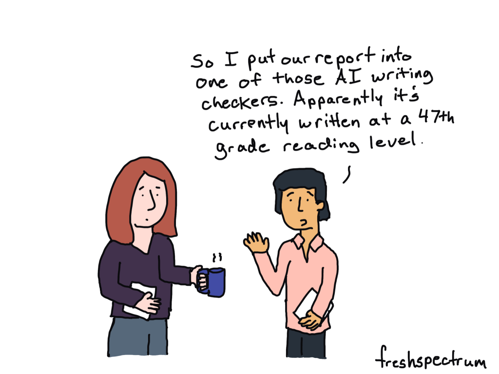
Luckily, reading level assessments are super easy these days, just ask one of your handy dandy generative AI tools for some support (I used Claude’s Sonnet 4 for this one).
Average sentence length: 27.3 words (Very long – typical academic writing)
Complex vocabulary: 28.5% of words have 3+ syllables
Specific Challenges:
1. Sentence Complexity
60% of sentences exceed 20 words
Average sentence length of 27+ words is significantly above readable standards
Multiple embedded clauses and technical qualifications
2. Vocabulary Difficulty
High density of multi-syllabic technical terms
Specialized UN/environmental jargon throughout
Complex institutional terminology
3. Document Structure
Dense, academic formatting
Heavy use of abbreviations (UNEP, GEF, MTS, etc.)
Multiple cross-references and technical citations
Reading Level Interpretation:
Flesch Reading Ease Categories:
0-30: Very Difficult (Graduate level) ? This report scores 18.0
30-50: Difficult (College level)
50-60: Fairly Difficult (High school level)
Target Audience: Environmental professionals, policy makers, academic researchers, and UN system stakeholders with specialized knowledge.
Recommendations for Improved Accessibility:
Reduce sentence length to 15-20 words average
Add executive summaries with simplified language
Define technical terms in a glossary
Use more active voice instead of passive constructions
Break up dense paragraphs with bullet points and subheadings
Provide visual summaries (charts, infographics) for key findings
This document is appropriately written for its intended professional audience but would require significant simplification for broader public consumption.
According to the AI, this is appropriately written, but that’s a trap.
Just because your audience is filled with people who have advanced and insider knowledge does not mean it’s a good idea to write at a 17th grade reading level.
This is especially true for any type of guidance set to be delivered to busy, overwhelmed, policy decision makers. Or for any guidance designed to reach a global audience, many of whom not speak english as a first (or even maybe second) language.
Let’s look at some specific examples of complex language pulled from the AI analysis that gives potential revisions.
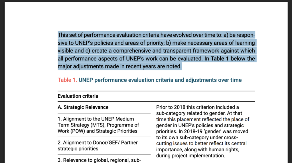
Top of Page 28
From the Evaluation Criteria section:
“This set of performance evaluation criteria have evolved over time to: a) be responsive to UNEP’s policies and areas of priority; b) make necessary areas of learning visible and c) create a comprehensive and transparent framework against which all performance aspects of UNEP’s work can be evaluated. In Table 1 below the major adjustments made in recent years are noted.”
Problems:
Technical terminology without definition
Complex list structure interrupting flow
Abstract concepts not explained
Run-on sentences
Better version:
“UNEP has updated its evaluation standards over time for three reasons: to match current priorities, to highlight key lessons, and to create clear measurement tools. Table 1 shows recent changes to these standards.”
Top of Page 44
From Chapter 3:
“Since project interventions are very diverse thematically, geographically, and in terms of their resource envelopes, conscious effort is needed to ensure that performance assessments are made in a consistent manner. In this regard, the Evaluation Office is continually aiming to improve the objectivity and comparability of its evaluation approach across UNEP projects. External evaluation consultants are routinely provided with standard Terms of Reference for project evaluations, as well as detailed guidance on evaluation processes and methods, report structure, content, and quality, to help maintain consistent approaches and performance assessments.”
Problems:
Three very long sentences (34, 25, and 44 words respectively)
Unclear pronoun references (“In this regard”)
Technical jargon not explained
Passive voice predominates
Poor paragraph unity – jumps between topics
Better version:
“UNEP projects vary widely in theme, location, and budget size. This diversity creates challenges for fair evaluation. To solve this problem, the Evaluation Office gives all external evaluators the same guidelines and standards. These tools help ensure consistent, objective assessments across all projects.”
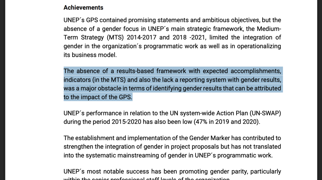
Middle of Page 76
From the Strategic Evaluations section:
“The absence of a results-based framework with expected accomplishments, indicators (in the MTS) and also the lack a reporting system with gender results, was a major obstacle in terms of identifying gender results that can be attributed to the impact of the GPS.”
Grammatical errors (“also the lack a reporting system”)
Unclear abbreviations (MTS, GPS)
Convoluted structure
Better version:
“UNEP lacked clear goals and indicators for gender work. Without proper tracking systems, it was impossible to measure the success of the Gender Policy Strategy (GPS).”
So what is an appropriate reading level for an evaluation report?
Reading level can be a design choice. Those terms of reference things you have to check off to use some piece of software is overly complicated often by design. But I don’t think this applies to most evaluation and research reports.
The evaluation world is filled with super smart people who spent a lot of their time in school. Meaning they have pretty expansive vocabularies, often like precision, and have been rewarded for that precision in their academic studies. So when it comes to report writing, words and paragraphs will naturally get complicated.
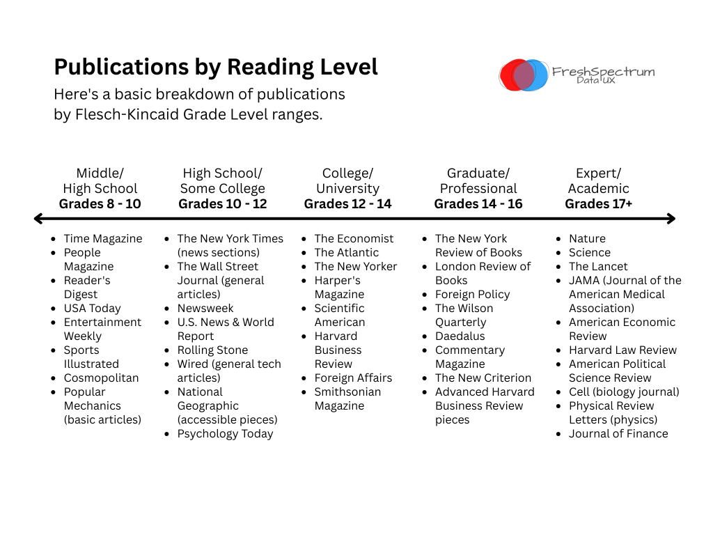
One easy way to pick an aspirational reading level is to compare the reading levels of different publications. There are major differences between reading a People magazine, The Economist, and the journal Science.
My suggestion for most reports is to try to write for grades 10-12, but you can settle for writing that ends up in the 12-14 range.
What is this blog post’s reading level?
I thought it would be interesting the assess the readability of this particular blog post. And it came out to a 12.2 grade level
Complex vocabulary: 17.8% of words have 3+ syllables
Total words: 1,212
Total sentences: 63
Reading Level Interpretation: This falls into the “Difficult (College level)” category on the Flesch Reading Ease scale.
Assessment:
This document is a great example of practicing what you preach. The author critiques the UNEP report for being written at a 17th+ grade level, and their own writing comes in at a much more accessible 12.2 grade level – exactly in the range they recommend (grades 10-14).
Strengths of this writing:
Reasonable sentence length (19.2 words average vs. the UNEP’s 27.3 words)
Lower complexity (17.8% complex words vs. UNEP’s 28.5%)
Clear structure with headings and examples
Conversational tone that makes technical concepts accessible
Concrete examples rather than abstract concepts
Why this works well: The author successfully demonstrates that you can discuss complex evaluation methodology and data analysis without resorting to overly academic language. They use technical terms when necessary but explain them clearly, and they break up dense concepts with examples and clear formatting.
This document achieves the sweet spot the author advocates for – professional enough for the target audience (evaluation professionals, data analysts) while remaining accessible to busy decision-makers who may not have deep technical expertise.
Brief Reading Level Guide
Want to go deeper on the differences between different reading levels? Here is a quick guide.
Grade Level 8-10 (Middle/High School)
Characteristics:
Sentence structure: Short to medium sentences (10-15 words average)
Vocabulary: Common, everyday words with occasional complex terms explained
Concepts: Straightforward topics, concrete rather than abstract
Organization: Clear, linear structure with obvious transitions
Tone: Conversational, direct communication
Background knowledge: Minimal assumptions about reader expertise
Writing style: Active voice, simple explanations
Example Publications:
Time Magazine
People Magazine
Reader’s Digest
USA Today
Entertainment Weekly
Sports Illustrated
Cosmopolitan
Popular Mechanics (basic articles)
Grade Level 10-12 (High School/Some College)
Characteristics:
Sentence structure: Medium-length sentences with some complexity (15-20 words)
Vocabulary: Mix of common and moderately advanced words
Concepts: Current events and issues explained with context
Organization: Clear structure with supporting details
Tone: Professional but accessible
Background knowledge: Basic cultural and educational literacy assumed
Writing style: Balance of explanation and analysis
Example Publications:
The New York Times (news sections)
The Wall Street Journal (general articles)
Newsweek
U.S. News & World Report
Rolling Stone
Wired (general tech articles)
National Geographic (accessible pieces)
Psychology Today
Grade Level 12-14 (College/University)
Characteristics:
Sentence structure: Complex sentences with multiple clauses (20-25 words)
Vocabulary: Advanced vocabulary, specialized terms used without definition
I’ve decided to build upon my report design book. So, for a limited time, I’m making theworking version free again.
Why the revision?
I started writing a new book (code name: Report Like This).
But then I found myself repeating what was already written in The Reporting Revolution. Truth is, that book provides the foundation for how I approach reporting. It’s the mindset behind my approach.
So instead of writing a second book, I’ve decided to expand the little book into a second edition.
My goals for the new edition.
Bigger.
Better.
Cheaper.
Bigger.
I’m going to convert the 5″ by 8″ book to a 6″ by 9″ book. I also plan to add a set of new chapters.
Better.
Illustrations. I think I went a little overboard on the stock photos, so I’m going to replace most of them with hand-drawn illustrations and a few new comics.
More chapters. I’ll go into more depth on reporting tools, reporting products, and some of the key lessons I’ve learned the hard way over the last few years.
Exercises. I plan to add a bunch of DiY exercises throughout the book. If you eventually get this in print, you can actually fill them out inside the book.
Cheaper.
Stuff keeps getting more expensive these days, so I’m going to do something radical. My goal with the new book is to make the print version $10. The only way to do that is to turn it black and white (color costs a lot more to print).
As I update the book, I’ll update the download. As of today, the latest version is the full digital version of the original book. That will change over time as I add and update things.
Then, email me (chris@freshspectrum.com) if you have reporting questions you would love for me to cover in the book, things you think I’m missing, or if you need more clarity on anything.
This is probably not the argument you would expect to hear from someone who has spent the better part of a decade teaching people how to design better reports, tell better data stories, and create better charts. But here’s the thing, you can create the most interesting, visually stunning, engaging, and insightful report, but there is still no guarantee that anybody will read it.
I have seen fantastic reports languish on dusty shelves and inside low-traffic resource libraries. Not because of what they are but how we share them.
Putting on a Show
To understand the problem, you have to understand the status quo.
Most of the time, dissemination is performative.
Last century, when our current default was being established, we didn’t have the same tools at our disposal. The roots of how we report today start well before the rise of the web. Before social media. Before Google. Before email. Before the internet.
For most organizations, the idea of delivering reports directly to a large of group of people was not feasible. It would take way too much time and cost way too much money.
So you create your report for a small group of people. If you have more time and money, you make it pretty and engaging. You might also print more copies and share them at meetings, conferences, and other event.
Even with all our fancy new tools, this is still how we report.
The hope is that if you put on a great show, people will show up. It’s why we tend to evaluate our reports with simplistic metrics like number of downloads. Like how you would evaluate the success of a show by how many people showed up to watch.
And while things have changed a bit in the last couple of decades, the essence is still the same. You build the report, try it make it engaging by thinking about potential audiences, and then market on your website and over social media.
It’s report first, audience later. Which is a lousy way to disseminate information.
What is Direct Dissemination?
My dissemination approach is inspired by the split between brand marketing and direct marketing. I won’t go into details on that one so if you’re interested just ask Google or your AI of choice.
But the idea behind the direct dissemination approach is to start with the people, not the report. I could probably write a whole book on this, but let’s start simple.
Here are the steps.
Step 1. Name and Frame your Audience.
When I say name, I mean it. You should be able to name members of your audience. You should know at least some of them as people, not arbitrary groupings or categories or avatars.
How many other people exist that share the same general characteristics as the ones you can name? Seriously, give me a number. That’s your frame.
Step 2. Now Build your Audience.
If you already have all of your audience’s email addresses, this step is easy.
If you don’t, this is going to take a bit of work but it’s important. You have to forge a personal connection with your audience members. You need to be able to reach them directly. That’s the point.
This is something you should do at the very beginning of any project that will culminate in a report.
Step 3. Layer your Content based on REAL Audience needs.
Report content doesn’t have to be a long PDF, data dashboard, interactive website, or fancy infographic. It can be a simple email, or series of emails. It could be a series of blog posts, an Excel spreadsheet, or a set of PowerPoint slides.
This all comes down to what your audience actually needs, which you’ll know if you know your audience. And if you don’t know your audience, this is an opportunity for you to learn more about their needs. It might involve conversations or perhaps some little experiments.
Step 4. Evaluate, Evaluate, Evaluate.
If you do this right, here are some of the things you should know or be able to find out.
The percentage of your audience you actually reach.
The percentage of those reached who actually engage with your information.
The specific pieces of information people engage with the most.
The ways individual people stumble up on your work.
How important web search, social media, or other channels are to connecting people with your reporting content.
The things your audience members don’t actually care about.
Which content delivers the most value to your audience.
How many people visited specific pages of your website.
How many people downloaded your pdf.
Want more information on my approach?
If you want me to elaborate more in future posts, let me know in the comments. If you want to learn how I help you implement your own organization’s direct dissemination strategy, schedule a chat.
One thing you should know about program evaluators is that they like their logic models and theories of change.
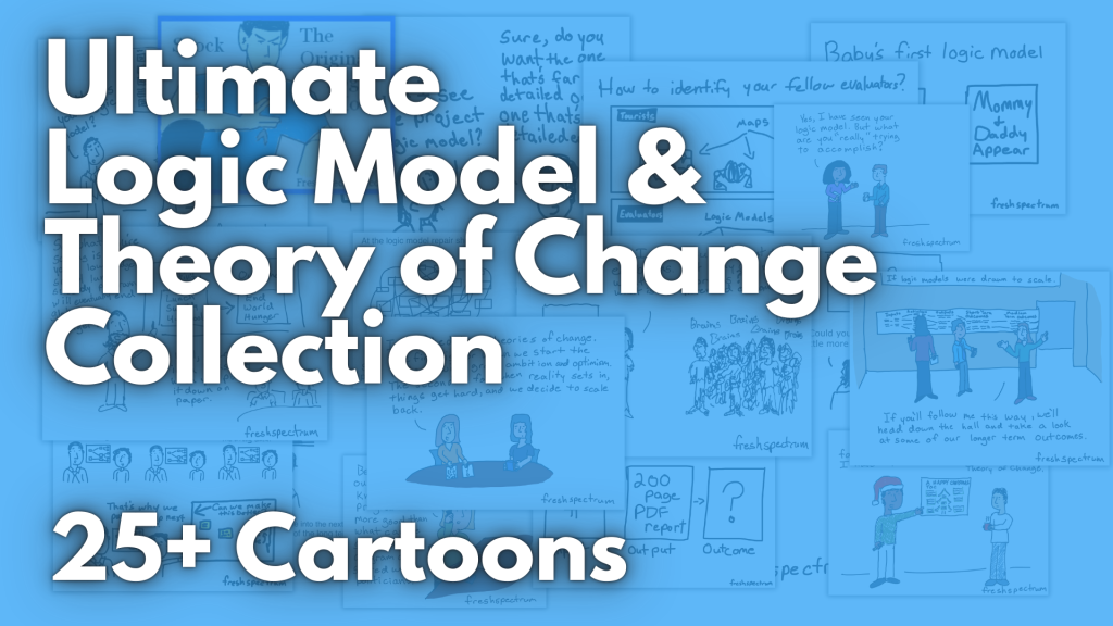
Over last 13ish years I’ve drawn over 25 comics on the subject. And as long as I keep cartooning, I’ll likely create a bunch more. In today’s blog post I’ll share the top 5 crowd favorites.
Let’s start my latest.
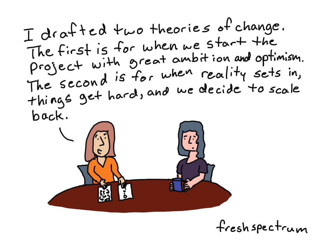
Two Theories of Change
In the last 5 days since I posted this one on LinkedIn, this comic has received 174 reactions and been seen on timelines over 12,000 times.
What that means to me, is that people relate. Things change, and your theory of change has to keep up. There is also a point here about changing expectations.
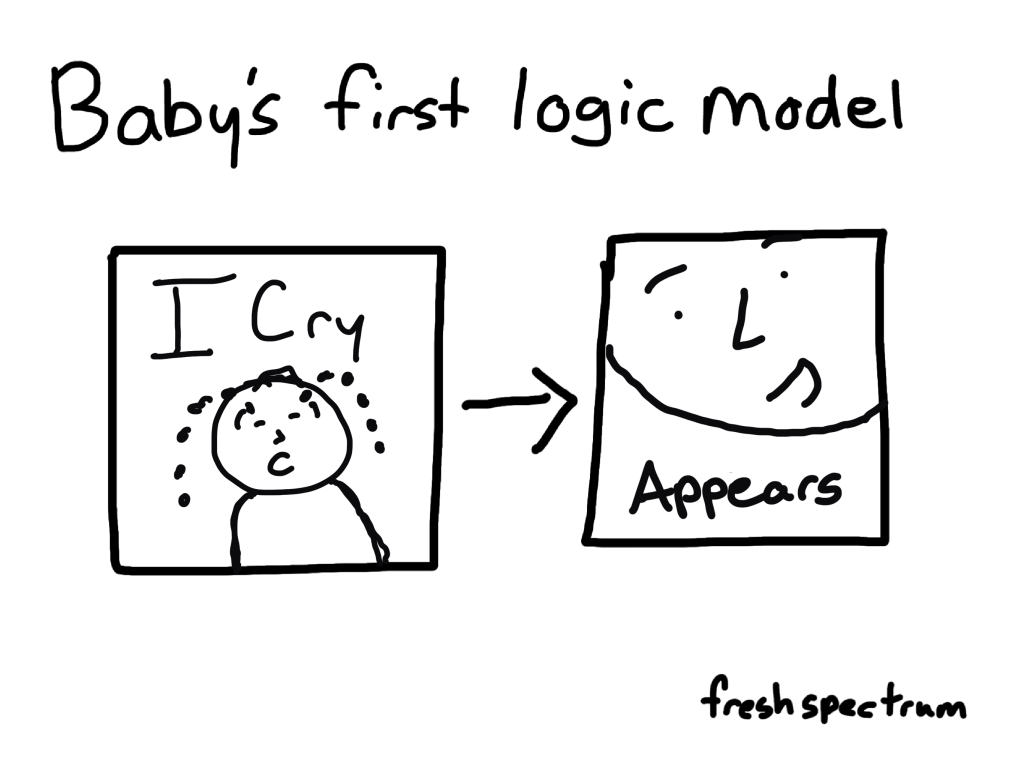
Baby’s First Logic Model
This comic started as a onesie for a pair of evaluators expecting their first child. It is still a onesie you can buy on RedBubble. But the cartoon itself is stand alone, and fits just as well in a presentation deck as it does on your kiddo.
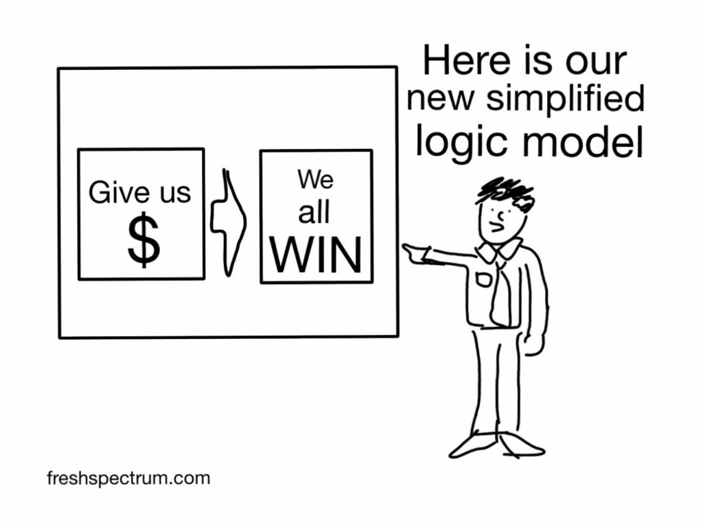
Simplified Logic Model
This comic is actually one of a set of three comics I drew all the way back in 2012. And the original post on How to Not Really Evaluate is still live. But this comic stands out because of its simplicity and absurdness. It also rings a little too true for too many people.
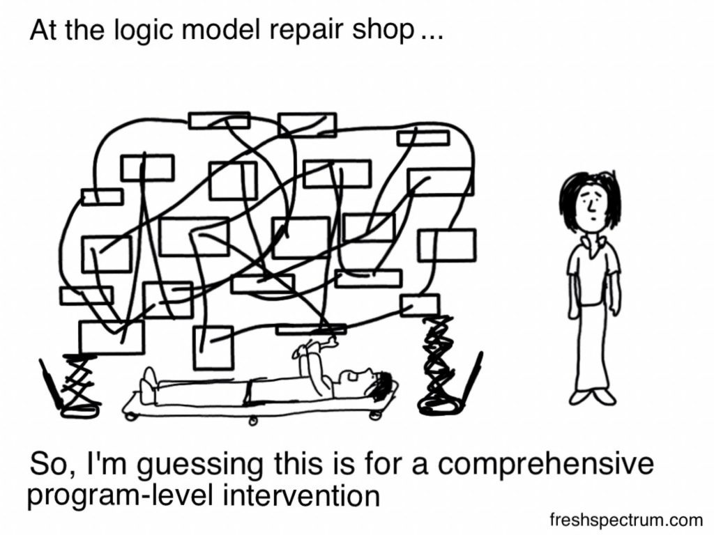
Logic Model Repair Shop
Some models are simple. Others, not so much.
This cartoon has been a favorite for the people who really like talking about systems change. It’s also a good way in to start talking about complex programs.
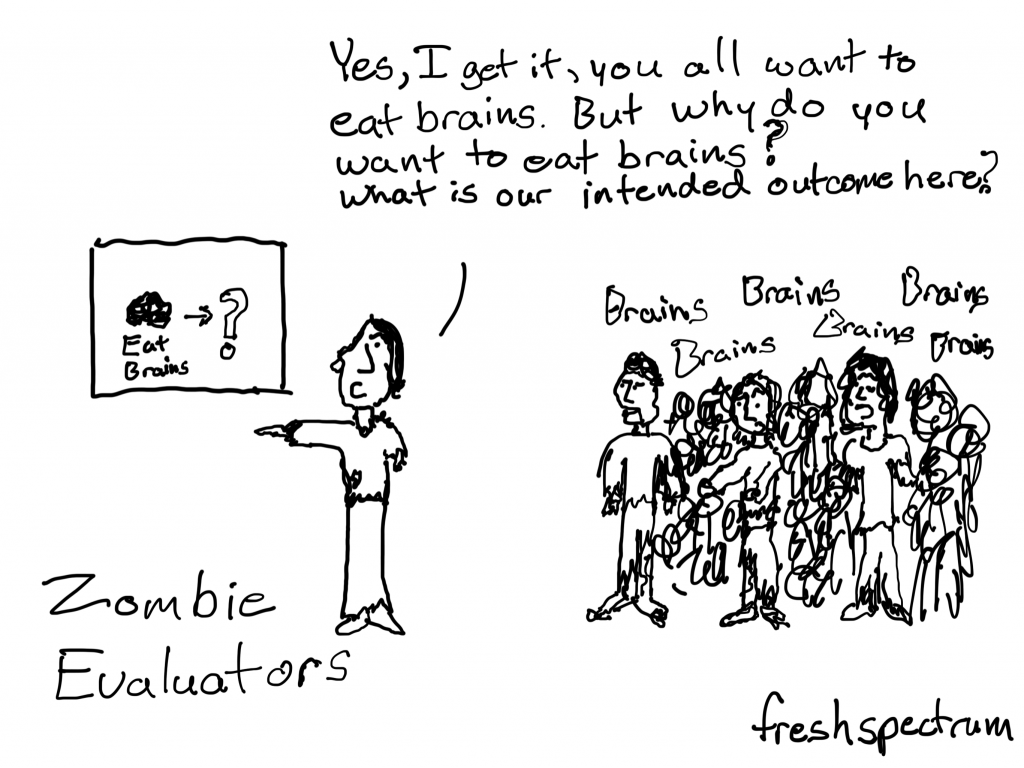
Zombie Evaluator
This one here is one of my favorites. It’s more about intended outcomes than it is about logic models or theory of change, but it does have that eat brains leads to question mark slide. Which I would say is a kind of start to a logic model.
Want to see 20 more logic model and theory of change comics?
Going to be taking a little break from the data design and Canva blog posts for a little while. Not saying I won’t come back to it, but I think the universe is telling me I need to be a cartoonist right now.
I’ve quietly relaunched the FreshSpectrum Comics page.
My goal is to backfill with my archives, but it will take some time. In the meantime, I’m going to try for 5 comics a week. If I’m not data design blogging too, it’s a lot more realistic.
I’ve restructured my Patreon page.
I was sick last week and had one of those “What if” moments. What if I actually tried being a cartoonist for real? It doesn’t have to be my main job (seriously, hire me for some consulting) but what if I made it my side job?
So for the next several months I’m going to give it an honest to goodness try. So if you like my stuff, and want to see more of it, support me on Patreon.
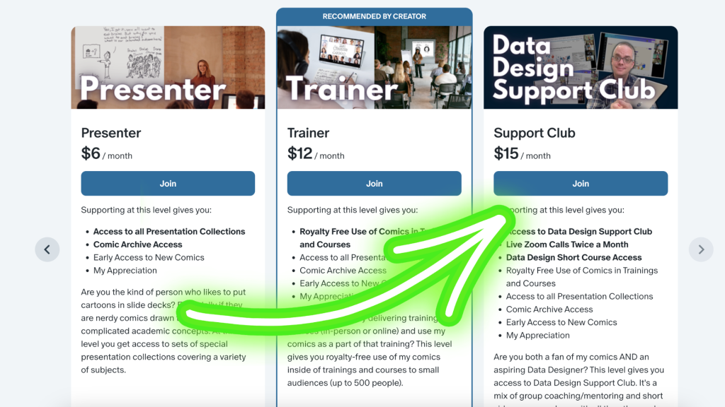
I’ve made Data Design Support Club cheaper.
I’ll be honest. I’m not very good at running a data design training company. Ann and Stephanie are much better at it than I. I spend a lot of time (and money) on upkeep but am rarely focused enough to make it work financially.
I like coaching and mentoring and want to keep doing that. But I think perhaps I need a different model that requires less financial/technical upkeep.
So I’m just going to bring everything over to Patreon, where I won’t have the same administrative upkeep costs. We’ll still meet twice a month over Zoom. But now it’s going to drop to $15/month and include a bunch of benefits I give my cartoon patrons.
Any questions?
I’m still working on some additional stuff, but for the moment that’s it!