• Skip to main content
  • Skip to footer
  • Home

The May 13 Group

the next day for evaluation

  • Get Involved
  • Our Work
  • About Us
You are here: Home / Archives for allblogs / freshspectrum

freshspectrum

Jan 28 2025

You should build an audience, before you write your report.

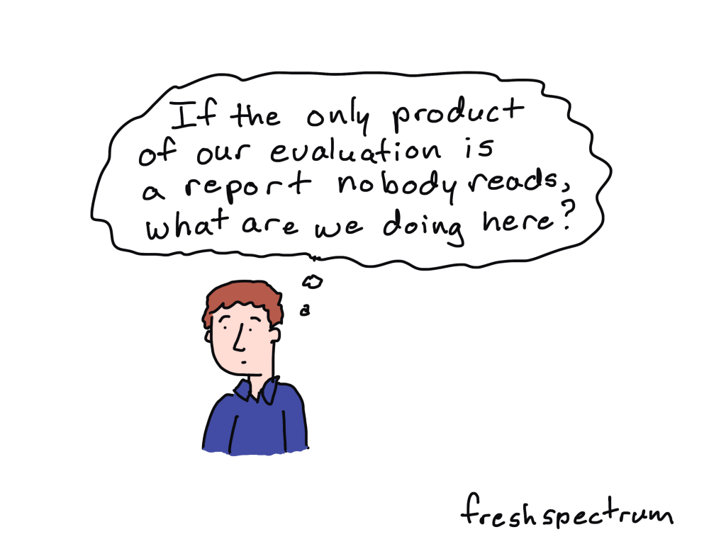
Time for another report design mindset change.

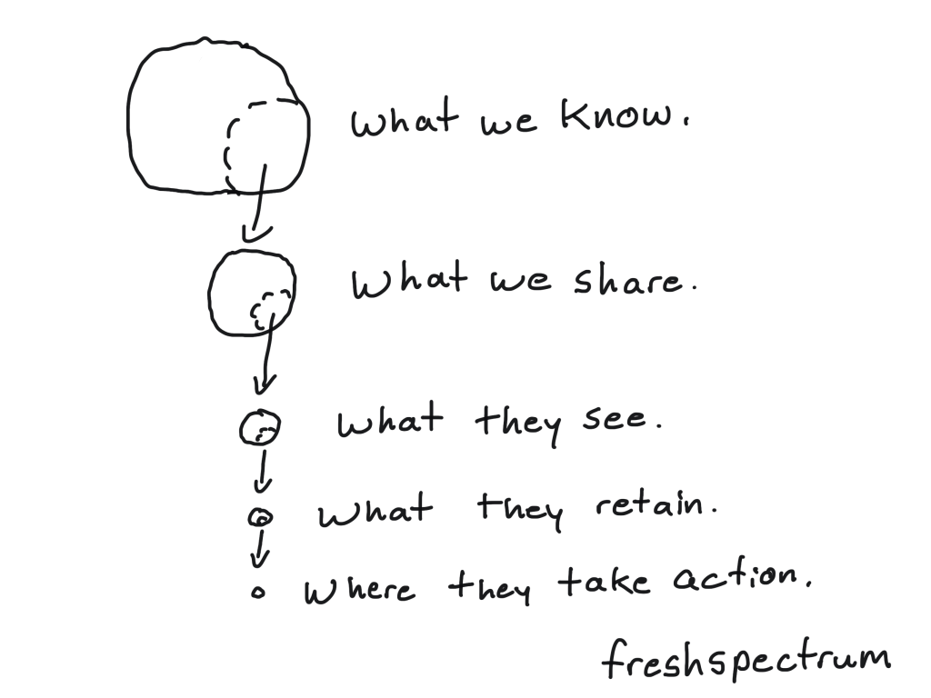
At the most basic level successful communication requires a sender, a message, and a receiver.  You, as the report designer, are the sender. The report carries the message.  So who is the receiver?

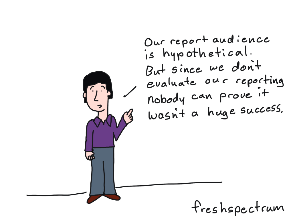
For a lot of organizations the receiver is hypothetical.  At least for those wishing to reach outside of their immediate stakeholder groups towards a broader audience. But even when defined, this broader audience is often just a hodgepodge of different personas, not actual people.

As any person with an online business will tell you, reaching an audience isn’t as simple as posting to social media. To be successful, you need to put in work to actually build your audience.

And if you actually want your report to successfully reach a broader audience, you need to do the same.

Email beats social media.

When organizations do put in effort to build an audience, they usually start with social media.  Like us on Facebook. Connect with us on LinkedIn. Follow us on Twitter.

But social media is unreliable for a few reasons.

1. Very few of your posts will likely be seen by your followers. 

This has become increasingly true over time as what we see is guided by algorithms.  These companies can control these algorithms and even shadow ban your content without your knowledge.

2. Most social media companies are for profit. 

They prioritize money making over information sharing.  This has become worse over the years, forcing many to feel the need to pay for attention even if they have established social media audiences.

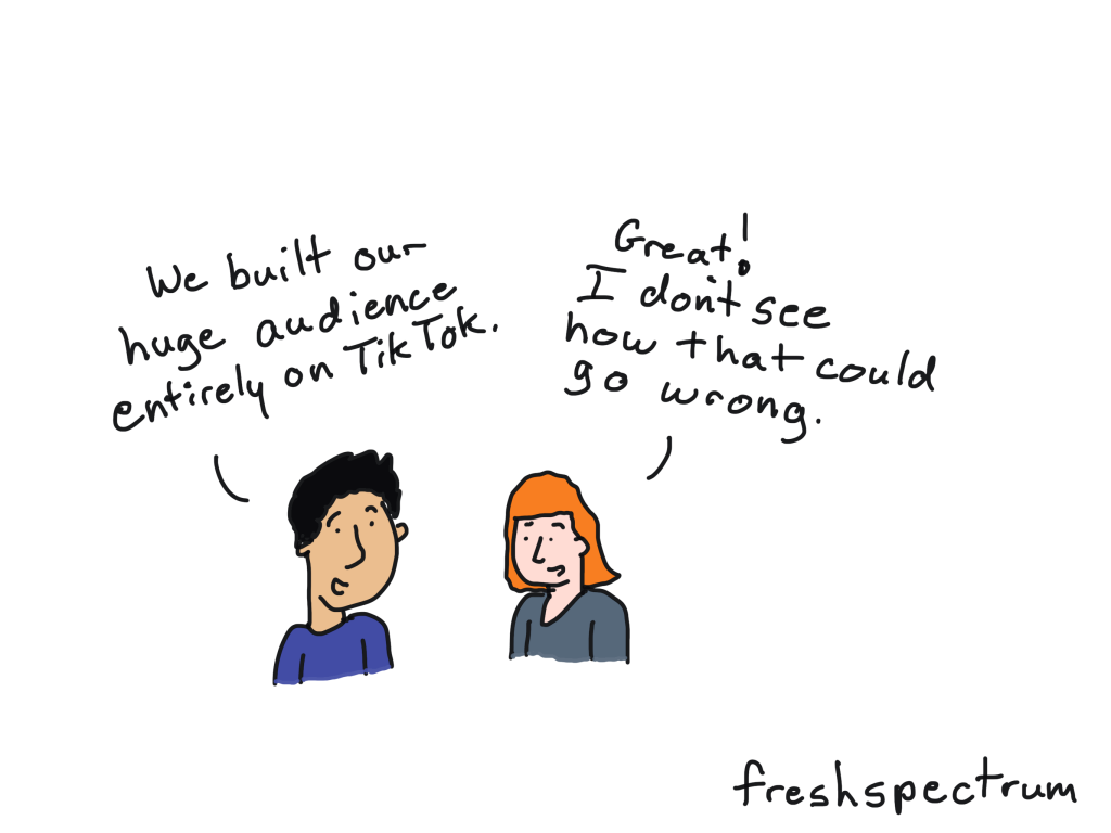
3. Social media audiences do not carry over to other platforms. 

So if you build a following on TikTok, and TikTok goes down, your following is gone.  If your account gets hacked, and then suspended by the social media company, your following is gone.  If your social media channel of choice gets purchased by an egomaniac who turns it into some kind of right wing propaganda tool, your following is gone.

But if you start building an email list, a higher percentage of your audience will see your messages when you send them.  You can choose your email platform.  You can also change your email platform and bring your audience with you.

Email beats search.

Search engines like Google, can deliver report audiences to your report.  But it’s also pretty unreliable.

1. Search engine algorithms are a constantly changing blackbox.

Small changes can lead to a large disruption in your ability to reach audiences.

2. Most search engines are for profit. 

Just like social media, they put advertising ahead of information sharing.

3. AI is completely changing the way search works. 

AI search interprets your reporting in ways that could easily distort your messages.  It can even outright lie about your findings or suggest false sources.

Email gives you the ability to reach an audience with your messaging in a way that gives you some level of control otherwise impossible through search.

How to build an audience for your reports.

Unfortunately, building an audience isn’t exactly easy.  It takes work, usually through the implementation of a content strategy.  It also takes some preparedness, as you should work towards building your audience well before sharing your report.

There are multiple ways to start collecting emails for the people with an interest in your reporting.  Here are a few simple strategies you can use.

1. Setup a landing page with a direct invitation for those interested in following your reporting. 

This landing page should ask for their contact information (email address). 

Tip: this is an opportunity for audience input and feedback through the fields on the form.

2. Hold webinars. 

Give presentations on your models, methods, or preliminary findings. People are used to registering for webinars and are willing to provide their email addresses.  They are also often willing to opt-in to future updates on your reporting.

Tip: this is also an opportunity for direct audience input and feedback.

3. Write monthly updates in the form of blog posts. 

This still requires a landing page to get email addresses but consistent updates can help you to cultivate and serve your reporting audience.

Tip: and yes, this is also an opportunity for audience input and feedback through comments.

Final thoughts.

I know very few evaluation teams that are actually putting in the work to build their report audiences.  In larger organizations they might assume their comms team will already have access to these audiences.  But this is a pretty big assumption.

The audiences organizations build through their communications strategy are not necessarily the same ones you would want to reach with your reports.  Comms teams also often rely heavily on social media.

Are you building the audience for your reporting?  If yes, please share in the comments and let us know how.

Written by cplysy · Categorized: freshspectrum

Jan 24 2025

Stop Creating Spork Reports

What is a spork report?

I want you to imagine visiting a nice little cafe for a light lunch. You decide to order a simple salad and a cup of soup. When the meal shows up, what utensils will you use to eat your food?

Easy, right? A fork for your salad and a spoon for your soup.

So why not a spork?

For the salad, a regular fork will work better than a spork. And for the soup, a regular spoon will work better than a spork. And for the restaurant, it’s not really any harder to offer two utensils, especially if they have a dishwasher.

This is why, in a world of forks and spoons, sporks are just a novelty.

The problem with solving two problems with one product.

The evaluation reports we create are often designed to satisfy two goals.

The first goal is that we need something to help us defend our work. Being a professional evaluator requires that you systematically document your theory, questions, methods, analyses, and recommendations.

The second goal is that we need to tailor our findings so that we can present them to a variety of audiences. Lots of people don’t care about all the things, they just want something specific that meets their particular needs.

A lot of organizations start by writing a technical report. Then they try to make that technical report meet the needs of their particular audience.

It becomes a catch 22. To defend your work, you need to share all the details. But to present your work to many different audiences, you need to cut out some of that important detail.

So the organization creates a spork report.

It doesn’t defend as well as a technical report. And it doesn’t meet the needs of your audience as well as a presentation report.

Different Goals, Different Products.

Out on the web you will find some pretty common, but misguided, evaluation report design advice. It starts by telling you to create a technical report. Then it tells you to tailor that report for your audience.

Don’t do it. This just leads to frustration, and a revision loop.

It leads to a spork report.

Instead, write your technical report. It should be as long as you need it to be so that you can defend your work. It may have some jargon and feel academic. It may never be read by anyone. AND THAT’S OKAY. First and foremost, it needs to exist.

Then, write your presentation reports. These are the ones you adapt to meet the needs of your audiences. They come in all shapes and sizes. They can refer to the technical report, but should be stand alone presentations designed for specific audience members.

Written by cplysy · Categorized: freshspectrum

Jan 14 2025

How long does it take to read a report?

Page count is a somewhat useless measure.

When I was young, every once and awhile a teacher would allow us to bring in a “cheat sheet” to use when taking a test. I would write in tiny script so that I could fit a ton on that single page. (sidenote: It was definitely a trick, because I would then spend way more time creating this sheet than I would usually spend studying).

Technically the “cheat sheet” was one page. But that one page would probably be the equivalent of about 6 pages if it were regularly structured 12 pt font.

I find lots of evaluation teams tasked with writing shorter reports take a similar approach. Instead of editing down their reports, they just use smaller fonts and include fewer pictures. So you end up with fewer pages that are far harder to read. (I talk more about this and what to do about it in another blog post: Is your report too wordy? Don’t do this).

But in this post, I want to break down how long it actually takes to read a common length annual report. You can then use these estimates to start a conversation with your colleagues about how many words you “should” include in your report and how much time you believe your readers will spend reading it.

Reading rates are relative.

The general estimate you find on the web is that most educated adults can read at about 300 words per minute. But that’s assuming they are interested in what they’re reading. It also assumes that the text is not too complicated or filled with jargon.

Skimming lets you read faster, but you are going to miss things. But this will increase the speed at which you can read a report.

Intentionally reading more carefully slows down your reading rate. And if the material actually makes you think, that’s going to slow it down even more. And honestly, if the report is important, don’t you want your audience to think and apply?

My rule of thumb estimates.

I found this well-researched set of reading rate estimates from Wake Forest University’s Center for Advancement of Teaching. The point of the article was to estimate the amount of time it would take a student to complete common academic tasks.

Now report readers are not college students. I doubt that you are planning to grade your report readers’ comprehension. But I do think we can derive our own report reading estimates based on their findings. And since these are estimates, I’m going to round them out to make discussion easier.

WPM = Words per Minute

Here are my four levels of reading:

  • The skim read – 600 wpm
  • The quick read – 300 wpm
  • The careful read – 150 wpm
  • The deep read – 75 wpm

Typical technical report word counts.

A college paper, 12 pt font and single spaced, will give you about 500 words a page.  Unlike most college papers, even text heavy technical reports usually include some images.  There are also notes that the authors likely expect their readers to skip.  

So let’s estimate 300 words per page for a standard report with some charts, images, and notes.  If the total length of that report is 30 pages, that would be 9000 words.

The skim read – 600 wpm

Time spent reading the 30 page report: 15 minutes

A skim assumes the audience member will skip large portions of the report.  This reader will read headings and spend more time when they see an interesting chart, illustration, or section.  But ultimately, they will miss lots of content.  

This will give them a sense of the report material but likely not stick in their heads or be retained for any significant length of time.

The quick read – 300 wpm

Time spent reading the 30 page report: 30 minutes

A quick read assumes the audience member will read at a speed similar to one you might use when reading an interesting novel or magazine article.  If your report is highly technical, uses lots of jargon or complex words, or discusses complicated material, this speed is more like a skim than an actual careful reading.

Just a note: the closer you are to the base material, the faster you will read.  So the author’s judgement on time to complete could easily be twice as fast as an actual reader who is experiencing much of this content for the first time.

The careful read – 150 wpm

Time spent reading the 30 page report: 60 minutes

A careful read assumes the audience member will read just about every major section of the report and take a look at all the charts and graphs.  While slower than a quick read, there will likely not be much in the report challenging the reader to think deeply or apply lessons learned.  

At two minutes per page, some of the more interesting information shared will likely be retained.  But you would also assume nothing in the report will be deeply mind changing.

The deep read – 75 wpm

Time spent reading the 30 page report: 120 minutes

The deep read assumes that the audience member is very interested in the content of the report.  The reading speed will be slower either because the content is complicated or the reader is actually applying lessons learned to their own work.

If your goal as an evaluation report writer is to provide information you believe will change the reader’s perspective and influence their decision making, you should assume a longer period of time would be required for someone to read through the report.

Final thoughts.

These are estimates built on top of estimates.  I have seen 20 page evaluation reports with 11,000 words and 50 page evaluation reports with 5,000 words.   There are people who read very quickly and are still able to retain information and apply it to their own work. The only way to know for sure how long something would take to read is to test it, but that’s something we rarely do when it comes to reports.

But you can get word counts pretty quickly by using the tools menu in either Microsoft Word or Google Docs.  If you have a PDF report, I recommend copying and pasting out the words into one of those two options to check the counts.

Do this with an old report.  Once you have your word count, calculate the time estimates by dividing the total by the words per minute estimates above.  Then use this as data as a conversation starter when writing your next report.  

Written by cplysy · Categorized: freshspectrum

Jan 08 2025

The 5 Stages of Wasted Data

So how do you waste data?

I’ve decided to start the year by really digging into my own report design process.  My hope is to eventually create a set of tools that can be used to help guide the review of an organization’s reporting strategy.

Part of that review will be very user centric.  But in today’s post I wanted to switch the perspective a little, focusing on the data and identifying the stages where we find the most waste.

I came up with five stages.

Stage 1. What we Could Know vs. What we Know

This first stage is mostly about your research, evaluation, and data collection methods.  To put it simply, if you don’t ask the questions, you won’t know the answers.  

When writing this post I almost skipped this stage because it’s not really about reporting.  But I think it’s important to recognize that having asked the right questions is foundational.  

The collection methods also directly influence data quality.  Poorly administered surveys, bad interviews, and confusing question language can produce low quality/unusable data (which is a waste).  

We also potentially waste data by not tapping into relevant existing data sources or through poor data governance.  

Stage 2. What we Know vs. What we Share

Stage 2 is where we traditionally put a lot of focus.  It’s the stage that usually pushes an evaluation team to write a long wordy report.  It’s also where we see the most resistance to shorter visual reports from conservative evaluation teams, because the assumption is that creating a shorter report means sharing less of what we know.

I always encourage my clients to continue writing their longer reports because I think it’s important to document what we know.  Even if very few people will ever read this technical report (and you should expect that very few people will actually read the long report).

We can also waste data by not making these reports public, and by not sharing the underlying data sources.  

Stage 3. What we Share vs. What they See

This is where the status quo reporting methods really start to break down.  Most often, only a small subset of your overall intended audience will actually see your reports.  We can waste data by not adapting our longer reports into formats that are more accessible to a variety of audiences.

Creating shorter visual reports can increase accessibility, but it also requires making choices about what to share and what to not share.  It’s a balancing act because if we don’t share enough in our accessible reports, we also waste data (see stage 2).

This is where layering can help.  Make sure your shorter accessible reports link back to the longer ones as well as the underlying data sources.

We also have to choose appropriate reporting methods for the platforms we plan to use for dissemination.  Far too often organizations merely send links to longer pdf reports through their social media and email newsletter content.  This is a missed opportunity, as simple adaptation to things like infographics and carousels can greatly increase exposure.

Stage 4. What they See vs. What they Retain

Just because someone sees your report, or actually reads your report, does not mean they are going to retain what you shared.  Jargon, giant blocks of text, poor formatting, and bad graphic design reduces the information your audience will potentially retain.

Alternatively, better design, writing, and illustration can increase retention.  

Stage 5. What they Retain vs. Where they Take Action

Retention is not always enough.  If your ultimate goal in sharing data is to give your audience the data they need to make decisions, you need to share your data in an actionable format.  Your audience needs to be able to answer the follow-up “so what” question in order to make use of the data.

There are a lot of evaluators uncomfortable with this stage.  But I believe that the people who best know the data, should play the role of an influencer and guide. If you want to get better here, storytelling, copywriting, and presentation design can be really useful skills to learn.

Written by cplysy · Categorized: freshspectrum

Dec 31 2024

Because Evidence Matters

I spent a large portion of yesterday writing a blog post that I don’t think I will ever publish.  It started with a chat about creative burnout and then kind of went off the rails a bit.

Truth is, I’ve been feeling really pessimistic lately.  About the current state of society and the actual merits of my chosen vocation. It’s the kind of headspace that makes it hard to write a blog post anybody would actually want to read.

So I’m trying again.  And if you’re reading this, it means I actually decided to publish this one.

Did you know that TED has a new tagline?

For almost 20 years it’s been “Ideas Worth Spreading.”  But in April they announced they were changing that tagline to “Ideas Change Everything.”

I think I like the old one better.  In just a few words it sums up the whole point of TED, to spread ideas.  And not just any ideas, but ideas worth spreading.

“Ideas Change Everything” seems more like a statement than a purpose.  Or is that really the goal, to change everything?  Does everything really need to change, shouldn’t we keep at least some things.

But perhaps I’m reading into it a bit too much.  I didn’t even know about the change until a random Google search this morning, and it doesn’t really have any impact on my life.

Finding my own lodestar.

One thing the TED tagline pushed me to think about was my own tagline.  I love to teach. But is helping to build confident data designers the true purpose in my heart of hearts?

I wish it was. And I think it is part of my purpose.  Because if it were enough, blogging would be easier for me. I wouldn’t have just spent almost two months not posting.

I wish I could be happy just writing tutorials, or just drawing comics, or just creating videos.  But the truth is, I’m not.  Something is missing.

It might be purpose.

Because Evidence Matters

I’m going to try this new tagline out for a bit. 

A big part of why I started my business was because I got tired of working on large evaluation projects producing reports very few would ever likely read. 

Bad reporting is a waste of time and money.  And not just the time and money that went into the report, but all the time and money that went into the evaluation or research project.  

But none of that matters if the evidence doesn’t matter.

And there are times, when I’m feeling most pessimistic, that I don’t think it does.  That regardless of what we know, people are going to ignore even the most basic facts. Especially when those facts are inconvenient.  

Then again, evidence does matter.  Regardless of the decisions people make, I do really believe that evidence matters.  That there is a purpose behind our work.

So maybe I just need to remind myself.

Time will tell.

Now on the more positive side…

I appreciate you. 

Each time I see one of my comics shared by one of you on LinkedIn, or in a blog post, or in a presentation, or in a book, I smile. 

The fact that people want to read my words and open my emails is simply amazing to me.  Especially when I feel like I can’t keep my mind straight, when I lose focus or go off on tangents.

So thank you for your attention, it means so much more than I can ever express.  And I wish you and yours all the best as we head into 2025.

And as always, what’s on your mind as the year changes?  Drop me a comment and let me know.

Written by cplysy · Categorized: freshspectrum

  • « Go to Previous Page
  • Go to page 1
  • Interim pages omitted …
  • Go to page 3
  • Go to page 4
  • Go to page 5
  • Go to page 6
  • Go to page 7
  • Interim pages omitted …
  • Go to page 54
  • Go to Next Page »

Footer

Follow our Work

The easiest way to stay connected to our work is to join our newsletter. You’ll get updates on projects, learn about new events, and hear stories from those evaluators whom the field continues to actively exclude and erase.

Get Updates

Want to take further action or join a pod? Click here to learn more.

Copyright © 2026 · The May 13 Group · Log in

en English
af Afrikaanssq Shqipam አማርኛar العربيةhy Հայերենaz Azərbaycan dilieu Euskarabe Беларуская моваbn বাংলাbs Bosanskibg Българскиca Catalàceb Cebuanony Chichewazh-CN 简体中文zh-TW 繁體中文co Corsuhr Hrvatskics Čeština‎da Dansknl Nederlandsen Englisheo Esperantoet Eestitl Filipinofi Suomifr Françaisfy Fryskgl Galegoka ქართულიde Deutschel Ελληνικάgu ગુજરાતીht Kreyol ayisyenha Harshen Hausahaw Ōlelo Hawaiʻiiw עִבְרִיתhi हिन्दीhmn Hmonghu Magyaris Íslenskaig Igboid Bahasa Indonesiaga Gaeilgeit Italianoja 日本語jw Basa Jawakn ಕನ್ನಡkk Қазақ тіліkm ភាសាខ្មែរko 한국어ku كوردی‎ky Кыргызчаlo ພາສາລາວla Latinlv Latviešu valodalt Lietuvių kalbalb Lëtzebuergeschmk Македонски јазикmg Malagasyms Bahasa Melayuml മലയാളംmt Maltesemi Te Reo Māorimr मराठीmn Монголmy ဗမာစာne नेपालीno Norsk bokmålps پښتوfa فارسیpl Polskipt Portuguêspa ਪੰਜਾਬੀro Românăru Русскийsm Samoangd Gàidhligsr Српски језикst Sesothosn Shonasd سنڌيsi සිංහලsk Slovenčinasl Slovenščinaso Afsoomaalies Españolsu Basa Sundasw Kiswahilisv Svenskatg Тоҷикӣta தமிழ்te తెలుగుth ไทยtr Türkçeuk Українськаur اردوuz O‘zbekchavi Tiếng Việtcy Cymraegxh isiXhosayi יידישyo Yorùbázu Zulu