• Skip to main content
  • Skip to footer
  • Home

The May 13 Group

the next day for evaluation

  • Get Involved
  • Our Work
  • About Us
You are here: Home / Archives for allblogs / freshspectrum

freshspectrum

Jun 22 2022

How to Import Excel Charts into Canva, the Right Way

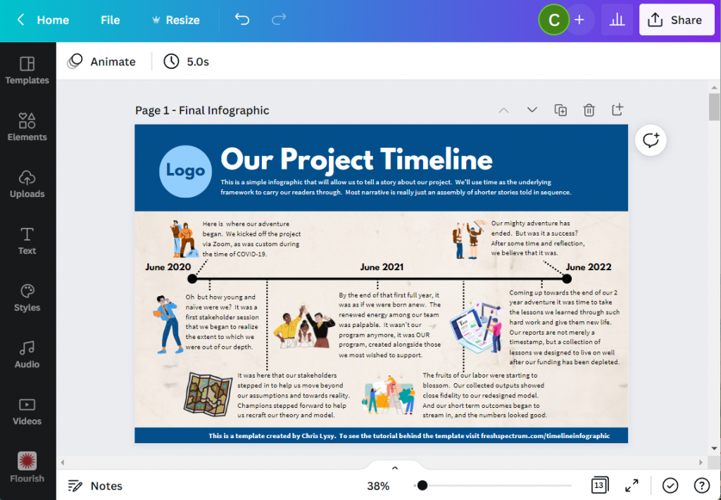
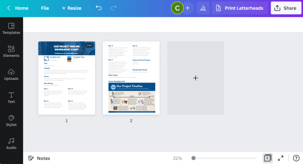
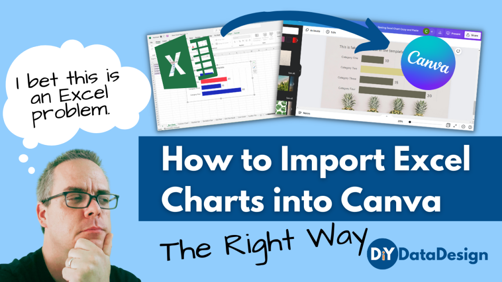
There are several ways to bring Excel Charts into Canva but which way is the right way? In this post I’ll walk you through the options and help you decide the best way for you.

So I had this question from an attendee of one of my data design webinars. “How do I bring Excel charts into Canva with a transparent background? I’ve tried copy and pasting but I end up with a white background.”

This is a pretty common problem, and it’s not just bringing charts into Canva but into other tools too. Luckily there is also a pretty common solution.

How to Import Excel Charts into Canva Featured Image

Why a simple Copy and Paste gives you an image with a white background.

So the easiest way to bring a chart from Excel into another program like Canva is to use Copy/Paste. Just select the chart and COPY (CTRL C), then open a Canva design and PASTE (CTRL V).

Excel Screenshot Bar Chart

This will work, but two things will likely happen.

  1. You’ll have a white box behind the chart (meaning you won’t be able to see the background through your chart.
  2. You’ll probably also have a border around the box.
Canva Screenshot with Copy Paste Bar Chart

The first thing you should know though is that this isn’t really a Canva problem. It’s an Excel problem.

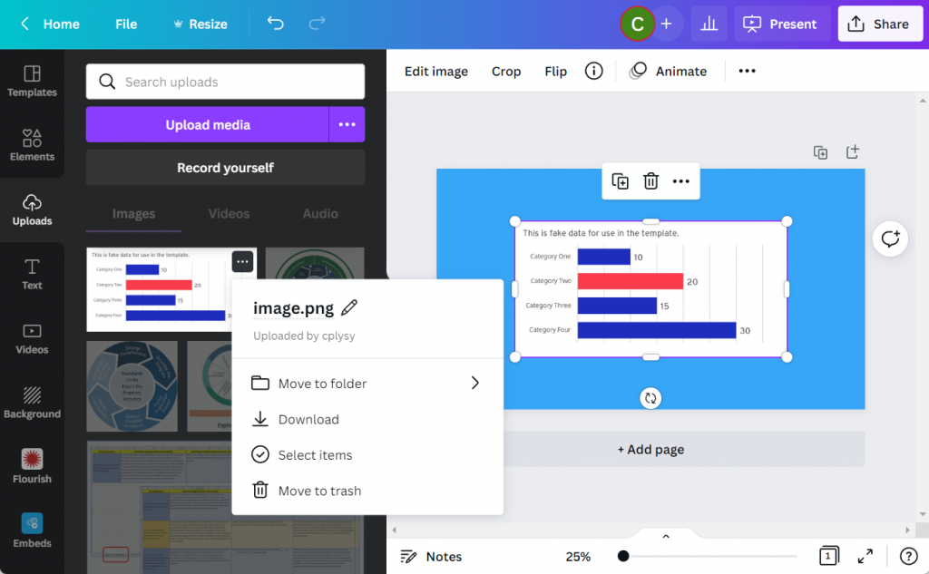
When you copy from Excel and paste into Canva, you’ll find a new image file in your Uploads tab. You’ll also notice that the image is a PNG, which is good. Because a PNG “can” give you a transparent background (a JPG will not).

Canva Screenshot Uploads Menu

Giving Your Excel Chart a Transparent Background

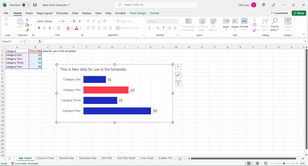
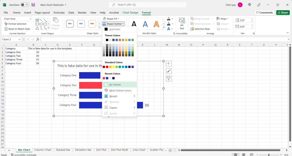
Let’s go back to our chart in Excel.

We’ll select the chart and go into the format tab. Then select Shape Fill and then “No Fill.”

This will give us the transparent background. You can quickly see why this isn’t Excel’s default, because a transparent chart in front of the spreadsheet blends in a little too much with the sheet.

Excel Screenshot Shape Fill

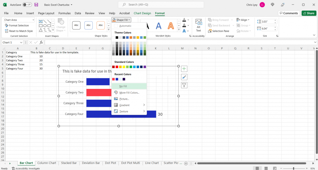
Another step you should take while you are here is to make the shape outline transparent as well by clicking on “No Outline.” Now this default setting I don’t get, it’s just annoying.

Excel Screenshot Shape Outline

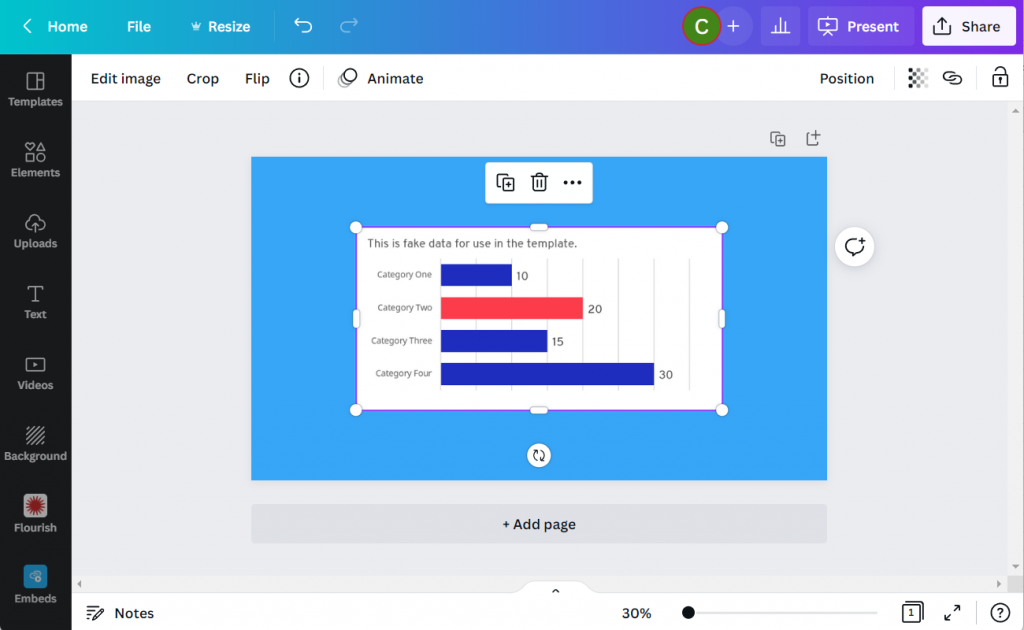
Now the Simple Copy Paste Works

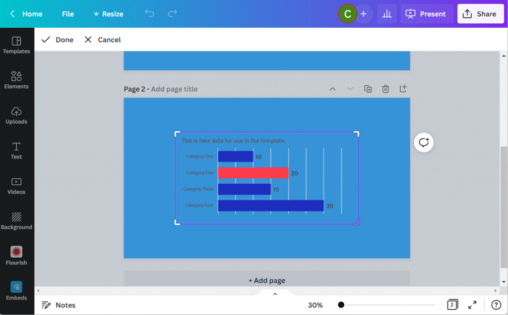
Now that we’ve made the chart background go away it’s time to copy and paste again. The difference is that this time, the chart will have a transparent background and can be better placed within the Canva design.

Canva Screenshot Excel Chart Transparent Background

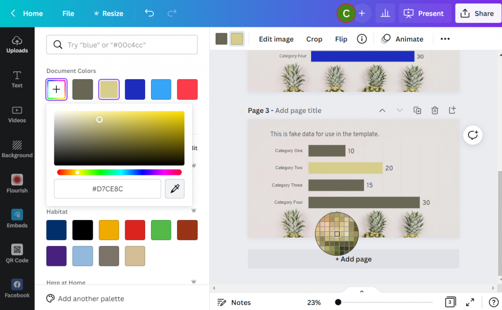
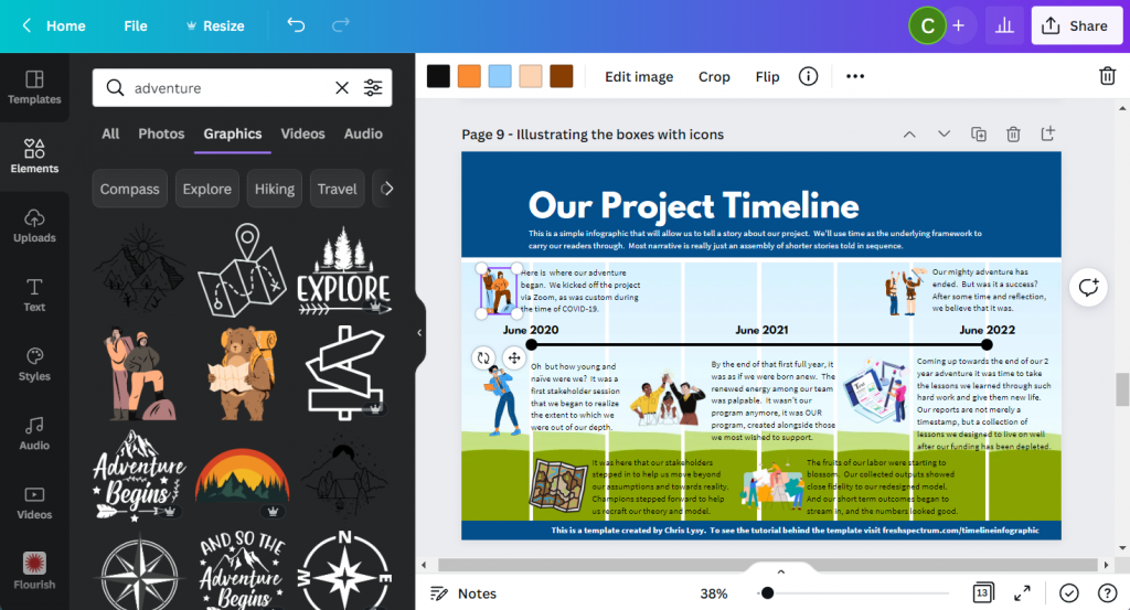
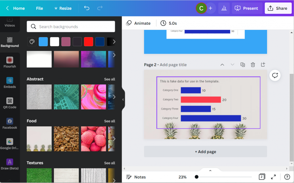
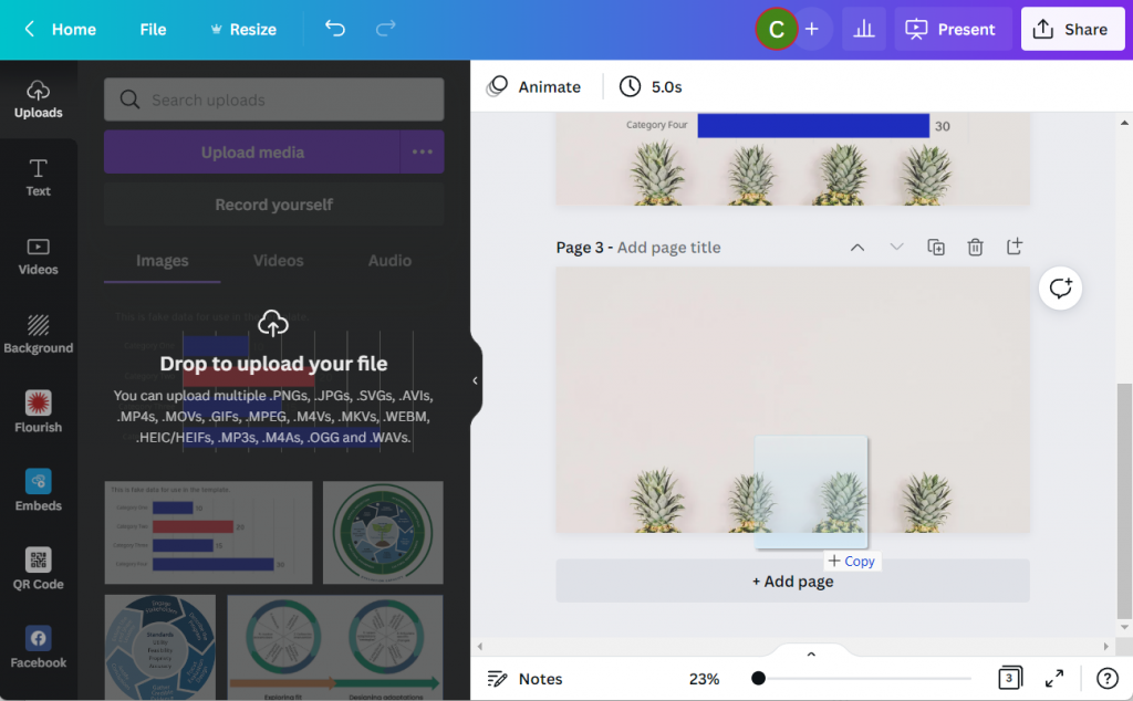
Did you know that Canva has a backgrounds menu? If you don’t see it on the left panel menu click on the “More” button at the bottom. You’ll find bunches of abstracts, textures, gradients, and photos ready to become backgrounds.

Like this super cool Pineapple background.

Canva Screenshot with Excel Chart and Background Image

Bonus: Saving your Excel Chart as an SVG

Okay, want to take the cool factor one step further?

Instead of copy and paste let’s save the chart as a picture in Excel.

Excel Chart Save as Picture

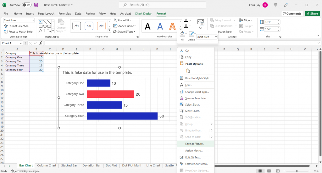
And not just any picture, let’s set the type to Scalable Vector Graphics.

Excel Chart Save as SVG Screenshot

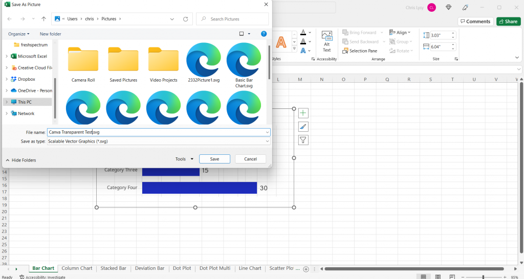
Then we’ll drop the newly created SVG chart into Canva.

Canva Drop to Upload Picture

In the uploads tab you won’t notice much of a difference between the transparent PNG and the SVG. But something has definitely changed.

If you put the SVG in your Canva design, you’ll notice that you can actually change the colors!!! (I’ve tested this a bunch, and it has its limits. But for basic Excel charts you’ll be able to adjust most if not all of the colors).

Canva Screenshot Excel Chart SVG

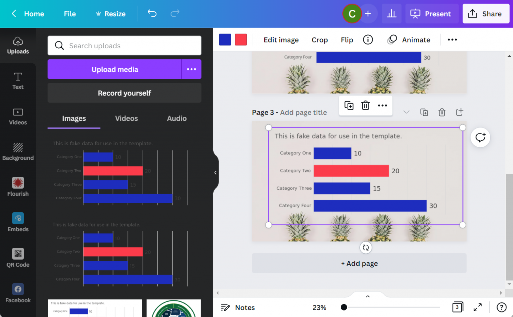
You can even use the eyedropper tool in the colors panel (the first one with the plus sign gives you the option). Now I can match my chart to the awesome pineapple background.

Canva Screenshot Excel Chart SVG Color Dropper

Written by cplysy · Categorized: freshspectrum

Jun 14 2022

Join our private community of evaluators and researchers.

Inside DiY Data Design, evaluators and researchers like you come together to meet and support one another, discover new tech, learn new tricks, get answers to burning questions, participate in data design challenges, and more.

Let's Create Together - DiY Data Design Learning Community with Chris Lysy

Could you become a data design champion?

Behind every well designed report there is a data design champion.

They only sometimes recognize their own talent. And even then, they tend to give far more credit to technology than it deserves. But the reality is, without that person behind the scenes, the cool looking infographic would never exist. Neither would that sleek visual presentation or easy to read slidedoc.

The technology used to create cool things doesn’t work without a person. And if nobody on your team takes the initiative, the status quo remains.

And that’s the secret. It’s not just talent or skill, but initiative. Anyone with the desire to learn could develop the skills to become a data design champion. There are tons of tricks and tools that a person can use to create better infographics and reports.

You could become THE person who makes better design happen in your organization or with your clients. It just involves commitment to building your own skill set, trying new things, and lots of practice.

DiY Data Design Community

Introducing DiY Data Design.

DiY Data Design is a private learning community designed to support aspiring data design champions. The people who join are motivated to go beyond the status quo, committed to self-discovery, willing to do the work, and eager to create.

All data design journeys are unique, but they can all benefit from things like:

  • Direct support from a data design mentor.
  • Introductions to new technology.
  • Cutting edge education.
  • Networking with data design peers.
  • Access to tutorials and templates.

Delivered from within a safe space, free from Cre-Haters and serial Nit Pickers.

Our DiY Data Design Circle Space

What I mean by safe space.

A privacy first attitude. Your work will never be shared outside of the group without your permission. I often stop recording a coaching session so that participants can feel free to privately share their work.

There are no stupid questions. Ask any question without fear of judgment or rejection. We all start somewhere and it’s always okay to ask even the most basic of questions.

A welcoming community. This is a community that welcomes members from diverse backgrounds including race, ethnicity, gender, orientation, neurodiversity, and physical ableness. 

Participate as much or as little as you would like. Want to lurk in the background, take the included courses, watch replays, and not participate in discussions. Feel Free.  The format is open, participate when you have time, take breaks when you don’t.  There is no judgment for lack of participation.

Inside DiY Data Design

Inside DiY Data Design Laughing

So what does being a part of a modern learning community actually look like?  I would say there are 6 fundamental components that make up DiY Data Design.

1. Weekly whiteboard coaching sessions with Chris.

We get together just about every Wednesday except for the occasional holiday or vacation.

Every session opens with either a tour of a specific piece of software, a lesson on a specific data design process, or a case study review of an actual modern report, infographic or dashboard. This part is always recorded.

Then we dive into a whiteboard coaching session and group discussion.  In the second half of sessions members are encouraged to share their work, processes, and experiences.

DiY Data Design Whiteboarding Session

2. A coaching session recording archive.

I always believed that a successful workshop or course always left you with something.  A takeaway that you could apply to your own work. Every coaching session is designed to deliver at least one practical takeaway, if not a bunch.

As such, our recording archive is filled with valuable takeaways. We’ve already been operating as a community for 9 months, meeting weekly. And as a bonus, I’ve also included short courses and lessons from my original diy data design workshop.  This gives you hours and hours of content you’ll have access to the minute you register.

The best thing about this group is meeting other people with a similar interest in using data for quality improvement but with expertise and insight from different fields!

Joanna Prout, PhD, Psychologist and Evaluator

3. An online circle community hub.

In a lot of ways DiY Data Design is a learning community for people who don’t always have the time to be active in a community.  

We are built on a Circle community site. There you’ll find a space where you can learn about upcoming events, freely share your work, get feedback, and ask questions.  You can also build out your profile to introduce yourself and your learning goals to me and your fellow community members.  

You are not required to visit often, or ever, if an online community is not your style.  It’s a site that is there if and when you need it. I will also personally read every post that goes onto the site and will usually reply within the next day or two.

4. Self paced courses.

As a DiY Data Design member you will also gain access to a set of self-paced courses.  There are a few existing courses right now, with another handful slated for release this summer and fall.

Currently included:

  • Lunch Break Sessions – Series 1 (diydatadesign exclusive)
  • 1.2.3. Report! (soon to be unpublished and archived)
  • DataViz for Anti-Racism (currently unpublished and archived)

Upcoming course release schedule:

  • Effortless Infographics (Summer 2022)
  • Canva Jumpstart (Summer 2022)
  • Flourish Jumpstart (Summer 2022)
  • Logic Models and Theory of Change (Fall 2022)
DiY Data Design Canva and Flourish Template Collection

5. Data Design Template Collection

You will gain access to a growing collection of specially designed Canva and Flourish design templates. These designs are available to copy and use in your own work.

In the future this collection will also include PowerPoint infographic templates, Excel chart templates, and Data Design Worksheets.

6. Hands on support and coaching from Chris Lysy

As a consultant my minimum project size is in the thousands of dollars. Through this learning community model I get to offer direct hands-on support at a fraction of the cost. I love to teach and will go out of my way to support our community members.

Very much enjoying our creative reporting workshop with Chris.

He has gone the extra length to help me with an annual report and gave feedback on an article I wrote. Our weekly sessions are informative and practical and helping me moving forward in my data and design journey!"

Mareli Claassens, PhD, Professor and Evaluator

Right now is the perfect time to join the community, here is why!

The summer registration period is only open through the end of this week (June 17, 2022).  It won’t open again until early September.

Here is why you should sign up today!

  1. Prices are going up in the fall (considerably). This is the last quarter to lock in your membership at the original subscription rate.
  2. Last chance to get all of the upcoming self-paced courses included in the subscription.  Starting in the fall only a subset of the upcoming DiY Data Design self-paced courses will be included with the subscription.
  3. Last chance to get a free 30 day trial.  The trial period is going to drop from 30 to 7 days.
Deadline is Coming Cat GIF

Feel like it’s a match?

Outstanding! Here is the current pricing information.

Just keep in mind that enrollment is only open through June 17, 2022.

  • Monthly – $50
  • Annual – $500 (two months free)

Right now you can use this link to apply a 15% off coupon.

15% Off Discount (15OFF)

Need a Scholarship?

Intended for students, non-profits, unemployed, BIPOC, developing countries, and anyone who would like to join the workshop but cannot afford full registration costs.

No application necessary, choose one if you need one, just use the following coupon codes:

25% Off Scholarship (25SCHOLARSHIP)

50% Off Scholarship (50SCHOLARSHIP)

Join US!!!

There is nothing to LOSE!

Join us today and you'll get a 30 day free trial.

If it is not right for you, cancel anytime before the 30 days are up and you will NOT be charged.

Written by cplysy · Categorized: freshspectrum

Jun 09 2022

How to create a timeline infographic using Canva.

Looking for an infographic that is easy to write and design? This post will you through the process of creating a timeline infographic from scratch using Canva. I’ll also include the final templates at the end of this post.

Here is what I will design – “Our Project Timeline”

This is just a simple timeline, nothing too fancy with only so many text blocks. The text blocks are fairly large (at 18pt font). So if you wanted a busier timeline with more blocks, there is certainly room if you drop the text size a bit.

Timeline Infographic Concept created in Canva - Screenshot

Step 1. Choose your base size.

Canva’s infographic templates are all based on a size of 800 by 2000 px. That’s a fine size if you are only sharing on the web and want a portrait style infographic.

If you plan to print your infographic, I would suggest creating with a standard paper size. Most professional office printers can easily print up to 11 inches by 17 inches (or A3 if you are going with international sizes).

This tabloid format is kind of cool because it’s like having two letter size pages side by side. You can easily fold it in half and put the infographic into a folder.

Screenshot of creating a custom size infographic in Canva

Step 2. Build your grid.

I like having a basic grid when I start designing. It really helps me arrange things.

In Canva I’ll create that grid by clicking on Elements and searching for “Grids”. These are technically photo grids, but I’m just going to keep them in the back and use them as measuring tools. Later on, after I put in content, I’ll delete the grids.

Screenshot of setting up grids within Canva

Step 3. Add in your timeline.

For my line I’ll simply search for “Lines”.

Choose the line style first, then you’ll be able to change the line weight, color, and end points. I usually place my line in the middle of the page.

Screenshot of adding a line in Canva

Step 4. Putting a Title on the Page.

Next we’ll add a Title. For this we will use the Text menu and Add a heading. Even though I am designing this infographic for print, I still think it will likely be reviewed via a screen most of the time. So I’ll use a pretty large font size (64 pt).

Screenshot of adding a header in Canva

Step 5. Adding a Subtitle.

A sub heading is a great way to keep you from writing too much in your main heading. Use the subheading to setup your infographic for your reader. I’m using a fairly large font size (18pt) for a print piece because, again, I do want it to be readable on a screen.

Screenshot of adding a subheader in Canva

Step 6. Adding your starting and end points.

Now we can start adding blocks of text. For this template I created a block at the beginning and at the end. I also put general dates above the line.

You don’t have to create timelines exactly to scale, but it should it be close.

Screenshot of adding text blocks in Canva

Step 7. Adding content blocks.

You have choices for the content blocks under the line. I kept the font large at 18pt, but if you have more to write you can shrink the size a bit. All sorts of infographics will drop down their text size to 10pt (sometimes less). This all depends on how much content you have to share (and how much you white space you would like to see on the page).

I also added a short by line at the bottom of the page. Most good infographics will send you somewhere at the end of the page where you can find sources or other additional information.

Screenshot of adding additional text boxes in Canva

Step 8. Adding color blocks.

I put a couple of rectangles behind the text at the top and bottom of the page. This creates a bit of differentiation between the heading, main timeline content, and the little footer.

Screenshot of a Canva infographic with colored rectangles used to separate sections

Step 9. Illustrating the text blocks with icons.

Now that we have all the text in the infographic it’s time to illustrate. One of the easiest ways to illustrate is to find icons that pair well with your text blocks. Canva has a ton of icons available through a simple search in the Elements tab (especially if you have Canva Pro).

Screenshot of a timeline infographic with Icons being added

Step 10. Deleting the grids.

Once I have everything on the page, it’s time to drop the background grids, I don’t need them anymore and this lets me see the infographic like it will be seen by the reader.

Screenshot of the timeline after the grids were erased

Step 11. Adding connecting lines.

So I’ll want to connect the text boxes to the appropriate times on the infographic using lines. If an icon is in the way, just click on the line and send it to the back.

At this point we really have a completed infographic and could stop.

Screenshot of the project timeline infographic with additional connecting lines

Step 12. Adding background texture.

Black text on a white background can feel pretty stark sometimes. It has really good contrast but can feel a little too bright for your eyes.

Since the random text I wrote for the infographic had a kind of adventure vibe, I put in a map paper texture in the background. It was a little too dark so I lowered the transparency and added a really light color behind the texture.

Screenshot of project timeline template with added texture.

Step 13. Creating space for a logo.

Finally, I shifted the header and subheader over a little to make room for a logo. Since this is just a fake project, I created a fake logo.

And that’s it, we now have a ready to share completed timeline infographic.

Screenshot of final project timeline infographic template

Start where I finished: grab the template.

Link to the Canva template referred to in this blog post.
Use this link to open the Template in Canva.

BONUS: Template Script

When writing an infographic, especially with a team, the actual template can be a bit of a distraction. In these situations a script can be really helpful. You don’t have to create one in Canva like I did (a simple word document is fine).

But here is an example, the script has all the words you’ll find on the infographic and some additional details. Save it as a PDF and share it with colleagues for comments and cowriting.

Screenshot of the two pages in the timeline infographic script.

Grab the template script worksheet here.

Screenshot of the infographic script template.  Accessible on Canva if you click on this picture.
Use this link to open the worksheet in Canva.

Create an Infographic in an Hour Webinar

Like this tutorial? Sign up for my upcoming webinar, Thursday, June 9 at 2PM EDT.

I’ll be walking you through another example of a quick to create infographic.

Register on Eventbrite

Written by cplysy · Categorized: freshspectrum

Jun 02 2022

How to create an infographic in an hour

If you are not used to creating your own infographics, creating a professional infographic quickly might seem like a tall order. But sometimes deadlines call or you just need to create lots of infographics in a short amount of time.

In this post I’ll show you how to create an infographic quickly.

Just a note, I’m assuming you already know some information worth putting into an infographic format (such as a timeline) or you have some other kind of content you want to adapt into an infographic (like a report). If you don’t have information worth sharing, find that first!

Fresh Spectrum Cartoon "We need you to create an infographic for our new report."

"No Problem, when is the deadline?"

"You have 1 hour."

1. Pick easy-to-infographic information.

A lot of times you’ll be creating an infographic from an existing report. But what inside the report should go into the infographic? There are certain things you’ll find in your report that are easier to infographic than others.

For example, these things are usually pretty easy to infographic:

  • Recommendations
  • Key Insights
  • Chosen Methods
  • Timelines
  • Surprising Results

If a quick infographic is your goal, stay away from anything that requires a lot of explanation or subtlety. Infographics are engagement tools, ultimately you’ll want to send your audience back to the primary report for more detailed information.

2. Choose a simple infographic formula and style.

There are all sorts of infographic formulas and styles.

Start with shape and size. If you plan to print your infographic, make sure to design it in an easy to print format (such as letter size paper, legal paper, tabloid, A3, or A4). If you are sharing it on the web keep in mind where you are sharing the infographic and the platform limitations that might exist.

As for formulas, here are a few that make for easy infographics:

  • Listicle infographics (i.e. 5 lessons learned)
  • Timeline infographics (i.e. Successes over our last 4 years)
  • Side by side comparisons (i.e. A tale of two program sites)

3. Find an infographic template.

Screenshot of canva infographic templates.
Canva has tons of infographic templates!

Once you have a basic idea of the type of infographic you are going to create, try to find a template before you start writing. There are other infographic template sites out there in the world, but I usually suggest starting with Canva.

There is a tendency to write too much when you are writing content for an infographic. You spend a lot of time making sure the words are just right only to find that they look super busy once you put them on the page. Choose a template that more or less matches the amount of content you want to share.

A template you like is also going to take care of a bunch of design choices around colors and fonts. If you have make the template match your brand it might take you a little more time.

4. Write an infographic script.

I prefer writing my infographic text outside of the infographic. It makes it easier to track change and edit if necessary. Then I just paste the text into the template.

Use the template you chose in step 3 to give yourself target word counts for each block of content. If you go far above or below the word count, it could really distort the look and feel.

Cartoon showing Jack from Titanic's scribble drawing of stick figure Rose.

5. Illustrate your infographic.

Now that you have the text, it’s time to add the pictures.

I suggest being consistent. Choose between photographs, illustrations, charts, cartoons, and icons as each will give your infographic a different look. Since we are creating this infographic quickly, I would suggest using stock visuals already included as part of Canva.

Another option is to upload your own charts and pictures.

6. Bring it all together, save, and share.

Now that you have your infographic all together and filled with content it’s time to give it the final touches. If you want to print your infographic (or share it as a printable) I would suggest saving it from Canva as a PDF. If you plan on sharing it via social media I would suggest saving it as a PNG.

If you share it on a website or on social media as a PNG, make sure to add alternate text wherever you share (i.e. WordPress, Twitter, etc.).

Want some resources, including a few Canva templates and an infographic script worksheet? Register for my free upcoming webinar.

Next week I’m holding a webinar to go along with the Summer registration kickoff for DiY Data Design. Hope you can attend!

Join us at 2PM on Thursday, June 9, 2022. Register on Eventbrite through this link.

How to Create an Infographic in an Hour - Webinar.

Written by cplysy · Categorized: freshspectrum

May 25 2022

How to create logic models and theory of change using MURAL [Guest post by Anne Heberger Marino]

Today’s post was written by Anne Heberger Marino who is the founder of Lean-To Collaborations. You can learn more about Anne’s work by visiting her website or by following her on Twitter (@LeanToCollabs).

When Chris shared his Canva redesigns of a logic model and theory of change, it didn’t take much for me to agree it would be interesting (and possibly instructive) to recreate them in MURAL.

I am a BIG fan of MURAL. A crazy amount of my world and work winds up in MURAL.  MURAL has become the place where I think, plan, dream, and run collaborative workshops for my business.

Though I don’t work on many evaluation projects these days, evaluation is still my professional home.  

A screenshot of Anne’s Logic Model & Theory of Change MURAL adaptation, you’ll find the template link at the bottom of this post.

In today’s guest post, I’ll walk you through how I re-created Chris’s Canva redesigns of a Logic Model and Theory of Change in MURAL.  If this is a new tool for you, don’t worry. I’m assuming zero familiarity with MURAL.  The plan is to look at:

Creating and adapting a standard logic model in MURAL

  • Creating and adopting a theory of change in MURAL
  • A few MURAL-specific features to try in your logic models & TOCs
  • Additional ideas for how evaluators might use MURAL in your practice.

You can think of MURAL  as an online version of the whiteboard in your office or classroom.  You can use MURAL alone or with hundreds of collaborators. If you’ve used Jamboard, Miro, or Zoom’s whiteboard feature, you’ll be familiar with some of the features and use cases for MURAL.

Recreating the Logic Model using MURAL – Version 1

Looking at a standard logic model through the MURAL lens, it’s made of up 3 x5 sticky notes, 3 x3 sticky notes, and arrows.   The process I was to make all the sticky notes, line them up, connect the arrows, and add labels.

It only takes seconds to create a sticky note formatted with a box around it.

Screenshot of Adding Sticky Notes inside MURAL

Now that the sticky note looks the way I want it, single-clicking on that sticky lets me add text.  MURAL will automatically shrink the text to make it fit in the sticky note so don’t go overboard.  Double-clicking near the sticky note I just made creates another sticky with the same formatting.  Great time-saver! The align tool gets all the boxes looking orderly.

Screenshot of aligning sticky notes inside MURAL

The arrows and connecting lines are a bit fiddly to get juuust right, but I expect that when adding lines and arrows to things.  The align tool is helpful here, as are the guidelines that show up automatically.

In less than 15 minutes I was able to recreate the W.K. Kellogg logic model.  In the lower right I added stickies with links to the original model and Chris’s freshspectrum post.

Screenshot of Anne’s adaptation of the W. K. Kellogg Foundation Logic Model

If you look closely at the template version, you’ll see a light gray line around this model.  That’s because the model is within what MURAL calls an “area”.   The individual pieces of the model are part of one area, so I can copy the whole thing to create Version 2.

Almost magic, right?

Logic Model Versions 2 and 3: Gray boxes, Pastel Boxes

Here’s the process for Version 2:

  1. Duplicate Version 1
  2. Align the new model with the first
  3. Select all the sticky note boxes
  4. Change the formatting on the boxes

For Version 3, follow steps 1-4 and then change the color of the headers to match the boxes.

It took less than 2 minutes to go from Version 1 to Version 2 and Version 2 to Version 3.

Version 3 uses default colors already part of the MURAL color palette.  Using an eyedropper tool would have made it easy to precisely color match Chris’s design or a client’s branding.

Screenshot of Anne’s MURAL – W. K. Kellogg Foundation Logic Model Version 2
Screenshot of Anne’s MURAL – W. K. Kellogg Foundation Logic Model Version 3

Version 4: Adding Images to the Logic Model

I couldn’t perfectly replicate Chris’s results using a photo background for the logic model. 

MURAL comes with an extensive album of photos that you can crop, turn, and adjust to whatever size you need.  Every image I tried felt like it was competing with the model rather than adding value.  This is how I feel about most photo backgrounds in MURAL.  It’s a personal preference. 

You can upload your own photos to MURAL. And I’ve done that when I want to brand a workshop for a client.  In this case, I decided to stick with “out of the box” content from MURAL. It would have felt like cheating to use one of my own photos or design one that fit my needs.

Eventually, I found an image that fit with the content of the logic model.  I used an eyedropper tool to match the background to the “hospital scrub green” in the image.   Part of why I chose this picture was the pure horribleness of the color.  Consider this a reminder to make your color and design choices carefully. 

Screenshot of Anne’s MURAL – W. K. Kellogg Foundation Logic Model Version 4

Version 5: Experimenting with Tags

In this screenshot, you can see that I started off replicating the labels Chis used in his model using MURAL tags.  It would have been possible to recreate those labels, but I wanted a way to demonstrate the power of tags.

Screenshot of Anne’s MURAL – W. K. Kellogg Foundation Logic Model Version 2, adding tags.

The tag feature allows you to add words and an icon to a sticky note.  They allow you to convey more information on a sticky note without taking up much space or diverting too much attention to the main text.   I’m curious what Chris thinks about this feature from a design standpoint.

[Note from Chris: I like it. One of the biggest issues evaluators run into when creating models is the desire to add way more text to a box than can actually fit. Tags give you another way to incorporate additional context without adding a lot more text.]

What might that offer to an evaluation logic model?  We could indicate partners that are involved in the program’s activities.  We could use icons corresponding to different data collection methods and when those will occur. You might use tags to indicate the status or progress connected with an outcome. 

Screenshot of Anne’s MURAL – W. K. Kellogg Foundation Logic Model Version 2 with Tags
  • I imagined an evaluator adding methods and timing to the logic model.
  • Under A1, there is a tag and icon showing indicating there will be a survey in Year 1 and Year 3 to assess this activity (see legend at the lower right).
  • There are also tags for who might be involved in these activities.  You’ll see tags for the Coalition Team, Medical Network, and Partnerships.
  • Each tag can be given a label, color, and icon.  
  • We could communicate what’s been done (and what’s left to do) by greying out the tag color as work progresses
  • Tags can only be added to sticky notes.  They won’t work on shapes like the ones used in Models 7-10.  

There may be no end to the creative ways evaluators could find to use tags in MURAL. What would you use them for?

Model 6 & Model 10

These are blank versions of the models.

Recreating the Theory of Change using MURAL- (Image 7)

Looking at the theory of change I can see it is best recreated by using shapes in MURAL.  We need several of the same size rectangle, several ovals, one long and skinny rectangle, and some arrows.

To create shapes with text, follow these steps:

  1. Create and format the shape you need.
  2. Add text. (You can change the font)
  3. Adjust the elements so that the shape surrounds the text, and the text is readable.
Screenshot of the NCVO Example Theory of Change created using MURAL

You may need to experiment to find a shape/text combination that will accommodate all the pieces of the model.  It may help to create the wordiest element first.  If your shape/text combo looks good for that element, it will work for the others.

Adding Icons & Images to the Theory of Change (Models 8 & 9)

For Model 8, I used MURAL’s icon library to find simple images corresponding to the program’s outputs.  I kept all the icons the same color for a simple look.  Model 9 uses the image library and a bit of cropping to put “real people” in the model.  Since the photos all had distinct color profiles, I used pastel text boxes to unify each level of the model.

Screenshot of NCVO Example Theory of Change created using MURAL with icons and pictures.

Ways to Share your Models

There are several ways you can share models made in MURAL. 

  1. Invite people to the mural itself.  If you’re using this option, be sure to “lock” areas unless you want people to be able to move things around. Viewers can leave comments for you in the mural. 
  2. Download and share. You can download an entire mural board or sections of one as a PDF or png image.  It’s also possible to download HTML and data in a zip file. 
  3. Share your mural as a template. When you publish a mural as a template, others can use and adapt your designs to suit their needs and your original mural remains unchanged.  (That’s what I did with this set of models.) 

Other ways to use MURAL for evaluation

  • MURAL is a very flexible tool, making it well suited for diverse evaluation contexts.  Here are a few other ways you might use MURAL in your evaluation work.  I’m sure you have others.
  • Use an existing logic model as the background for an entire mural board, giving you a large workspace for a stakeholder engagement workshop.
  • Put the building blocks of your evaluation (inputs, activities, outputs, intended users, evaluation questions, methods, and outcomes) into a mural and invite stakeholders to build a representation of your evaluation plan.
  • Create different versions of the same theory of change (linear, circular, etc.) and host a “gallery walk” to get feedback on the designs.
  • Make a “home base” for evaluation in MURAL.  Store links to your models, reports, explainer videos, meeting notes, and cartoons so everyone can access the information they need when they need it.
  • Take the identifiable information out of your logic model or theory of change and share it as a template with the MURAL community.

Want to play with these designs in MURAL?

You can get a copy of the template of all the models here if you already MURAL account or want to register for one. (It’s free, there’s no catch, and this is NOT an affiliate link.)

And if you end up creating something using these templates, please do share it with me in the comments!  I’m happy to answer your questions about MURAL too.

Written by cplysy · Categorized: freshspectrum

  • « Go to Previous Page
  • Go to page 1
  • Interim pages omitted …
  • Go to page 28
  • Go to page 29
  • Go to page 30
  • Go to page 31
  • Go to page 32
  • Interim pages omitted …
  • Go to page 54
  • Go to Next Page »

Footer

Follow our Work

The easiest way to stay connected to our work is to join our newsletter. You’ll get updates on projects, learn about new events, and hear stories from those evaluators whom the field continues to actively exclude and erase.

Get Updates

Want to take further action or join a pod? Click here to learn more.

Copyright © 2026 · The May 13 Group · Log in

en English
af Afrikaanssq Shqipam አማርኛar العربيةhy Հայերենaz Azərbaycan dilieu Euskarabe Беларуская моваbn বাংলাbs Bosanskibg Българскиca Catalàceb Cebuanony Chichewazh-CN 简体中文zh-TW 繁體中文co Corsuhr Hrvatskics Čeština‎da Dansknl Nederlandsen Englisheo Esperantoet Eestitl Filipinofi Suomifr Françaisfy Fryskgl Galegoka ქართულიde Deutschel Ελληνικάgu ગુજરાતીht Kreyol ayisyenha Harshen Hausahaw Ōlelo Hawaiʻiiw עִבְרִיתhi हिन्दीhmn Hmonghu Magyaris Íslenskaig Igboid Bahasa Indonesiaga Gaeilgeit Italianoja 日本語jw Basa Jawakn ಕನ್ನಡkk Қазақ тіліkm ភាសាខ្មែរko 한국어ku كوردی‎ky Кыргызчаlo ພາສາລາວla Latinlv Latviešu valodalt Lietuvių kalbalb Lëtzebuergeschmk Македонски јазикmg Malagasyms Bahasa Melayuml മലയാളംmt Maltesemi Te Reo Māorimr मराठीmn Монголmy ဗမာစာne नेपालीno Norsk bokmålps پښتوfa فارسیpl Polskipt Portuguêspa ਪੰਜਾਬੀro Românăru Русскийsm Samoangd Gàidhligsr Српски језикst Sesothosn Shonasd سنڌيsi සිංහලsk Slovenčinasl Slovenščinaso Afsoomaalies Españolsu Basa Sundasw Kiswahilisv Svenskatg Тоҷикӣta தமிழ்te తెలుగుth ไทยtr Türkçeuk Українськаur اردوuz O‘zbekchavi Tiếng Việtcy Cymraegxh isiXhosayi יידישyo Yorùbázu Zulu